 I realized that I use less than 5% of the materials in my pencil box. I’ve decided to try doing a project using my neglected materials to see if I have a good excuse for not using them. I’m a little nervous. What if I hate these materials? Well, if I don’t like working with these pencils, I can throw them out or donate them. If I do like them, I can commit to using them more often. I started by using a 2H pro art pencil for my outline. I used a 4b pencil for medium to dark shading and an h pencil for light shading. The h pencil came out darker than I thought it would. I used a sepia pencil for the darkest shades. Verdict Do I hate these pencils? Absolutely not! On the contrary, I found them to be very smooth and enjoyable to work with. I had been shoving these pencils, which are mostly from Pro Art, in favor of my Koh-I-Noor pencils for years. It’s funny how we can get so used to using a select few products that we almost forget our other materials exist, even if there’s nothing objectively wrong with them.
0 Comments
 I hereby give you permission to make bad art. In fact, I encourage you to make bad art, if, by trying to avoid making bad art, you’re not making art at all. In my post on making art a habit, I said what you make during your art time doesn’t have to impress anyone. It can be utter crap. I said that you can make great art in any medium and that’s true, but you won’t be able to make great art in any medium when you first start out with it, or at least, that’s how you’ll feel. I’m saying this as much to myself as I am to you. I need to get over my fear of making art that might not be up to the standards I’ve set for myself. I just keep thinking of the “two crappy pages a day” that writers swear by. Making bad art could lead to you making good art in the future. You might consider sketching or doodling also. There’s something very satisfying about creating something without actually worrying about the outcome. That’s what I was doing when I made the picture at the top of this post. Create, learn, and have fun.
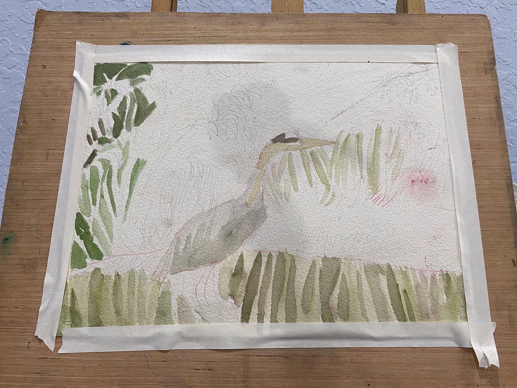
 I feel like the most important thing for creating the right texture is to have my lines going in approximately the right direction and to have them either straight or curved, depending on what’s in my reference photo. I can be off the number of strokes in a given place and I can even be off with the length and width a little. If I have the direction and curve right, though, the animal I that ends up in my piece might not even look like the animal in my reference photo at all. While I’ve been working on my current painting of a multicolor heron, I haven’t even been thinking about what texture I want the feathers to be. I’ve literally just been thinking about the direction they go. If I do that, the texture takes care of itself. Sometimes, I happen to pause and take a look at a mass of hair or feathers and see that they’ve come out with almost the exact feel I wanted them to have, without me consciously trying for that feel. I love when that happens. An example I can think of the hair on this portrait. 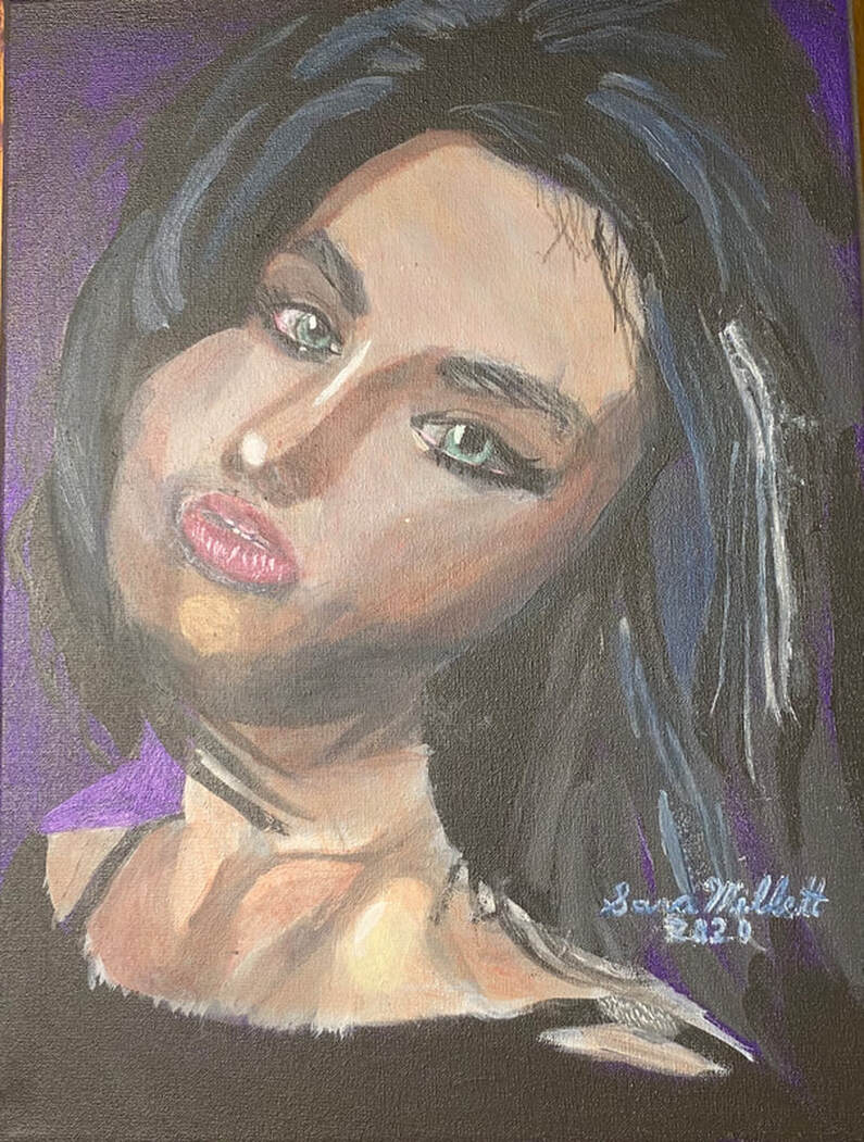 I just painted the shapes I saw in my reference photo and keeping my strokes going in the right direction. Before I knew it, I had the volume I was looking for. As you can see from the examples I've given, this principal applies across mediums.
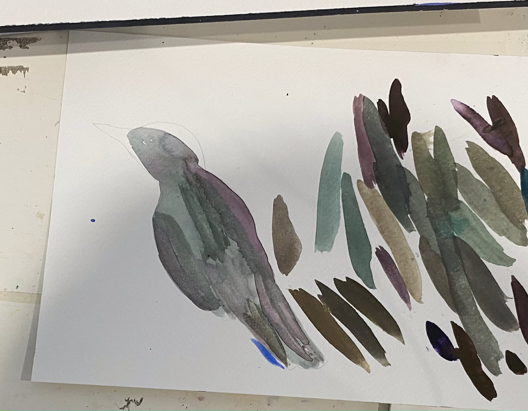
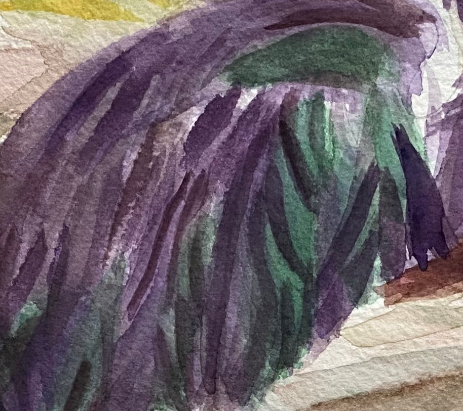
 The bird I’m painting has a lot of colors in him. Trying to paint them all can be overwhelming. I’m starting simple by only focusing on green and purple for now. I’ll build up layers of these colors until I reach the darkness I desire. At this point, I'm not concerned with whether it's good or bad. This bird will have many layers and probably multiple colors on him by the time I’m done. By limiting my focus to two colors at these beginning stages, though, I keep myself from being too paralyzed by indecision to start. Don’t think about making a masterpiece when you start. Just think about starting.
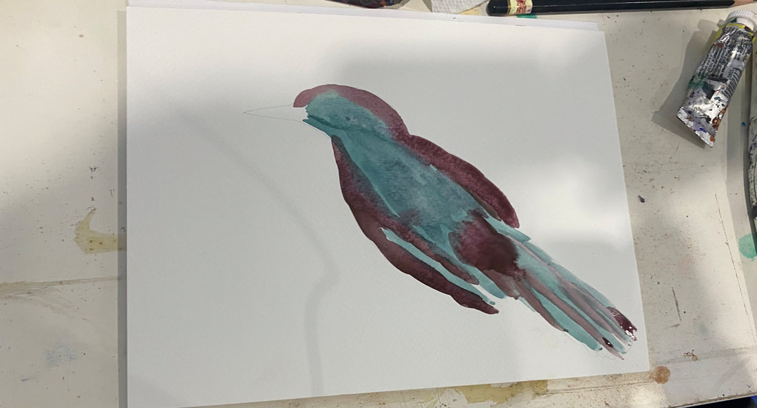
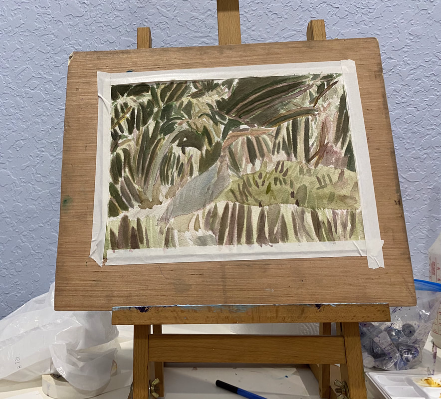 My goal is always for my subject to stand out from my background. I usually try to achieve this by making the background darker so the subject appears lighter and making the background cooler and the subject warmer, which I usually do by adding layers of blues over the background and yellows and oranges over the subject. I thought I’d try something different with my current painting, though. Since my subject is a bird with blue feathers, I knew painting yellow over him was out. That would just turn him green. Painting orange wasn’t much better because that would dull him and send him further into the background, exactly what I don't want. I remembered what I’d learned from Alicia Farris’s watercolor workshop and that's that layering analogous colors, or colors that are near each other on the color wheel, makes shades more vibrant. I could certainly use some more vibrancy in my subject. That would probably be a more effective way if getting him to stand out than trying to "warm" him. I chose cyan blue to layer over him. I could've chosen any blue, as well as purple or green. With just one layer of the cyan, he started to come forward more. On the other hand, his neck is more of a warm brown, so I've been painted red over it to get it to stand out more. I've added more layers of blue to my bird since I started writing this post. I'm looking at the painting now and he's standing out nicely from the background. What I think I need to do now, though, is create more separation between his feathers.
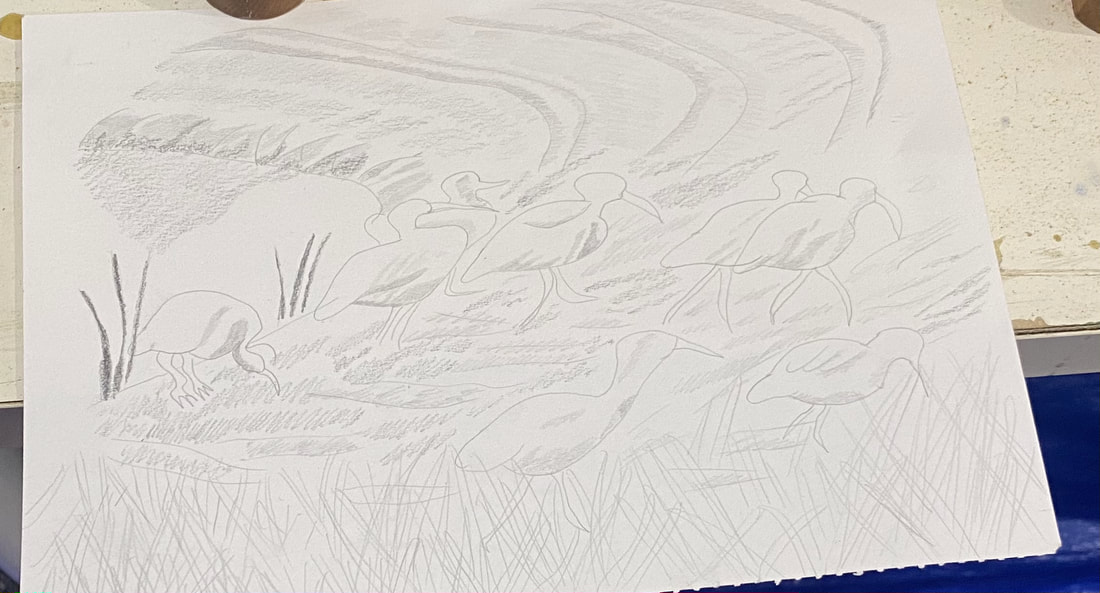
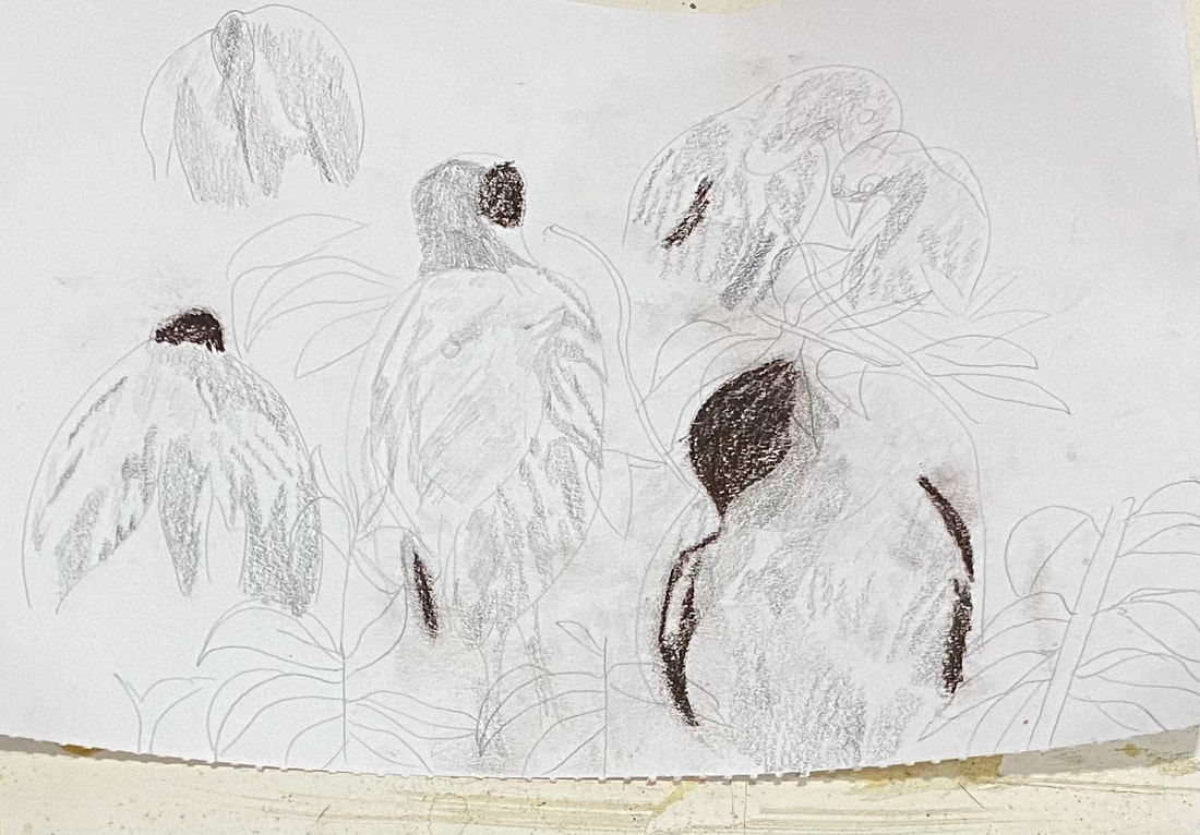
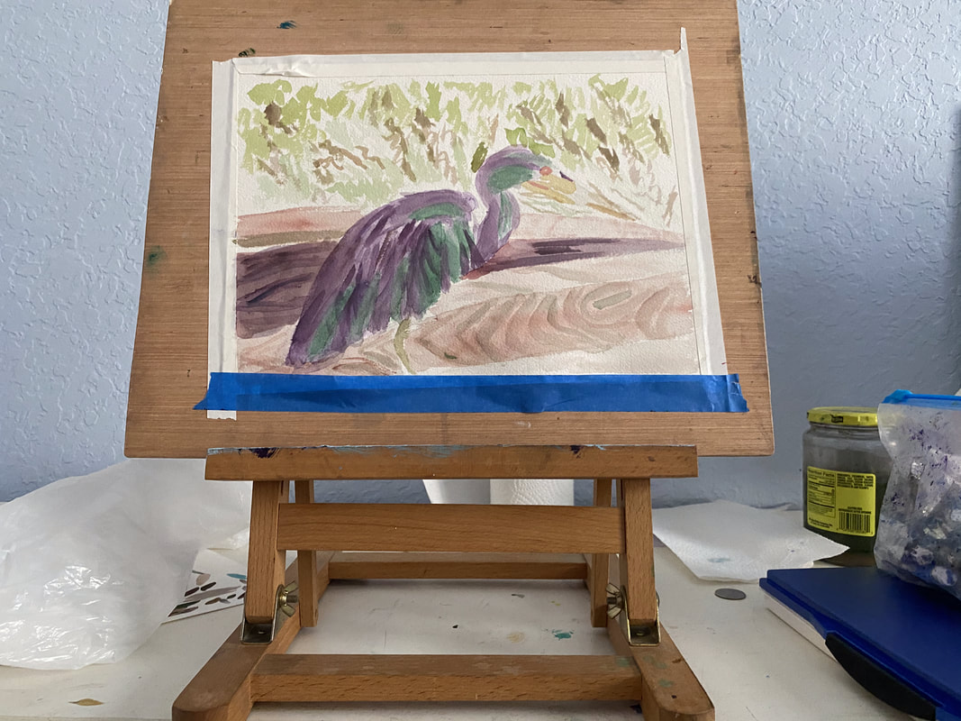
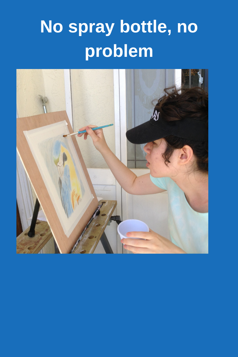 I went to the Art room on Thursday and when I got into my painting, I realized I didn’t have my spray bottle or pencil. I used my brush to load water from the cup on my table and borrowed a pencil from the supply closet to do a sketch of some white ibises from a photo that I'd taken on the way to the clubhouse. My tendency is to curse myself whenever I forget something, but I’m determined not to let missing a few supplies ruin my time in that room. I thought of the quote "Do what you can with what you have right now." I started a new painting that day. I painted his neck by mixing yellow ochre with cobalt blue, and then mixed more cobalt blue with that to make a gray shade.
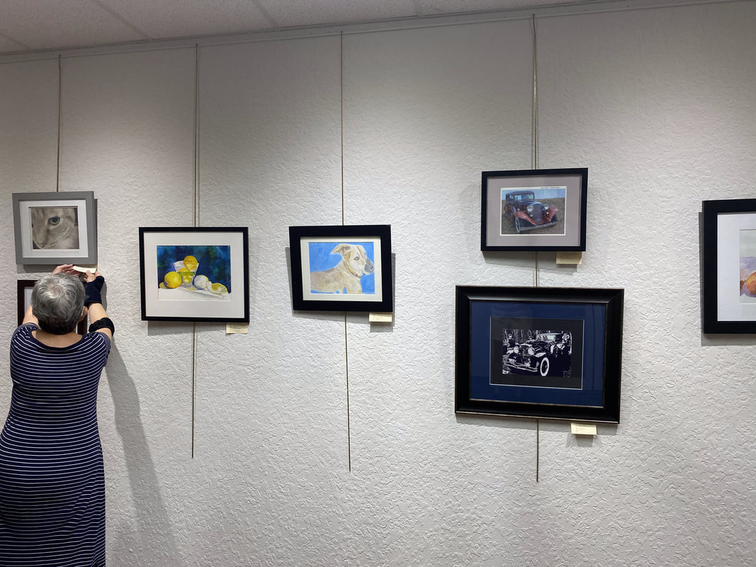
In Other News Last Tuesday I recorded intros and outros for my blue heron and my anhinga video, along with my video on making art a habit. I’ve been working on editing them throughout this week. I still need to record b-roll for my art habits video. I’ve gotten as far as taking out the long silent bits on that one. I hope to have the blue heron video on my youtube channel, Sara Makes Art, soon.  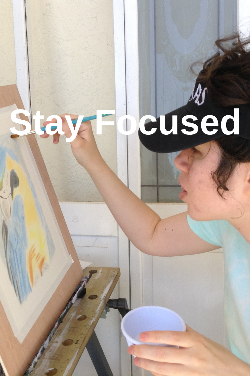 I’ve mentioned this in my last post, but I have an out of home studio to go to now. It’s in my community’s clubhouse and it’s open Mondays and Thursdays from 9 to 4. I’ve committed to going on those days, sitting down in there for around an hour, and being in painting mode. It’s actually not easy for me to be focused on one thing for a long time. I’m struggling with it now writing this draft. I don’t have to have my brush in my hand the whole time. Sometimes it’s necessary to pause and evaluate in order to figure out what to do next. These moments of uncertainty are uncomfortable and my goal is to learn to sit in the discomfort. I watched a guy do Picasso’s routine. The guy painted for a total of eleven hours a day! That included an eight hour stretch from 2-10. If he could do that, I certainly should be able to paint for one hour without needing to get up and do something else right? I’m never going to be able to paint for eleven hours a day, well most likely, I’m never going to be able to paint for eleven hours a day, even if I wanted to, but maybe I’ll try it for one day just to see if I have the stamina. But that’ll be for another day. Now, I don’t have to work on a major project all that time. I can do color mixing experiments, sketches, doodles, etc. For example, in these last Mondays and Thursdays, I’ve experimented with mixing alizarin crimson with other colors. I also have a watercolor sketch of a squirrel that I worked on this Monday when I’d reached a standstill on my crow, pumpkins, and storm clouds painting. It’s Thursday and therefore, I got a chance to put myself to the test. My parents generously gave me a ride and what do you know, soon after arriving at the art room, I realize I forgot my crow and pumpkins painting! My main reason for going! I was ready to kick myself, but I wasn’t going to let my time there goes to waste. I painted line details in the tree on my squirrel painting. This gave me practice making smooth brush strokes and mixing different shades of brown. By smooth brush strokes, what I mean is I have a tendency to stop and start when painting, but I forced myself not to lift the brush from the paper until each line was finished. 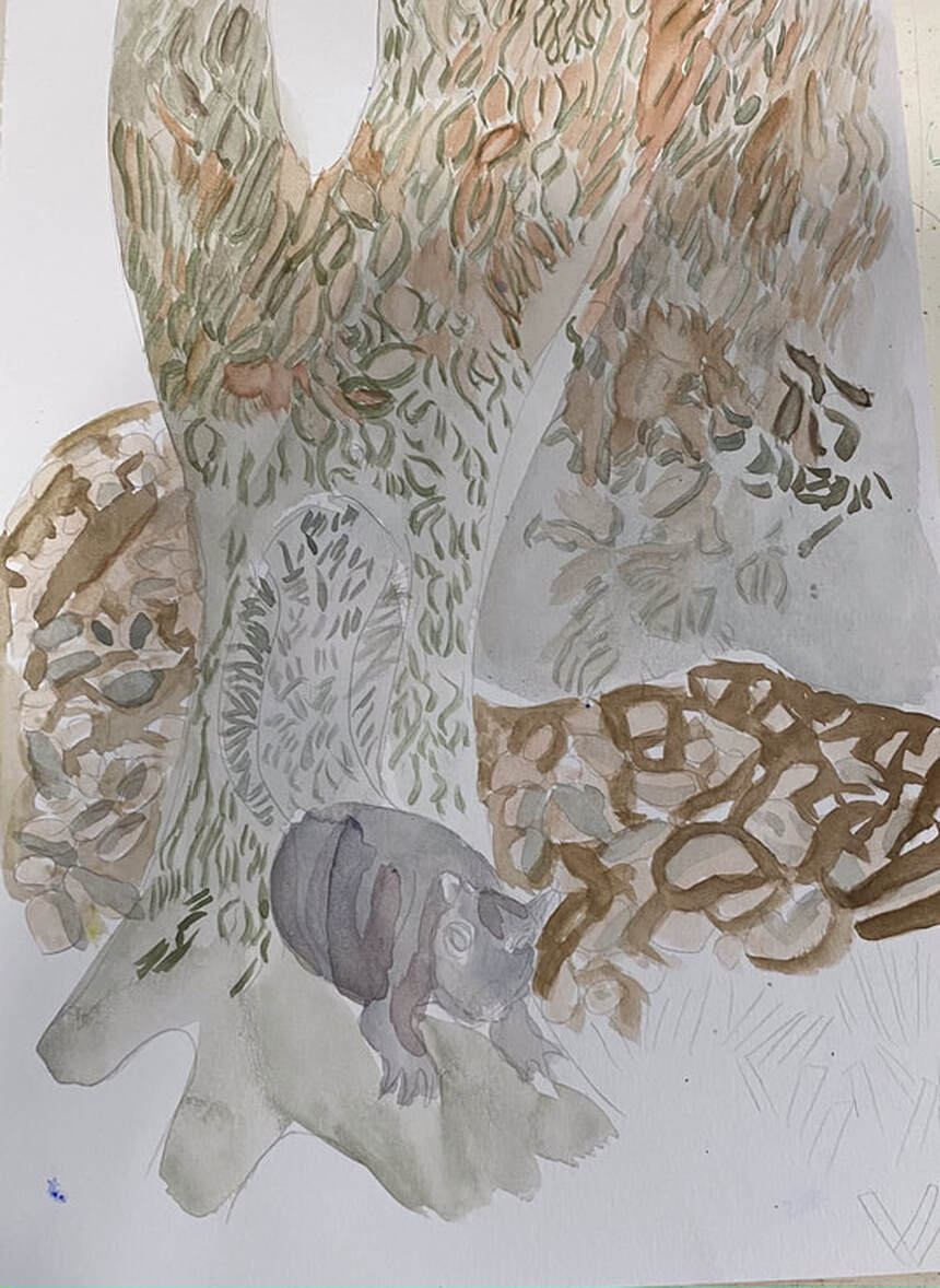 In Other News My colored pencil drawing of Tyler, a dog who belongs to a friend back in San Diego, will be hanging in the Artists In Residence Gallery at my community's club house for the month of August. The hanging was today. I'm so excited.
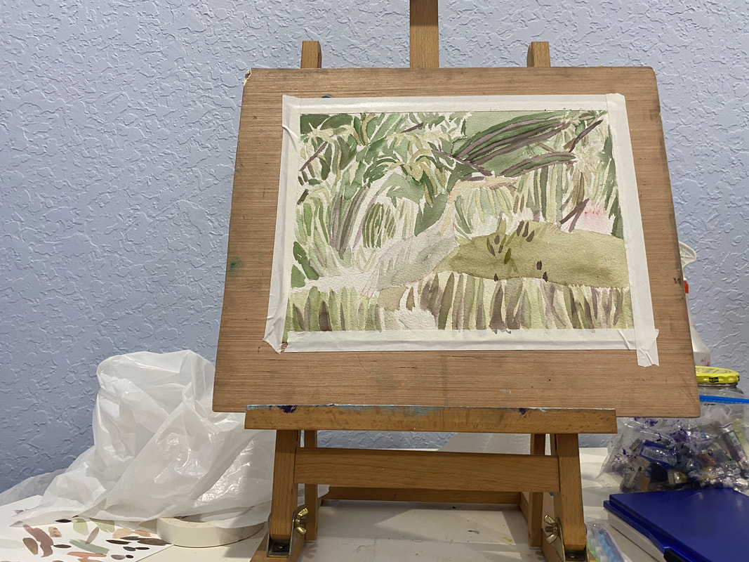
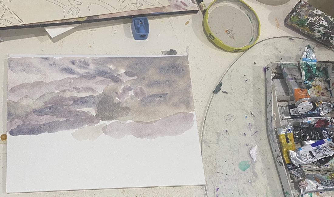
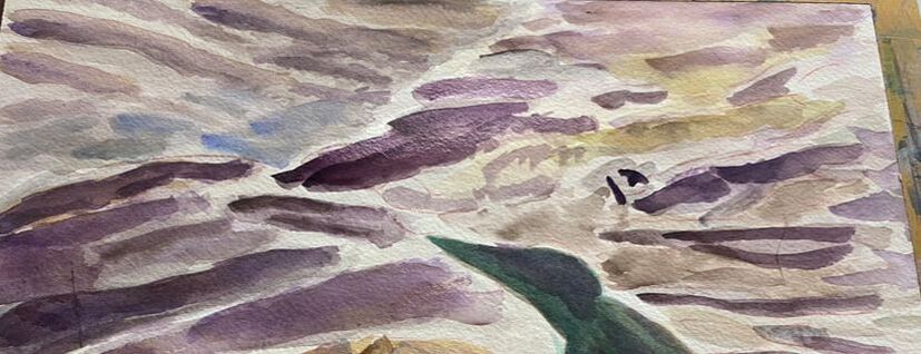 I’m learning things about painting clouds in watercolor while working on my current painting. At first, I just followed what I saw in my reference photo as best I could. After I put down a few shapes, though, I wasn’t happy with my results. My edges were too harsh. I tried wiggling my brush back and forth, thinking this would help me get the soft edges I was looking for. It helped, but it wasn’t enough. Then I thought to myself, you know, this is probably the perfect time to use wet on wet. Wet on wet is for when you need soft edges, which of course, is what I needed here. I thinly wetted the area I was going to paint and when I did, boy did I love the results. The paint was a little runny, but those soft, almost smokey edges seemed to almost create themselves. It takes a lot longer to build up your darkest darks using this method, but it’s worth it, as I’m finding. Note: After I've built up a few layers, I find that I can start using wet on dry again for the darkest shadows. Here's an updated picture.  In Other news Mixing with Alizarin Crimson I found out that alizarin crimson makes a beautiful orange when mixed with cadmium yellow and a gorgeous purple and violet when mixed with cobalt blue. I found this out while experimenting with these colors in my mixed media art book in the 2nd craft studio of my community’s clubhouse, a room my family has unofficially dubbed the art room. 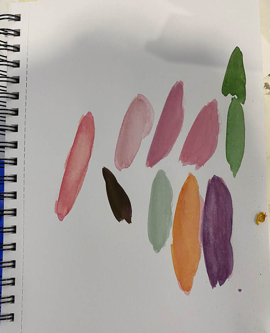 Changing My Mind About The Bird In My Painting My goal for my bird in my painting has changed. You may remember me saying I wanted him to be stark black. Well, having seen how it’s coming along, I’m starting to think a more iridescent effect would be cool. I’m doing this by increasing the warmth of the purple and the coolness of the green, because it’s that contrast that’s going to give me shimmer. Also, because the essence of iridescence means that an object reflects the colors of the other objects around it, I’m bringing some of the orange of the pumpkin into the bird. 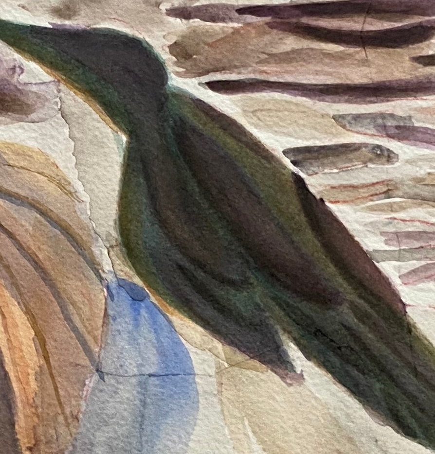 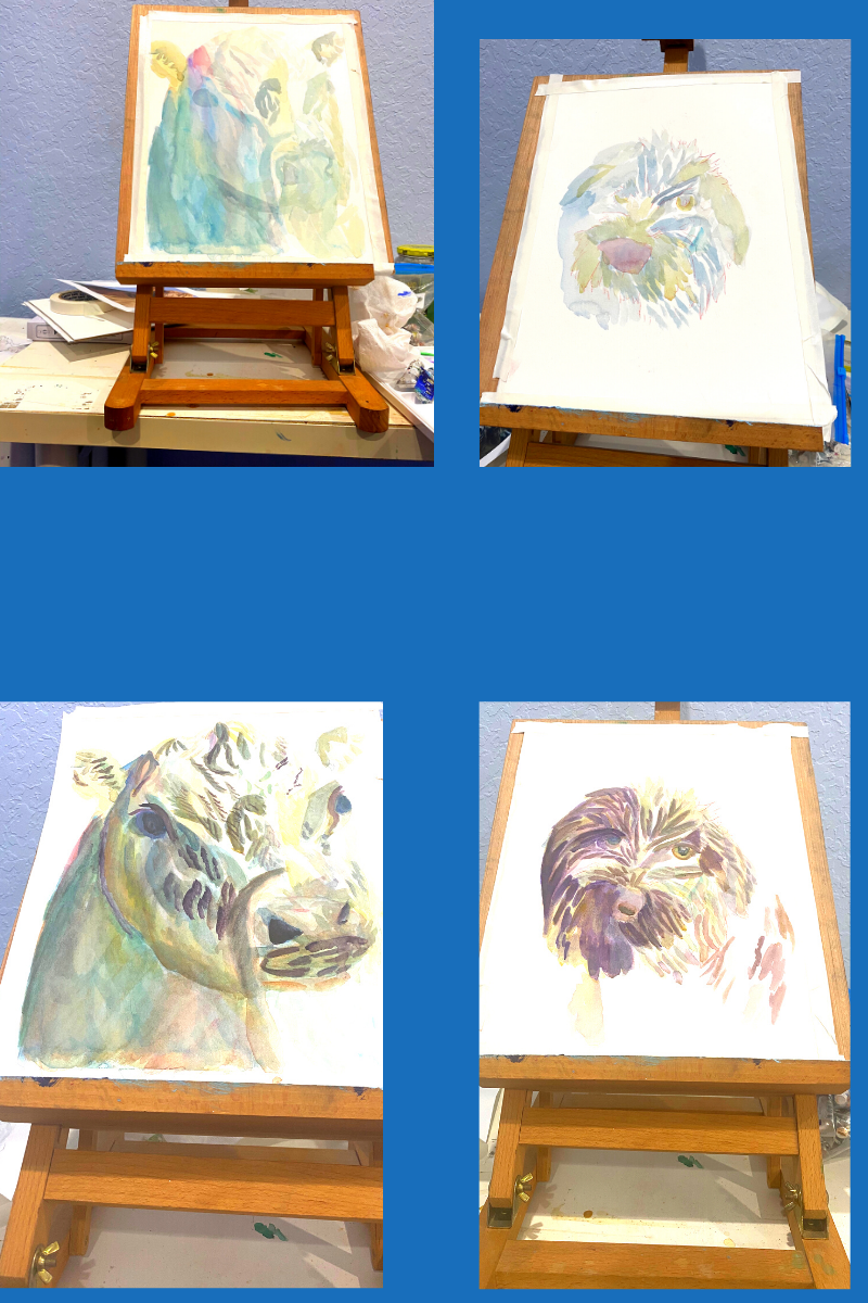 Jul 14 On Monday, Tuesday, and Thursday of this week, I’ve been taking a virtual workshop in painting animals in watercolor and I’d like to tell you a bit about what I’m learning. The class is taught by an artist named Alicia Farris. Lesson number one: Don’t use so much water I have the habit of relying on using tons of water to lighten a color. After all, it’s called watercolor, right? But in this workshop, I’ve learned to use proportionally less paint if I want my color to be lighter. In this way, I don’t have to use so much water and I have more control over my colors. I also don’t get that dreaded dark ring around lighter color that happens from there being too much water on the paper and the paint migrating toward the edges. Lesson number two: It’s better to build up dark colors by layering on the paper itself than by trying to mix them on the palette This is something I’d kind of already observed in my own work, but now I know not to be frustrated if a color doesn’t seem to mixing as dark as I want it. Lesson number three: I can use more than one complementary colors I’ve known about complementary colors and how they work together for a long time, but I’d been stuck on exact combination; ie, red and green, blue and orange, and yellow and purple. In this workshop I’m learning that I can use other color combinations to achieve the effect of combining complementary colors, as long as my color combination includes a warm and a cool color. For example, in working on my cow, I used burnt Sienna and raw Sienna to mute ultramarine and cerulean blue. Don’t layer two primary colors, though, unless you’re trying to make a secondary color, ie, don’t layer blue and yellow, if you don’t want green. Warm your blue with orange or maybe burnt Sienna. Lesson number three: Combining analogous colors creates a more vibrant color Like complementary colors, I knew what analogous colors were before I took this workshop. I had never thought about their potential to brighten other colors, though. I realize now that I’ve been using this principal, subconsciously in one of my favorite color combinations, cerulean blue with ultramarine blue. You can hear more about how I use this combination and why I love it here. Lesson number four: Think of each segment of the piece as it’s own entity This is another concept I already knew, but probably needed to be reminded of. This means just focusing on the area you’re painting and, for the time being, ignoring the rest of the image. You see, I’ve known this is tremendously helpful for a long time. I’ve even talked about it on my YouTube channel. But I still fall into the trap of trying to figure out how I’m going to paint an entire piece at once and getting overwhelmed. This obviously makes painting more stressful than it needs to be. Jul 14 Today we had the day off from the class, but Alicia was kind enough to hold a q&a to give us an opportunity to ask questions. I wasn’t sure if I was going to participate, but since I was sitting at my computer anyway while it was going on, I decided to pop on the q&a, even if it was just to listen to other people’s questions. I got some tips on mixing black and how to avoid blooms. The first one involves mixing ultramarine and burnt Sienna. I can use green to intensify or red to warm. The second one requires waiting until my previous layer is at least semi dry before adding more paint on top of it. During final hour of the broadcast, Alicia did a demonstration of on using negative painting to depict trees and I worked on my crow with pumpkins and storm clouds painting. I tried to keep what I learned about water in mind. 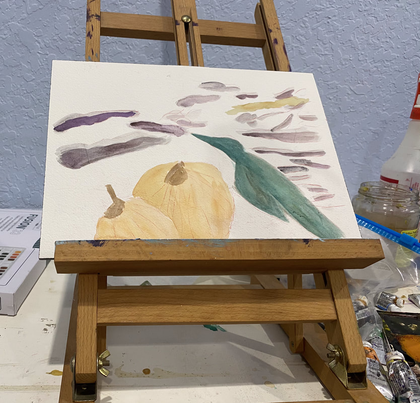 Jul 15 Today was the last day of the class. We added some finishing touches to our cows and spent most of the class working on our dogs. I touched on this in my comments on lesson number three, but this time I was more conscientious of how the color I was putting down was going to effect what was underneath it. I had some blue in my dog and while I wanted to soften the blue, I didn’t want it to turn green, so instead of using yellow, I used raw Sienna instead. Ways This Workshop Inspired Me After taking this workshop, I want to practice negative painting more. I also want to do a series of painting dog’s eyes in watercolor, like the one's I did in acrylic. I think this workshop is going to change the way I think about the painting process going forward. I’ve always incorporated warm and cool tones into every painting, but I now I think I’m going to have it my head as I’m painting what temperature the color I’m putting down is. In my current project, the bird is green, which is a cool color and the pumpkins are orange, which is warm obviously. When I work on it again, I’m going to be thinking about if I want to put any warm tones over the bird and any cool tones over the pumpkins. If you're reading this at the time of posting, Ms Farris is holding this same workshop again in September. Like the other workshop, this one will also be virtual, through Zoom. I can't guarantee that spots will be available by the time you read this, but I thought I'd share the link, just in case.
I said in my last post that I had doodled some clouds as practice for an upcoming painting. There was another reason I did it too, though and that’s stress relief. I hadn’t painted in a couple of weeks, and as you might guess, I was getting pretty antsy. I was almost feeling guilty for not doing any art. With my mental state at the time, though, I couldn’t handle the pressure of an actual project. I needed to do something where I had the luxury of not caring how it came out. Cheap pads of paper or boards are perfect for this. You can throw your project away when you’re done if you want. I don’t think allow myself to just play with paint often enough. It felt really good to it at that time. The stress lifted off of me for the moment. I’ve decided I’m going to paint my crow with a base of dark green and not black. He’s going to have purplish brown shadows on him. If I paint him solid black, he’ll look flat, like a silhouette. On July 7, I set about mixing a green for the bird. The well I mixed in already had a greenish yellow color in it. I want a very dark bluish green for my purposes. I thought I could start by mixing some ultramarine into the paint that was already in the well. This could be enough to get me the color I was looking for, I thought. As I dripped more and more blue in to the well, tested the color, and saw that it stayed brown, I knew this wasn’t the case. It was going to take my eons to get the color I was looking for this way, if it would work at all. I thought, I’ll use the green that’s in my tube and add blue to it. That’ll work. It seemed to for a bit, but I was surprised, and not pleasantly so, to find that after awhile, the more blue I added, the more brown and gray the color became. I thought the color that was already in the well must be muddying it up. I needed to clean the well of the old paint and try again. Later, in a clean well, I put my green and then mixed some blue into it. When I tested it, I liked the results. I decided to mix some red into it, thinking that, because red is the complement of green, this would help to darken and mute the color. When I did it, though, I must have mixed too much because it turned the mixture brown. I mixed more green and blue and I'm going with that. Then I put down some purple in another well and some yellow to mute and brown it out. I made a couple of sketches of the bird I’m planning to paint.
I haven’t explored sketching in mediums other than pencil very much, but I’ve heard it can be a good way to plan a painting. Seeing how these colors look next to each other on paper gives me more clarity and more confidence than imagining them in my head. What's Happening With My Video? Well, I had to put my video demo of painting a blue heron on the back burner, due to technical difficulties. I was going back and forth with the Wondershare team and while they were very accommodating, I’d reached the point yesterday where there was nothing more I could do until I heard from them again. I moved forward and started editing my anhinga painting video. Well, great news! This morning I heard back from the Wondershare team again, and following their instructions, I was able to get sound back in my video! I can go back to editing it. That's all for now. I'll talk to you again next time.
|