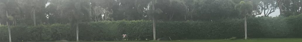
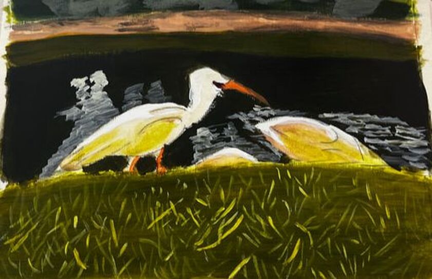
 I don’t paint enough white things, tending to shy away from them because I fear they will look too stark. My mind tells me it’s better to stick to black and white. It’s time to face my apprehension and do a project that features a white subject, these ibises, in color media. So I'm painting white ibises in acrylics. Before I get to the white ibises, though, I want to discuss the grass and lake around them because the shades I use to paint those will play into how I paint them.Before I get to the white ibises, though, I want to discuss the grass and lake around them because the shades I use to paint those will play into how I paint them.
I used the same base of yellow and ultramarine blue for the patch of grass near the viewer and the bush on the other side of the lake. I used more blue for the bush and added red and black to the lake to mute and darken it.
I want the patches of grass bordering the lake to be somewhat bright, and I’m using analogous colors to do this, glazing yellow over the nearest patch and blue over the far one. 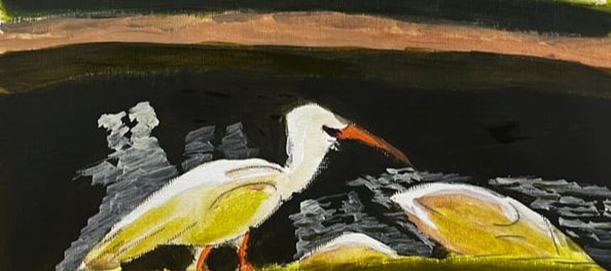 After painting another layer on the grass near the viewer, I mixed some yellowish green color into titanium white. Then I painted reflections in the water using a small round and a sideways wiggling stroke.  As for the ibises themselves, I painted most of their bodies with sheer light brown and green, picking up the grass and lake bed colors. I left only the very tops of them white. This is where light would be hitting them; therefore, it would be the brightest. Did you notice what I did here? Less than ten percent of the white ibises’ entire bodies were painted white. The rest were painted to reflect the colors of the things around them. This is why I mixed yellow-green into my titanium white when I painted the shadows. The ibises do not show as pure white. Therefore, their reflections couldn't either.  Back to the grass, there are lots of individual pieces of grass in the patch nearest the viewer. I used titanium white first because if I went in first with my yellow-green mixture, it wouldn’t show up properly against what I already had down. Having the titanium white down was especially important because these blades of grass needed to be lighter than the base. These blades gave the grass the brightness I’d been trying to achieve by glazing yellow over the area.
0 Comments
I’m planning to paint this photo, which I took in the canal behind my family’s house, in an impressionistic style. 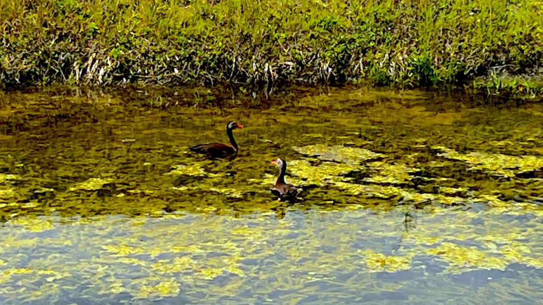 I already started practicing the looseness of this style with the preparatory sketch by holding my pencil far back from the tip. Holding my brush like this helped me move my wrist more freely, emphasizing basic shape and not detail. 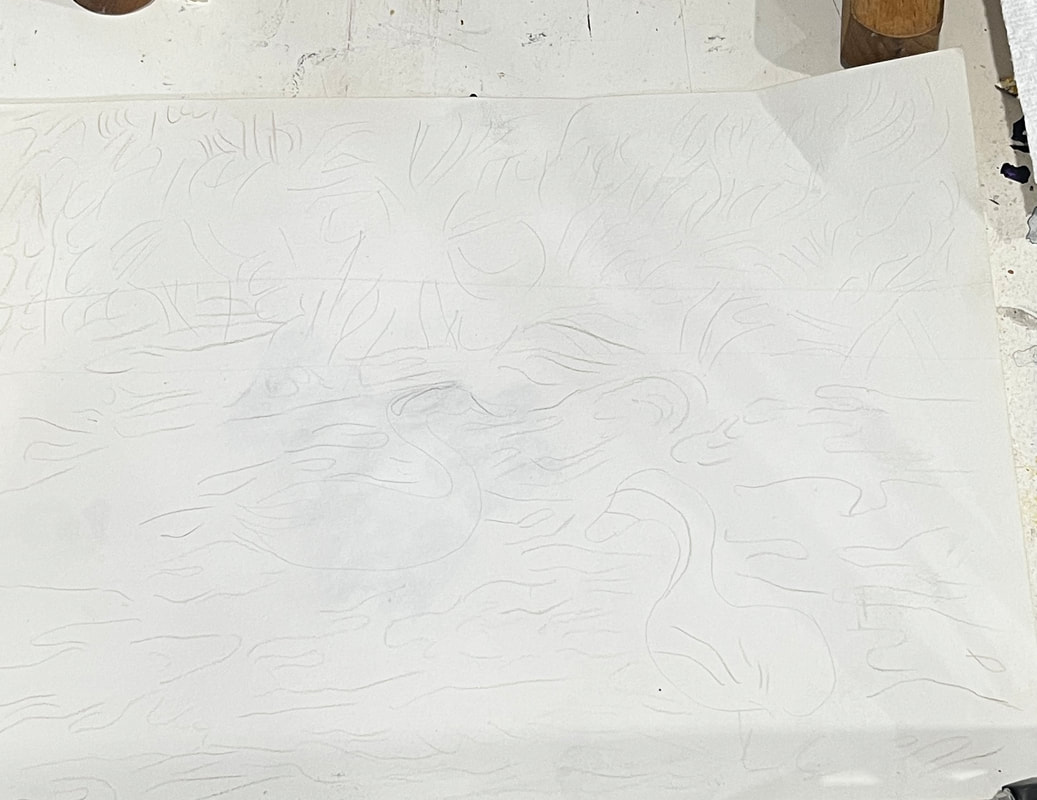 For this style, I want my brushstrokes to show more clearly, so to enable this effect; I’m planning to order a thickening medium for my more fluid paint. I plan to use more flat brushes than the filberts I usually use.  I’ve decided to employ the fat over lean technique for this piece. I’m working in acrylics, not oils, so I technically don’t need to do it this way, but I wanted to get in the habit. 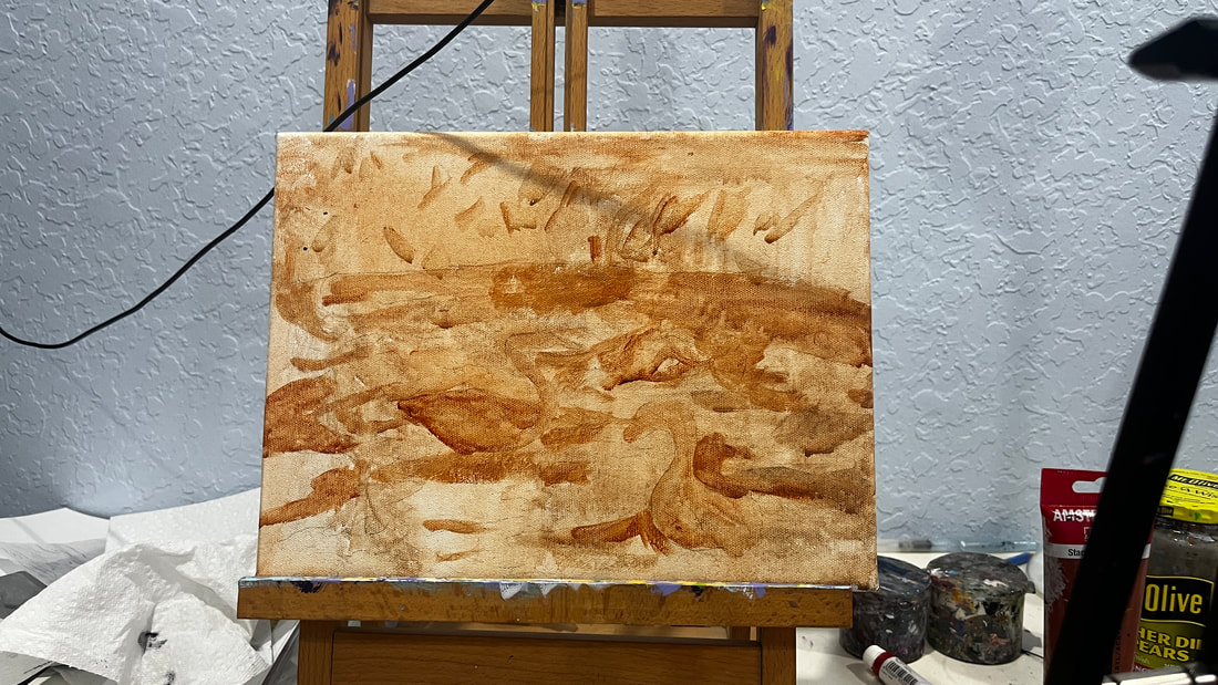 I’m sitting in my community’s Art Room while writing this, and I’ve just put the first layers of color on the painting. You can probably see that it will need a lot more layers. I haven't even completely covered the underpainting in some parts. 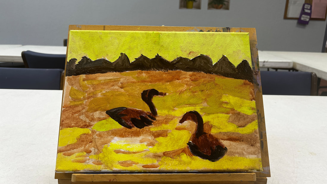 I have a lot of transparent colors, so to get them to cover the background, I painted titanium white over those parts first. Today I worked on creating the contrast between the part of the canal closer to the viewer and the region farther away from it. The part that’s closer to the viewer is significantly lighter. For today's entire session, I used different combinations of burnt umber, unbleached titanium white, and mars black. 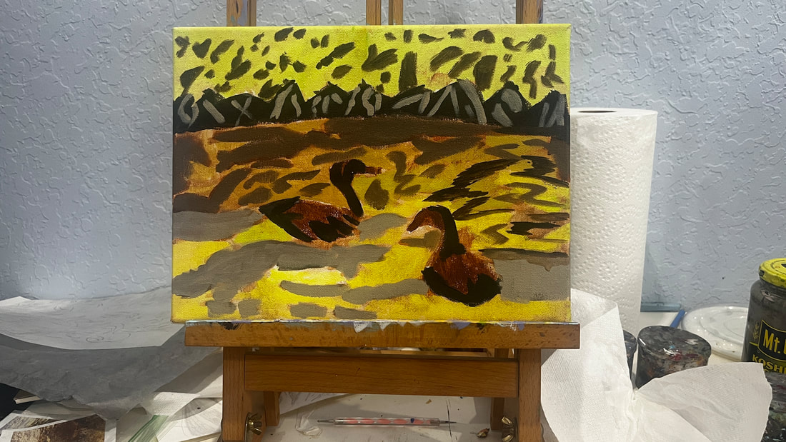 I purchased a jar of Liquithick acrylic medium from @liquitexofficial, which I used for the first time today. It gave the paint an almost custard-like texture on my palette. When I used it with brown shades, it even reminded me of a bit of pudding. The information on the container said this product wouldn’t make a difference in the opacity of the paint, so I was a bit worried it wouldn’t help me achieve my goal. With this in mind, I was pleasantly surprised. I think adding this medium did give me more opacity. I did already have paint on the canvas, however. I don’t know how well paint mixed with this product would cover a black canvas. I wanted even more contrast in the water, so I painted over the part of it that's closer to the bushes with a shade that had more red mixed in it. The idea is that the closer something gets to the viewer, the brighter it should be and the farther from the viewer it is, the duller it should be. 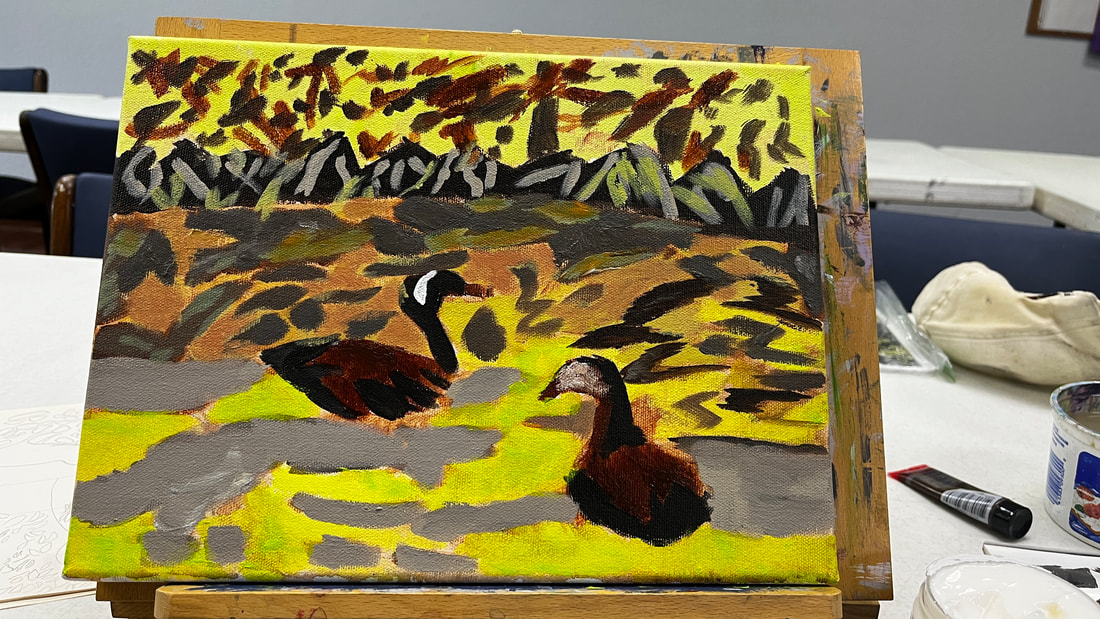 Glazing would never be a significant technique with this piece, but I glazed over some parts to intensify the colors. For example, I glazed red in this area.
Since red is already present, adding more red, and letting the original shade show through, doesn’t change the color, it just makes it more saturated. I added highlights to shape the ducks’ bodies. To make the shade for it, I mixed burnt umber and red to make burnt Sienna. I thought about what I would use to make a complement for burnt Sienna, and the conclusion I came to was green since it’s the complement to red, and Burnt Sienna is a red-based brown. So I mixed green into my red and burnt umber mixture, then mixed titanium white into that. Because these highlights were meant to add shade, I placed them along the curves of the ducks’ bodies. 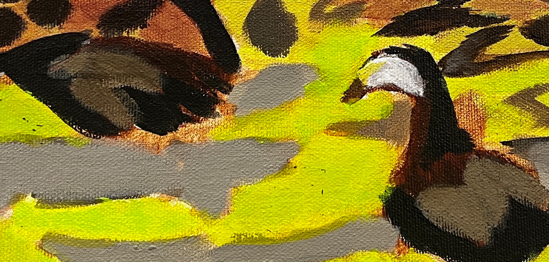 I added more brown to the bushes because they were looking a bit too plain. The color of the leaves in the upper half of the water needed to be changed to make them flow with those on the bottom. 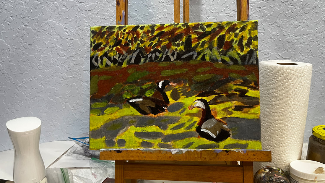 To recap, use thicker paint or a thickening medium, larger brushes, don't blend out your brush strokes, and use a heavy-weight canvas when doing impressionism.
 My goal is always for my subject to stand out from my background. I usually try to achieve this by making the background darker so the subject appears lighter and making the background cooler and the subject warmer, which I usually do by adding layers of blues over the background and yellows and oranges over the subject. I thought I’d try something different with my current painting, though. Since my subject is a bird with blue feathers, I knew painting yellow over him was out. That would just turn him green. Painting orange wasn’t much better because that would dull him and send him further into the background, exactly what I don't want. I remembered what I’d learned from Alicia Farris’s watercolor workshop and that's that layering analogous colors, or colors that are near each other on the color wheel, makes shades more vibrant. I could certainly use some more vibrancy in my subject. That would probably be a more effective way if getting him to stand out than trying to "warm" him. I chose cyan blue to layer over him. I could've chosen any blue, as well as purple or green. With just one layer of the cyan, he started to come forward more. On the other hand, his neck is more of a warm brown, so I've been painted red over it to get it to stand out more. I've added more layers of blue to my bird since I started writing this post. I'm looking at the painting now and he's standing out nicely from the background. What I think I need to do now, though, is create more separation between his feathers.
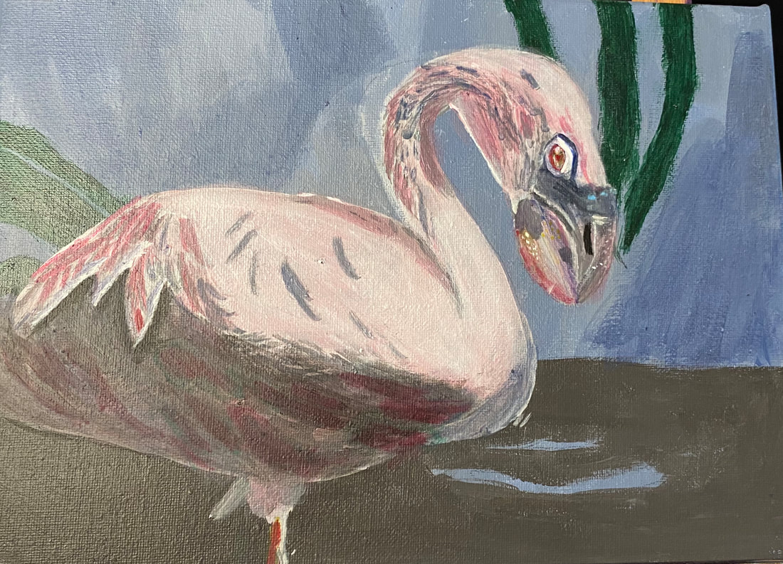 My reference photo for this piece came from Lisa Clough of Lachri Fine Art. I’m starting by painting the whole canvas blue for this painting. I haven’t figured the whole background out yet, but as of writing this, I’ve decided to paint some dirt along the bottom quarter of the canvas, leaving a couple wholes for the blue to show through. 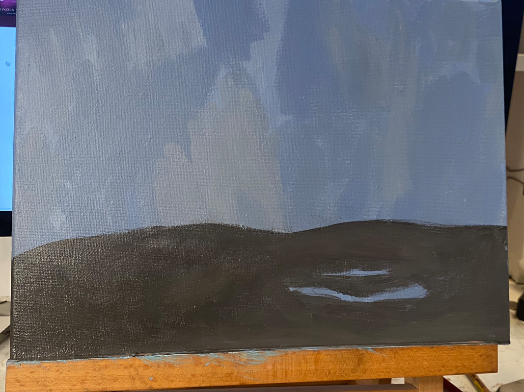 Today I painted some leaves on the painting. I used my small round brush for most of the body of the leaves, switching to my liner brush for the tips in order to have more control over the shapes. I worked with my hand back on the brush handle, allowing it to move freely across the shapes of the leaves. This will be it for the background. 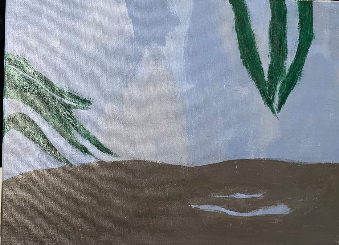 I’ve transferred my flamingo onto the canvas. I decided to keep things simple to start with when it came to the underpainting. I blocked in the entire body, including the neck, except for the bottom quarter of the stomach, with a very light, almost white, shade of gray, leaving openings for feathers. I blocked in that bottom quarter with a much darker gray. I used my small filbert brush for all of this. Using my small round and my liner brushes, I painted feather texture where I saw it in my reference photo.I used the tip of my liner brush and some dark gray and started to paint some dense feather texture on his head. After taking another look at my reference photo, I saw that there was some pretty apparent feather texture in the flamingo’s belly, so I mixed some more black into the gray I’d already mixed for that section, making it even darker and painted that texture with my small round brush. Except for the tiniest details, I held my brushes with my hand back on the handle and let it move across the canvas in one fluid motion as much as possible. I didn’t worry too much at this point whether the shades were right. I was just concerned with putting my strokes where they should go. 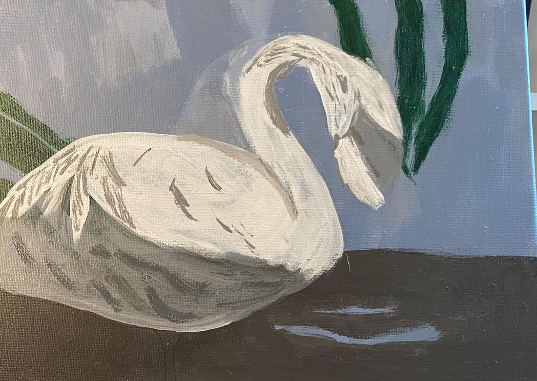 Today I continued with the feathers, starting by adding some highlighted ones to his belly. I thought by now that it was time to whip his beak into shape. I started by drawing in the division of the beak with my charcoal pencil. Then, when the paint was dry, I took my liner brush and some light gray paint, and being careful to keep my hand steady, and going slowly, I made one fluid, continues motion down the dividing line. I used that same continuous motion, with my much darker gray, for the shade that was to be on the dividing line. 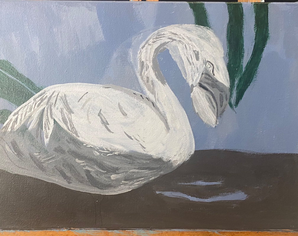 His belly needed more texture, so I mixed a shade that was in between the ones already on it, and looking at the shapes in my reference photo, I took my liner brush and did my best to copy these shapes on my canvas. I had to zone in on a particular square inch of the photo and give my full concentration to it before moving onto the next part. 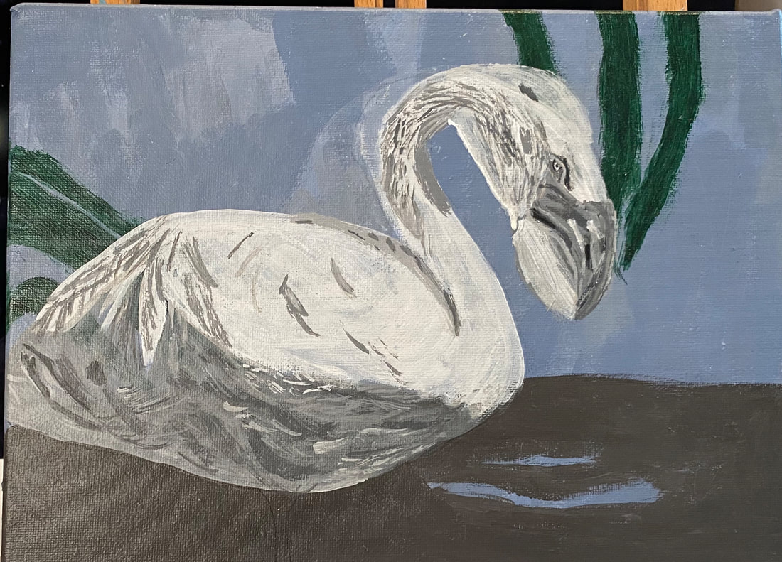 Today I added still more texture to his belly. I find it a challenge at this stage to concentrate on all the details. My mind is lazy and I have to force it to concentrate sometimes. I also turned much of my attention to the eye and beak, working on creating texture in the latter with highlights. This is going to take a lot of work. For my first layers of color, I mixed a bit of yellow into my red and white, because I could see some warmth in the flamingo’s feathers. Using my filbert brush, I glazed light layers of this color all over the flamingo. I kept my hand going in one direction and was careful not to go over the same place more than once while the paint was wet. 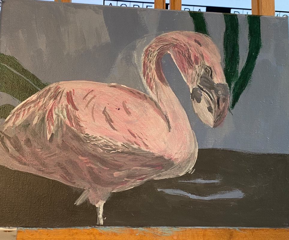 Today I glazed zinc white over the upper half of my flamingo to create more contrast between it and the bottom third. While that first layer was drying, I decided my flamingo’s beak needed some more contrast. I started by mixing some dark red into the white I already had on my palette and glazed this over the parts I’d already painted pink. I wanted them to have a rosier cast, though, than what they had. The blue part in the upper part of the beak also needed to be darker. I have a feeling I’m going to need a lot of layers in that beak to give it the sleekness I want it to have. Now I directed my attention again to the flamingo’s body. I already had a grayish blue out on my palette, so I added some zinc white into that, thinned it some more with water, and used my filbert brush to glaze it over the flamingo’s stomach, which I knew needed some blue in it. I painted some yellow on his eye and also glazed it along the edge of the pink part of his beak. 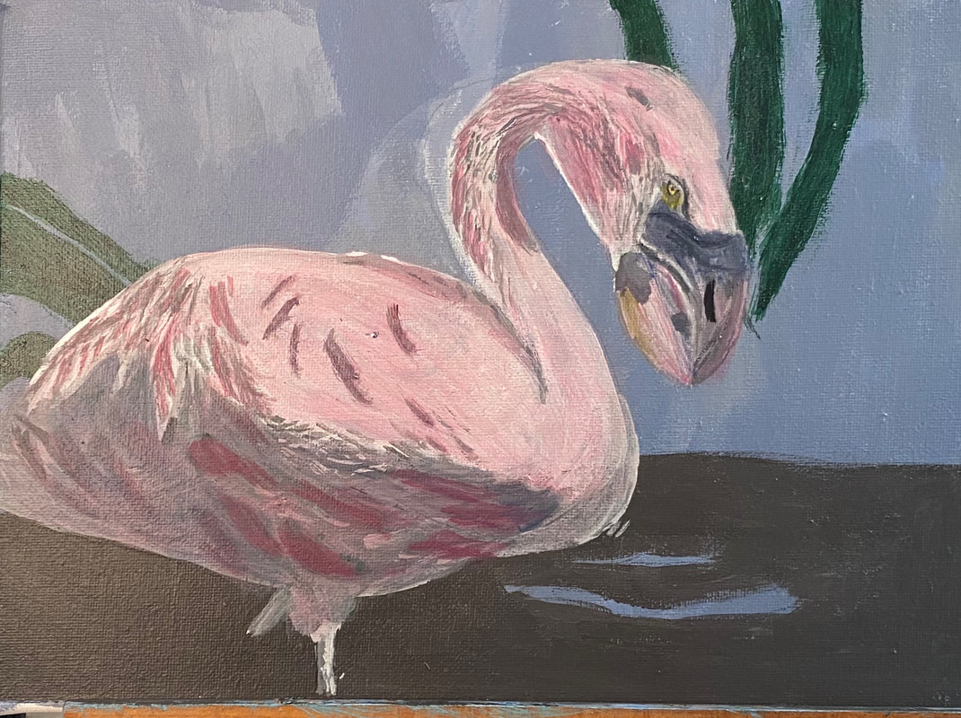 Today I found a way to tone down those feathers on the stomach that were too bright. I did this by painting green over one feather and then thinning that out with water and using it on as many of the others as I could until I couldn’t see the green any more. When I ran out of green paint, I repeated the process with another feather. His beak needed some more color in it too. I glazed purple and blue over parts of it, being careful to blend out any harsh edges, as I wanted the colors to look hazy. I also used my liner brush and some titanium white to paint some lines and speckles. I’m especially proud of the white speckles I painted in the little bit of yellow I’d glazed on the edge of his beak. Lastly, I glazed a few layers of zinc white over most of the top half of the flamingo’s body. 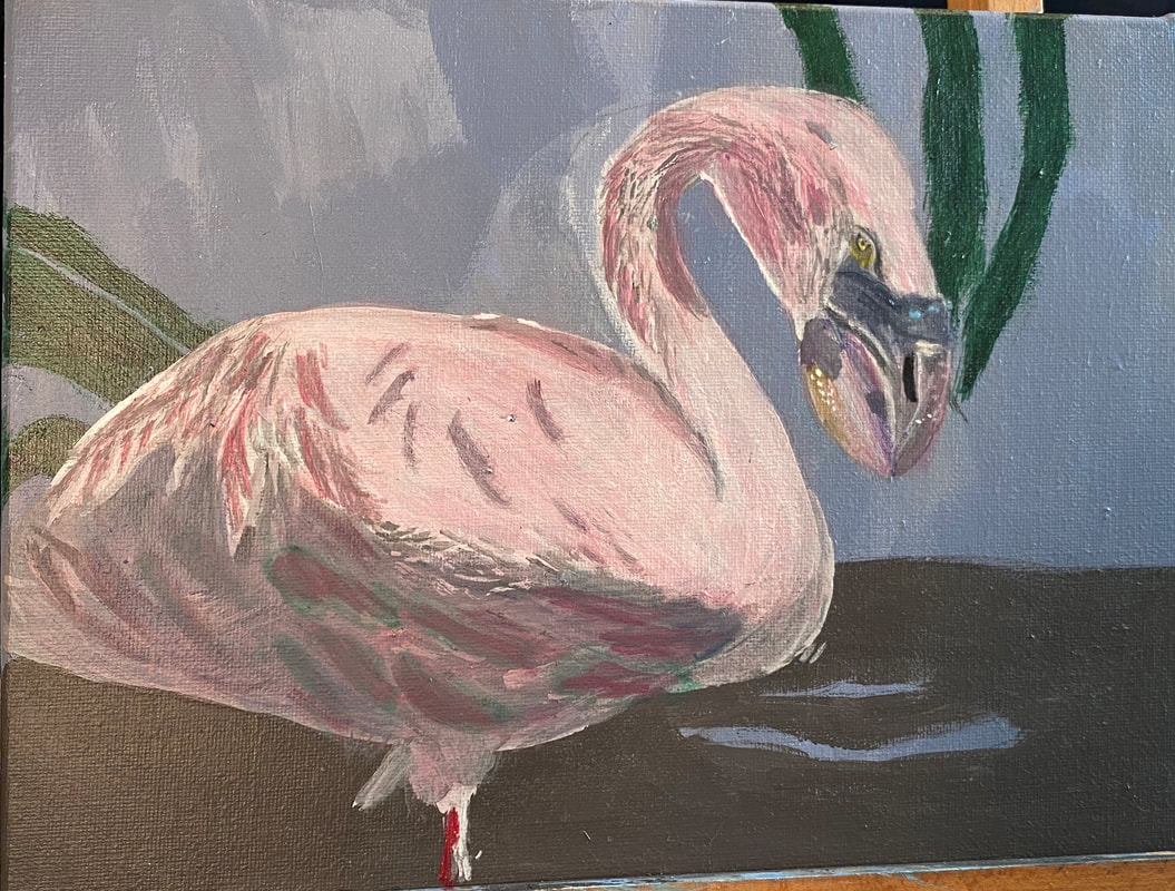 Last night, it was time to glaze some blush gray in the feathers that are showing in the upper half of the flamingo’s body. I directed my attention to the texture on his neck, which up until now, was pure gray. I didn’t think it was suitable to leave it like that, and I still had a ton of grayish blue out, so, I took my liner brush and…you can probably guess the rest. I worked more on the beak. I used my liner brush and titanium white to paint some more speckles. I started to paint a shadow of pink down the edge of the bottom, which is too dark at this point. 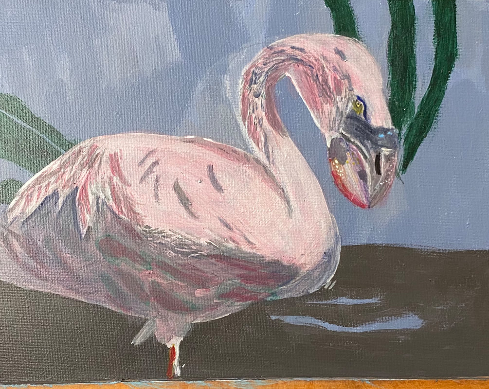 Last night, I started by glazing zinc white over the pink strip along the bottom of the flamingo’s lower beak. I was delighted at how much of a difference just one layer made. I’d known for a while that his eye needed some red around it and I decided now was the time. I also, saw however, that it had a thick band of pale pink above it, so I painted that with some paint that I already had on my palette. I glazed more yellow over the cornea to brighten it. While working on the eye, I also noticed that there needed to be another pale pink ridge above it, as well as a shadow above that, the latter of which I painted with my liner brush and some zinc white mixed with red. 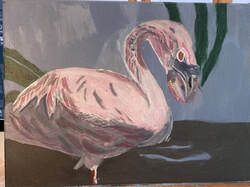 Today I applied titanium white to part of the outer edge of the rim I’d painted above his eye. I used my liner brush, but pressed harder on the canvas, so my line would be thicker. I saw that the bottom ridge needed to be darker to contrast with the top. I decided I would take care of this by glazing a bluish gray over it. I mixed my color too dark to begin with, but solved this by mixing my concoction into some more zinc white. I painted this onto the lower ridge of the eye with my liner brush. My too-dark color didn’t go completely to waste, though, because I used it to paint the blue streak right above the upper eye ridge. 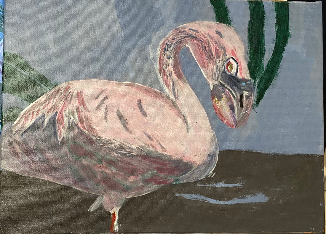 I saw that the blue strip above his eye needed some more blue in it, so I made a muted version by mixing ultramarine with an orange made from carmine and yellow. The blue strip isn’t exactly like it is in the reference photo, but I like it. 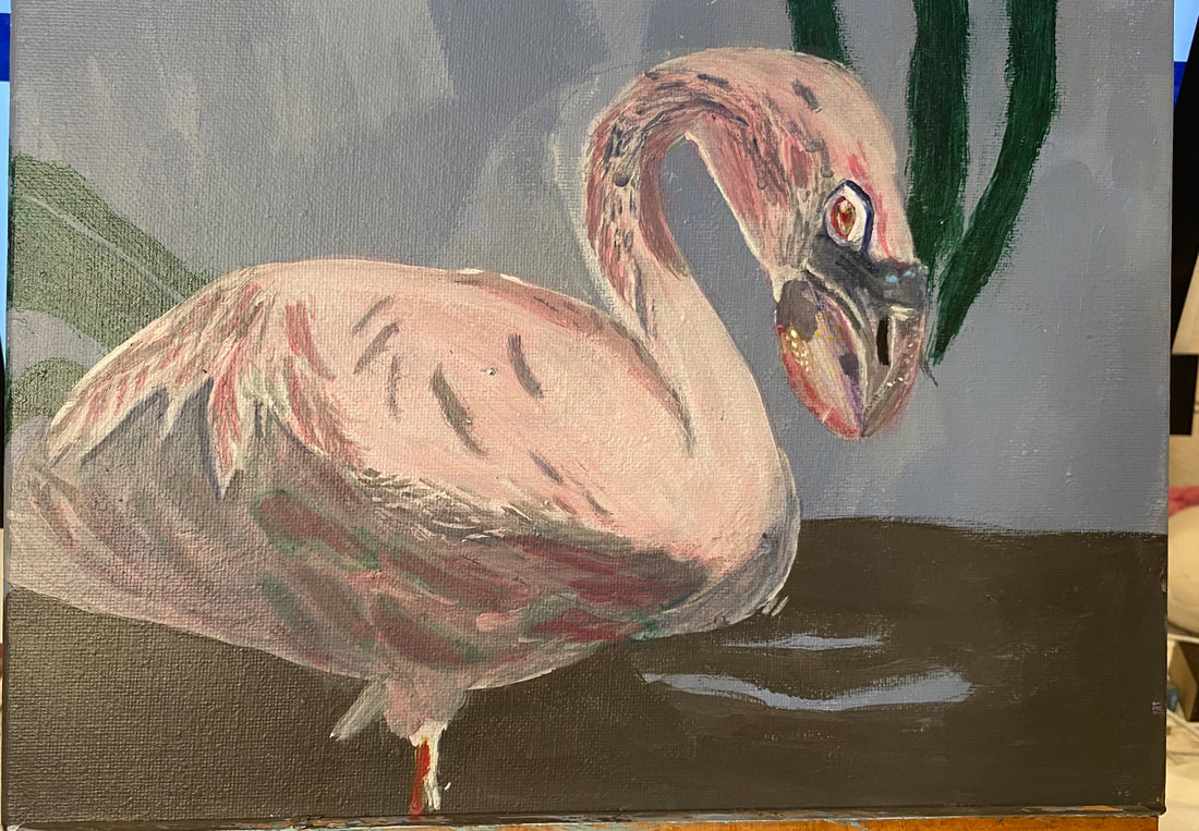 Today I added more pink to the feathers on his tail, because I thought they were looking a bit dull. I glazed zinc white over the upper half of his body again, and ivory black over his belly to increase the contrast between those two. I also mixed some ultramarine into my gray and glazed that over some of the upper feathers. I thought the feathers toward his tail were looking too flat. I wanted them to look like they were sticking up a bit from the rest of his body. I tried painting some titanium white over the edges of them with my liner brush, first going with the form, then going across it, wiggling my wrist as I went. I also painted some more ivory black right along the outer edges, using that same wiggle motion. After looking at my white lines though, I thought they were too harsh. I wasn’t immediately sure what to do about them, though, so I took a break. It was while doing a crossword puzzle on my phone, that I got the idea to glaze some more blue gray over part of my white marks. 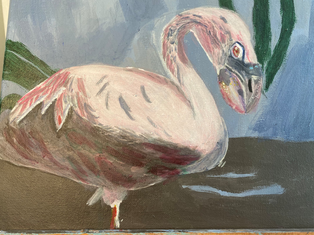 To finish it off, I painted some layers of black under these feathers for more contrast. 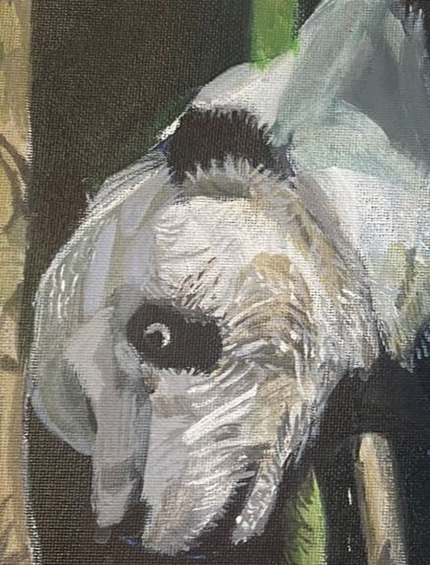 Last week I published a post on painting a panda in acrylics. In this post, I'm going to focus on tips for painting white fur in acrylics. Be prepared for very little of the fur to actually be white. In fact, the shades I’ve used for my panda go all the way to a dark gray. I’m only using white for my brightest highlights. When I painted the underpainting for this guy, in fact, I painted his entire back a medium to dark gray as my base shade. I used a similar shade of gray on the right side of his face.
Make sure to bring surrounding colors into the fur. For example, white fur almost always has blue in because it’s reflecting the sky. In the case of my panda, though, because I used an entirely green background and there’s no blue in it, bringing blue into the panda’s fur wouldn’t have made much sense. Instead, I mixed a lighter version of the same green I’d used for the background and brought that into the panda’s fur. I also brought some brown light brown in because of the bamboo.  Even though you will be bringing surrounding colors into your white fur, make sure to keep them muted and transparent. If you make them bright or opaque, it won’t look realistic. Make sure your strokes are going in the right direction. You’re not necessarily going to paint in every strand of fur. That will look artificial, and in fact, I only put in little touches of individual hairs on his back and legs. I did a lot more on his face, though, and I suspect that was because he was probably wet when I took this photo. Getting back to what I was saying, though, make sure your strokes go in the right direction, because this not only will give you a hint of the texture of the fur, but will ultimately form the animal’s body, ie, his bones and muscles. Make friends with your liner brush. I have a video that I think will help you learn how to use it. You’ll need to learn to be able to use a liner brush properly to make whatever individual fur strokes you’ll need. I'm going to copy and paste a paragraph from my post on painting this panda in full, which I would like to remind you of, since it's very relevant here. I want to point out that when I’m painting all these fur lines, I find that, as much as I like to maintain control, when I make quick strokes, often with a little wrist flick, I’m happier with my results than when I go real slow and try to control everything. Maybe that’s because most things in nature are rough and uncontrolled. I hope that makes sense. I followed this principal of not trying to control things too much to paint extra fur texture around his left ear, his eye, and again, where the black on his fur meets the white. Again, though make sure, though, that your strokes are going in the general right direction and that they're approximately the right size and shape. Also, pay attention to how much of your brush is touching the canvas as this will determine how thick your lines are. If you want extremely thin lines, barely let the tip of your brush touch the canvas. You can read my post about this entire painting here.
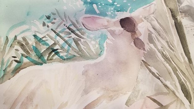
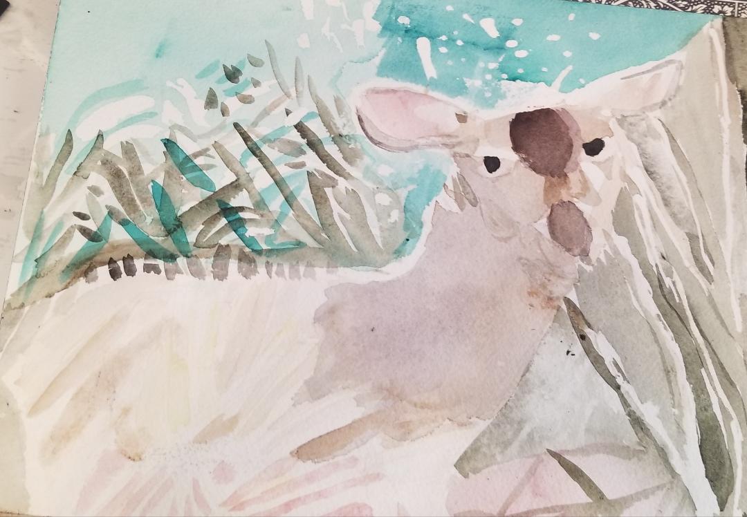
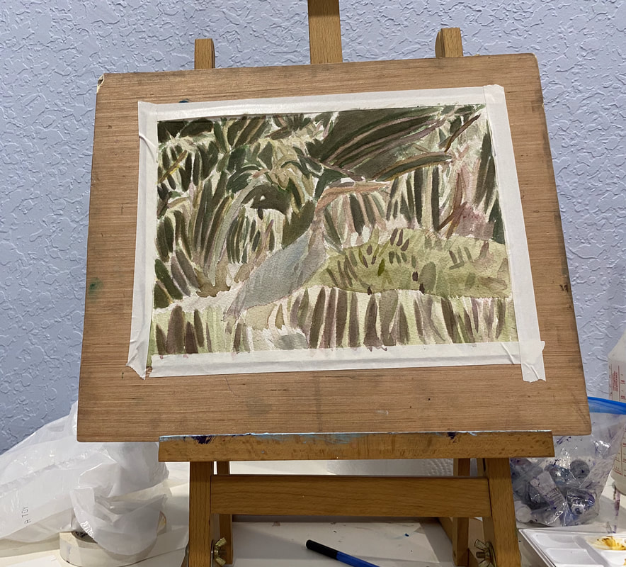
 In this post, I'm going to explain how I did this watercolor painting of a doe in the bushes. An important tidbit I've learned about watercolor painting and layering is to paint your lightest colors first. Not only is it pretty much impossible to paint a lighter color over a darker one in watercolor and have it show up, but if you put a layer of paint on top of one that has less water in it, the water in the upper layer can cause the layer underneath to lift, even if the layer underneath was dry. 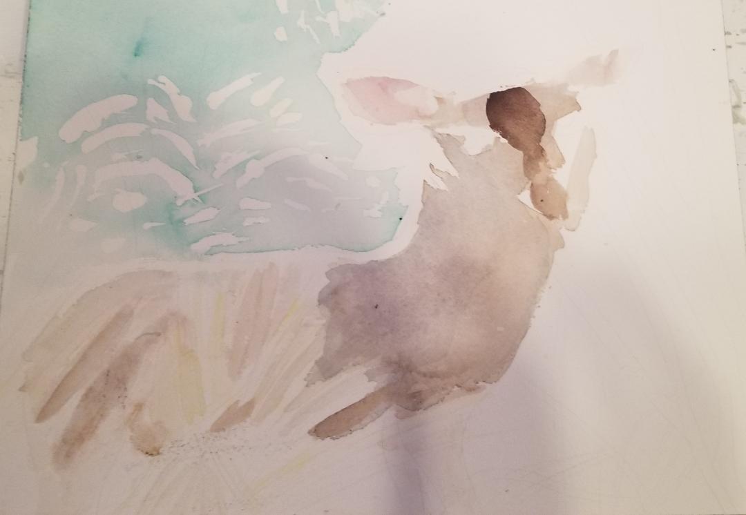 This is day two. I started by putting masking fluid down on parts of the deer's face and body that I wanted to stay white. I thought his body should be painted a taupe brown color with a grayish purple shadow. My plan to accomplish the taupe brown base was to mix my burnt umber with paynes gray. After wetting down my paper, so the color wouldn't go on too dark, I painted on my first layer. It didn't turn out grayish enough for me, though, so I layered black over it, but the black was watered down so it looked gray. Before I painted the purple shadow, I wetted that area of the paper again so the edges would be soft. Then I mixed some of the black that I already had in my palette into the purple I had. I actually liked the look of it better after I dabbed the color with a tissue, lightening it. For my background, I put down masking fluid in placing that were going to be white spots. This photo was taken early in the morning, so that probably had something to do with why everything was so bright. I wetted the paper again, and using my flat brush, I painted a blue-green that I'd mixed from emerald green and ultramarine blue. 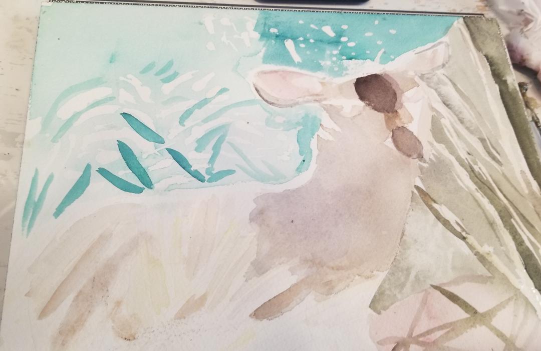 Here's day three. I knew I would have to go over the brown marks on her forehead and that's the first thing I did in this section, starting with watered down black, and when that was dry, purple. I painted the edges of her ears with black and brown paint, being careful to leave a rim of white showing. I had very little water in my brush while I was doing this so that I could have maximum control to make the shapes I wanted. I turned my attention to the background. First I put some dots masking fluid down in the space above the doe's head. While letting that dry, I went back to the same color, the blue-green that I had used to paint the background near the doe's back, without wetting the paper this time, and with relatively little water in my brush, painted texture in this area. Once my dots of masking fluid were dry, I painted some of the blue green over that space with my flat brush, but with the paper dry this time because I wanted value color to be darker this time. While I'm on the topic of the background, I came across an example today of why you need to always look closely at your reference photo and never assume anything. I was prepared to paint the whole background the same blue-green, but, on closer inspection, I saw that the brush on the doe's left was more of a yellowish green. You might even say it's more olivy. I tried mixing that shade by mixing my emerald green into some dried yellow that I already had on my palette. I ended up with a very bright yellow green. I needed to darken and dull it and I tried to do that by mixing black from another part of my palette into the paint. I still had yellow-green in my brush when I went to scoop up the black, though, so I ended up accidentally mixing the colors in that compartment. Even though mixing the colors in this way was an accident, though, when I saw the results, I knew they were what I had been aiming for, so that was going to be the color I would use. This part of the painting would have to wait, though. The next thing on my agenda was figuring out what to paint the ground underneath the doe's hooves. I decided on a pinkish brown. I wanted this to be very light because I was going to paint sticks on top of it. I wanted to get the ground painted first, so I wouldn't absentmindedly paint that area with my yellowish green. I wanted to have highlights on the branches, so I put down more masking fluid. Then, having mixed black into the same brown that I'd used to paint the doe's body so it was even more grayish, I painted the branches with my smallest round brush. Now it was finally time to use that grayish yellow green that I'd mixed earlier. Using my medium sized round brush, I painted my the yellow green, carefully, around the branches I'd painted.
Days four and five. On day four, I was down to the last twenty minutes before I was due to "close shop" for the day. I thought I wouldn't have time for something as involved as painting. I set up my stuff, without dallying, and painted the brown in the bushes that you see above the doe's back. You can see that I went right through some of the green and the white. That's exactly what I wanted. I wanted the brown to be fairly dense, to I painted little clusters here and there and painted some vertical lines going off the horizontal lines. I also painted more on the branches on that day, going almost to the edge, but being careful to still leave some white showing. I was so anxious I would accidentally lose that white! On day five, I painted even more brown, this time, going right up to the edge of the doe's back and leaving just bits of white. I'm leaving more white than is in the reference photo, just because I'm nervous about accidentally covering up too much of the white and I'd rather have too much white showing than lose it all. You can see I've finally given her some pupils too. There were some parts of her face that needed touching up, so there wasn't an abnormal amount of white showing. On the topic of white, I did something that is unorthodox in watercolor painting and that's to take some titanium white acrylic paint and use that to mark out areas that I want to be lighter than the color underneath them, and that I forgot to paint around. After fighting with the color a bit, I used some plain burnt umber and dabbed it with a tissue. I couldn't forget the rest of the ground under the doe's hooves, so I used the same light pinkish brown I'd used before. I painted very slowly around this part, so I wouldn't accidentally paint over the grass here. I'm working on another 11x14 acrylic on Belgian Linen,which I'm titling "Monkey Eating Leaf" for now. I started with an underpainting for my background.  At this point, I've been glazing gray blue made by mixing transparent mixing white and ivory black with ultramarine blue over the rocks on the right hand side. I then added quinacridone red to this mixture to make it purple and used it on the rock on the far left. Tonight, I mixed gray blue and white and titanium white and mars black with violet and, using a small round brush, painted little bits of these colors over the sheer blue and purple. After putting down my gray violet color, I realized it was too strong, so I mixed transparent mixing white and ivory black and glazed that over it to tone it down. I tried to use my gray blue straight out of the tube, but saw that it was way too dark for some areas and decided to mix titanium white into it  Tonight I mixed a transparent purple, similarly to how I described above and glazed it over the upside down triangle at the top. I mixed transparent grayish brown using transparent burnt umber and glazed that right under where the purple was. I glazed ivory black over that to make it even darker. I mixed transparent gray blue the same way I did last time and, using a small round brush, painted little bits of that over where I'd painted the purple. Using that same brush, I repainted the titanium white streaks that were lost when I glazed the purple. 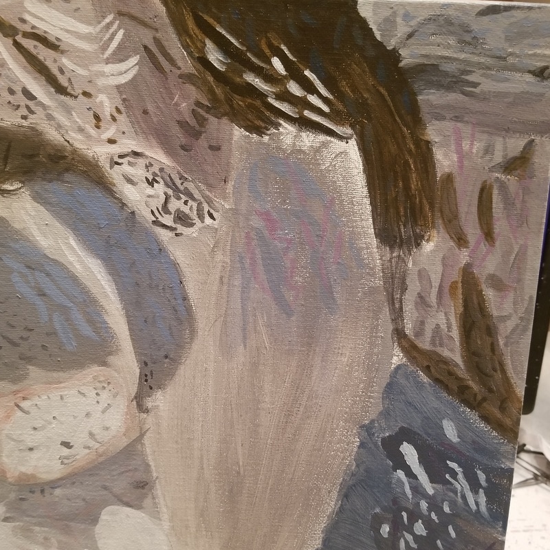 I added more sheer grayish white and purple to different areas of the painting.  In the lower right hand corner, I used prussian blue to make a sheer grayish blue. 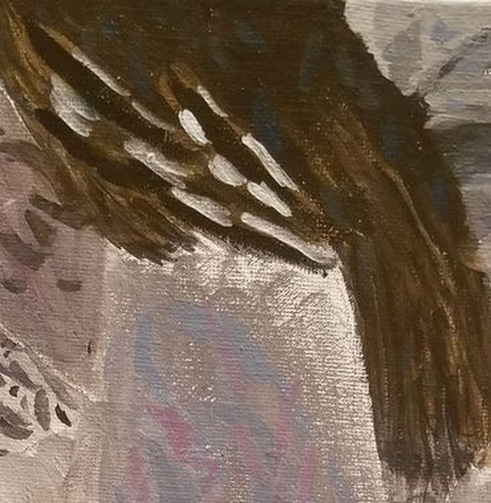 I'd previously used this color to make little blue marks in the dark brown at the top of the painting. 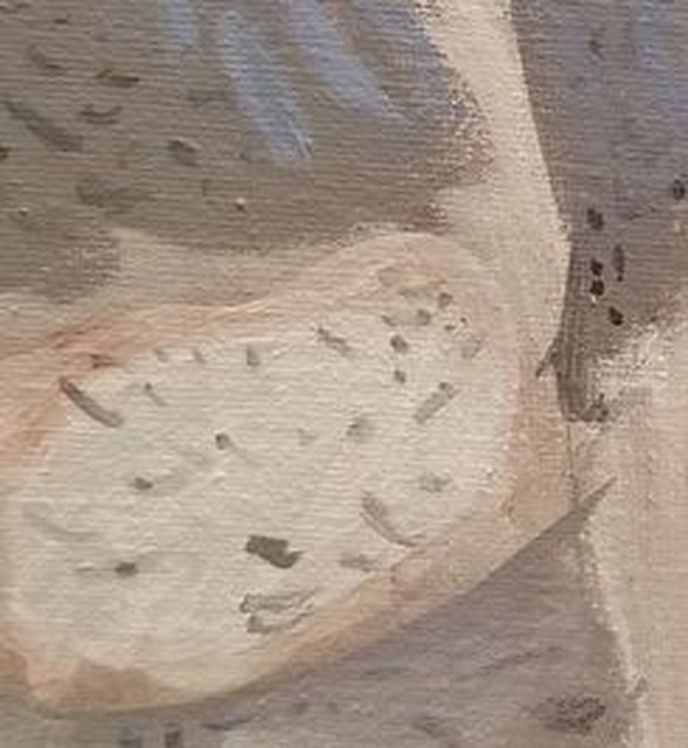 I mixed a transparent pink for the area around the white of the rock on the left hand side. 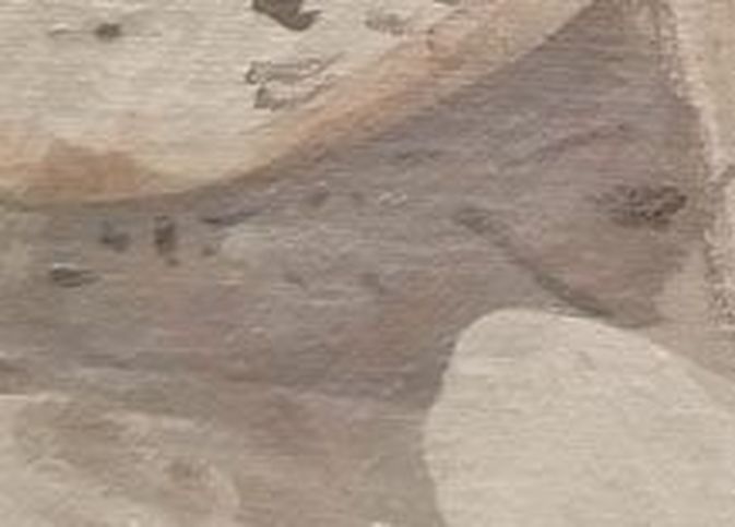 Finally, I put titanium white and transparent mixing white patches on the blue at the bottom. 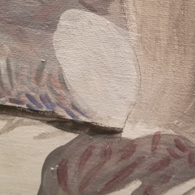 I added more transparent blue and purple here and some transparent gray to the gray spot where the ground meets the rock.  Last night, in addition to adding yet more transparent blue and purple to the painting, I went over the lightest parts of the floor with titanium white. I rimmed the dark shadowy area on the far right with transparent pink, layered over with green made by mixing hansa yellow light and ultramarine blue, to tone it down. In the aforementioned dark patch, I've started to put bits of pale blue, made by mixing a touch of ultramarine blue into titanium white. 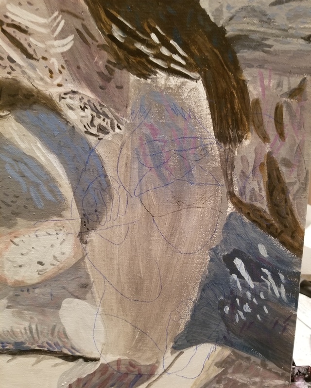 Here's my drawing of the monkey transferred onto my canvas. 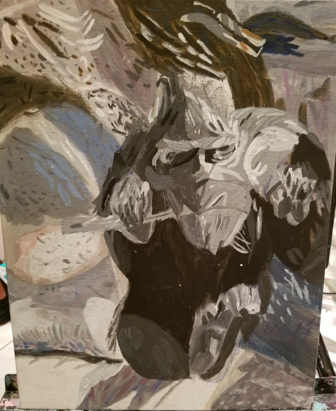 Here's my underpainting for the monkey done. 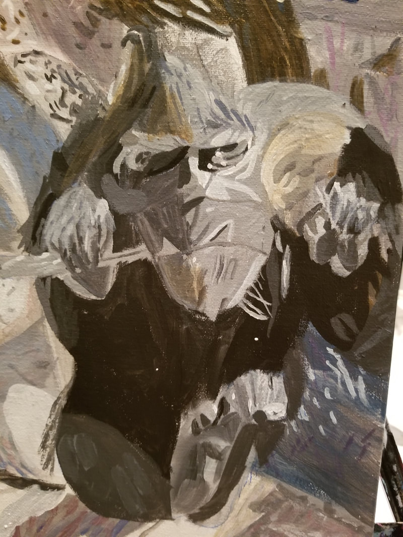 Tonight, I started to add color to the monkey. I used grayish shades of blue and brown using a large filbert brush. Using a small round brush, I painted small lines of grayish blue made by mixing titanium white, ivory black and ultramarine blue in where I'd put the the transparent gray-blue. 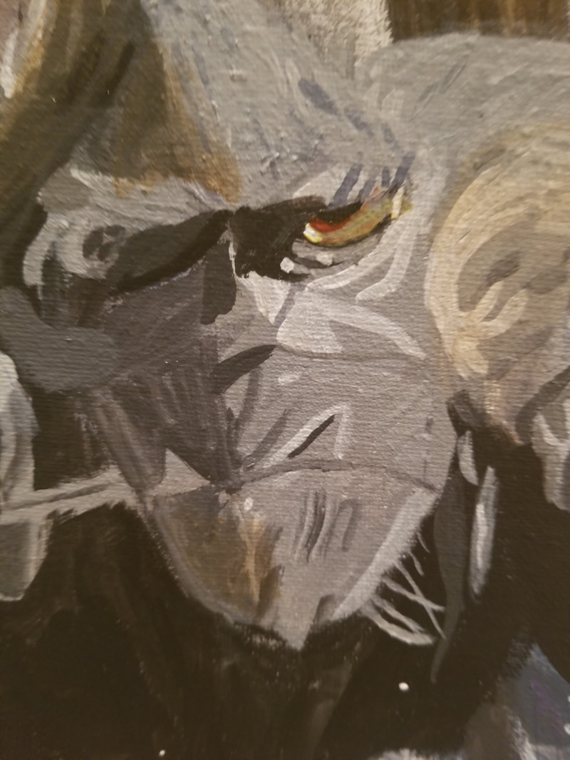 To paint his left eye, I first painted pale gray from the lid to the first crease. Then I glazed hansa yellow light over this part accept for a liner part at the outer corner. Using a liner brush, I painted thin lines of quinacridone red along his pupil and along the first rim. I painted a dot of titanium white on his inner corner and went over most of that with the hansa yellow light. Finally, I filled in the space between his pupil and that dot with transparent burnt sienna. I think I'm going to bring the dark gray at the inner corner in a little further. 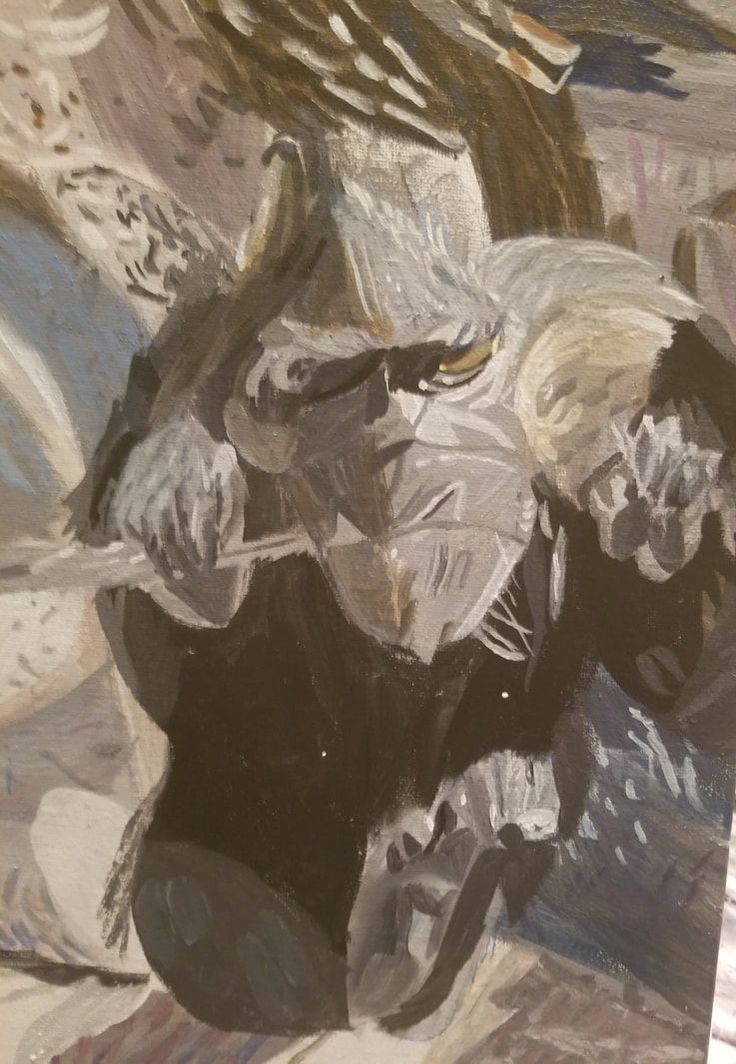 I've added a lot of titanium white and transparent mixing white strokes with a liner brush and I think it's made a big difference. 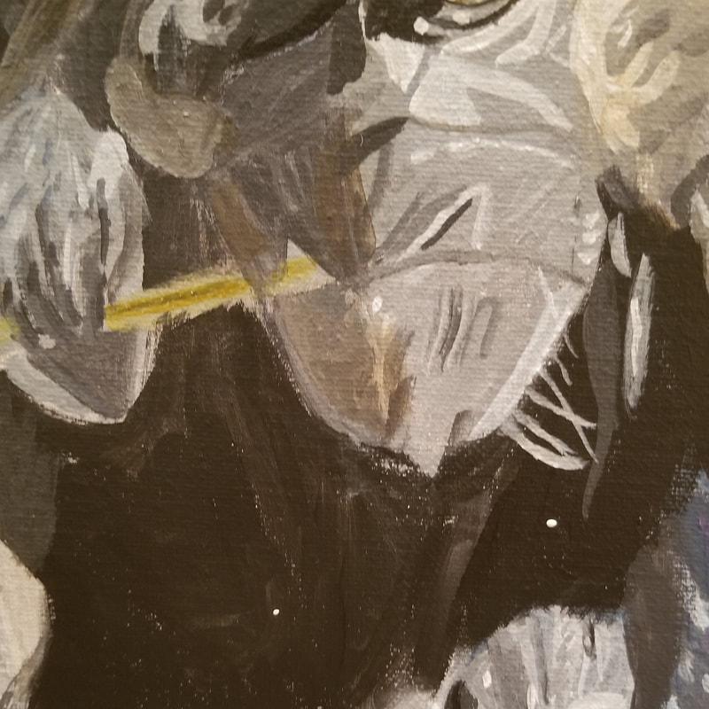 Tonight, I used the color I described in my last post to fill in the leaf, doing a glaze. I mixed some more of every color I'd used to mix it, except white, and painted the ridge in the middle. 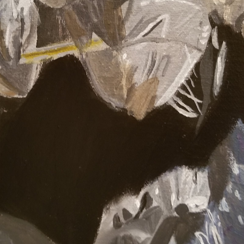 Tonight, I went over the monkey's torso with Mars black to make the color more uniform and then glazed ultramarine blue mixed with ivory black over it to give it some depth. 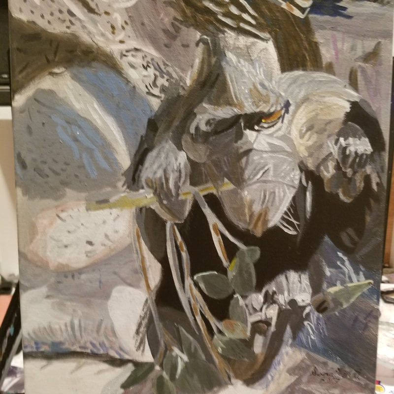 Finished! To paint the leaves, I mixed equal parts ultramarine blue and hansa yellow to make a transparent green and glazed that all over most of the leaves. I adjusted this with either ivory black or transparent mixing white as needed. I also used touches of cadmium yellow, gray made by mixing titanium white and mars black, and grayish brown made by mixing burnt umber into those colors in various parts of the leaves and branches. For most of the branches, I glazed a mixture of transparent mixing white and transparent burnt umber over them, adding more burnt umber to darken the color for shading.
|