|
Day One I’m experimenting with my French ultramarine from Winsor & Newton. I was a bit alarmed by how dark it looked coming out of the tube. I knew I would have to wet my paper to lighten it. As you can see, thanks to this water and the water in my brush, my blue came out nice and pale. I made sure to mix some orange with the blue too. I'm using a mix of cool blue-greens and warm yellow-greens for the grass, buses and trees, adding more yellow or blue to the same mixture that was on my pallet, depending on what I needed. I painted the palm trees with a layer of very light yellow green and later when that was dry, I painted my darker color, letting the original layer show where it needed to. Where I left the yellow green showing is of course where the sun is hitting the trees. 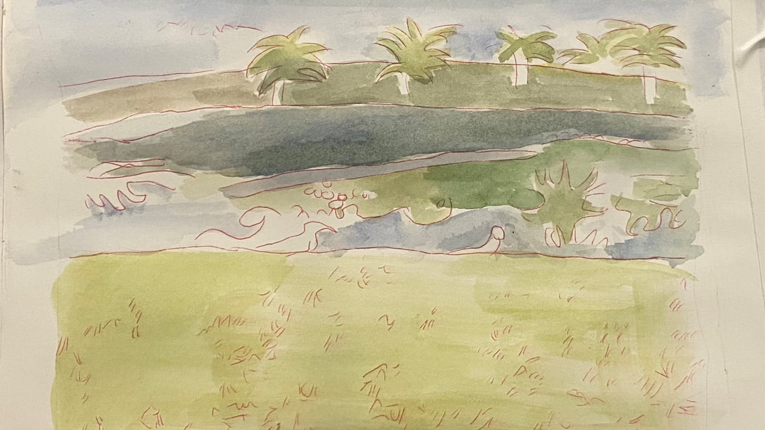 Day Two I’m concerned with working on creating as much contrast between the shadowy parts of the bushes and trees and the parts where the light is hitting. To achieve this, I’ve been mixing red into green to darken and mute it and applying layer after layer of this onto the parts of my trees and bushes that are in shadow. I’m using this same mixture for my blades of grass, which I'm making a warmer color overall because it's closer to the viewer. By making the buses and trees duller and darker, I'm pushing them further back. 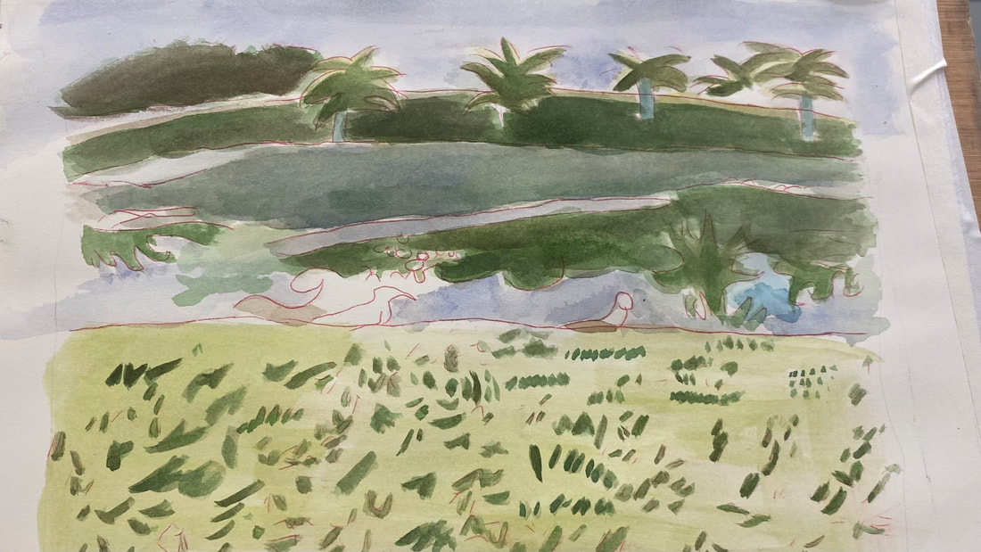
1 Comment
I’m feeling intimidated by the painting I want to do next. That’s why I’m easing into it by doing practice, or what you might call, thumbnail, pieces. A couple weeks ago I wrote about practicing doing a smooth wash. This last Thursday, I made two small sketches of bushes and trees reflected in water on paper from a mixed media pad. Making these trial paintings gives me more confidence that I can do the real thing.  You can just jump into a painting. I do that a lot. But taking baby steps can take enough of the fear out doing a difficult piece for you to actually have the confidence to do it. I like doing pieces that scare me and I encourage you to do pieces that scare you, because those are the pieces that really help you grow. One of those pieces for me was this one, since I'd never done a landscape before.  I’ve had a habit, for quite a while of drawing my subject onto a piece of scratch paper before starting my actual piece. This is so I have something to transfer onto my canvases, but it also is a sort of dress rehearsal. I give myself practice drawing those lines without putting pressure on myself. Making these practice sketches also helps you stay in the habit of painting or drawing, which improves your skill and confidence.
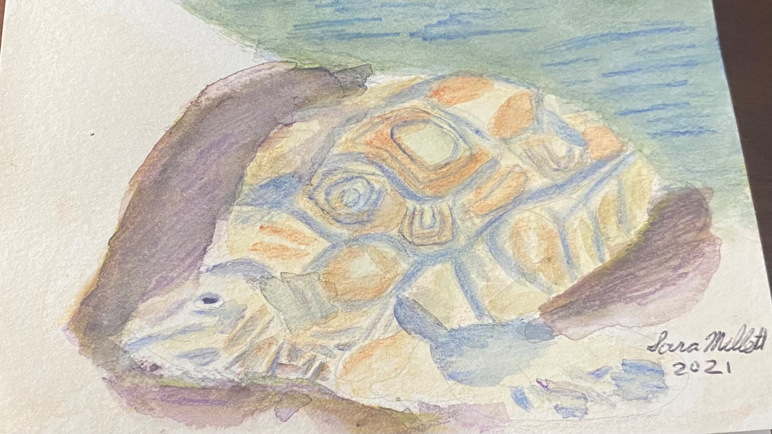 When I started on this painting, which is for my mom’s birthday card, and I looked at the rocks the turtle was coming out of in the reference photo, I thought, what if that was the ocean. My mom loves the ocean, so I chose to paint the rocks to look like the waves were washing up on the shore and the turtle was crawling out of them. I’m using my set of Kimberly watercolor pencils. I don’t have a lot of colors, so I have to rely on layering to get the colors I need. Putting green on top of blue was how I colored made my sea. I saw a couple of times that I needed to add more layers of blue after my paper had dried. I used a tan shade all over for the turtle and blue for the edging around his scales. I painted my tan layer, waited for it to try, then shaded in my blue, then blended that with water, and waited for it to try. If I’d shaded in the tan, then the blue, and blended them all at once, the colors would’ve all run together and the the blue needed to be in a distinct pattern. I wanted the turtle to look as three dimensional as possible, so I drew a purple shadow around him. Layering yellow and black over this shadow helped to get it just right. This time, I started layering colors while my paper was still wet. This was to intensify the shades and make them blend more thoroughly. I added more layers to the blue on the turtle’s shell sections to give them more oomph. The shell sections had a darker brown pattern on them, so I used my terra cotta pencil. Adding extra layers to reinforce certain shades adds a lot to my painting, even if it doesn’t necessarily look like that in the reference photo. If you’re looking at your piece and thinking, should I add more color here, should I make this darker, go for it. I could see that there were some pencil marks on my ocean that didn't seem to want to blend out. Rather than fight these, I chose to make them work for me by turning them into ripples, ie, I emphasized them. I shaded some small “triangles” around the turtle’s neck. The negative space between them created a pattern of wrinkles.
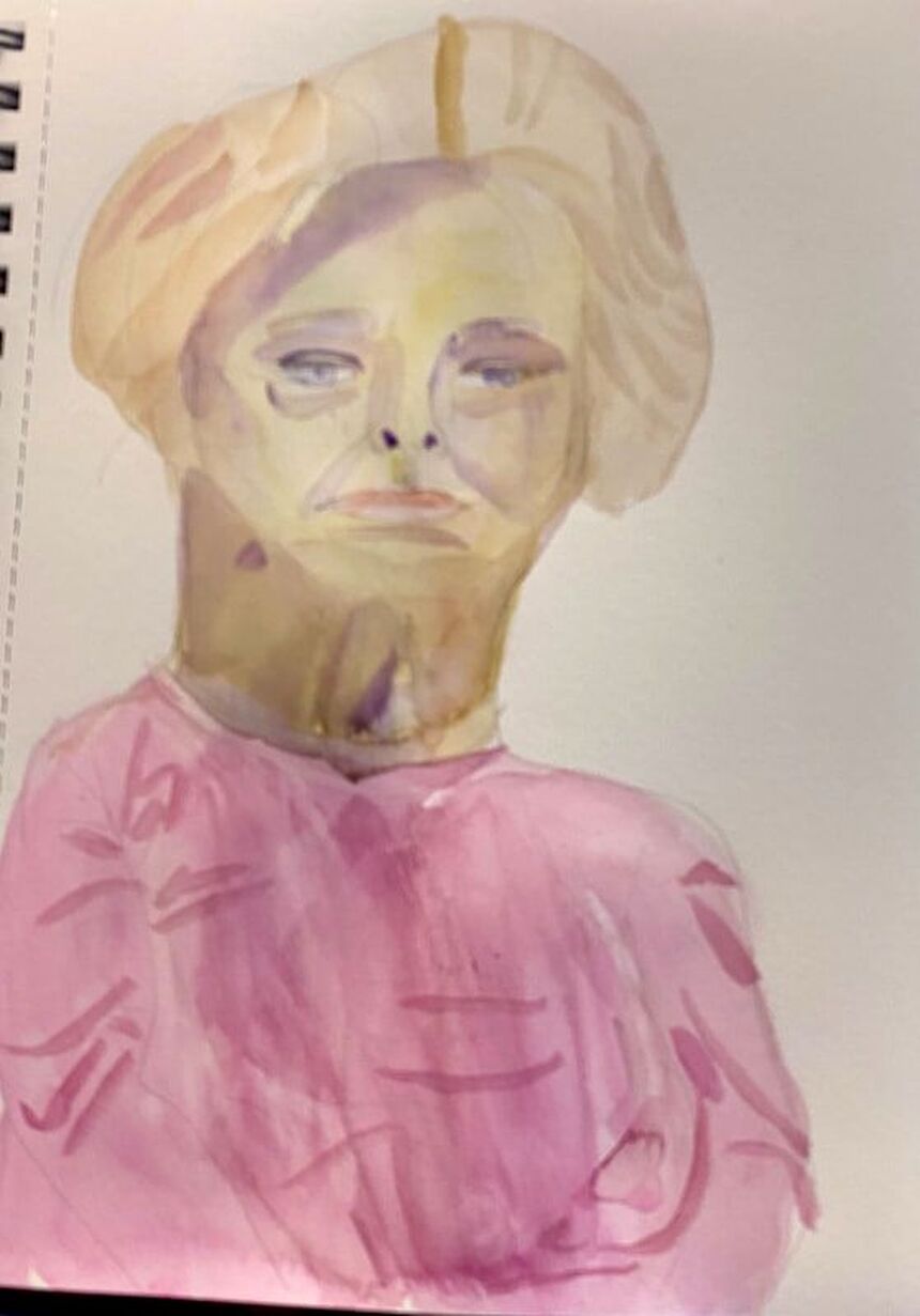 I’ve had the opportunity to draw live models before in art classes, but today I made my first attempt at painting one. This session took place in the Craft Studio 2 of my community’s club house. I chose to work in watercolor. I started by sketching in the outline of the subject’s face and body as quickly as I could while still making it accurate. To make sure the features of the face were in the right places, I used the techniques outlined here. When it came time to start painting, I started with the model’s flesh, which I painted by mixing yellow and purple. Now, the color I had was going to be way too dark, so I wet my paper first to dilute the color. Watercolor is probably not the best medium or the most practical medium for a short modeling session, since when you wet the paper, like I did, you have to wait for that layer to dry. When someone’s only going to be in front of you for a half an hour, you want to be able to go back and add more layers as quickly as possible. After I painted the model’s hair, I realized I needed another layer on her face. This layer, though, was way too yellow. Nothing I could do about that, though, until it dried. In the meantime, I blocked in color on her shirt. Once it was safe to go back over the face on my portrait, I did so with purple, making sure to thin it out of course. This toned the yellow right down. I decided to use purple for the shadows and planes on her face too. I tried to look and see where the edges of the shadows were and draw them in my piece. My goal was more about having fun and learning than creating a masterpiece. If I was painting a model professionally, it would be done in sessions and both the model and I would take breaks. I think next time, I'll work in black and white. That will probably be easier.
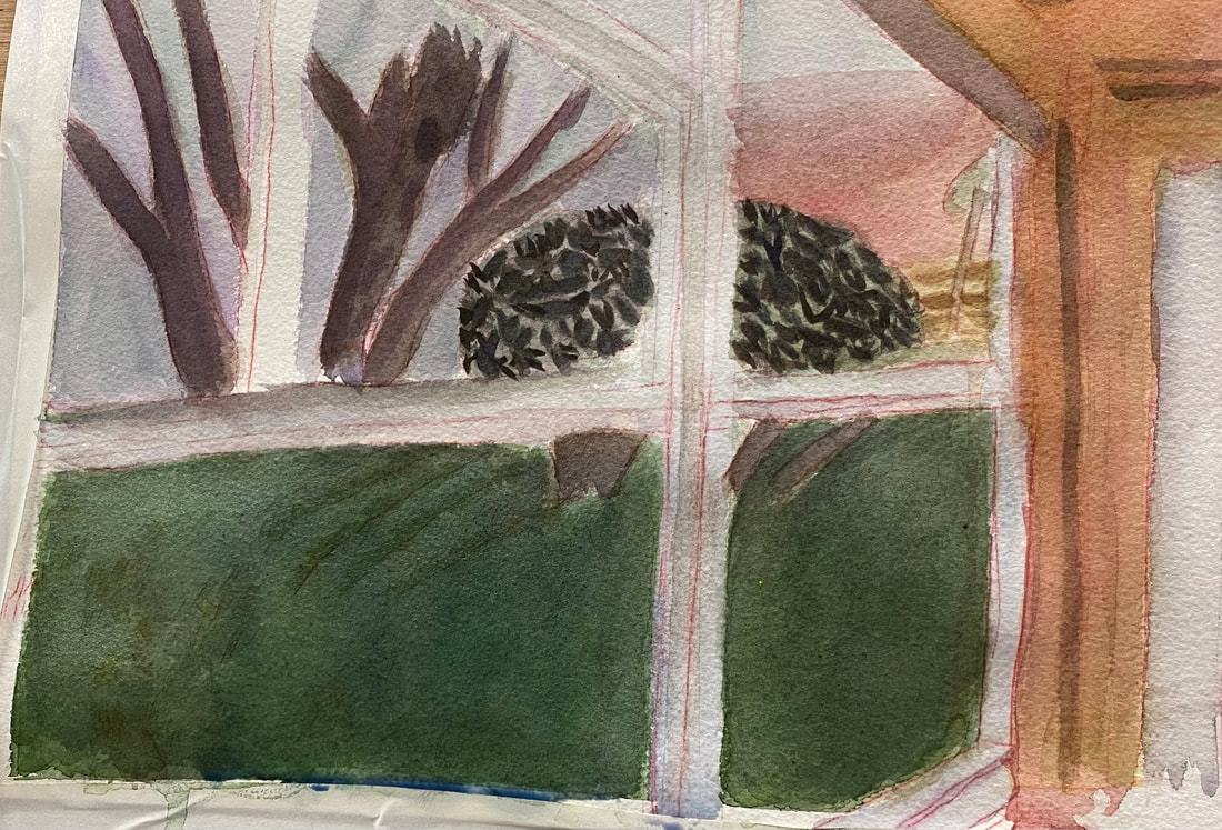
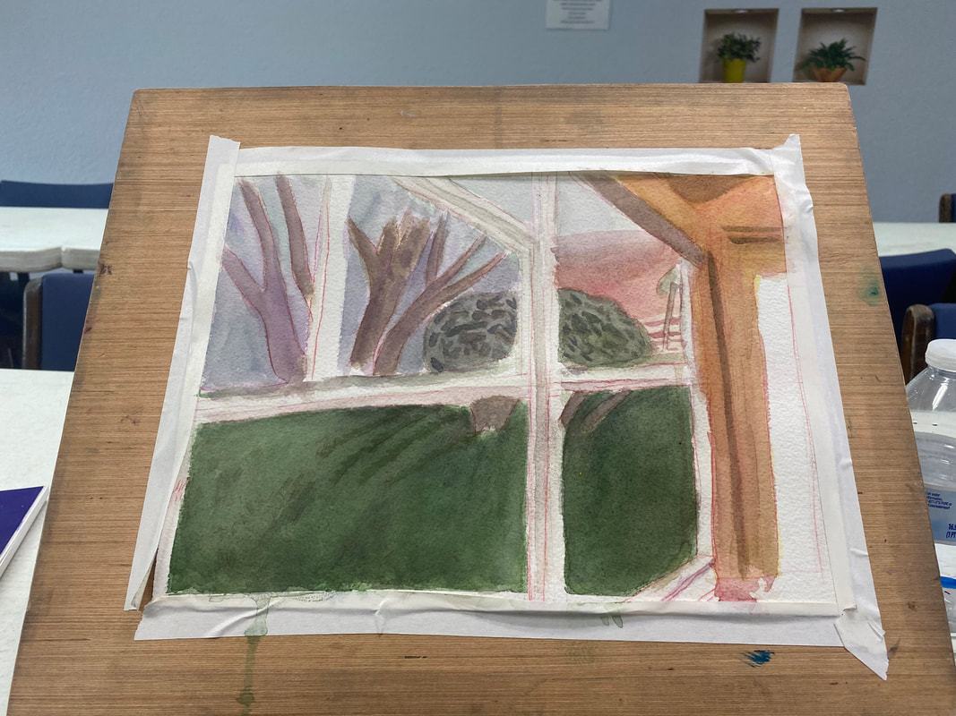
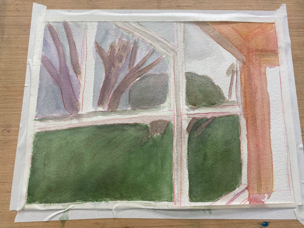
Your reference photo is your guide for your piece. It's your gps, so to speak. But just as you may need to take a different route from what your gps suggests when traveling, sometimes you need to do something in your art other than what your reference photo shows, because it just doesn't look right in your piece. I talked about that in this video. The window frames in my photo appear pure white. 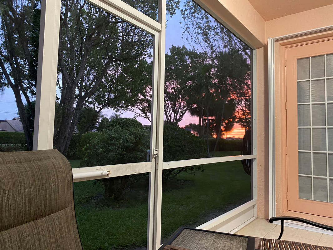 But that looked too stark in my painting. It bothered me. I mixed cerulean blue and purple, the same color I'd used for the sky, and painted very thin washes of this over the frame. My goal was to leave just a hint of the color, so that the frames would look like they were reflecting the color of the sky, but not that they were the color of the sky. I could never have felt that the painting was finished, no matter how many layers I put on it, if I'd left those frames white.
So do what feels right for your piece, not necessarily what your reference photo shows.
 When it was time to start painting my sunrise, I started by blocking the whole area in with yellow. While that was still wet, I painted red on top. The goal was for the red and yellow to mix and make a peachy color. Using wet on wet also prevented sharp edges. It was very important to me, also, to leave some of the yellow showing. I painted a band of purple between the blue and the pink of the sunset to help the colors blend a little better. When the top layer was dry, I painted a couple bands of red along the bottom with my smallest brush. I used wet on dry this time because I wanted the edges of these bands to be a little sharper. I plan to go over these bands with some layers of yellow to soften them. If you like this post, you might enjoy the one before this, where I explain why I use the particular shades that I do in this piece.
 I’m working on a scene of my backyard during a sunrise. It’s teaching me something about how the eye’s perception of color will change with the time of day. If I was painting this same scene at midday, I would use more yellows and oranges and make everything warmer. Because it’s the beginning of the day, I’m making everything blue, purple, and generally cool. The grass on the bottom needs to be much darker. I’m going over it with layers and layers of “black”, made by mixing ultramarine blue and burnt Sienna. I realized that the blue I’d painted the sky was also too warm. Now, I was just blocking in the color when I was doing it, so I wasn’t all that concerned with accuracy. But now, it was time to fine tune things a little. I thought I’d try layering purple over it and see how that looked. Other than the purple going on a little thicker than I would’ve liked, I was very happy with the results. By contrast, the third of the sky where the sun is rising is going to mostly shades of pink and yellow, but that will be for another post.
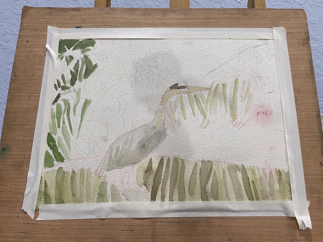
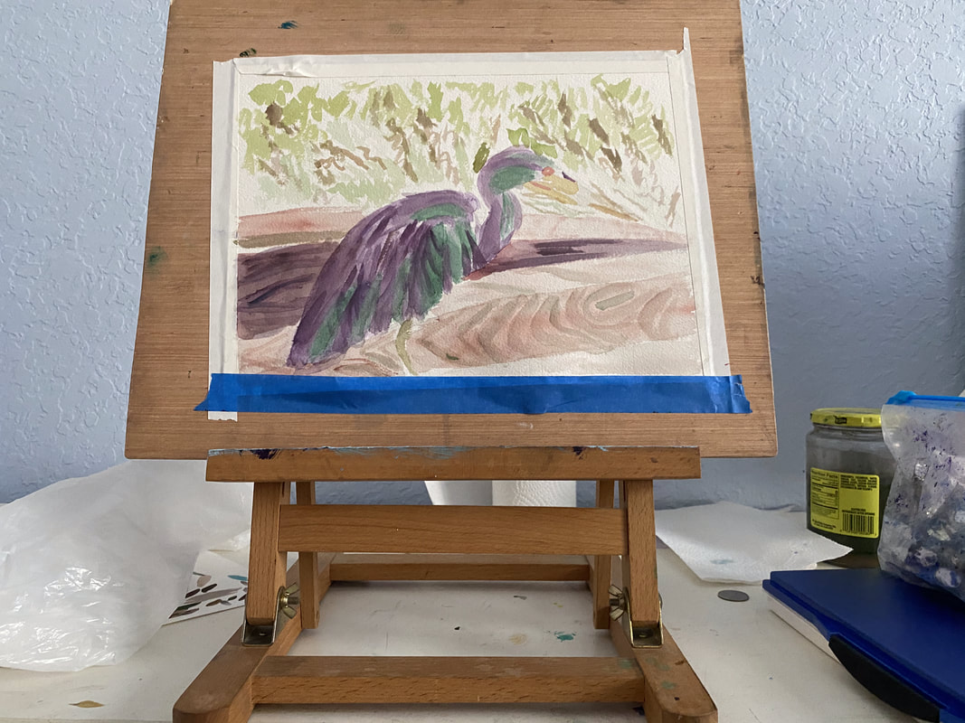 The bird I’m painting has a lot of colors in him. Trying to paint them all can be overwhelming. I’m starting simple by only focusing on green and purple for now. I’ll build up layers of these colors until I reach the darkness I desire. At this point, I'm not concerned with whether it's good or bad. This bird will have many layers and probably multiple colors on him by the time I’m done. By limiting my focus to two colors at these beginning stages, though, I keep myself from being too paralyzed by indecision to start. Don’t think about making a masterpiece when you start. Just think about starting.
 My goal is always for my subject to stand out from my background. I usually try to achieve this by making the background darker so the subject appears lighter and making the background cooler and the subject warmer, which I usually do by adding layers of blues over the background and yellows and oranges over the subject. I thought I’d try something different with my current painting, though. Since my subject is a bird with blue feathers, I knew painting yellow over him was out. That would just turn him green. Painting orange wasn’t much better because that would dull him and send him further into the background, exactly what I don't want. I remembered what I’d learned from Alicia Farris’s watercolor workshop and that's that layering analogous colors, or colors that are near each other on the color wheel, makes shades more vibrant. I could certainly use some more vibrancy in my subject. That would probably be a more effective way if getting him to stand out than trying to "warm" him. I chose cyan blue to layer over him. I could've chosen any blue, as well as purple or green. With just one layer of the cyan, he started to come forward more. On the other hand, his neck is more of a warm brown, so I've been painted red over it to get it to stand out more. I've added more layers of blue to my bird since I started writing this post. I'm looking at the painting now and he's standing out nicely from the background. What I think I need to do now, though, is create more separation between his feathers.
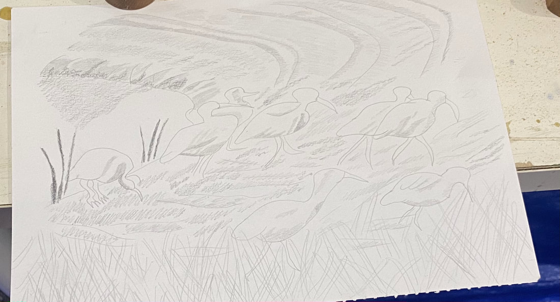
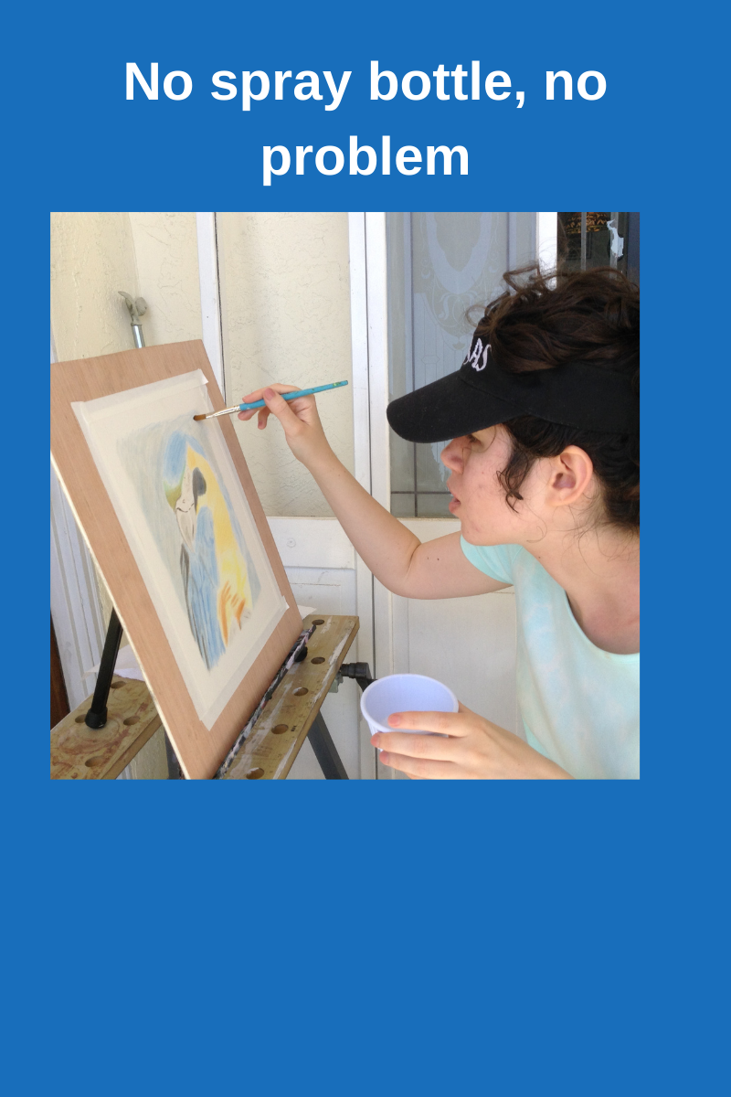 I went to the Art room on Thursday and when I got into my painting, I realized I didn’t have my spray bottle or pencil. I used my brush to load water from the cup on my table and borrowed a pencil from the supply closet to do a sketch of some white ibises from a photo that I'd taken on the way to the clubhouse. My tendency is to curse myself whenever I forget something, but I’m determined not to let missing a few supplies ruin my time in that room. I thought of the quote "Do what you can with what you have right now." I started a new painting that day. I painted his neck by mixing yellow ochre with cobalt blue, and then mixed more cobalt blue with that to make a gray shade.
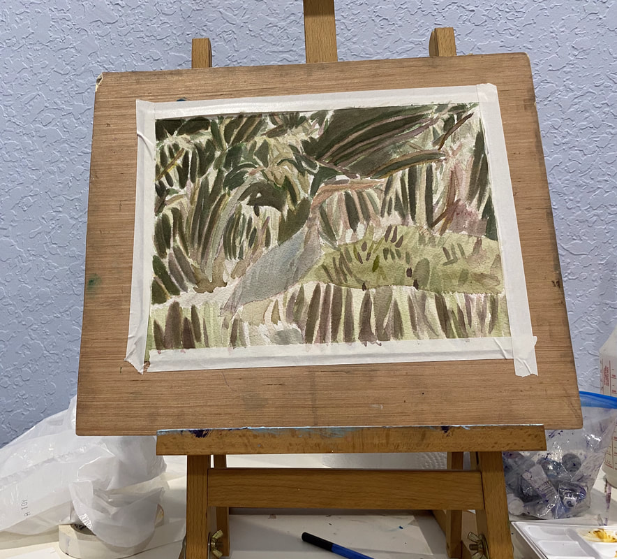
In Other News Last Tuesday I recorded intros and outros for my blue heron and my anhinga video, along with my video on making art a habit. I’ve been working on editing them throughout this week. I still need to record b-roll for my art habits video. I’ve gotten as far as taking out the long silent bits on that one. I hope to have the blue heron video on my youtube channel, Sara Makes Art, soon. 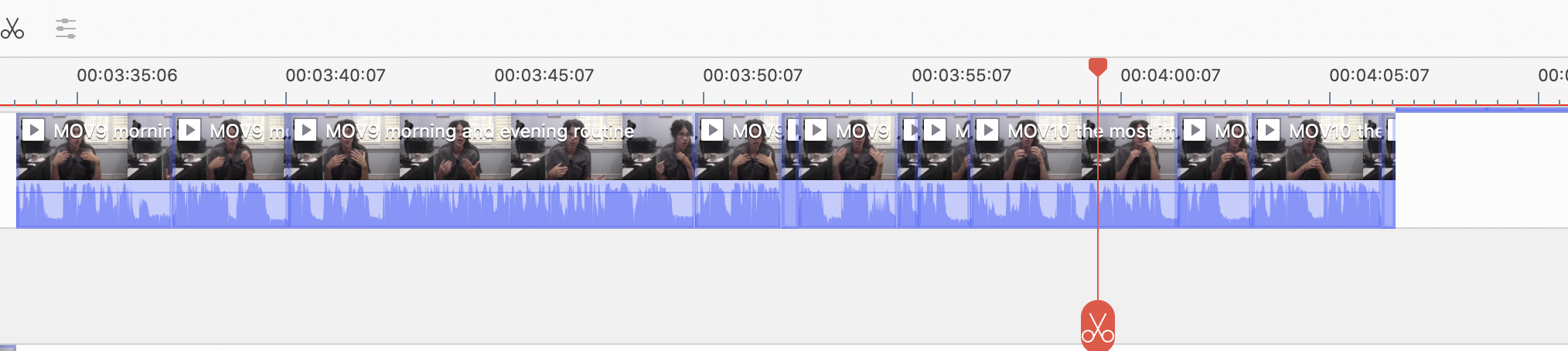 |