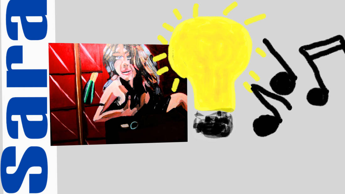
 Today I want to talk about borrowing as an artist while still being original. I'm going to use my painting "Woman With Cabinet" to try to explain this.  The concept for this painting was taken entirely from the song "Killer Queen". The woman herself is a representation of the character in that song, and there's a plate of caviar, and a cigarette box on her nightstand and of course a bottle of Moet & Chandon champagne in her cabinet. The point I want to make, though, is that even though I got the concept for that painting from someone else, so the concept isn't original, the painting itself is. The design is mine. That exact design doesn't exist anywhere else in the world. If you've followed someone else's concept very closely, though, I think it's only right to give credit to them for it. This painting wouldn't have existed if I hadn't listened to that song and it's lyrics, so whenever and wherever I've posted this painting online, I've given credit to Freddie Mercury for this concept. So while I do take concepts from other people, I make sure that #1, the execution is my own and #2, I give credit where credit is due. When do I think credit is due? Personally, I give credit very liberally, but the time I think it's really due is when your following someone else's concept so closely that it's obvious you got the idea from that person as was the case with my painting. I can remember my former stepfather sitting me down and going through pictures with me of things he was going to have me paint. He said, "Some people say, I want mine to be original. They're full of sh%t. I agree with him and I don't, kind of. I agree in the sense that everyone borrows, everyone gets ideas from other places. But I still think that there are ways you can make things your own, such as changing a color and taking lots of elements from different artists and combining them to make something that's uniquely yours. I've said this before and I'm saying it again. Ideas and concepts cannot be copyrighted. Only the execution of those ideas and concepts can be copyrighted. So you can use someone else's concept as long as you execute it in a different way. I'm not the only one who has taken a concept from someone else and changed the execution of it. I happen to know that Freddie Mercury, himself, took the concept of Richard Dadd's painting "The Fairy Feller's Master Stroke" and used it as the basis for the song he wrote with the same title. I also have an idea for a painting I want to do that is taking a concept from another artist and I'll tell you more about that after I've started on it. Maybe you've taken a concept from someone else and executed it in your own way. I'd love to read about it in the comments. My former stepfather would bring things home that he had found and tell people that we were going to pass this off as my piece and it could be something that only did I not make it, but something that I would never have made period. It could be something that wasn't even my style. I even remember walking into our dining room to find him finishing a painting a Rockwell style painting and saying basically that I was looking at my next painting. There were so many instances like that, where he either found something or threw something together himself and told me to take credit for it. I don't want to go into the reasons why my former stepfather did what he did in this post. All I'm going to say about it here is, just as I would hate for someone to take something that I did and pass it off as there own, I feel indescribably icky about taking credit for something I didn't do. Have you ever taken a concept from someone and executed it in your own way.
0 Comments
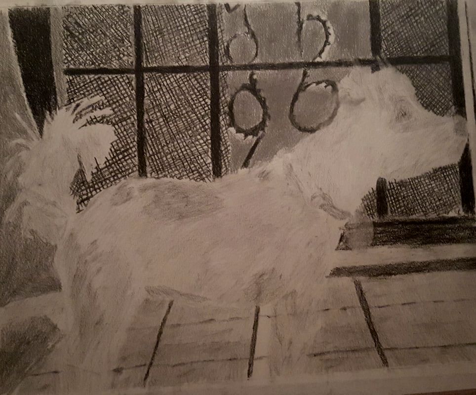
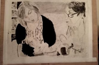
 In this post I'm going to be reviewing Artist & Craftsman Supply. 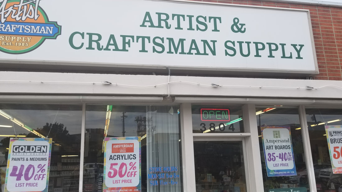 Pros It's close to me. I know that obviously won't apply to everyone. It carries a lot of good brands. It has friendly and knowledgable staff. That's how why gallery wrap canvas is called gallery wrap canvas. Cons It's small. But I also think that's a pro in a way because that makes it easy to find things and it's kind of cozy. How Did I Discover Artist & Craftsman? The short answer is my mom told me about it. I'd reached a point where I was fed up with Aaron Brothers, which is where I'd been buying my art supplies. Now, I'm not bashing Aaron Bros, because I only have experience with one branch, and I don't know, maybe there are good ones out there. But the one I was going to was understaffed and the staff that was there never knew the answers to my questions. Either that or they were on a break. sAnyway, my mom told me that there was an art store she knew about in Hillcrest, which is a neighborhood close to ours and I was more than willing to check it out. I know I mentioned before that A&C Supply has friendly and knowledgeable staff and they really do. I can ask them how something works or what something is for and they will tell me very clearly, no problem. eI remember asking someone about different kinds of tape because I was confused. I asked someone what modeling paste was for, because I was trying to figure out whether or not I wanted to buy it. I had some oil pastels and I was trying to figure out if the pastel paper I was looking at would work for them or if it would only work for soft pastels. I asked someone and they said yes it will work, I just have to use the correct side of the paper. I have a hard time finding my way around places and sometimes it takes me a few tries before I really know where something is. I've asked the staff at A&C Supply where the paper and canvas was numerous times because it took me a while to figure it out since it's behind something, and a lot of the time, the employee will offer to walk me right to the thing I'm looking for. For a while, A&C Supply was the only art store I shopped at. But then I found out I could go to Blick's too, which I also like because they carry some things that A&C doesn't, such as Liquitex's Basics and Softbody lines. A&C has become my go to place for canvases. A long time ago, I wrote a post about how I use lots of colors in my paintings. In that post, I touched on the fact that using an unexpected color can give a piece added depth. Here, I want to demonstrate that concept in more detail for you. Right now I'm working on a mouth for an upcoming tutorial. Thel last time I was working on them, I used purple. This is what it looked like before, 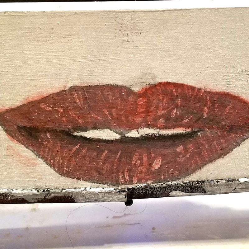 and this is what it looked like after. 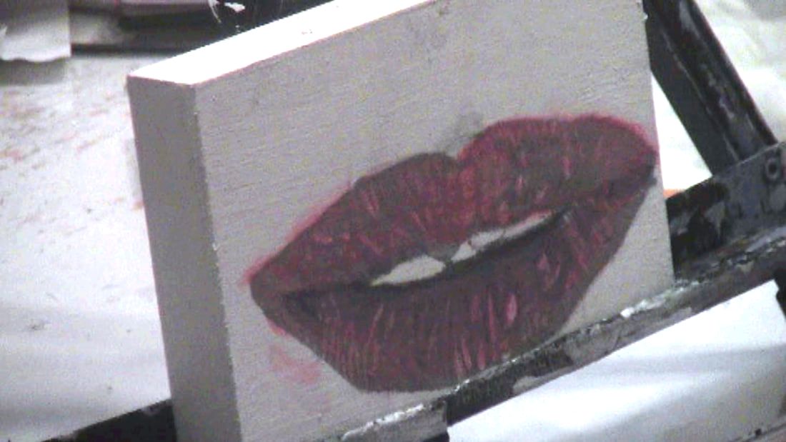 I used a transparent, greyed out version of purple. I didn't use a bright purple and that's important. The point is not for people to look at this and go "There's purple in those lips". The purple is only there to add dimension and character to the lips. I also used a liner brush to make sure the marks were the thickness and curved them to create three dimensionality. Just seeing how adding a color that doesn't seem like it could work for a piece add so much to it is one of the most enjoyable things about painting for me. 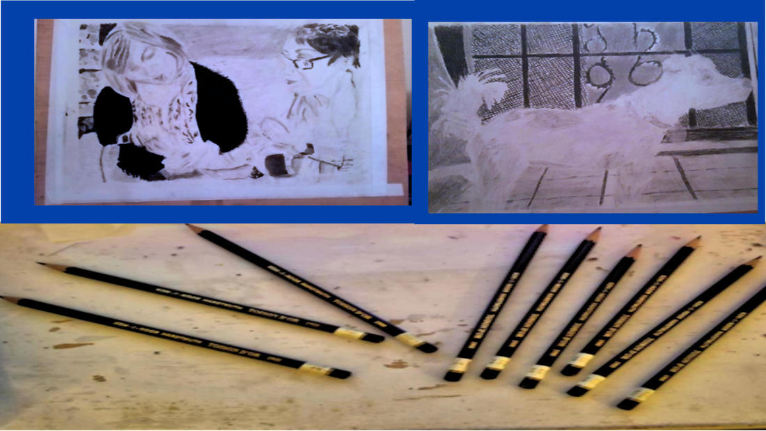 In this post, I'm going to be reviewing the Koh-1-Noor graphite pencils that come in the wood casing. For a large portion of the time I've been drawing, Koh-1-Noor and Proart were all I used, so I have a lpt of drawings that were made partially or entirely with these pencils. Here are two of them.
Pros These pencils come openstock, which is very important. They're inexpensive and not very scratchy. They also sharpen to a nice point. Cons What I think is a major con with these pencils is that 6b, 7b, and 8b, look virtually identical. Here they are in a row. 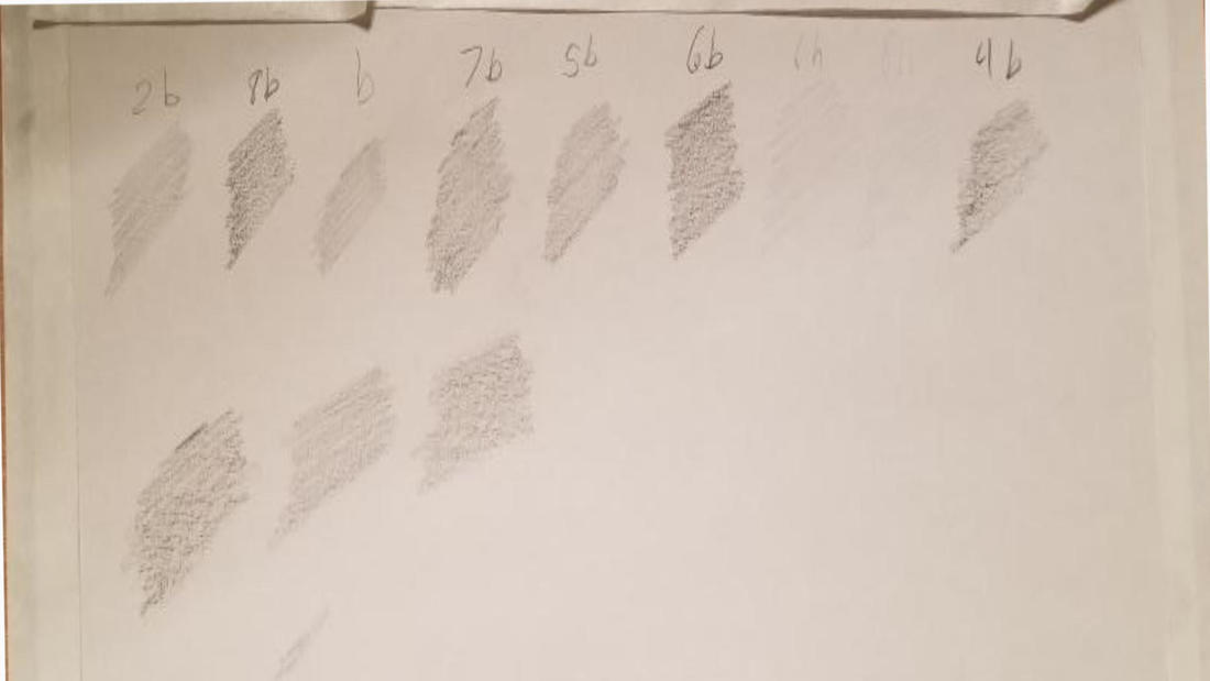 If three pencils have different numbers on their spine, yet you can't see a difference between them on paper, that's a major con in my opinion. All in all, I think Koh-1-Noor are very good for their price range. Here's a link to where you can buy these pencils yourself. It's an affiliate link, so that means if you buy through it, I get a portion of the price. In this post, I'm going to tell you what I do as an artist during the day. It should go without saying that two of the thins I do as an artist are paint and draw.
I spend a lot of time 1ooking online for reference photos. My site of choice to do this on is Pixabay because it's both royalty-free and free-free. 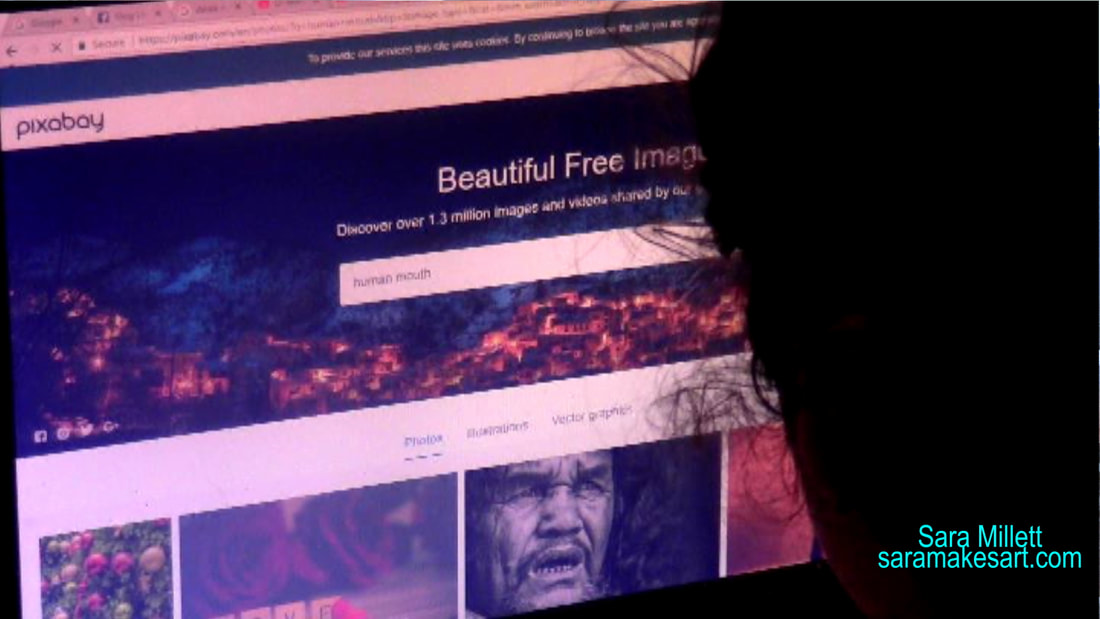 I also keep an eye out for opportunities to take reference photos when out and about.  Part of being an artist is also promoting one's work, so at some point during each day, I usually share a work in progress pic to one of my social media accounts like Instagram or Facebook.  I also write blog posts, which is what you're reading right now.;)  What is the best era to be an artist? A lot of people think the best time to have been an artist is long in the past, but in this post, I'm going to tell you why I think the best time to be an artist is probably right now. Reason #1 Artistic Freedom The reason people think the best time to be an artist was the middle ages or the Renaissance . photography hadn't been invented yet,so if you were a painter, your services were needed for portraits and such. That's true, but the price painters paid for more job opportunities was a lack of freedom. Almost all art was done on commission, meaning a patron specified how a piece would be done, what would be in it, what materials would be used, etc. Very few artists were able to just paint whatever they wanted and sell it. Commissions is still a big part of how a lot artists make their living today, but the paint what you want and sell it route, is also a very real option. Even if you did have the luxury of pretty much painting whatever you wanted, if you were an artist in the middle ages, there were rules put down by the government and the church that dictated certain things about your art. These included what colors you could use and how much of them and how portraits were to be painted. Depending on the subject, a portrait might have to be...
front facing, three quarter view, or completely to the side. Reason #2 Artistic Respect Artists were not valued before the Renaissance. It's arguable if they were even valued then, but artists were definitely not valued before the Renaissance. Oh, art was valued for sure, but not artists. Art was seen as a manual labor job. People looked on artists similarly to the way we look at fast food workers today, ie, they were someone who you instructed to make something for you and they made it. Artists weren't considered to be creative. It was the patron, the person who commissioned the art, who was considered the creator of the art. The fact that art was done by a certain artists didn't even make it valuable. As stated in an article cited in this post, if a drawing done by Picasso was found on a napkin, it would be valuable simply because it was done by Picasso, because of his reputation. In the Middle Ages, however, what made art valuable was purely the materials used in it, which like I said, were chosen by the patron not the artist. I wonder if this is why before the Renaissance, almost no artist bothered to sign their work, hmmm. Reason #3 How Easy It Is To Actually Make Art, Comparatively Speaking The ability to squeeze paint out of tube, like this  and use it immediately, was unheard of before the nineteenth century. Before that time, artists had to make their own paint by mixing dry pigments with the vehicle, the thing that makes the paint wet, which at the time was usually water or oil, and binding ingredients. Of course, if you were luck enough to become a Master, you could have your apprentices do this manual labor for you. On top of making the paint, artists had to spend a lot of time mixing colors because there were so few available. So in short, artists in the old days might have had more job opportunities, but they also had less freedom and respect. sources https://www.khanacademy.org/humanities/art-history-basics/beginners-art-history/a/what-made-art-valuablethen-and-now https://www.youtube.com/watch?v=5OTngEHvq8Q 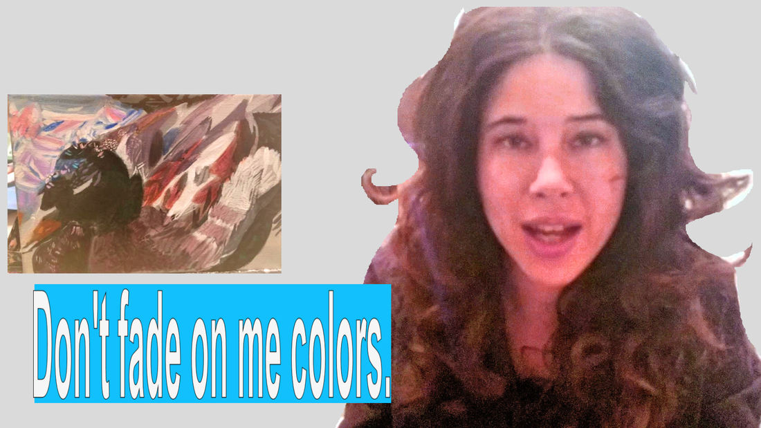 Simply put, lightfastness is the ability of pigment to resist fading when exposed to light, particularly sunlight. Lack of lightfastness can cause your colors to go from this... 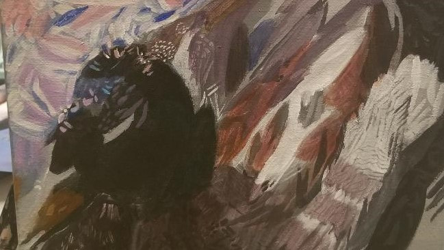 to this... 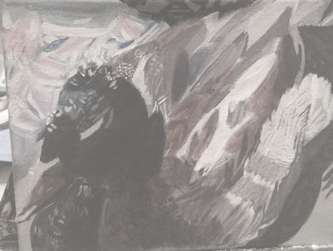 in a matter of just a few years. How Do I Know If A Product Is Lightfast? Some brands, like Liquitex make finding this out really easy by marking it right on the tubes. Otherwise, you can probably f8nd this information on the company's website.  Royal Talens, for example, offers a downloadable PDF with all kinds of info about their products, including their lightfastbess ratings. How Long Does Paint Have To Last To Be Considered Lightfast? From what I gather, anything that will last less than ten years, is considered to have poor lightfastness. Anything that will last at least a hundred years is excellent lightfast. Anything that will last twenty-five to fifty years has good lightfastness.  I've heard of colored pencils that will last 800 years and that to me sounds like phenomenal lightfastness. How Important Is Lightfastness? That depends on what you want to do with your piece. If you want to sell the original, lightfastness is very important. People who buy art invest a lot of money into it and they're not going to be happier with you if a piece they bought from you is faded and dull in a few years. 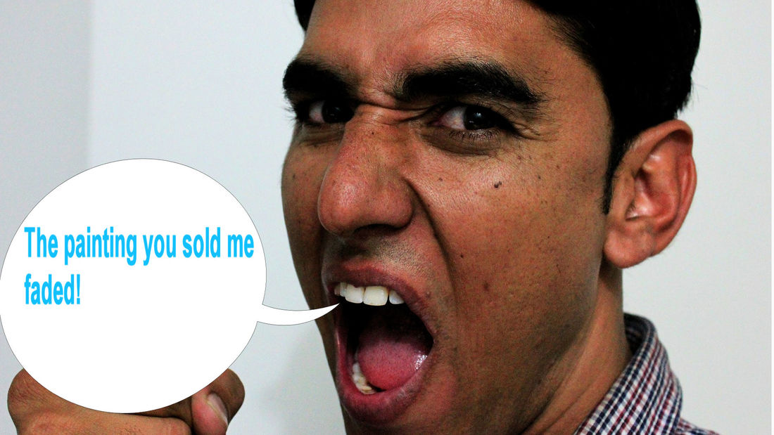 But if you're okay with not selling the original and maybe just selling prints, then lightfastness may not be that important. I think it also depends on how long you're going to spend on the project. If I spent a long time on a piece, I would be more upset to see the colors fade quickly than if I didn't spend that long on it.  This post is going to be about the differences between gallery wrap and studio wrap canvas. The main difference between the two is how thick they are around. So basically gallery wrap canvas has a very thick edge. It's usually at least 11/2 inch think and it has no side staples and it's made to be hung without a frame. So instead of framing it you would paint around the edges.   Studio canvas has a much thinner edge. It's usually less than an inch thick and it often has staples on the sides, so you'll have to frame it to make it presentable.   Now, what I gave you are generalizations. These lines can be blurred. For example, in my case, I've done almost all of my paintings in the last few years on studio wrap canvas that has no side staples, kind of like gallery wrap canvas and that I painted the edges on as you would do with gallery wrap canvas. 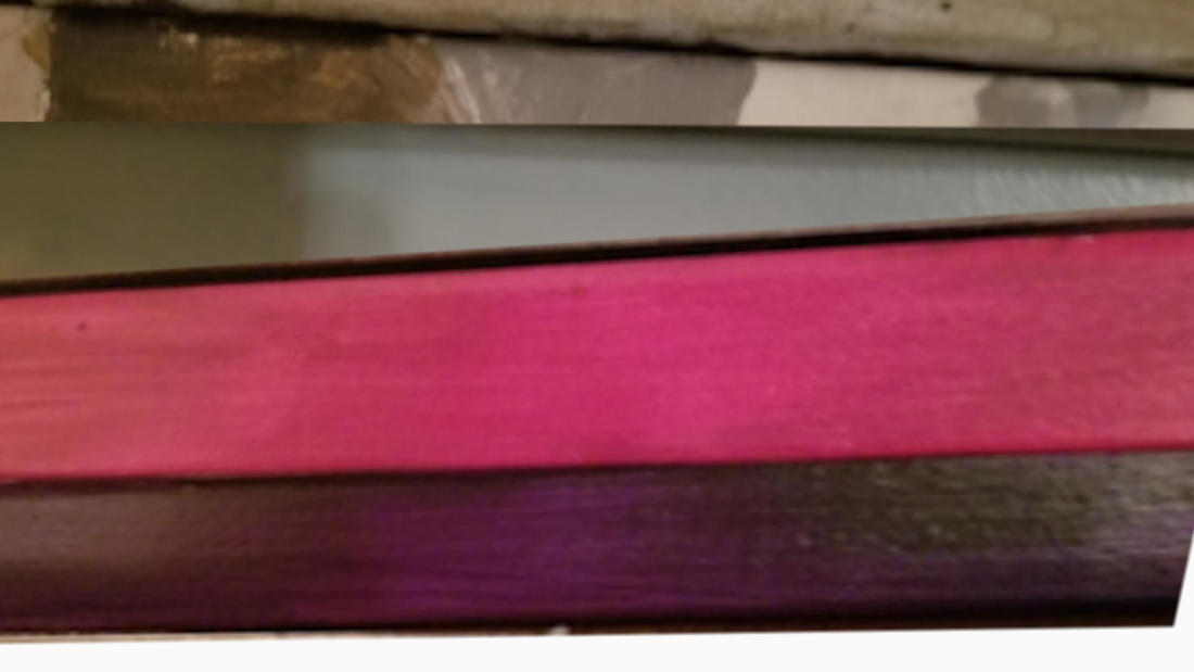 Also, don't think that just because your painting happens to be done on a studio wrapped canvas that it can't be shown in a gallery. I've done paintings on studio wrapped canvases that I've shown in galleries.  So why are gallery wrap canvas and studio wrap canvas called that? Well, I had a little chat with one of the employees and Artist and Craftsman and basically, the answer is just because, like I said because gallery canvases don't need a frame, traditionally they were ready to hang right on the gallery wall, just as they were. But, like I believe I said earlier, you can really paint on anything you want and hang it anywhere you want. So how do you choose between a gallery wrap canvas and a studio wrap canvas? So how do you choose between a gallery wrap canvas and a studio wrap canvas? Really it comes down to personal preference, whatever you like better. But there are some factors that would weigh in on this. Number one is budget. Gallery wrap canvases are more expensive.  But on the other hand, if you choose some studio wrapped canvases like I said, if you wanted to display them and have them look presentable, you'll have to frame them  and so you'll have to deal with the cost of the frame and who knows it could end up costing you as much as you would've just paid for a gallery canvas. The other factor is the size that you're working on.This is something that the woman at the store told me too is that studio wrapped canvases, the thin spined canvases, are more likely to warp if they're large, so you probably won't find, say a 30x40 studio wrapped canvas. Large canvases tend to always be gallery wrapped.  You might notice that some companies don't even use these terms anymore, instead using terms like deep profile for the wide spined canvases or shallow profile for the narrow spined canvases. My guess is to reflect the fact that it really doesn't matter where you hang things anymore. 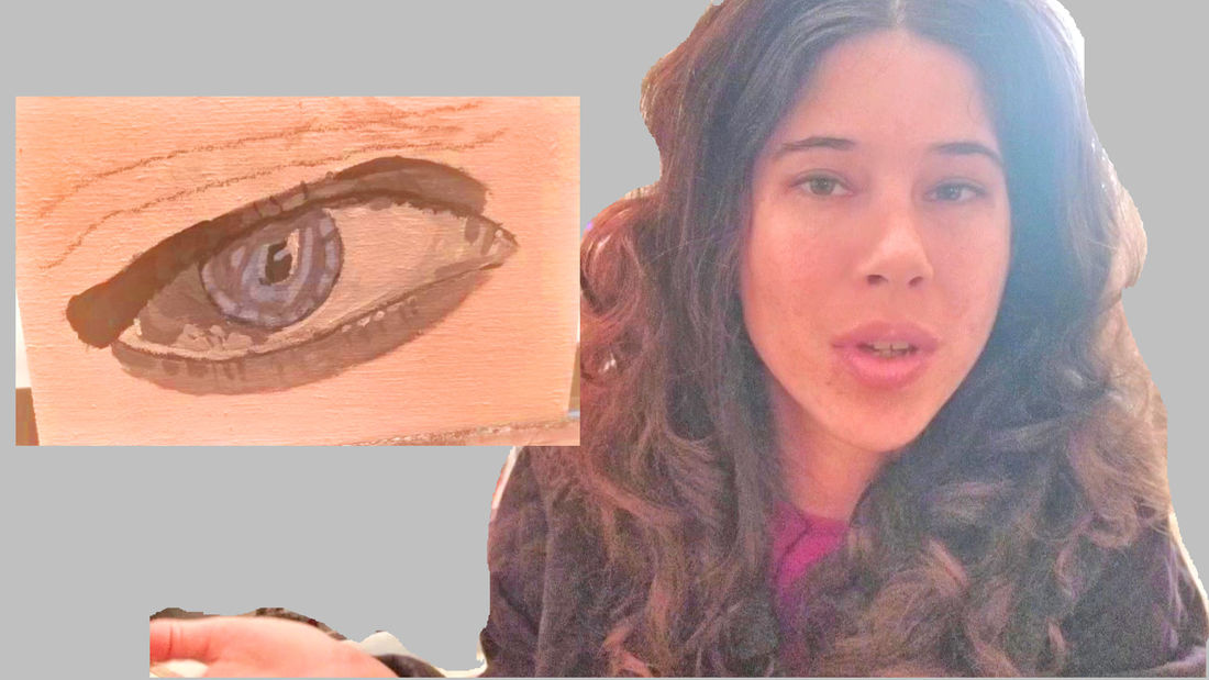 In this video, I'm walkng you through the process of how I paint a human eye in acrylics. I decided to do a stand alone eye, instead of one as part of a whole face so I can really show you the details. I'm using Liquitex and Amsterdam acrylics on a 4x6 wooden board from Elephant.
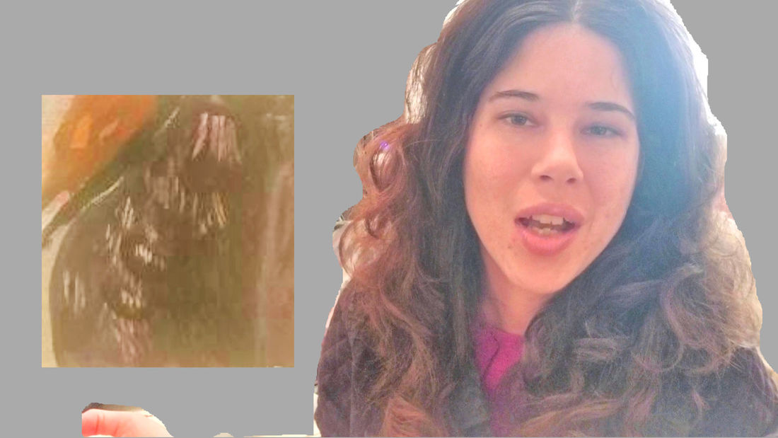 In the above video, I'm walking you through how I painted the feathers on a duck's chest in acrylics.
|