|
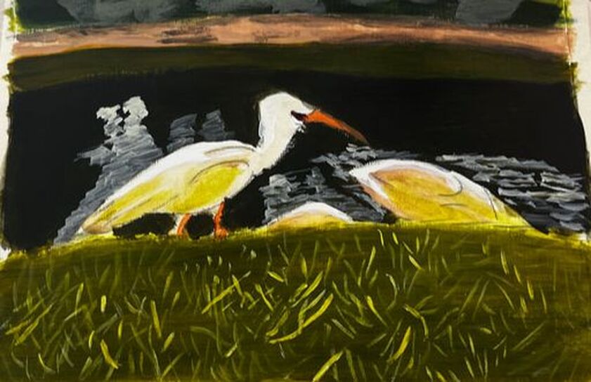
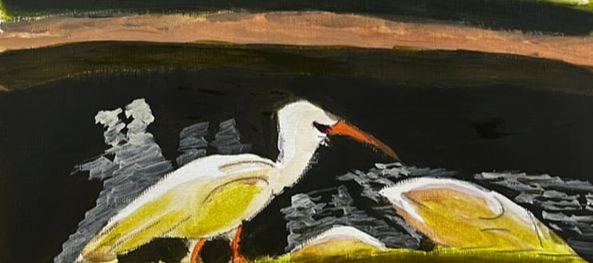
I don’t paint enough white things, tending to shy away from them because I fear they will look too stark. My mind tells me it’s better to stick to black and white. It’s time to face my apprehension and do a project that features a white subject, these ibises, in color media. So I'm painting white ibises in acrylics. Before I get to the white ibises, though, I want to discuss the grass and lake around them because the shades I use to paint those will play into how I paint them.Before I get to the white ibises, though, I want to discuss the grass and lake around them because the shades I use to paint those will play into how I paint them. I used the same base of yellow and ultramarine blue for the patch of grass near the viewer and the bush on the other side of the lake. I used more blue for the bush and added red and black to the lake to mute and darken it. I want the patches of grass bordering the lake to be somewhat bright, and I’m using analogous colors to do this, glazing yellow over the nearest patch and blue over the far one. After painting another layer on the grass near the viewer, I mixed some yellowish green color into titanium white. Then I painted reflections in the water using a small round and a sideways wiggling stroke. As for the ibises themselves, I painted most of their bodies with sheer light brown and green, picking up the grass and lake bed colors. I left only the very tops of them white. This is where light would be hitting them; therefore, it would be the brightest. Did you notice what I did here? Less than ten percent of the white ibises’ entire bodies were painted white. The rest were painted to reflect the colors of the things around them. This is why I mixed yellow-green into my titanium white when I painted the shadows. The ibises do not show as pure white. Therefore, their reflections couldn't either. Back to the grass, there are lots of individual pieces of grass in the patch nearest the viewer. I used titanium white first because if I went in first with my yellow-green mixture, it wouldn’t show up properly against what I already had down. Having the titanium white down was especially important because these blades of grass needed to be lighter than the base. These blades gave the grass the brightness I’d been trying to achieve by glazing yellow over the area.
0 Comments
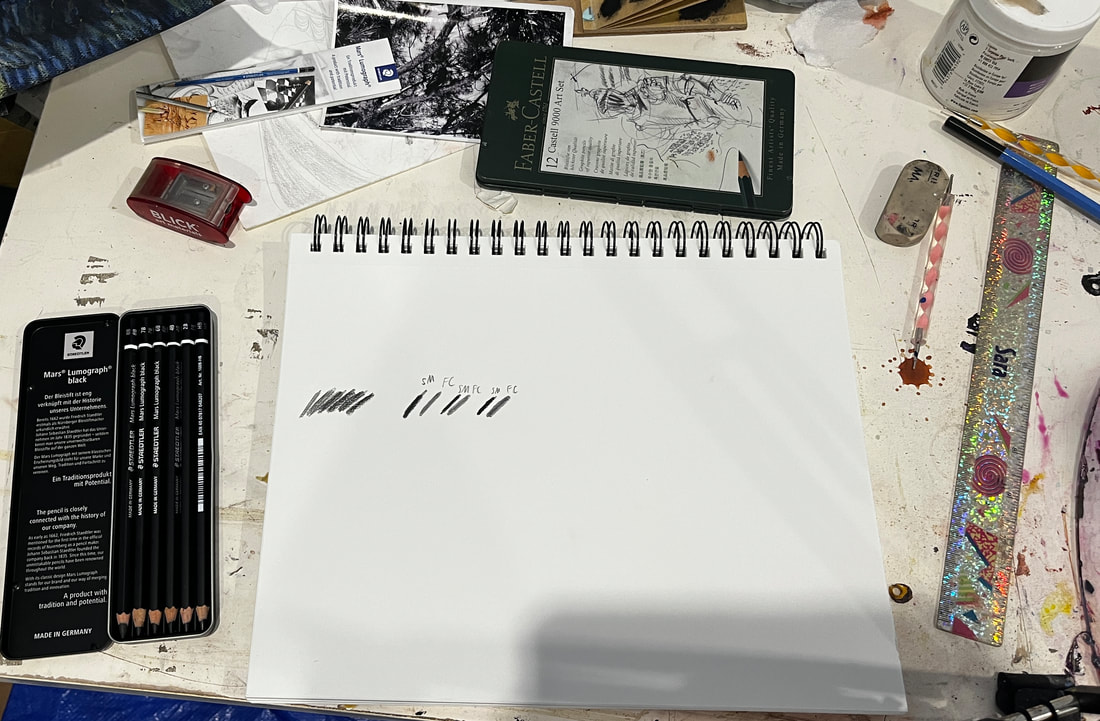
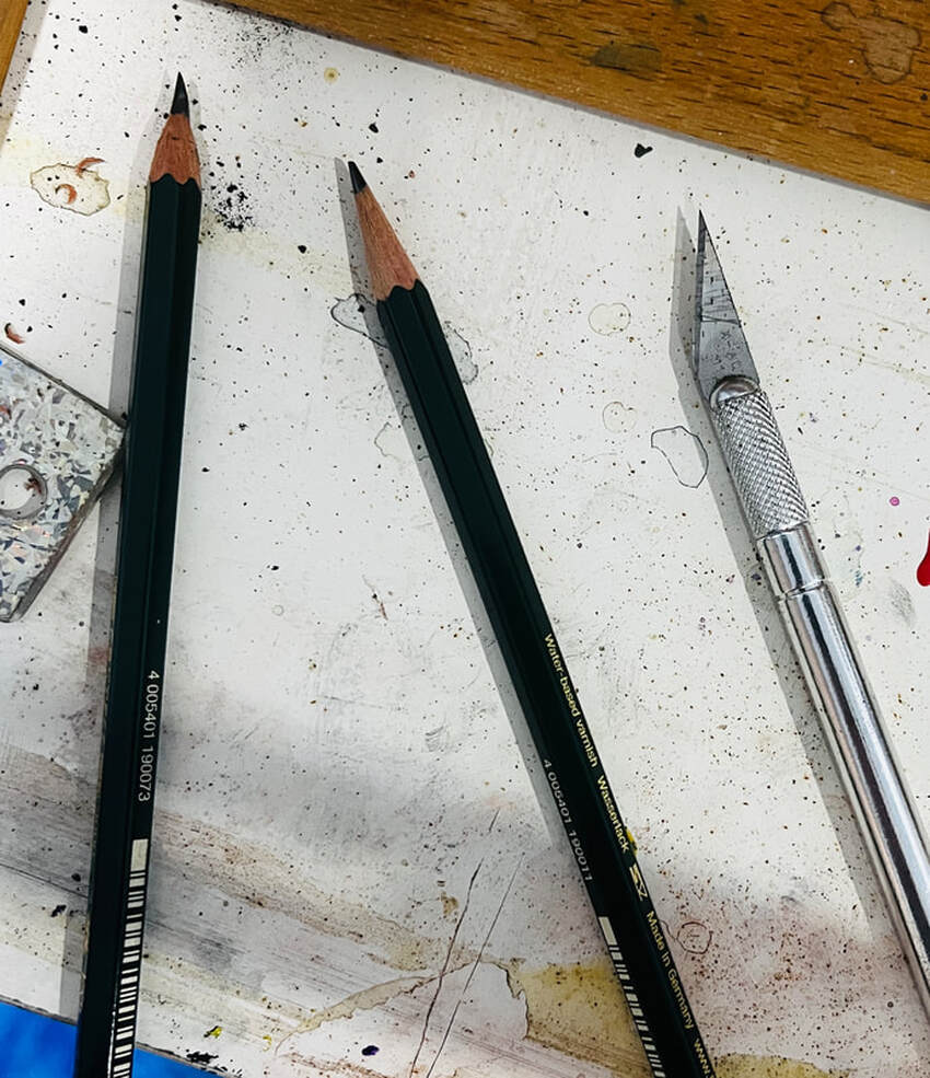
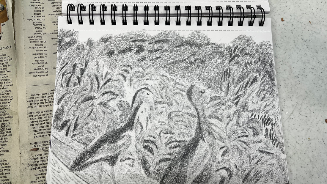
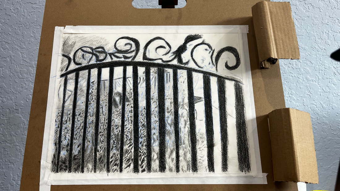
I had been frustrated with the lack of intensity in my darks regarding my shading. Sometimes, I wanted the extra drama that even my darkest pencils weren’t getting me. Shana Rowe Jackson had made a video in which she made a drawing with some genuinely black shading in it. I looked up that video, found out what pencils she’d used, and ordered them. Those pencils were the Mars Lumograph Black line. Now, I have to admit, when I opened the box and looked inside, I was skeptical because the pencils went from 2b to 8b, which were grades of pencils I’d been using all along. But these are not like the other pencils I’d been using. I believe the Mars Lumograph pencils each have a bit of carbon mixed in with the graphite so they can get much darker than a regular graphite pencil of the same grade. To prove to myself how different these are, I tested them against my pencils in the Faber-Castell line. While these pencils are indeed very dark, they don’t cover the paper as well as I was hoping. Achieving the stark black I’ve been going for has required a slow process of layering. It occurred to me that the pencils might not be sharp enough to cover properly. I started looking up “how to get pencils super sharp” on YouTube. That search yielded a video from Leonardo Pereznieto. The method described in the video involves using a blade to remove the wood from the pencil and sandpaper to refine the lead. It’s slow and tiring, but it leaves my pencils sharper than any pencil sharpener I’ve tried. I was working on a drawing of some ducks, and I’d left it a while ago. I’d wanted darker shading on it than I could get with the pencils I had at the time. I decided to try using the 7b in the Mars Lumograph line. While doing this, I accidentally discovered that these pencils might cover better over other pencil than over blank paper. Unfortunately, if I’ve already started with the Mars Lumograph, it’s too late, as I found when I tried to use my Faber-Castell pencils on the gate posts in my drawing. Going back to my bird bath drawing, the edges are where I really want to direct my attention for these things to look truly filled in. The edges are where I really want to direct my attention for these things to really look filled in. Going slowly and methodically gives excellent results. All in all these pencils are definitely worth pick up if you're going for dramatically black shading in your drawings.
|
Sara MillettPainter of portraits and wildlife Archives
November 2023
Categories
All
|
