|
I find it so exciting to see how something as seemingly insignificant as a small stroke paint , can make a massive difference in a painting. Last Thursday night when I was painting, I picked up my script liner brush and started applying small strokes of titanium white and after just one or two strokes, I saw such a difference. I wish I had a picture of my painting after I’d added just those first couple strokes so I could show you the before, with no white fur strokes, and after, with just two white fur strokes. I don't often think about how much of an impact a small add on can have. But I started marveling at this fact when I saw what those white strokes were doing for my painting. The thing is, I didn't know that those little white strokes were what my painting needed, but I'm confident now that my painting could not have been complete without them. Besides painting and drawing, I've also come to love cooking in the past few years and I hear cooks say all the time that adding just a little bit of a particular ingredient will make such a difference to the recipe. I need to point out something important, though. I just talked about cooking and we know that not just any old ingredient is going to create a mind blowing recipe, right? It has to be the right ingredient. Well, the same thing applies to art. I said earlier that I used my script liner brush to apply these strokes and that was the key. The lines had to extremely thin and that brush was the only one that could help me accomplish it. If I’d used a round brush, or a filbert brush, or any other brush, it would not have been the same. So for a word of caution, yes, you can create a big impact with a tiny stroke, but only if you’re using the right brush, the right color, putting that color in the right place and using the brush the right way. I know I said not to agonize over color choice in another video, and I’m not taking that back, but you will have to get everything right, including color, in order to make a giant impact with a tiny stroke. I mean, there were points where I could see that the titanium white was not having an impact in some places and that was because I needed the transparent mixing white for those places. Also just because you see that a couple of tiny strokes are making this huge difference in your painting, doesn’t mean you can stop there, necessarily. Sometimes, you just need a little smudge of color somewhere to make your painting right, but even after I saw that those first couple of strokes were having such a big impact, I kept going and making more strokes because that’s what my painting needed. If you do this, you’ll just watch that impact grow with each stroke. So have you ever done something small in a project and seen it make a world of difference? Tell me in the comments. Before 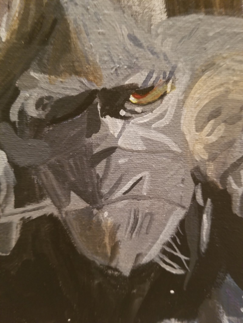 After 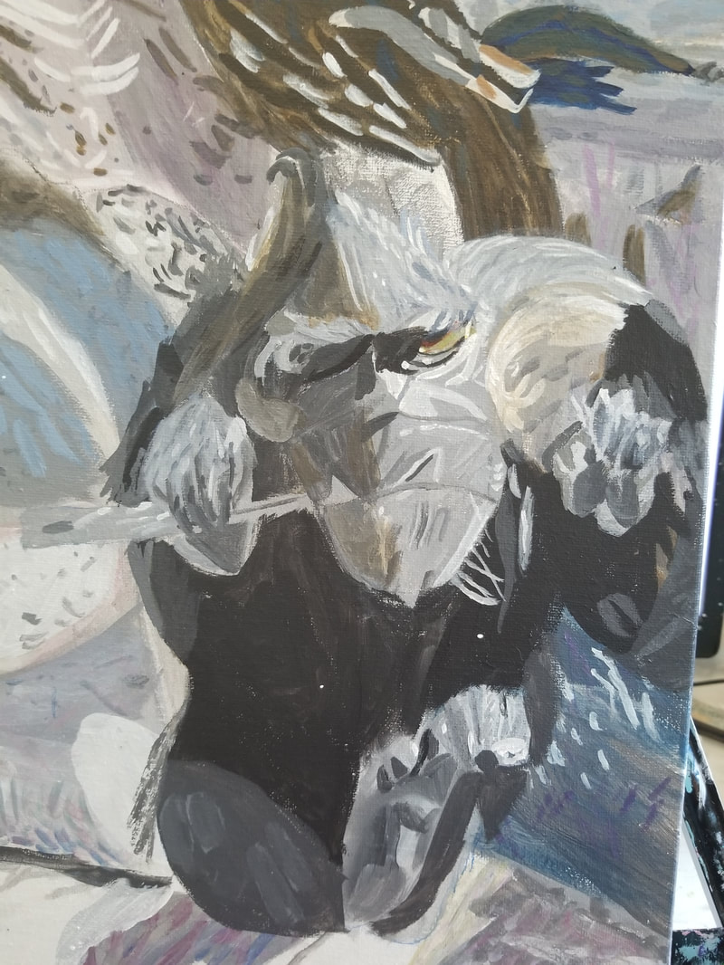 This post is going to be about the concept of trying to create effects as opposed to just portraying things in art Lately I’ve been watching a lot of lectures by the artist Stephen Baumann and creating effects is something he brings up a lot. Of course hearing about it over and over again made me start thinking how I can incorporate such an idea into my work Now a large percentage of these effects have to do with light and how it shines on or bounces off an object. For example, I can see in this photo that I’m working from that there’s a light shining on his eye 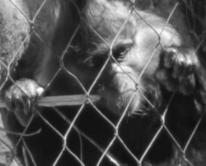 and in my underpainting, I’ve attempted to capture this by painting white dots in the appropriate places. 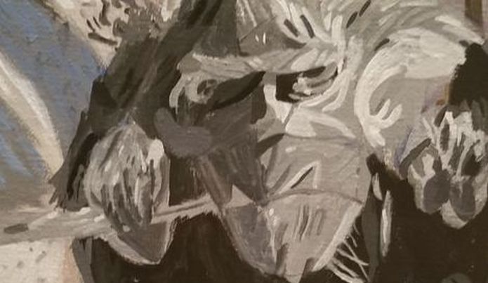 I’ll make further attempts when I add the color by using various glazes, which will probably include transparent mixing white. You’ll see that I made the other eye extremely dark. This contrast serves to make this eye look even brighter. Contrast and lighting are the most important things in making a painting stand out. They’re things I’m committed to paying more attention to. In truth you really can’t have a good lighting effect without contrast because it’s by making surrounding areas so much darker that you make whatever you’ve chosen to be your lighted area so bright. I’ve talked about how I deviated from my reference photo while working on my painting “Mother Walking With Child” and I was willing to do it with this one too. I was willing to make the contrast between the lighted areas of the monkey and the shaded areas more stark if that was necessary to get the effect I was going for. In my painting “In Coming Okapi”, I attempted to create the effect of sunlight bouncing shining on the okapi’s fur by painting that part of the fur lighter than the others and glazing hansa yellow light over it. 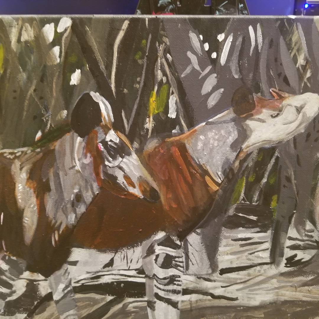 So, question time. How do you feel about creating effects in your work? Tell me in the comments below.
This post is going to be about the lesson I learned while painting a primate’s eye as well as what I did to make it right. Last night, I did a younow live stream and I dedicated it to painting the eye right here. After forty minutes of working on this eye, I still wasn’t happy and I admitted that as I ended my broadcast. I said I was going to start over and that’s what I did. About the biggest mistake we can make as artists is thinking that because we messed up somewhere that the painting is ruined. It’s tempting to think I wasted my time if I’ve spent time painting and I’m not happy with the results and will have to rework that area. But it’s not a waste of time because when you don’t get the results you want, those are the best learning experiences They also give me teaching opportunities like this one. If everything I did in my work went perfectly, I wouldn’t have much to talk about. This mistake could have been prevented by looking at reference photo a bit more closely instead of going with my preconceived notions of what this animal’s eye should look like. My problem was I painted what I thought I knew. I thought I knew, from having painted other primates, that a primate’s eye was some shade of yellowy brown. So I tried mixing hansa yellow with purple that I made by mixing quinacridone red and ultramarine blue to tone it down and glazing that over the eye. I could see red in the eye and I thought the way to achieve that was by thinning down quinacridone red with a ton of matte medium, so it would barely show and glazing it over the eye. But because I was working in such a small space, I couldn’t spread the paint out far enough, so it was still very visible. Because I’d painted an orangutan’s eye in “Orangutan Hanging Out”, 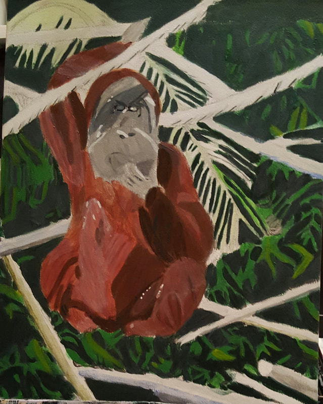 I thought I had a pretty good idea how to paint this guy’s eye. But this is not an orangutan and just like knowing how to paint one breed of dog doesn’t mean you know how to paint every breed of dog, knowing how to paint one primate doesn’t mean you how to paint every primate. So now, as promised, I’m going to explain what I did to make it right. First of all, I noticed, after studying my reference photo a little more, that the predominant color in the cornea was not brown, but actually gray. So I painted a light gray over the whole cornea right up to the first crease. Then I glazed hansa yellow light over this, except for a small portion in the outer corner, allowing the still visible gray showing through the yellow to mute it. Instead of trying to make the red barely visible and glaze it all over the eye, I took a script liner brush and painted thin lines of it along the bottom of the pupil and above the first rim. I also glazed transparent mixing white over the whole eye. I used titanium white to paint a small in the inner corner of his eye then went over most of that with the hansa yellow light.  Lastly what I want to point out is I started to pay more attention to what was going on around the eye. I extended this dark gray out more and put some transparent burnt sienna from the pupil to this white dot. Later I’ll extend this darkness so it covers more of the dot. I’m going to have a video up next Wednesday about creating effects in art that will explain all about why I’m doing this. So what’s an experience you had with messing up on something and then figuring out what you needed to to do to make it right and starting over. Please share in the comments. If you don’t have any experiences to share I hope I’ve made you feel a bit better about those times when you mess up.
Sometimes you just gotta start and everything will fall into place. Last night, I didn't know what I was going to do on my painting before I sat down to paint. But I knew I had to sit down to paint, especially since I'd made a commitment to painting on live broadcast. I'll admit I was a bit worried. But almost as soon as I put the brush to the canvas, the picture started coming together for me. I started one place and I just kept seeing places that needed painting and knowing almost exactly what was needed there. You see, you're not going to know what to do on your painting when it's off in a corner. Comparing your project to your reference photo helps a lot of course, but a lot of times, what you really need to do is just start painting. So have you ever felt like you'd figured out what to do after you got started painting or drawing? If not, I encourage you to give it a try and tell me how it goes.
This post is going to be about getting comfortable switching quickly between light and dark shades. Next Wednesday, I'm going to have a pos about how starting to paint can make you figure things out, and for me, last night, that meant switching between light and dark shades. Let me explain before I go any further. When I paint, I have base colors. That's the shade I use over large portions of what I'm painting. When I talk about light or dark shades, I'm referring to shades either lighter or darker than that base tone. So for example, on the monkey's torso, the very dark gray, almost black really, is the base. On his head, the medium gray is the base. 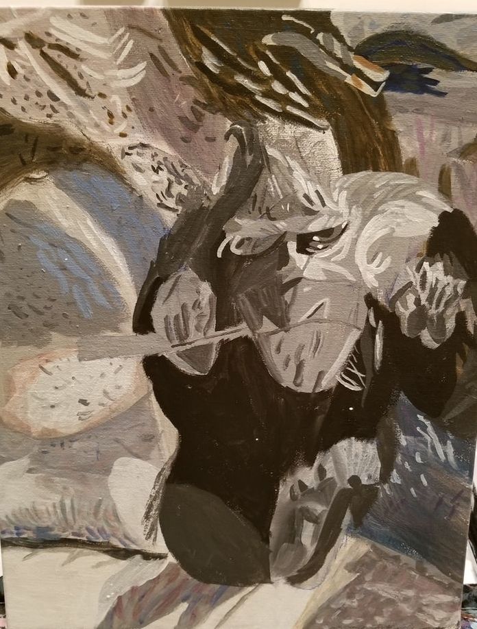 What switching back and forth between light and dark shades meant was that I was frequently remixing colors. But it was okay, because I knew what I was doing. I had a direction where I was going. I would do a few strokes that were darker than my base color and then see another area that was lighter and have to remix in order to paint it. I learned that it really doesn't matter if I use one shade for a long time or frequently move back and forth between lights and darks as long as I find myself moving forward with a piece. So do you always use one shade for as long as possible before switching or do you ever switch frequently like I'm describing. Tell me in the comments.
This post is going to be about not agonizing over color choice. I’ve made posts about color before and in my post “How I Choose Colors”, I said that the first way I choose color s is by what I see. But sometimes it’s not quite clear what I’m seeing. Now don’t get me wrong. Of course I know whether I’m seeing blue, red, green, pink, etc. But it’s not always clear exactly what shade I’ll need to make that color. .The message I want to give today is, that’s okay. I’ll usually have a pretty good guess and I’ll go with whatever my gut is telling me. Since I work acrylics, if the color looks horrible, I can paint over it almost right away. If you’re working in a medium that’s not so easy to paint over, like watercolor for example, you might want to test your color on a scratch piece of paper. Just make sure it’s the same color and texture as the paper you’re painting on, so you’ll get a correct reading  To give a personal example, last night I was painting and I saw that there were blue spots in my reference photo. I’d already used a lot of blue in the painting and I could tell these spots were a different shade. As you might have guessed, I couldn’t tell exactly what shade they were, but I decided to go with prussian blue as the shade that I would mix into transparent mixing white and ivory black to make a greyish blue and it turned out fine If it’s really important to you that the colors are exactly right, you’re welcome to keep repainting until you get them that way. But if worrying about getting your colors exactly right is causing you to enjoy making art less, than I encourage you to lighten up on it a bit. I haven’t personally had this happen, but I have heard if you’re doing pet portraits, some clients will get very particular about the colors and in fact will expect you to get the color exactly right. So if you’re doing a commissioned pet portrait, you might do well to ignore the advice in this video. For the record, you’ll probably need to use at least three or four different colors in any given area before it looks right anyway. Check out my post, “I Use Lots Of Colors” for more on this topic. So how do you deal with color choice? Are you determined to get every color exactly right or do just try to get it as close as you can? Tell me in the comments, please.
|