|
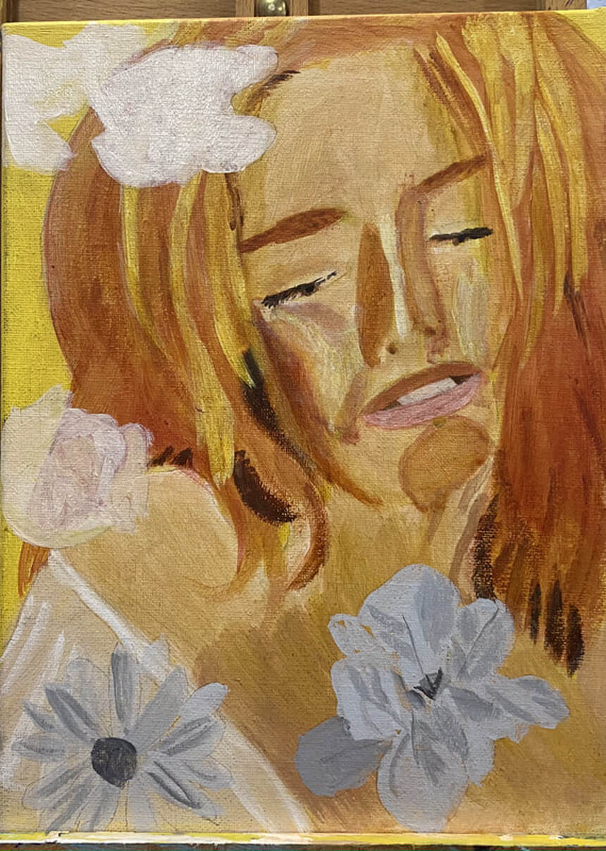
The painting I want to do next requires me to do a smooth wash. I recently practiced this in watercolor. When I was almost finished, I accidentally dropped a big bead of water on the paper and I got a bloom. Now I understand that blooms happen when I get too much water in one area and to avoid them, I need to keep my water even. I wouldn’t have noticed this if I’d been working on a full project. When I'm also focused on all the elements of a piece, there's no way I'm going to see that that unsightly edge was the result of more water being in that part of the paper than the rest. But since all I was focused on were the strokes for this wash, I clearly saw that bead drop and create that bloom. Stripping back to the basics adds clarity This is the painting I want to do, by the way. You can see why the wash has to be so smooth. ;) Also, don't touch your paper while it's wet.
0 Comments
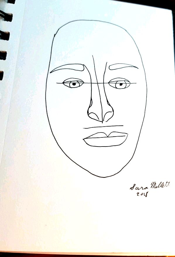
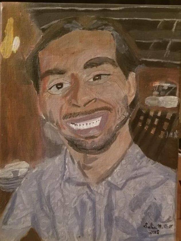
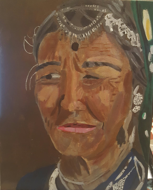
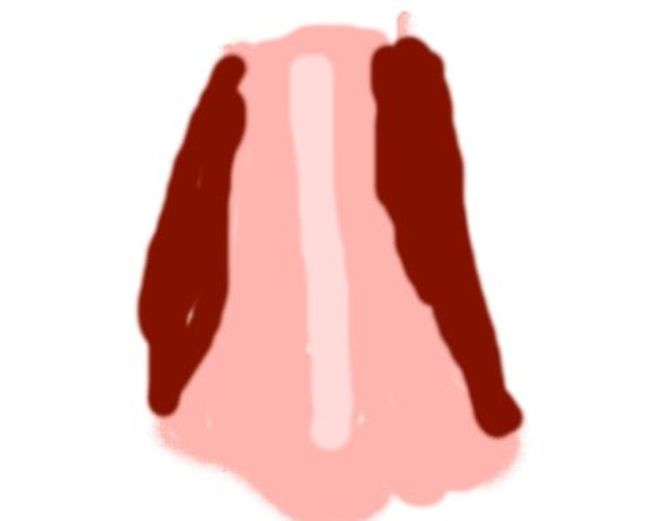
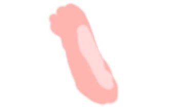
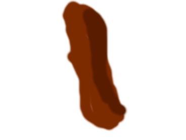
I've made posts about portraits before, but this time, I'd like to make a guide for the absolute beginner to portraits. In an earlier post, I told you about how to apply the golden ratio to drawing a face, but in this post, I'd like to show you a more simplified version of this. Placement Of Features As you can see, all I've done is draw a basic face, then draw a horizontal line at the halfway mark, a vertical line down the middle and another horizontal line at approximately one third the distance from the bottom of my vertical line and the bottom of of my face. I drew my eyes along the top horizontal line, my nose around the vertical line and my mouth along the bottom horizontal line. This keeps everything lined up. I drew my eyebrows right under where the top of the nose was. I just want to note that I used pen because that's what I had available to me and so that the lines would show up. When you do this yourself, you'll use a light pencil so that you can either erase these lines when you don't need them any more or they'll get blended in when you do your shading. You don't always have to use these lines. I don't. I just draw by eye, but they can be helpful for people getting started. It goes without saying, though, if you're going to use these lines, make sure you draw them very lightly. You should be able to erase them easily, or cover them up with your shading. You're also not going to draw the same shapes I drew. You're going to draw whatever shape eyes, nose and mouth that your subject has. Pupil Size I imagine most people probably don't pay a lot of attention to this, but the size of your subject's pupils will send a big message about their mood and demeanor. If you draw your subject's pupil's pinpoint small, like this they'll look angry, disgusted or just shocked. Most of the time we don't want our subjects to look this way, so we want to open up the pupil a bit, more like this. Subjects with pupils like this will look friendly, open, and interested. They will also come across as being generally more attractive. But don't go the other extreme, ie this. If you draw your subject's pupils like this, they'll look like they're on drugs or concussed. Start In Black and White I think the best advice I can give you for when you're getting started on portraits is to start out working in black and white. I'm not saying you need to work in graphite. You can use paint if you'd like, but I think you'll be less stressed if you don't worry about color for a bit. Working in black and white will help you to perfect your shading and your highlighting. This brings me to my next point... Pay Attention To Value Here are some examples of portraits I've done and where I put the shading and highlighting. In these two, I put shading only on the left-hand side of the nose. In this one, I put shading on the top and bottom of the nose, but nothing in between. It's not about a streak of highlight down the middle and blocks of shading on the side, like this, Also, you'll find that most of the time, you'll get the best results if you layer your shading and highlighting. I hope you find these tips useful. If you use them and want to share your work with me, please post it to social media and tag me. I'm Sara Makes Art on Youtube, Facebook, and MeWe and @_saramakesart on Instagram.
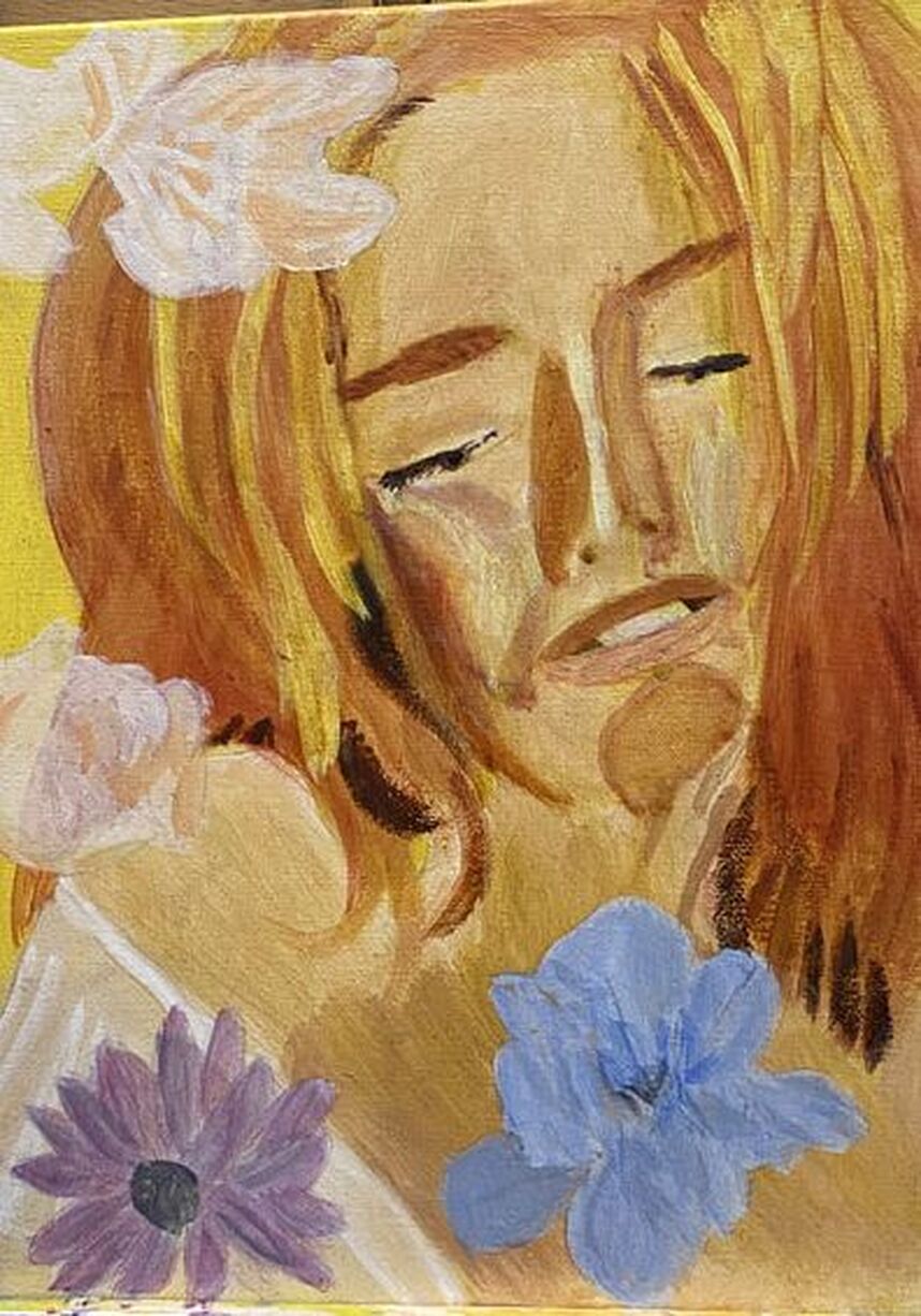
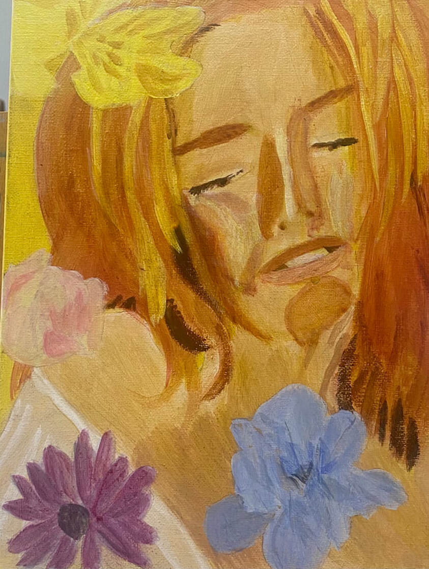
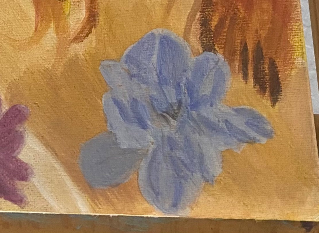
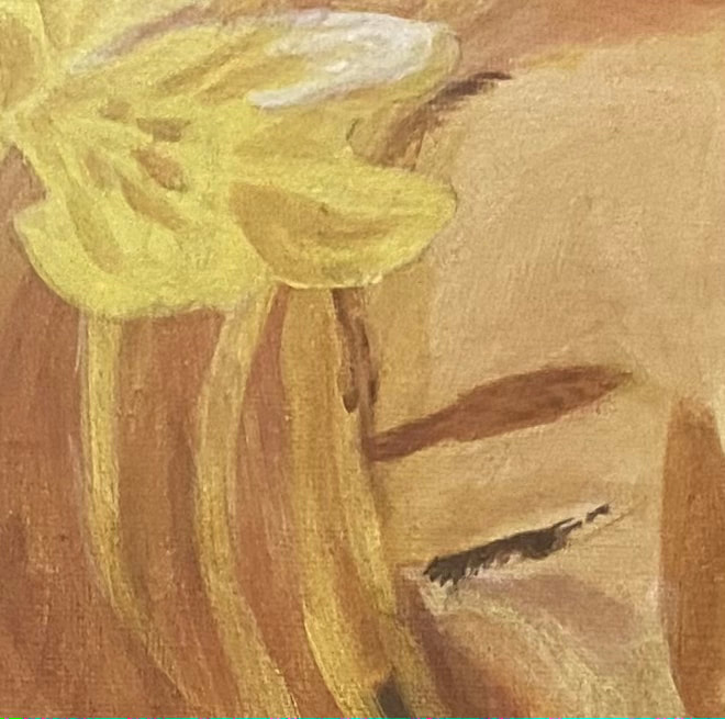
I knew I wanted the blue on the one flower to be very light. I obviously over did it, though, because when I put that first layer on, I could hardly see any color at all. It needs to be darker than this, I thought. I couldn’t fix it right away, though, because that first layer had to dry. My other flower is somewhere between pink and purple. My plan was to mix red into the blue that was already on my palette. I knew the cadmium red medium I’d been using wouldn’t work. I needed a bluer red, so I chose carmine, from the Amsterdam line. The color I came up with didn’t exactly match the reference photo, but that didn’t matter to me. Getting back to that blue flower, it took two more layers, both times adding more ultramarine blue into my mixture, before the I started to be satisfied with the color that I was seeing. Maybe this is a lesson that even if I think something should be extremely light, it might be better to go a little darker than what I think something should be. I mixed purple with my yellow for the shadows on the flower in the top left-hand corner.I needed to be careful when painting the pink on the rose, so as not to cover up all of the yellow. I needed some of it untouched and I’m always nervous when doing stuff like this. I look back at my reference photo every time I finish painting one patch to see where my next one should go. I used a couple different shades of pink, as you can probably see. I painted shadows on the blue flower by mixing blue with orange. What stood out to me when looking at the yellow flower was the white highlight on it.
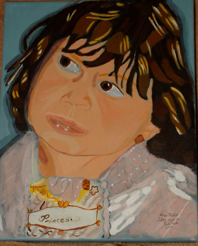
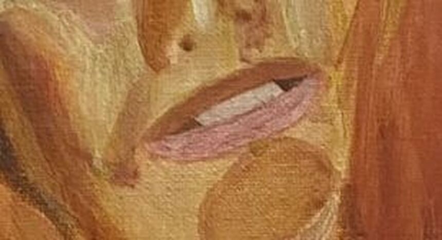
For the flowers, I drew them onto a separate piece of paper and transferee them onto the canvas using tracing and transfer paper. When I was getting ready to transfer the flowers, at first I thought, oh no, I’ve made them too big! I made it work, though, by spreading the flowers around the subject. I’m leaving one out, though, because I think to include it would ruin the balance of the composition. One of the flowers is yellow, one is yellow and pink, one is blue, and the last one is purple. For the blue flower and the purple flower, I’m using a gray toned underpainting and for the yellow and pink and pure yellow flower, I’m using a sepia toned underpainting. I want to talk a little bit about her mouth. I did not use white for her teeth, nor did I use black for the space around them. For both of these, I actually used a combination of burnt Sienna and raw umber. I just mixed it with white for the teeth and black for the inside of the mouth. Using straight black or white for these things would’ve looked totally unnatural. Now that I think about it, I might bring some of the colors from the flowers I'll be painting into the teeth also. I'll discuss that in next week's post.
|
Sara MillettPainter of portraits and wildlife Archives
November 2023
Categories
All
|
