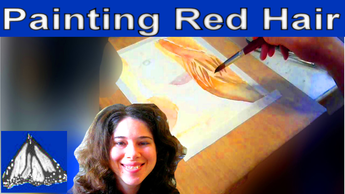
 Here’s my painting, “Couple In Costume At Balboa Park Centennial”. 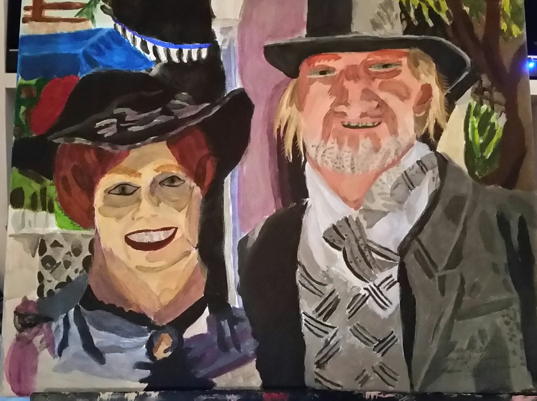 I want to direct your attention to the woman’s hair that’s peeking out from under her hat. 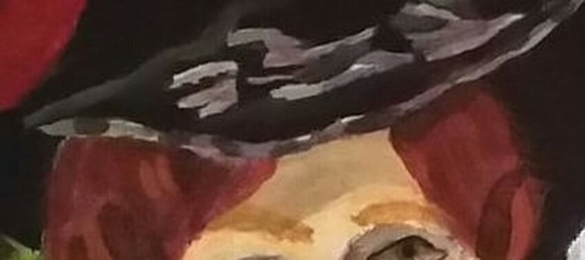 Working on this painting was the first time I had to paint a subject with red hair. I knew I couldn’t use red out of the tube. That wouldn’t look natural at all. I went out on a limb and decided to mix green into the red and it worked. That was pretty easy. So, just as we mix purple into our yellow when painting blonde hair, since purple is the compliment to yellow, we mix green into red when painting red hair, since green is the complement to red. But, we have a problem. We can’t just use a red and green mixture for this woman’s hair 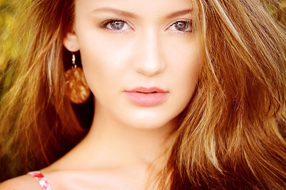 because her hair has a golden cast to it and just using red and green would look too dark and severe. Obviously we need another color in there, but which one? The obvious choice is yellow. The only problem though, is that if you mix yellow with red, of course you just get orange and I don’t want plain orange here. I want a color you won’t see in a crayon box. What if I mix yellow ochre into it instead? Okay, since writing that last paragraph, I've done some color mixing experimentation. Here are the results. 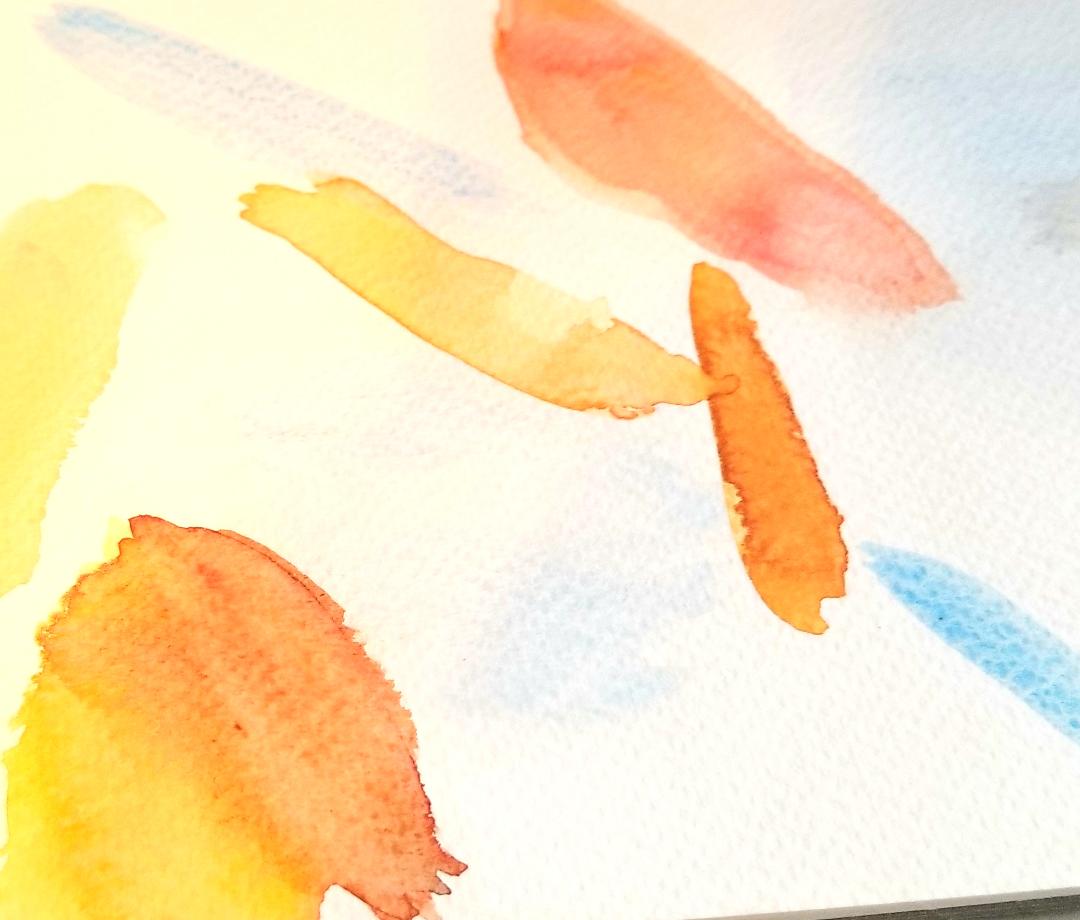 I feel the mixture that gets closest to what I'm looking for is a combination of red, green, yellow ochre, and yellow. Now that I think of it, maybe it would look even better if I mixed purple into the yellow also. In addition to the proposed green, red, and yellow ochre mixture, I also tried just mixing burnt sienna, a reddish brown, with yellow. 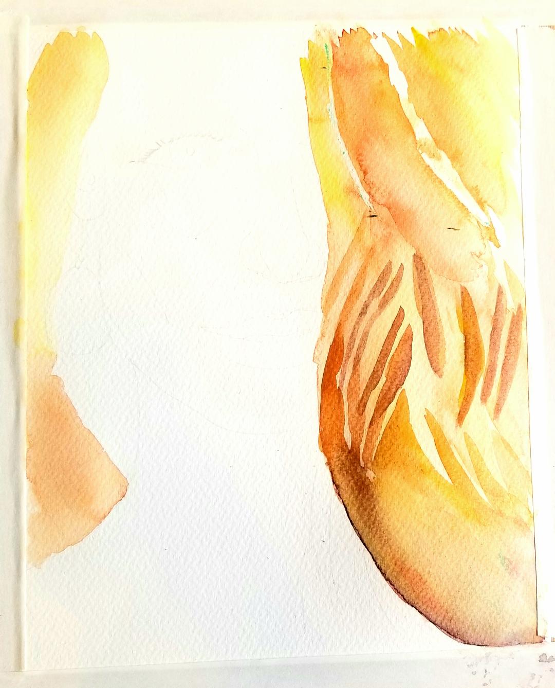 I started by laying down my shades using wet into wet. I didn't think the darker shade was red enough, so I mixed red into it while the paint was still wet and was careful to blend it so it would stay subtle. When I was done laying my shades in, while I thought what I had creator was pretty, I didn't think it looked like hair. After, I layed those strands down, I thought they looked pretty purple, so I glazed yellow over them to tone that down and finally glazed red over them. It started to come together, though, once I added my darker pieces in over the dry paint. Then the lighter parts started to take shape, too. It's kind of like making negative space work for you, even though this space wasn't exactly negative. When I was working on this, I felt like my darker shade, which was a combination of burnt sienna and yellow, by the way, wasn't quite red enough, so I actually layered more red into it. I did this while the paint underneath was still wet, which allowed me to blend the colors on the paper. By having just a touch of the color on the edge of my brush and utilizing the water on the paper, I was able to make the red subtle enough not to overwhelm. 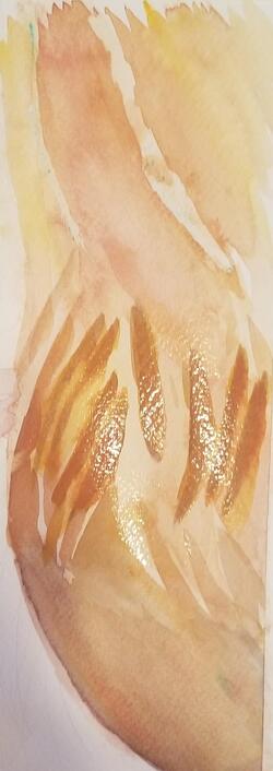 Watch me in action painting this in the video below. Get your hands on the products I used in this article and video. The links provided are affiliate links. If you buy from them, I get a small percentage at no extra cost to you.
Amazon affiliate links Winsor and Newton Cotman watercolors https://amzn.to/2DNdt9f Royal Talens Van Gogh watercolors https://amzn.to/2LlWbGc Fabriano Studio 140 pound cold press watercolor paper https://amzn.to/2H0XwOz
0 Comments
 To paint blonde hair, you might want to just paint it yellow, and you would be mistaken. Some blonde hair, in fact has little to no yellow. Regardless, you're going to want to mix your yellow with purple to tone it down. 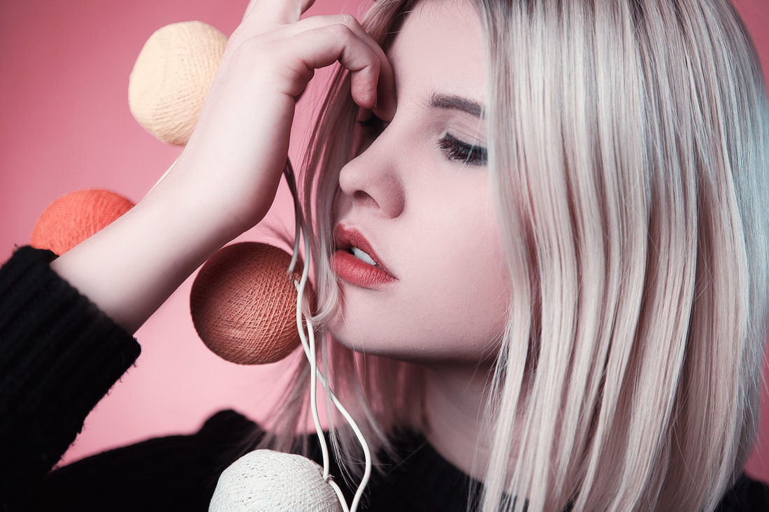 You'll also notice, in this reference photo, that while this woman's hair is pretty light, there are some very dark parts to it too. Getting that variation in is important. Now that I'm looking at it again, I even see a little bit of blue in this woman's hair. It's subtle, but it's there. Note: Okay, I realize this model's hair is probably dyed, as evidenced by her dark eyebrows, but I really like the shade. Beyond that, I love the angle she's at and the position her eyes are looking, so I really wanted to use this photo. 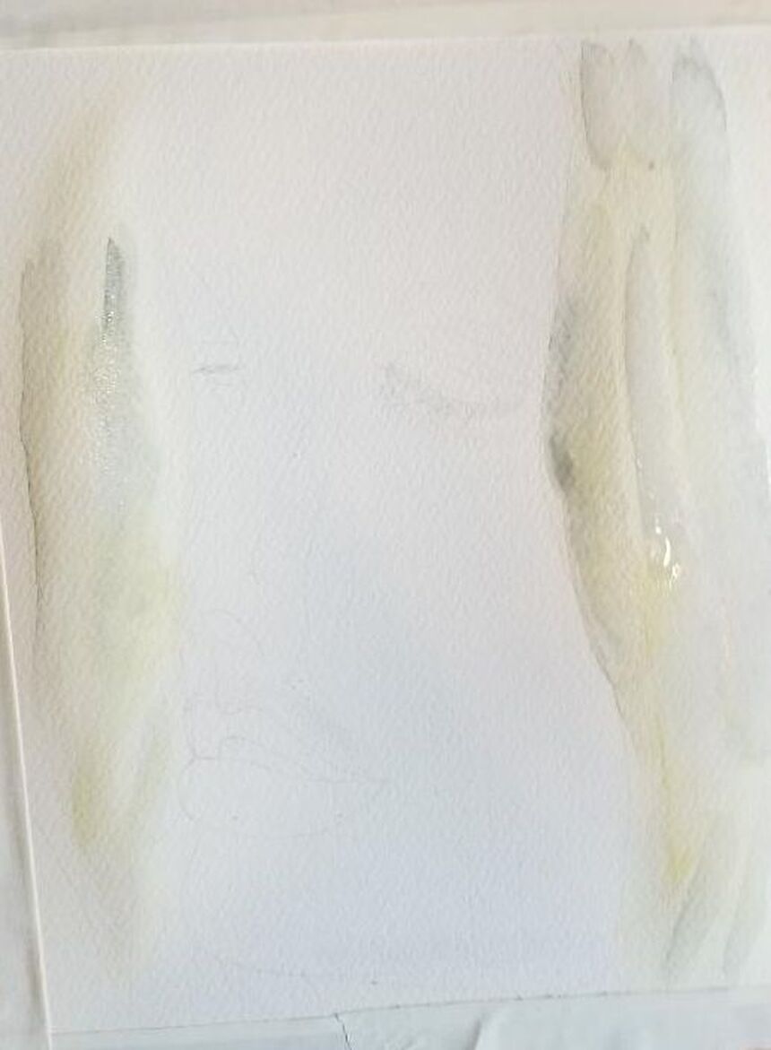 The first thing I did before painting this was wet the paper. That way, I could utilize the water on the paper, as well as the water I mixed into the paint on the palette, to get the super light color I was going for. After I got the base tone down, I dipped my brush back into the same yellow mixture, and with less water mixed in it now so it would be darker, I painted "lowlights" or parts of the hair that are darker than the base. This helped give the hair texture. Remember I said I noticed some blue in it? Well, I mixed some black into the prussian blue that was already on my palette. I was going to use this, until I remembered a very important rule when painting portraits. When using bright colors, blue, red, etc, always mix the color with it's complement. You want to use muted versions of these colors. So I mixed a bit of orange into the blue. Then I used a filbert brush to paint streaks of it on top of the yellow. I did all of this with the surface wet, so my edges would be soft. If you were doing this in oils or acrylics, the process would be pretty much the same, except you would use white to lighten and blend out your edges with your brush as you went, instead of relying on the water to do the lightening and blending for you. 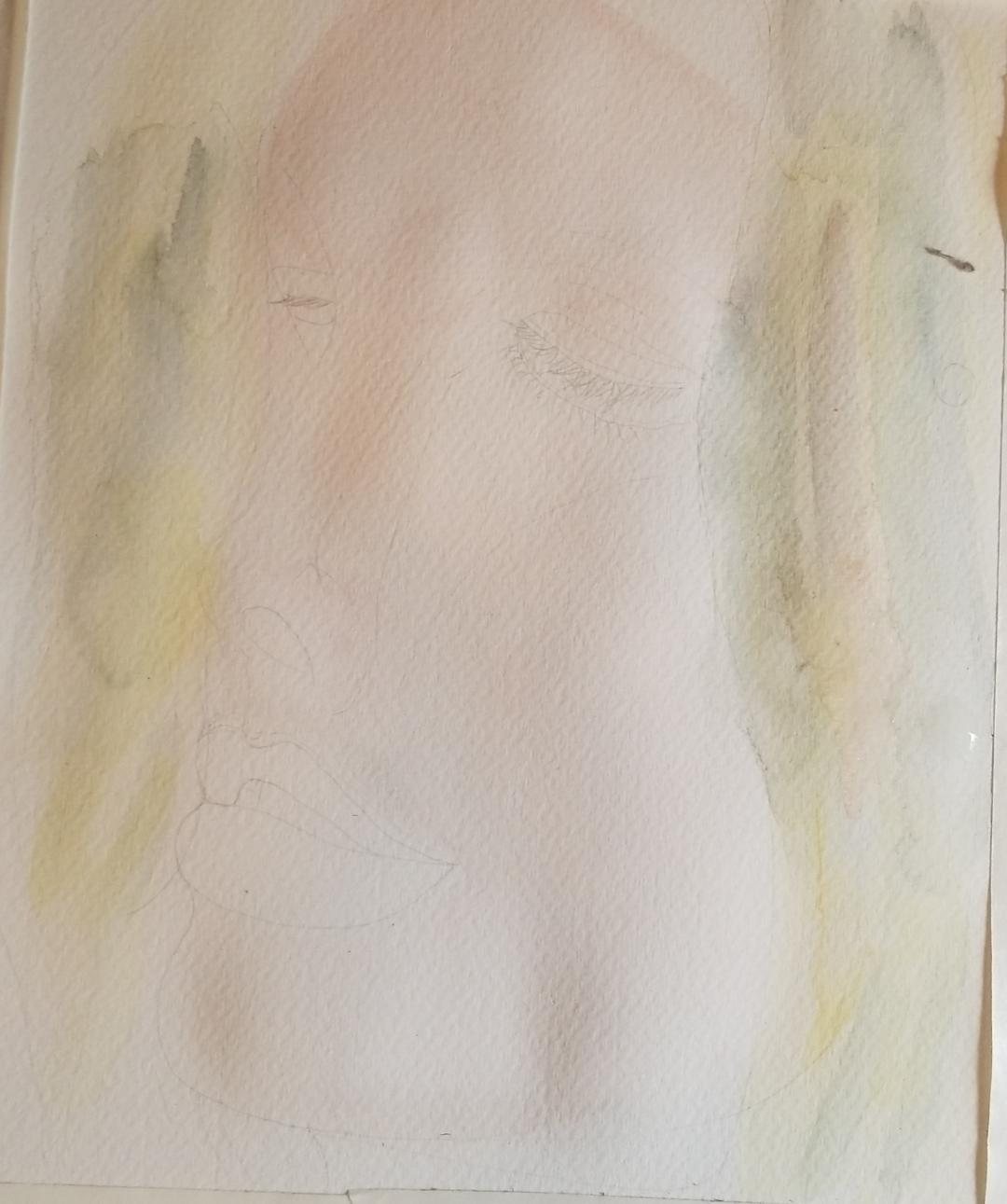 When I looked at the painting again and compared it to my reference photo, I noticed that I painted one of the blue streaks too thick. Now, watercolor isn't easy to paint over, but I'm going to try layering over the blue with orange to neutralize it(which I did) and then painting over that with my yellow mixture. I also noticed that the yellow overall was too bright, so I layered more purple over it. 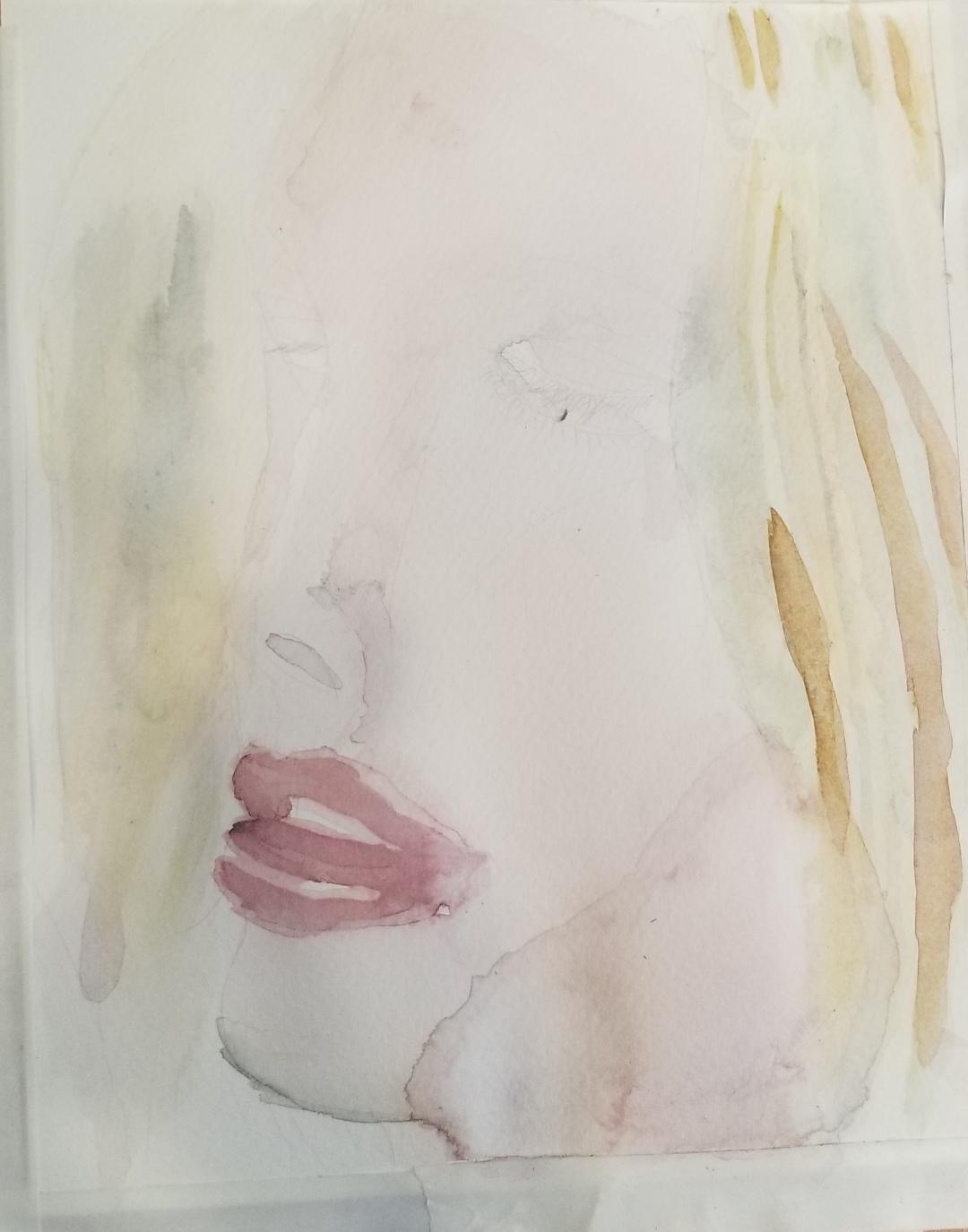 Even in this woman's very light hair, there were some parts that were actually pretty dark. I mixed the blue that I'd used for the blue highlights into some burnt umber and then mixed that into the same yellow mixed with purple and, using my smallest filbert brush, painted on the streaks that you see. I was careful to make sure the streaks were the right shape, which is tapered at the top and getting thicker going down, and at least approximately in the right places. If you just put in streaks randomly, it won't work. 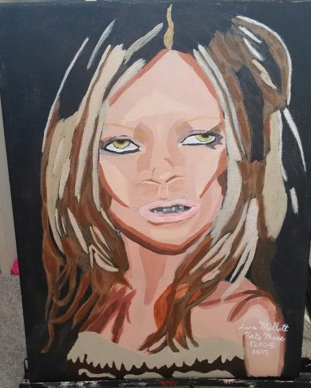 ref photo by Evan Agostini used with permission ref photo by Evan Agostini used with permission Here's my painting, "Kate Moss(2005)". Doing this painting was actually the first time it occured to me to mix purple into the yellow to make it more natural looking. 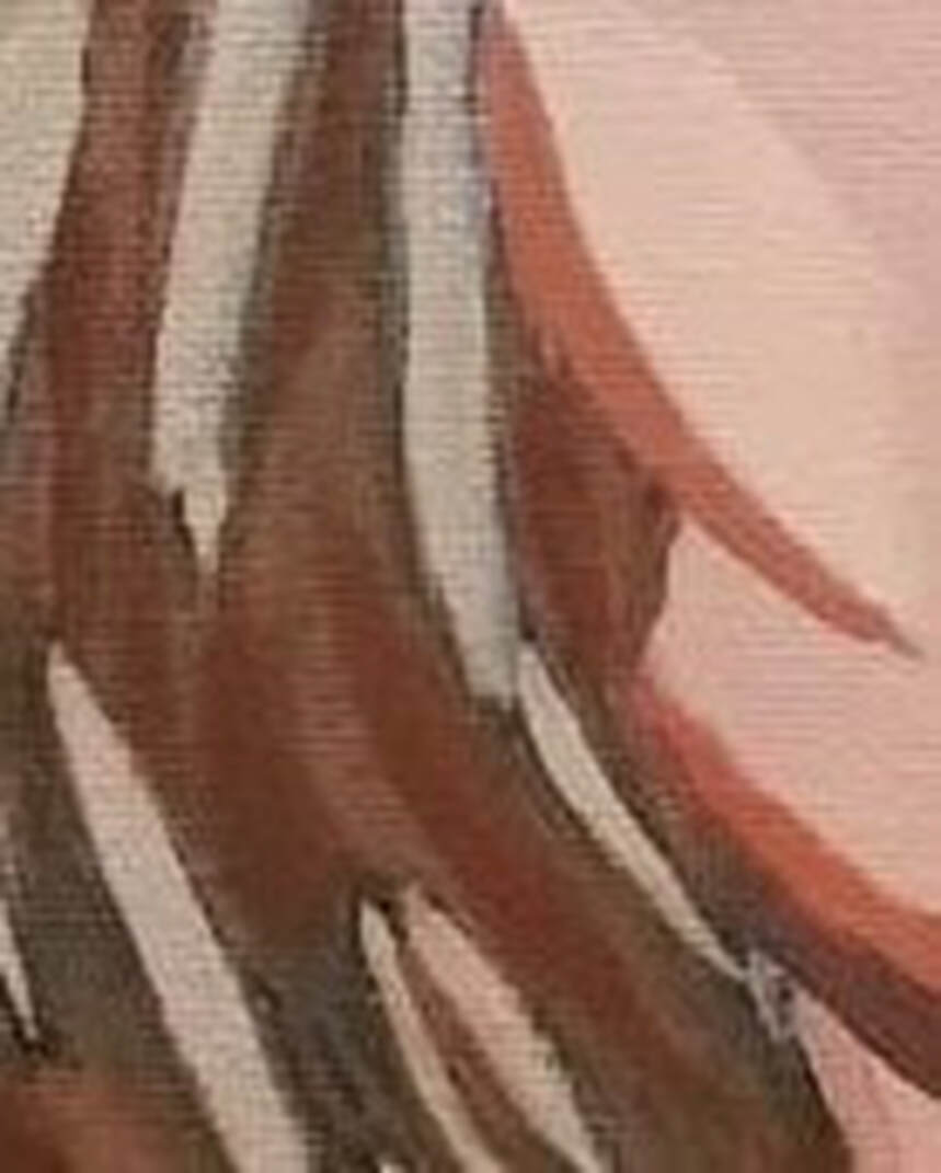 But you can see for her under layers I used burnt sienna, which is pretty dark compared to the yellow. You can watch this process in action in the video below. Here are Amazon Affiliate links for the supplies I used for this painting. If you buy from these links, I get a small percentage at no extra cost to you.
Amazon affiliate links Winsor and Newton Cotman watercolors https://amzn.to/2DNdt9f Royal Talens Van Gogh watercolors https://amzn.to/2LlWbGc Fabriano Studio 140 pound cold press watercolor paper https://amzn.to/2H0XwOz  My mom loves turtles and the beach, so I decided to combine them in this fantasy painting I made for her for Mother’s Day. In this post, I’m going to discuss some principals I took advantage of for this painting. For the baby turtle’s shell, I chose to use warmer colors, ie, a golden brown, to represent youth, while for the Mommy Turtle’s shell, I chose to use a more grayish brown to represent maturity. To me, these turtles represent my mom and me. Now, for some reason, I really love painting patterns on turtles' shells and I just realized that as I was working on this article and video. While I'm pretty loose with small patterns, such as the scales on the head, where I just try tp follow the general pattern, for the shell patterns, I try to get as close to the reference photo as I can, both in terms of shape and how close the colored spots are to eachother.  Speaking of the pattern on the turtle's head, I could see in my reference photo that the scales were largest at the front of his head and got smaller going back toward the neck, so I mimicked that in my painting  For the waves crashing onto the beach, I used blue and purple. I shook my wrist slightly as I painted so the lines would come out a bit zigzagged. The last thing I wanted was straight harsh lines. I wasn't too concerned about keeping things neat. In fact, I wanted things to be a bit messy and wild here. I repeated the blue and purple them in the sky and used similar brush strokes. I masked off bits of the sky with masking fluid so they would stay white. I put a wash of very watered down blue over all the parts that were not going to stay white or have the darker blue or purple on them. In the patch in the far left, some of the strokes ran together unintentionally. At first, I thought, oh, no, but over time I've come to like the effect I've achieved.  Mixing black into the same color I used for the base color, with very little water mixed into the paint and with the layer underneath dry, using a small brush, I painted wrinkles on the Mommy Turtle's neck.  When I started to paint the sky, I blocked most it in with a darkish blue, but left big chunks white. I didn't bother with masking fluid at this point, because these spots were big enough to paint around easily. When it came time to paint those parts, though, I did put down some masking fluid because there were tiny areas that wanted to make sure stayed white. As for the areas surrounding them, I wanted them to be lighter than my base color, by quite a bit. I mixed water into my paint to lighten it, but it still wasn't light enough for me, so I dabbed it with a tissue. I find it really cool how you can manipulate the value of watercolor paint by how much water you mix in to it. If I want to lighten a color when working in acrylics, I actually have to get out white paint and mix it into the color I want to lighten, which takes more time. In this sense, watercolor lets you be a bit lazy. But then, maybe it's just giving you a break from all the painstaking work you had to do else where, such as making sure every line is in place in your drawing, and making sure every color is just where it should be, not stopping too short, or going too far. To learn more about how I did this painting, watch the video embedded below. 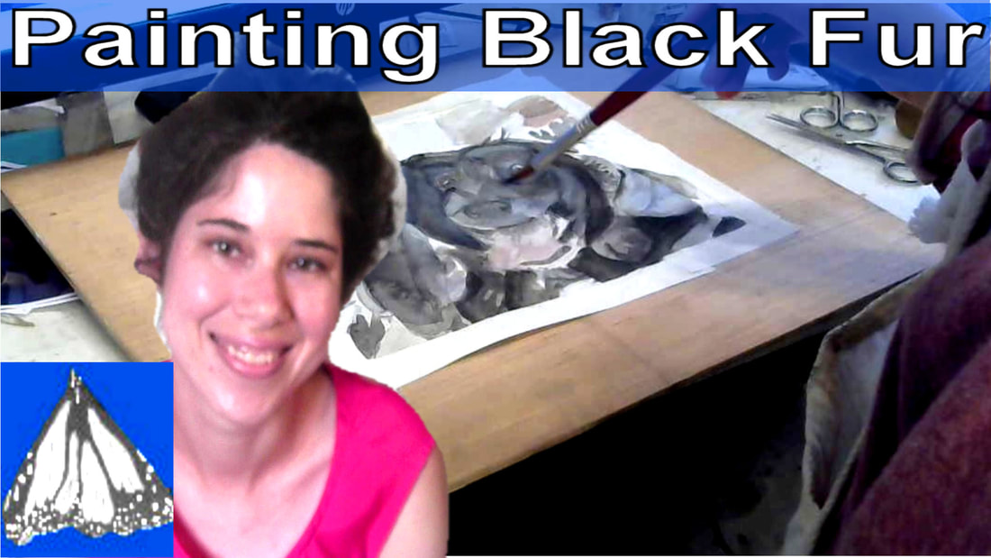 In the past, I've made videos about painting black hair and also about coloring something that's black in general. I thought why not add to that series and cover black fur on animals. For this demonstration, I'm going to be using this dog. 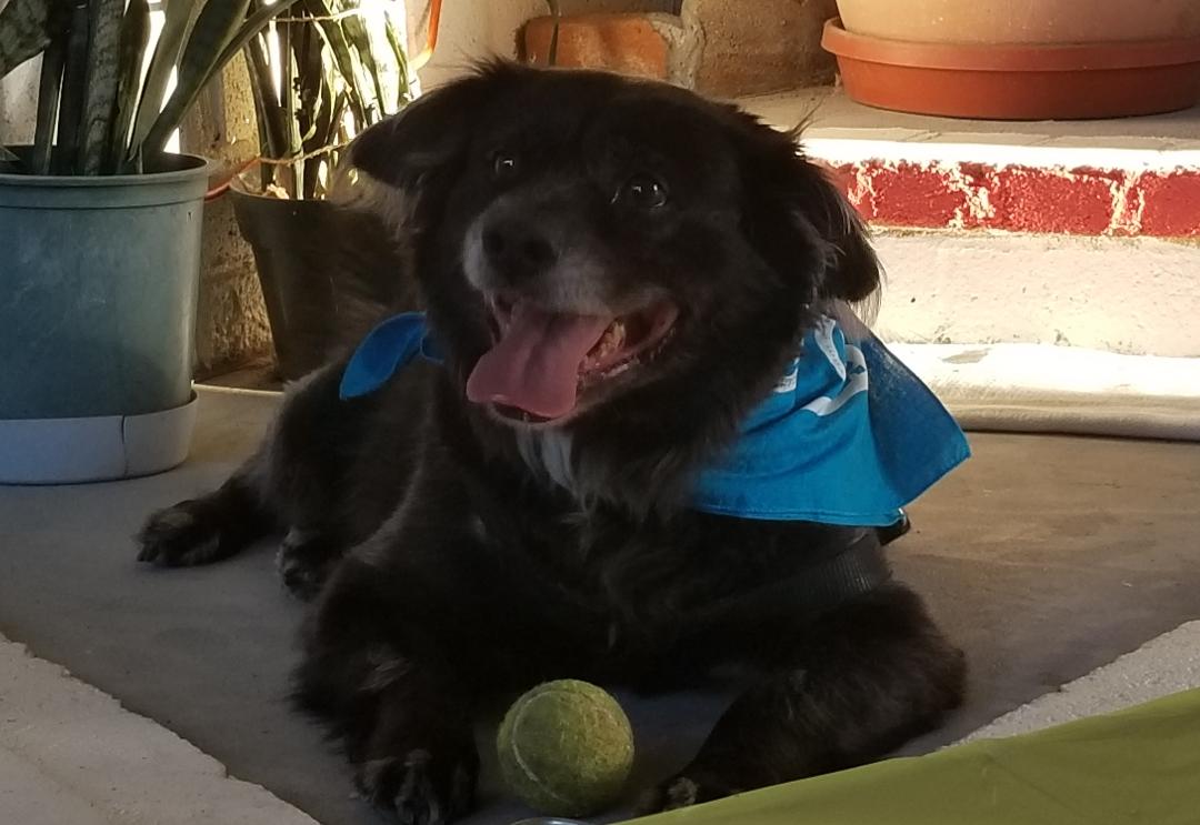 Now, as I said in my video on painting things that are black, you almost never want to start with straight black. This looks very severe and because you can't get any darker, you have no way to paint shadows and so whatever you're painting will look flat. If you really look at this dog's fur, you'll see it's really mostly shades of gray, brown, and blue. I can even see some purple in it. Very little of it is really truly black. I'm not accustomed to doing this, but if you like you can use a color picker tool to help you find what colors are really in something before you start painting. Here are a couple videos that explain how to do that. From Amie Howard Art From Lachri Fine Art I started by taking some blue that was already on my palate and mixing it into some black so it would more grayish and muted. I applied this as a wash all over the dog's face, except for the darkest parts. Over those, I layered brown mixed with black, and finally, straight black. 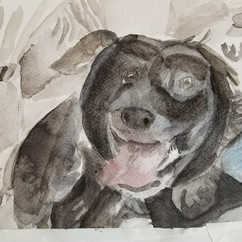 I thought the blue was too light and obvious, though so I built it up to darken it and make it more subtle 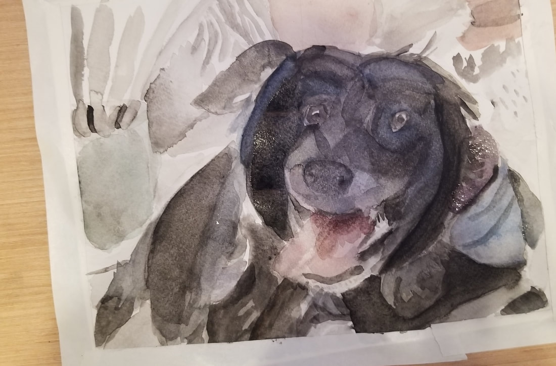 So why the blue? Well, like I said, I can't start with straight black, because than I can't add my shadows. I always need to start with a lighter color. Now, when it when you're looking for a lighter alternative to black, the obvious choice is gray. But, I try to avoid gray with animals, because it can make the animals look old. Using a bluish gray also gives a nice sheen to the animals fur. Amazon affiliate links (If you buy from these links, I get a small percentage of the cost.) Winsor and Newton Cotman watercolors https://amzn.to/2DNdt9f Royal Talens Van Gogh watercolors https://amzn.to/2LlWbGc Fabriano Studio 140 pound cold press watercolor paper https://amzn.to/2H0XwOz |