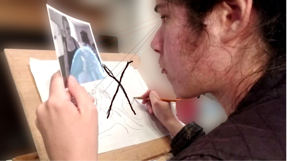
 Drawing while only looking at your subject and not your paper can actually imprint that subject in your mind better than either just looking at it alone, or drawing while looking at your paper would. You will be tempted to look back at your drawing to see how it's coming along, but don't. Also don't be embarrassed if you're drawing comes out looking super ridiculous. The point is not to make a great drawing. If anything, just try to laugh at it. You can see the process of doing a blind contour and hear more of my thoughts in the video below.
0 Comments
Sometime ago I was inspired by this video to try blending oil pastels with OMS(odorless mineral spirits or odorless paint thinner. The way it works is I dip a brush into the paint thinner and either stroke it onto the pastel stick or rub the stick onto my palette and stroke the oms dipped brush onto it, and "paint" the pastel onto my paper with the brush, rather than simply rubbing it onto the paper straight from the stick. I'm using 140 pound hot press watercolor paper from Fabriano Studio for this project. I chose to use watercolor paper because I need a paper that I can get wet without it warping and I chose to use hot press, rather than cold press, because it gives me the smooth surface I want. It would be impossible to get the pastel into all the nooks and crannies of the cold press paper, giving me a bumpy look. So far I've painted lashes with a liner brush, 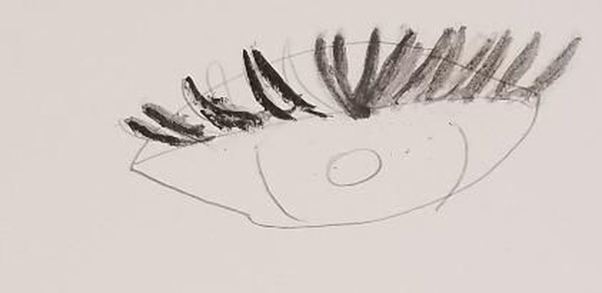 creating a flesh tone by mixing raw sienna, white, and red pastels with OMS and a brush, 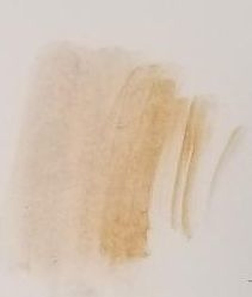 painted thin lines with black pastel, OMS and a liner brush, just to see if I could, 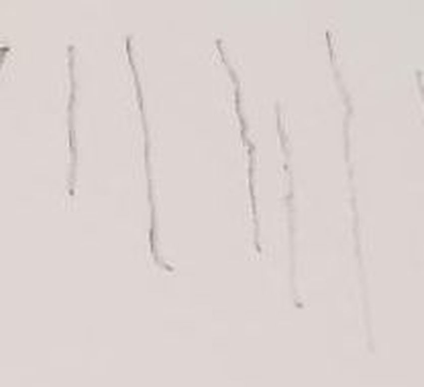 and mixed violet and purple. 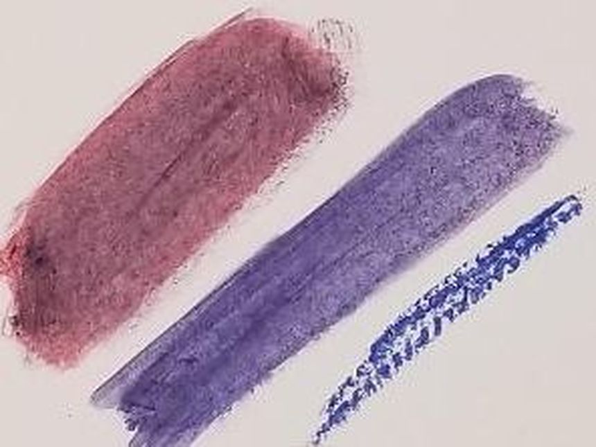 What I've Learned In doing this I've learned that by stroking the pastel onto my palette and dipping my brush with the OMS into that, I'm able to get much more pigment onto my brush than by stroking the brush with the OMS directly onto the stick. I found I can get a much truer, more attractive CVolir by blending out my pastel layers with paint thhinner than I can by layering alone. 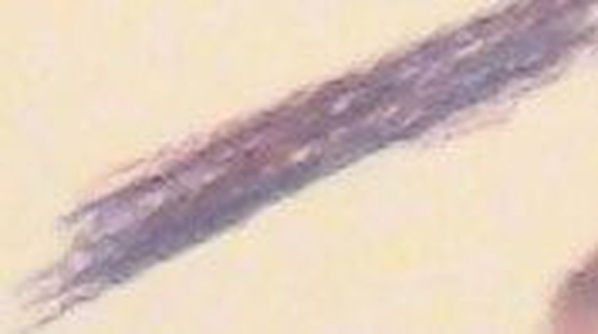 This is my purple made from layering blue and red pastels before blending out with OMS 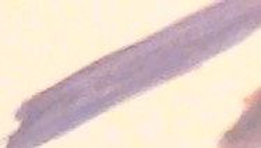 This is that same mixture after I blended it out with OMS I also have to keep in mind that the things I learned about tthe unequal strengths of colors while working in acrylics also applies to pastels. That means that if I want to make orange, I have to put down my yellow more heavily thsn my red, otherwise the the red will take over because it's such a strong color. I decided to try out how rhe principal of toning down colors with their complements would work when OMS was added into the mix. I set about trying to create a muted yellow by mixing it with its complement, purple. All I ended up getting, though, were varying shades of purple. I demonstrated in my first youtube video about working with oil pastels that purple is much stronger than yellow andI huess I underestimated just how much stronger it was. Just a little more than a dab of the purple can completely take over the yellow. |