|
I made a video on this topic years ago when I started my youtube channel, but I think it’s time for an update. First, I’m going to give you a brief overview of what shading and highlighting is and why artists do it. All shading and highlighting is adding a darker shade of your base color, shading, and a lighter tint, highlighting, in order to make a feature stand out, give something texture, or just give something more depth. If you're working with graphite, charcoal, or watercolor, your highlight may very well just be the white of the paper. I’m going to go over some of my paintings and give you examples of how I used shading and highlighting. 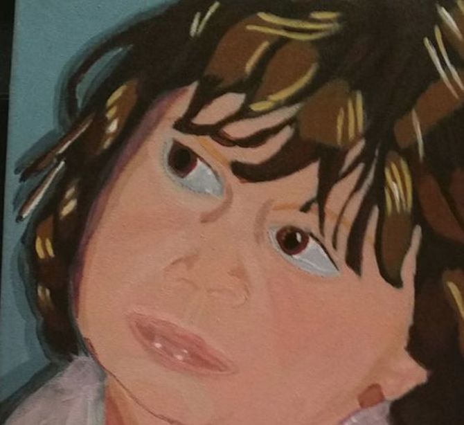 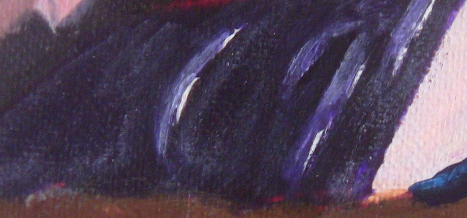 As you can see, in my painting "Little Girl In Pink Satin, I added a darker shade around the sides of her nose and a lighter tint along her cheeks and philtrum. I added shine to her lips by painting bright white highlights along them. You can see how adding such bright highlights helps create shine even more in the bottom photo, which is a close up from my painting "Woman With Cabinet". As for where to put your shading and highlighting, I really can’t tell you that because it will change every time. You really just have to study your reference photo or model closely. Speaking of reference photo, if you want to make a detailed painting or drawing with actual depth, it’s imperative that you photo you work from not be taken with a flash as that will blow all the details out and make everything look flat. That’s probably the reason why working from photos gets such a bad rap from art teachers. That's all for now. I'll talk you again next time.
0 Comments
This post will focus on this parrot. 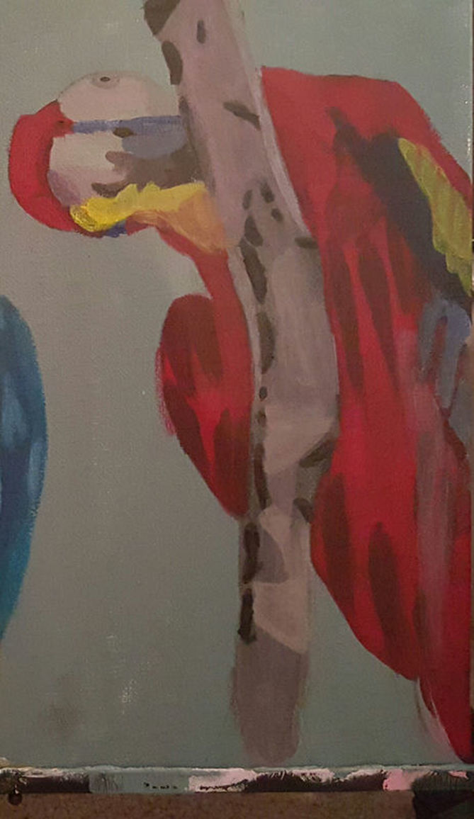 This is another subject that came together in a snap. I used cadmium red deep for the majority of the parrot’s body. I mixed ivory black into that for the shadows. I used cadmium yellow medium and ultramarine blue in the wings. 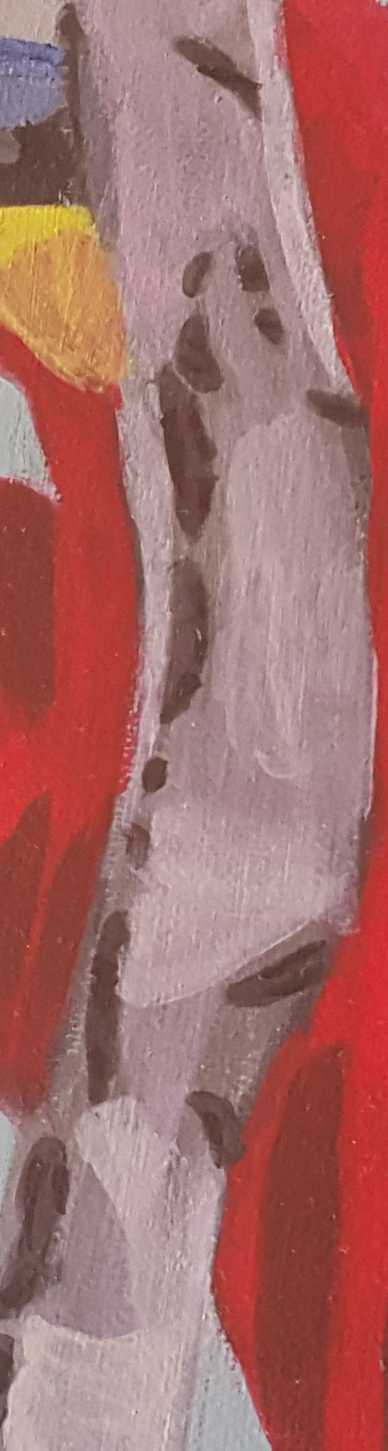 This may sound strange, but I used lavender on the tree branch, just one layer, letting the grey of my underpainting show through. Sometimes it’s better to do less. I also used purple in the parrot’s head. 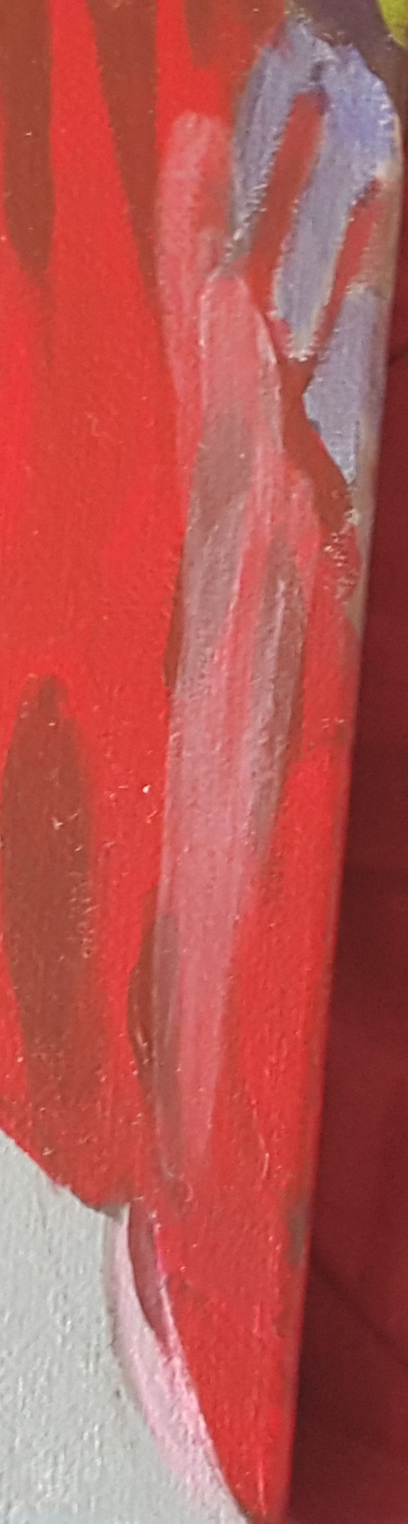 I also put a single layer of thinned down pink on some parts of the parrot’s body That’s all for now. I’ll talk to you again next week.
Many creatives have praised social media for being an avenue to sell our work and make a living without relying on the more traditional path of things like galleries or record labels. Basically, it allows us to not have to rely on another person to decide we're good enough to sell to buyers. But I was thinking of another benefit of being on social media, and having a blog like the one I'm writing in now and that's that it helps creatives eliminate excuses for not doing our job, Heck, for freelancers, social media is part of our job, since it's essential for getting ourselves out there, which in turn is essential for getting paid. If you're reading this post, there's a chance you found it linked in a newsletter and if that's the case, you will have seen an in progress or completed photo of whatever piece of art I'm working on this week. The desire to provide others with photographic evidence that I've been working, either in a newsletter, or on sites like Instagram or Facebook is a big motivator to work on my art everyday. If I had to tell my newsletter subscribers that I didn't have any photos of art to show them, because I hadn't been making art that week, I would be very embarrassed. After all, it would be pretty strange for someone who claims to be an artist, to not have been making art. Back to this blog itself. I truly believe if I wasn't consistently making art, and therefore constantly thinking about it, I wouldn't be able to come up with enough ideas for keep writing blog posts every week, in addition to the ones I copy over from my Wordpress account. If you're a creative and don't keep a blog or have any social media accounts, I encourage you to start one and create some and make at least a weekly commitment to post in them. I think you'll be amazed at how much your productivity will increase. That's all for now. I'll talk to you again next time. This post will focus on this parrot. 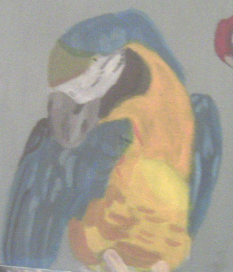 Over a gray toned underpainting, I layered cyan blue, ultramarine blue mixed with that and black over the wings. 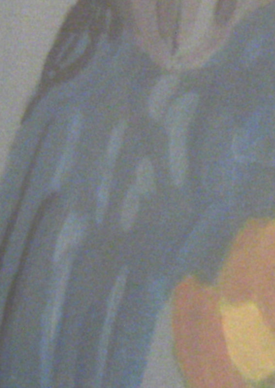 I layered azo yellow light, cadmium yellow medium and orange over the chest. For the darkest shadows, I mixed raw sienna into the orange because I saw they were a bit brownish. I thought the color looked too pink on the palette, but when I put it on the canvas, it looked perfect. 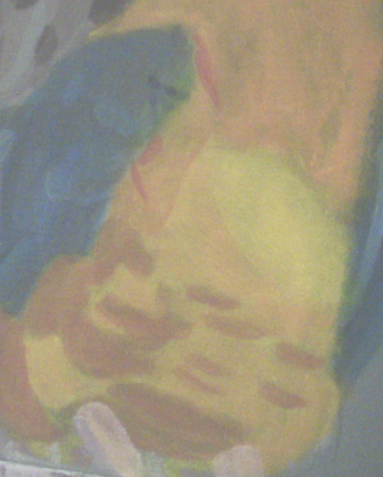 I used touches of purple in his feet.  For the branch he's sitting on, I used titanium white, a pale purple made from mixing titanium white with a touch of dioxizine purple, and touches of azo yellow light. At first glance the patch on his neck may look stark black, but it actually has bits of olive green and purple in it as well as black.  There are the main highlights of painting the first half of "Hey Over There". I'll see you again next week with highlights of painting the second bird. Bye for now.
In this post from her website, Amy Schmittaur of Savvy Sexy Social, shares the necessity of doing free work in order to get paid work. I want to launch a service of making and selling hand painted cards. Before I can officially offer this service though, I have to make several cards, that I don't know whether or not they will sell in order to give people a visual. 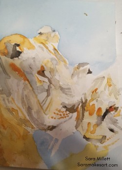 Although I don't need clients to make these sample cards for, I also have to do work that may never make me any money in order to show potential clients or buyers. Those of us who work for ourselves don't need a degree to get work. What we do need is examples of work we've already done in the field we're trying to break into. This shows a potential client what they can expect from us. People are very possessive of their money and they want to know what they're going to get for it. Eventually we need to organize these examples into a portfolio, but that could be another post entirely. Creating these work examples will inevitably involve doing some work for free whether for clients or not. People need to see the kind of paintings I make before they're going to hire me. If I want to sell paintings, of course I need to work in order to have something to sell. I want to put a disclaimer here. By no means am I saying you should let people suck free work out of you. You are the one who decides when you will work for free, no one else. All I'm saying is that if your goal is to make a living at something you must do it consistently no matter what, and you must have things to show people before you even launch your business or a new addition to your existing business. I think I've made my point. That's all for now. I'll talk to you again next week.
I finished a new drawing! This one is an 11×14 graphite on Strathmore 400 series drawing paper. It depicts my family’s dog, Lady, standing in front of our doorway, hence the title. Lady was running around a lot as I was taking pictures, but when she got in front of the doorway, I thought the scene would make a beautiful piece of artwork, so I seized the opportunity and snapped the pic. 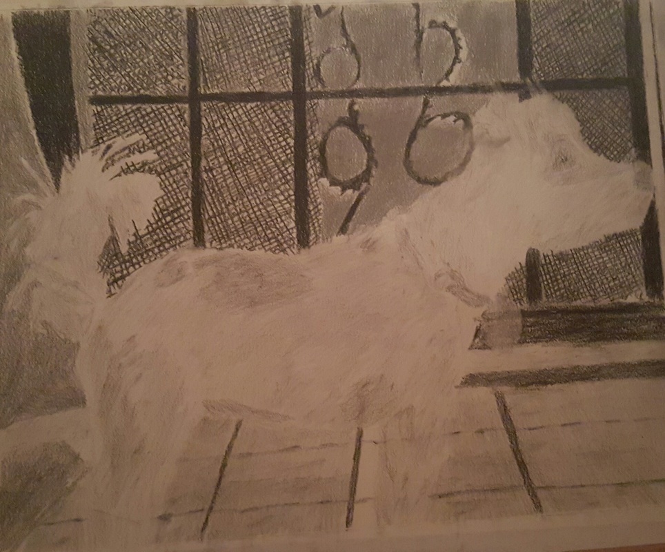 This drawing, like all of my drawings now, started as an outline made with a 6h pencil. I drew the background first and then drew the subject over it, instead of drawing the subject first and drawing the background around it. I made the pattern in the door using a 4b carbon pencil to make crisscross lines and then fill in the spaces between the lines and the circles I’d drawn. I had to fight with myself to make this pattern because I thought it would be too much work, but it turned out to be worth it. Like I said, don’t be afraid of hard work. 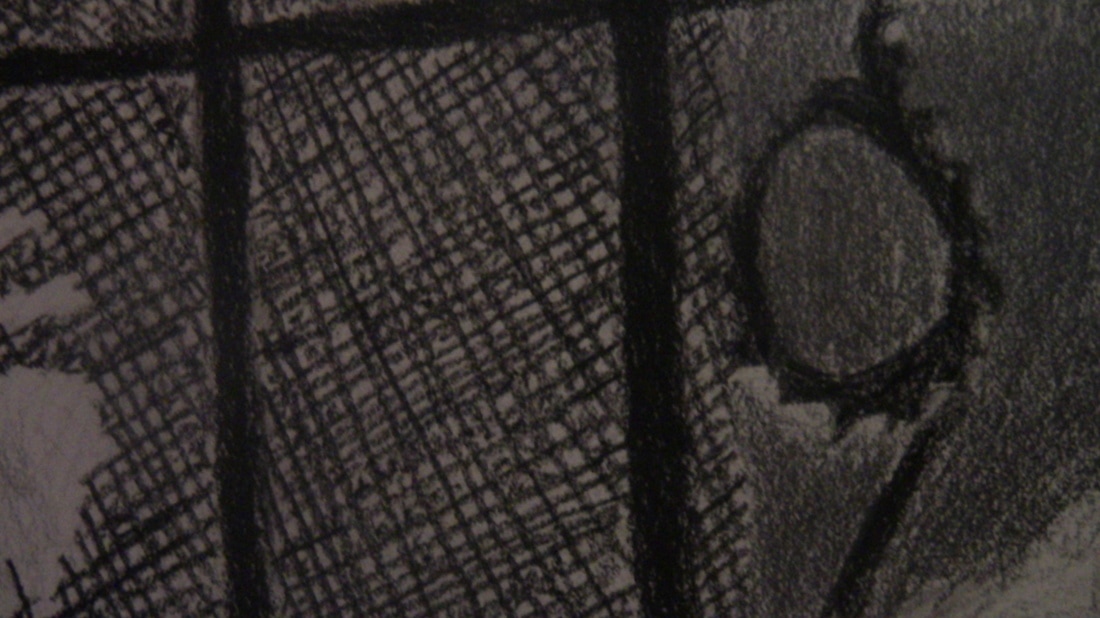 I used a 4b, then a 6b, carbon pencil over the bars in the doorway 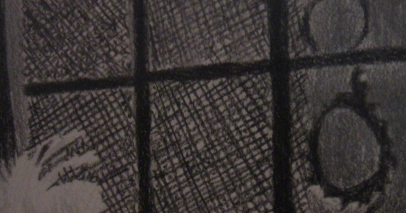 For the area in back of the decoration, I first used a 8b, then a 9b, and finally went over it with 6b carbon pencil to try to get it as dark as possible. 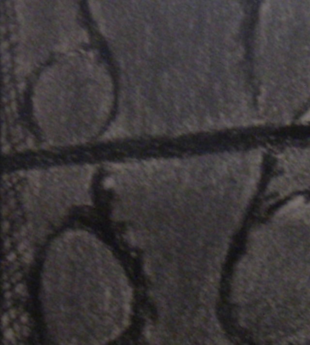 For the floor, I blocked in the tiles using a 3b pencil. which I lightened with a kneaded eraser. I used a 5b for the biggest shadows and tiny touches of a 6b for the darkest parts. For the ridges, I used a combination of a 4b carbon pencil and an 8b graphite pencil as I wanted them to be dark, but not quite as dark as the spokes in the door 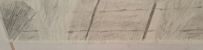 I used a 2b and a 4b to shade the majority of Lady’s body. I was careful to make sure my strokes went in the direction of her fur. I used touches of 5b 6b and 8b throughout her fur. I also used my magic rub eraser to rub off some pencil to make highlights.  I used a combination 4b, 5b, 6b, 2b, and 3b pencils for the bottom most part of her stomach.  I used my magic rub eraser to rub away the carbon on top of Lady’s head and filled in part of the space with more carbon, creating tufts. For Lady’s face, I first used a 4b pencil, careful to follow the shapes I saw in my reference photo. I drew details over that using a 5b, and smaller details using a 6b. I filled in the rest using a 2b, adding details over that with a 3b and 4b. 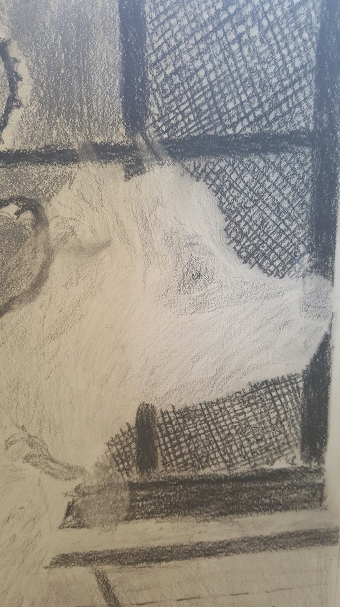 I blocked in Lady’s entire tail using a 2b pencil. I used a 4b over that, following the shapesa and patterns I saw in my reference photo. I used a 5b over the 4b and a 3b over the 2b to make marks in the appropriate places.  I like having odd numbered pencils because they allow me to make marks that are barely noticeably darker than the color underneath. Sometimes going from a 4b to a 6b is too stark of a contrast. I would use a 1b pencil if I knew it existed. I used a 4b pencil on Lady’s collar and lightened it with a kneaded eraser. I drew the dark shadows with the same 4b pencil, this time, without lightening it. I used my six b pencil for the places where Lady’s collar meets her neck. 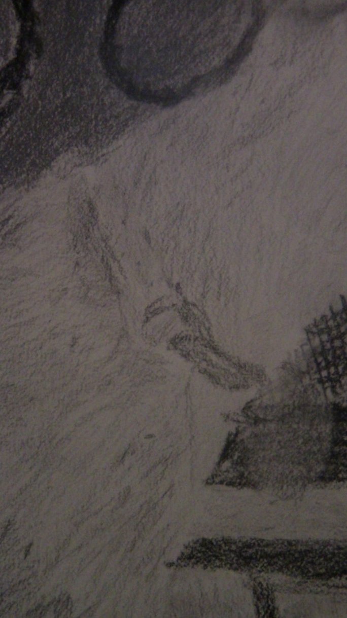 That’s all for now. I’ll talk to you again next week.
I recently copied two paintings by Lisa Clough of Lachri Fine Art. They are below. 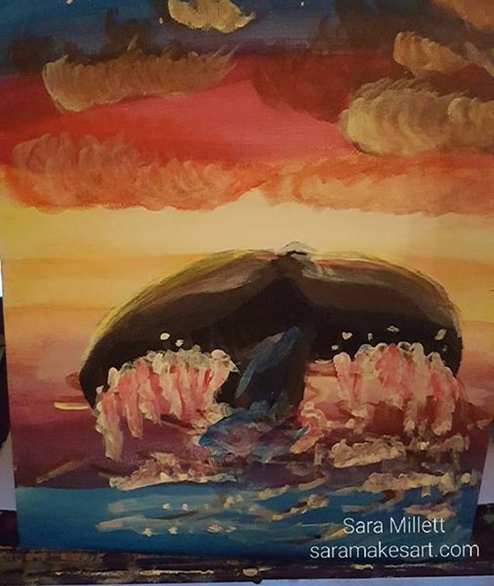 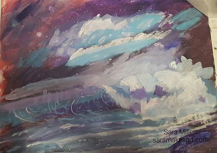 These were both done while watching live streams where Lisa invited viewers to paint with her. While I am not advocating copying other artists' work to sell, the only way to really learn to paint is to, well, paint and that can include copying the work of other artists. I could have watched someone paint sea foam and read about it a thousand times, but until I painted it myself, I didn't understand how it was done. While I usually can't sell art that I make from other artists, I can learn techniques and principles that I can apply to my own pieces. Copying other artists is a huge part of being a beginner painter, I copied Matisse when I was eleven or twelve, for example, but as I've pointed out, it can be valuable for experienced artists too, if you're trying to learn a new medium, or just learn to paint something you haven't painted before. In painting the whale tail and sunset painting, I found that I liked the contrast of the muted, almost muddy colors against the brighter colors of the background and I'm thinking about trying to incorporate that into my own work. So, on top of increasing what I'm able to do, copying other artists can show me more of what I might want to do. That's all for now. I'll talk to you again next week. I finished a new drawing! This one is called “Little Girl Playing With My Dog”. 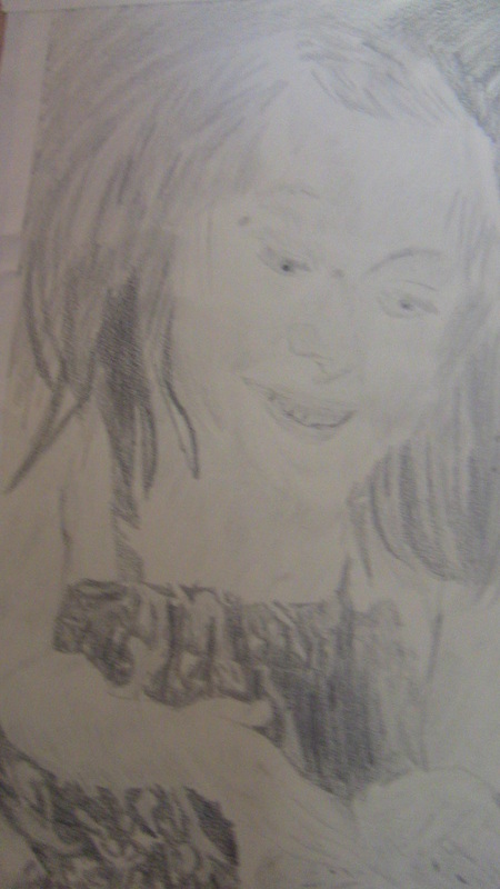 It’s an 11×14 graphite on Strathmore 400 series drawing paper. I took the reference photo while watching the subject play with my dog in a park during a concert. This drawing, like all my drawings, started with an outline made with a 6h pencil. I used a 2b and a 4b over the girl’s entire face. I lightened some of the 2b with a kneaded eraser and used a tombow mono eraser over the areas I wanted to be very white. I’m finding the tombow mono eraser challenging. Maybe I need to put down more layers of pencil initially and make sure things are really filled in solid before I use it. While working on this drawing, I held the pencil at times with the back end in the inside of my palm and my pointer finger over the top.While somewhat awkward to get used to to, this holding technique, seemed to give me most control and the smoothest results. I used a 5b to fill in her right eye and a 3b to fill in her left eye. I used an 8b for the irises and a 6b carbon pencil for her pupils. I used a combination of 2b, 3b, 4b, and 5b, for her brow areas. I used the side of a 5b to make her eyelashes, by making a single swoop down and out. I used 5b and touches of 6b for the crease of her left eyelid. 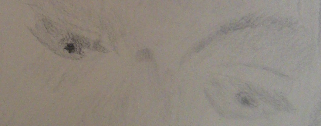 I filled in her bottom lip with a 5b pencil, careful to leave a space in the middle, which I filled in with a 2b and took out highlights with a tombow mono eraser. I used the 5b for the top lip with touches of 6b along the bottom edge. I used 4b on top of her teeth and 2b on the bottom, with touches of 5b and 3b in her mouth and in between her teeth. 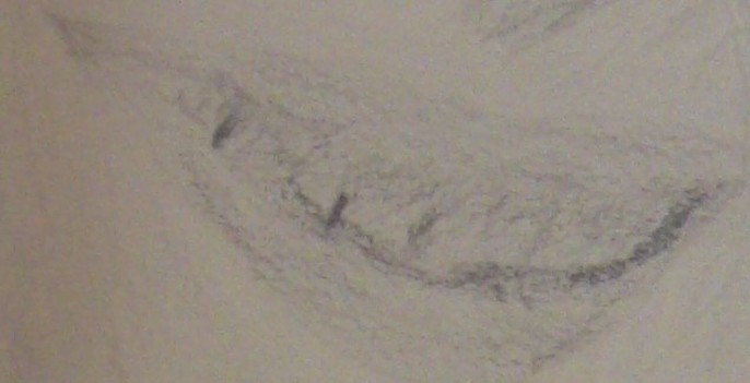 I used mostly 2b and 4b on her chest, right arm, and right hand. I applied my 2b very lightly at first, then did another layer, pressing slightly harder. I used my 3b for her knuckles and my 6b the crook of her elbow and the edge of her arm. For her other arm, I filled it in with a 2b, lightening it with a kneaded eraser. I used 3b for the place where her left arm met her chest and around her waist. I used 3b under where her arm rested on her shoulder.   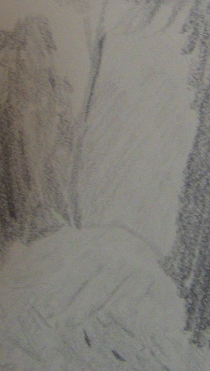 I used 8b, 5b and 3b in her hair. I used mostly 5b and 3b for the left side of her hair, with touches of 2b and 6b for the darkest parts. For the top part, I used 5b, 3b, and 2b, careful to follow the shapes I saw in my reference photo. 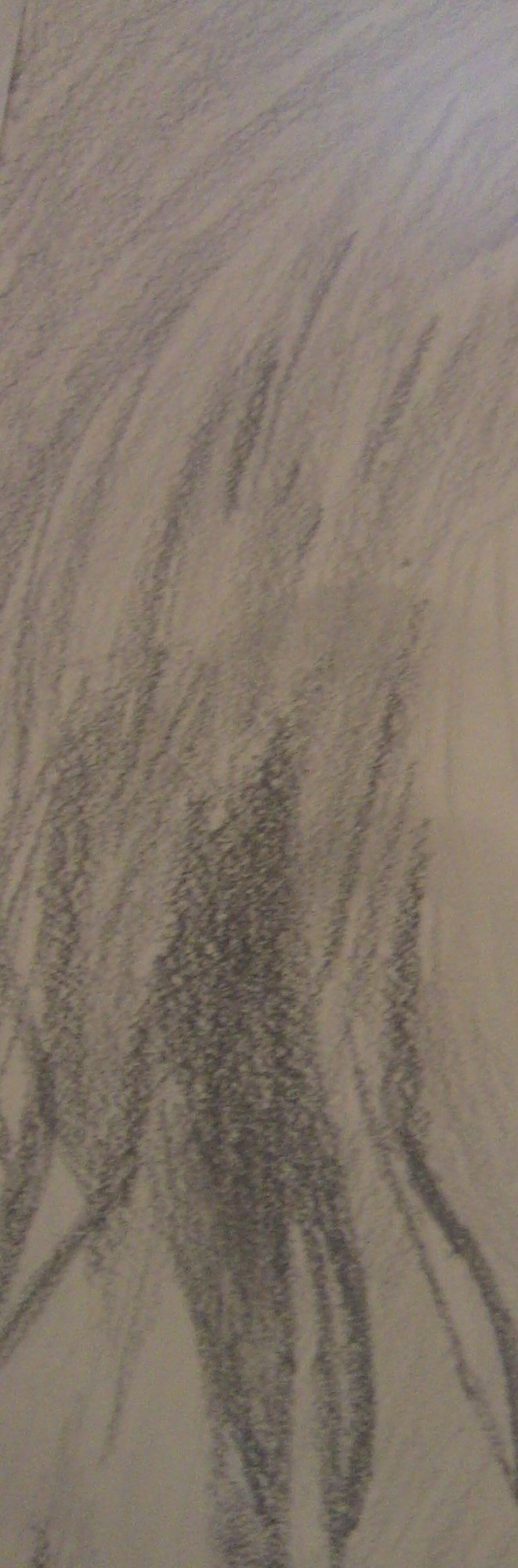 For her dress, I filled in the whole thing with a 5b pencil, and used a 6b to make the pleats. Every once in awhile I lightened some of the 5b with a kneaded eraser to intensify the folds. For the pattern I used 3b pencil, leaving some areas white. 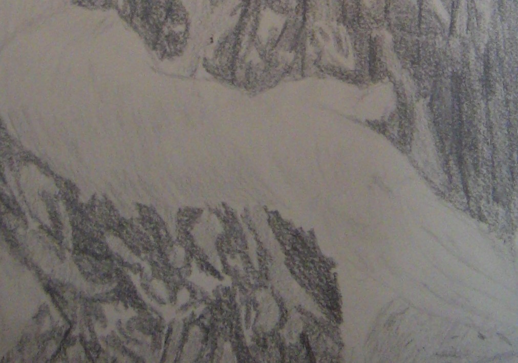 As for drawing the dog, I employed the same techniques I discuss in this post Drawing Lady In The Doorway.  I used a 7b pencil and a 4b pencil for the background. That’s all for now. I’ll talk to you again next week. Bye. I recently bought myself a set of Faber-Castell 9000 pencils after hearing about them from Lisa Clough of Lachri Fine Art's videos. I was concerned because the set only goes up to a 2H, which I didn't think would be light enough. I was wrong. The 2H pencil in the Faber-Castell brand is more like a 4H or even a 6H in other brands I've used. Below is a comparison between the 2H pro art pencil and the 2H Faber-Castell pencil. Keep in mind, I pressed the same for both lines. The Faber-Castell line is on the left and the pro art line is on the right.  In fact, the Faber-Castell is so light it took me three attempts to get this pic because I couldn't find the line through my camera lense and I had to use my finger to tell me where it was. The 4b in this brand is especially dark. I'll have to be careful with that one. I wanted to do an entire drawing using only these pencils, which is this one. 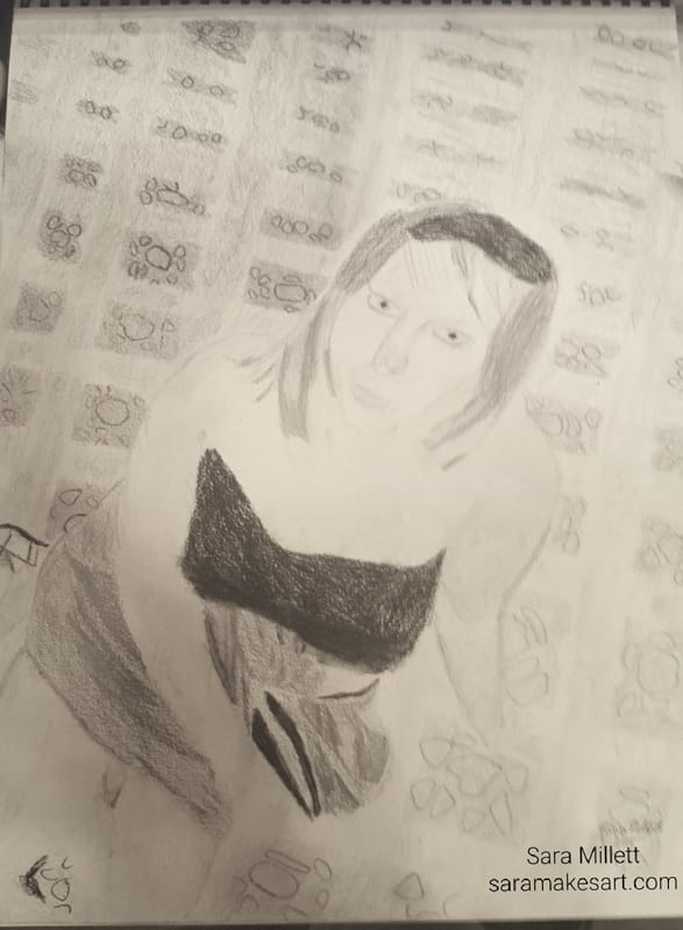 I ended up having to use my carbon pencils and my Koh-1-Noor Progresso woodless pencil, because the Faber-Castell set didn't give me the range I felt I needed. I think my results started to improve, though when I made use of the 2h pencil for shading. It gave me that extra light look which even the 2b couldn't give me. The above drawing is titled "Girl On A Rug", by the way. You can read about it here. That's all for now. I'll talk to you all again next week.
I finished a new painting! This one is called “Blue Parrot” and it’s a 9×12 acrylic on Art Alternatives Studio Canvas. 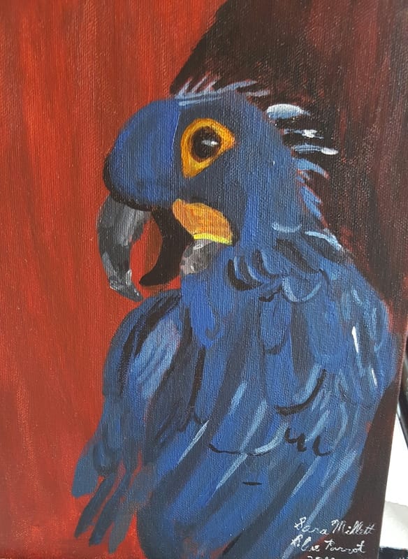 I used a combination of cobalt blue mixed with transparent mixing white and Mars black, unsure if I would be able to get the color that was in my reference photo. The cobalt blue was a last minute change from the ultramarine and I believe I made the right decision regarding that. Surprisingly, as soon as I added the first black curved lines, it already started to look like feathers 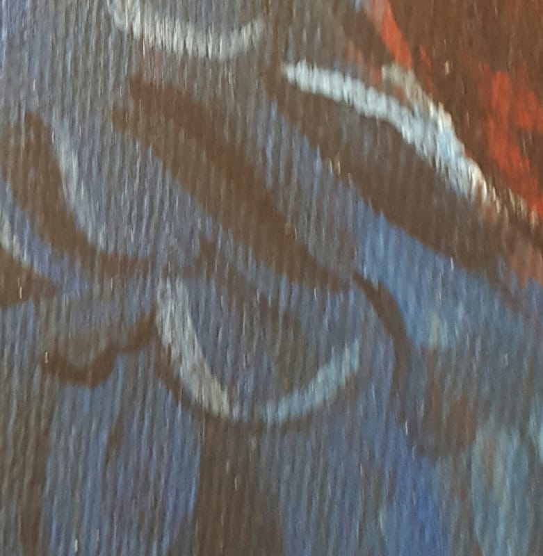 Speaking of feathers, they were created by layering darker and lighter colors over my base color 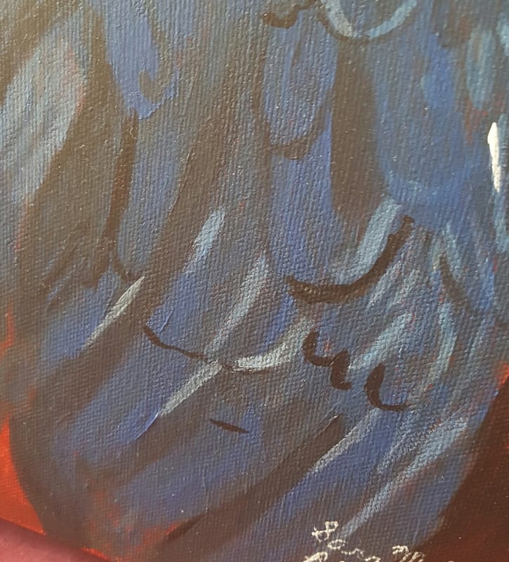 Before I go any further, I think I should mention that before I started this painting I created a project in Corel paintshop and placed the parrot against different color backgrounds. That’s how I decided on the burnt sienna background. Because I wanted the beak to appear more solid, I used ivory black and titanium white to paint it. These colors are opaque as opposed to being transparent, so they create a solid effect 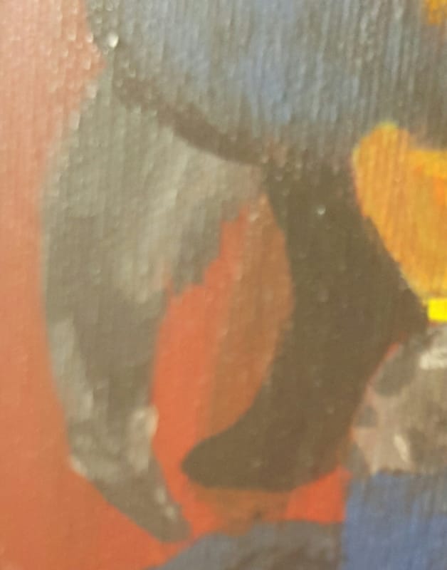 That’s all for now. I’ll talk to you again next week.
|