|
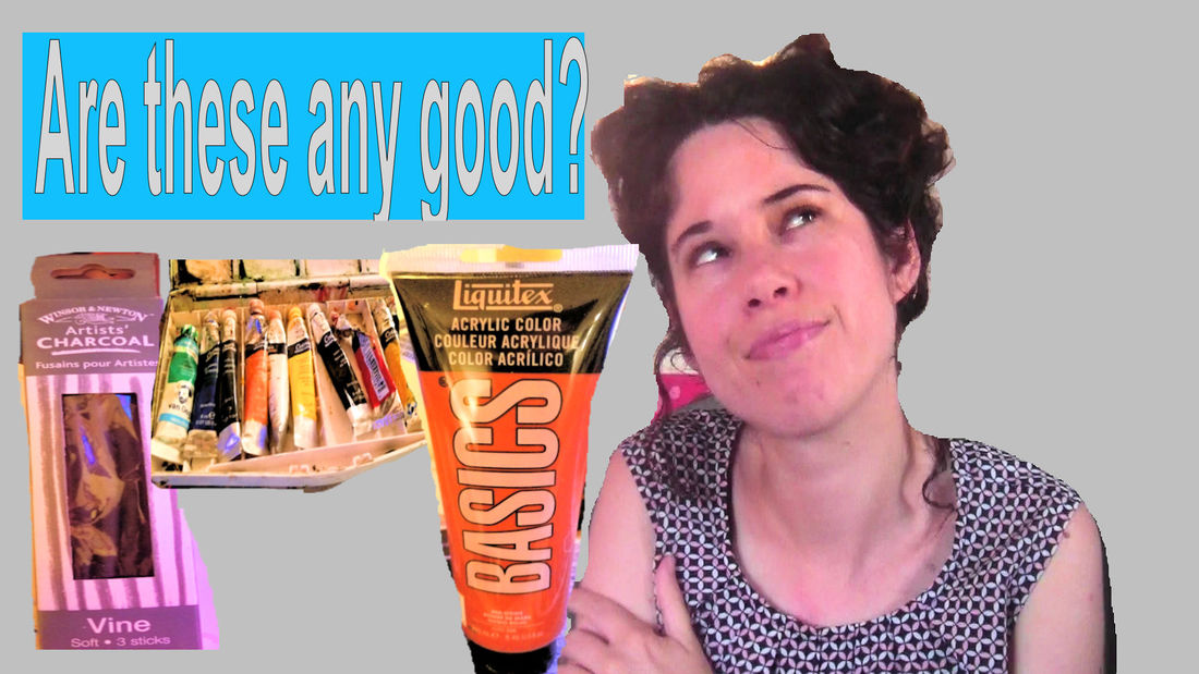
In this post, I'm going to be talking about good quality art supplies, why you need them and give you seven ways to find them. I want to talk about objective quality, that is, if a product is any good at all, and subjective quality, that is, if a product is good for what you want to do. So first, why do you need good quality supplies? I've touched on this in other videos, but they're a must if you want your work to last. Having quality supplies, both objective and subjective, will also ensure that you have the best experience painting or drawing and that you have the easiest time achieving your goals. Now for seven ways to find good quality art supplies, both objectively and subjectively. #1 info blurbs Now, this isn’t a very reliable way to gage objective quality. After all, it's not in a company or stores’ best interest to have you think a product isn't worth buying, but it can help you gage subjective quality. A company will often say, for example, if a brand of paint is good for heavy brush strokes, or glazes, or if a canvas is lightweight or heavyweight. #2 Customer Reviews Sometimes you can find reviews, from customers who have bought the product on the store’s website. Some sites might only print positive reviews, though so you need to be careful with this one. #3 Vlogs and Blogs You can also find more in depth reviews in the forms of run by artists, many of whom are not afraid to say if a product is lousy if that's the case. You can also see artists do entire projects with a particular brand of pencils or paint where they talk about the product for ten or fifteen minutes, so you really get a good idea of how good, or not, that product is. Keep in mind, though, artists who make videos or blog will probably be using products that suit them and they’re style, so it’s probably a good idea to find one whose work looks how you would like yours to look. While we're on the topic of reviews, even if a person is being payed to promote a product, 'cause I know a lot of people worry about that, legally they still have to be honest about their feelings. A lot also believe in being honest from an ethical standpoint. #4 real life friends and acquaintances You could call or email artists you know in real life and ask if they've used a product, and, if they did, what they thought about it. #5 art groups on Facebook or Google + You have to join these first, but once you do, if you don’t know anyone personally who’s used the product you’re wondering about, you could ask about it in one of these group, just say something like, “I’m thinking of trying such and such brand of paint. Have anyone use it? What did you think of it, etc”. It also helps to say what your goals are, or what style you’re working in, so people know whether or not to recommend that product to you. #6 The company’s reputation I think this goes without saying, but if a company has been around a long time and has a solid reputation, you should be able to trust in the quality of their products. I'm talking about companies like Winsor & Newton, Derwent, Generals, Strathmore, etc. Basically anything that’s instantly recognizable. #7 Your own experience: This is really the most important one. All the others can help, but the only way to really know if you personally will enjoy using a product is to just buy it and try it. So that was why you need quality art supplies, and seven ways to find them.
1 Comment
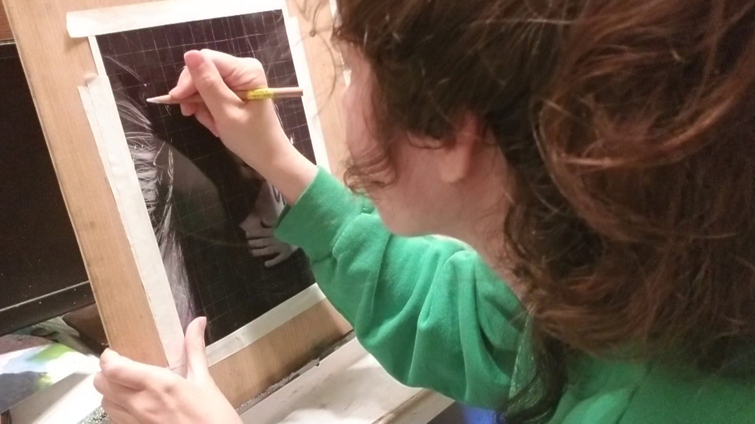
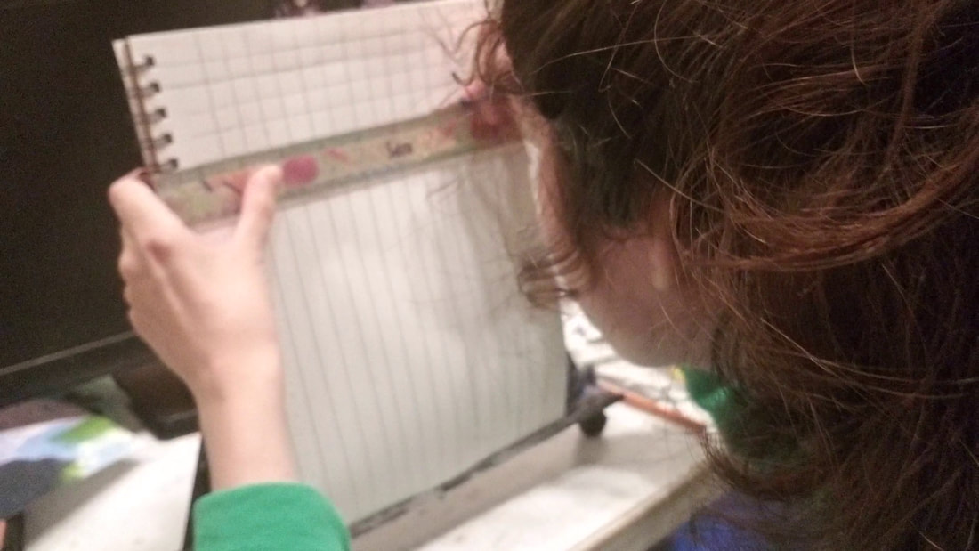
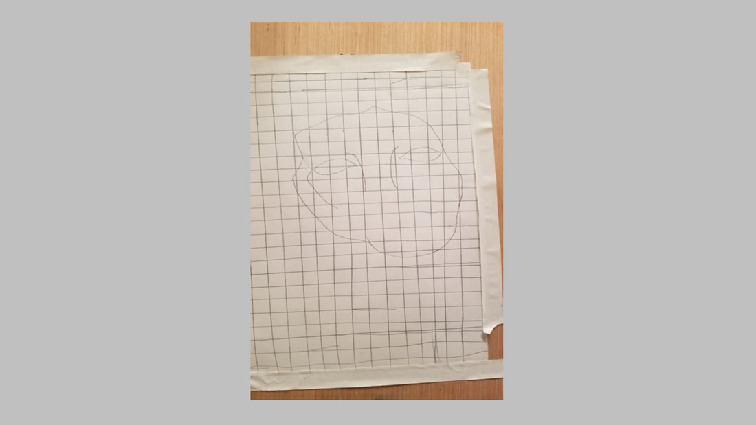
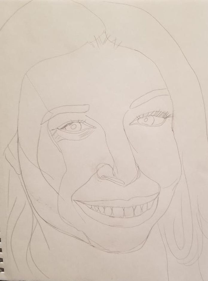
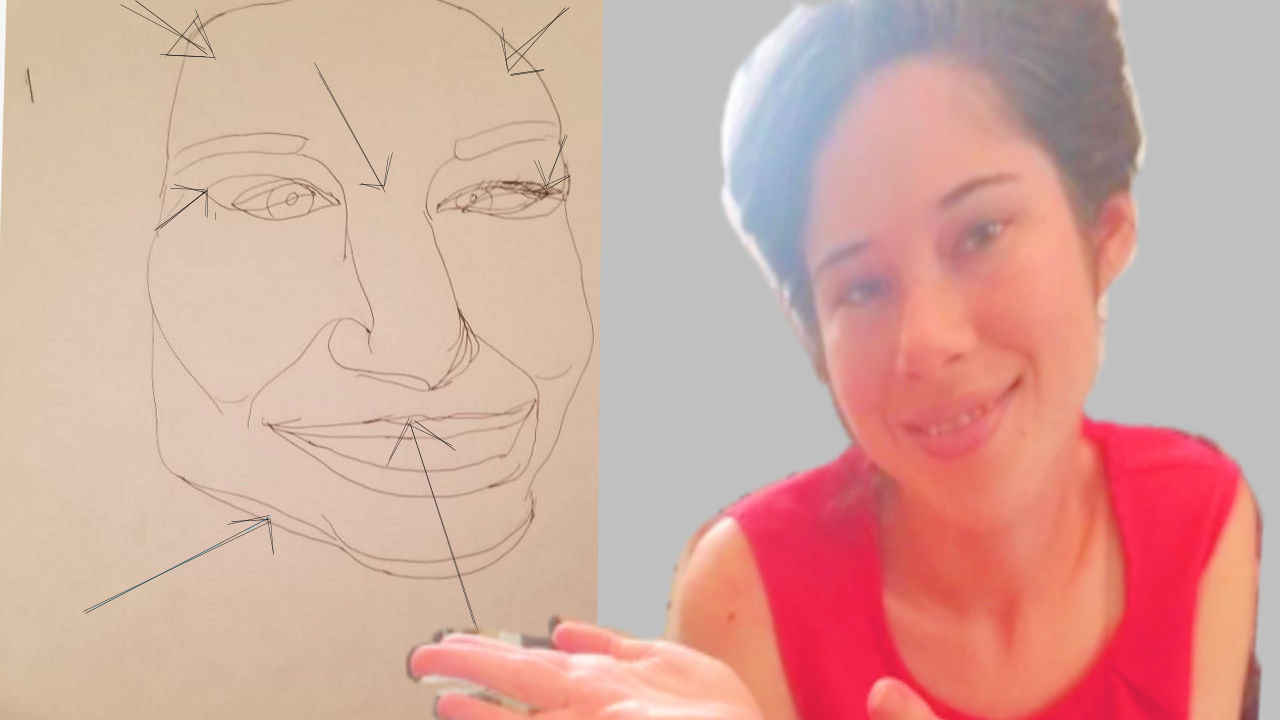
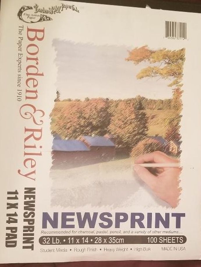
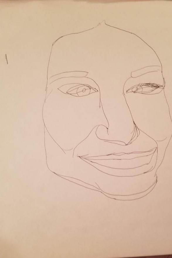
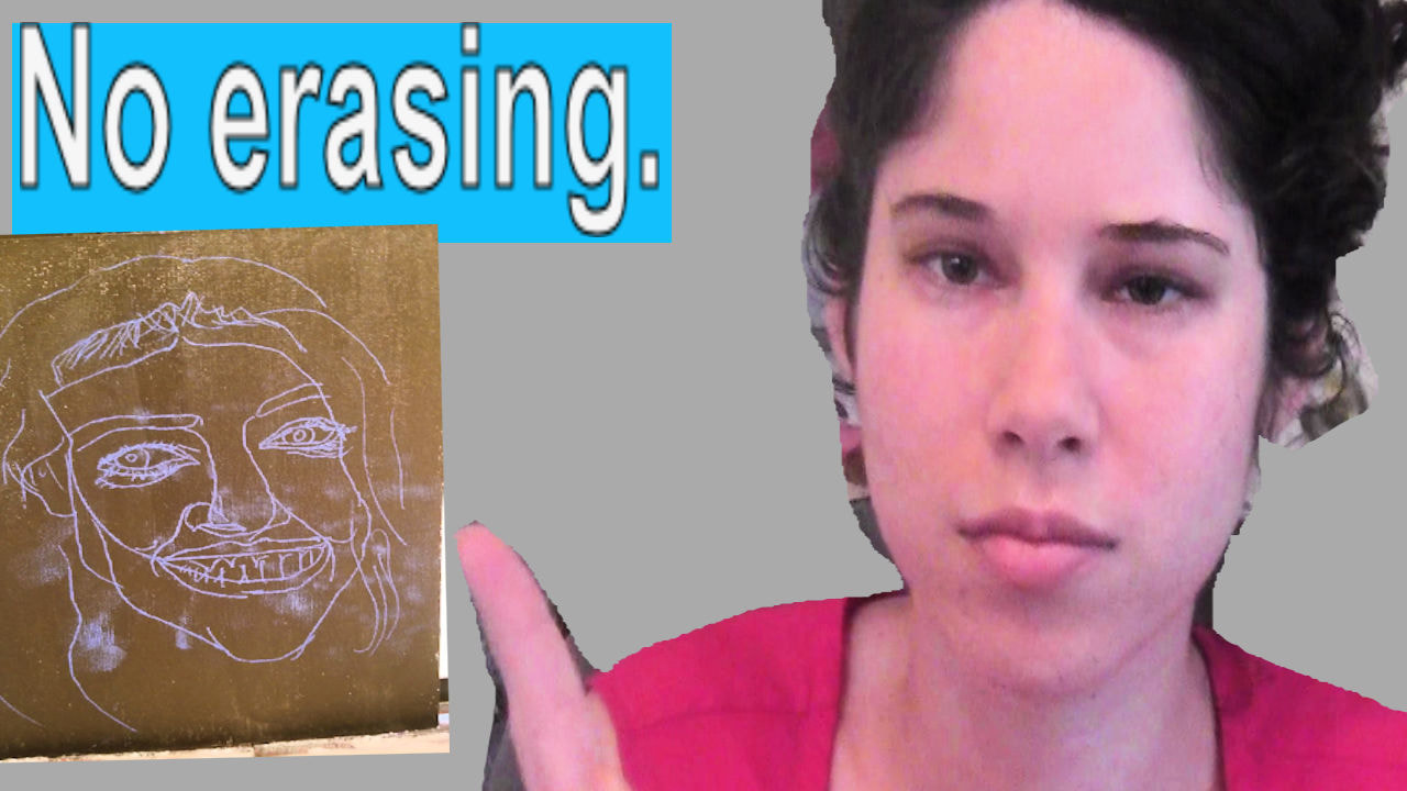
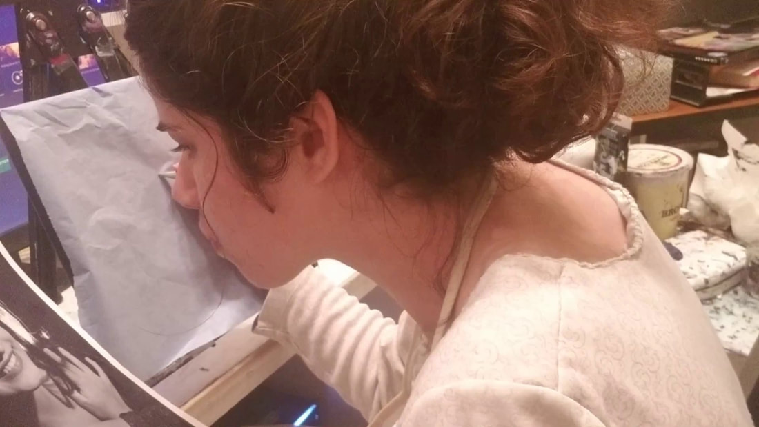
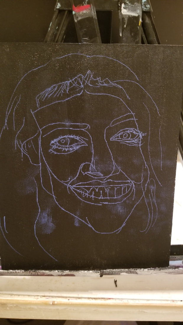
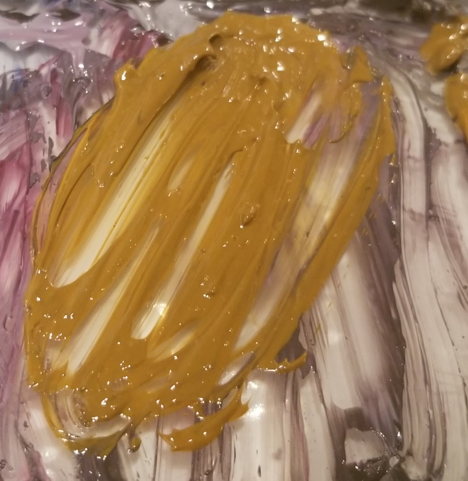
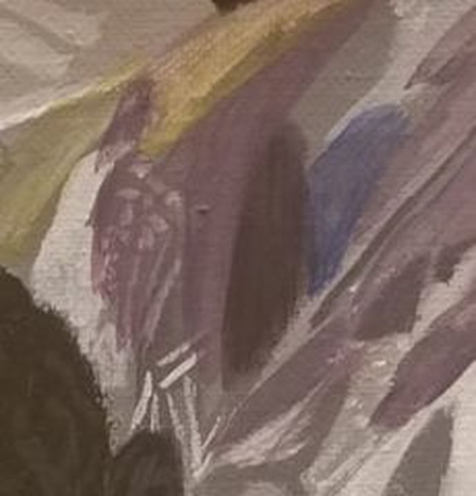
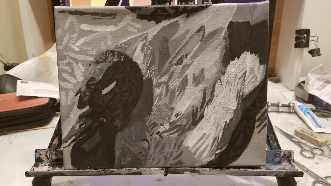
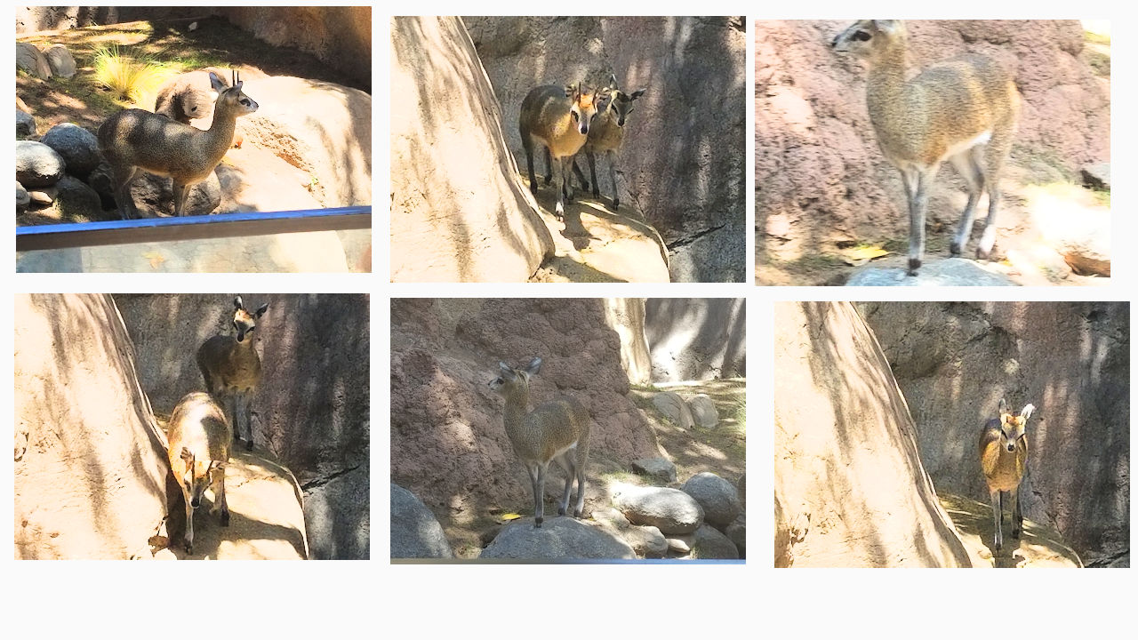
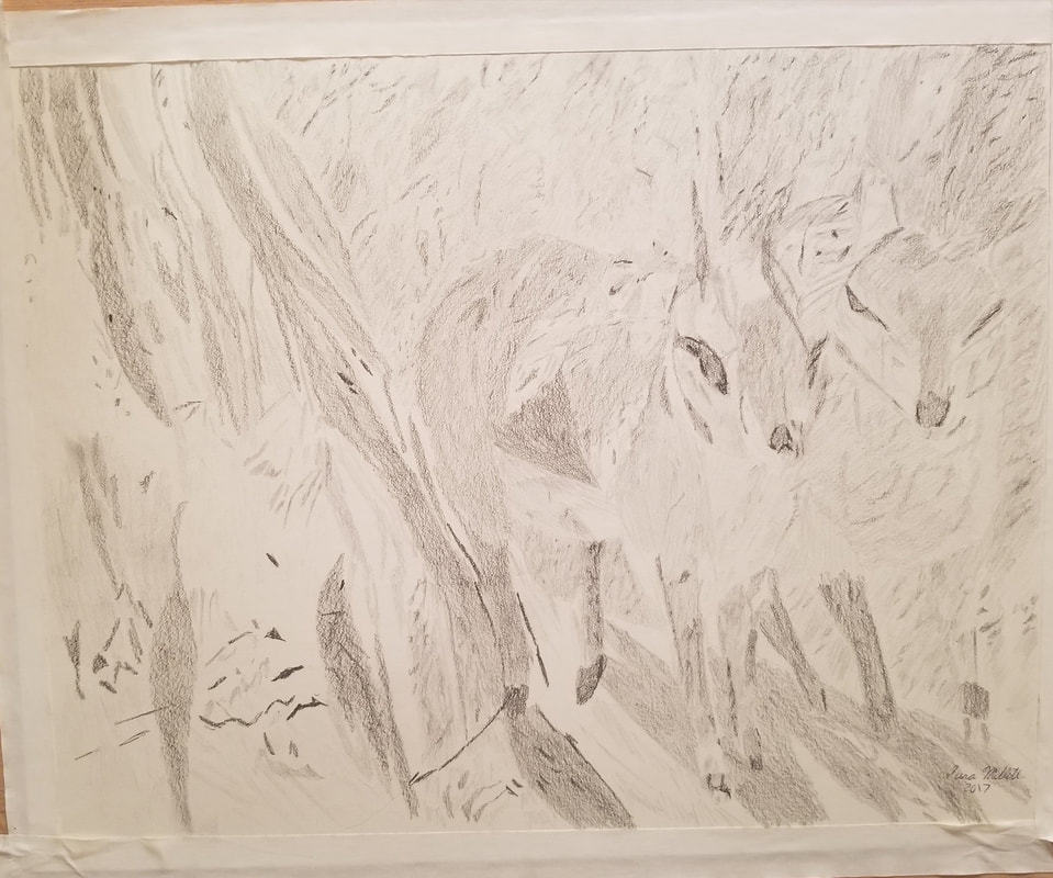
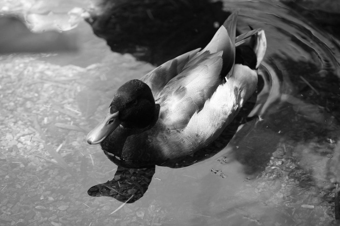
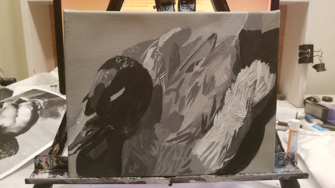
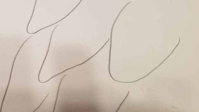
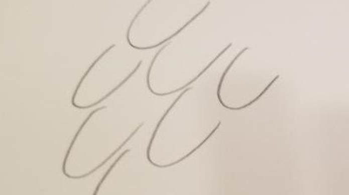
In this post, I've decided to try out the grid method. Okay to do the grid method, first you draw a grid over your reference photo. I’m using a ruler so I can make sure all the lines are straight and evenly spaced. I’ve chosen to make each square a half inch squared. Then you draw an identical grid over the paper you’re going to be drawing on. Now I’m making my grid lines really dark on purpose because I want you to be able to see them, but if you were doing this in real life, you’ll want to make those lines super light, because no one wants to see a bunch of grid lines on your paper. After I had both of my grids drawn, I went to the grid on my reference photo and along the outside edge, Io put A, B, C, etc, and I did the same thing on the grid on my drawing paper. Now the idea with the grid method is that I look and see what squares my subject’s features fall into on my reference photo and try to put them in the same places on my drawing. That’s where these letter marked squares come in, so for example, the left eye was two squares across from square C. Well, this is as far as I got with my grid method drawing. I really wanted to finish the face, but I got too tired and frustrated at this point. I could already tell it wasn't working out. As I drew, I found myself having to mentally add squares because the grids on both pieces of paper weren't the same and that's not how the grid method is supposed to work. The grid method has never personally appealed to me. I always thought of it as stiff and time consuming, but you know what they say, don’t knock it ‘till you try it, so I did. I think you can guess how much of a role it's going to play in my drawing. Despite my best efforts, I couldn't make the squares line the grid identical on my drawing paper to the way I made it on my reference photo and these squares are clearly not the same size and that's having used a ruler. I'm sure someone's going to say, "You just need more practice". Maybe, but I just don't feel like being bothered. While I don't like using the grid method, I do like using guidelines, such as drawing a line from one eye to show me where to draw the other eye and drawing horizontal lines to help me keep the eyes and mouth straight. I'm not going to tell you not to use the grid method. You might have much better luck with it than I have. After all, it's very popular. A lot of artists use it and love it. So I thought the grid method wasn't for me and now I know. In this post, I'm going to be letting you in on my thought process when drawing a human face. Much of my thought process when drawing is centered around lines and shapes. I'm looking at where things curve up and where they curve down, what's rounded, what's strait, etc. I could see that her left eye was right next to the shadow on her cheek, so to take the guess work out of where to put that eye, I drew a line where the shadow would be. When drawing the nose, I was reminded that sometimes our brains can trick us into thinking something is more simple than it actually is. Like, the tip of the nose is just a little round thing, right? No, it's not really. So I hope this shows you that going to into a drawing thinking you don't quite know how to draw it doesn't have to be unpleasant. I like to think of myself almost as a detective when I'm working. Only instead of solving a crime, my task is to solve where to put the features on someone's face. In this post I’m going to be practicing drawing foreheads and tellig you about working on weaknesses within your strength. This is a follow up to my last post. If you haven’t read that one, this one might not make a lot of sense. So I suggest you go and read it, and then come back to this one. I’m using newsprint because I’m expecting to make a lot of throwaway drawings and newsprint is perfect for this. Just an aside:Do not use newsprint for anything that you want to last, because it will yellow and deteriorate over time. Like I said, it’s best for little practice or warm up sketches that you’re going to throw away. I’m also going to be working in pen because I don’t want to give myself a chance to erase and forget about my mistakes. Those mistakes are going to be staring me in the face. This is going to be so uncomfortable. The drawing of the forehead went better than I expected so I decided to extend this practice to the whole face. I could see that I drew the eyes too close to the edges so I moved them in closer to the center. I could also see, once I had the mouth in, that the left side of the jawline should be more curved and not indented like I had it. That brought the chin down lower. What I just showed you was an example of working on a weakness within your strength. Even with things we’re good at, there will be areas where we are weak, but if we work on them, we can strengthen those weaknesses. What Did I Learn From This? What I learned by doing this was that if you start drawing something with the idea that you really don’t know how to draw it, you’ll pay more attention to what you’re doing and draw it better, whereas if you start drawing something thinking you know where it should be and how to draw it and everything, you won’t pay so close attention and end up drawing it not as well. Of course this isn’t a huge deal most of the time because we have erasers, but I think that’s interesting to know. Of course that’s just my experience. Yours might be totally different. I’m making this video because, number one, I refuse to be embarrassed by the fact that I have weak points, and number two, I want to help you not to be embarrassed. I decided to attempt a drawing technique used during the Renaissance called Silver Point. Now, I couldn’t get my hands on a silver stylus, which is what they would have used, so I used a pen that’s out of ink. I had to change my plans when I realized that to get the required ground cost more than I was willing to spend for a one time project, so I decided to draw on a canvas through transfer paper. My goal was to be as accurate as possible without reworking the piece. That's where challenge comes in. Once an artist working in silver point put down a line, he was committed to it because this technique doesn’t allow for erasing and I wasn't able to erase while doing this either. When you consider this, it’s kind of obvious why people were so great at drawing in those days. They pretty much had to be. So here's my finished piece. I knew when I was drawing it that the forehead was too low. I'm not sure how the mouth ended up where it is, though. So, obviously what I did there wasn't actual silver point, but what I did, drawing without being able to erase, is it something you want to do? Do you want to draw in a way that essentially doesn't allow you to correct your mistakes? Well, if it's something you intend to sell, you need to be very confident and competent in your drawing skills, because not only can you not erase with metal point, you really can't even see what you're doing as you're drawing! But, to draw without erasing can be a very good exercise. I suggest using a regular pen without any drawing under it. By drawing in a way that doesn't allow you to correct your mistakes, you'll be forced to think a lot more about what you're doing and that will show you what you need to work on. In this post, I’m assuring you that no matter what medium you’re working in, be it oils, acrylics, colored pencil, or what have you, you can make great art. What Determines How Good We Get As Artists? How good we become as artists is not determined by the medium we use. It’s determined by how much time and effort we’re willing to put into learning how to work with that medium. My Own Misunderstanding I used to be under the impression that I was limited by the mediums I was working in. I thought excellent paintings were always done in oils and until I was able to work with them, I would be artistically confined to mediocrity. What Happens When You Only See Good Art Done In One Medium Looking back it’s not surprising that I thought this way since almost all the great paintings I was exposed to were oil paintings. If you’ve pretty much never seen a fantastic watercolor or colored pencil piece, how would it occur to you that these mediums can be used to make phenomenal artwork? It wouldn’t. How Can You Change Your Beliefs About What Can Make Good Art? To that end, I encourage you to expose yourself to artwork done in a variety of mediums. I’m going to recommend a artists' websites to check out as reference. The first one is Lisa Clough's. Lisa works in acrylics, oils, colored pencil, graphite, and ink. The second one from Leonardo Pereznieto, by Leonardo Pereznieto. Leonardo works in oils, charcoal, graphite, ink, colored pencil, watercolor, and marker. Next is Lena Danya, who works in oils and watercolors. The last site I’m going to recommend is Kelly Eddington's for her stunning watercolor work. Amazing Art Can Be Made With Surprising Materials I've even seen amazing work done in ballpoint pen and Crayola crayon. I wouldn't really recommend those, because I don't think they're archival, but still, it is possible to make fantastic artwork with them. If you want to work in pen or crayon, there are artist pens, which are archival and there things called Conte crayons, which are a fine art variety of crayon. In this post, I'm going to tell you why it might not be such a bad thing if you get color mixing wrong. The first reason is because you can learn from it. When you've mixed a color that isn't what you'd hoped for, don't just say, "Ugh, it's not right", and wipe it up. No, look at it and think, "What could this be good for?" Just because a color isn't right for what you're painting now, doesn't mixing it can't show you how you could get a good color for something you'll be painting in the future. I realized this when I was trying to mix a color for this duck's feathers I'm painting. I had a dark grayish purple already and I mixed that into some transparent raw sienna. This is what I came up with. This is what I'm trying to paint. The color was totally wrong for what I was doing, but looking at it, I could tell it could make a good skin tone for some people with darker skin. The other reason, is something I've said before, and that's color is not that important. Value is. I talked about that more in this post. So that's why it's not necessary to worry if you mix the wrong color. We need really light lights and those really dark darks to give our paintings dimension and make them pop. A lot of artists, including myself, have a tendency to want to make everything more or less midtone and that’s a mistake. I was reminded of this when working on my painting last night. I was using a light gray on this area, because I thought white would be too extreme, and then I thought, you know what, this isn’t light enough. So I got out some straight titanium white and painted over it. Notice at the beginning of this post I said, if you need to. Not everything needs to be stark white or jet black, or even charcoal gray. Midtones are necessary. But the midtones aren’t going to do anything for your piece if you don’t have the lights and darks in there also. I’ve made a video just on the topic of shading and highlighting and why we do it as artists, so if you’ve been a bit confused during this that should clear it up. You can here more and see me working on my painting in this video. Here’s the thing. Being a gifted painter, doesn’t automatically translate into being a gifted photographer. While getting reference for a painting, I’ve taken photos that are absolute garbage. Honestly, I can take more than a dozen photos just to get one that’s worthy of being turned into a painting. To illustrate, here are six photos of some antelope I took at the zoo, and here's the one drawing I made from just one of those photos. If you’re able to get your subject to pose for you, you might be able to take just one photo and have it work, but a lot of times that won’t be the case. Often your subject, especially if it’s an animal will be moving around, constantly changing positions. When trying to get a good reference photo of moving subject, just worry about pressing the shutter button. Don’t stop to look at what you’re getting. I do this myself, but it’s a bad habit. After all, painting worthy moments might only last for a split second, so if you might miss a golden opportunity to take a fantastic reference photo if you’re constantly looking at the photos you’ve already taken. When you’re done taking pictures, then you can look through the files on your phone and decide which ones you want to keep and paint from and which ones you want to chuck. Take a look at this photo of a duck I took. I made it black and white because I wanted you to focus on the shapes and not the color. I want you to notice what you don’t see.You don’t see a uniform pattern like this.  You see a little something that looks like that, but not very much. A bird’s feathers might look more like that if it’s fluffing them up, but most of the time, they’re going to look like abstract shapes. Now take a look at this painting I’m working on. I’ve painted all kinds of random shapes all over. Drawing or painting feathers in a uniform pattern by making u- shapes, not only looks totally unnatural, but can make your feathers come out looking more like scales. If anything, the duck's feathers look more like this than this. Since my current painting is of a bird, a duck to be exact, and I'm actively working on feathers, I thought that would be the perfect topic for today's blog post. You can see some footage of me painting the duck's feathers in the video below. |
Sara MillettPainter of portraits and wildlife Archives
November 2023
Categories
All
|
