|
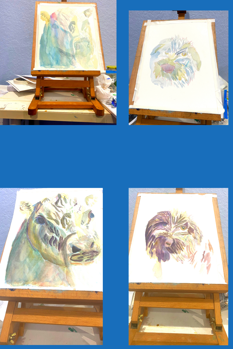
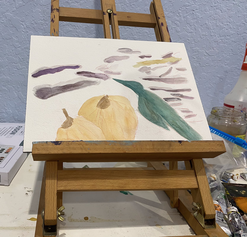
Jul 14 On Monday, Tuesday, and Thursday of this week, I’ve been taking a virtual workshop in painting animals in watercolor and I’d like to tell you a bit about what I’m learning. The class is taught by an artist named Alicia Farris. Lesson number one: Don’t use so much water I have the habit of relying on using tons of water to lighten a color. After all, it’s called watercolor, right? But in this workshop, I’ve learned to use proportionally less paint if I want my color to be lighter. In this way, I don’t have to use so much water and I have more control over my colors. I also don’t get that dreaded dark ring around lighter color that happens from there being too much water on the paper and the paint migrating toward the edges. Lesson number two: It’s better to build up dark colors by layering on the paper itself than by trying to mix them on the palette This is something I’d kind of already observed in my own work, but now I know not to be frustrated if a color doesn’t seem to mixing as dark as I want it. Lesson number three: I can use more than one complementary colors I’ve known about complementary colors and how they work together for a long time, but I’d been stuck on exact combination; ie, red and green, blue and orange, and yellow and purple. In this workshop I’m learning that I can use other color combinations to achieve the effect of combining complementary colors, as long as my color combination includes a warm and a cool color. For example, in working on my cow, I used burnt Sienna and raw Sienna to mute ultramarine and cerulean blue. Don’t layer two primary colors, though, unless you’re trying to make a secondary color, ie, don’t layer blue and yellow, if you don’t want green. Warm your blue with orange or maybe burnt Sienna. Lesson number three: Combining analogous colors creates a more vibrant color Like complementary colors, I knew what analogous colors were before I took this workshop. I had never thought about their potential to brighten other colors, though. I realize now that I’ve been using this principal, subconsciously in one of my favorite color combinations, cerulean blue with ultramarine blue. You can hear more about how I use this combination and why I love it here. Lesson number four: Think of each segment of the piece as it’s own entity This is another concept I already knew, but probably needed to be reminded of. This means just focusing on the area you’re painting and, for the time being, ignoring the rest of the image. You see, I’ve known this is tremendously helpful for a long time. I’ve even talked about it on my YouTube channel. But I still fall into the trap of trying to figure out how I’m going to paint an entire piece at once and getting overwhelmed. This obviously makes painting more stressful than it needs to be. Jul 14 Today we had the day off from the class, but Alicia was kind enough to hold a q&a to give us an opportunity to ask questions. I wasn’t sure if I was going to participate, but since I was sitting at my computer anyway while it was going on, I decided to pop on the q&a, even if it was just to listen to other people’s questions. I got some tips on mixing black and how to avoid blooms. The first one involves mixing ultramarine and burnt Sienna. I can use green to intensify or red to warm. The second one requires waiting until my previous layer is at least semi dry before adding more paint on top of it. During final hour of the broadcast, Alicia did a demonstration of on using negative painting to depict trees and I worked on my crow with pumpkins and storm clouds painting. I tried to keep what I learned about water in mind. Jul 15 Today was the last day of the class. We added some finishing touches to our cows and spent most of the class working on our dogs. I touched on this in my comments on lesson number three, but this time I was more conscientious of how the color I was putting down was going to effect what was underneath it. I had some blue in my dog and while I wanted to soften the blue, I didn’t want it to turn green, so instead of using yellow, I used raw Sienna instead. Ways This Workshop Inspired Me After taking this workshop, I want to practice negative painting more. I also want to do a series of painting dog’s eyes in watercolor, like the one's I did in acrylic. I think this workshop is going to change the way I think about the painting process going forward. I’ve always incorporated warm and cool tones into every painting, but I now I think I’m going to have it my head as I’m painting what temperature the color I’m putting down is. In my current project, the bird is green, which is a cool color and the pumpkins are orange, which is warm obviously. When I work on it again, I’m going to be thinking about if I want to put any warm tones over the bird and any cool tones over the pumpkins. If you're reading this at the time of posting, Ms Farris is holding this same workshop again in September. Like the other workshop, this one will also be virtual, through Zoom. I can't guarantee that spots will be available by the time you read this, but I thought I'd share the link, just in case.
0 Comments
|
Sara MillettPainter of portraits and wildlife Archives
November 2023
Categories
All
|

