|
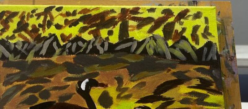
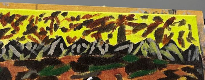
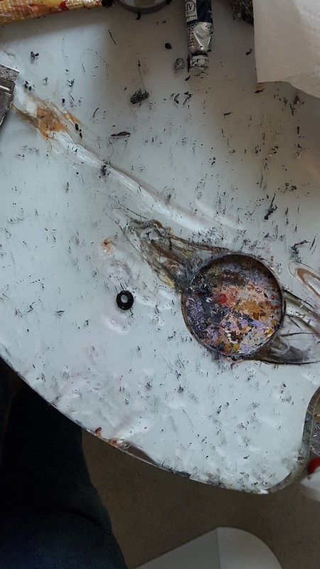
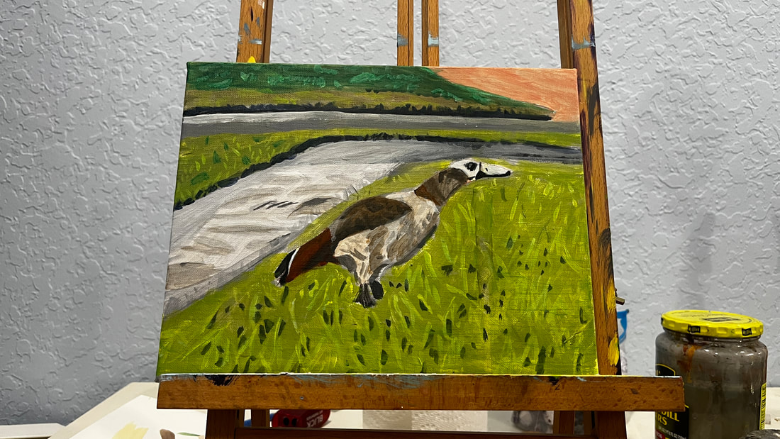
I’m planning to paint this photo, which I took in the canal behind my family’s house, in an impressionistic style. 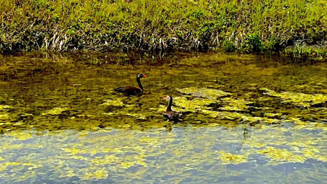 I already started practicing the looseness of this style with the preparatory sketch by holding my pencil far back from the tip. Holding my brush like this helped me move my wrist more freely, emphasizing basic shape and not detail. 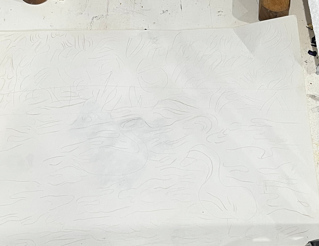 For this style, I want my brushstrokes to show more clearly, so to enable this effect; I’m planning to order a thickening medium for my more fluid paint. I plan to use more flat brushes than the filberts I usually use.  I’ve decided to employ the fat over lean technique for this piece. I’m working in acrylics, not oils, so I technically don’t need to do it this way, but I wanted to get in the habit. 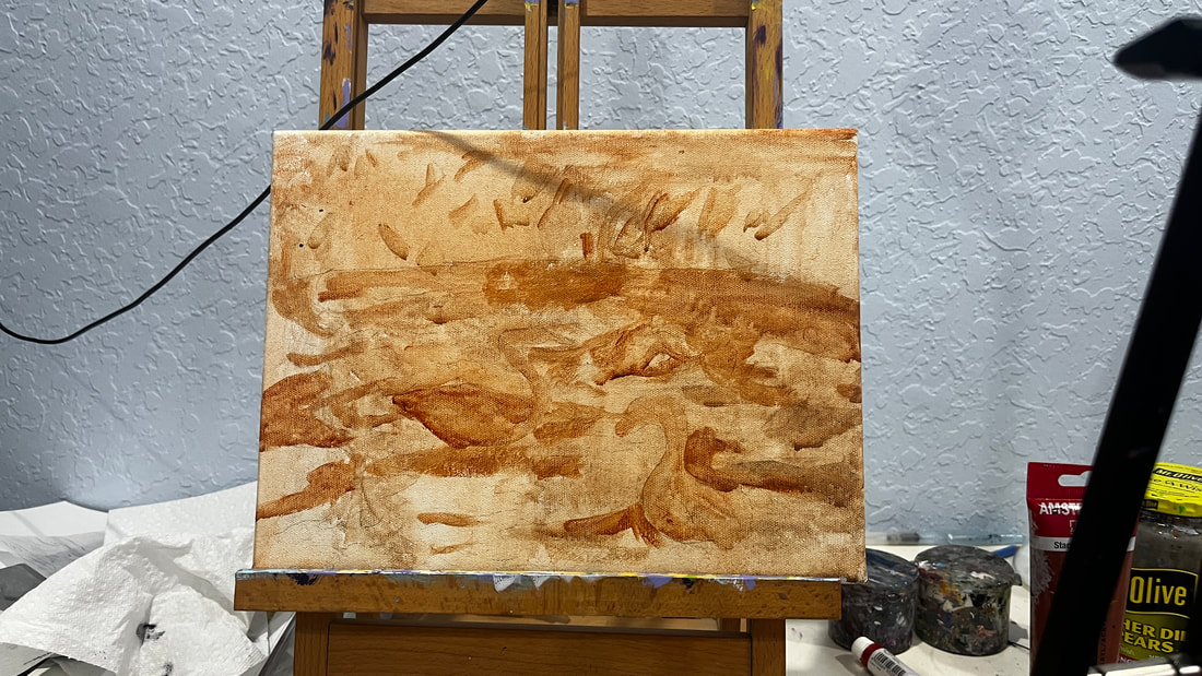 I’m sitting in my community’s Art Room while writing this, and I’ve just put the first layers of color on the painting. You can probably see that it will need a lot more layers. I haven't even completely covered the underpainting in some parts. 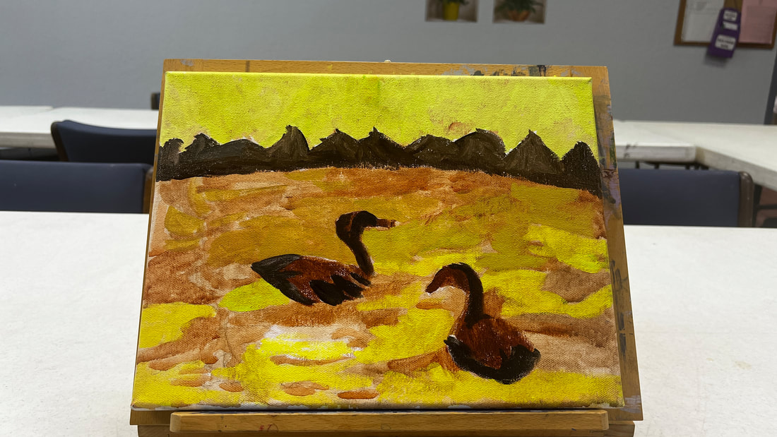 I have a lot of transparent colors, so to get them to cover the background, I painted titanium white over those parts first. Today I worked on creating the contrast between the part of the canal closer to the viewer and the region farther away from it. The part that’s closer to the viewer is significantly lighter. For today's entire session, I used different combinations of burnt umber, unbleached titanium white, and mars black. 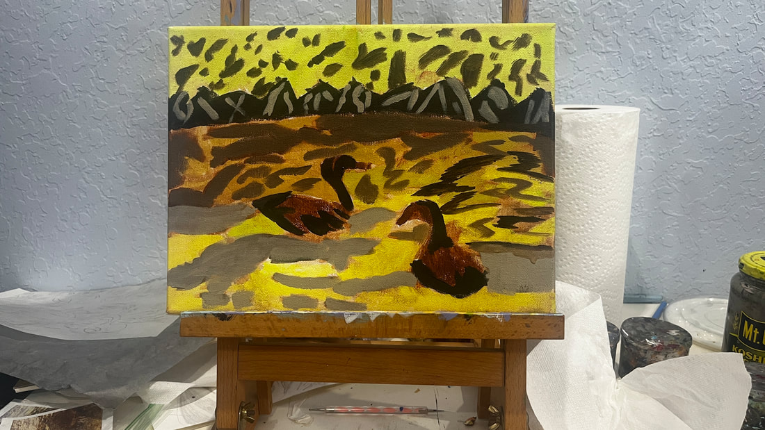 I purchased a jar of Liquithick acrylic medium from @liquitexofficial, which I used for the first time today. It gave the paint an almost custard-like texture on my palette. When I used it with brown shades, it even reminded me of a bit of pudding. The information on the container said this product wouldn’t make a difference in the opacity of the paint, so I was a bit worried it wouldn’t help me achieve my goal. With this in mind, I was pleasantly surprised. I think adding this medium did give me more opacity. I did already have paint on the canvas, however. I don’t know how well paint mixed with this product would cover a black canvas. I wanted even more contrast in the water, so I painted over the part of it that's closer to the bushes with a shade that had more red mixed in it. The idea is that the closer something gets to the viewer, the brighter it should be and the farther from the viewer it is, the duller it should be. 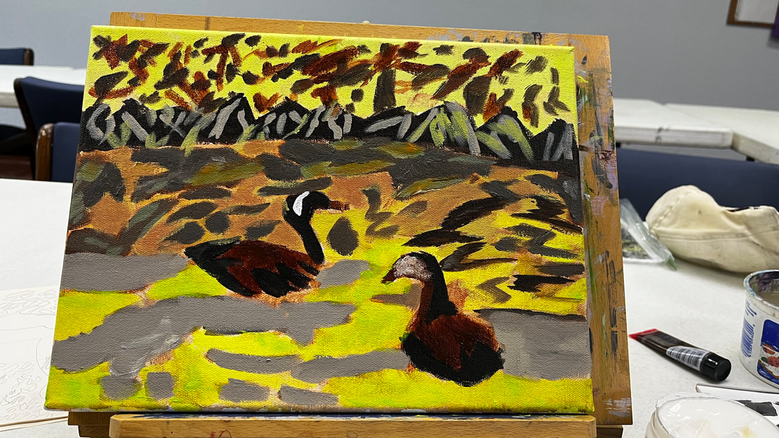 Glazing would never be a significant technique with this piece, but I glazed over some parts to intensify the colors. For example, I glazed red in this area.
Since red is already present, adding more red, and letting the original shade show through, doesn’t change the color, it just makes it more saturated. I added highlights to shape the ducks’ bodies. To make the shade for it, I mixed burnt umber and red to make burnt Sienna. I thought about what I would use to make a complement for burnt Sienna, and the conclusion I came to was green since it’s the complement to red, and Burnt Sienna is a red-based brown. So I mixed green into my red and burnt umber mixture, then mixed titanium white into that. Because these highlights were meant to add shade, I placed them along the curves of the ducks’ bodies. 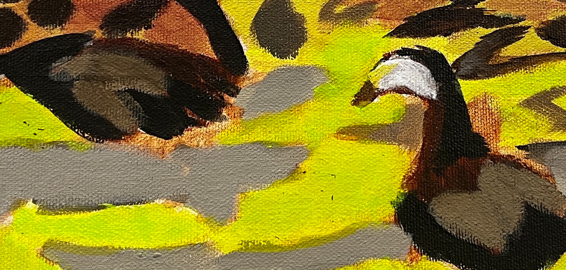 I added more brown to the bushes because they were looking a bit too plain. The color of the leaves in the upper half of the water needed to be changed to make them flow with those on the bottom.  To recap, use thicker paint or a thickening medium, larger brushes, don't blend out your brush strokes, and use a heavy-weight canvas when doing impressionism.
0 Comments
 I had been looking at the grass for a while and feeling overwhelmed by all the detail. I told myself I would just find one aspect of each section to focus on. These were the slightly lighter green marks on the grass across the street and the tiny yellowish blades in the grass on the opposite side of the sidewalk from the goose. While I was working on those sections, I only allowed myself to focus on these things. This made the process far less daunting. My brain doesn't get as tired because it's not trying to figure out half a dozen things at once. Later I can look for another type of detail to add, or add more of this one. I made my strokes somewhat follow the reference photo, although, since there is a lot of detail close together, I didn't put pressure on myself to copy it exactly. To paint the yellowish blades of grass, I used my smallest filbert brush and just put paint on the tip. This process didn’t take long and after doing it, the grass was coming to life. The goose’s body has dark gray patterns on his wing. I was careful to follow the pattern in my reference photo as closely as possible while painting these.
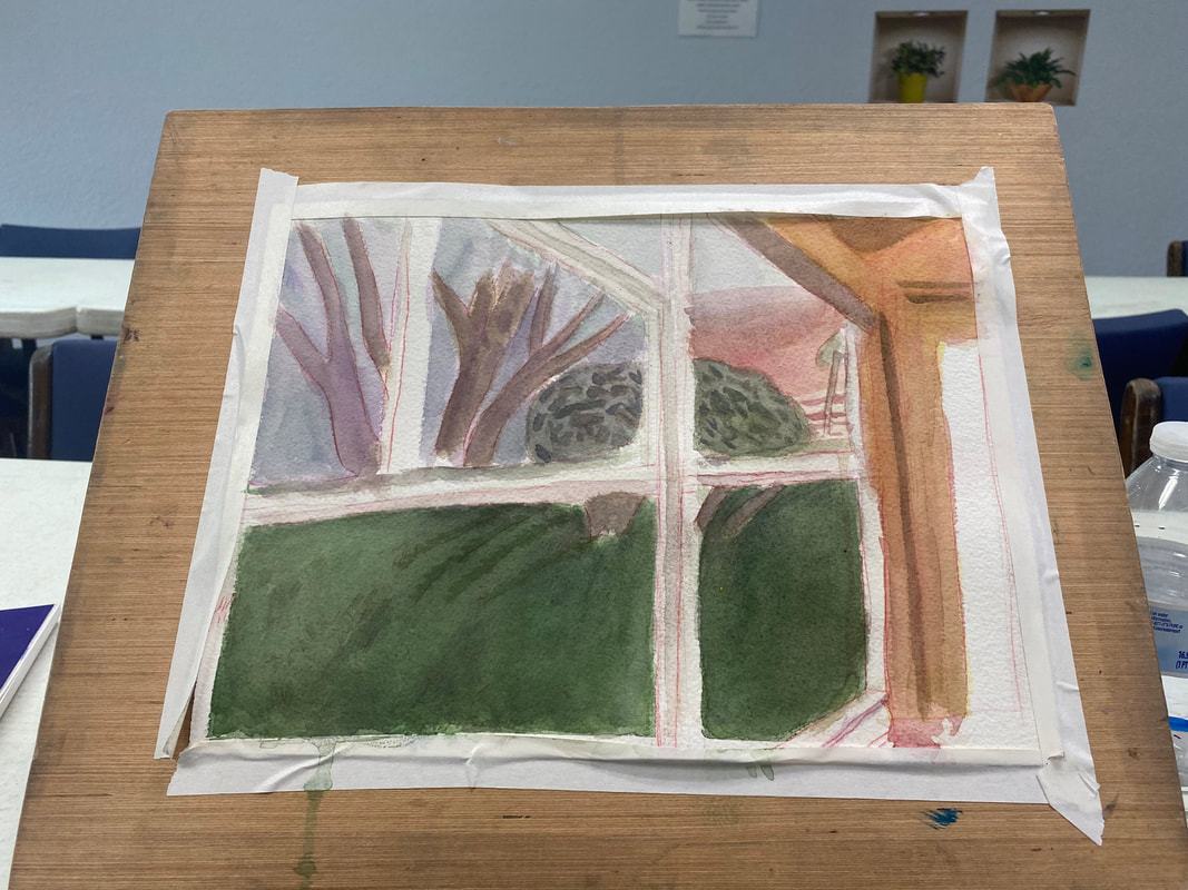
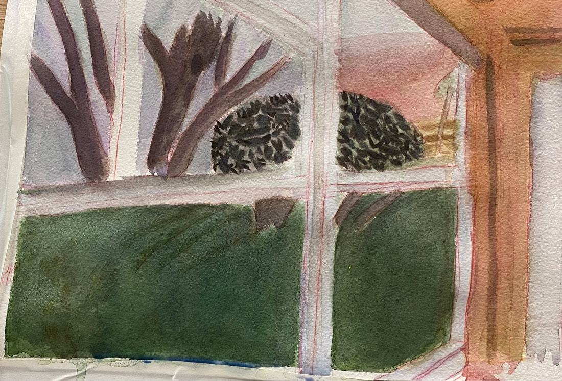
Your reference photo is your guide for your piece. It's your gps, so to speak. But just as you may need to take a different route from what your gps suggests when traveling, sometimes you need to do something in your art other than what your reference photo shows, because it just doesn't look right in your piece. I talked about that in this video. The window frames in my photo appear pure white. 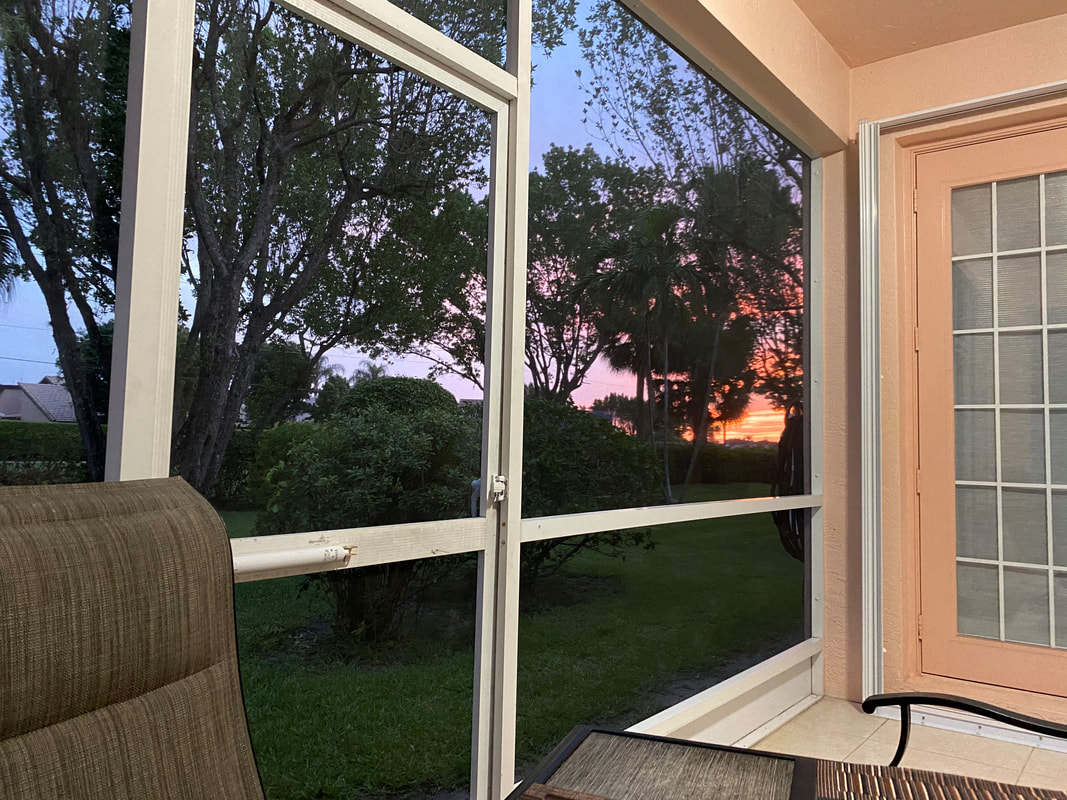 But that looked too stark in my painting. It bothered me. I mixed cerulean blue and purple, the same color I'd used for the sky, and painted very thin washes of this over the frame. My goal was to leave just a hint of the color, so that the frames would look like they were reflecting the color of the sky, but not that they were the color of the sky. I could never have felt that the painting was finished, no matter how many layers I put on it, if I'd left those frames white.
So do what feels right for your piece, not necessarily what your reference photo shows.
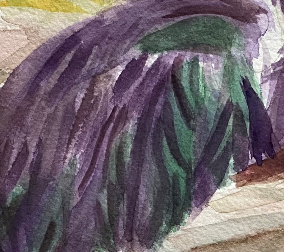 I feel like the most important thing for creating the right texture is to have my lines going in approximately the right direction and to have them either straight or curved, depending on what’s in my reference photo. I can be off the number of strokes in a given place and I can even be off with the length and width a little. If I have the direction and curve right, though, the animal I that ends up in my piece might not even look like the animal in my reference photo at all. While I’ve been working on my current painting of a multicolor heron, I haven’t even been thinking about what texture I want the feathers to be. I’ve literally just been thinking about the direction they go. If I do that, the texture takes care of itself. Sometimes, I happen to pause and take a look at a mass of hair or feathers and see that they’ve come out with almost the exact feel I wanted them to have, without me consciously trying for that feel. I love when that happens. An example I can think of the hair on this portrait. 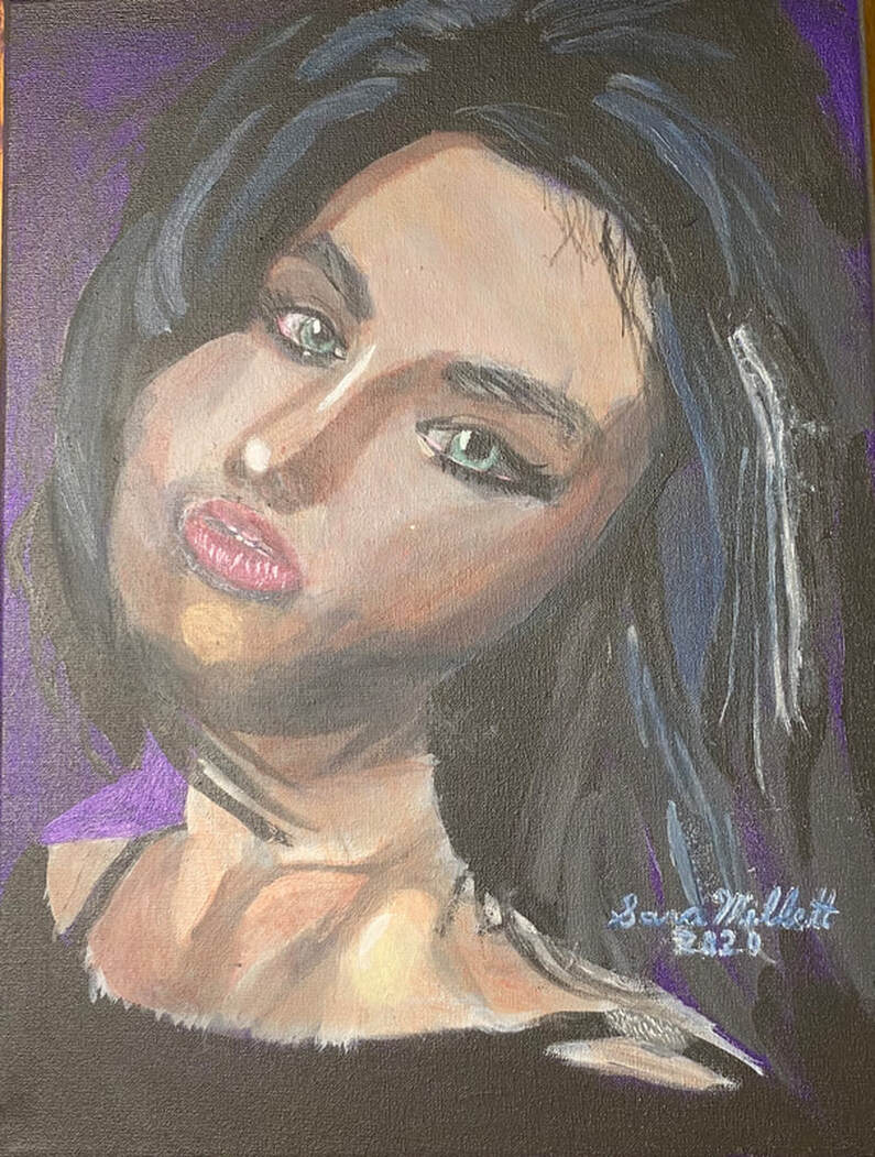 I just painted the shapes I saw in my reference photo and keeping my strokes going in the right direction. Before I knew it, I had the volume I was looking for. As you can see from the examples I've given, this principal applies across mediums.
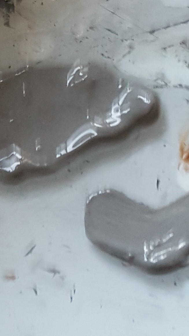
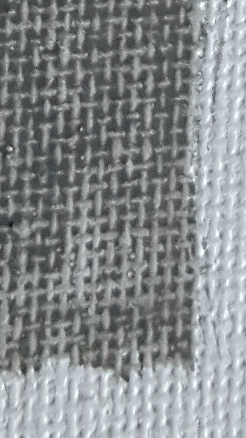
Please don't be misled by the title of this post. It's purpose is not to say which is better between the two, but just point out what I know to be the differences and similarities between the two mediums. Similarities The most major similarity between acrylics and watercolors is that they're both water soluble paints. That means they can be thinned with water and the brushes can be rinsed in water during painting sessions. Because of this, neither acrylics nor watercolors require the use of harsh chemicals so they're perfectly safe to let your kids play with, assuming they're old enough to know what not to put in their mouth of course;. Also, both watercolor and acrylics are relatively cheap mediums to work in. Now, no quality art materials are cheap cheap, but these mediums are a lot less expensive to work in then say oil paints. Differences So those are the similarities. Now for the differences. While all watercolor paint I've personally encountered pretty much has the same type of texture, acrylic paint comes in three varieties, "light viscosity", often labeled "fluid" or "soft body", medium viscosity, and heavy viscosity, often labeled "heavy body". According to manufacturers, the light viscosity acrylic paints are better for glazing for more realistic styles, while the heavy viscosity paints are better for impasto and impressionistic styles because they hold brushstrokes very clearly. If you like painting with a palette knife, a heavy body paint is definitely the way to go. A glazed effect is pretty easy to achieve with watercolor, because tend the put the paint on transparent. You can't really achieve an impasto look with watercolor, though, unless you layed the paint on so thick that it looked more like an acrylic or oil painting. But if you're going to do that, you might as well work with oils or acrylics. So in that sense, acrylics are more versatile than watercolors. That's not to say that you can't achieve a wide variety of styles in watercolor, though. But, if you like to paint in a style with bold brush strokes, you probably won't enjoy working in watercolor, since the nature of the paint interacting with the water tends to blend those out automatically. While writing this, I decided to do a google images search for "watercolor impasto" and I found pictures of watercolor paintings and impasto oil paintings separately. While there are watercolor canvases and acrylic papers, generally speaking most watercolor painting seems to be done on paper and most acrylic painting tends to be done on canvas. Acrylic paper doesn't seem to be good for much of anything other than practice anyway, so there. Another major difference is in the histories of both mediums. It wasn't as popular or as prestigious as oil paint, but watercolors have been around since ancient times. Albrecht Durer is known to have done them. Acrylics, on the other hand, as we know them, have only been around since about the 1950s. *Watercolor paints are comprised of just pigment and water, whereas acrylics also have a polymer called acrylic mixed into them, hence their name, which accounts for their more oil paint like texture. How I Work With Each Medium When I work in acrylics, I usually work on canvas. Sometimes I might work on board, but I never work on paper with this medium. I use a smooth glass palette without any wells, because I'm not going to be adding a lot of water to my paint. I'll usually thin the paint with some acrylic medium, or add just enough water to thin the paint without making it runny. In the gallery below, you can see both what that paint would like like on my palette and on the canvas. I achieve this by adding little bits of water at a time with a brush. When I'm working in watercolor on the other hand, I use a little spray bottle to load that paint down like crazy with water. When working in watecolor, you should expect to put so much water in the paint that the paints would run into each other if they weren't separated. That's why palettes made for watercolor have wells or compartments for individual colors. I'm including a pic of my watercolor paint in my palette after I've mixed water into it. You'll see that the paint runs along the edges of the compartment, because there's so much water. Note:If you already have a palette like this and want to try acrylics, you can definitely use it for that. I prefer the large glass palettes, though just because they're so much easier to mix on and clean. 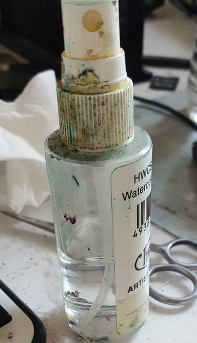 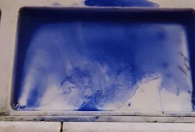 When working in acrylics I don't put anything on the surface under the paint, unless it needs to be gessoed. When I work in watercolor, though, I usually find it very helpful to wet the area I'm working on before putting the paint on top. It just seems to flow much better that way. Here's some paint put directly on the paper 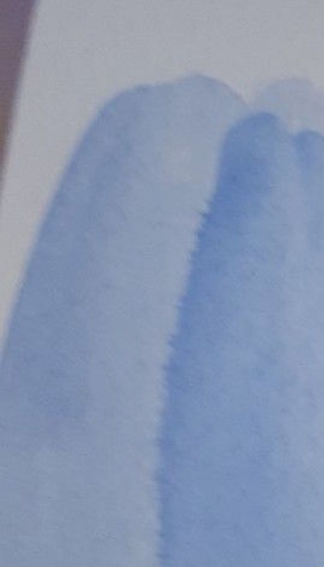 and here's some paint put down after wetting the paper. 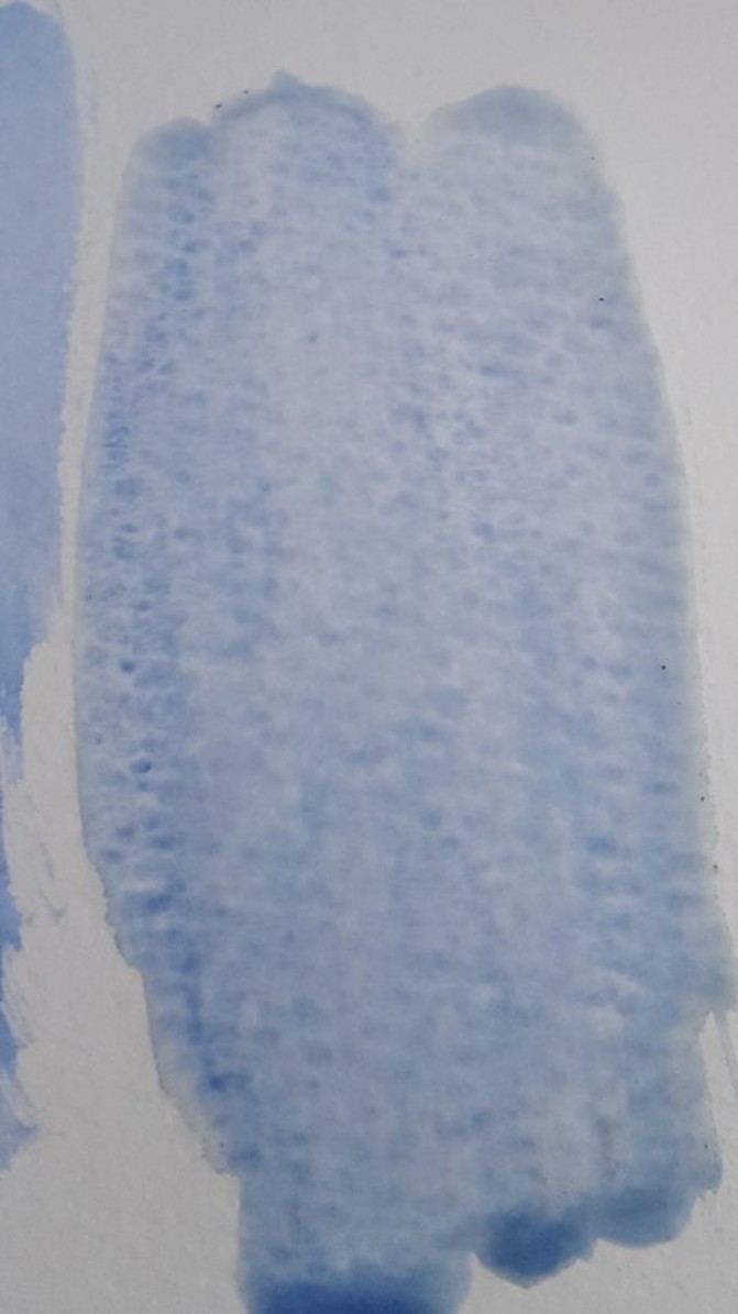 As far as how I actually paint, how I move the brush and stuff, that's pretty much the same with both mediums. The difference is in how I prepare the paint on my palette and how, or even if, I prepare my surface for the paint. So those are the similarities and differences between watercolor and acrylic paints and how I work with both. That's all for now. I'll talk to you again next week. *Since writing this post, I've learned that watercolor paints also include gum arabic and additives like glycerine, ox gall, honey, and preservatives. |