|
A while ago, I made a video asserting that you can make great art in any medium. With that in mind, I want to urge you, if you're not satisfied with how your piece is coming out, don't blame your medium. By the way, just so we're clear, by "bad", I mean that doesn't have the results you were going for. This was brought to my attention as I've been becoming reacquainted with watercolor after painting almost exclusively in acrylics for years. I did several of the same paintings in both watercolor and acrylics and the acrylic version always come out better than the watercolor versions. Now, I can't say that acrylic is a better medium than watercolor, because I've seen artists who work in watercolor do amazing work. Something I know from having done the videos I do and looking at the footage I have, is that I spend a lot more time on my acrylic versions of these paintings than on the watercolor versions, sometimes as much as twice as long. Now, it would be so easy to just say "Well, I guess watercolor isn't as good as acrylics, 'cause look at the results I'm getting with the acrylic paintings that I'm not getting with the watercolor". But what this shows me, is that I need to slow down and take more time with my watercolors to get comparable results to my acrylics. In other words, I have to accept that if I don't like how my art is coming out, it's not my medium. It's me. I assure you, no matter what medium you're working in, even if you don't like how you're work is coming out, somewhere, someone else is doing what you would like to do in that medium. Take this rose for example. I did it in acrylic 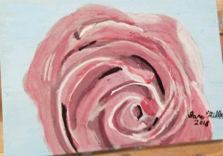 and watercolor. 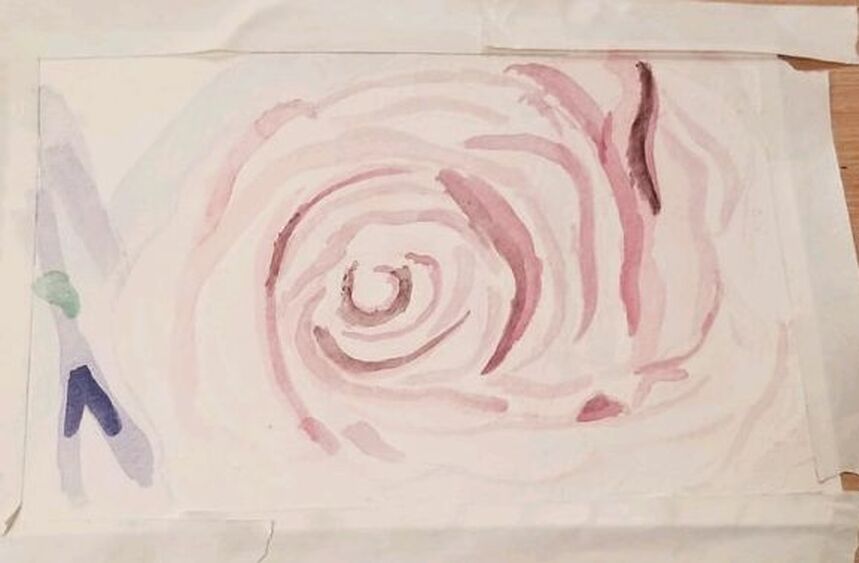 As I said before, I really like how the acrylic version came out a lot more. The main reason for this is because the colors are so much more intense. I was afraid to go super dark on the watercolor version. I thought it would look bad with that medium and my work suffered because of it.
The folds of the rose show so much more in the acrylic version and I could have had that in the watercolor version, if I hadn't been afraid to go super dark. Disclaimer: While any medium can yield great results in the hands of a skilled artist, you do need quality materials. Here are seven of my tips for finding them.
0 Comments
 I'm starting with a black and white grisaille. In the second photo, I've just added more values and softened my edges a bit more than in the first photo. I feel like the key to making something look shiny, like silk, is to use lots of different colors/shades and have soft edges.   Even though this dress is technically blue, I've started by painting the raised parts violet. 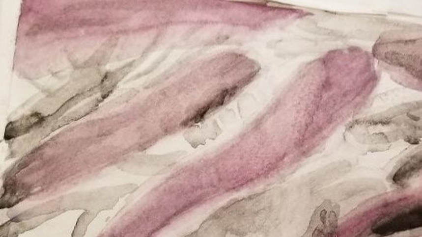 When it came time to add the blue, I added some black into my Prussian blue that was already on my palette to dull it. I applied this to the rest of the painting using the wet on wet technique. 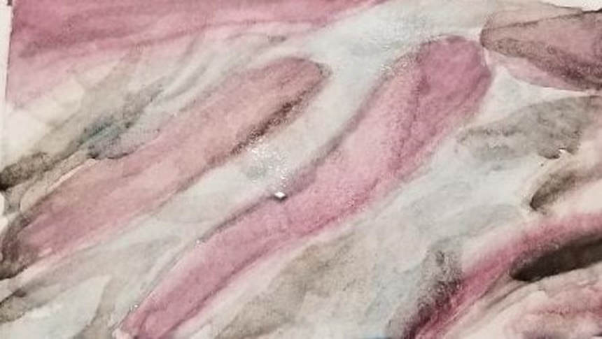 At this point, I still didn't feel like the piece had the shiny look I wanted it to have. I realized I needed to add more contrast by adding darker shades next to my lighter ones. 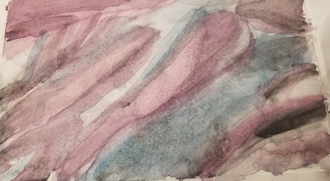 The more contrast between light and dark you add, the silkier something will look. In the next pick, I added even more contrast. 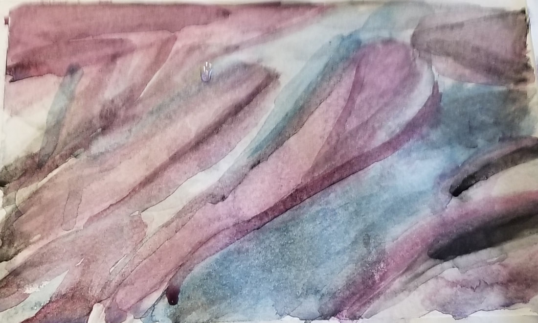 I want to point out that I showed this painting to my mom when it was in the stage before I'd added the extra contrast and she didn't say anything. I asked her what she thought and she said the painting didn't speak to her. But when I showed it to my mom after I added the extra contrast, she was like, "Ooh, wow, now I see it". To me, this drove home the fact that contrast, or lack thereof, can mean the difference between someone stopping and looking at your work, (and possibly buying it) and walking on by without giving it a second thought. During the time of writing this article, I visited my aunt in New Jersey. She takes watercolor classes and she told me about a trick of spraying the edges on a watercolor painting with water to soften them. By the time I heard about this, the painting had been sitting dry for days, but that wasn't a problem, because, as I've said before, watercolor can be reactivated after it's dry. I spritzed the edges of this painting with my little spray bottle and I think that was just what it needed. 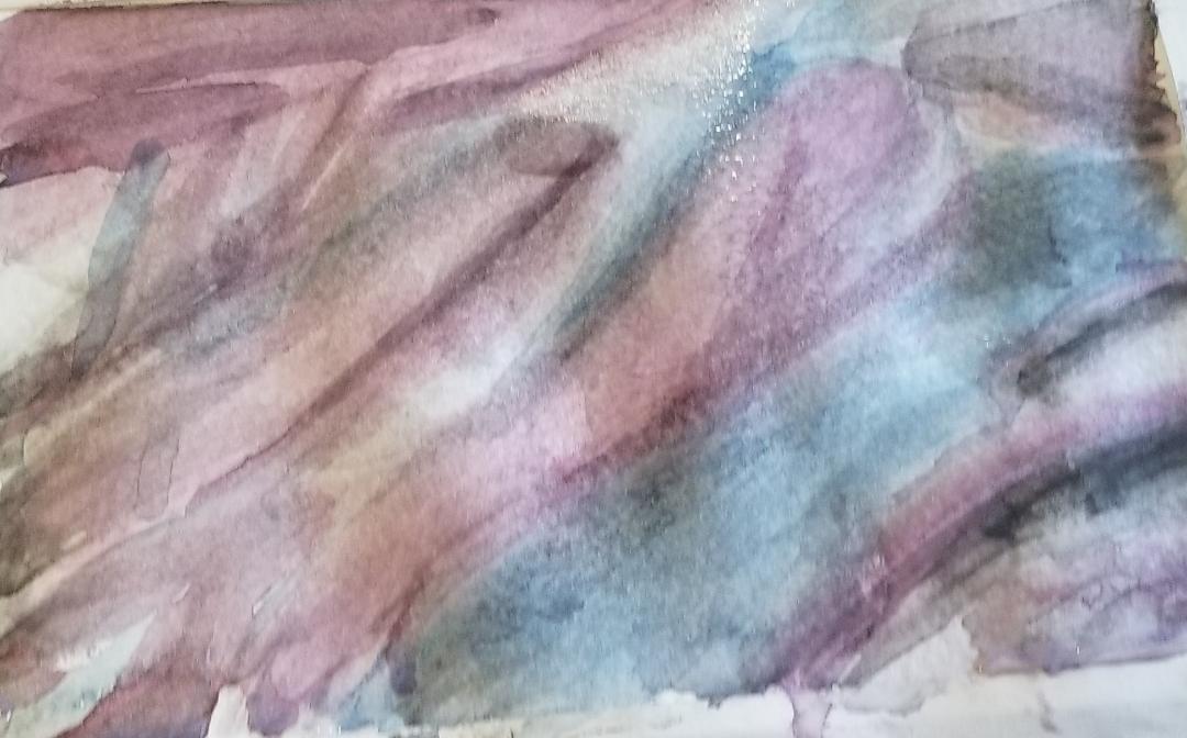 Now that the watercolor portion of this lesson is finished, or at least as good as I can make it, today it was time to start on the acrylic portion. I almost got through the underpainting. 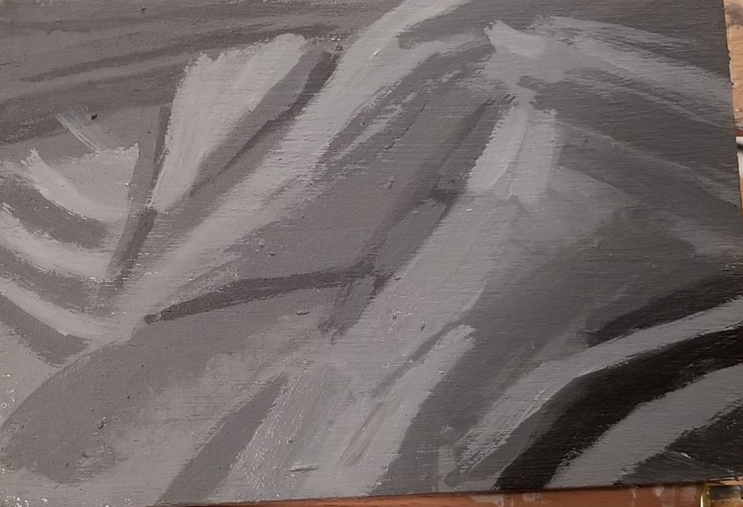 I started by mixing up some gray blue from zinc white, mars black, and ultramarine blue and painted this onto the patch, followed by some violet, made by mixing a little bit of ultramarine blue into red. 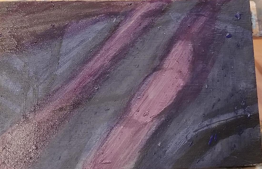 To amp up the shine even more, I added some mars black along the edges of my violet with a liner brush and lots of water. I layered gray made by mixing zinc white and mars black over my purple patches to adjust them.  I decided I wanted to lighten some areas even more, so I added zinc white, which is a transparent white from the Amsterdam line to them and blended the edges with my brush. 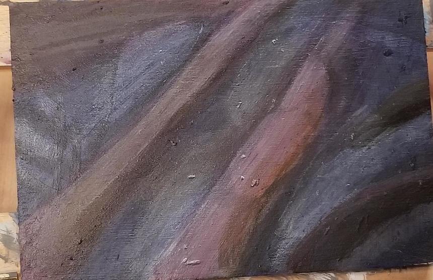 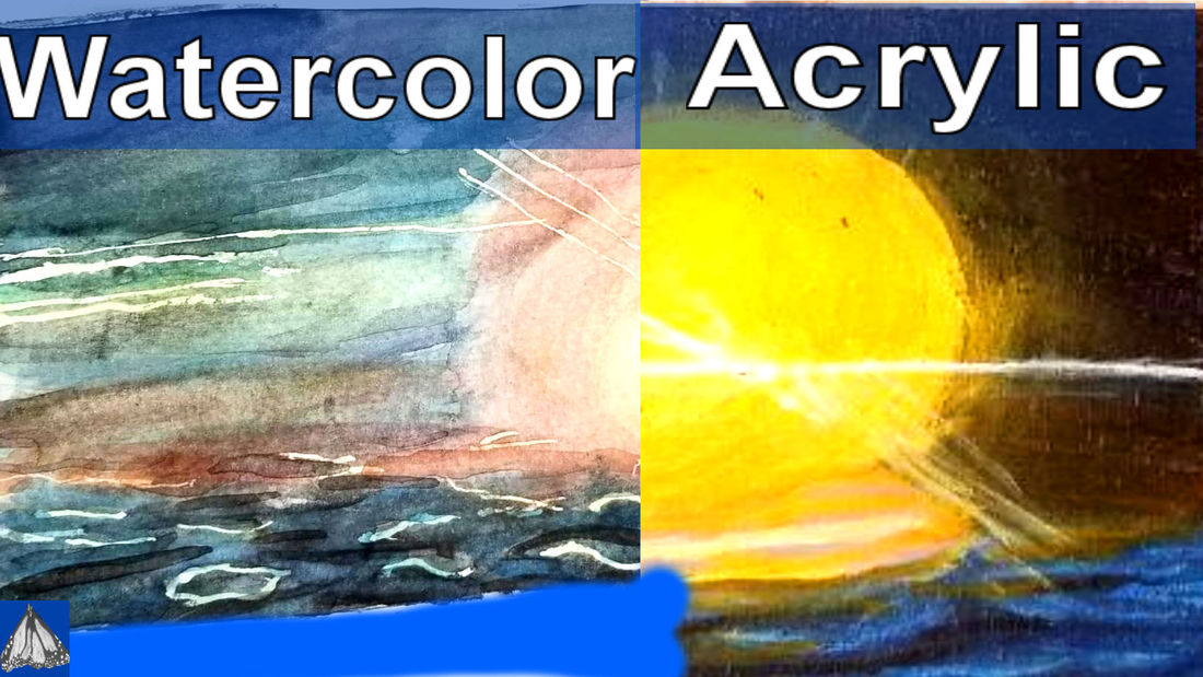 As with my painting of the rose, I'm determining where my whites will go first on the watercolor version of this painting. I decided to try the grisaille method this time with my watercolor painting. 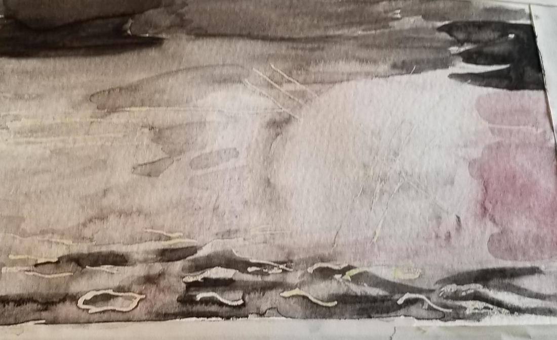 I thought I'd cleaned out the section of my palette that I put my black on pretty well, but it turned out there was still some residual red paint, which showed up in the painting. Now, this is a sunset, so the red works. That brings me to an important point. Part of being a good artist is learning how to fix mistakes, or if you can't fix them, how to make them work for you in the painting.  When I was painting the sky, I was careful to leave a space open for the sun. When it came to painting the sun, I thought the rim around it was a bit too reddish and I wanted it to be more toward the yellow orange side. I don't have much practice glazing in watercolor and I don't know how effective I can make it, but I decided to try it with this painting. I glazed yellow, lightened with water of course, over the rim of around the sun. 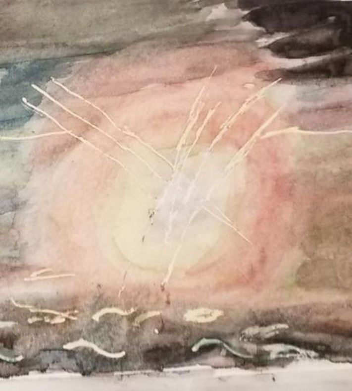 When it came time to add color, I filled the sky with blues and greens. I would periodically take a brush with nothing but water on it and soften my edges, blending my colors into each other. 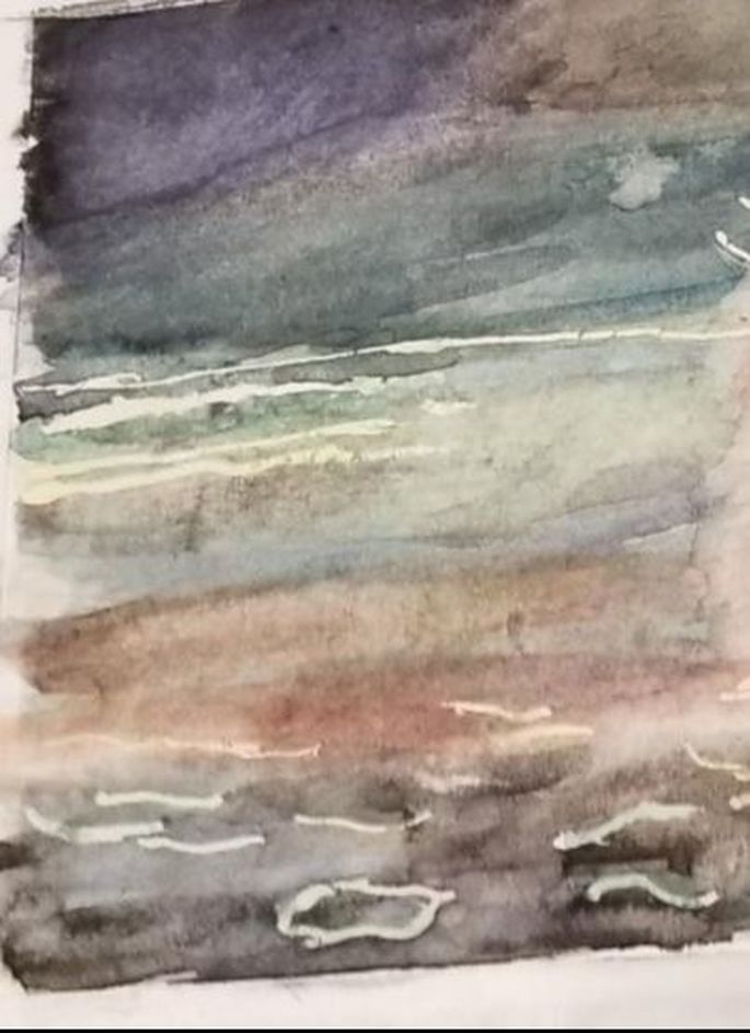 Now, in the middle of painting, I realized there should have been some yellow in the sky. I set to work lightening my blue in the sky with a wet brush. I wasn't able to lift it completely, but I was able to lighten it enough that I could get yellow in that part and have it show up somewhat. I used this same technique to get blue on the part up top, which I'd painted black in my underpainting 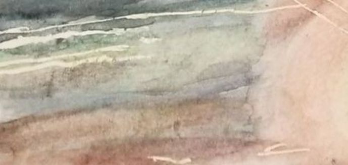 I feel I should mention, I used Prussian blue to paint the water because it's brighter than my usual ultramarine blue. 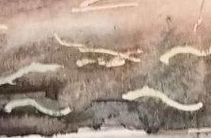 On the second day of painting, I went over my waves with some black paint and a liner brush, because I decided they needed to be redefined. I used a liner brush, even though the waves are a bit thick, because it gives me the most control, so I'm able to make the specific shapes that I wanted to. I also thought the blue of the water wasn't intense enough, so I put another layer of it on. In some parts I thought the paint had gone on too thick, so I took a brush with, again, nothing but water on it, no paint, and spread and thinned the paint out. When watercolor paint has the right amount of water mixed into it, it's a pleasure to work with. 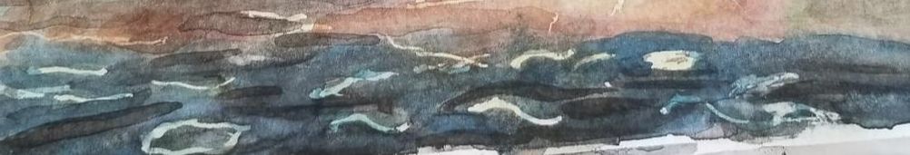 The last thing I did was go over the sun again with more yellow to intensify it and glaze some of the yellow over the orange part to give it more of a glow. 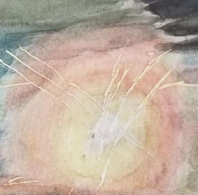 Now that the watercolor version of this painting is done, I’m starting on the acrylic version. I’ve started with a layer of a midtone gray and I’ll layer darker and lighter shades on top.  Here's the result of adding extra values to my initial midtone painting. When it came to painting the water, I actually drew my the shapes of the waves in with a charcoal pencil. 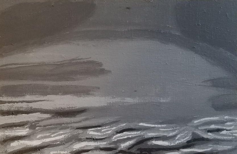 I layered phthalo blue on top of ultramarine for the top part of the sky. I painted the main part of the sky a transparent blue green. I didn't bother to leave space for the ultramarine streaks I would be painting on, because I actually wanted the blue green to show through them. 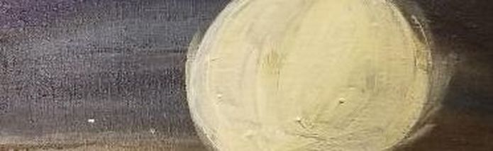 I glazed burnt umber over the right hand side of my blue streak and brought it into the green. This has nothing to do with the lesson, but I just want to say that I'd been using my transparent burnt umber from the Liquitex Soft body line, but this time I decided to try the burnt umber from Amsterdam. It worked for the technique I was using, but I think I might like the results I get from the Liquitex paint better.  The water in my reference photo is a really beautiful blue and I was debating with myself over how I was going to capture that. For the watercolor portion, I used prussian blue, but for the acrylic version of this painting, I decided to mix ultramarine blue with cyan and I glazed that over the entire water portion, right over my waves. Then I took some yellow orange that I mixed from Cadmium yellow and Cadmium orange, and using a liner brush, painted that over some of the light blue waves.  I tried to paint my sun straight on top of my sky, but the paint I was using was too translucent for that. So I painted the sun with titanium white and then painted my yellow and orange over it. That titanium white works like a charm. I also painted rays of light coming off the sun using a liner brush and both zinc white, because I wanted the yellow to show through some of the rays, and titanium white. You can see, I also painted a streak of titanium white going straight through the sky and sun. 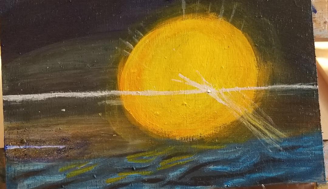 I decided to paint the area of the ocean that was around the sun titanium white and then go over it with pale orange and green, to brighten up the area. When I showed the painting to my mom and this stage, she asked if the green line going across wias the green flash and I was like, I hadn't thought of it, but I guess it is. 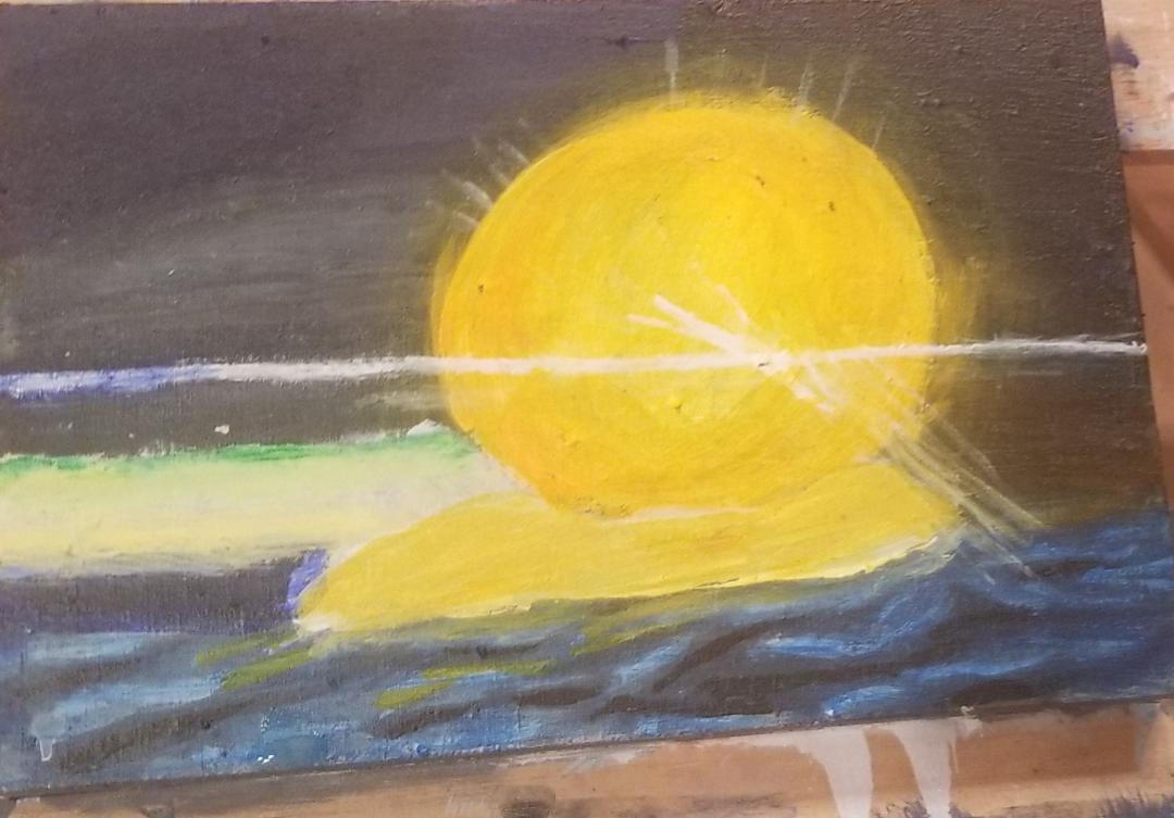 ...and here's the acrylic version of this painting finished. 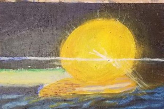 |