|
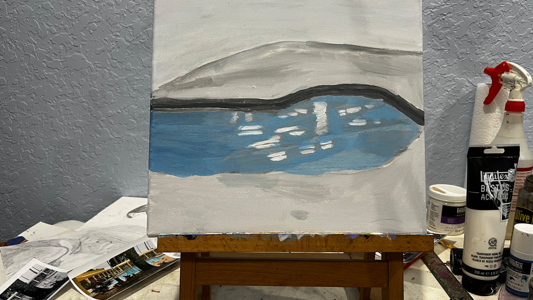
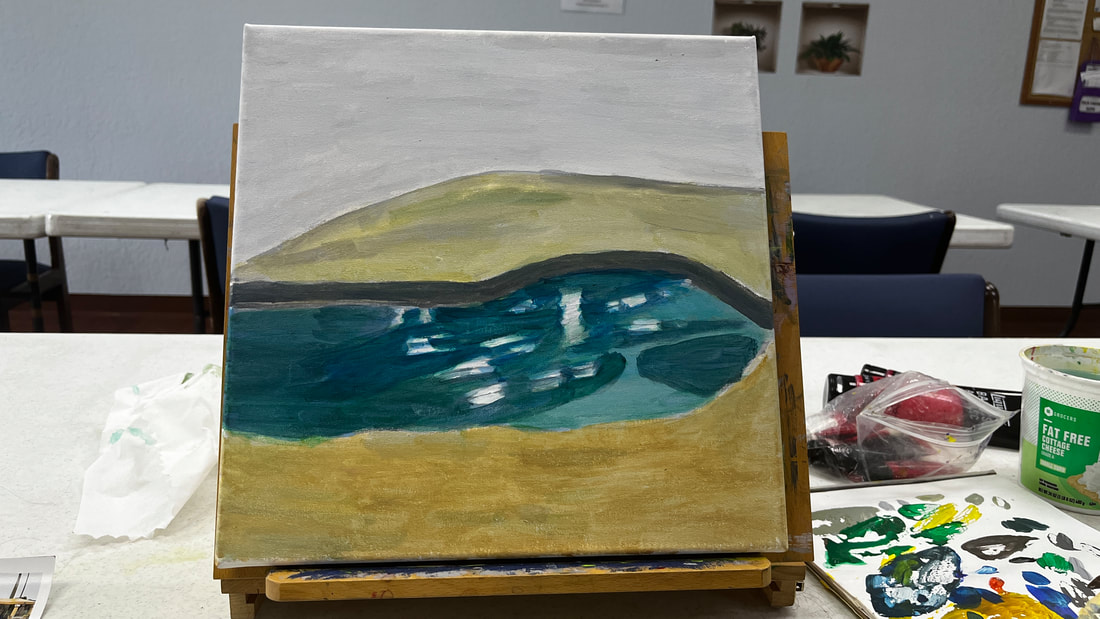
I painted my community's clubhouse pool area in acrylics. Read on to find out how. 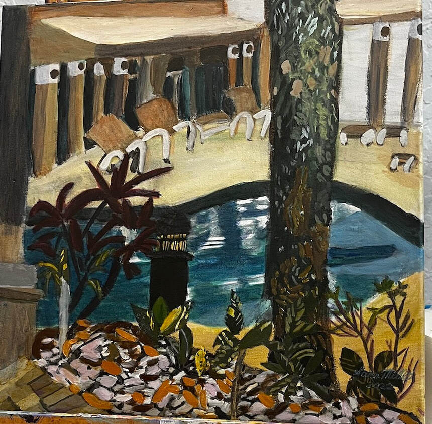 I’m starting by painting the sky, pool and deck as a base. I’m painting the grisaille and I’ll go on top with color. After I painted the shadows on the pool, I realized they were too dark and needed to be lightened. 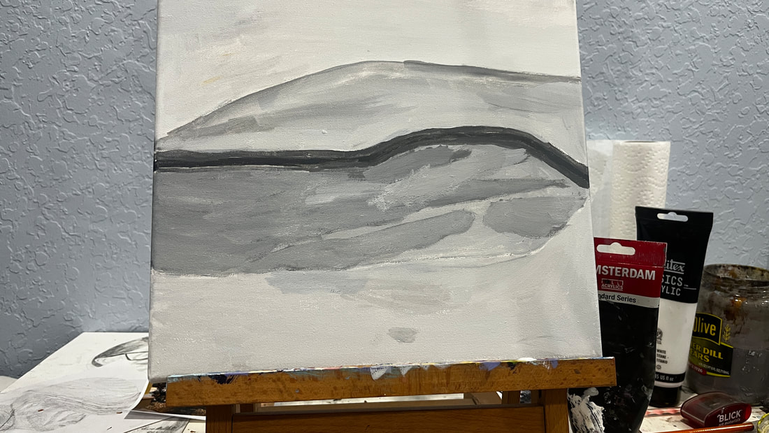 I mixed cerulean with ultramarine for the water and glazed green on top of that to brighten it.
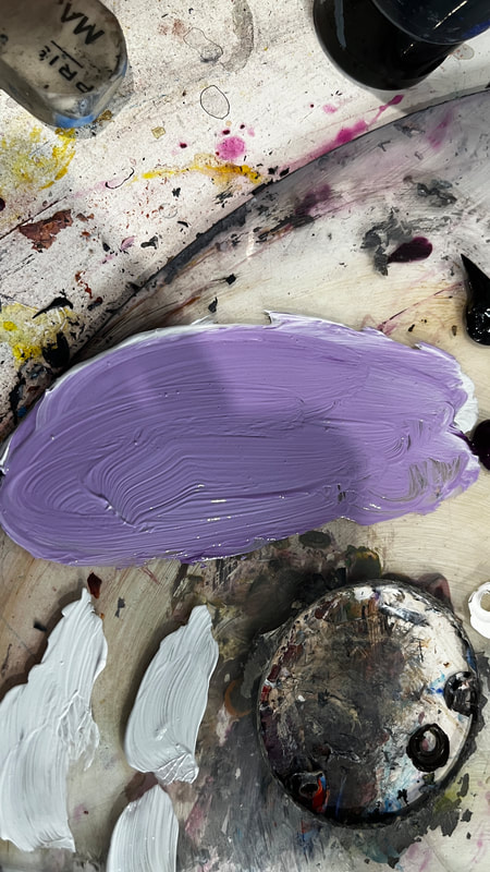
After I’d finished glazing color over the water and the deck, I took a charcoal pencil and drew in the plants, gazebos, chairs, and tree. At this point, it was time to start over with the grisaille again. 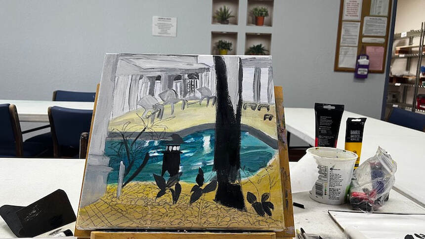 Using my liner brush and wiggling my wrist while holding the handle, I can get the roughness in the tree bark I’m going for. Making the highlight on the side of the top of the light post sufficiently light gives it dimension. I’m much happier with how the gazebo looks much better since I’ve added those dark shadows to the spaces between the posts. 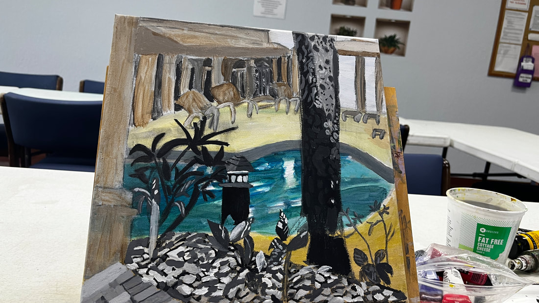 Approaching painting the pebbles, I’ve decided to mix a grayish purple from transparent mixing white and ivory black for the palest of them. The purple came out too bright, so I mixed some orange into it.
Most of the pebbles were different shades of brown, so I used yellow ochre or burnt umber mixed with cadmium red medium, which I chose for its orange tint. I had originally tried to use my yellow ochre and red mixture mixed with green and black for the darkest pebbles, but I quickly realized that mixture wasn’t dark enough. 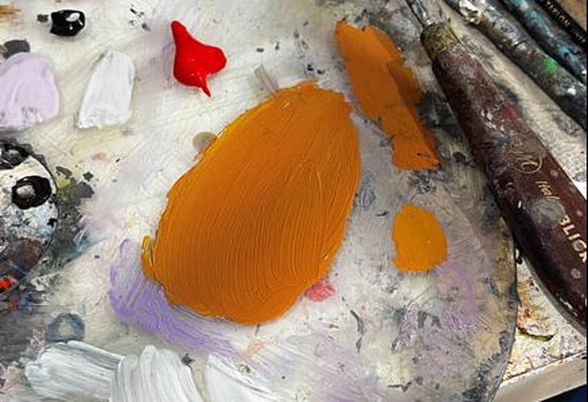 yellow ochre mixed with cadmium red medium I planned to paint the spaces in between the bars on the light post yellow and glaze orange on top of that, but I was surprised by how happy I am with just the yellow. 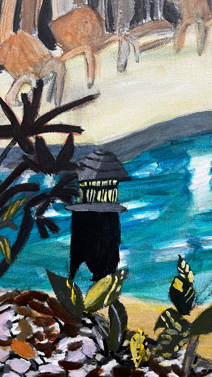 Here’s the lighthouse with orange glazed over the yellow. 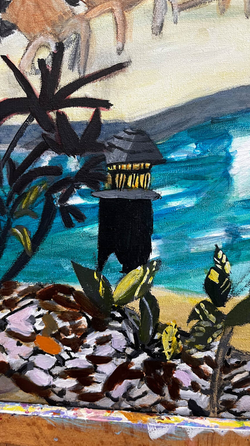 I mixed transparent white with yellow, purple, and cadmium red medium and glazed over the gazebo because it needed to be peachy. I used an opaque version of this color for the top of the gazebo roof to create the necessary contrast between it and the sides to make it look three-dimensional. 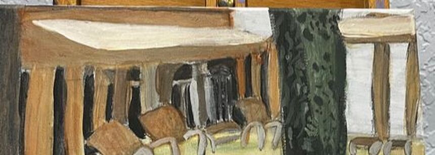 There needed to be more medium-brown pebbles.  I knew the tree needed more detail, and I painted some brown markings on it, being careful to paint the same approximate shapes as were in my reference photo. 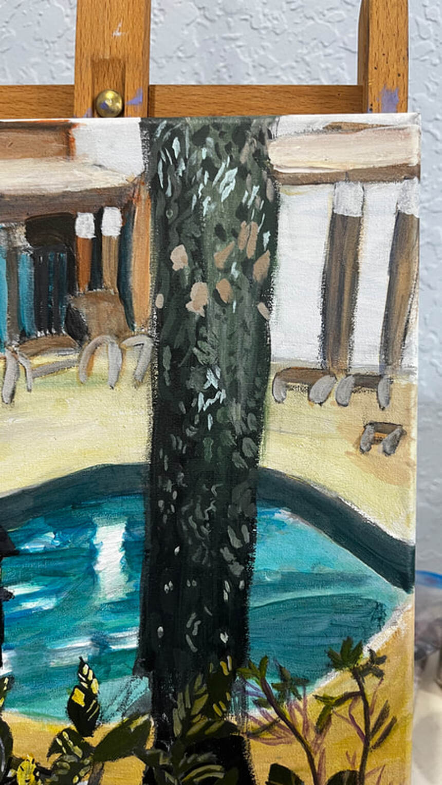 When I felt I’d done all I could on the tree, my attention was turned back to the gazebo, and I realized that there needed to be a shadow along the front of the overhang to give it dimension. I did this simply by glazing blue, which I’d toned down with orange so it would be muted and shadowy over that side. While I was doing that, I glazed that same blue over half of all of the posts. You don’t always have to do a big mixing job to get effective shading in your pieces. I saw that the windows in the gazebo looked to be bluish green. I used cyan instead of ultramarine this time when I mixed the shade for them. 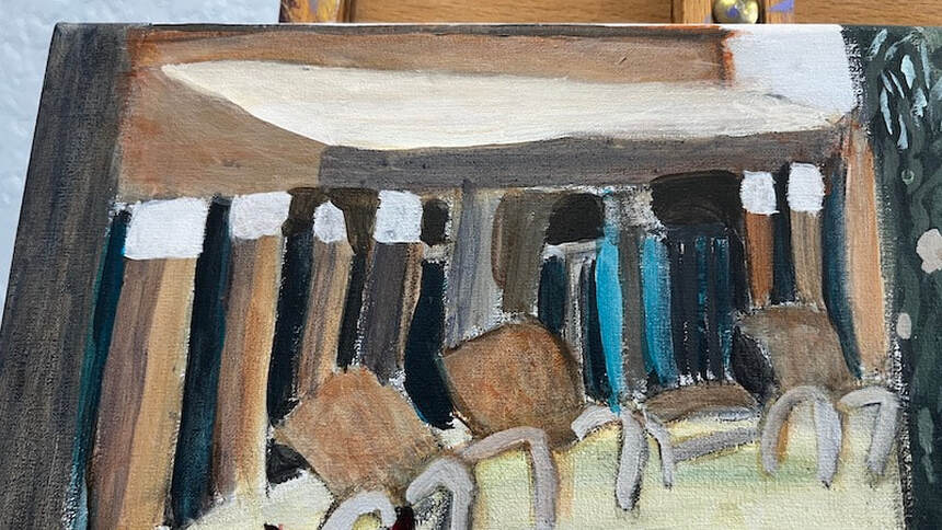 The first thing I did today was paint pale purple highlights on the reddish-purple leaves in the lower left-hand corner. The shade I mixed didn’t come out red enough, so I glazed some red over my purple when it had dried. 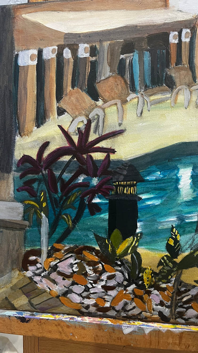 You can also see the light post in this pic, and you might notice that I painted two-thirds of it a lighter shade of gray, so now it looks like it has a front and a side. There was some obvious dry brushing in between the posts in the gazebo and on the edges of the tree, so I worked on taking care of that. Dry brushing is when there are little holes or bumps in the paint due to insufficient paint or water in the brush. So the fix for dry brushing is to go back over those parts with the same color, of course, but with just more paint and/or more water, in the brush. I painted reflections in the pool by wiggling my wrist from side to side, then spritzing the canvas with my cosmetic spray bottle, and then blending out the edges of the wet paint with a dry brush. 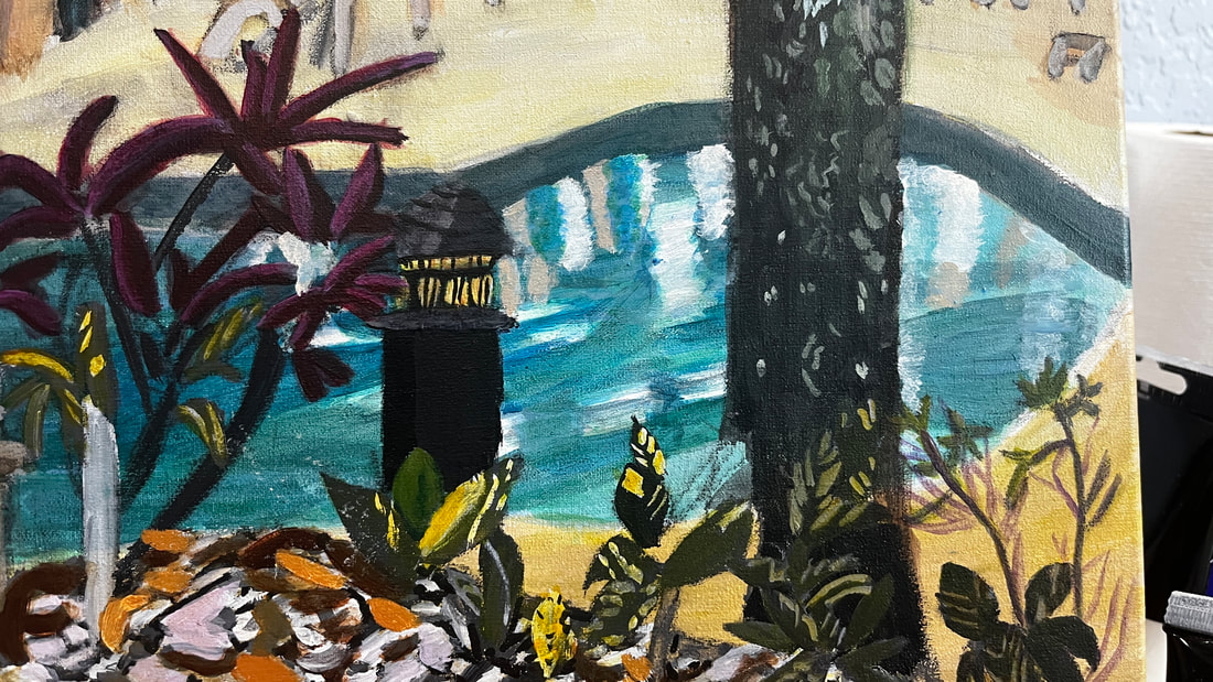 Then I glazed a layer of blue-gray over all of this. My first layer was too sheer. I wanted the reflections to look almost cloudy underneath. 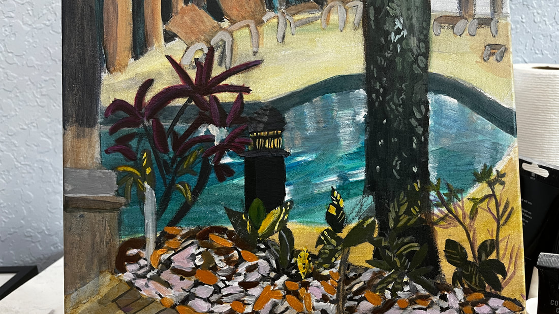 I painted more green detail in the tree using a liner brush. I blended out the edges so they wouldn’t be harsh lines. 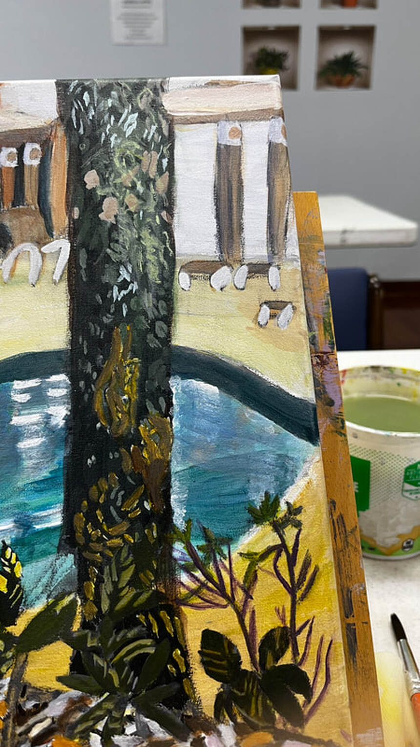 Those brown spots were too warm when I first put them down, so I added blue to my mixture for the second layer. I was finally satisfied when I mixed some gray into my brown. I glazed burnt umber over these leaves and I think they look much better. The color I’d painted them had been bothering me for a while. 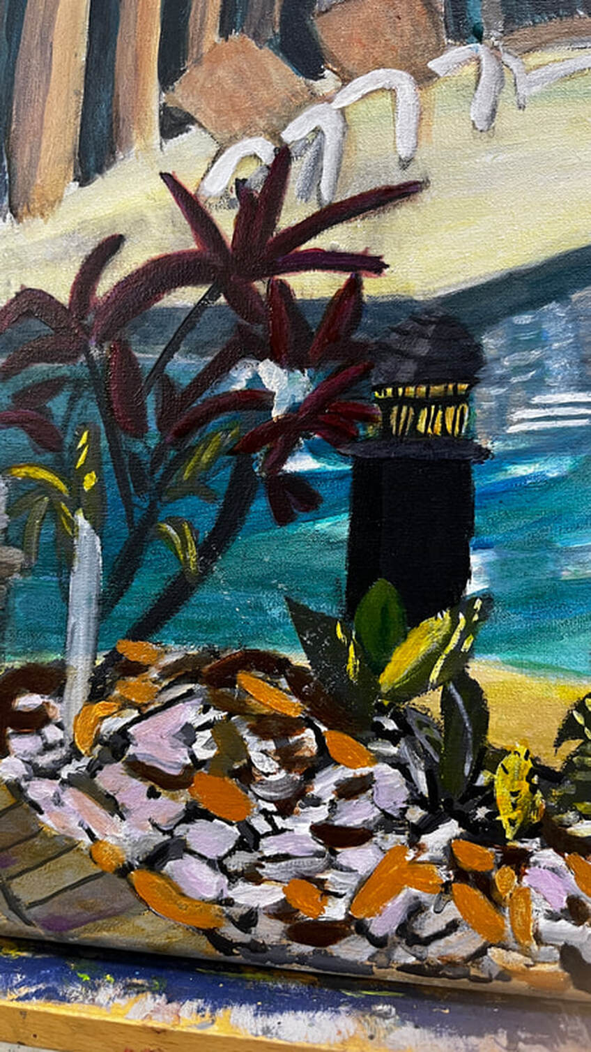 Being almost finished with this painting, my main concern today was adding contrast and saturating colors where appropriate. I darkened the edge of the pool, the windows of the clubhouse, and the tree with ivory black. I also lightened the deck with transparent mixing white. What I was really interested in, though, was brightening up the water in the pool. I did this using a combination of dark permanent green and, later, ultramarine blue. I was pretty satisfied with my work, 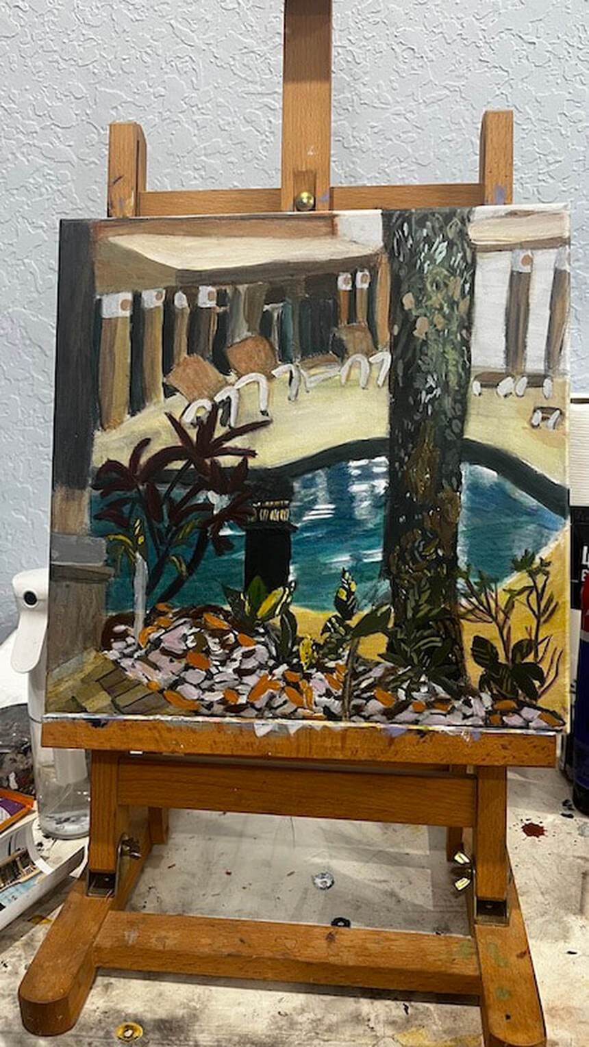 but then, while I was cleaning up, a bottle fell off a shelf, and when I looked at it, I saw that it was Prussian blue, a color I hardly ever use. I wondered if it was still good, as it didn’t seem to want to squeeze out of the container. I scooped some out with a brush and, while it was on my pallet, thought to myself that it really was a beautiful color and it was a shame I didn’t use it more often. It might just be perfect for what I’m going for with this swimming pool, I thought. 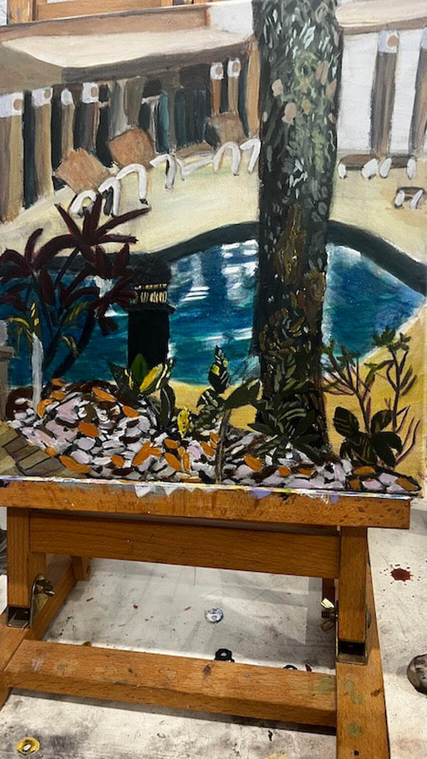 Before adding the Prussian blue, the water looked gray in comparison. I used a 12x12 watercolor canvas from Fredrix and paint from Liquitex and Royal Talens for this painting.
0 Comments
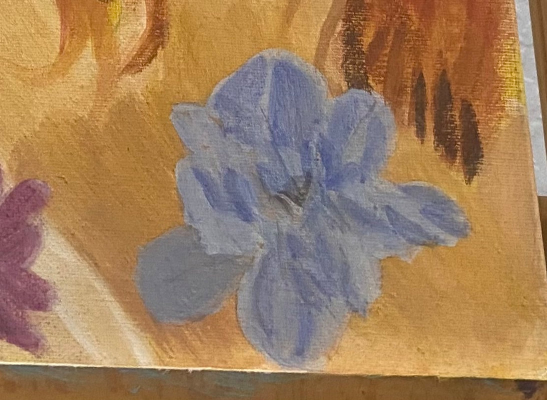
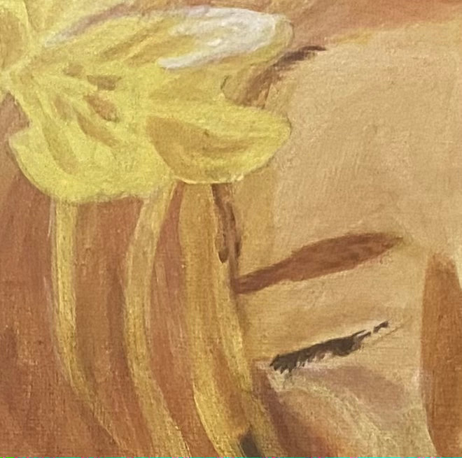
 I knew I wanted the blue on the one flower to be very light. I obviously over did it, though, because when I put that first layer on, I could hardly see any color at all. It needs to be darker than this, I thought. I couldn’t fix it right away, though, because that first layer had to dry. My other flower is somewhere between pink and purple. My plan was to mix red into the blue that was already on my palette. I knew the cadmium red medium I’d been using wouldn’t work. I needed a bluer red, so I chose carmine, from the Amsterdam line. The color I came up with didn’t exactly match the reference photo, but that didn’t matter to me. Getting back to that blue flower, it took two more layers, both times adding more ultramarine blue into my mixture, before the I started to be satisfied with the color that I was seeing. Maybe this is a lesson that even if I think something should be extremely light, it might be better to go a little darker than what I think something should be. 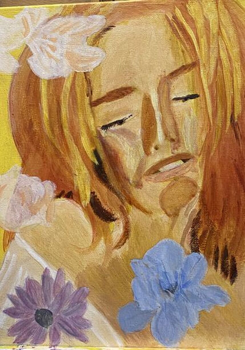 I mixed purple with my yellow for the shadows on the flower in the top left-hand corner.I needed to be careful when painting the pink on the rose, so as not to cover up all of the yellow. I needed some of it untouched and I’m always nervous when doing stuff like this. I look back at my reference photo every time I finish painting one patch to see where my next one should go. I used a couple different shades of pink, as you can probably see. 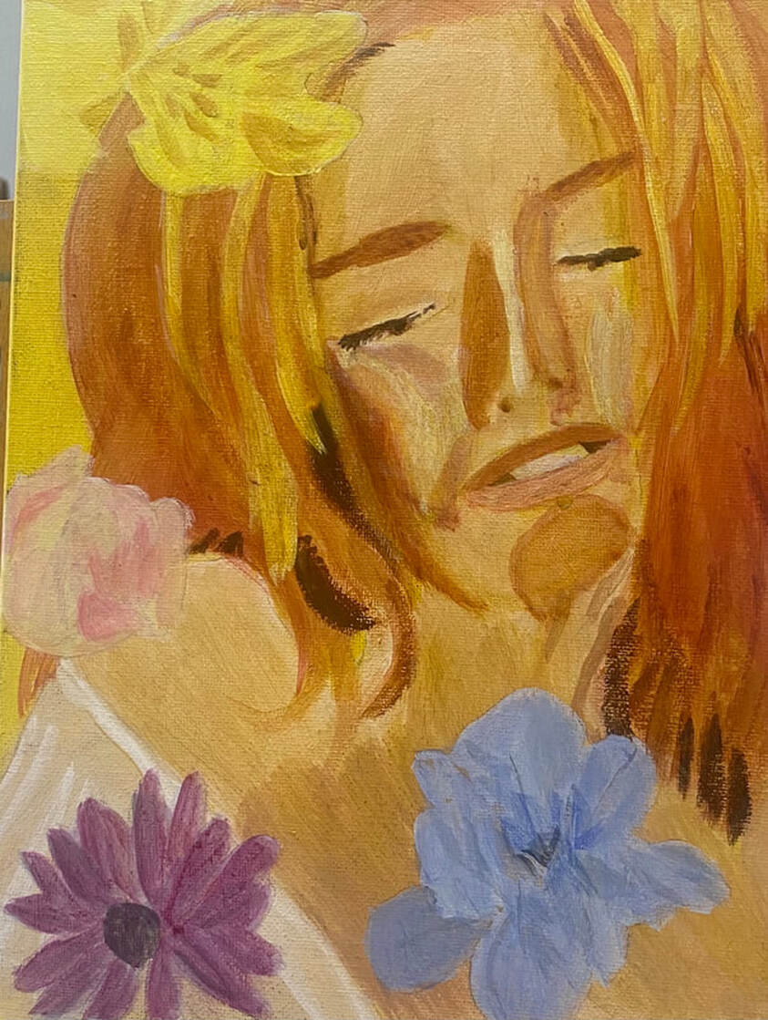 I painted shadows on the blue flower by mixing blue with orange. What stood out to me when looking at the yellow flower was the white highlight on it.
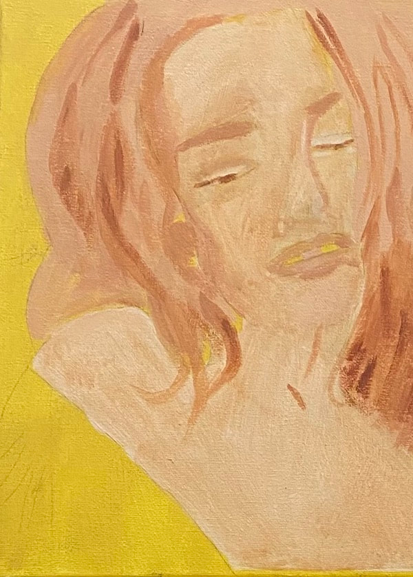 A few years ago, I showed you how I made a painting with a dark and spooky mood. I decided then that one of these days I would do a something about creating a calm and happy mood in a painting and now I’m finally doing it. I chose this particular photo because of the woman’s serene expression. I’ll be using mostly warm tones, yellows and oranges. The concept of using warm colors starts with background, for which I used yellow mixed with a bit of burnt umber. 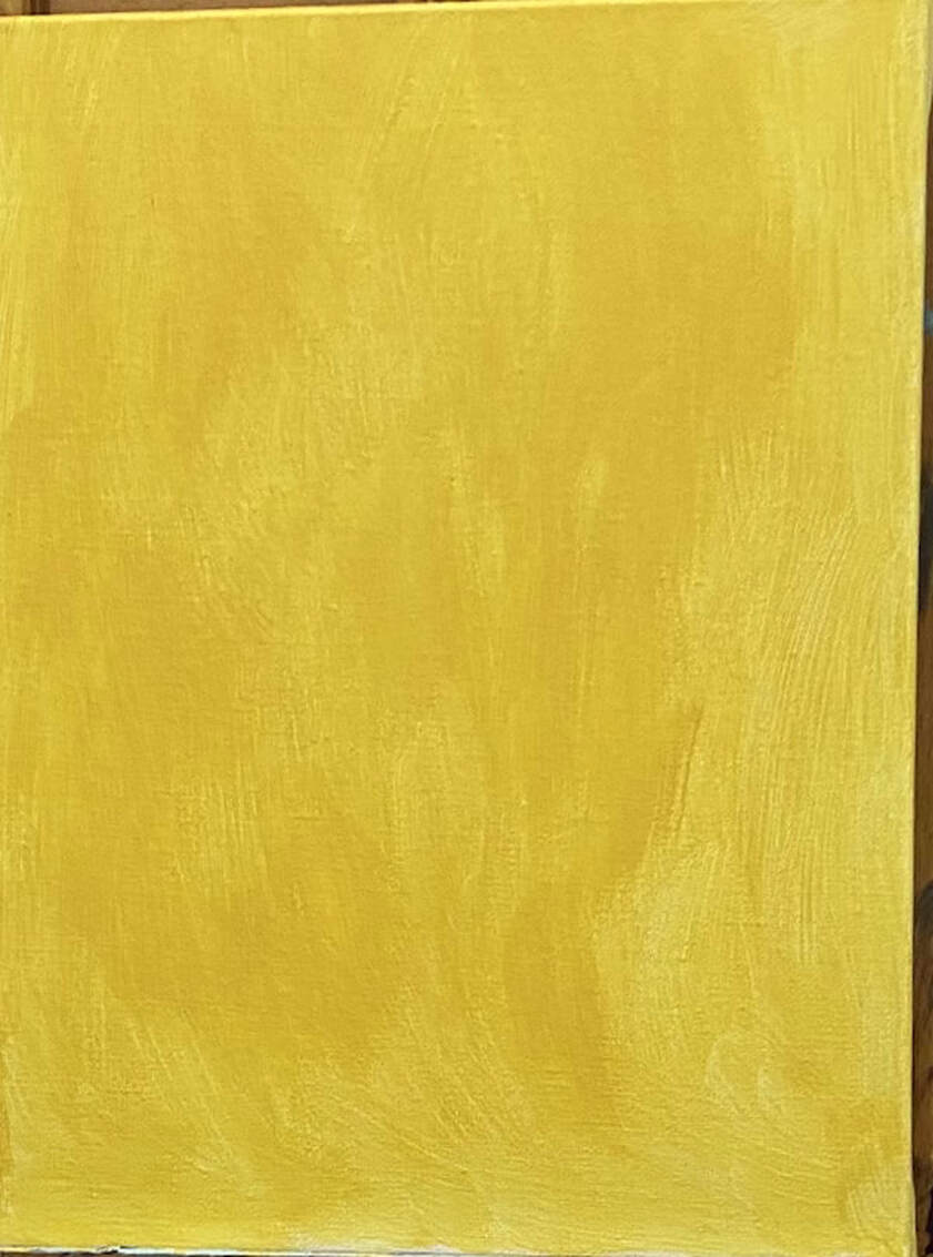 I’m using a sepia toned underpainting instead of my usual gray one for this piece. This will not inferior with the warmth of the colors I’ll be putting on top. I know this from this experiment. 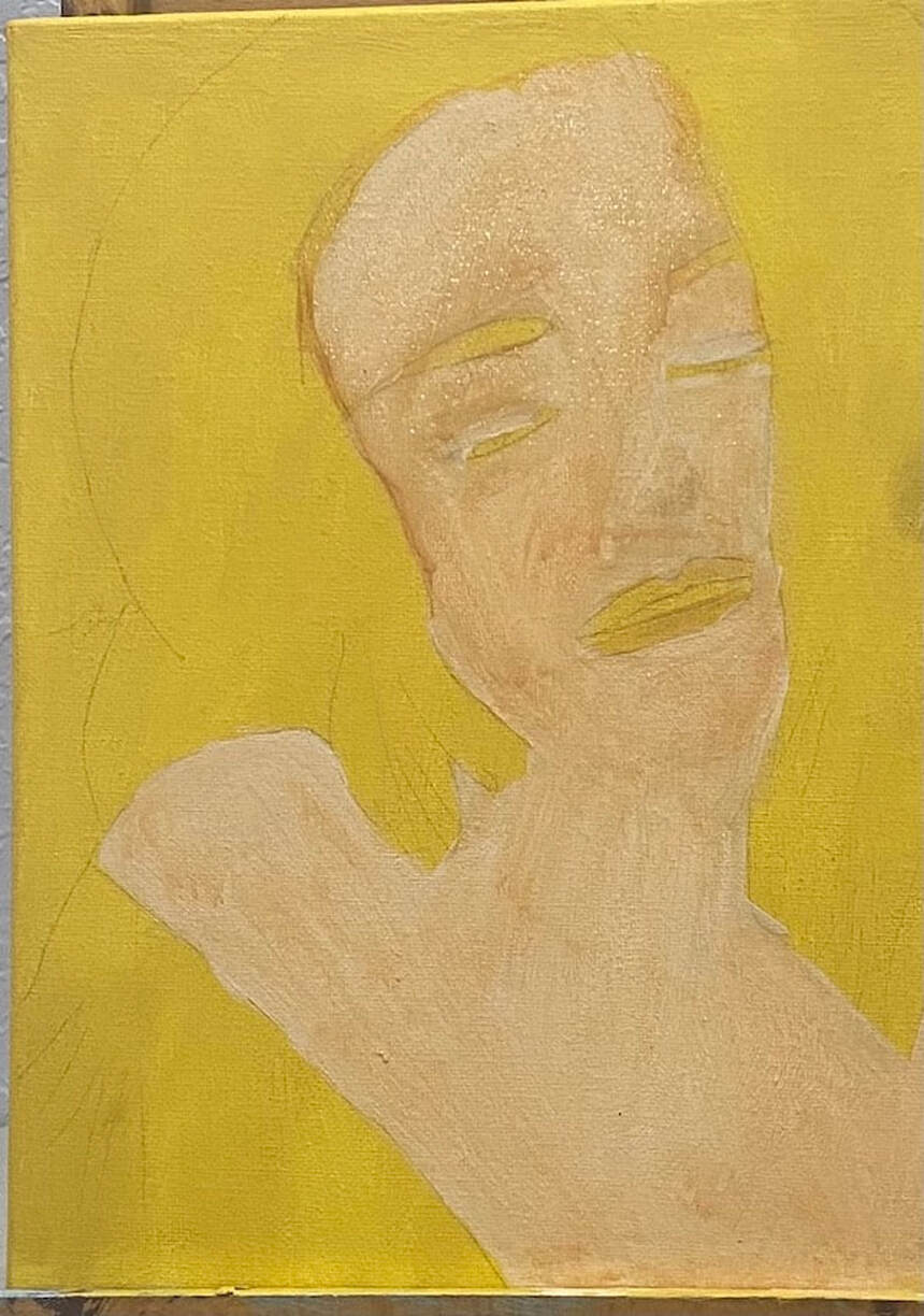 I part two of this post, I'll be discussing the surface colors.
|