|
I had been frustrated with the lack of intensity in my darks regarding my shading. Sometimes, I wanted the extra drama that even my darkest pencils weren’t getting me. Shana Rowe Jackson had made a video in which she made a drawing with some genuinely black shading in it. I looked up that video, found out what pencils she’d used, and ordered them. Those pencils were the Mars Lumograph Black line. Now, I have to admit, when I opened the box and looked inside, I was skeptical because the pencils went from 2b to 8b, which were grades of pencils I’d been using all along. But these are not like the other pencils I’d been using. I believe the Mars Lumograph pencils each have a bit of carbon mixed in with the graphite so they can get much darker than a regular graphite pencil of the same grade. To prove to myself how different these are, I tested them against my pencils in the Faber-Castell line.  While these pencils are indeed very dark, they don’t cover the paper as well as I was hoping. Achieving the stark black I’ve been going for has required a slow process of layering. It occurred to me that the pencils might not be sharp enough to cover properly. I started looking up “how to get pencils super sharp” on YouTube. That search yielded a video from Leonardo Pereznieto. The method described in the video involves using a blade to remove the wood from the pencil and sandpaper to refine the lead. It’s slow and tiring, but it leaves my pencils sharper than any pencil sharpener I’ve tried. 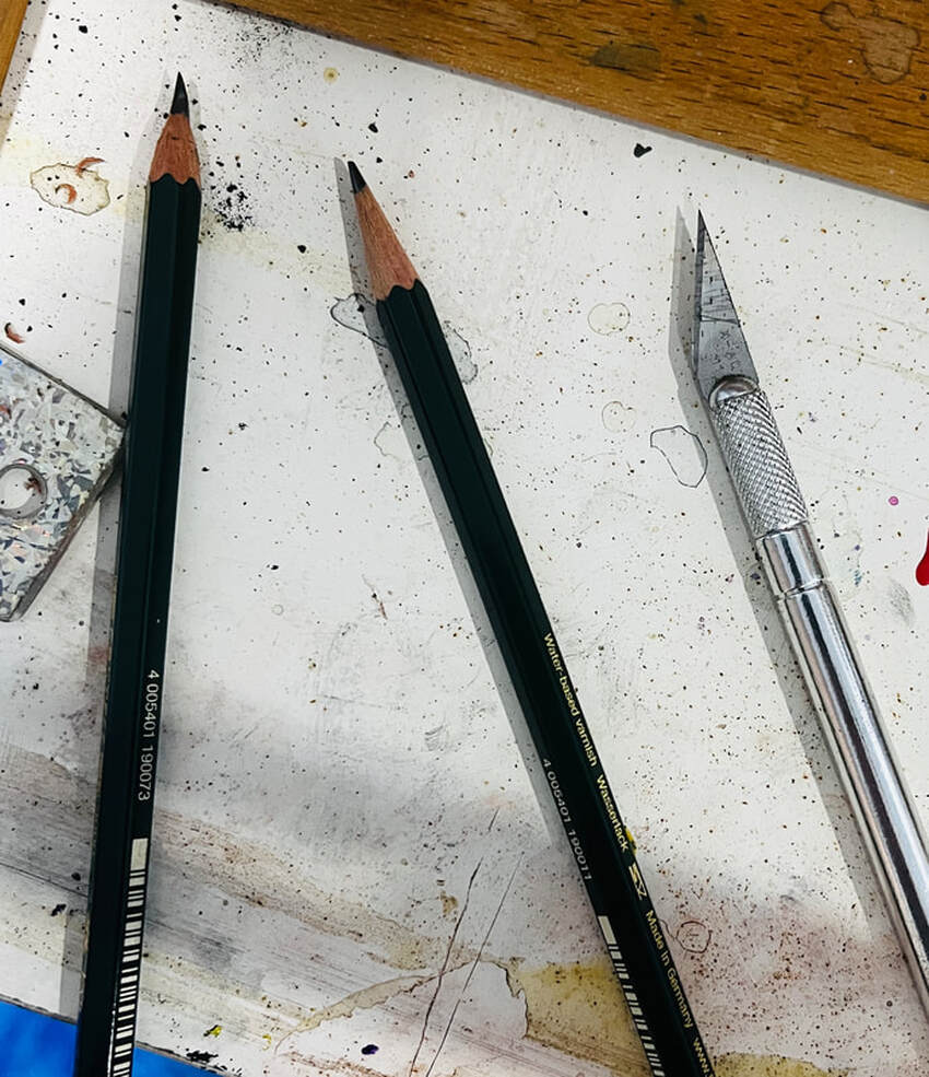 I was working on a drawing of some ducks, and I’d left it a while ago. I’d wanted darker shading on it than I could get with the pencils I had at the time. I decided to try using the 7b in the Mars Lumograph line. While doing this, I accidentally discovered that these pencils might cover better over other pencil than over blank paper. Unfortunately, if I’ve already started with the Mars Lumograph, it’s too late, as I found when I tried to use my Faber-Castell pencils on the gate posts in my drawing. 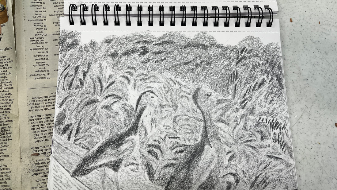 Going back to my bird bath drawing, the edges are where I really want to direct my attention for these things to look truly filled in. The edges are where I really want to direct my attention for these things to really look filled in. Going slowly and methodically gives excellent results. All in all these pencils are definitely worth pick up if you're going for dramatically black shading in your drawings. 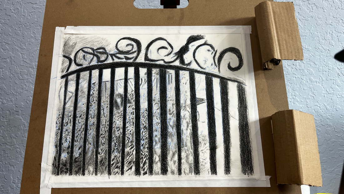
0 Comments
 Today I decided to draw my family's new living room table to give myself practice drawing glass, using graphite. Glass, as you probably know, is very smooth. As such, I must keep my shading smooth while drawing it. This is not as easy you might think, as the edges of my shading tend to get ragged if I’m not careful. I had to give my full attention to what I was doing with my pencil while I worked on this. My pencils also needed to be as sharp as I could get them if I was going to achieve the level of smoothness I was after. I looked carefully at the rims of the circles and saw that there was some very thin, very dark shading around them. This provided necessary contrast, which brought out the reflective nature of the glass and made it look more three dimensional, as did drawing the reflection of the shutters. While I worked, I didn’t think about the fact that I was drawing a glass table. I only thought about where I was putting each bit of shading, how dark the shading needed to be, and about keeping the edges of that shading as smooth as possible. When I stepped back from it, I saw it come together, though.
 I realized that I use less than 5% of the materials in my pencil box. I’ve decided to try doing a project using my neglected materials to see if I have a good excuse for not using them. I’m a little nervous. What if I hate these materials? Well, if I don’t like working with these pencils, I can throw them out or donate them. If I do like them, I can commit to using them more often. I started by using a 2H pro art pencil for my outline. I used a 4b pencil for medium to dark shading and an h pencil for light shading. The h pencil came out darker than I thought it would. I used a sepia pencil for the darkest shades. Verdict Do I hate these pencils? Absolutely not! On the contrary, I found them to be very smooth and enjoyable to work with. I had been shoving these pencils, which are mostly from Pro Art, in favor of my Koh-I-Noor pencils for years. It’s funny how we can get so used to using a select few products that we almost forget our other materials exist, even if there’s nothing objectively wrong with them.
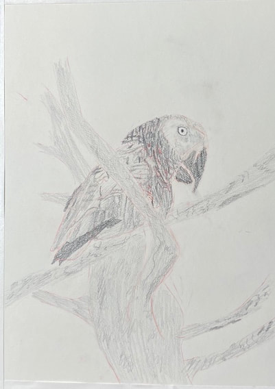
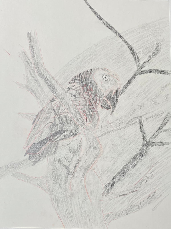
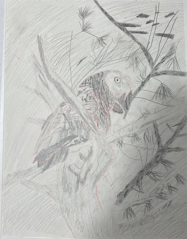
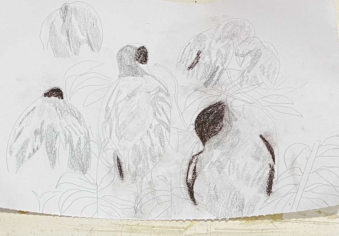
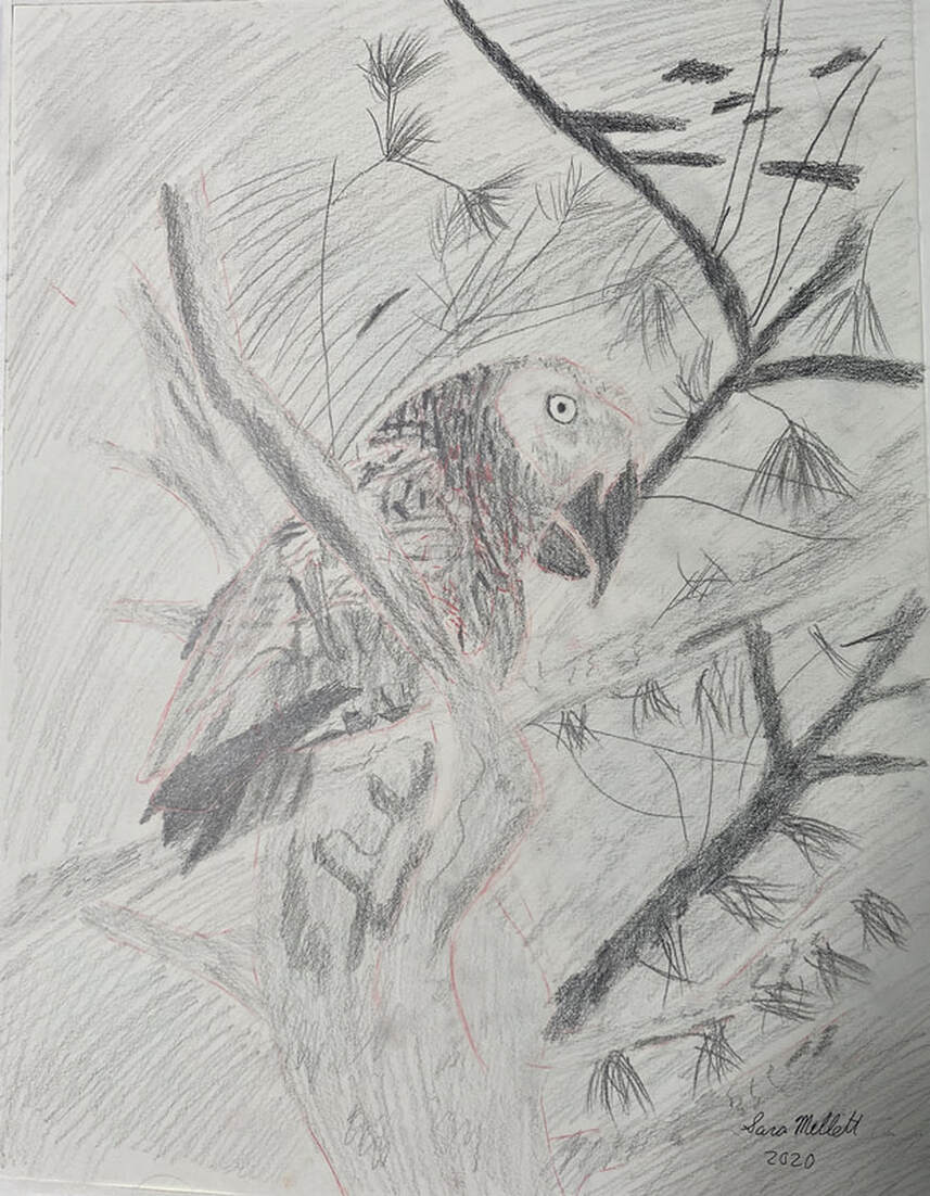 I saw this bird once in a tree in a park near my house. It didn’t look like any common city bird you see around, so understandably, I was surprised to see it just chilling in a tree. I thought, that bird looks like something I might see in a zoo. How did it get in this park. I didn’t even know what kind of bird it was at the time. I guessed it was a kookaburra because it made a noise like one. I readjusted the lines of his body, particularly his head and the right-hand side of chest several times before starting on the details. While drawing his feathers, I made little flicks of my wrist. I almost drew them randomly instead of trying to draw each one in the exact right spot. By being overly careful, I could’ve easily fallen into the trap of drawing the feathers in rows and that wouldn’t have looked natural. You can be too careful sometimes. I drew my outline onto a separate piece of paper and transferred it onto my drawing paper using tracing and transfer paper. I don’t think I could’ve said the word paper more times in one sentence. When I started shading, I went right in with a 5b pencil, keeping a light grip on the pencil and going in little circles. This seems to make the shading more uniform than going back and forth. I blocked in his entire body with a 3b pencil. When it came time to add the feathers, I did so by shading in shapes that I saw in my reference photos. A lot of these were little triangles. Some of the feathers seemed to be groups of horizontal lines in rows. To draw these, I didn’t take my pencil and drag it from one end to the other in one motion. I made vertical back and forth motions with the side of my pencil in horizontal rows, keeping my wrist moving rapidly. Almost like scribbling, but not quite. It’s important that these lines curve in the right direction and that they’re approximately the right distance apart. Day Two I’m continuing to shade the feathers. It gets tiring staring so closely at all this detail. I look for where certain shapes of shading are in relation to each other and this helps me make the shapes of the feathers. I think more needs to be done on the tail, so tomorrow I’ll focus more on that in my reference photo. I’ve taken a closer look at his eye and the patch around it, which I can see now is not really white, and in fact, had much more shadow on it then I thought. The eye itself is very white and is surrounded by a ring of black, which gave it an eerie glow. I’ve started to fill in the tree branches with a 3b pencil as a base. Day Three Getting back to the branches, I drew the details on them by holding the pencil way back on the handle, using the side of the pencil, and wiggling my wrist back and forth. This made my strokes come out kind of zigzaggy. I didn’t want to take too much control and I didn’t want anything very uniform or perfect. I made sure to vary the size and thickness of my marks. Day Three Sometimes you try something new and it doesn’t work. I tried to create the texture of the feathers using only shading and no lines. It turns out though that, while the viewer doesn’t to see them, I needed some lines to guide me not only in the direction the feathers should go, but in how they should be shaded in the first place. Example: I drew in a feather with my 6h pencil next to one I already shaded. Immediately, I knew that there was a small area between the feather I’d already shaded and the one I’d just drawn that needed to be lighter than the surrounding area, significantly lighter in fact. Some things started to stand out to me during this drawing session, like the bird’s tail feathers and the underside of his belly. When I started to feel fatigued working on the details of the feathers, I thought it would be a good idea to direct my attention to the background. I was ready to start shading it in when I noticed the thinner branches in between the thick ones I’d already drawn. I drew those in with my 6h pencil and filled them in with a 6b as base. Day Four I finished filling in the background with my 3b pencil. I had no idea what I was going to do after that, so I looked at my reference photo to give me some guidance. I went to work drawing more thistles on the branches. I just let my wrist flick as I did so, not being too careful to put every line in the right place. The only thing I was concerned about was that they were adequately filled in. I didn’t want a lot of space between my lines. Day Five After a little break, it was time to get back to work on this. WOW! It’s amazing what a little sharpening can do! I just went over a lot of what was already on the paper with sharpened pencils and it looks so much smoother. Day Six I figured out I needed to go over things with more layers. Just because there’s pencil on the paper, doesn’t mean something’s finished. There shouldn’t be any white of the paper showing, unless, I, the artist, want there to be. There certainly shouldn’t be any white of the paper showing just because I don’t have enough pencil on the paper. I don’t push as hard as I can and go at it with the pencil, though. I build it up a little at a time, keeping a light hand. |