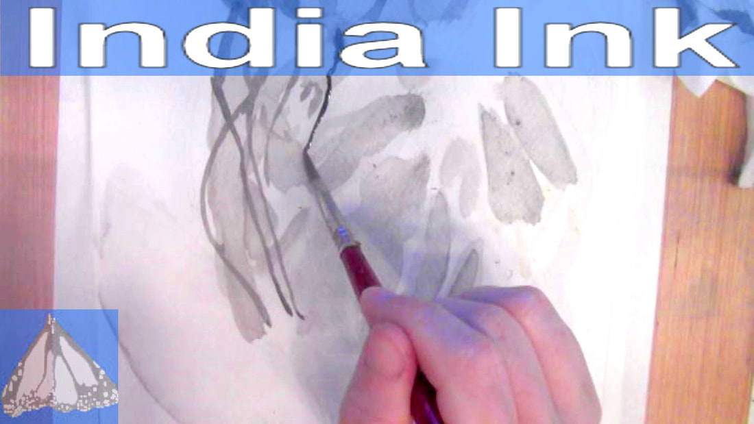
 I was inspired to do this when I saw that my friend, Shana Rowe Jackson, who runs the channel, Caution: Artist At Play, uploaded a video of herself doing a project in India ink to her channel. 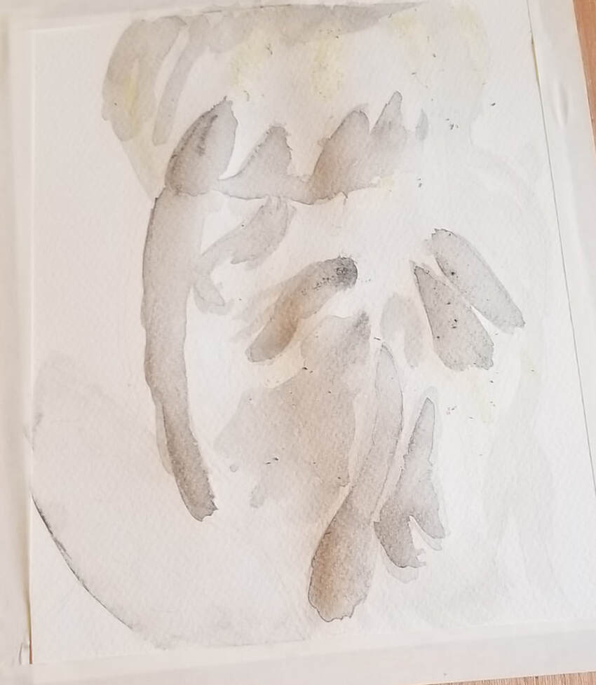 This is day one of working on the jellyfish. I wanted to have a very light wash to start with. I layered some darker, but still fairly light shapes on top of this light wash. The thing I’m having the hardest time with is getting the right ratio of water to ink to get the value I want. My ink keeps going down way darker than I want it. I shouldn’t be too hard on myself. This is my very first piece in this medium. I’m finding, though, that I can lighten a mark that’s already on my paper by layering water on top of it with a wet brush. My friend Shana, who inspired me to do this told me India ink is a good way to get those really stark blacks that are hard to get in watercolor. I think she’s right. Even when I don’t think I have a lot of ink on my brush, my values still end up being a lot darker than what I had in mind 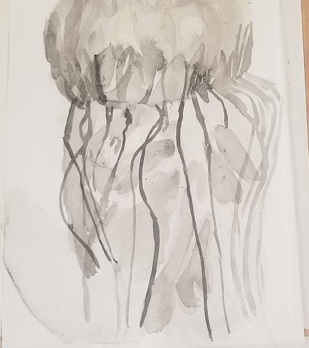 Today was day two of painting my jellyfish. I learned to use the dropper to put out just a little bit of the ink onto my palette, but it was still going on way darker than I wanted it. I continued to paint shapes, copying my reference photo. I utilized a tissue to dab the ink and lighten it. Then it dawned on me to use my spray bottle, the same one I used to mix water into acrylic and watercolor paint, to spritz water straight into the ink! That really helped to lighten it and I don’t know why I didn’t think of it before. Anyway, I thought the piece really started to come together when I added the tentacles, which I did with a combination of my smallest watercolor round brush and my liner brush. I started with a lot of ink in my brush at the top and purposely kept going without reloading my brush so I the lighten would get lighter going down. For some reason, painting those and those little loops at the top was the most fun part for me of this whole project so far. I made sure to have the tentacles overlap each other. The last thing I want is for them all to be in a neat row. In the water, the tentacles would be moving. After all, that's how the jellyfish catches his pray. 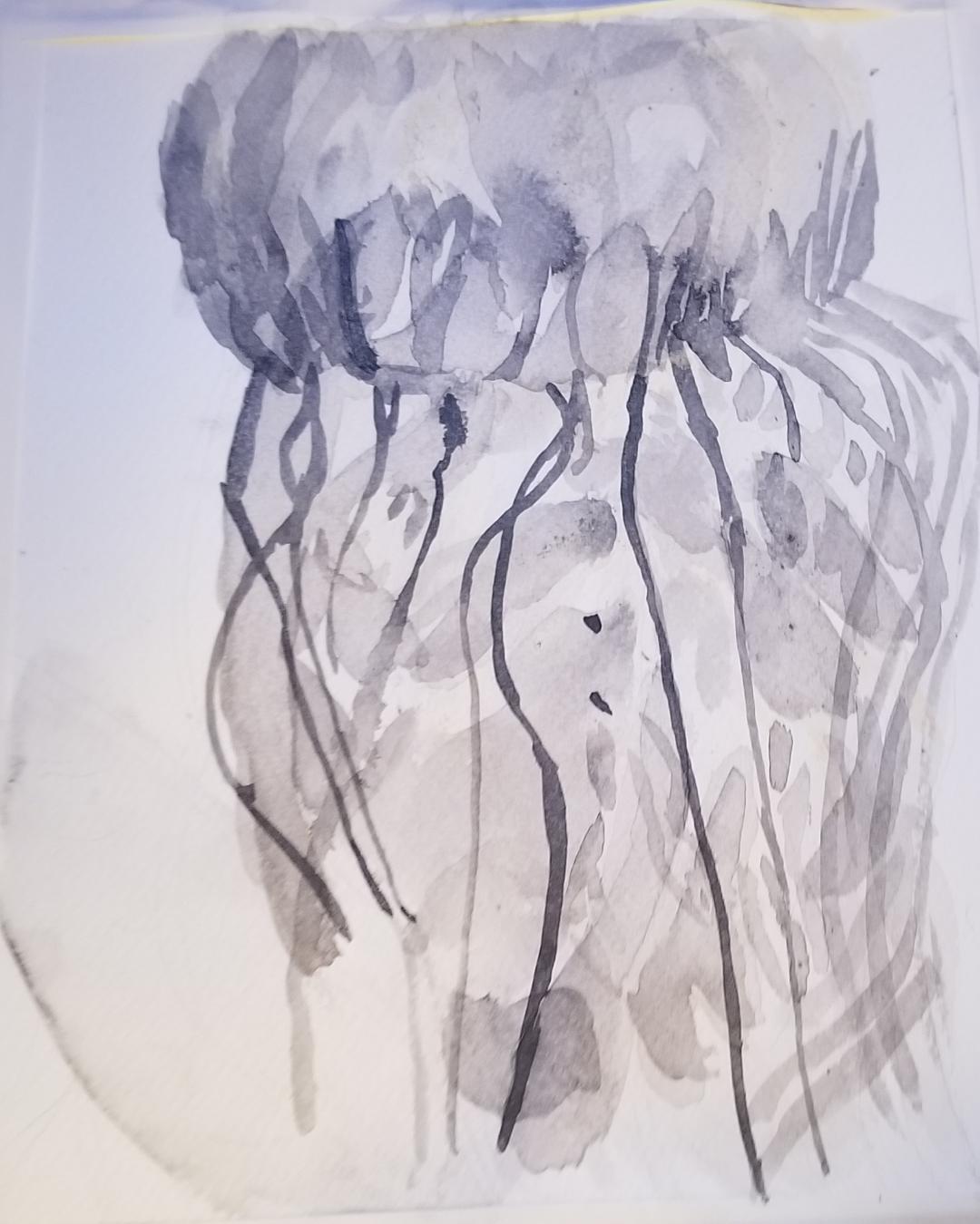 Today I painted more smaller shapes on top of the bigger ones I’d painted. I can see the texture coming out more and more. I put some marks down too dark like before, but I used the excess ink for more marks, rather than going back to my palette. 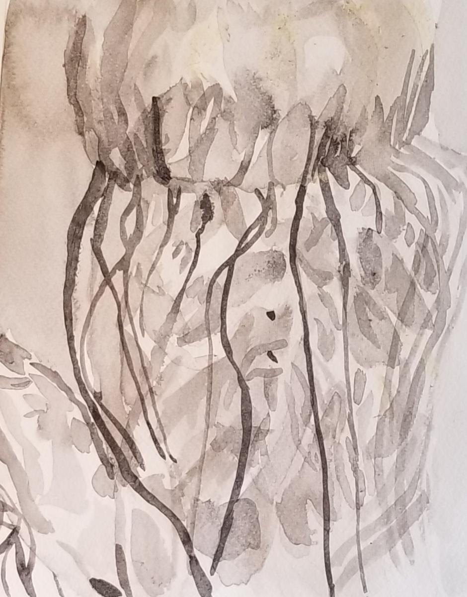 Today I painted the leaf on the side and even more shapes on the jellyfish. The process of painting this guy's body has been painting a shape, then paint a smaller shape on top of that, then paint an even smaller shape on top of that,etc. I figured out that I can use the excess ink from a too dark spot to paint other marks and lighten the spot in the process. affiliate link(I get a small commission if you buy from this link)
https://amzn.to/2PSIjWq
0 Comments
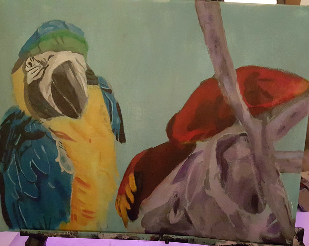
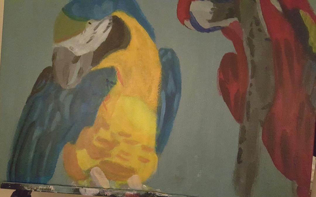
Forget About What You Think You Know Something Looks Like I'll repeat that, forget...about what you know something looks like. We all have these preconceived notions of what shapes and what colors things are, usually from cartoons. You need to get those notions out of your head while you're painting. A cat's ear is not a triangle. 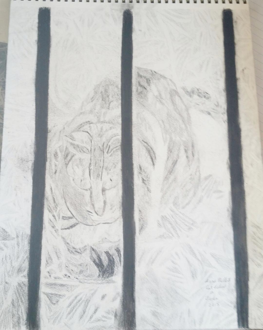 As you can see in the drawing above, I drew this cat's ears with folds and a rounded shape at the top. We might think we know a cat's ears are triangular shaped, but only cartoon cats have truly triangular ears. A parrot's beak is not solid black. Or orange, for that matter. For these parrots, I used mostly shades of gray, and very light gray at that, to paint their beaks. As an aside, nothing that's black, assuming it's three dimensional, is really going to be totally black. Not only that, but you're really only going to use black for the darkest shadows. See my post video, "How To Color Something That's Black" for a demonstration of this principal. Take a look at the bird's beak I'm working on now. 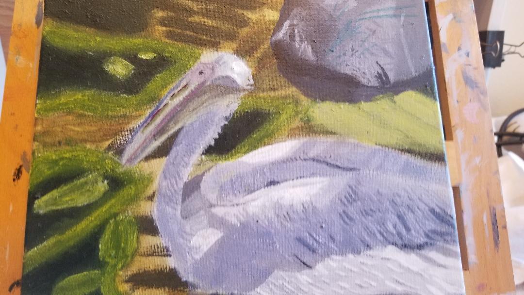 I didn't use any black or orange on it. I used a pale yellowish green as the base color and then mostly blues and purples. That's why I say, forget about what you think something looks like. Look at everything as an abstract shape and not as what it actually is. Look At Every Rock, Tree Branch, Etc, Like It's Unique, Because It Is When you paint an object, you're not only painting that object, you're painting the lighting on that object. That means the colors and patterns you paint on it will very, depending on that lighting.I will tell you, though, that in my experience of taking pictures outside in natural daylight, rocks, tree branches, and even animal’s fur, tend to have bluish and purple shadows on them. You can see examples of this in my paintings, “Monkey Eating Leaf”. 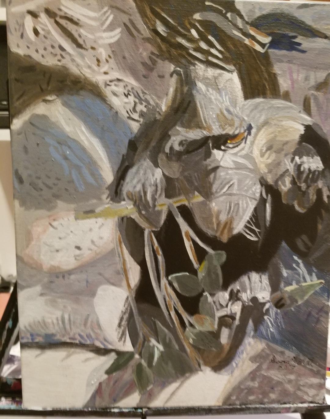 While working on this painting, I was surprised to see bits of blue and purple in the "gray" rocks the monkey was sitting on. and “Squirrel Among The Palm Branches” While we're on the topic of rocks, I feel I might as well bring up my latest painting again.  Note the big rock in the upper right hand corner. You'll see that I put streaks of turquoise on it. As a result of the way the light was hitting the rock, that's what appeared. Now, no other rock I've painted so far had those, so this is a perfect example of why you need to forget about what you think you know something looks like and look at every individual thing like it's unique. If I went into this with the idea that I know what a rock looks like and that all rocks look the same, I would've completely missed those turquoise streaks. Look at things like a child who's seeing something for the first time when you paint or draw. 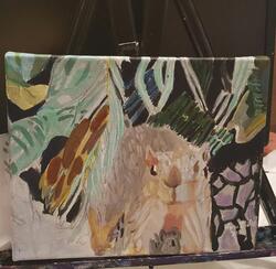 If you look closely at this squirrel's fur, you'll see that I put bits of purple in it. If you look closely at this squirrel's fur, you'll see that I put bits of purple in it. Believe me, when you see these colors, you’ll think to yourself, those colors can’t be there. I must be seeing this wrong. If I paint blue on this gray rock, anyone who looks at this painting will think I’m crazy. I’m telling you, ignore these thoughts. Paint those colors anyway. I promise, you won’t regret it. On the contrary, you’ll love the results. There are a couple of caveats, though.
First, don’t use bright versions of these colors, mainly blue and purple. Always mix them with gray or brown to mute them. This will make them more natural looking. To make them even more realistic, apply them transparently in glazes, rather than opaquely. I think this would be a good time to point out my article, "I Use Lots Of Colors" as it's very relevant to this topic. But this all comes down to one specific thing and that's look at your freakin' reference photo, or your subject, if you're working from life. That's why I say to number one, forget what you think you know something looks like, and number two, to look at every individual thing like it's unique, because the biggest mistakes that will keep you from seeing these like an artist, are, to think you already know what everything you're painting looks like, and thinking every rock looks the same as every other rock. Trust your eyes, not your brain. I asked in a Facebook group about things I could add to this article. A couple of suggestions were watch proportions and pay attention to composition. I'd like to direct you to my video "2 Tricks For Drawing Better Proportioned Figures", and, for more help on the composition front, my videos, "Subject As The Focal Point: Making It Happen" and "How Do The Elements Of A Painting Work Together? If you came across this post in a search and are not on my email list, please consider joining so you can get posts with tips to help you improve your art sent straight to your inbox every week. You'll also see the latest progress of the piece I'm working on and maybe hear about future plans. You can sign up at the side of this post. 1. Set the intention to improve If you paint consistently, you'll improve over time, no matter what. But I think you can accelerate the rate at which you improve by actually making the decision to draw or paint something very well by putting extra effort into it. So by, set the intention to improve, I mean, make the decision to put in extra effort. 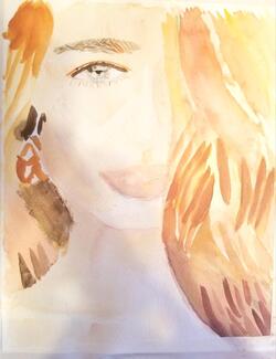 I want to direct your attention to this painting, particularly the eye on it. 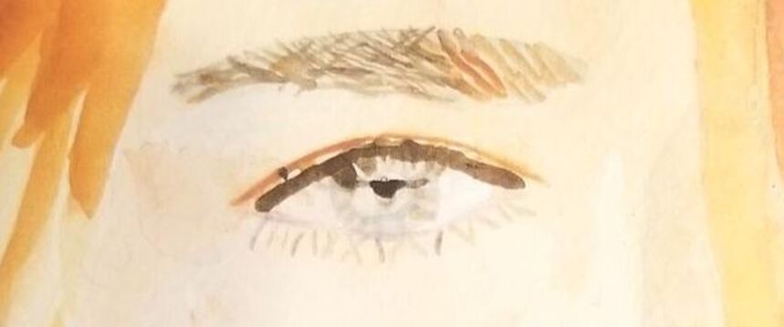 When it came time to paint this eye, I could've just decided I was going to fill the iris in one solid color, paint some flicks going out from the lid for lashes, painted a little black dot in the middle for a pupil and called it done. that entire process probably would've taken me less than a minute. But that's not what I did. Instead, I looked intently at the reference photo before I started painting and asked myself what colors and shapes I saw. Where was there white showing? What direction did the hairs in her lashes and brows go in? I made it my goal to replicate all of this in my painting to the best of my ability. I might've spent about five minutes just on this one eye, but it was worth it. I want to remind you that what made this eye one of the best things I've painted, one of the things I'm most proud of really, is something I did before I started painting. I'm really working on getting better about not only looking at the reference photo, because I could glance at a photo and count that as "looking", but to study it before diving into the painting, that's what I'm talking about here. 2. Go into each piece with the mindset that you're capable of more than you think you are. Believe your goals are attainable. Along those same lines, is to believe that you can actually achieve what you want to achieve. Where you are now in your skills is not where you have to stay. As I mentioned in tip one, this will probably mean spending more time on a single part of your piece than you originally thought necessary or might have been willing to spend. I wrote about the topic of patience and how important it is to artists a long time ago. 3. Don't set lofty goals. It's great to be ambitious, but don't tell yourself, I'm going to paint super realistic faces, without breaking it down into smaller, more manageable steps. Otherwise, you'll most likely get discouraged. Instead, put increased effort, like I said in tip one, into a small, but important aspect of achieving this goal, and as your competence increases, add to that overtime. Decide you're going to work on getting accurate proportions, then decide you're going to master shading and blending, etc. Overtime this will lead to you painting more realistic faces, even super realistic ones. This brings me to my next point which is... 4. Practice mindfully and deliberately Of course, there's nothing wrong with zoning out while you're painting and I do it all the time. I even made a post endorsing it, or rather, endorsing painting without judging yourself as you do. But when you're trying to master a new area, you need to be focused and deliberate about that task. For example, I've been taking a portrait drawing class and I decided, I was going to practice getting smoother shading. Everytime I started to shade, I was 100% focused on what I was doing with that pencil. Of course, putting all this mental effort can be tiring, so to take the pressure off... 5. Do this practice as part of a project you're excited about You don't have to do your deliberate practice separate from your incidental practice, ie, projects you do because you want to. Pick a photo, whether one you took yourself, or from a royalty-free site, that you really like, and in recreating it as a painting, use that to work on improving your art skills. 6. Take time off from all of the above Now this might sound like a contradiction of all of the above, but it's not. Constantly being intentional about your work and worrying, for lack of a better word, about improving, will exhaust you and take the joy out of doing art at all. You need those times where you just zone out and paint and don't worry about anything. In fact, I recommend doing any of the other five steps only as much and as often, as you can emotionally handle them. Keep in mind, these are tips for how to improve your art faster, not how to improve your art fast. I also can't give you a timeline of how fast these tips will help you improve because everyone is different. Here's the painting I was working on while writing this post. 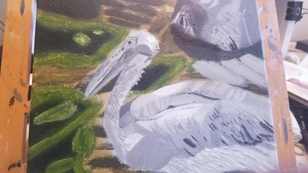 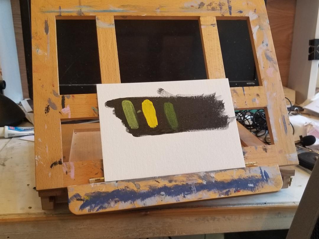 I decided to do my tests against a black background because I thought it would give you and me a better view of how the yellows looked than white. From left, I have hansa yellow, cadmium-free yellow and azo yellow. There was a surprise, because, while the hansa yellow says it's transparent, and the azo says it's semi-opaque, as you can see, the hansa clearly has more opacity than than the azo! I also think the azo looks green against the black, so I knew I'd have to test these colors against a white backdrop too. 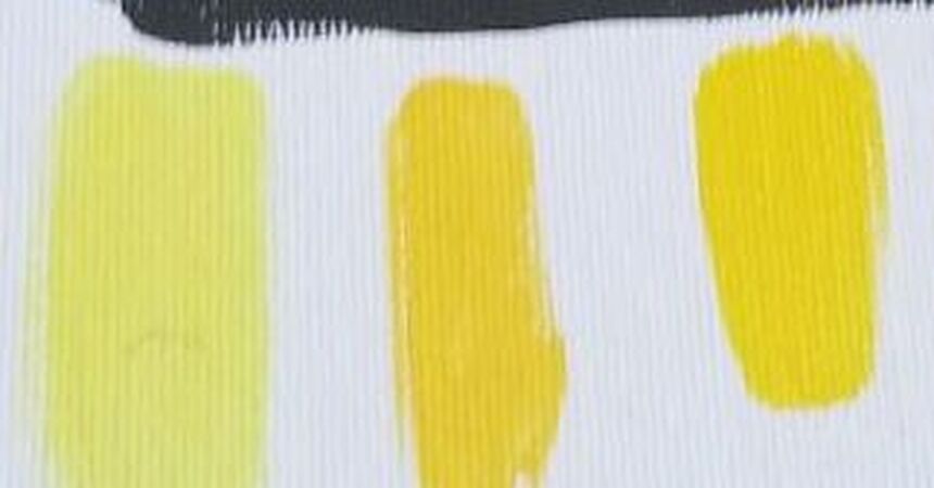 So far all of the yellows I've swatched for you have been from Liquitex's soft body line. I felt having all of the paint be from the same line was important to get a fair comparison. But, I wanted to compare the hansa yellow from the soft body with the cadmium yellow from the Basics line. Hansa yellow is known to be a transparent color, and while cadmium is traditionally an opaque color, the paints in the Basics line tend to have very little pigment and so, be very translucent. Basically, I wanted to see which is more translucent, the hansa yellow from the soft body line of Liquitex, or the cadmium yellow from the basics line. I was a bit surprised to see that the Basics cadmium was actually more translucent than the soft body's hansa. I'll keep that in mind when I'm painting in the future.
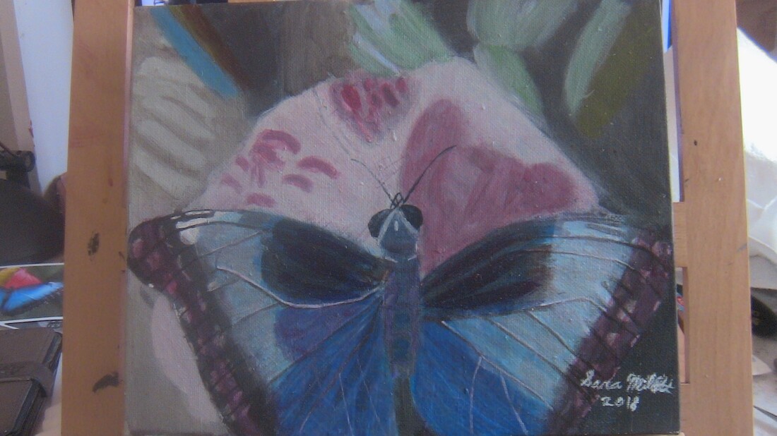 I made a discovery when I decided to take a chance. I was painting the butterfly above and I needed the aforementioned bright, but deep blue for the butterfly's wings. I knew no premixed color that I had would cut it. I thought, though, what if I mix cyan with ultramarine? I start with cyan, because I want that to be the dominant color. I put a generous amount of it on my palette, then I squirt some ultramarine next to it, and using either a palette knife or a brush, I slowly add the ultramarine into the cyan until I get the color I desire. Okay, so this color mixing experiment worked out, but what if it hadn't. That would've been fine and I explain why in this post.  I remember wishing I had some cyan in watercolor when I did this painting, because I thought it would be perfect to mix with the ultramarine I had for the water. I seem to remember finding a tube of cerulean that I didn't know I had after going out and getting one after finishing this piece. 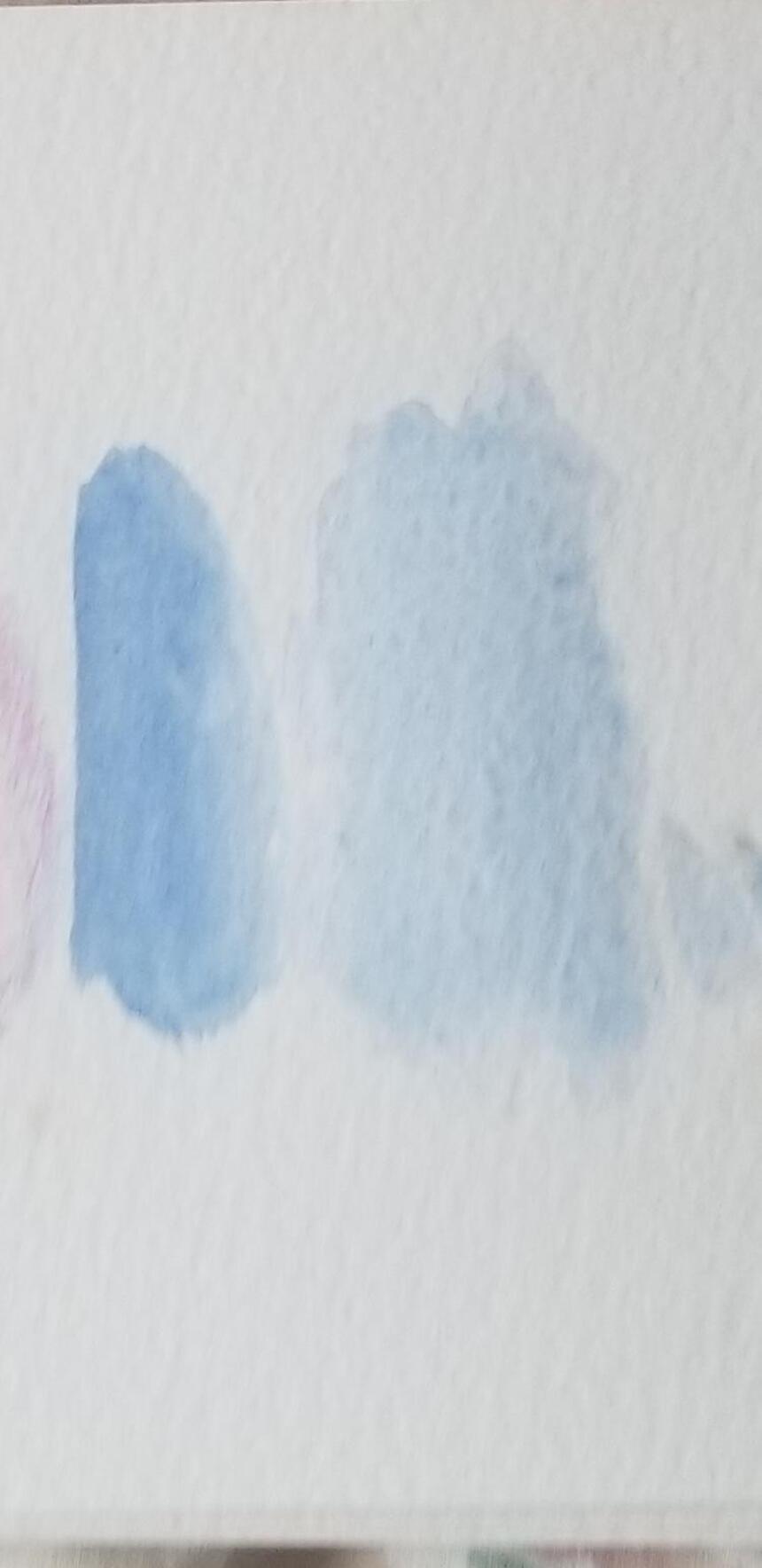 Here are swipes of cyan mixed with ultramarine in watercolor, both in wet-on-dry and wet-on-wet. While ultramarine tends to be my go-to blue, I do find cyan to be a very pretty color, I used for the sky in my painting, "Mountains Over A Lake In Silverton", 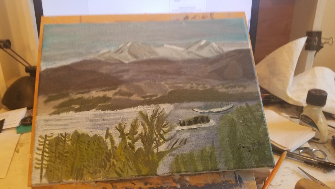 and for Adelaya's top in my painting, "Mother Sitting With Child".  I saw another artist that I watch on Youtube, Sayanti Chadhauri, who's channel is Sayanti Fine Arts, do a painting on her channel that involved layering streaks of ultramarine and cyan on top of eachother to paint water. That inspired me to try that out for myself. Here's the result. 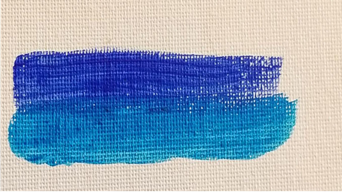 I started to like this combo the more I looked at it. I had learned through Facebook that mixing cerulean with raw umber gives a nice blue gray color. I'm a curious person, so I had to try it out. 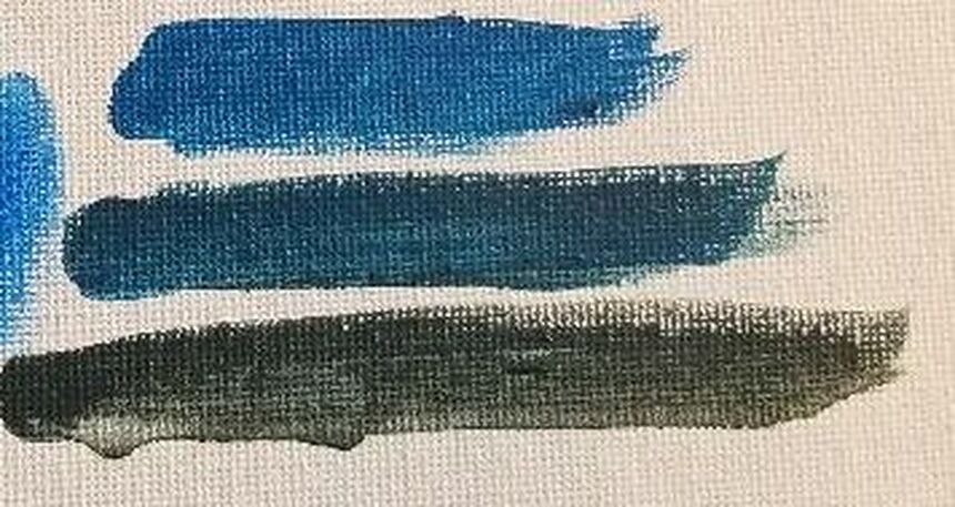 I mixed a little bit of raw umber into some cerulean, than a bit more raw umber into the cerulean, and a little cerulean into some raw umber. I really like the first two shades, but I'm not so sure about the last one. |