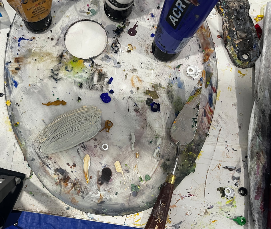
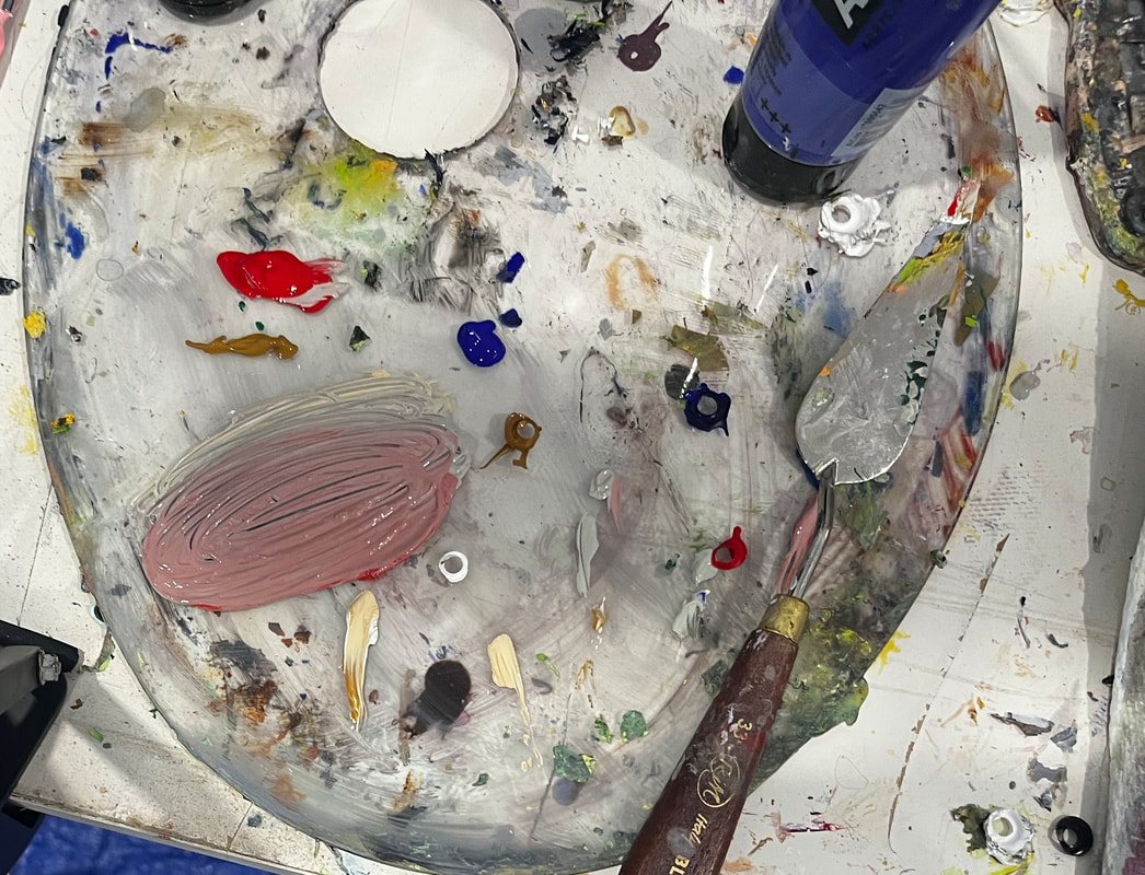
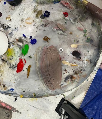
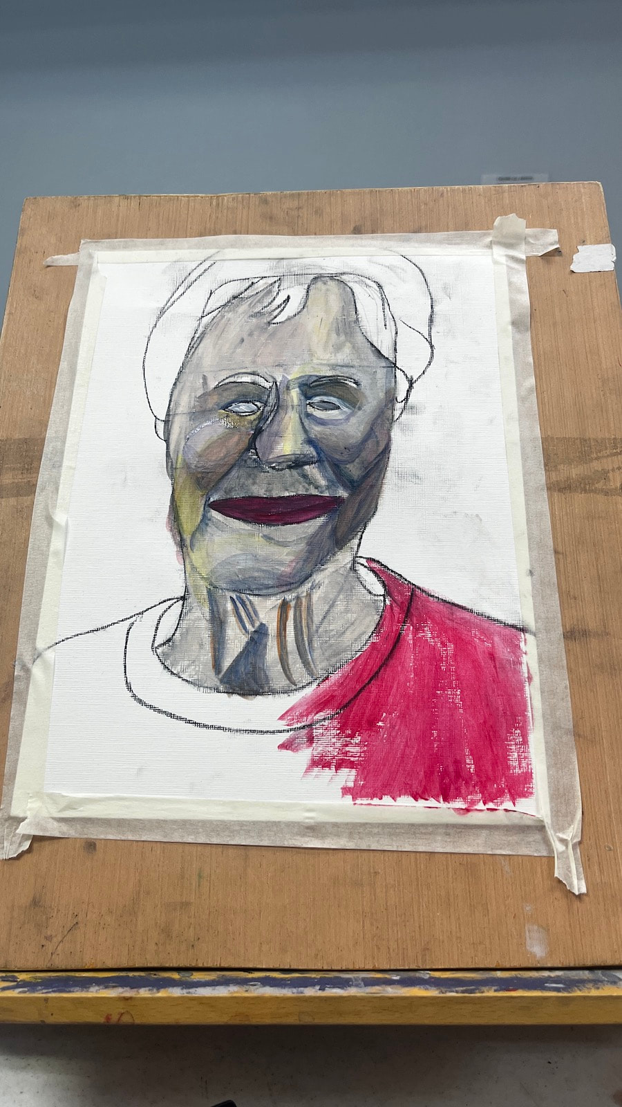
 I softened the blue that I used for the shadows with orange because. The blue is always going to be too bright on it's own. If you’re like me, you put a lot of pressure on yourself to get your color right when mixing skin tone for a portrait and, if you’re like me, you fail a lot at first. I should note that things like the type of light the person is under will affect how the color of their skin looks, so, technically, there’s no such thing as a perfect or “correct” skin color. Nevertheless, you’ll probably find that something’s look off to you. What now? Do you just throw the whole painting out and start over? Of course not. There’s always something you can do. Most art teachers, and I agree, would probably tell you to add color in slowly a little at a time because, well, you can always add more, but you can’t take the color out once it’s in there, they say. They’re right, you can’t take a color out once it’s mixed in. But you can neutralize it by mixing it with its complement. Red is an easy color to mix too much of, because it’s so strong and when that happens, I mix green in with it. I do agree with trying not to add too much in the first place, but mistakes do happen despite out best efforts. If you mix too much blue into your skin tone, the effect it can have on it is making it look gray. To counteract this, I mix a bit, just a bit, of red, to liven it back up.
What if you don’t notice anything wrong until your paint is on the canvas? Don’t worry. You can still use complementary colors via glazing. If you’re looking at your reference photo or model and just can’t figure out what colors to use, I encourage you to just come up with the best approximation you can. Once you see what you’re working with, it’ll be much easier to know which of the tricks above you need to employ to improve it. You can edit a rough draft, after all, but you can’t edit something that doesn’t exist.
0 Comments
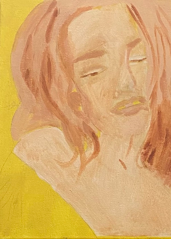 A few years ago, I showed you how I made a painting with a dark and spooky mood. I decided then that one of these days I would do a something about creating a calm and happy mood in a painting and now I’m finally doing it. I chose this particular photo because of the woman’s serene expression. I’ll be using mostly warm tones, yellows and oranges. The concept of using warm colors starts with background, for which I used yellow mixed with a bit of burnt umber. 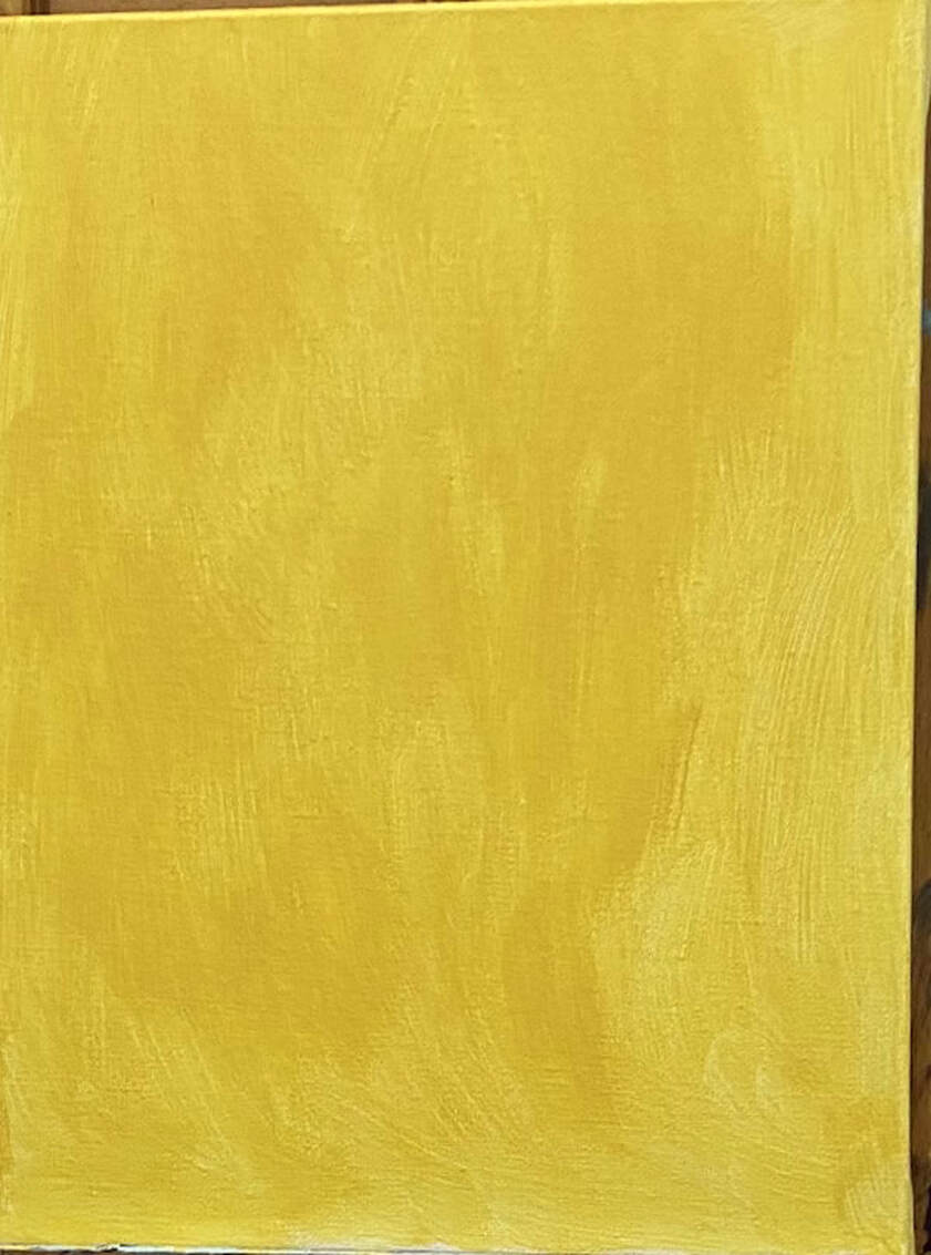 I’m using a sepia toned underpainting instead of my usual gray one for this piece. This will not inferior with the warmth of the colors I’ll be putting on top. I know this from this experiment. 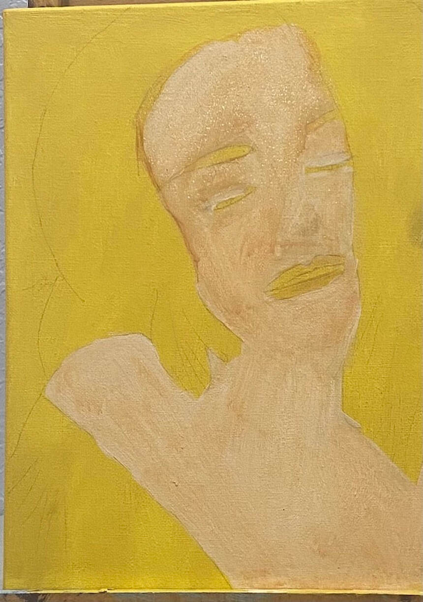 I part two of this post, I'll be discussing the surface colors.
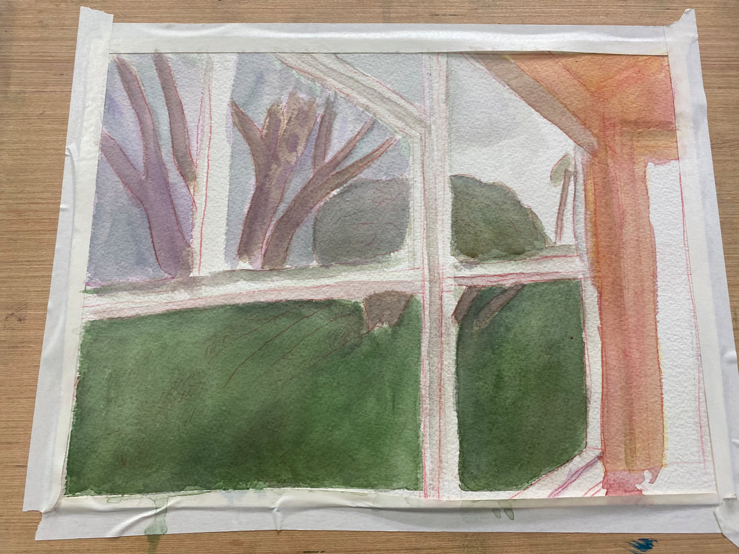 I’m working on a scene of my backyard during a sunrise. It’s teaching me something about how the eye’s perception of color will change with the time of day. If I was painting this same scene at midday, I would use more yellows and oranges and make everything warmer. Because it’s the beginning of the day, I’m making everything blue, purple, and generally cool. The grass on the bottom needs to be much darker. I’m going over it with layers and layers of “black”, made by mixing ultramarine blue and burnt Sienna. I realized that the blue I’d painted the sky was also too warm. Now, I was just blocking in the color when I was doing it, so I wasn’t all that concerned with accuracy. But now, it was time to fine tune things a little. I thought I’d try layering purple over it and see how that looked. Other than the purple going on a little thicker than I would’ve liked, I was very happy with the results. By contrast, the third of the sky where the sun is rising is going to mostly shades of pink and yellow, but that will be for another post.
|