|
Sometime ago I made a video for my youtube channel about changing the color in a painting from what it is in a photo. Now, I’m faced with changing how things are laid out. I have this photo that I took of some crows. 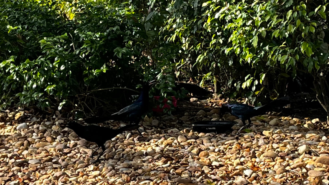 There are three crows in the frame, which fits with the “rule of odds”, but one of the crows is off away from the others. I’m thinking, bringing him in between his friends and slightly down, will make for a better painting. Just because you have a subpar photo doesn’t mean you can’t have a pretty good painting. Take this painting, for example. 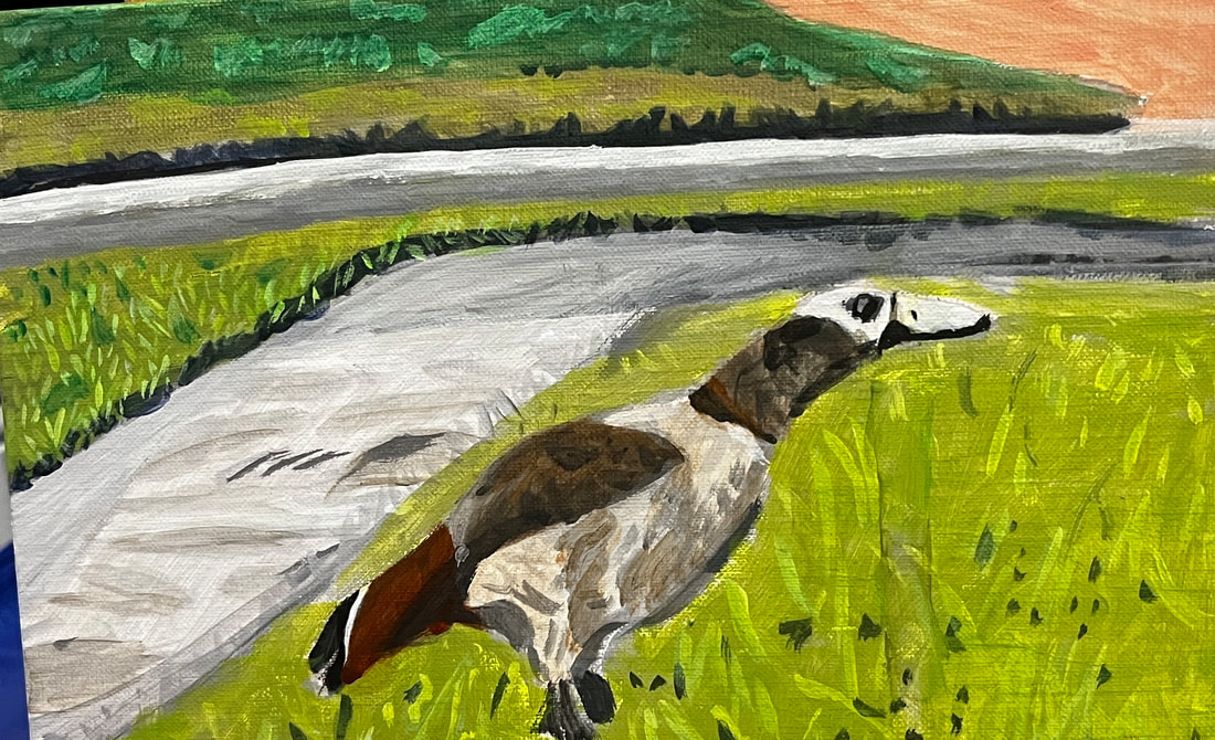 The photo includes another goose, but I chose to leave it out of the painting. When I started to make the drawing, I thought it looked better with just the one goose. Your painting doesn’t have to be an exact copy of your reference photo. Do what you think will make your painting look the best. 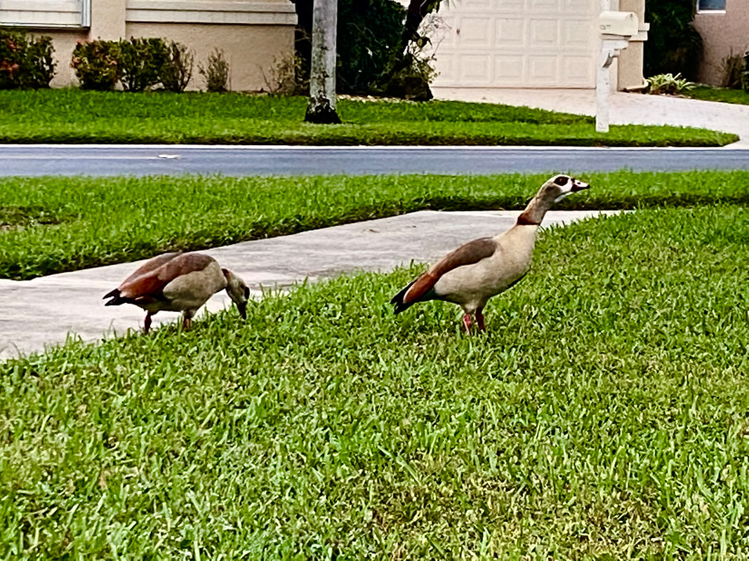
1 Comment
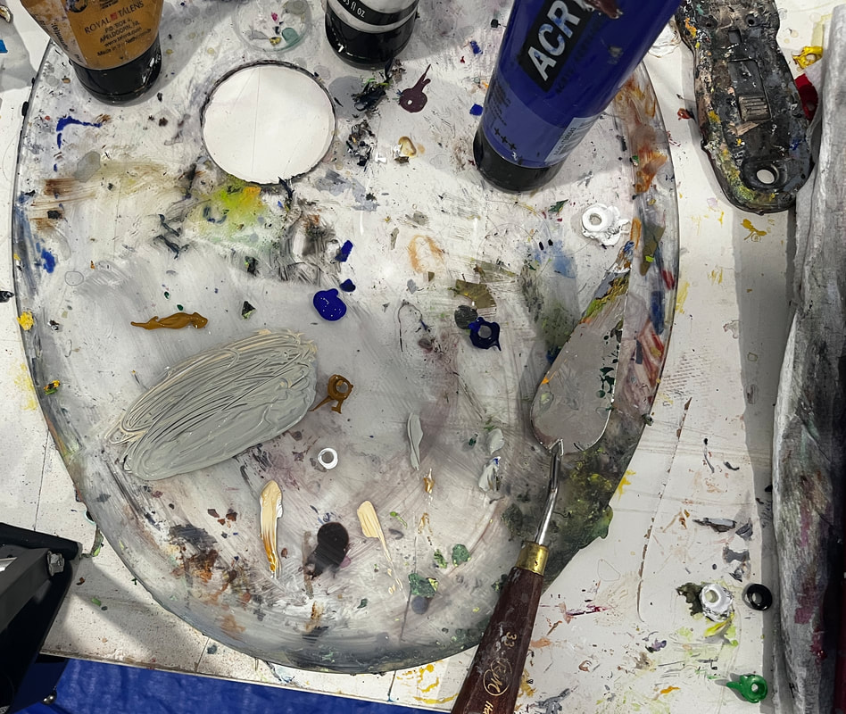
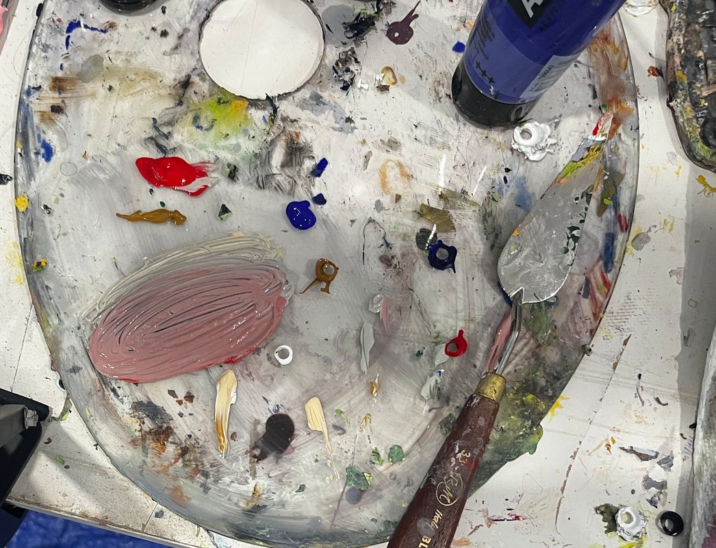
 I softened the blue that I used for the shadows with orange because. The blue is always going to be too bright on it's own. If you’re like me, you put a lot of pressure on yourself to get your color right when mixing skin tone for a portrait and, if you’re like me, you fail a lot at first. I should note that things like the type of light the person is under will affect how the color of their skin looks, so, technically, there’s no such thing as a perfect or “correct” skin color. Nevertheless, you’ll probably find that something’s look off to you. What now? Do you just throw the whole painting out and start over? Of course not. There’s always something you can do. Most art teachers, and I agree, would probably tell you to add color in slowly a little at a time because, well, you can always add more, but you can’t take the color out once it’s in there, they say. They’re right, you can’t take a color out once it’s mixed in. But you can neutralize it by mixing it with its complement. Red is an easy color to mix too much of, because it’s so strong and when that happens, I mix green in with it. I do agree with trying not to add too much in the first place, but mistakes do happen despite out best efforts. If you mix too much blue into your skin tone, the effect it can have on it is making it look gray. To counteract this, I mix a bit, just a bit, of red, to liven it back up.
What if you don’t notice anything wrong until your paint is on the canvas? Don’t worry. You can still use complementary colors via glazing. If you’re looking at your reference photo or model and just can’t figure out what colors to use, I encourage you to just come up with the best approximation you can. Once you see what you’re working with, it’ll be much easier to know which of the tricks above you need to employ to improve it. You can edit a rough draft, after all, but you can’t edit something that doesn’t exist.
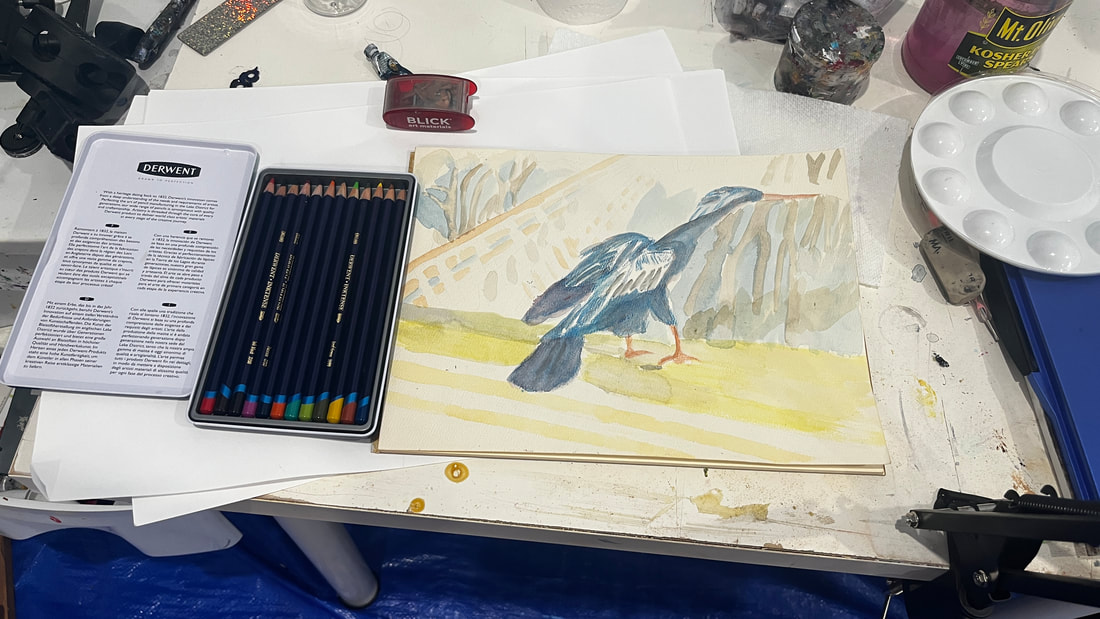 I ordered a set of Derwent Inktense pencils from Blick Art Materials and I’m doing my first project in them. Inktense are water soluble ink in pencil and block form. This makes it easier to work with than traditional ink in liquid form. I’d worked with India Ink a while back and really enjoyed it. Since Inktense is a water soluble medium, I'm working on watercolor paper. Inktense pencils should not be confused with watercolor pencils, however. Inktense will not lift like watercolor. Once it's dry, it's permanent. Don't worry, though. If you don't like a color you put down, you can always go over it later. For best results, I’ve learned that it’s best not to apply the pencils directly to your project. If you do this, the pencil will appear gritty even after you blend it out with water. Instead, rub your pencil on a separate piece of paper or board, add water, and apply that mixture to your project with a brush. To mix two or more colors together, layer them on top of each other and do the same thing you would do to blend out one color. 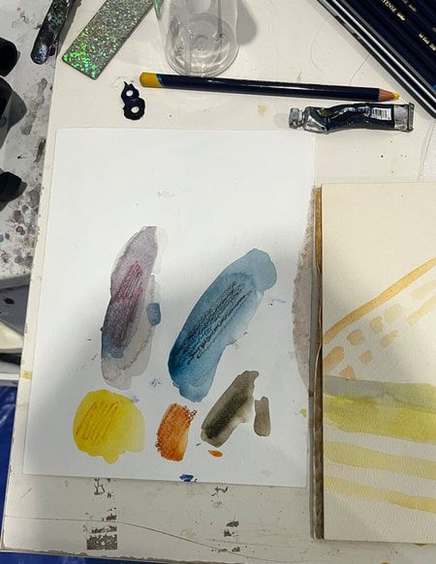 The puddles of color you see, when wet, can be dipped into with a brush and applied to the paper, as if you were painting. The puddles of color you see, when wet, can be dipped into with a brush and applied to the paper, as if you were painting. I hope to have more inktense tips for you in the future. In the meantime, I recommend the tutorials of Lisa Clough of Lachri Fine Art and Shana Rowe Jackson of Caution Artist at Play, both of which you can find on youtube. Lisa's artwork is also on the box for the pencils and the Inktense blocks.
 I’ve recently dove back into oil pastels. I’m reminding myself that most of the same principals I’ve been practicing when it comes to color use with acrylics and watercolor will apply with these. One of these principles is to layer multiple colors in one place. The grass will have a yellowish green base, darker green strips and brown spots. Besides being blue, the lake will have the green reflections from the bushes that are above it. Another one is to use less of "strong" colors, like red and purple, and more of "weak" colors", like yellow and orange. For some of the green in the grass, I put red down first and then green on top, because I knew the green could not overpower the red as easily as the other way around and so I would get a nice, muted green color. 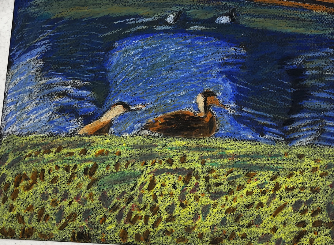 When you start with another medium, you don’t have to start from zero. I made a video about what I was learning when I first started using oil pastels. You can watch it here.
I’m feeling intimidated by the painting I want to do next. That’s why I’m easing into it by doing practice, or what you might call, thumbnail, pieces. A couple weeks ago I wrote about practicing doing a smooth wash. This last Thursday, I made two small sketches of bushes and trees reflected in water on paper from a mixed media pad. Making these trial paintings gives me more confidence that I can do the real thing. 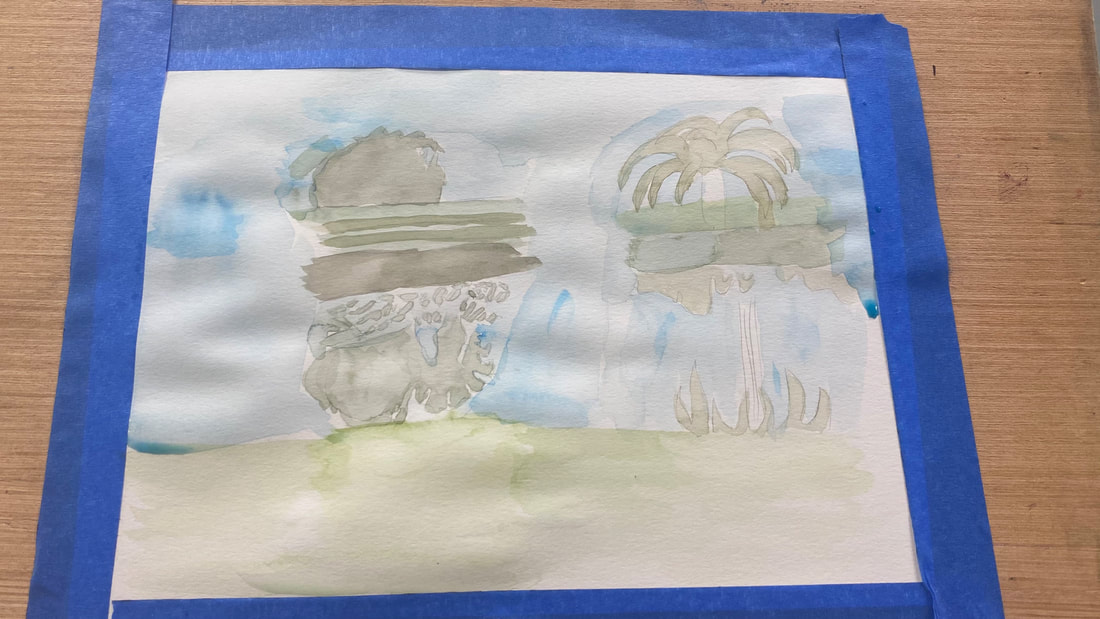 You can just jump into a painting. I do that a lot. But taking baby steps can take enough of the fear out doing a difficult piece for you to actually have the confidence to do it. I like doing pieces that scare me and I encourage you to do pieces that scare you, because those are the pieces that really help you grow. One of those pieces for me was this one, since I'd never done a landscape before. 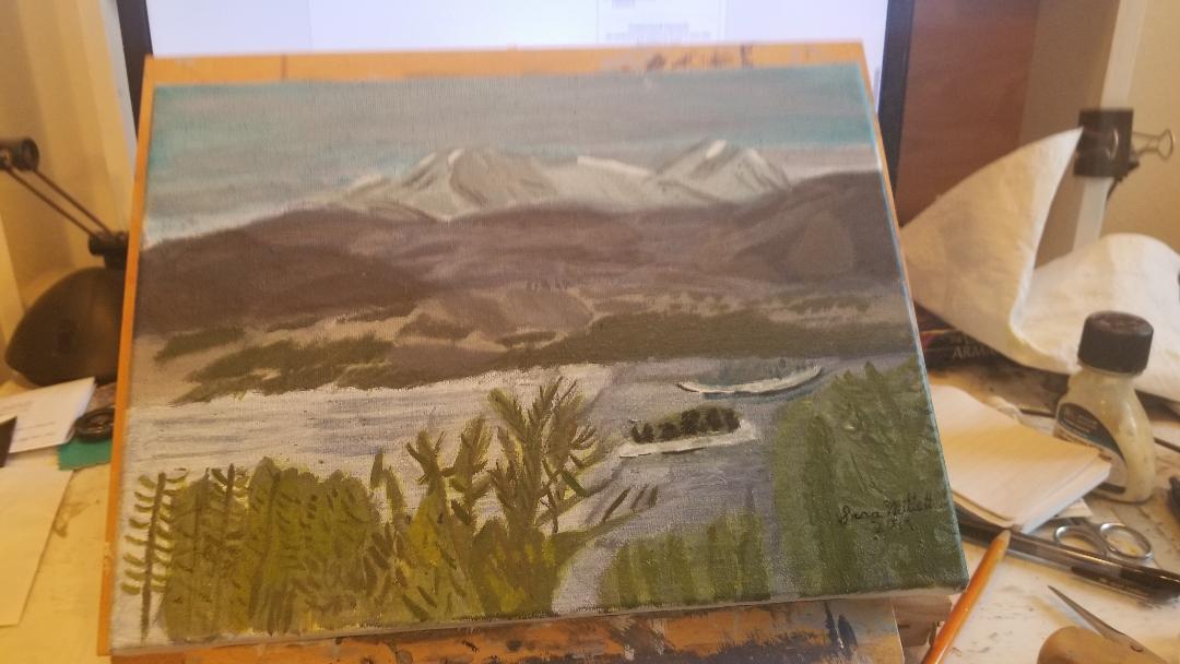 I’ve had a habit, for quite a while of drawing my subject onto a piece of scratch paper before starting my actual piece. This is so I have something to transfer onto my canvases, but it also is a sort of dress rehearsal. I give myself practice drawing those lines without putting pressure on myself. Making these practice sketches also helps you stay in the habit of painting or drawing, which improves your skill and confidence.
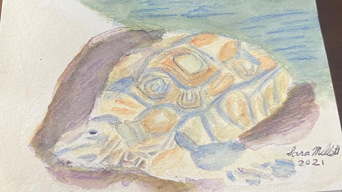 When I started on this painting, which is for my mom’s birthday card, and I looked at the rocks the turtle was coming out of in the reference photo, I thought, what if that was the ocean. My mom loves the ocean, so I chose to paint the rocks to look like the waves were washing up on the shore and the turtle was crawling out of them. I’m using my set of Kimberly watercolor pencils. I don’t have a lot of colors, so I have to rely on layering to get the colors I need. Putting green on top of blue was how I colored made my sea. I saw a couple of times that I needed to add more layers of blue after my paper had dried. I used a tan shade all over for the turtle and blue for the edging around his scales. I painted my tan layer, waited for it to try, then shaded in my blue, then blended that with water, and waited for it to try. If I’d shaded in the tan, then the blue, and blended them all at once, the colors would’ve all run together and the the blue needed to be in a distinct pattern. I wanted the turtle to look as three dimensional as possible, so I drew a purple shadow around him. Layering yellow and black over this shadow helped to get it just right. This time, I started layering colors while my paper was still wet. This was to intensify the shades and make them blend more thoroughly. I added more layers to the blue on the turtle’s shell sections to give them more oomph. The shell sections had a darker brown pattern on them, so I used my terra cotta pencil. Adding extra layers to reinforce certain shades adds a lot to my painting, even if it doesn’t necessarily look like that in the reference photo. If you’re looking at your piece and thinking, should I add more color here, should I make this darker, go for it. I could see that there were some pencil marks on my ocean that didn't seem to want to blend out. Rather than fight these, I chose to make them work for me by turning them into ripples, ie, I emphasized them. I shaded some small “triangles” around the turtle’s neck. The negative space between them created a pattern of wrinkles.
The painting I want to do next requires me to do a smooth wash. I recently practiced this in watercolor. When I was almost finished, I accidentally dropped a big bead of water on the paper and I got a bloom. Now I understand that blooms happen when I get too much water in one area and to avoid them, I need to keep my water even. I wouldn’t have noticed this if I’d been working on a full project. When I'm also focused on all the elements of a piece, there's no way I'm going to see that that unsightly edge was the result of more water being in that part of the paper than the rest. But since all I was focused on were the strokes for this wash, I clearly saw that bead drop and create that bloom. Stripping back to the basics adds clarity 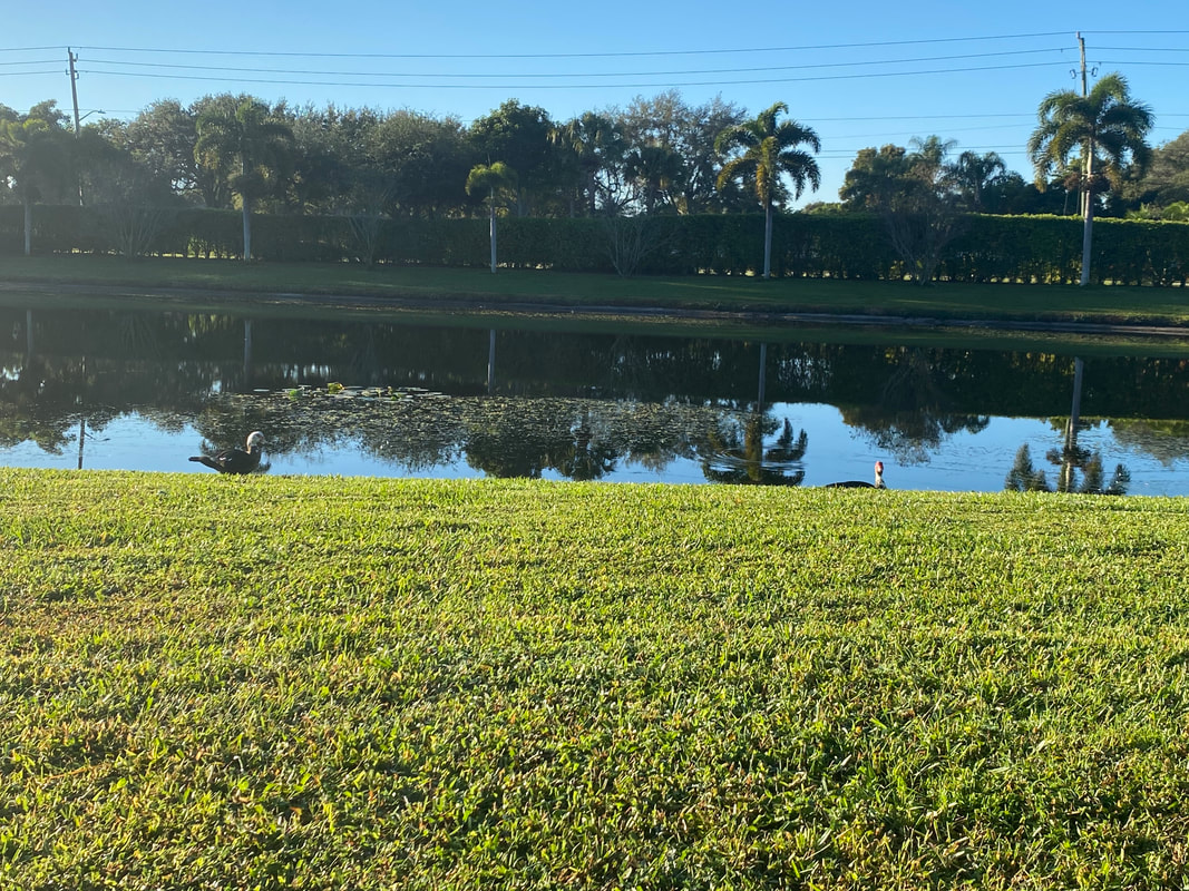 This is the painting I want to do, by the way. You can see why the wash has to be so smooth. ;) Also, don't touch your paper while it's wet.
I've made posts about portraits before, but this time, I'd like to make a guide for the absolute beginner to portraits. In an earlier post, I told you about how to apply the golden ratio to drawing a face, but in this post, I'd like to show you a more simplified version of this. 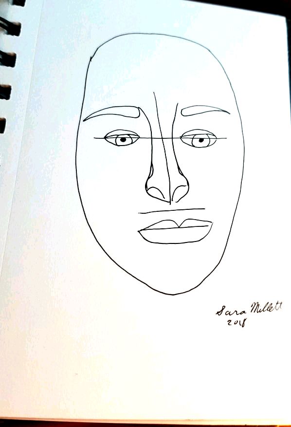 Placement Of Features As you can see, all I've done is draw a basic face, then draw a horizontal line at the halfway mark, a vertical line down the middle and another horizontal line at approximately one third the distance from the bottom of my vertical line and the bottom of of my face. I drew my eyes along the top horizontal line, my nose around the vertical line and my mouth along the bottom horizontal line. This keeps everything lined up. I drew my eyebrows right under where the top of the nose was. I just want to note that I used pen because that's what I had available to me and so that the lines would show up. When you do this yourself, you'll use a light pencil so that you can either erase these lines when you don't need them any more or they'll get blended in when you do your shading. You don't always have to use these lines. I don't. I just draw by eye, but they can be helpful for people getting started. It goes without saying, though, if you're going to use these lines, make sure you draw them very lightly. You should be able to erase them easily, or cover them up with your shading. You're also not going to draw the same shapes I drew. You're going to draw whatever shape eyes, nose and mouth that your subject has. Pupil Size I imagine most people probably don't pay a lot of attention to this, but the size of your subject's pupils will send a big message about their mood and demeanor. If you draw your subject's pupil's pinpoint small, like this  they'll look angry, disgusted or just shocked. Most of the time we don't want our subjects to look this way, so we want to open up the pupil a bit, more like this. Subjects with pupils like this will look friendly, open, and interested. They will also come across as being generally more attractive. But don't go the other extreme, ie this.  If you draw your subject's pupils like this, they'll look like they're on drugs or concussed.  Start In Black and White I think the best advice I can give you for when you're getting started on portraits is to start out working in black and white. I'm not saying you need to work in graphite. You can use paint if you'd like, but I think you'll be less stressed if you don't worry about color for a bit. Working in black and white will help you to perfect your shading and your highlighting. This brings me to my next point... Pay Attention To Value Here are some examples of portraits I've done and where I put the shading and highlighting. In these two, I put shading only on the left-hand side of the nose.  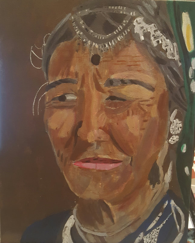 In this one, I put shading on the top and bottom of the nose, but nothing in between. 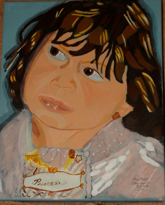 It's not about a streak of highlight down the middle and blocks of shading on the side, like this, 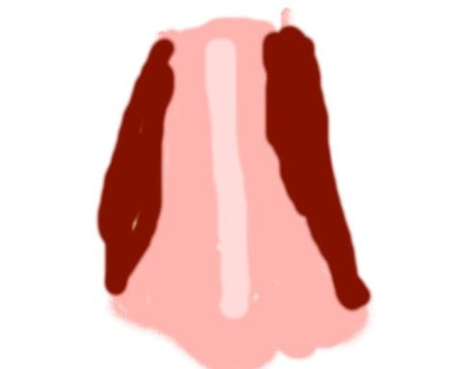 Also, you'll find that most of the time, you'll get the best results if you layer your shading and highlighting.
I hope you find these tips useful. If you use them and want to share your work with me, please post it to social media and tag me. I'm Sara Makes Art on Youtube, Facebook, and MeWe and @_saramakesart on Instagram.
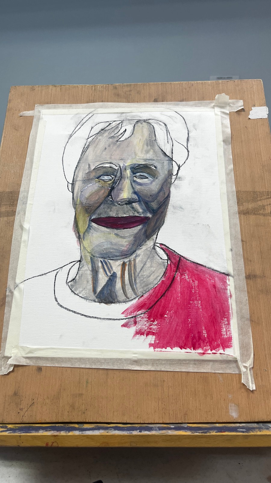
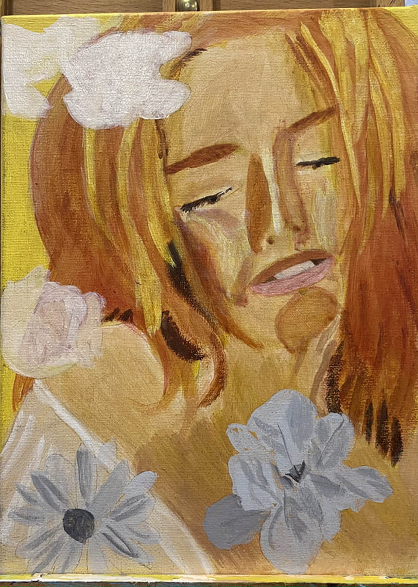 For the flowers, I drew them onto a separate piece of paper and transferee them onto the canvas using tracing and transfer paper. When I was getting ready to transfer the flowers, at first I thought, oh no, I’ve made them too big! I made it work, though, by spreading the flowers around the subject. I’m leaving one out, though, because I think to include it would ruin the balance of the composition. One of the flowers is yellow, one is yellow and pink, one is blue, and the last one is purple. For the blue flower and the purple flower, I’m using a gray toned underpainting and for the yellow and pink and pure yellow flower, I’m using a sepia toned underpainting. 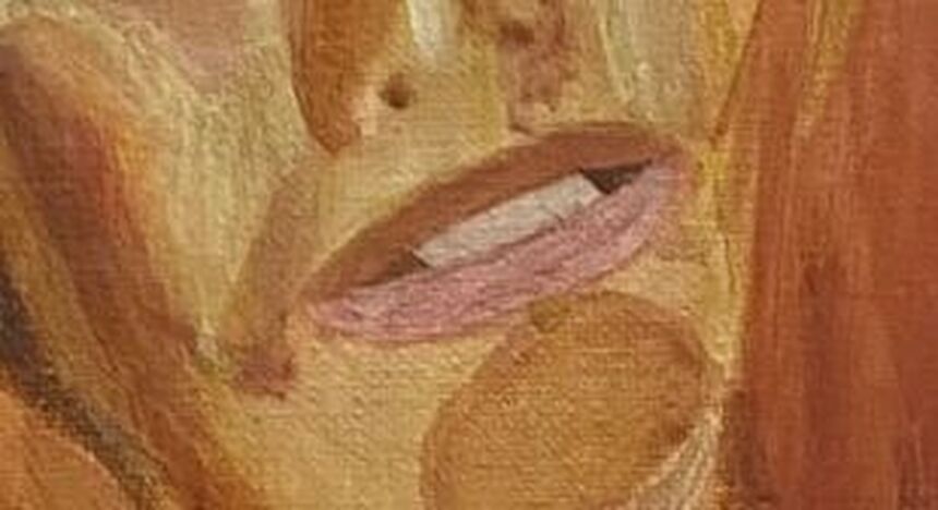 I want to talk a little bit about her mouth. I did not use white for her teeth, nor did I use black for the space around them. For both of these, I actually used a combination of burnt Sienna and raw umber. I just mixed it with white for the teeth and black for the inside of the mouth. Using straight black or white for these things would’ve looked totally unnatural. Now that I think about it, I might bring some of the colors from the flowers I'll be painting into the teeth also. I'll discuss that in next week's post.
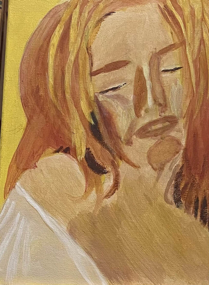 It's time to start adding dimension to my subject's face. The first thing I did when I started working on this painting again, was glaze yellow over the edges of her right cheek and nose where a ring of red had formed. I’m very happy with her cheek now, but I think her nose still needs some work. Her hair needed some highlights. Because these needed to be opaque, I painted strokes of titanium white where I wanted them to be. Otherwise, they wouldn't have shown up. For the highlights themselves, I used a combination of yellow with a touch of burnt Sienna. I was considering going over the apples of her cheeks with titanium white mixed with yellow because the highlights are just not as bright as I think they need to be. I know I’ll have to careful to blend the edges out properly of course. It’s the day after after I wrote that last block and I’ve followed through with my plan of painting titanium white mixed with yellow over the areas I said I would. I really didn’t mix enough yellow into the white at first at it was really glaring. After I glazed some yellow over it, though, I was much happier. Now they’re starting to look like cheekbones. Next I'm going to add flowers around her to enhance the cheerful mood of the painting.
|