 I started the process of adding color by glazing raw sienna mixed with zinc white over this woman’s face. I decided to add my warm yellow over the parts of her face where light would hit, so cheekbones, bridge of nose and chin protrusion. I thought this would look more natural than painting it all over. I wanted to paint a golden red over this yellow. Now, I wanted this to be golden red, not orange. I experimented to figure out how I’m going to come up with that color. I decided I was probably going to mix green into red and mix that into yellow. After this is on the canvas and dry, I’m probably going to glaze some of my red and green mixture over it. I'm less happy with my piece after having added this last layer. That just means I need to figure out how to improve it. I need to make my shadows around the nose and cheekbones darker and my highlights brighter. If you're interested in how I bring a piece back from being "ruined", which happens more often than you might like this video.
0 Comments
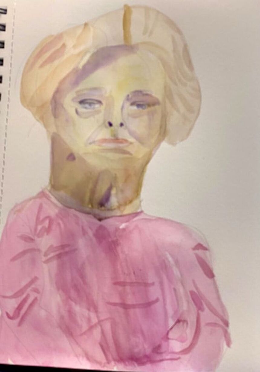 I’ve had the opportunity to draw live models before in art classes, but today I made my first attempt at painting one. This session took place in the Craft Studio 2 of my community’s club house. I chose to work in watercolor. I started by sketching in the outline of the subject’s face and body as quickly as I could while still making it accurate. To make sure the features of the face were in the right places, I used the techniques outlined here. When it came time to start painting, I started with the model’s flesh, which I painted by mixing yellow and purple. Now, the color I had was going to be way too dark, so I wet my paper first to dilute the color. Watercolor is probably not the best medium or the most practical medium for a short modeling session, since when you wet the paper, like I did, you have to wait for that layer to dry. When someone’s only going to be in front of you for a half an hour, you want to be able to go back and add more layers as quickly as possible. After I painted the model’s hair, I realized I needed another layer on her face. This layer, though, was way too yellow. Nothing I could do about that, though, until it dried. In the meantime, I blocked in color on her shirt. Once it was safe to go back over the face on my portrait, I did so with purple, making sure to thin it out of course. This toned the yellow right down. I decided to use purple for the shadows and planes on her face too. I tried to look and see where the edges of the shadows were and draw them in my piece. My goal was more about having fun and learning than creating a masterpiece. If I was painting a model professionally, it would be done in sessions and both the model and I would take breaks. I think next time, I'll work in black and white. That will probably be easier.
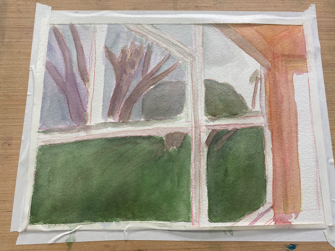 I’m working on a scene of my backyard during a sunrise. It’s teaching me something about how the eye’s perception of color will change with the time of day. If I was painting this same scene at midday, I would use more yellows and oranges and make everything warmer. Because it’s the beginning of the day, I’m making everything blue, purple, and generally cool. The grass on the bottom needs to be much darker. I’m going over it with layers and layers of “black”, made by mixing ultramarine blue and burnt Sienna. I realized that the blue I’d painted the sky was also too warm. Now, I was just blocking in the color when I was doing it, so I wasn’t all that concerned with accuracy. But now, it was time to fine tune things a little. I thought I’d try layering purple over it and see how that looked. Other than the purple going on a little thicker than I would’ve liked, I was very happy with the results. By contrast, the third of the sky where the sun is rising is going to mostly shades of pink and yellow, but that will be for another post.
The community I live in has an art group, which I'm apart of. Every month, there's an opportunity to have our work displayed in an informal hanging. The theme for next month’s is Impressionism and abstraction. I’m not much for abstract, but I thought I’d try my hand at planning an impressionistic painting. I’ve chosen to do a painting of a parrot in a tree that I snapped in Trolley Barn Park. I turned up the contrast on the photo so the lighting would look more interesting. 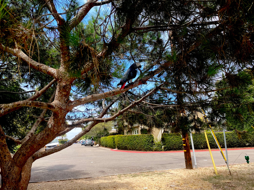 I’ve been going back and forth with myself whether to do the painting in watercolor or acrylics. If I’m going to do it in acrylics, I need to order a different type of canvas than the one I have. The impressionistic style involves putting a lot of paint on the canvas, which requires a heavy weight surface. I still have some sheets of 300 lb watercolor paper that I had to buy for that workshop I took though, so I’m leaning toward doing the project in watercolor. Some principals I’m going to follow are: 1: Use large brushes, no liners, and use the whole body of the brush, not just the tip. 2. Hold my brushes far back on the handle. Both of these principles will prevent me from being able to add a lot of detail, which we don’t want in impressionism. Rather, we want to rely on our shadows and highlights to give our subject shape. 3. (In acrylics) Use lots of paint and let my brush strokes show. But then... After all this, though, I realized I was being a little over ambitious. I wasn’t going to have time to complete this painting before the next art hanging. Luckily, I happened to have a painting already done in an impressionistic style, which is this one. 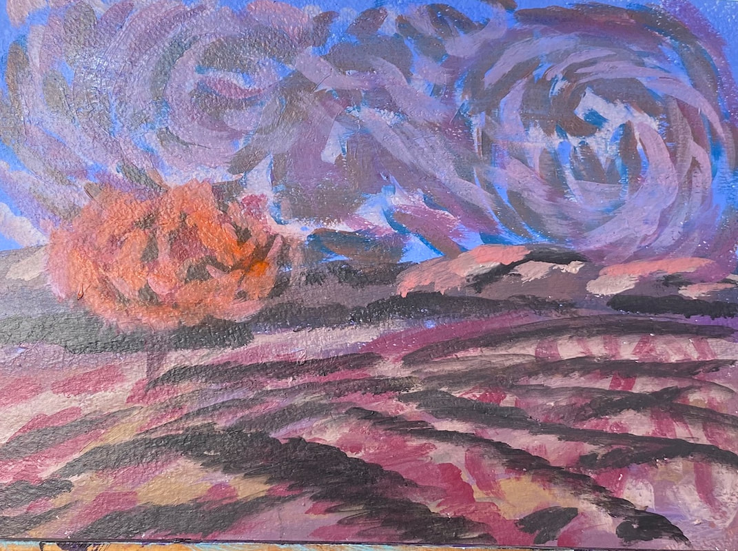 I painted this during one of Lisa Clough of Lachri Fine Art’s paint alongs. You might notice it’s very reminiscent of Van Gogh. That was done on purpose. I would like to paint the picture I was planning above. It just won’t be for this show. This teaches me a lesson about keeping up with what’s going on in my community and planning ahead.
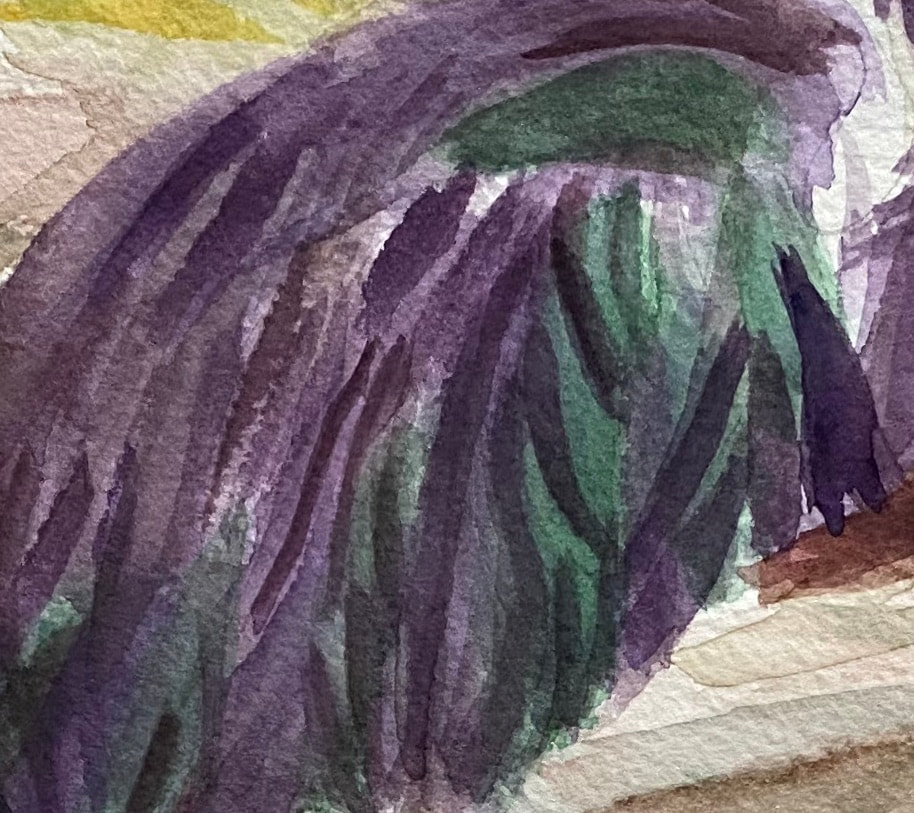 I feel like the most important thing for creating the right texture is to have my lines going in approximately the right direction and to have them either straight or curved, depending on what’s in my reference photo. I can be off the number of strokes in a given place and I can even be off with the length and width a little. If I have the direction and curve right, though, the animal I that ends up in my piece might not even look like the animal in my reference photo at all. While I’ve been working on my current painting of a multicolor heron, I haven’t even been thinking about what texture I want the feathers to be. I’ve literally just been thinking about the direction they go. If I do that, the texture takes care of itself. Sometimes, I happen to pause and take a look at a mass of hair or feathers and see that they’ve come out with almost the exact feel I wanted them to have, without me consciously trying for that feel. I love when that happens. An example I can think of the hair on this portrait. 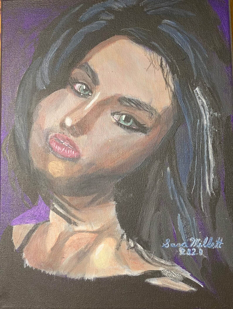 I just painted the shapes I saw in my reference photo and keeping my strokes going in the right direction. Before I knew it, I had the volume I was looking for. As you can see from the examples I've given, this principal applies across mediums.
 The bird I’m painting has a lot of colors in him. Trying to paint them all can be overwhelming. I’m starting simple by only focusing on green and purple for now. I’ll build up layers of these colors until I reach the darkness I desire. At this point, I'm not concerned with whether it's good or bad. This bird will have many layers and probably multiple colors on him by the time I’m done. By limiting my focus to two colors at these beginning stages, though, I keep myself from being too paralyzed by indecision to start. Don’t think about making a masterpiece when you start. Just think about starting.
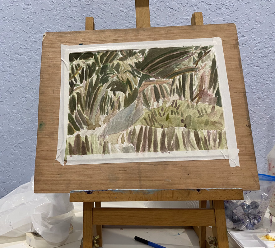 My goal is always for my subject to stand out from my background. I usually try to achieve this by making the background darker so the subject appears lighter and making the background cooler and the subject warmer, which I usually do by adding layers of blues over the background and yellows and oranges over the subject. I thought I’d try something different with my current painting, though. Since my subject is a bird with blue feathers, I knew painting yellow over him was out. That would just turn him green. Painting orange wasn’t much better because that would dull him and send him further into the background, exactly what I don't want. I remembered what I’d learned from Alicia Farris’s watercolor workshop and that's that layering analogous colors, or colors that are near each other on the color wheel, makes shades more vibrant. I could certainly use some more vibrancy in my subject. That would probably be a more effective way if getting him to stand out than trying to "warm" him. I chose cyan blue to layer over him. I could've chosen any blue, as well as purple or green. With just one layer of the cyan, he started to come forward more. On the other hand, his neck is more of a warm brown, so I've been painted red over it to get it to stand out more. I've added more layers of blue to my bird since I started writing this post. I'm looking at the painting now and he's standing out nicely from the background. What I think I need to do now, though, is create more separation between his feathers.
I’m starting by painting the bamboo and branches. This is so that when I add the panda over them, they’ll look like they’re behind him instead of growing out of him, if you know what I mean. I can see that most of the bamboo is very light, so I used a light gray as my base. I look at the shapes I see in my reference photo and mimic them. Painting all these shapes and keeping track of them requires a lot of concentration, but this allows me to almost turn painting into a mindfulness practice. Little by little, the shapes start to become the object I’m painting. 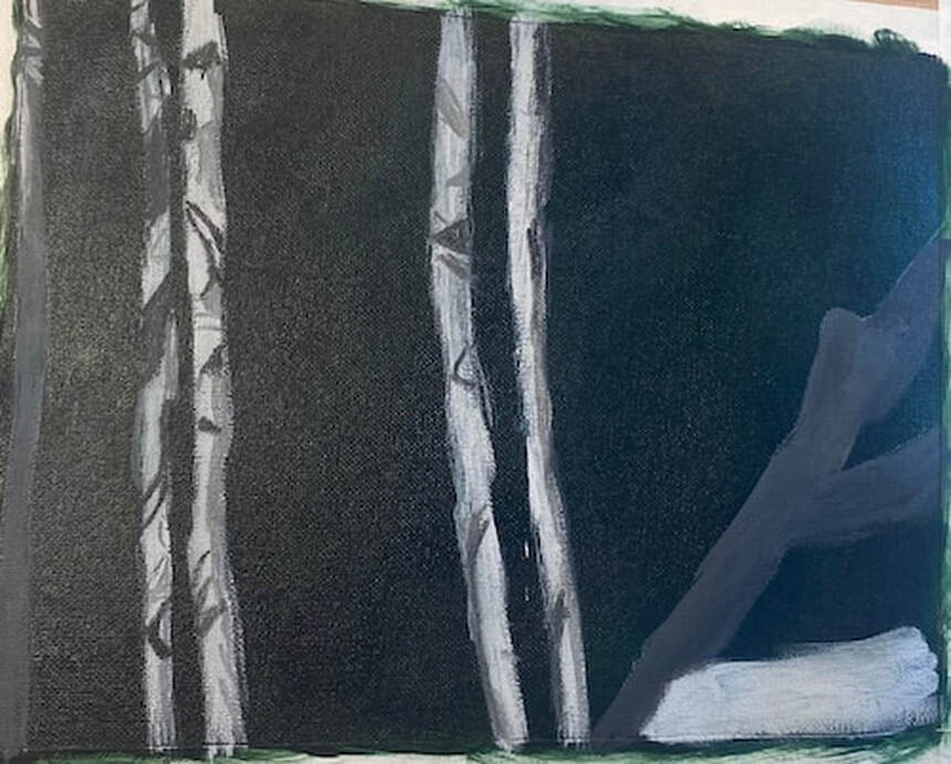 Today I finished the underpainting of the bamboo and transfer the giant panda on. I positioned my transfer paper so that he would be walking into the scene from the right hand edge. Once the major form of the panda was on the canvas, I refined the shapes of his head, back, and right hind leg. After that, since I still had quite a lot of paint on my palette, I started to use block in areas of the panda’s body that were similar in value. 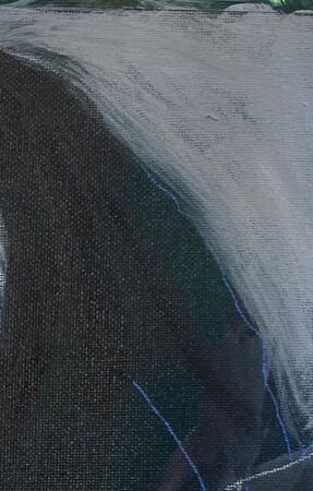 Today I painted more fur texture. I wasn’t worried about painting in every individual strand. I only painted those pieces that really stood out. What I did worry about, was making sure my strokes were going to in the general direction of the fur. Paying attention to the direction of your strokes can give you a fairly realistic, three dimensional look, even without spending a lot of time on individual strands of hair or fur. 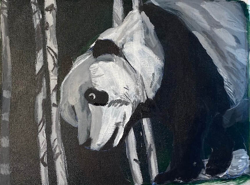 I started by glazing grayish brown all over the bamboo stalks. Later on, I brought this same color into the panda’s face and upper back. I was trying to glaze a grayish blue over the panda’s back, I can’t get the blue to show up now. I’ll have to try again on Monday. 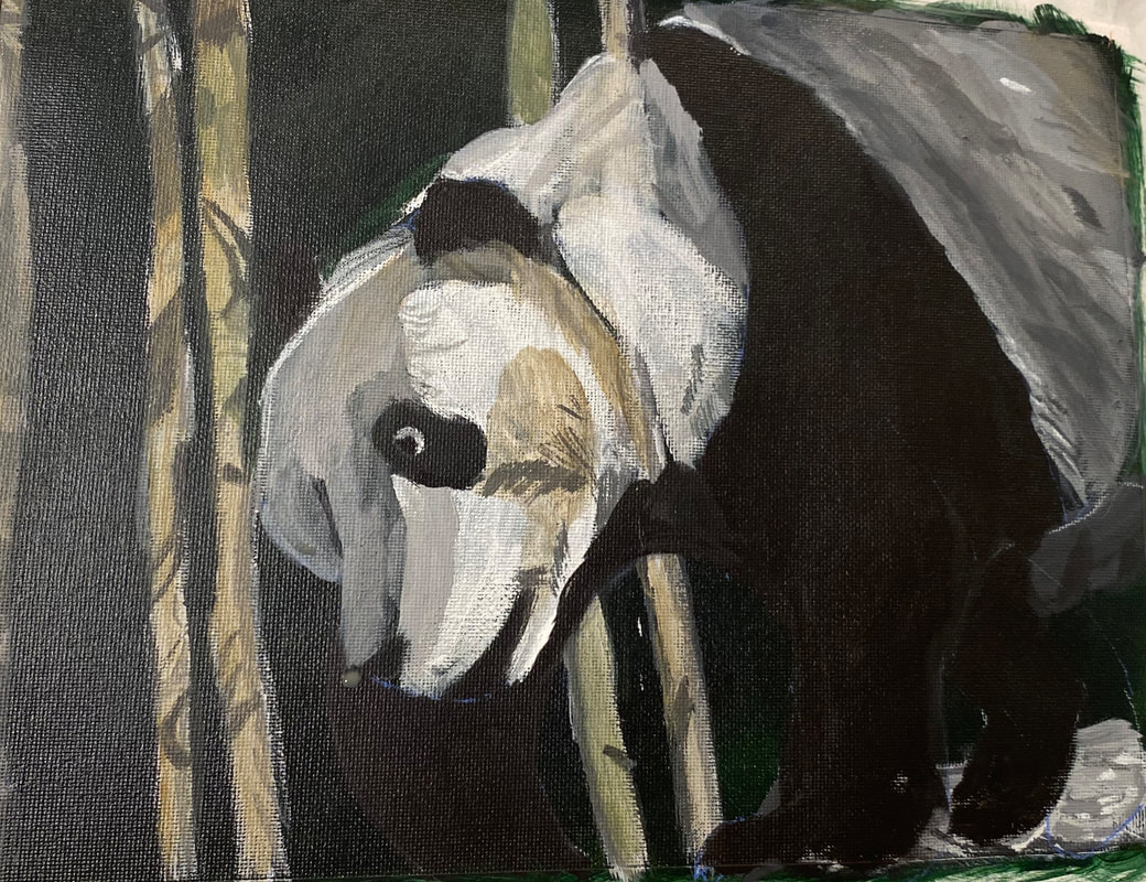 At this, I’ve started to reach the “I know this painting isn’t finished, but I don’t know what else it needs” phase. I pulled the reference photo up on my phone and took a close look at it. I saw that I needed some more pale grey fur strokes where the white meets the black on his back. I sat down to paint with the intention of just painting those strokes and while doing that, I also noticed some grayish brown marks and painted those. Sometimes you can sit down to paint one thing and see other things while you’re at it that can keep you going. What helps in this case, is, instead of looking at the photo as a whole, closely examine one part of it. In this case, I honed in one the panda’s back, ignoring everything else for the time being. The next time I work in this piece, I’m thinking I’ll do the same thing with his face. 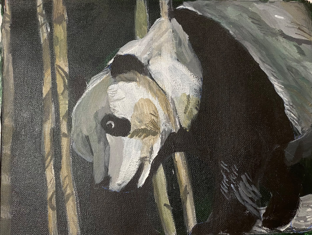 You might notice by now that even though pandas are technically black and white, there’s hardly any white in this guy and there’s less and, barring tiny highlights, the more I work on him. I covered up most of the white I had in his face yesterday. Nothing that’s three dimensional is ever going to be totally black or white, because, by it’s very nature, it’s going to have shadows and highlights. White fur is also going to reflect the colors around it. You can see that I’ve brought the grayish tan of the bamboo into his fur. If he’d been under a blue sky, I would’ve brought that into his fur, but since I used a green background, I brought that in instead. On the topic of white highlights, I’ve been using those to add more fur texture. 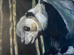 In my latest painting session, I directed my attention to this, 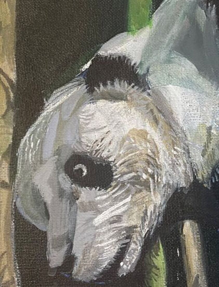 and this.  I noticed that there was lots of texture in both that I hadn’t painted yet. I mixed some light gray paint. The fur looked almost white here, but I didn’t want to jump to white just yet. I used my liner brush, and doing my best to load the paint on evenly and without clumps, touched just the tip of it to the canvas. Even with my best efforts, though, a lot of my lines came out thicker than I wanted, so I came back with my liner brush wet, but devoid of paint, and came back over those lines to thin them. I made similar strokes with both a darker, and a lighter shade of gray than that of my initial layers. 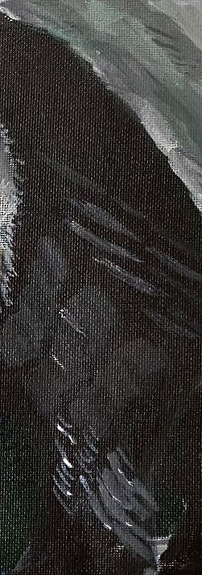 It’s becoming more apparent to me that the texture of the black part of his fur is very coarse, but also shiny near his ankle. To achieve the shine, I started by putting little dots of titanium white with the tip of my liner brush on the ends of the fur texture lines I’d already painted in that area. To achieve the coarse look throughout the fur there is going to be more of a challenge. I don’t want to paint lots of very thing lines because that will just make him look wiry. Also, the shade I used for the strokes had to be very dark, as to almost blend in with the black. I couldn’t have high contrast here. So I mixed a gray using mostly mars black and a little bit of titanium white. Then, using my liner brush again, but pressing harder with it, using more of the body of it, so the lines would be thicker, I painted dark gray texture lines on his leg, all going in the same direction.  I want to point out that when I’m painting all these fur lines, I find that, as much as I like to maintain control, when I make quick strokes, often with a little wrist flick, I’m happier with my results than when I go real slow and try to control everything. Maybe that’s because most things in nature are rough and uncontrolled. I hope that makes sense. I followed this principal of not trying to control things too much to paint extra fur texture around his left ear, his eye, and again, where the black on his fur meets the white. 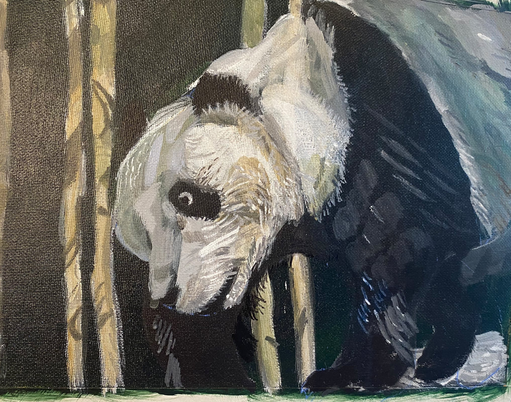 I’d known for a while that there needed to be a blue highlight on the lower part of his left foreleg. I couldn’t just paint it straight blue, though. It would have to be mixed with orange of course to tone it down. I had been frustrated with trying to tone down blue with orange because my blue would always turn purple. I was watching a video on YouTube from my friend Shana Rowe Jackson in which she was painting some blueberries and she was mixing all her colors from cyan, magenta, and yellow. I wrote to her in the comments about the same struggle I just described here and she encouraged me to try using magenta, instead of red, to mix my orange. I did just that with this painting and was thrilled with the results. I now realize that the red I was using was too warm. I was adding yellow to my blue without realizing it. The magenta has a blue undertone, so it doesn’t give me that issue. I took my liner brush and gave him some shaggy fur on his right foreleg. 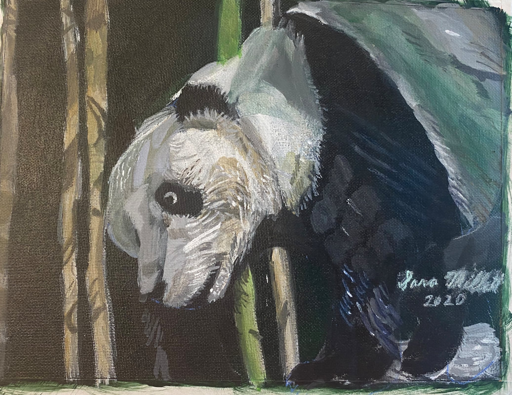 Here's the finished piece. To touch it up, I added some more intensity to the green shadow on his back. I made this decision after playing with the painting in my phone. When I turned up the color saturation, I realized I liked it. His neck had been way too transparent for a long time and I fixed that also.
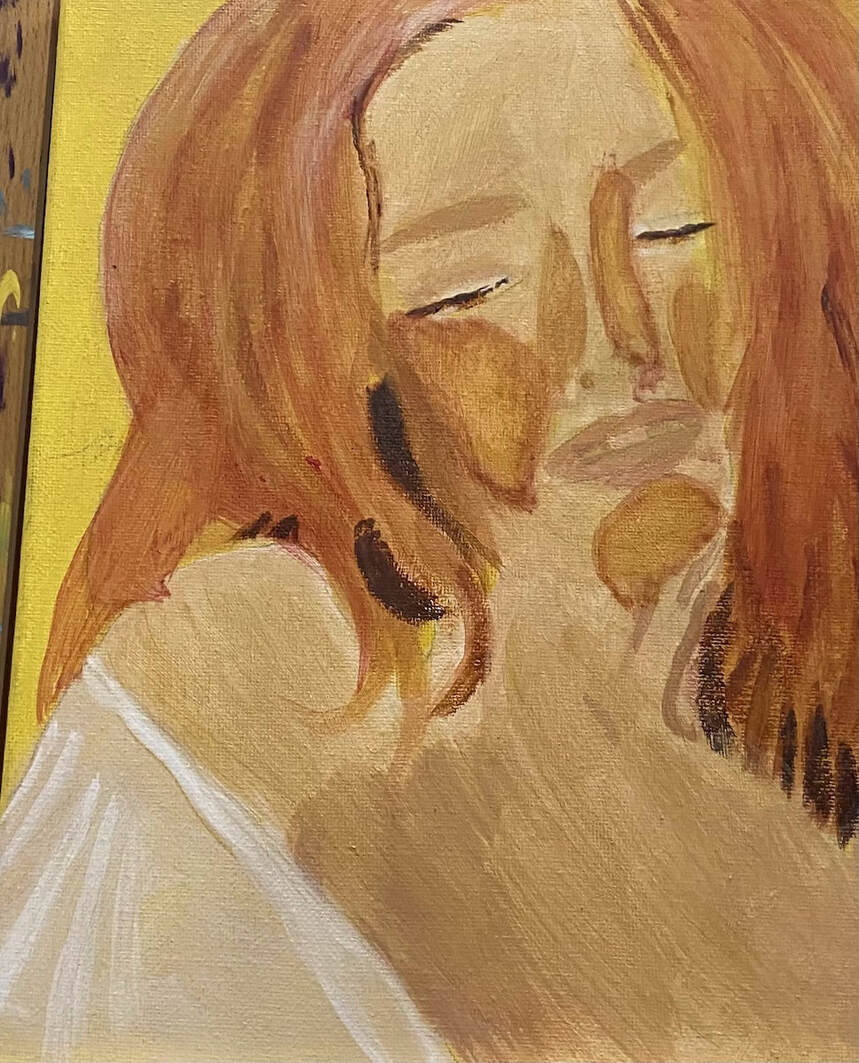
I'm taking a different approach with this painting. I've learned from Lisa Clough that, when working in acrylics, the background should always be painted first and the subject painted over it. This is because, if the subject were painted first, it would be almost impossible to blend around it before the paint dried.  To that end, I'm only worrying about the background right now. I'm pretending that the woman and the kid don't exist at this point. My plan is to paint the underpainting for the background, then glaze my color over that. Then I will draw the mother and child, paint the underpainting on them and finally glaze color over that. 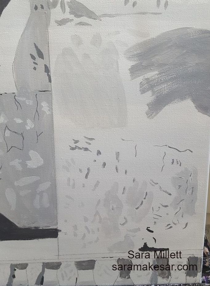 I'm creating texture through the use of different size brushes, including a liner brush, to paint lines and shapes, and various shades of gray. Today is the first day of adding color. After studying my reference photo, I could see that the dominant color of the building was a very pale brownish pink. To make that color, I mixed zinc white, with a little bit of cadmium red deep and burnt umber. I've been glazing this color in light layers over my underpainting. 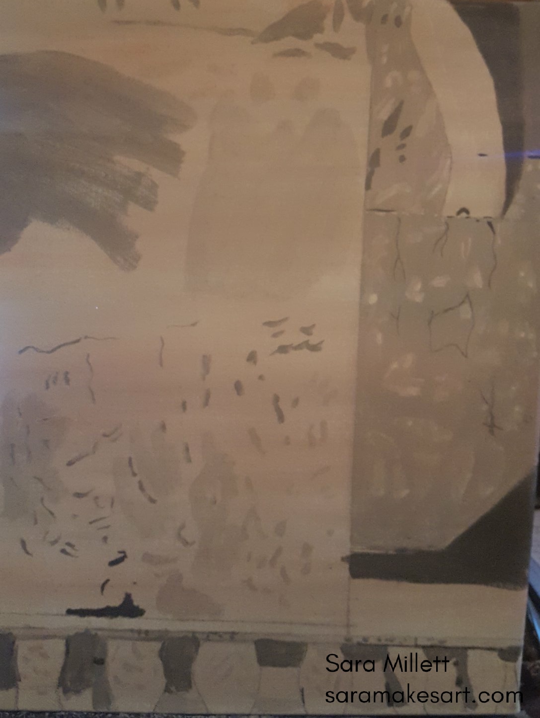 I added many layers of this color to the painting until it was more or less solid. When I was done, the color was a little uneven, so I went over some of the darker shades with zinc white to even it out a bit. 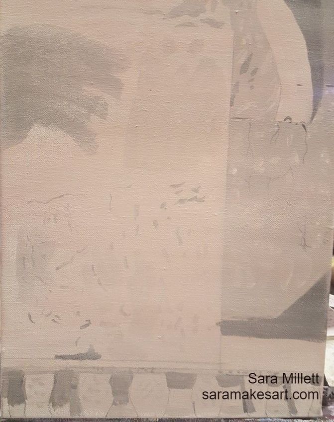 I added some of my premixed pinkish brown color, to the zinc white that was already on my palette along with some azo orange. I went back and forth mixing both of these until I was satisfied. When I put this color on the canvas, I thought it was still too brown, so I glazed some azo orange over it. 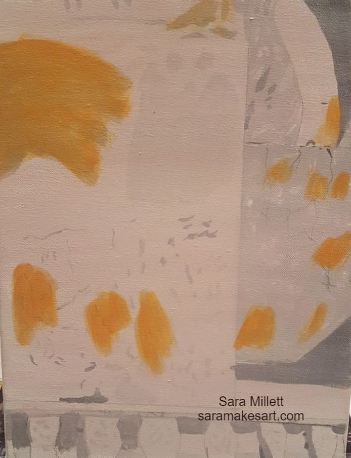 I preceded to glaze more azo orange and my premixed brownish pink mixed with zinc white over these areas. making back and forth strokes with my brush. 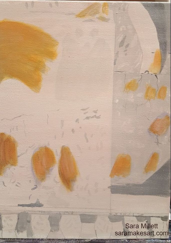 I mixed some of my brownish pink color into some titanium white this time to make it opaque and applied it to one of the orangey brown spots using a small round and a small filbert brush. 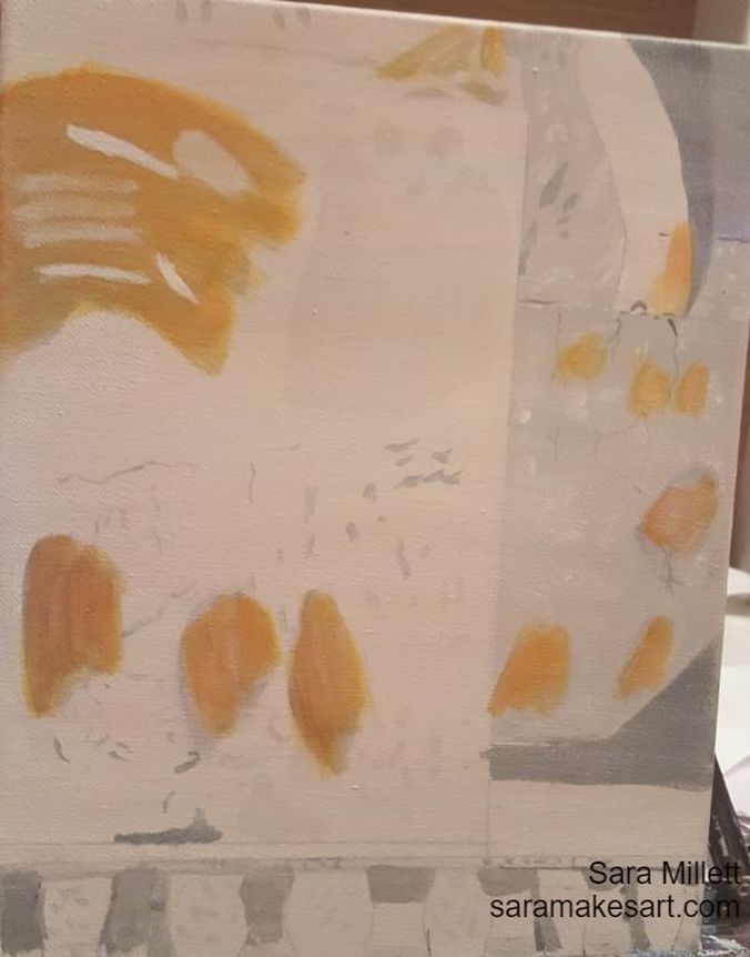 I mixed zinc white and ivory black to make a transparent gray and painted streaks of this color over one of the orangey brown spots. I also mixed a very light gray from titanium white and mars black,and painted patches of this color around the piece. Then I mixed some of my brownish pink color into this color and continued painting patches to increase the stucco effect. 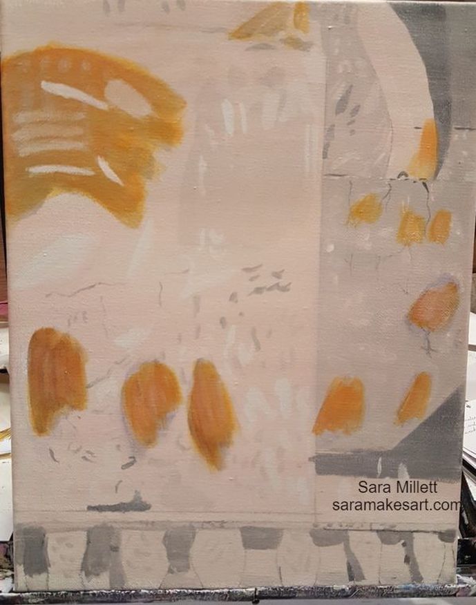 I mixed a darker version of my sheer brownish pink color and glazed it over the last third of the piece going horizontally. Then,I mixed gray from zinc white and ivory black, so it would be transparent, and painted streaks and squiggles of this over the white patches using a small round brush and a liner brush. 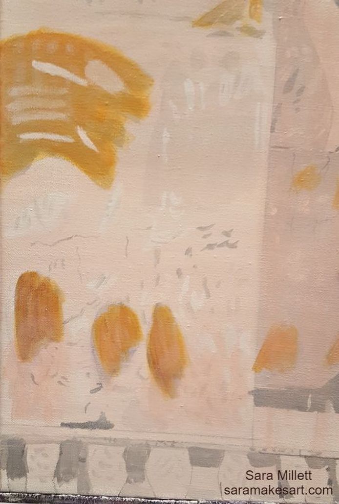 I took some transparent burnt sienna, this time from Liquitex's soft body line, mixed it with a lot more mixing medium than paint, and glazed it over some parts of the last third of the piece, going horizontally. I mixed ivory black, which is a transparent black, with a good amount of matte medium, and glazed it over some parts of the burnt sienna to darken it, while other parts as is. 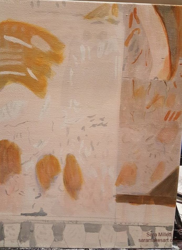 I'm learning that it's important to use a large enough brush for the area you're working on when trying to glaze. Otherwise, you get an unsightly ring around the area. For the bottom portion of the lower third, I started by glazing a light transparent gray made by mixing zinc white and ivory black all over. I then mixed a bit more black into my gray, and, using, a small round brush and a liner brush, applied subtle streaks of this color over my glazed light gray. In the middle of doing this, I decided my gray needed to be darker, so I mixed more ivory black into it. I painted subtle streakes of burnt sienna, glazed over with ivory black, and titanium white, finally glazing some light pink over some of the titanium white to blend it into the background. 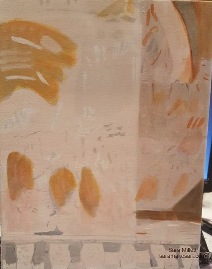 I glazed more layers of transparent gray and burnt sienna over other parts of the painting, and put in more spots of titanium white using a small round brush. 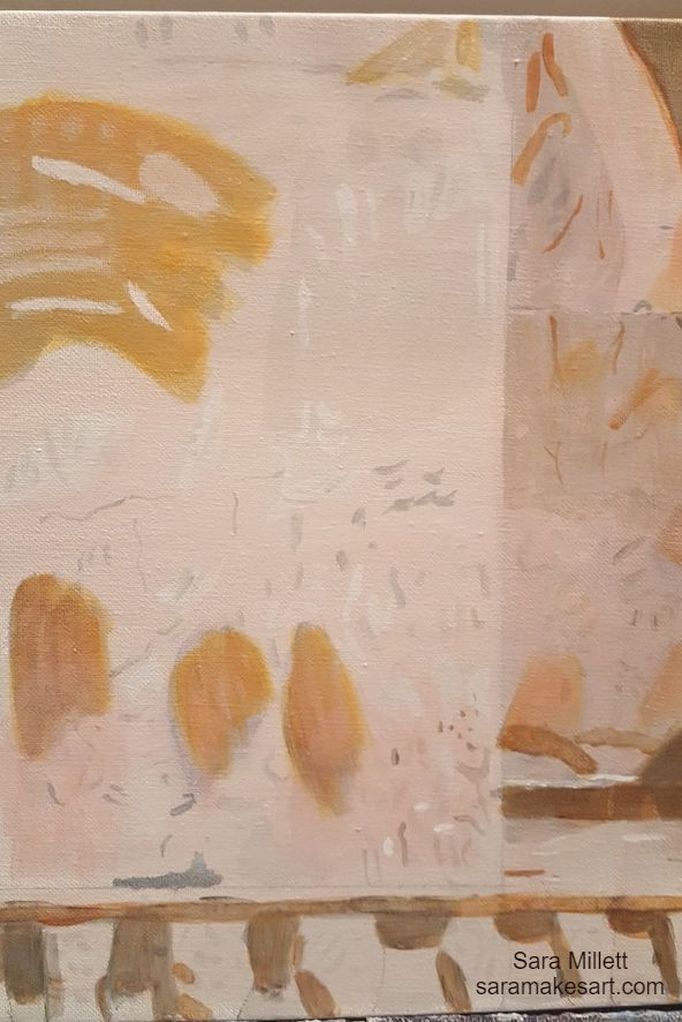 I added yet more white spots to the wall and glazed over them with a mix of zinc white and ultramarine blue. I took some of my premixed brownish pink color, mixed into some zinc white, along with transparent burnt sienna and a lot of matte medium, and glazed this color over the bottom third of the wall. Finally I took a liner brush and some transparent burnt sienna and painted subtle lines of this color where it was needed. 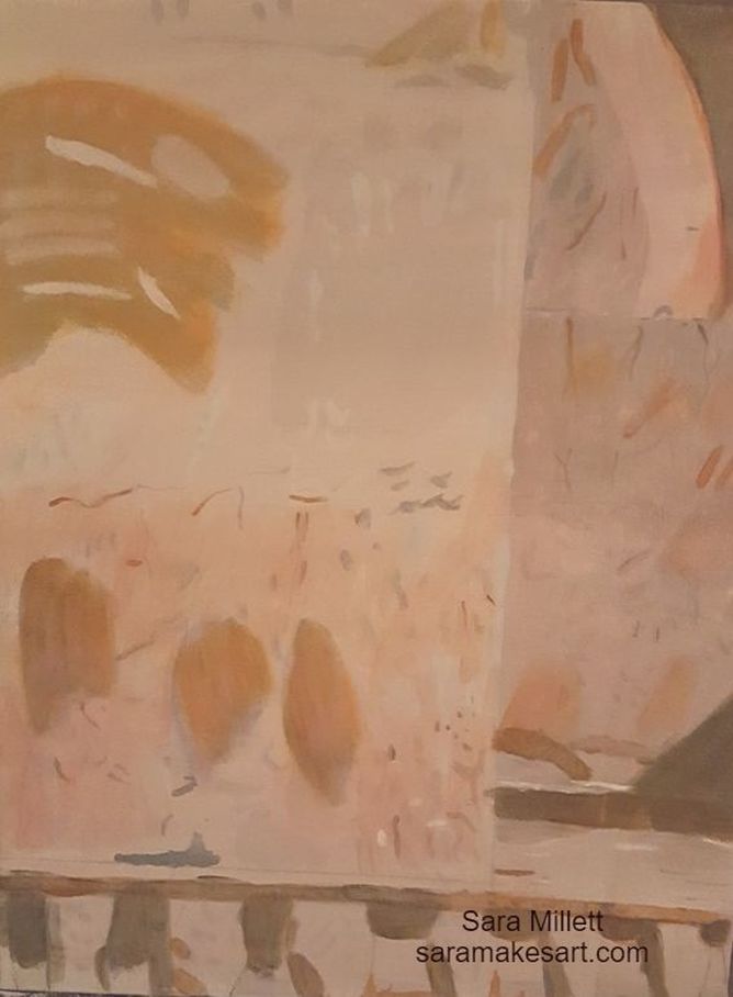 I noticed that part of the wall in the back need to be darker, so I mixed some transparent gray from zinc white and ivory black and glazed it along part of the area. I mixed more ivory black into this color and used it to strengthen the cracks in the wall. Whenever, I use a liner brush, by the way, I always make sure to roll in around a bit on my palette so there's an even strip of paint going throughout the brush and not a big blob at the end. I also took a liner brush and some trasparent burnt sienna and made some ridges, which I went over with my premixed gray color. I used my liner brush to paint bits of titanium white, the opaque white over the floor area. Finally, I took some zinc white, mixed with matte medium and went over the front of the ridge. 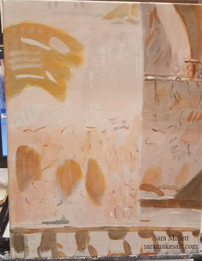 Tonight, I drew my subjects onto the canvas using transfer paper (I have another post explaining how I did that) and started the underpainting. The goal of any underpainting that I do is to bring out texture and provide depth using value. 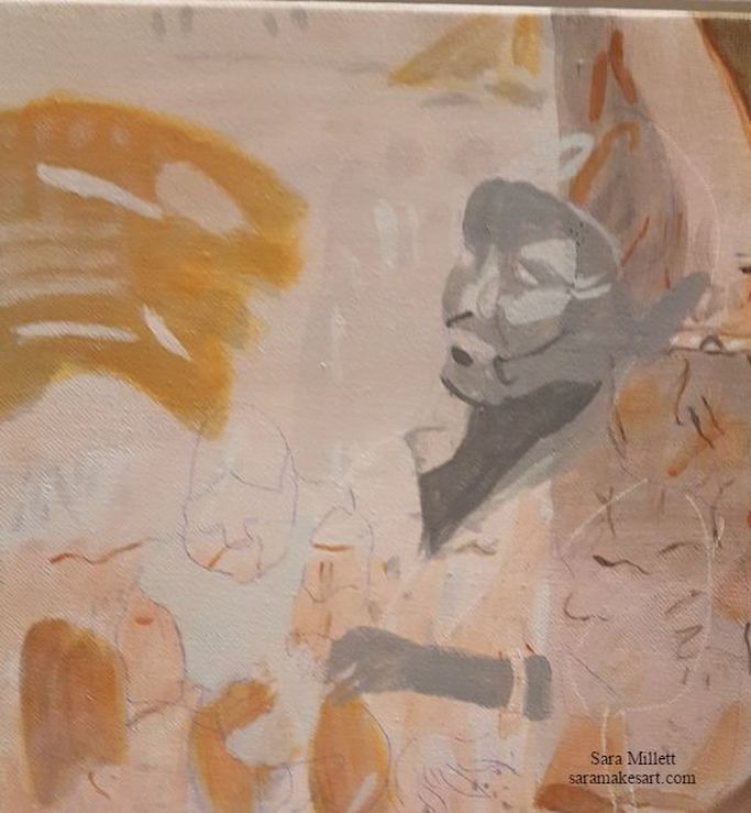 After finishing the underpainting on the subjects I mixed a combination of transparent raw sienna, zinc white, dioxazine purple, quinacridone red and hansa yellow light to make a flesh color. I also mixed quinacridone red and hansa yellow light together to make a transparent orange and mixed that into the paint as well as mixing the quinacridone red and hansa yellow light in individually. I mixed this combination into some matte medium and glazed it all over the mother's face, chest and arm. 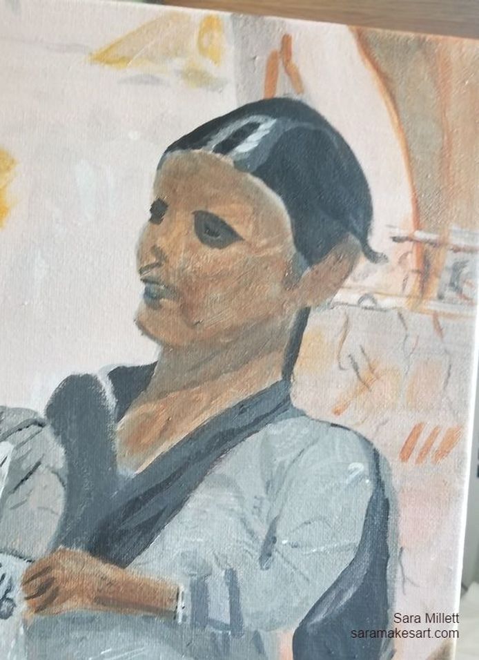 I intend to glaze some quinacridone red over her skin because I can see it looks a bit reddish in the photo. 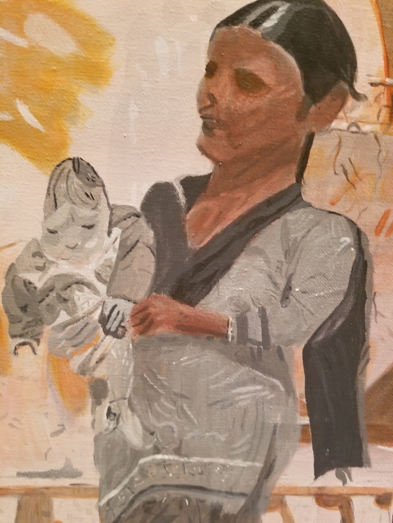 As promised, I glazed over the womans entire face and body with quinacridone red. My goal was not to create any obvious redness but to subtly warm up her skin. I alternatively mixed zinc white and ivory black into my base color to make shadows and highlights. After I was done painting the shadow around her eye, though, I didn't like how it looked. I'd faithfully copied my reference photo, in which the woman's eyes are in deep shadow, but in the painting, it looked wrong somehow. I decided to glaze some transparent raw sienna and some quinacridone red over tne shadows around the woman's eyes and as a result, while the shadow is still very dark, it now looks like a part of her face, as opposed to something that was cut out and stuck on. 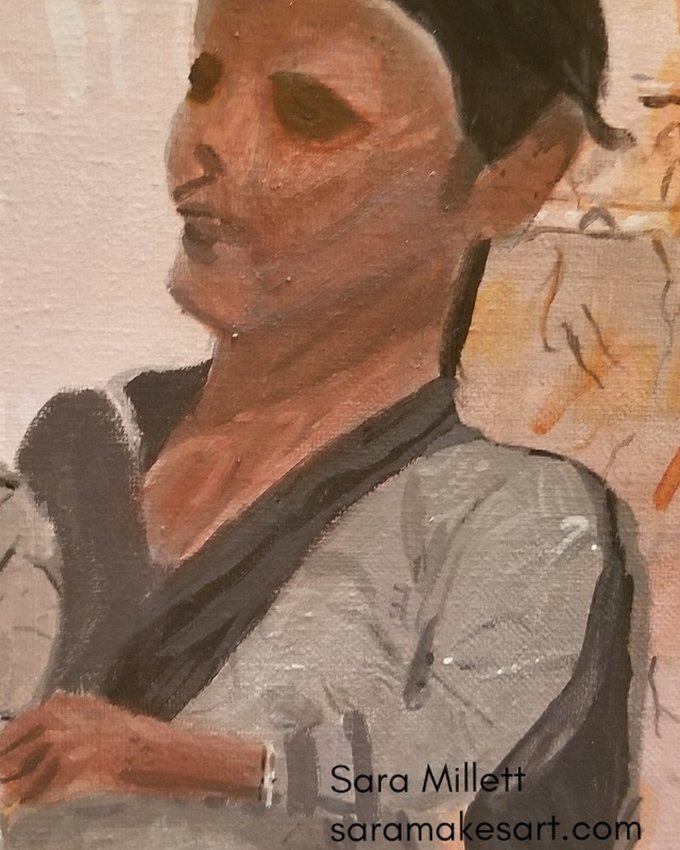 I could see in the photo that there was some gray in her skin, so I decided to add it by mixing zinc white and ivory black and glazing it around her jawline and chin. 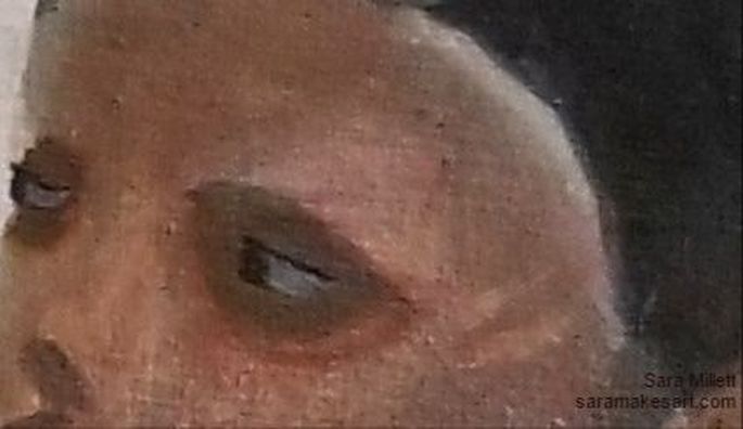 I didn't put much detail in her eyes, since I can't see much in the photo. I just filled in her cornea with a dark grey, that I had leftover from doing the underpainting. I used gray and not white because her eyes are in deep shadow and white would have looked wrong here. I used van dyke brown for her irises and used a liner brush to paint a dot of mars black in each eye for a pupil and a strip of black above each eye to represent eyelashes. 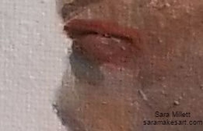 I glazed over her entire mouth with quinacridone red. I alternatively glazed transparent burnt sienna and quinacridone red over the lower half of her bottom lip and upper lip. I also put a highlight, using zinc white, on the last third of her upper lip. 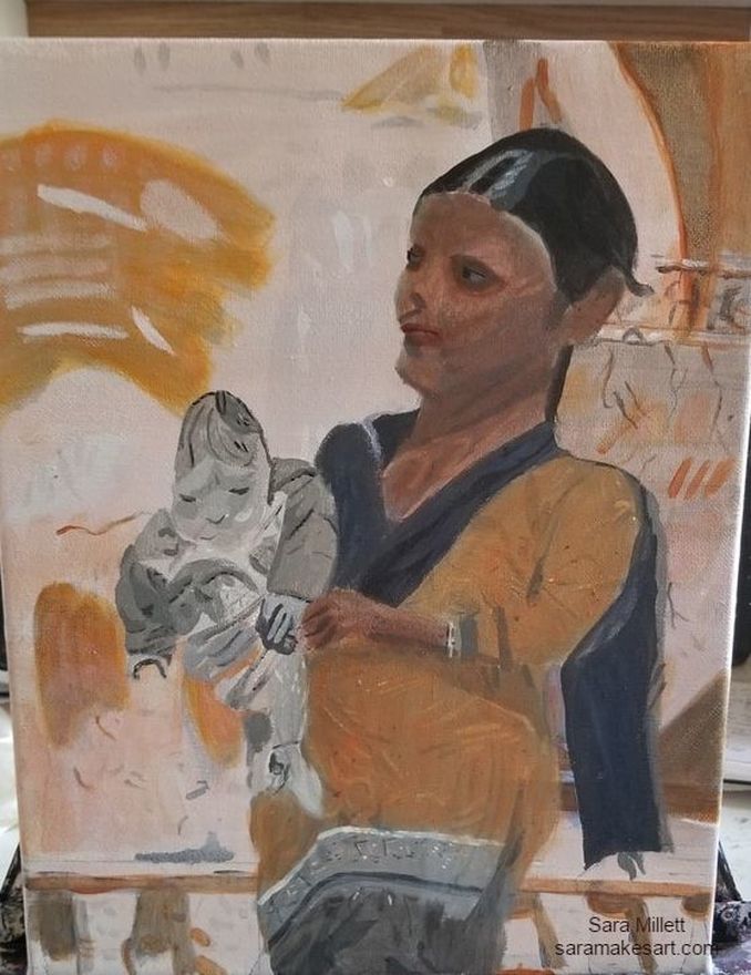 I mixed yellow light hansa and quinacridone red to make a transparent orange and applied it in three or four layers on her tunic. 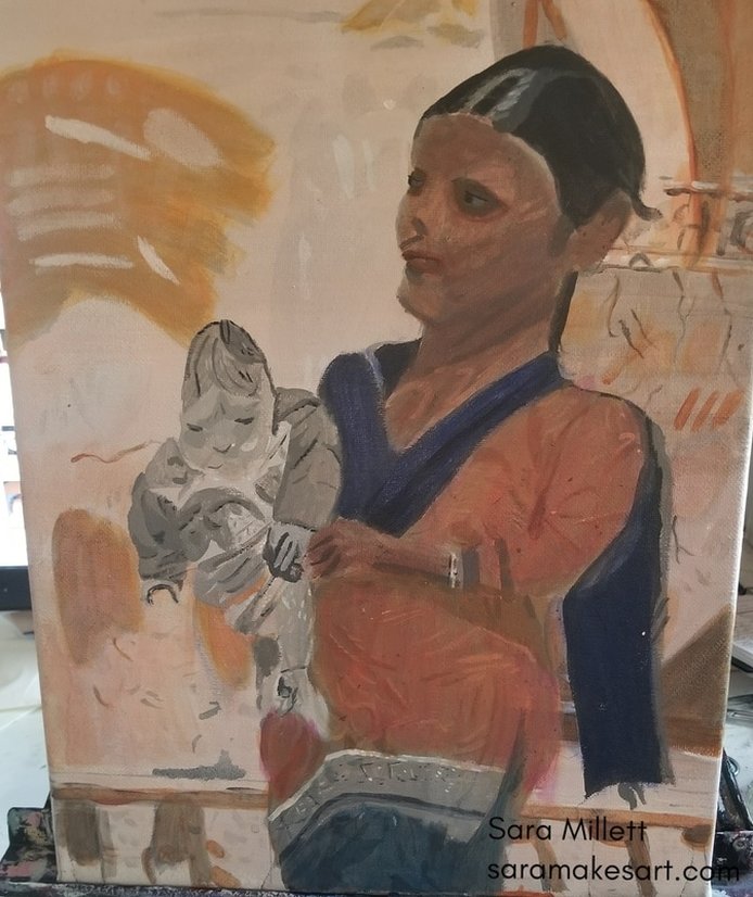 I mixed transparent burnt sienna into the orange I'd mixed for the woman's tunic and used a small round brush, and then a liner brush to create shadows in the folds. For her scarf and cape, I glazed several layers of ultramarine blue. I glazed a touch of magenta over her tunic to brighten the orange and painted zinc white over part of her scarf to lighten it and emphasize the folds. 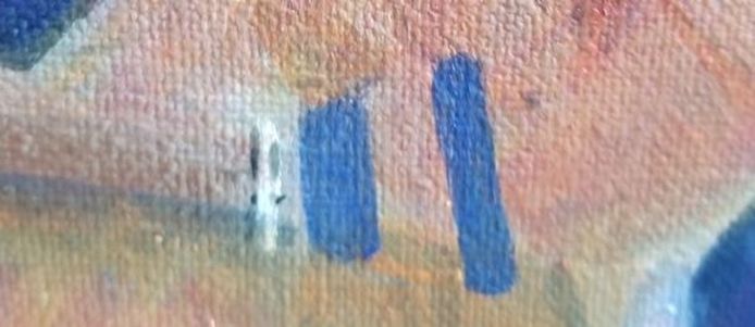 I mixed cobalt blue and ultramarine to make the color that I used to paint her rings. 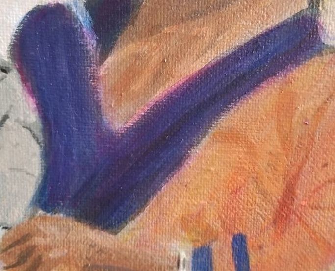 I glazed magenta over the her scarf and cape to brighten it.  For the gauzy bit on her cape, I mixed zinc white and ivory black to make a transparent gray, then using a round brush, painted streaks of grayish purple and blue. I mixed more purple into my grayish purple color, and using a liner brush this time, painted streaks of this color onto the gauze. I mixed a darker gray from zinc white and ivory black, and again using a liner brush, painted a steak of this along the bottom. 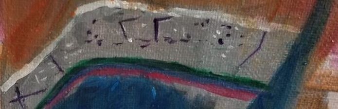 For the bottom portion of her cape, I let my underpainting show for the gray in the background. I used a liner brush and painted blue violet on the diamond like pattern. I used deep green permanent, ultramarine blue, and carmine, mixed with titanium white for the three stripes, going from top to bottom. I painted them with a little brush that came in a watercolor kit, but that works for acrylic paint too. 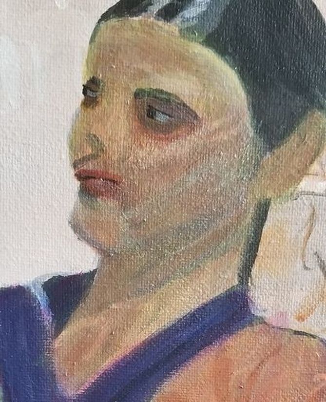 I glazed zinc white and then hansa yellow light all over her skin to brighten it. 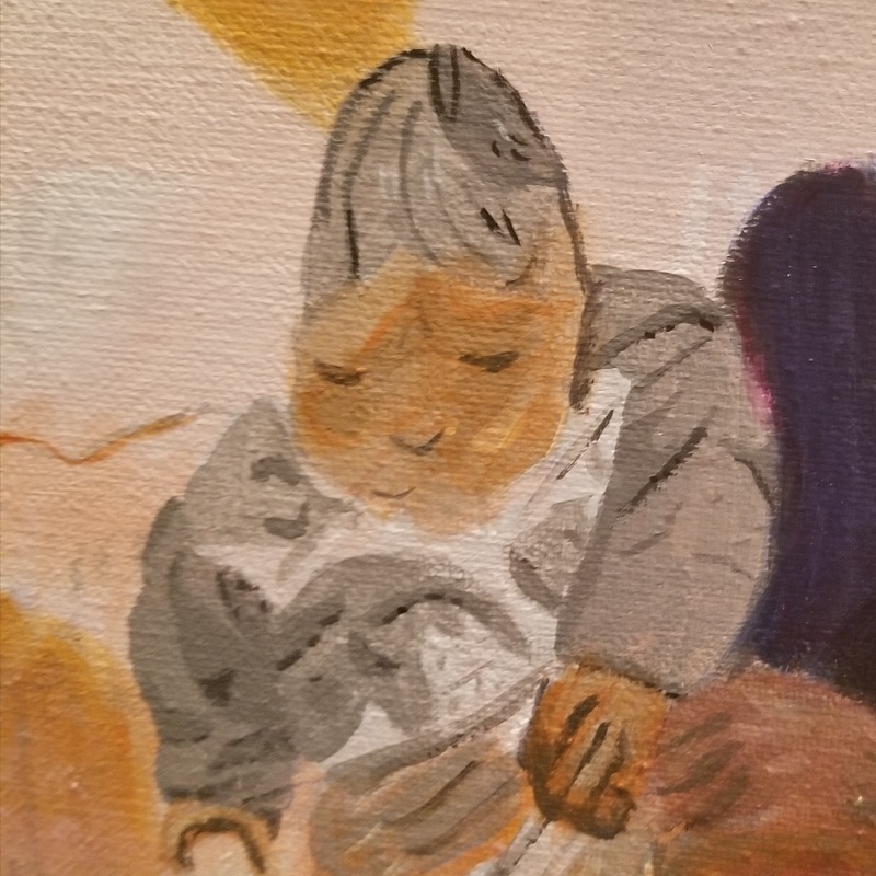 I mixed transparent raw sienna, quinacridone red, hansa yellow, and zinc white to paint the baby's skin. After it was all mixed, I thought it was too dark, so I mixed some purple into it. Purple is the complement to orange, so it tones it down.  I mixed some more of my fleshtone that I'd used for the baby and mixed that into some gray that I made by mixing zinc white and ivory black. I used this color to block in the baby's scalp. Then I mixed some more gray and mixed some van dyke brown that I'd saved into that, and, using a liner brush, I painted on strands of hair. Lastly, I painted on zinc white with a filbert brush. 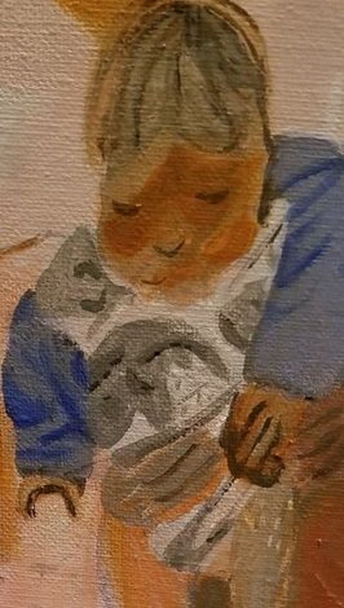 For the sleeves and hood baby's sweatshirt, I mixed a color that was mostly zinc white with some ultramarine blue, and, using a filbert brush, blocked in where this color went. I added varying degrees of ultramarine to this original color to make the shading for the folds, starting with the lightest shade, other than the base of course, and going darker. 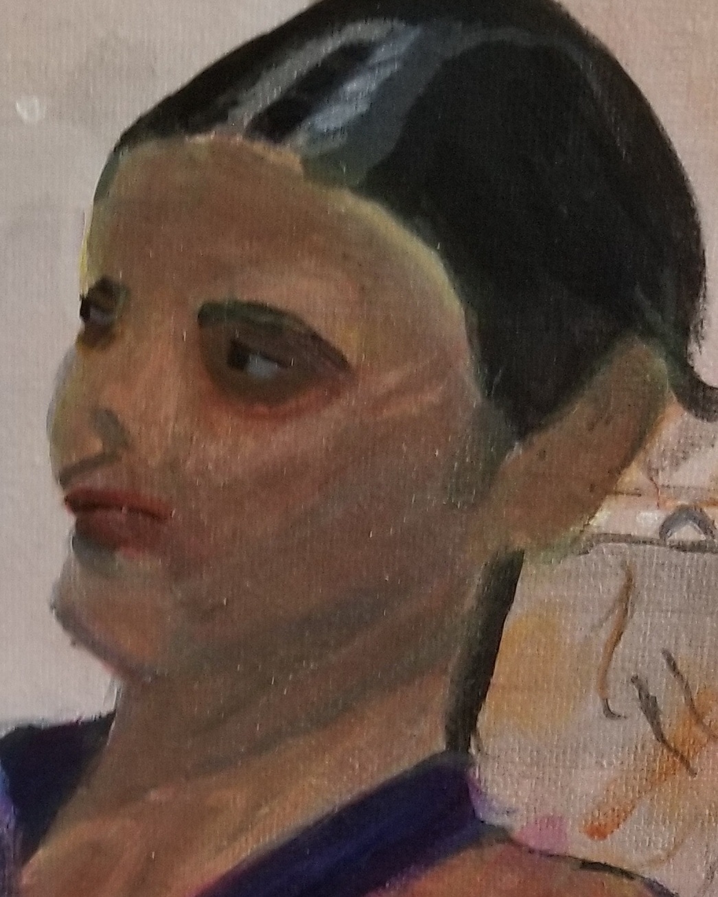 I decided the woman's skin needed some adjustments, so I glazed purple to town down the yellow, quinacridone red mixed with green, and transparent raw sienna all over her face and neck. Then I mixed some of my green-red shade into the transparent raw sienna and painted a sideways v on her forehead and a vertical curved line under her left cheekbone. 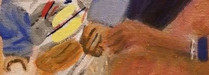 For the patches on the baby's sweatshirt, I used cadmium yellow medium mixed with titanium white, cadmium red medium, and prussian blue. 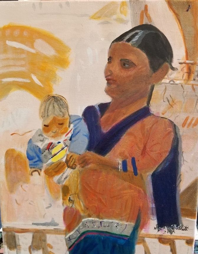 After making some adjustments to the baby's leg, here's the finished piece.
While working on my latest painting, it I learned that, while, as an artist, I use photos as reference, sometimes I have to judge a piece independently of the photo. In the photo I'm working, from the shadows around this woman's eyes are very dark, so of course I made them that way in the painting. But, as much as I tried to justify it, telling myself it looks that way in the photo, so it must be right, somehow I couldn't shake the feeling that something was off. 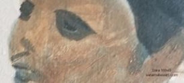 Here is a a close up of her eyes as I'd first painted them. I decided to glaze over my shadows with transparent raw sienna and quinacridone red The result is this: 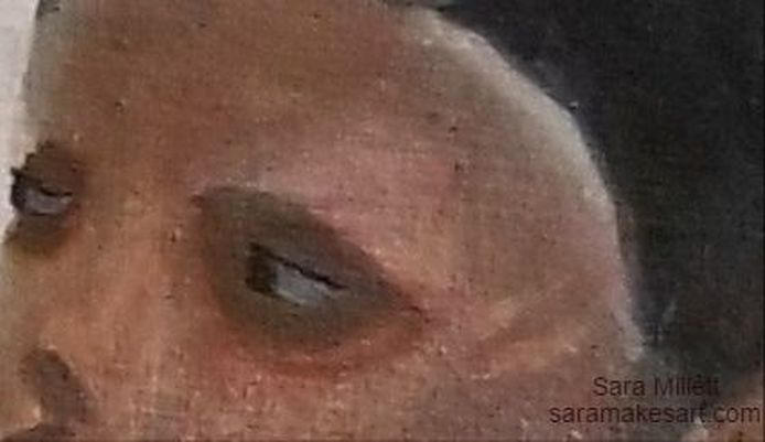 The result, as you can see, is that, while the shading is still extremely dark, now it looks like it's part of the rest of her face instead having like she's wearing eye masks. So while a reference photo is pretty much an indispensible tool for me in order to create the pieces I do, I ultimately have to judge a piece on it's own merits. Just because something looks a certain way in the photo doesn't mean it's going to look right in my painting. That's all for now. I'll talk to you again next week. |