|
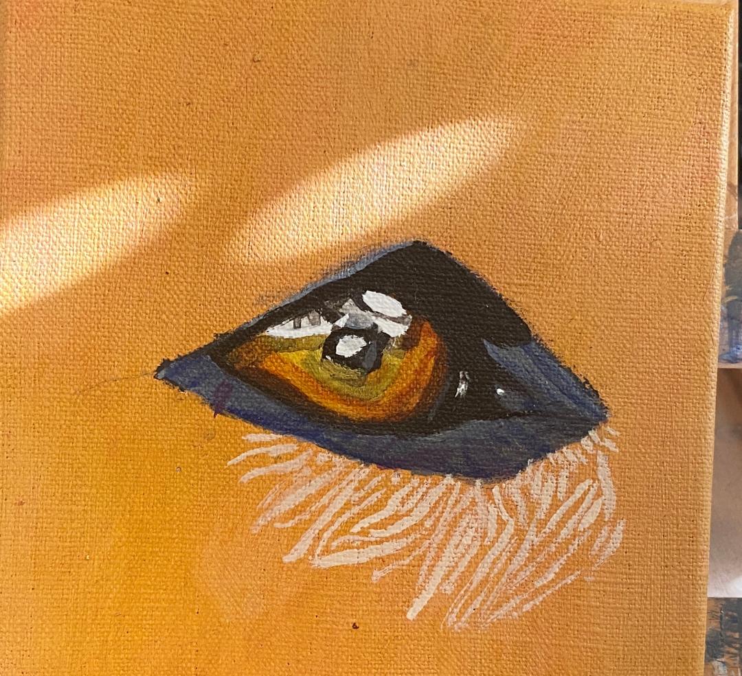
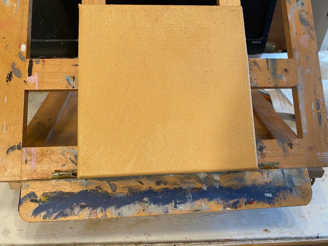
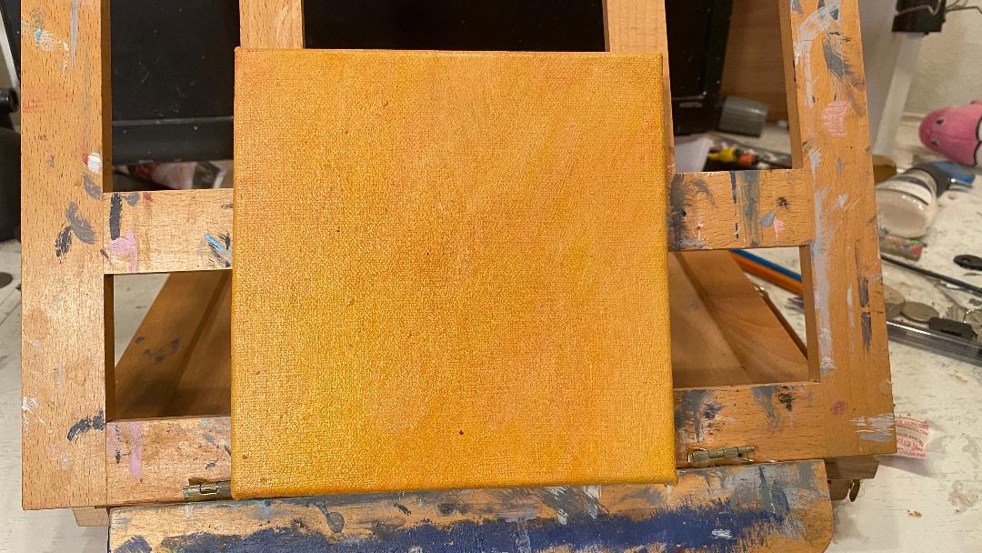
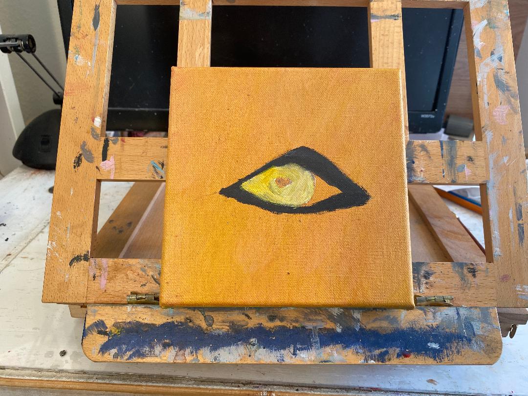
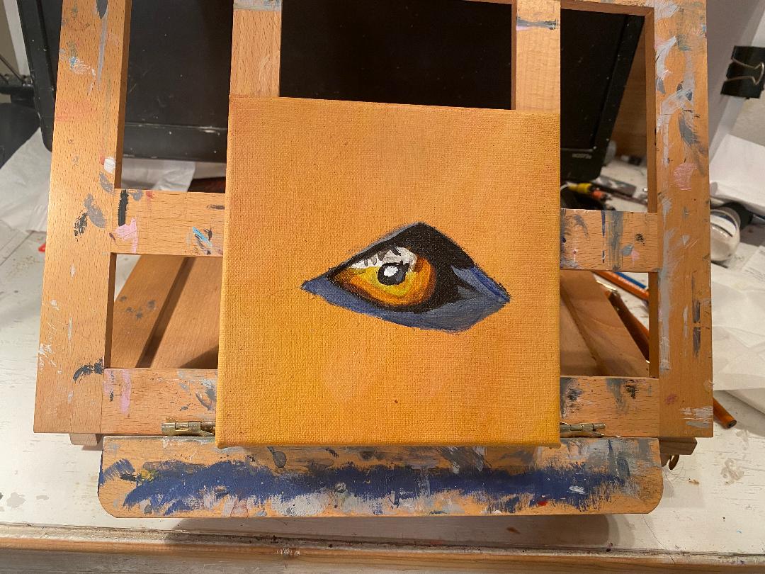
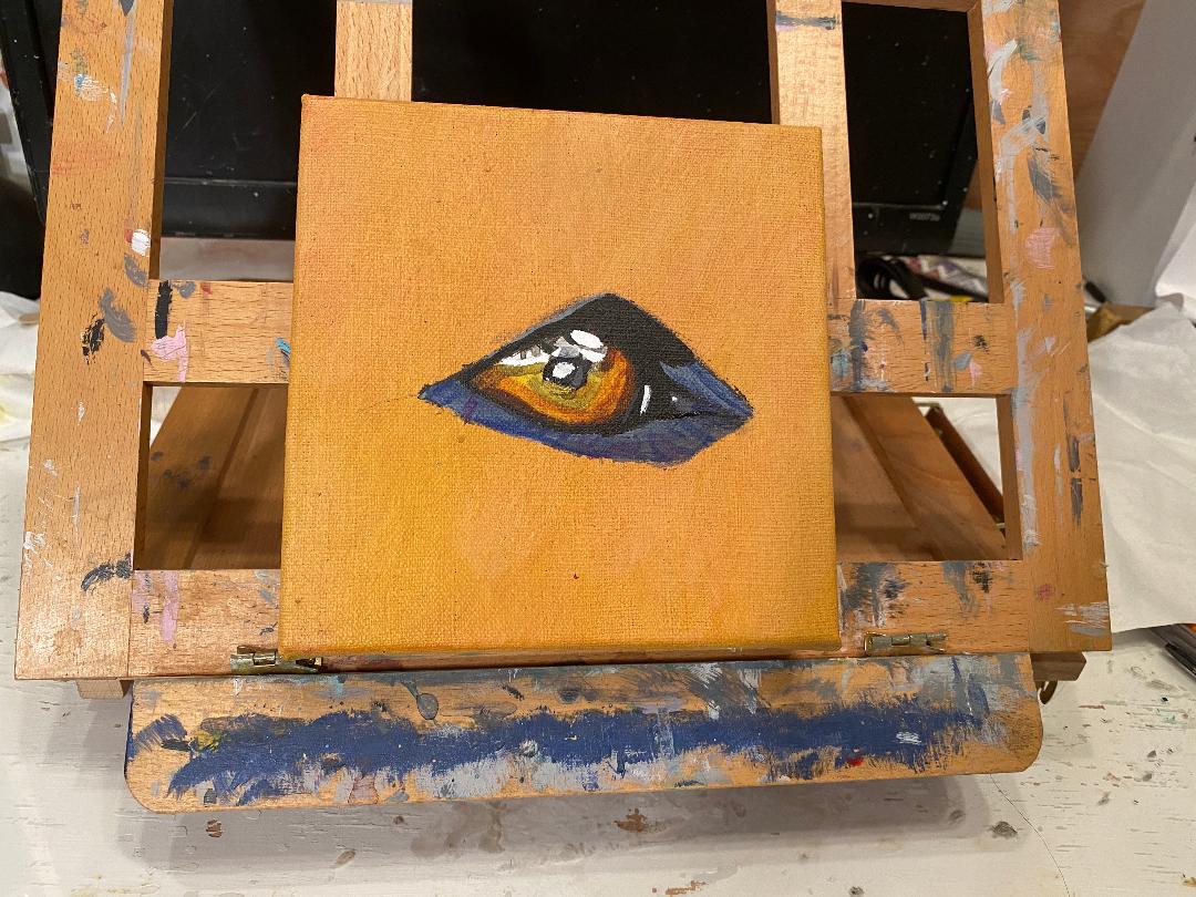
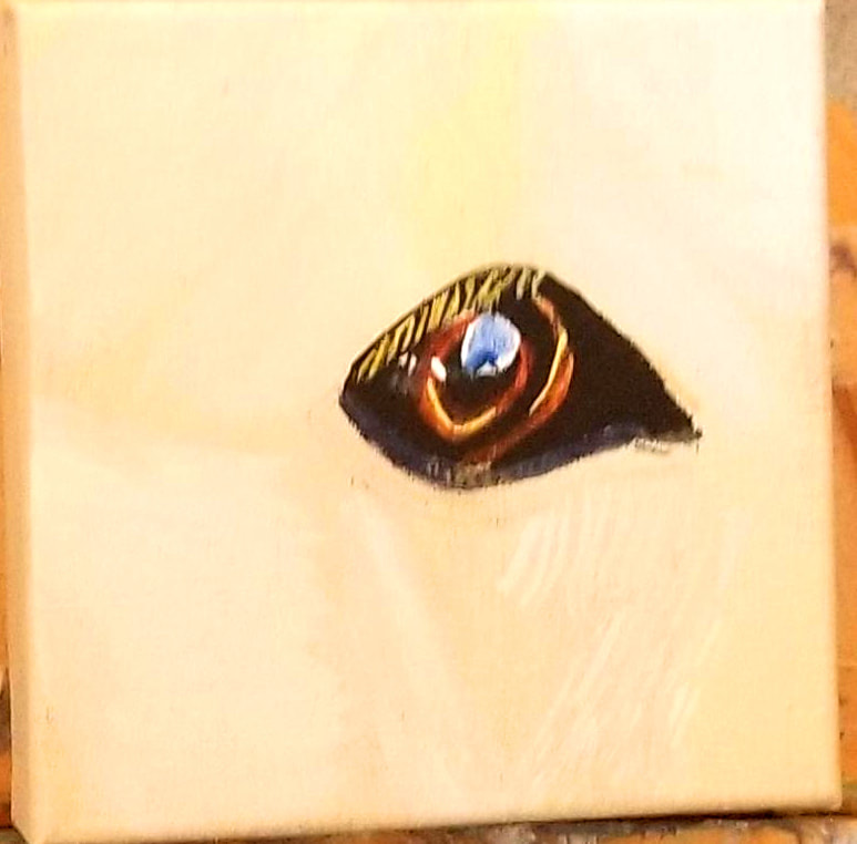
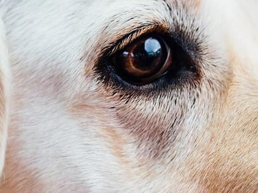
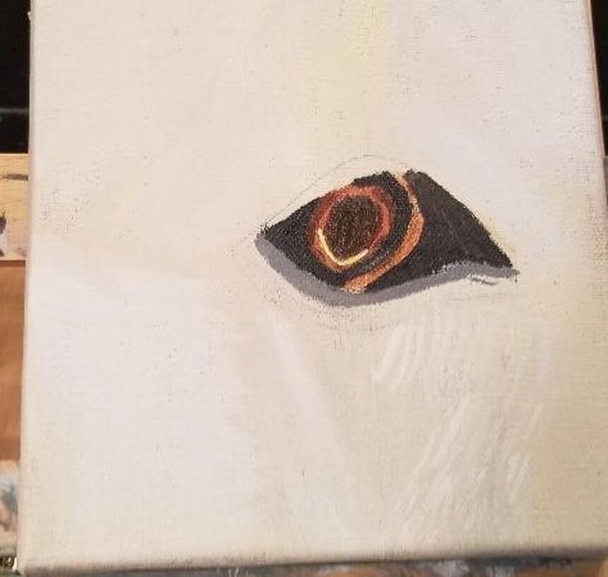
I started with a base I made by mixing raw sienna, transparent middle yellow, and a touch of red into some titanium white. ,I didn't think it was quite right, though, so I glazed yellow mixed with purple over it and then red mixed with green, and this is what I got and I'm much happier with it. This is an example of how, as artists, we can take a shade that's not quite right, and by glazing colors over it, make it right. Nothing's messed up just because a color isn't to your liking when you put it on the canvas, but you can't adjust what's only in your mind. I painted over where the sclera was to be with titanium white so that the colors I was planning to use, a mixture of yellow and purple, would show up. I've started to paint around the rim with a blue-grey made by mixing titanium white, mars black, and ultramarine blue. Last night I started the layering process required to give the eyeball the shine I want it to have. I painted a super transparent glaze of burnt sienna along the bottom of the sclera. What was really going to give it that shine, though, was painting titanium white along the top and in the pupil. Here I've brightened up the white shine spot, glazed some ivory black over the burnt umber to darken it, and glazed a very thin layer of ivory black over the sclera. I've also added blue and purple to the surrounding area. Here I've glazed some ivory black over the white highlight next to his sclera and glazed some gray made by mixing transparent mixing white and ivory black over the surrounding area with the blue and purple. I've also started to paint the fur around the eye.
And at this point, the eye is done. You can follow me on Instagram, which is _Saramakesart to see the rest of the progress of this painting.
0 Comments
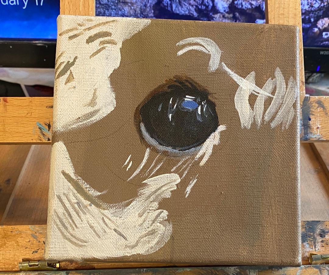
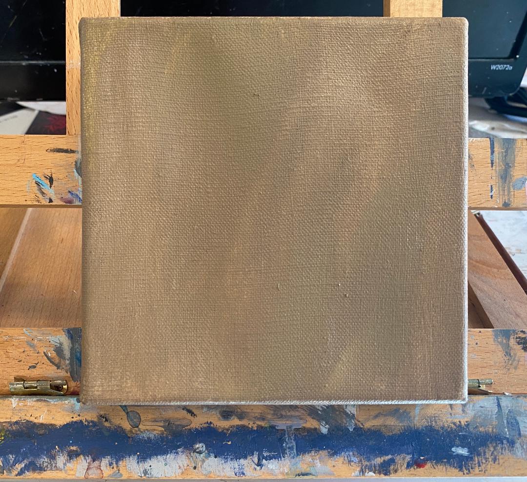
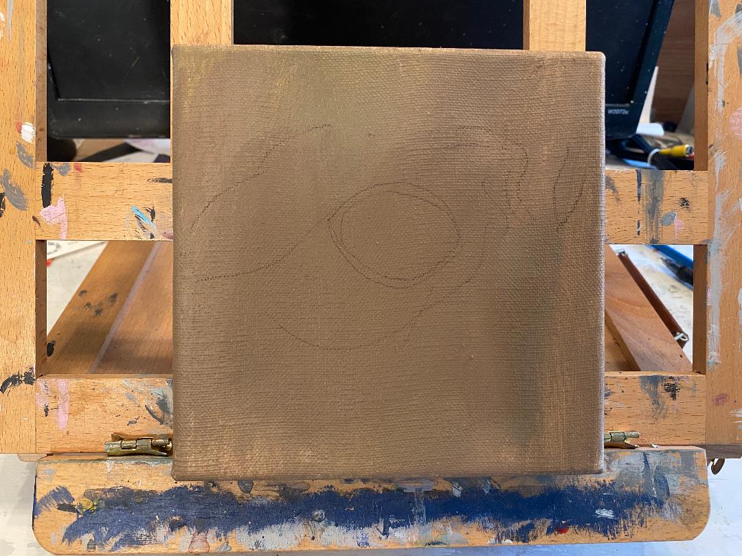
I started with a base I made by mixing titanium white, mars black, burnt umber, with a little bit of yellow and purple. Now I want to say a few words about making a decision about what color to paint something. Looking at my reference photo, I wasn't sure what "color" exactly that I saw. It wasn't definitely brown, or definitely gray, for example. I mixed the colors that I did, despite being unsure. If the shade I came up with wasn't right, I would know after I put it on the canvas. What I'm getting at here is that it's much easier to know if the mixture you come up with is "right" when you see the results with your eyes, as opposed to just thinking about it in your head. If something's off, I know if I need to add more of a particular color to my mixture or even if I need to glaze some of that color over the painting after it's dry. Of course, you may find that one color is too strong in your mixture and in that case, you'll need to tone it down. That's where complementary colors come in. I talk about those here. As always, I sketched out my design for the eye with a charcoal pencil over the now dry base. For the main part of his eyeball, I painted it with burnt umber mixed with mars black and titanium white. This was still too brown, though so I glazed gray over it made by mixing transparent mixing white and ivory black. I mixed more mars black into my color for the iris so it would be darker so I could paint the rim around the eye. For the white parts of the fur, I mixed my original shade for the base of the fur into some titanium white. This gives me a very light tone without it actually being stark white, which would've looked very flat. I was careful to make my strokes go in the right direction. This helps to create the curly texture that is characteristic of poodle fur. I’ve added blue, along with both transparent mixing white and titanium white with a liner brush, to create shine on the eyeball. The more I looked at the rim around the eyeball, the more I thought there wasn’t enough contrast between the two, so I glazed ivory black over the rim. Using a liner brush and some darker colors, I created more texture in the whiter parts of his fur. So that is how I would paint a poodle's eye in acrylics.
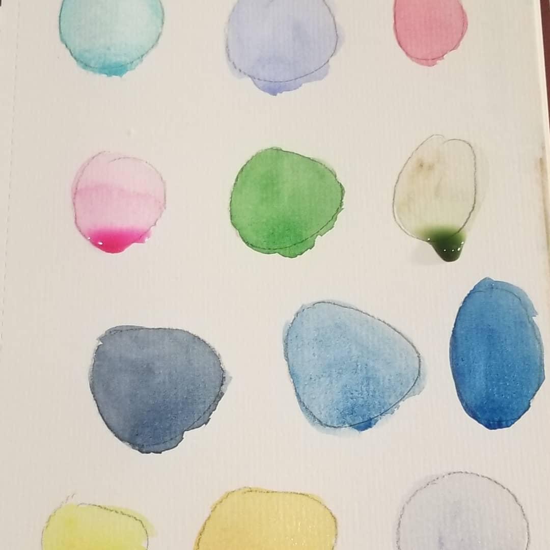
In this article, I'm telling you about my quest so far to learn how to avoid blooms while working in watercolor. Blooms happen in watercolor when part of the paint in an area dries before the rest of the paint dries in that area. They can be one of the most frustrating parts of working in watercolor.
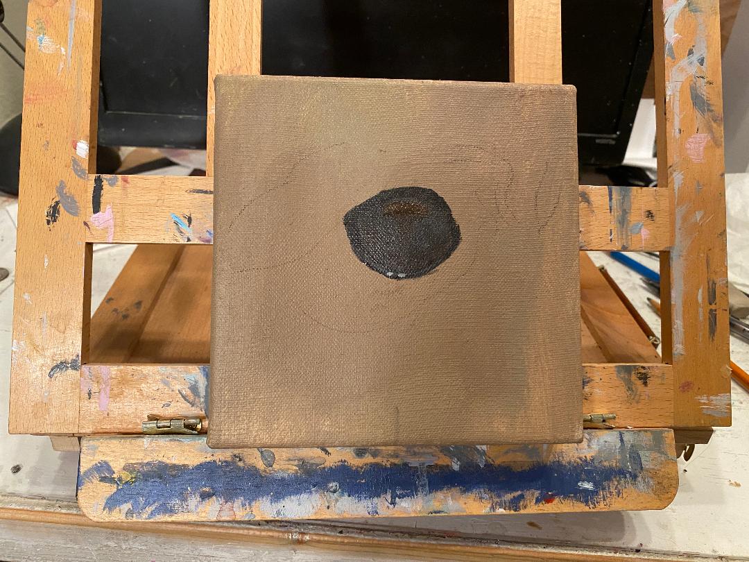
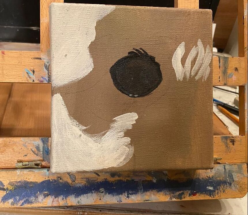
My attempts to avoid blooms while working in watercolor involve working on painting fast enough so the part of the paint in an area doesn't have a chance to dry before the rest. It goes without saying that I need to cover as much of an area as I can in one sitting. I think it also helps to watch the amount of water on my brush. A waterlogged brush will deposit more water onto the paper, which probably results in that area drying more slowly than the surrounding areas, thus creating blooms. So, that's what I've figured out so far about how to avoid blooms in watercolor. I'll continue to practice these principals in my watercolor work going foid I started by applying a base made by mixing a little bit of burnt umber with titanium white, yellow, and a tiny amount of purple, just so the yellow wouldn't be too bright. Then I sketched the design for my eye with a charcoal pencil. It was at this point that I my attention was drawn to what looked like some big white patches in the dog's fur. ,I didn't want to add patches of pure white, but the leaving the fur as it was didn't feel right either. I mixed burnt umber with a little bit of titanium white to see how that would look, and I was very pleased with the results. I used burnt sienna as a base for his eye and mixed that with burnt umber for my shadows. In the reference photo, I think you can see there's a high gloss shine to the eye. I achieved this with a combination of titanium white and zinc white from the Amsterdam line. Unlike titanium white, which is opaque, zinc white is translucent. For the big highlight on his pupil, I used ultramarine and a touch of cyan blue in addition to the two different whites. I was also careful to keep my wrist loose so I could paint a smooth, continuous line, which was also essential to achieve this look. I've used yellow mixed with a bit of burnt sienna for the highlights on his eye and glazed over his rim with some ultramarine blue. It was important to me that the gray underneath still show through. I used titanium white to paint the fur lines above his eye, being careful to follow the direction of my reference photo. I went over these lines with my yellow and burnt sienna mixture. Having the titanium white underneath, meant that the lines would now show up over the black. And that is how I would paint a labrador retriever's eye.
|
Sara MillettPainter of portraits and wildlife Archives
November 2023
Categories
All
|
