|
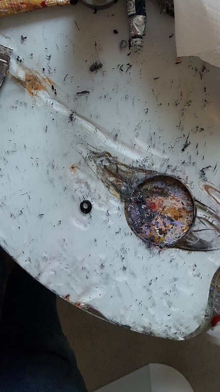
You can read about all the colors I’m using and how I mixed them in the blog post I’ll be publishing about this painting. When glazing, I always try to use the largest possible brush for the area I’m working on. That way I can cover an area quickly and I don’t end up with a dark ring around the spot with center being transparent. I learned this lesson the hard way.
0 Comments
While working on my latest painting, it I learned that, while, as an artist, I use photos as reference, sometimes I have to judge a piece independently of the photo. In the photo I'm working, from the shadows around this woman's eyes are very dark, so of course I made them that way in the painting. But, as much as I tried to justify it, telling myself it looks that way in the photo, so it must be right, somehow I couldn't shake the feeling that something was off. 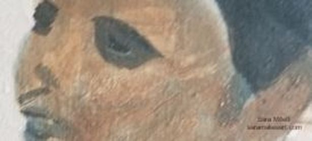 Here is a a close up of her eyes as I'd first painted them. I decided to glaze over my shadows with transparent raw sienna and quinacridone red The result is this: 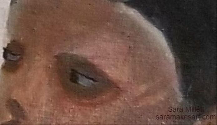 The result, as you can see, is that, while the shading is still extremely dark, now it looks like it's part of the rest of her face instead having like she's wearing eye masks. So while a reference photo is pretty much an indispensible tool for me in order to create the pieces I do, I ultimately have to judge a piece on it's own merits. Just because something looks a certain way in the photo doesn't mean it's going to look right in my painting. That's all for now. I'll talk to you again next week. The following is a repost from my wordpress blog. 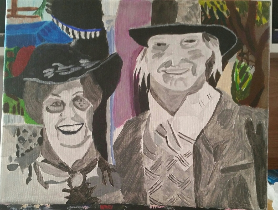 Above is a photo showing the finished background of my latest painting. In this post, I'm going to tell you all about how I painted it. I didn't make things like the fence in the upper left hand corner or the leaves on the other side very detailed. You'll see that I painted the foliage as random shapes. That's because I wanted to create depth and if every part of the painting has the same amount of detail, it looks very flat. I used dots of white in the leaves, also, to create the look of the sun reflecting on them. There's also use of the glazing technique, which is applying sheer washes of color over another, in this painting. I glazed burnt umber over the grey to the right of the tree branch and purple over the building behind the couple. I was very happy with how the overhang came out. I used a combination of cureulean blue plus ultramarine for the shadows and I could see that my underpainting was causing the different tones to show through even before I added the shadows. That's it for now. I'll see you guys next time.
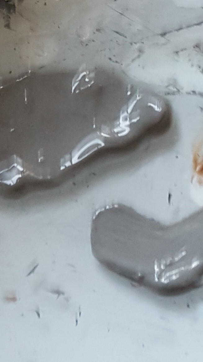
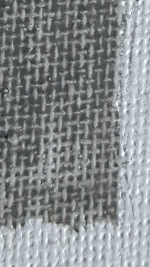
Please don't be misled by the title of this post. It's purpose is not to say which is better between the two, but just point out what I know to be the differences and similarities between the two mediums. Similarities The most major similarity between acrylics and watercolors is that they're both water soluble paints. That means they can be thinned with water and the brushes can be rinsed in water during painting sessions. Because of this, neither acrylics nor watercolors require the use of harsh chemicals so they're perfectly safe to let your kids play with, assuming they're old enough to know what not to put in their mouth of course;. Also, both watercolor and acrylics are relatively cheap mediums to work in. Now, no quality art materials are cheap cheap, but these mediums are a lot less expensive to work in then say oil paints. Differences So those are the similarities. Now for the differences. While all watercolor paint I've personally encountered pretty much has the same type of texture, acrylic paint comes in three varieties, "light viscosity", often labeled "fluid" or "soft body", medium viscosity, and heavy viscosity, often labeled "heavy body". According to manufacturers, the light viscosity acrylic paints are better for glazing for more realistic styles, while the heavy viscosity paints are better for impasto and impressionistic styles because they hold brushstrokes very clearly. If you like painting with a palette knife, a heavy body paint is definitely the way to go. A glazed effect is pretty easy to achieve with watercolor, because tend the put the paint on transparent. You can't really achieve an impasto look with watercolor, though, unless you layed the paint on so thick that it looked more like an acrylic or oil painting. But if you're going to do that, you might as well work with oils or acrylics. So in that sense, acrylics are more versatile than watercolors. That's not to say that you can't achieve a wide variety of styles in watercolor, though. But, if you like to paint in a style with bold brush strokes, you probably won't enjoy working in watercolor, since the nature of the paint interacting with the water tends to blend those out automatically. While writing this, I decided to do a google images search for "watercolor impasto" and I found pictures of watercolor paintings and impasto oil paintings separately. While there are watercolor canvases and acrylic papers, generally speaking most watercolor painting seems to be done on paper and most acrylic painting tends to be done on canvas. Acrylic paper doesn't seem to be good for much of anything other than practice anyway, so there. Another major difference is in the histories of both mediums. It wasn't as popular or as prestigious as oil paint, but watercolors have been around since ancient times. Albrecht Durer is known to have done them. Acrylics, on the other hand, as we know them, have only been around since about the 1950s. *Watercolor paints are comprised of just pigment and water, whereas acrylics also have a polymer called acrylic mixed into them, hence their name, which accounts for their more oil paint like texture. How I Work With Each Medium When I work in acrylics, I usually work on canvas. Sometimes I might work on board, but I never work on paper with this medium. I use a smooth glass palette without any wells, because I'm not going to be adding a lot of water to my paint. I'll usually thin the paint with some acrylic medium, or add just enough water to thin the paint without making it runny. In the gallery below, you can see both what that paint would like like on my palette and on the canvas. I achieve this by adding little bits of water at a time with a brush. When I'm working in watercolor on the other hand, I use a little spray bottle to load that paint down like crazy with water. When working in watecolor, you should expect to put so much water in the paint that the paints would run into each other if they weren't separated. That's why palettes made for watercolor have wells or compartments for individual colors. I'm including a pic of my watercolor paint in my palette after I've mixed water into it. You'll see that the paint runs along the edges of the compartment, because there's so much water. Note:If you already have a palette like this and want to try acrylics, you can definitely use it for that. I prefer the large glass palettes, though just because they're so much easier to mix on and clean. 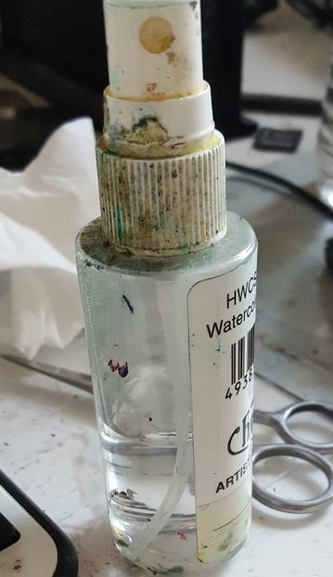 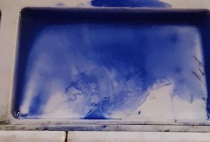 When working in acrylics I don't put anything on the surface under the paint, unless it needs to be gessoed. When I work in watercolor, though, I usually find it very helpful to wet the area I'm working on before putting the paint on top. It just seems to flow much better that way. Here's some paint put directly on the paper 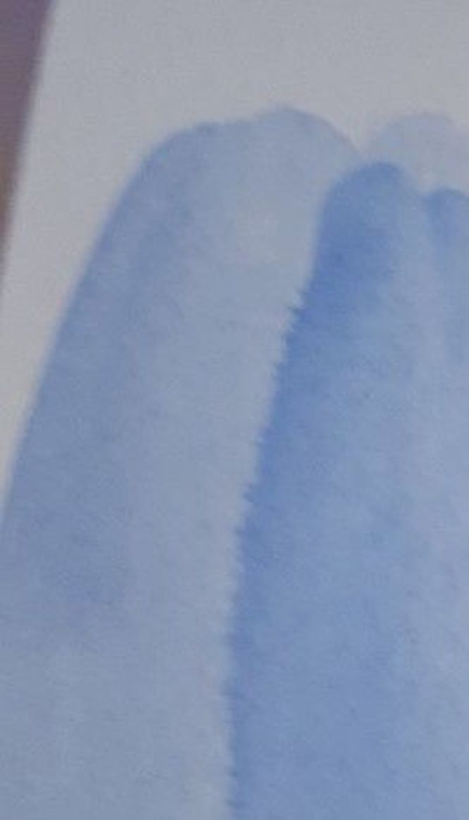 and here's some paint put down after wetting the paper. 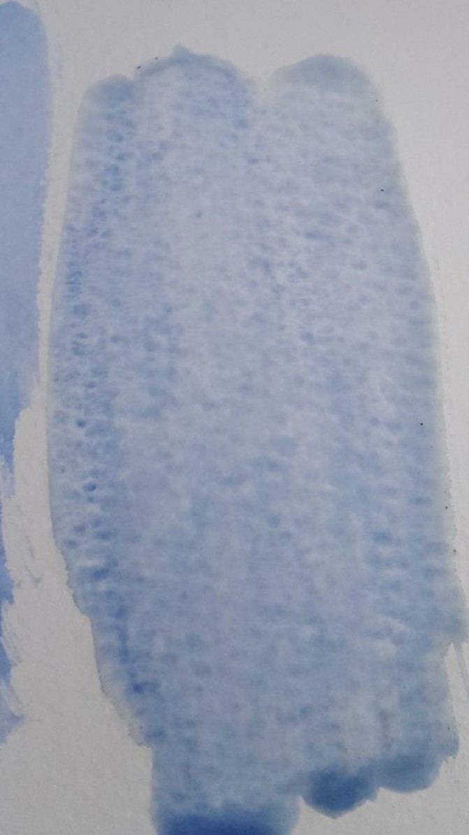 As far as how I actually paint, how I move the brush and stuff, that's pretty much the same with both mediums. The difference is in how I prepare the paint on my palette and how, or even if, I prepare my surface for the paint. So those are the similarities and differences between watercolor and acrylic paints and how I work with both. That's all for now. I'll talk to you again next week. *Since writing this post, I've learned that watercolor paints also include gum arabic and additives like glycerine, ox gall, honey, and preservatives. The following is reposted from my wordpress blog. I finished a new drawing! I’ve decided to title this one “The Gaze” because of the far off expression in the subject’s eyes. The photo I used was taken by Glennis Weston. The drawing is an 11×14 graphite on Strathmore 400 series drawing paper. I used a tortillon and blending stump in the beginning of making this drawing, but I abandoned both later on. 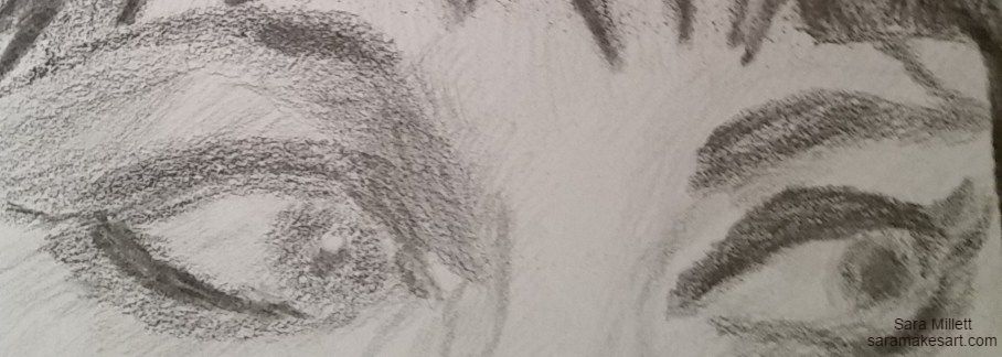 I was especially drawn to what was in the woman’s eyes, which again, ended up inspiring the title. I probably used just every pencil I had available to me to draw these. A trick I’ve figured out for spacing eyes correctly is to draw a line with ruler from the eye you’ve drawn to where the other eye should be. If you draw it with a light pencil, like you should, you can easily erase the line later.  For the hair, I used a combination of my vine charcoal stick and 8b pencil, which I applied in two layers. 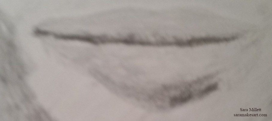 I originally filled in her bottom lip too dark, so I took my kneaded eraser, and making tapping motions, lightened it up a bit. I was just about to call the drawing finished, when I realized I needed to put shading under her bottom lip.  With the cheeks, I was careful to leave some space unshaded. This was the cheekbone. It needed to be lighter to stand out. Same deal with the center of the nose.  And here's the finished drawing. 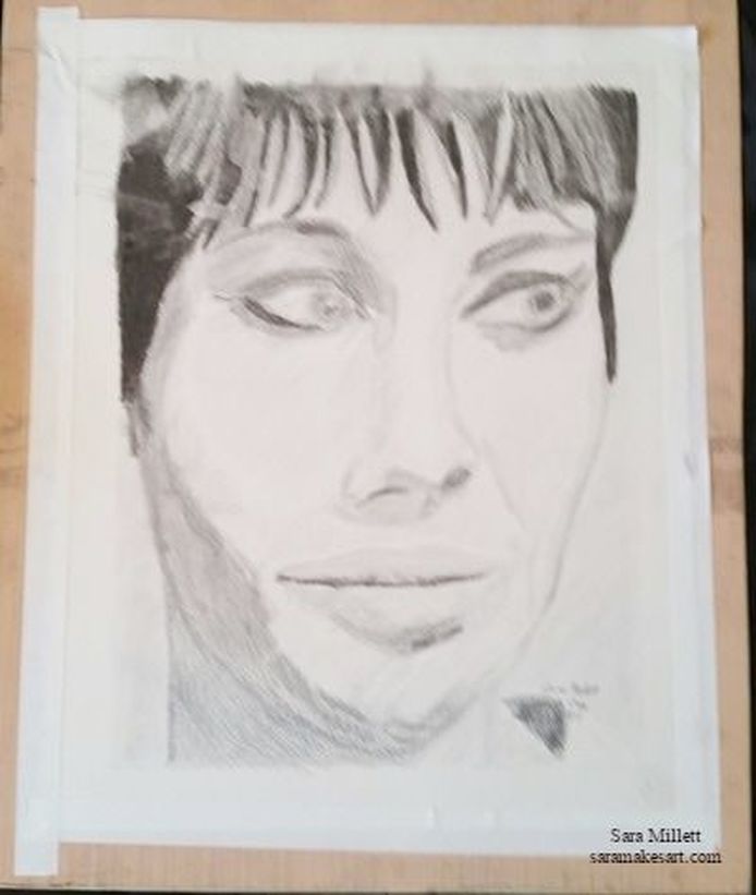 I was going to title this piece “Woman With Beehive”, but since most of her hair is invisible, I didn’t think that title would make sense. That’s all for now. I’ll see you guys next time. While working on my painting “Mother Walking With Child”, I used transfer paper to transfer my sketch to the canvas for the first time. I decided to blog about it so you can come on my journey with me. Something I think I should warn you guys about is that the color of the transfer paper, may transfer to your skin and the parts of canvas you don’t want it to. I ended up having to wash my hands after tearing a piece off. As for the canvas, you can wash off any unwanted transfer paper markings with soap and water and a wash cloth, so as long as the paint underneath is dry, it’s nothing to worry about. Also, the role that transfer paper comes in, at least the kind I got, doesn’t have a serrated edge for tearing the paper, so I like to put it in an old plastic wrap container, so I can tear off a piece. I placed my transfer paper and my drawing done on sketching paper on top of the canvas like so. 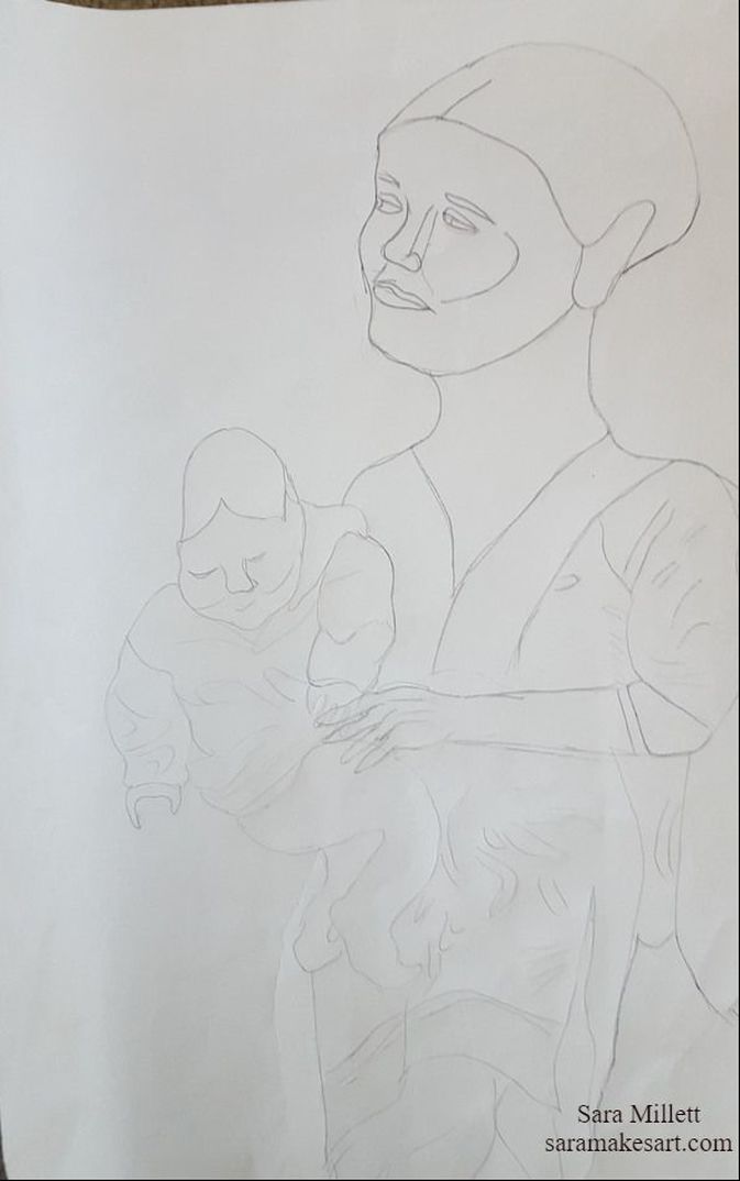  If you want to make this a bit easier on yourself, you might want to tape your transfer paper to your canvas before starting. I didn’t because I wanted to able to move it, so I’m just steadying it with my other hand. I did get transfer paper transfer lines where I didn’t want them, but like I said, it washes off with soap and water. After I was done I ended up going back and filling in some lines with a charcoal pencil.  Okay, so what I did was just take a pen, and use it like a stylus, to just trace around my drawing. You wanna use a pen that’s almost out of or completely out of ink. I lifted the paper every so often to make sure my drawing was going through the paper onto the canvas. 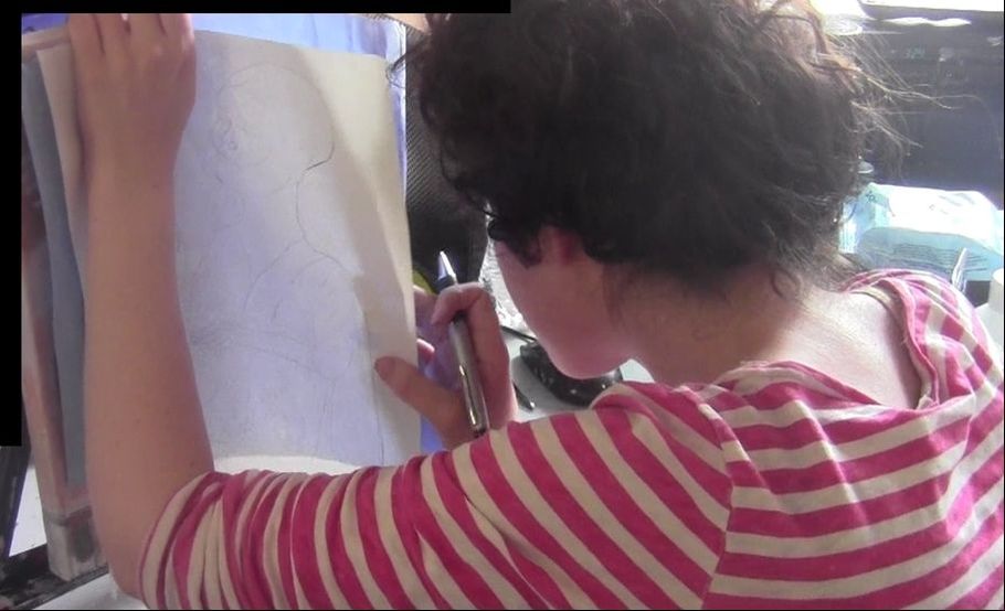 When I had to move the paper, it was a little hard to line it up in the right spot again, so that’s why I ended up getting transfer lines where I didn’t want them. But like I said, I’m not worried about it. So that wasmy first time using transfer paper to get my image onto a canvas. I thought I’d turn it into a little tutorial for you guys. That's all for now. I'll talk to you again next week. The following is a repost from my Wordpress blog. I finished a new piece! This one is called "The Knitting Lesson". It shows my Aunt Roz and her knitting instructor, Danique and I took the photo while visiting my aunt in New Jersey. It was done in graphite on 11x14 Strathmore 400 series drawing paper. 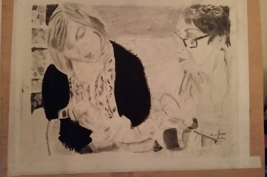 I did the outline using an 8h pencil, which is practically invisible. I've started shading going in the same direction. For this piece, I mostly started with the lightest shades and built darker ones on top of them. It's a lot easier to layer a darker shade on top of a lighter one than vice versa 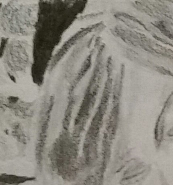 Here's Danique's hair. I converted my reference photo to black and white for this piece. It really shows me how dark the hair really is. If I hadn't converted the photo, I would never have thought to my 8b pencil or charcoal stick. This is a trick I learned from Lisa Clough of Lachri Fine Art. This is my first time using a kneaded eraser as a drawing tool. 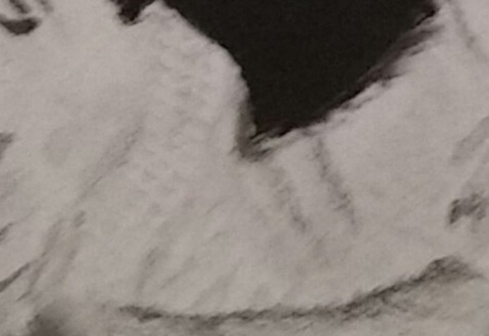 Shading this cloth was one of the most challenging but enjoyable parts of doing this drawing. A lot of the work we do as artists is done with our heads, not with our hands and I was really reminded of that here. It's all about making the right shapes and getting them the right distance from each other. It sounds simple, but it takes a lot of patience to execute. 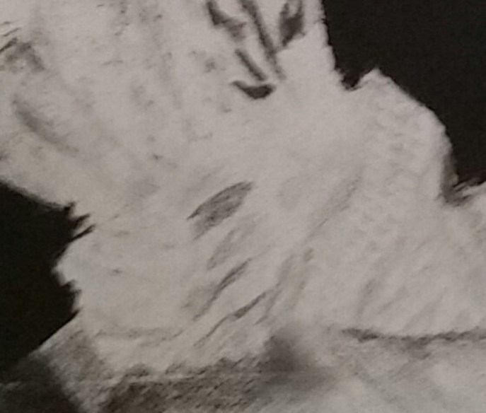 Not including the hands was of course, not an option. Hands are something you really need to take your time on but they can be really rewarding to get right. What I've learned is that they should be approximately the same size as the face. 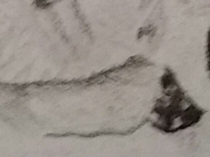 Creating texture in the couch was a matter of making short strokes close together. I used a compressed charcoal stick, which gives me the darkest possible shades, to fill in Danique's sweater and then used the vine charcoal to create the nubs. Afterwards, I blended the compressed charcoal with my finger to make it nice and smooth. 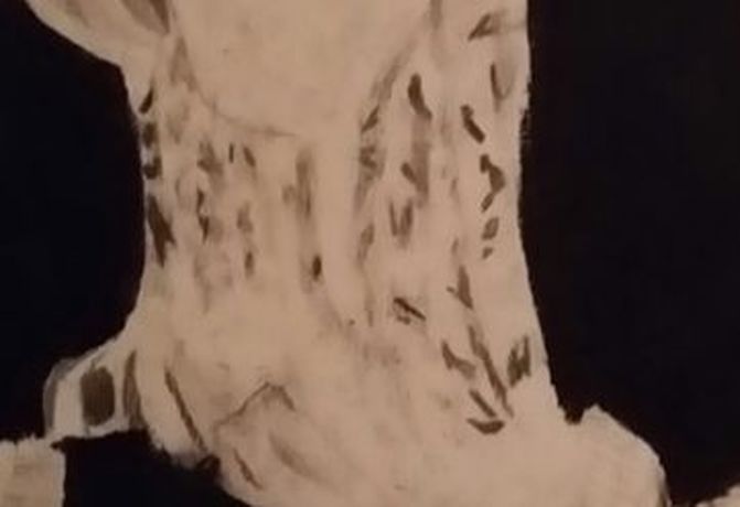 Danique's blouse is a series of pleats. I'll admit, I didn't want to put in all this detail. I added in the different tones as closely as a could to how I saw them, then I used kneaded eraser to make separations. Sara, just do it. That's what I need to say to myself in these situations. 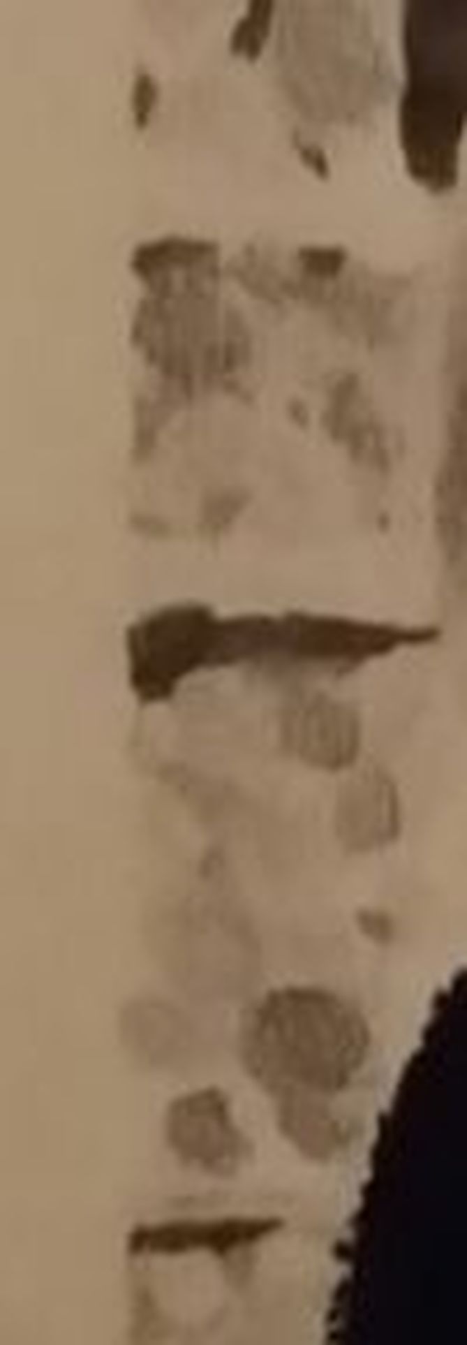 I used a vine charcoal stick to create depth in the shelves where the balls of yarn were. For the balls of yarn themselves, I started in the center of each one and made curved strokes going outwards until I got back to my starting point. I used a graphite shading stick to shade the background. I'd been wanting to experiment with shading sticks because I felt they could cover large areas faster than a pencil. 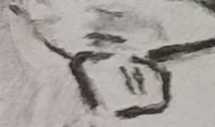 I didn't outline the other side of my Aunt Roz 's glasses. Instead, I used shadow to show where it ended. 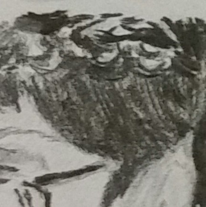 For her hair, I mostly used my vine charcoal stick, but was careful to leave some parts unfilled. For those pieces, I used a 6b pencil and an 8b pencil. 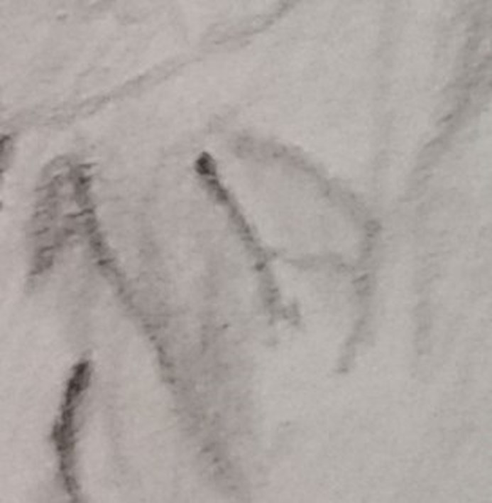 Drawing Aunt Roz's clothes required a lot of consideration and looking back at my reference photo. I was very proud of the effect I was able to achieve by running my vine charcoal stick over the bottom of her arm. Nothing in this drawing is shown by line, but by shadow. By adding darker shades either on or around something, I make it visible. To create the look of deep folds or wrinkles, I use my darkest shades such as my 8b and even my charcoal sticks. That's all for now. I'll see you guys next time. In a video I watched about drawing tips, the one thing I took away from it the most was to draw with the pen or pencil coming towards me and not going away from me. Yes, the video was focused on cartoons, but some tips can cross over styles. I find when I draw towards myself, I have much more control over my lines and I get much better results. It also feels more comfortable. To illustrate my point, I'm including two drawings of a hand. The first on was drawn with the pencil going towards me and the second one was drawn with the pencil going away from me. 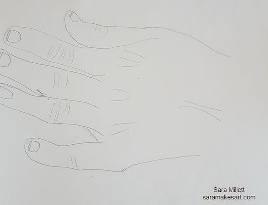 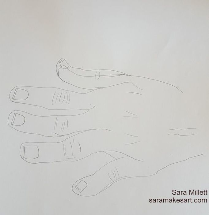 'See the difference? Under normal circumstances, my pencil lines are not going to be this dark, and if you're using a light pencil, as you should for realistic work, your outline will be practically invisible when you get your shading in. But just because your outline may not be visible, doesn't mean it's not important. On the contrary, your entire drawing will look wrong if your outline is. Drawing towards yourself is the easiest step to insure that your outline is the best it can be, even if that means stopping midline and going back to your starting point when drawing a feature. So how do you "draw towards yourself"? Simple. If you're drawing vertically, draw downwards, never up, since your body is going to be positioned in front of your paper. If you're drawing horizontally, you draw in the direction going toward your dominant hand. I hope this is helpful. I talk to you again next week. The following is a repost from my wordpress blog. Technically, this isn’t really my first time working in colored pencils. I’ve used colored pencils in cards and quick sketches, but this is my first time making a serious art piece with them. I saw artists like Lisa Clough and Leonardo Pereznieto do beautiful work with colored pencil and I started to wish I could do that myself. Well, recently, I needed colored pencils for an art class and I didn’t want to use my cheapies, so I went and bought a set of Faber-Castell polychromoses. I spent almost $60.00 on a set of twenty-four, so I'm determined to get my money’s worth. The first result of that determination, is the drawing you see below. It’s being made using a combination of the colored pencils and Mona Lisa odorless paint thinner to blend on 9×12 Fabriano Studio hot pressed 140 pound watercolor paper. 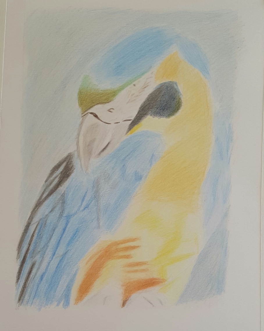 I surprised myself with how good colored pencil can come out. I found a new medium to enjoy working in. I used the technique of blending the pencil with paint thinner. Also, here are some pics my mom and stepdad took of me while I was working out on the balcony this afternoon. 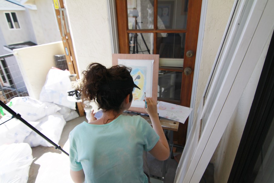 That’s all for now. I’ll talk to you again next week.
|