|
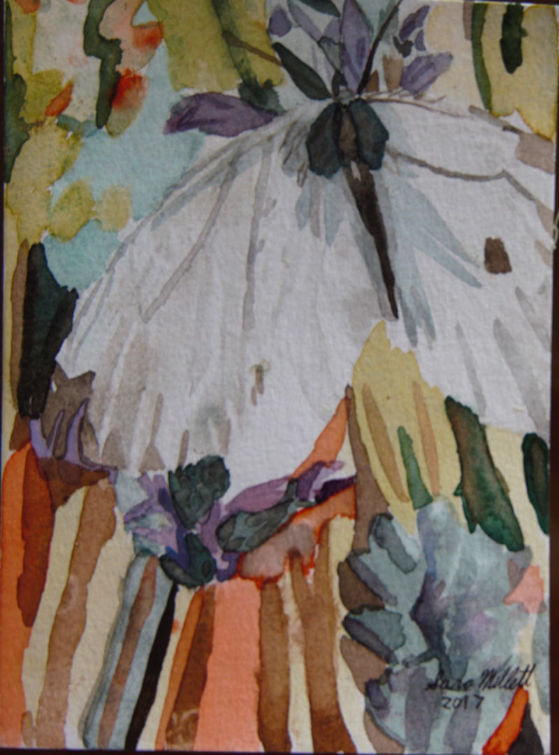
The trick is not to put the same amount of detail everywhere. For areas you want to appear further back, just concentrate on your lights and darks and try to avoid any sharp edges or definite lines. Save that for the foreground. Another thing to do is to keep your colors cooler and more muted for things you want to appear further away. Use warmer and brighter colors for things you want to appear more close up. Avoiding putting a lot of detail everywhere isn’t lazy, it’s actually showing good artistic judgement. When you look at something off in the distance in real life, you don’t see all the detail in it. So it should be the same way in your painting. You can see me demonstrate these principles in the video below.
0 Comments
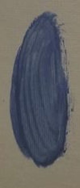
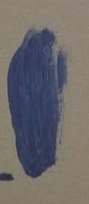
For clarification purposes, I’m talking about blending, meaning smoothing your paint on your canvas, not blending two or more colors together. Okay, this is a bad habit a lot of artists, including myself have. But we need to stop the blending madness. Have you ever seen where you have a ring of paint around an area and nothing in the center? Well, so have I and it’s because we blending too much. Here are two ultramarine blue spots.
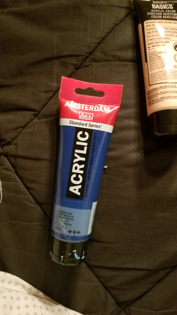
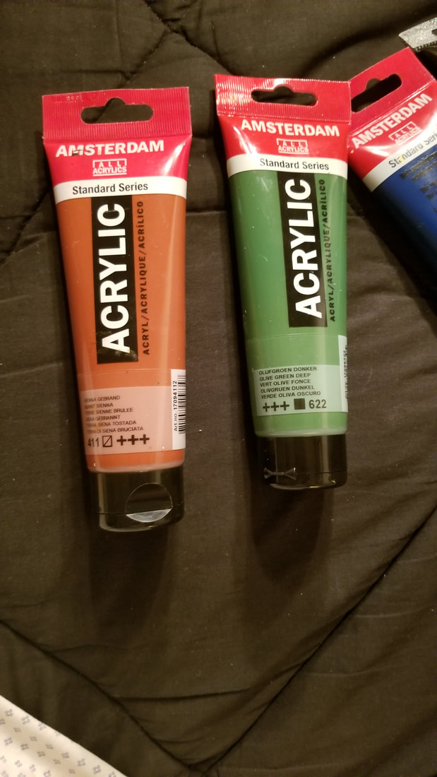
For the spot on the left, I blended for a long time very aggressively concentrating on the center. You can see that I've removed most of the paint from that area so that there's a ring around the edges. Trust me when I say I've seen spots come out way worse than this. On the other hand, for the spot on the right, I blended for a short amount of time, very gently; I kept my wrist loose, and concentrated on the edges. As you can see, it’s far from perfectly smooth, but that smoothness would be much better achieved by adding another layer or two, after the first layer is dry of course, than painting one layer and blending it to death. You can see this in action in the video below. The first step to ensuring success when it comes to creating detail in this way, is to choose the right liner brush. This is the one I use. 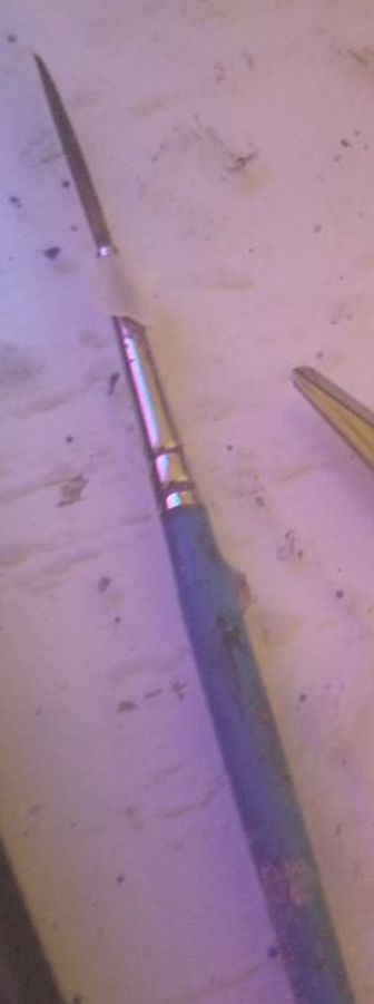 It’s called a script liner brush and you can see the bristles are very long. They’re probably about an inch long and that’s what you want because those kinds of brushes will hold their shapes. This is an example of a bad liner brush. 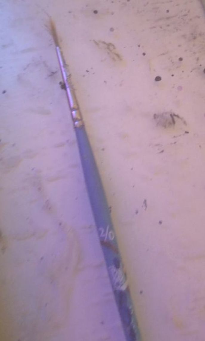 It’s just that it has a bunch of dried paint in it, which of course is bad, but the bristles are very short. As a result, it loses its shape quickly, and you have lots of hairs sticking out in all directions. So how do you use this type of brush? First I’m going to show you how to paint super fine lines, like barely thicker than a strand of hair. To do this, you first roll the brush around in some paint. 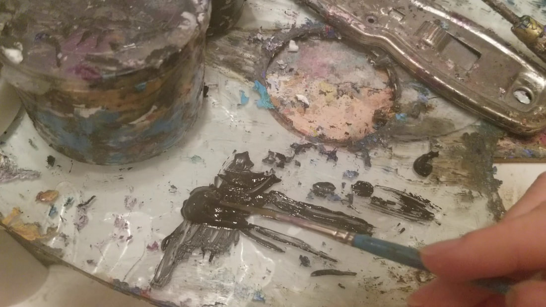 You want the paint to be spread along the length of the bristles, like this, 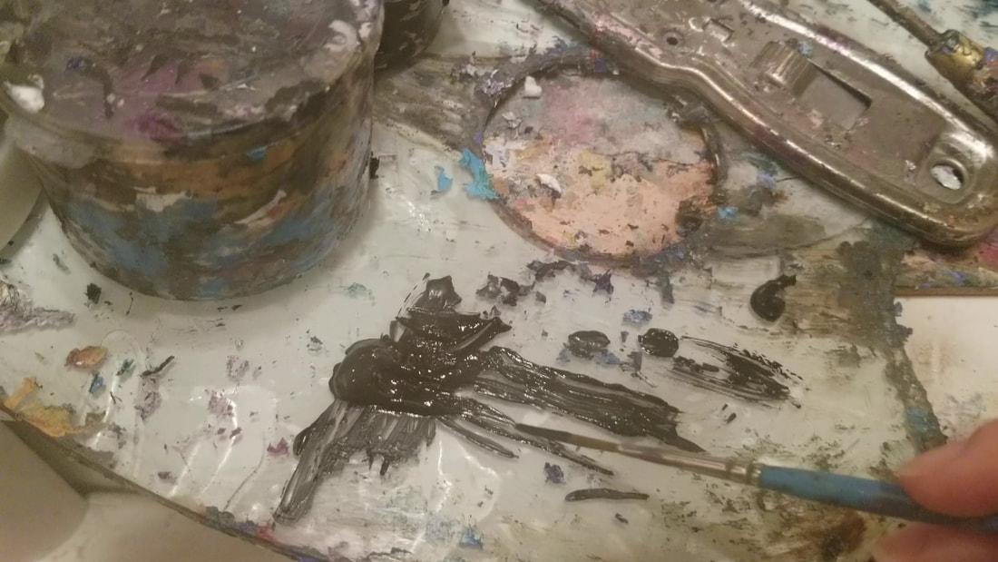 not all collected at the tip. Okay, so when you paint, to make your line as thine as possible, you’re barely going to touch the canvas with just the tip of your brush, like I’m showing you. 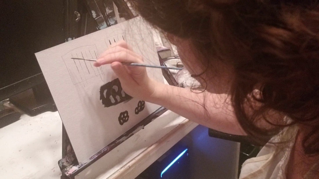 You can see me use this method in my painting, “Turkey On The Grass”, here 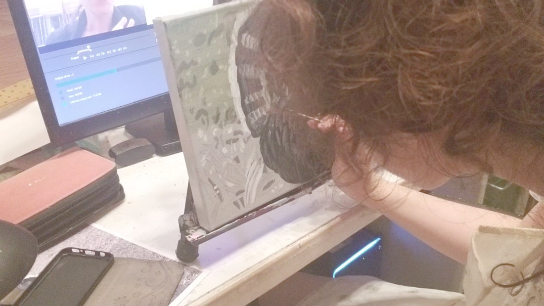 and you can see the results in the turkey's eye here. 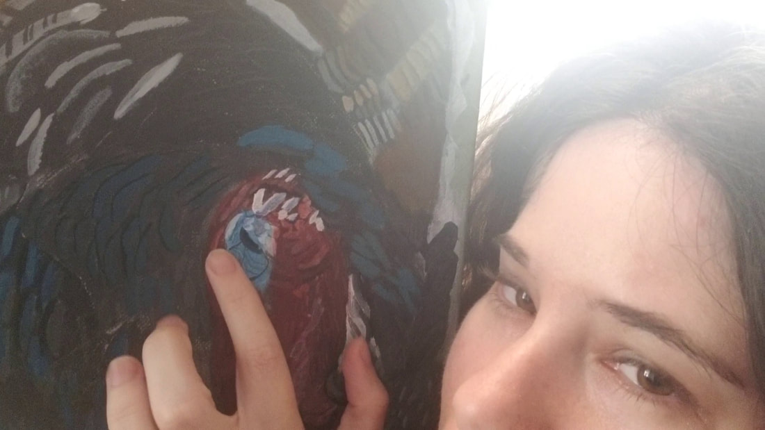 Now sometimes you might want a line that’s a bit thicker than that, but still smaller than what you can get with, say, a round brush. The same principle of rolling the brush around in the paint applies, but instead of just letting the tip touch the canvas this time, you’re going to let part, or all, of the length of the bristles touch the canvas, depending on just how thick you want your line to be. 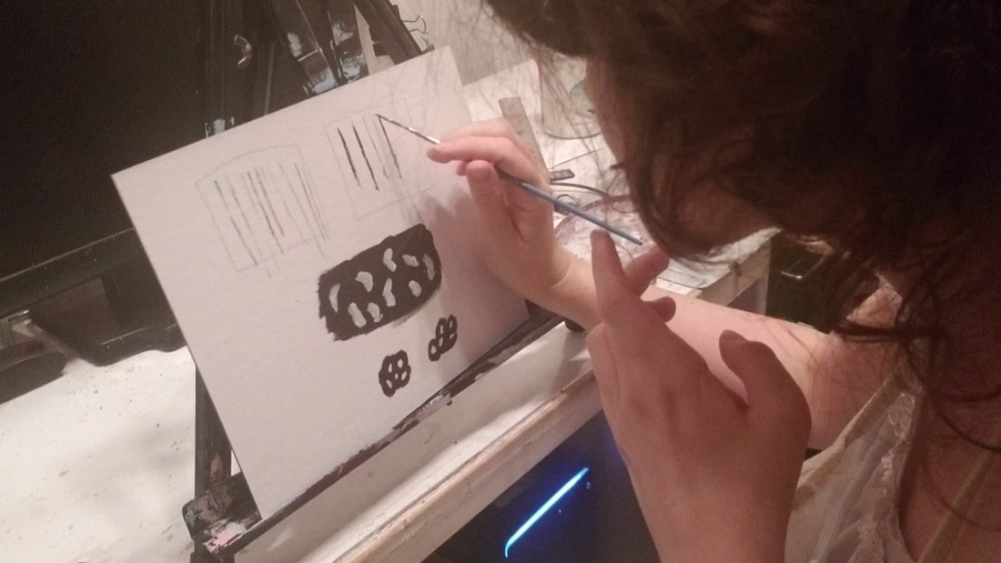 You can see these tips in action in the video below. Keep in mind, we’re talking about monetary value here, not emotional value. Who Has Owned The Art In The Past If a noteworthy person once owned a piece of art, that can drive its value up significantly. This is called provenance. Whether The Painting Was Done By A Famous Artist Or An Unknown One A painting that had once been believed to have been painted by an unknown shot up in value in value when it was attributed to Reubens. In modern times, this includes social media following and engagement. Something that’s also related to this is how often the artist has already sold, because more you sell as an artist, the more your name tends to get known. Whether The Artist Is Alive Or Dead Like I said before, when artist dies, he obviously can’t produce any more work, so whatever he has made becomes that much more valuable. What doesn’t influence the value of art? How good/detailed it is. The value of art is also has nothing to do with how similar you can make yours in style to that of a famous artist. In fact, if your work looks too much like that of another artist, it will be less valuable, not to mention that you might be breaking some copyright laws depending on just how similar it is. But in the art world, people value, both emotionally and monetarily, uniqueness. Now I don’t want you to think I’m saying that if you want to sell your art, you should forget about actually making good art and just focus on getting famous. I’m not suggesting that at all. Honestly even if I could paint and draw stuff that looked like it was done with my feet and people would fall over themselves to buy it, I would still feel the need to make my work the best I can for my own satisfaction. Besides, there is a chance you can make work that looks that bad and have people buy it, but I think you’ll have better chance if your work is of good quality. sources sources What Makes Art Valuable(BBC doc hosted by Alistair Sooke) https://www.youtube.com/watch?v=-a-29jpmXaY Tips for pricing your artwork - artist vlog w/ Lachri https://www.youtube.com/watch?v=OPNv-VrErWs You might remember I made a post a while ago about how to paint black hair. But today, I want to talk about painting black things in general. Now, I guess you're probably thinking the answer to the question, "what do you paint something that's black?" is "Black, duh." But that's not exactly correct. In fact, I think you should almost never paint something that's black entirely, or even predominantly, black. One reason for this is because, in order to have dimension, things need to have shadow and highlights. That means some parts of it need to be darker or lighter than the base. Now I think you can see where this becomes a problem because if you've already painted something black, you really can't go any darker. Take this picture of me in my black leather jacket for example. Here it is with three squares next to it. You can see, even if that’s a little too dark but we’re getting closer. Now I would say the best match is closer to somewhere between the second and third gray squares, than it was to the first black one. 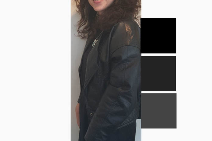 So in reality, when you’re painting something that’s black, only the darkest shadows should actually be black. I can even remember being in my mom’s car as a kid and looking around at the interior thinking, “I know this is technically black, but a lot of it looks gray to me." In the video below, you can see me demonstrate this concept by painting a board half black and half dark gray. Today I’m going to talk to you about how I would handle my work being reposted. Understand that as soon as you create an original work, whether it’s a painting, drawing, video, article, you have copyright. So don’t let anyone tell you, well you didn’t register it or you didn’t have a copyright symbol on it, yada, yada,yada. I’m going to be covering what your options are and what I would do if A. Someone has posted your work to one of their social media accounts and is taking credit for it or B This person is not only posting my work to their social media accounts and taking credit for it, but is trying to sell it or has repainted your painting and selling that. Option One: File A DCMA Takedown Notice:This is internet only. There is something called Digital Millennium Copyright Act or DCMA takedown notice. Almost all websites have avenues through which you can send one. Websites promise that if the copyright holder sends one, they will removing the infringing post. Even better some promise that repeat offenders will have their accounts terminated. If you don’t know how to send a send a DCMA takedown notice, just look for instructions on the website and you’ll find it. Youtube makes it really easy. You can find it in the flag option under every video. From the drop down menu, just choose “infringes my rights” and from there choose “infringes my copyright” and from there, it’ll take you to a place where you can fill out this form. Do not, I repeat, do not, send a fake copyright infringement notice. This can get you in heaps of trouble and you’ll probably be lucky if the only thing that happens is the account you used to send it with gets terminated. Option two:Send a cease and desist letter :This is both online and offline A lot of articles about cease and desist letters recommend having a lawyer send it for you, but you can definitely write a cease and desist letter yourself. What it is basically you write to the person and say something like, “Hey, I own the copyright to that painting. You’re not allowed to sell it. Knock it off”. I know if someone wrote to me and said that I was violating their copyright, I’d get pretty nervous and I’d definitely stop Option three:Suing for copyright infringement Now, it’s my understanding that you have to have your work registered with the copyright office to be able to sue, although copyright itself is automatic. I personally don’t have anything registered, but if I did, I would only sue as a last resort, after all other avenues had failed. The good news is, if you do have your work registered and you decide to sue, you are pretty much guaranteed to win that case. There also might come a time when the money you stand to lose by not being able to sue is greater than the cost of registering your work. Now what if someone steals your idea? If someone does a concept extremely similar to yours, to the point where you know they had to have gotten it from you, and doesn’t give you credit, that is called plagiarism. Plagiarism is wrong, but it’s not a legal issue. It’s an ethical issue. Not every case of someone using the same idea you used is plagiarism, though, even if they’re not giving you credit. Ideas get reused all the time. Here’s the thing about ideas. You can’t own them. Ideas are not copyrightable. Only the physical manifestation of an idea is copyrightable. I hope this helps you better understand how you can protect your copyright. Do your own research. Like I said, I’m not a lawyer, so I can’t guarantee that everything I said in this video is accurate. I just did my best. Today I'm going to talk to you about why I like to draw over my painting. You probably think the order of painting is draw everything out and fill it in with paint. There's nothing wrong with doing things that way, but I find it difficult when I’m trying to paint around all the tiny details I drew. 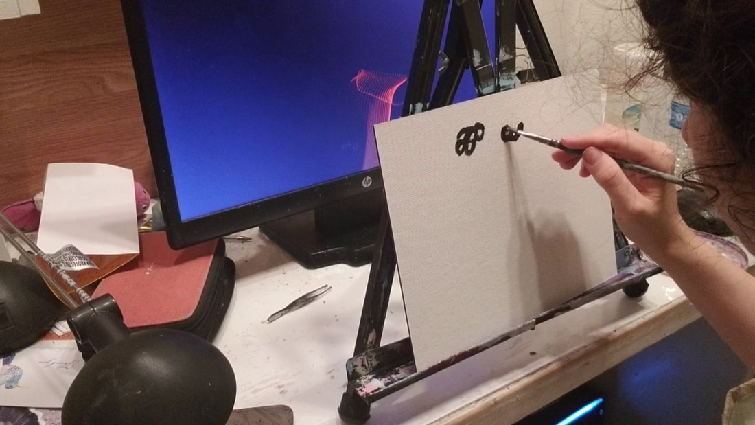 That's a pain. iI’ve tried blocking in the area and then painting on my details, 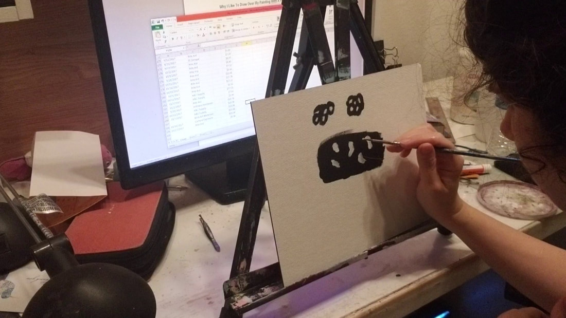 but I don’t have that much control with the brush. I personally find it much easier to draw in my details over the painted area with a pencil. 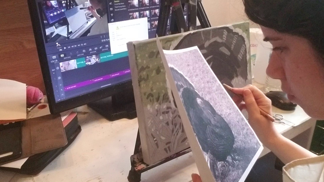 This gives me a kind of map for where things go. Then I can just go and fill in the shapes I drew. If you’d like to try this method, make sure the paint your using either has a matte finish or you use a matte medium with it. Glossiness will prevent the pencil from adhering properly. Also, make sure the paint is completely dry before you attempt to draw over it and try to lay it on too thick. This has caused problems in my experience. You know, only you can create an original, insert your name here. I was recently watching a video that was responding to someone’s concern posting their work online. This person didn’t want to do that for fear that someone might copy their work. The answer was if, work that’s any good is going to get copied. But here’s something else. A copy will never be as valuable as the original and, like the title of this video says, you are the only one who can create an original work of art by you. Take this painting for example. 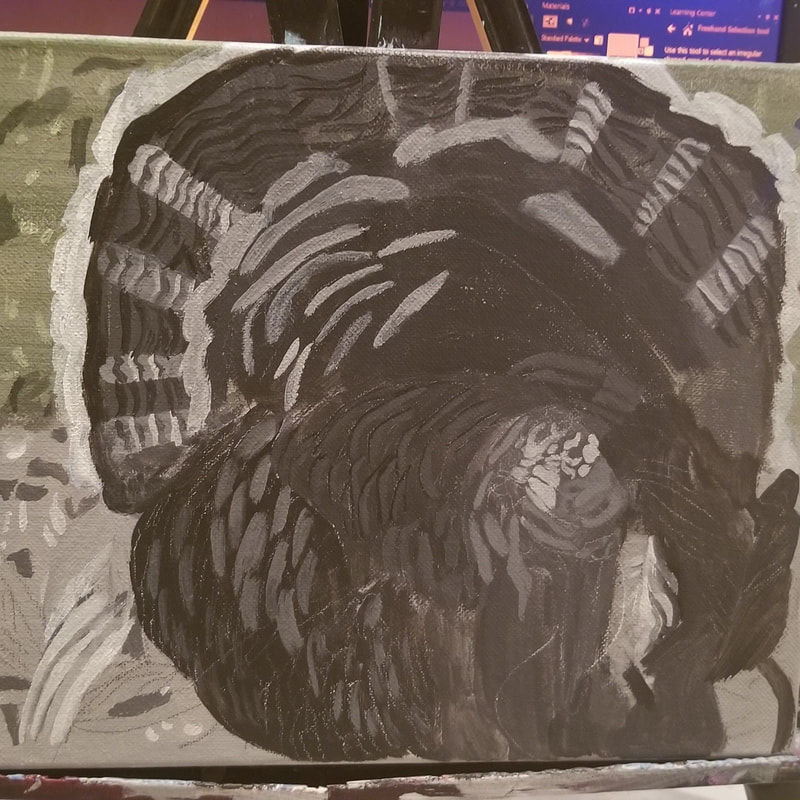 The photo I’m using comes from a royalty free site, so someone else could paint this image. But their painting will not be an original Sara Millett, because they are not me. By all means, stand up for your rights as a copyright holder. But don't fret over the fact that someone copied your painting, because that's all they can ever do. Today I’m going to be reviewing Amsterdam Standard Series Paint for you. What is Amsterdam Paint? Amsterdam is a line of acrylic paints from the Dutch company, Royal Talens, which also makes the lines, Rembrandt and Van Gogh. Standard Series is the student line. Amsterdam also has a professional line called Expert Series, which I have not used. How Lightfast Are Amsterdam Standard Series Paints? I talked about lightfastness in my post about student grade paint, but I’ll reiterate it here. Lightfastness is the ability of a medium to resist fading in light, particularly sunlight. Amsterdam has a lightfastness rating that’s symbolized by plus signs. 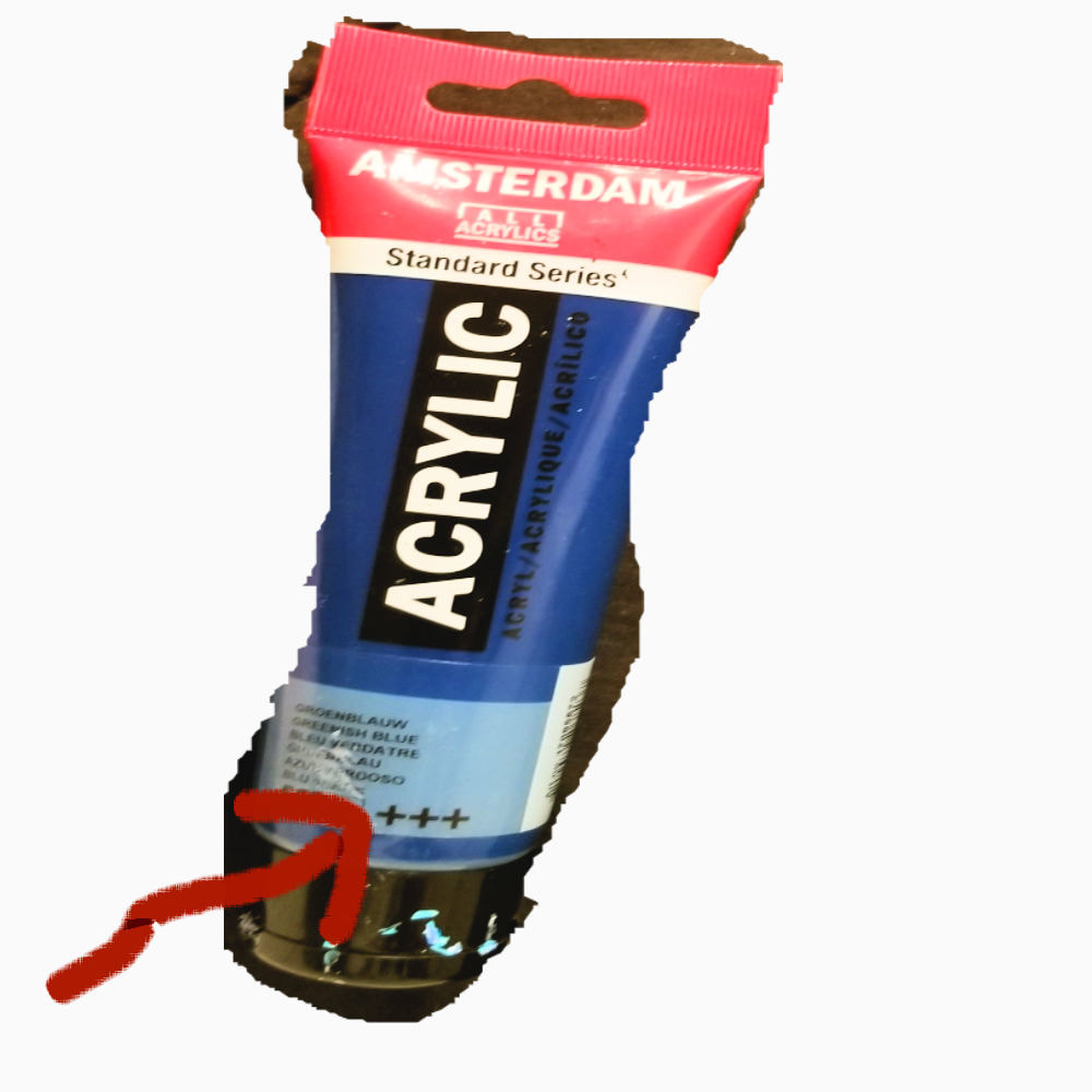 Three plus signs on a tube means that color will resist fading for up to 100 years, “in museum conditions”, according to Royal Talens’s website. Two plus signs means it will resist fading for 25-100 years. What Is It Like To Work With Amsterdam Standard Series? Pretty nice, actually. I would describe the texture as being somewhere between creamy and fluid. I personally find it very pleasant. I’m going to do a quick demonstration for you so you can see how it spreads on the canvas. My Personal History With Amsterdam Standard Series I’ve been using Amsterdam for a few years now. I had been using Liquitex Basics, but the art store I’d been going to and that I really liked, stopped carrying them and an employee told me that the Amsterdam Standard Series line was comparable to Liquitex Basics, so I decided I would start using them, and that brings me to my last point, which is… How Similar Are Amsterdam Stardard Series and Liquitex Basics? The answer is, similar enough that I can use both in the same painting, during the same painting session and not notice a difference in the textures. Just for this video, though, I’m going to a quick side by side comparison of five equivalent colors in both lines. In the video below, I'm showing a comparison between the two brands. Today I’m going to be exploring the question, are student paint brands horrible? Student brands of paint get a bad rap and from my experience and what I’ve heard from other artists, they don’t seem to deserve it. I frequently use Liquitex Basics and Amsterdam Standard Series paint, both student brands, in my own work and these cards were painted with Cotman, which is Winsorandnewton’s student brand for watercolors. Kelly Eddington, of Kelly Eddington Watercolors said of Cotman and Grumbacher Academy Watercolors, “They do everything that watercolors are supposed to do and their lightfastness(that is, how well they resist fading when exposed to sunlight)is very good”. Lisa Clough, of Lachri Fine Art, has repeatedly stated her preference for Liquitex Basics, sighting how their low pigmentation makes them easy to glaze with and how their matte finish makes it possible to draw over them with a charcoal pencil to allow for further layering. She noted in her video “Oil Painting For Beginners”, that WinsorandNewton’s Winton line, their student oil brand, was just as good as their professional line. Here are some other artists thoughts on student brands. Yes...i have fabercastell student grade water color pencils and i have created amazing art work with them.. my art teacher told me artist are not dependent on branded art material. Art can be created with simple graphite pencil and any paper, only fingers do the magic.. I have colored pencils I bought (24 for ~5€ all together!) that work nearly as good as my polychromos. But I dont know if they are lightfast and the colorrange is really small... (only these 24 colors) I now have good quality watercolour paints for their brilliance but acrylics have wonderful student brands that are affordable for us everyday painters, for practice or for selling. They are wonderful to work with I personally find Cray-Pas Expressionist oil pastels (student quality) quite decent. I've done entire pictures with them They do have a professional line called Specialists that aren't that much better but cost significantly more. Also Winsor & Newton Cotman Watercolors are pretty good too for being student grade. I much prefer the Blick brand student oil pants to Windsor & Newton. I own and use both, but slowly phasing out the WNs as I run out. The smoother, more creamy texture of the Blick brand is what I prefer. In my mind the quality is much better for the lower price So why do student brands get hated on so much? Well, student brands don’t have as much pigment as professional brands, they have more binder. The colors are often not as vibrant. Something you’ll see a lot in student brand paint that you won’t see so much in professional grade paint is the word hue. That word hue means it’s a lower intensity version of the color. Student lines also don’t have as many colors in them as professional ones, but I don’t think necessarily a bad thing for beginning artists, as if you have fewer colors available it kind of forces you to learn to mix colors. I’ve also seen in stores that the professional grade paint comes in bigger tubes than student grade paint. Still, I don’t think any of this a reason to demonize student grade paint or discourage an art student from bringing it to a class. After all, those people are who those lines are made for. Keep in mind, I’m talking about student grade paint for adults. I don’t encourage you to use Crayola or Prang or any of those brands marketed to kids. They won’t give you the results you want and they have terrible, really pretty much nonexistent, lightfastness. But Liquitex Basics, Cotman, Winton, and Grumbacher Academy are all high quality, reputable lines that will allow you to make beautiful artwork. Another thing that gets a bad rap in the art world is working from photographs, instead of from life. I made a post about that too. Here are my sources for this article. "Cheap Vs Expensive Paint" by Kelly Eddington Watercolor "My Top 11 Acrylic Painting Supplies-Supply List From Lachri" by Lachri Fine Art "Beginners Guide To Oil Painting and Demonstration W/Lachri" by Lachri Fine Art "Watercolor 101 Materials-All About Paint" by HulloAlice |