|
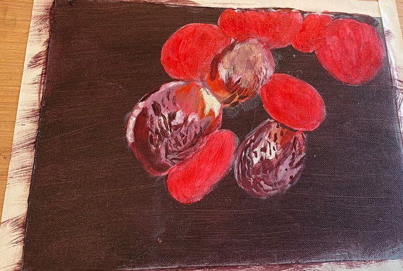
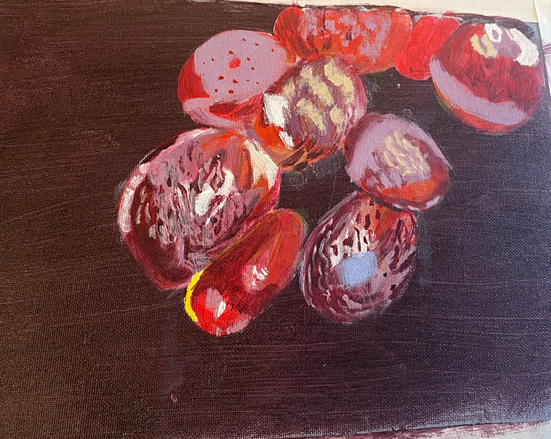
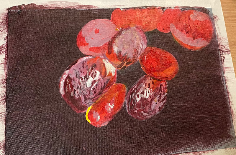
I followed along with one of Lachri Fine Art's live streams to paint these grapes. Using a combination of glazes and opaque layers, I achieved the frosty look you see. After going over the background with titanium white, I painted a couple layers of red, let them dry, and glazed a thin layer of yellow over it. During the live stream, Lisa reminded us to pretend we'd had too much coffee when doing the beige highlights on some of the grapes. This translates to "wiggle your wrist like crazy". Indeed to paint many of the dots and squiggles of red and pale purple, I did this, while holding my brush at the very end of the handle. Holding the brush in this way meant I had absolutely no control over my strokes, which was exactly what I needed.
After working on this painting for a while, it became clear to me that much of the glow in the grapes came from placing cool, blackish purple against warm red orange. In other words, cool against warm. If your grape is looking glowy enough, you probably need to darken your purple. I ended up putting more layers on my purple areas several times when I thought they were done.
0 Comments
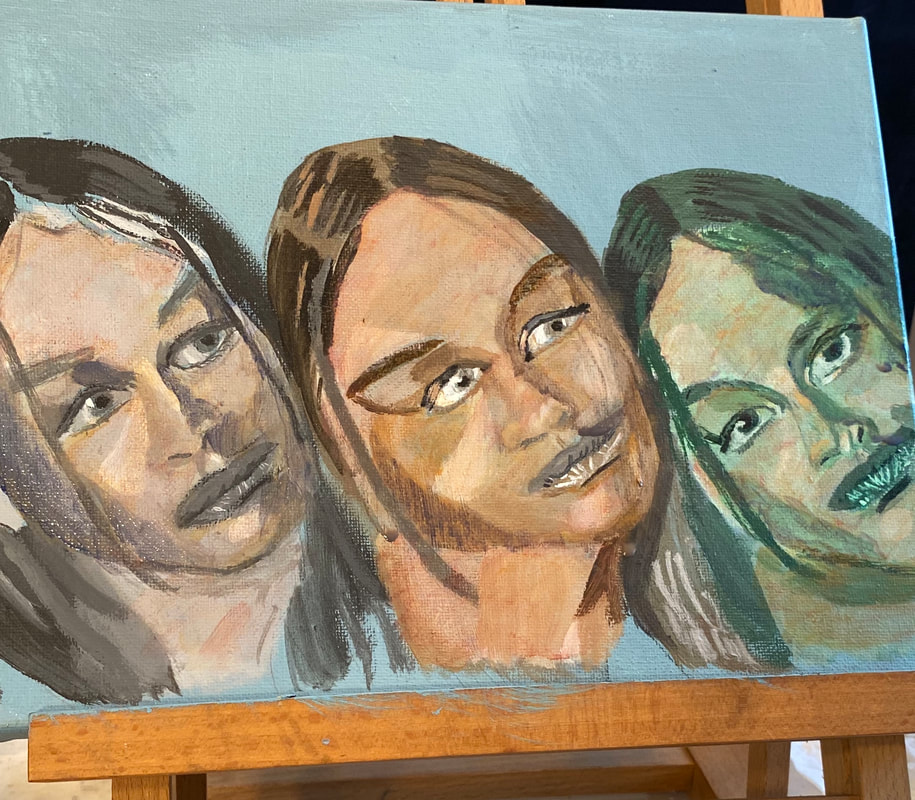
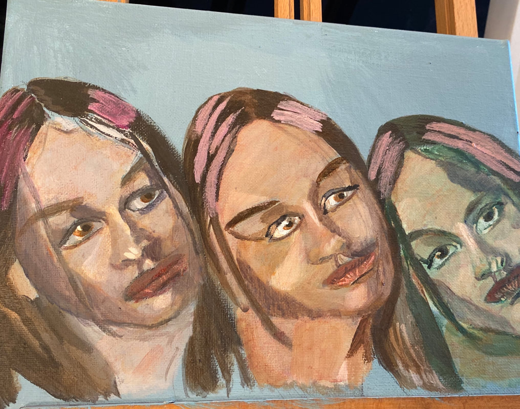
For the past few years, I've been starting the vast majority of my acrylic paintings with a grisaille underpainting, which is an underpainting done in gray tones. This time, though, I'm testing different types of underpaintings, of which there are many. For this experiment, in addition to my go-to gray toned underpainting, I'm also doing a portrait with a brown-toned underpainting and a green-toned underpainting. I've drawn the same woman's face three times. I'll be using the same surface colors on all three. The only thing that willc change are the underpaintings. This will show me if the same surface colors look the same or different, depending on the underpainting. If you're wondering why I use an underpainting in the first place, watch this video from my youtube channel. Today I finished the last of the underpinnings and so it was time to start the color. I started with a basic mixture of zinc white, because it’s transparent, that’s important, my trusty raw Sienna, and a touch of red. I applied a wash of this color over all three faces, then mixed some more raw Sienna and red for the shadows. I noticed that the face I'd done with the brown underpainting looked significantly warmer than the other two. I'd been struggling to find a way to paint people with warm skin without making them look sickly or jaundiced, so this was a very pleasant discovery. The green was significantly harder to cover than either the blue or the gray. I don't think I'll be using a green underpainting in this way for portraits in the future. It's just not worth it. The darkest shadows were bluish, though, so I mixed some ultramarine into my shadow color, but this color just looked muddy on my canvas. I mixed up some ultramarine and orange so it was muted and painted this on the left-hand sides of each face, down the right-hand sides of each of the noses and around the left cheeks, leaving a whole for the highlight. Back tracking a bit, before I did this, I glazed a muted red over the whole of all three faces. I kept mixing more water into my paint even after I had it on the canvas to keep it nice and subtle. Yesterday I added more layers to the green and brown under-painted faces. I adjusted the blue shadows by glazing orange over them because I thought they were too intense. I've started to add pale purple highlights to the hair. I’ll need to glaze yellow over those highlights. They're too intense. Now that I’ve looked at the piece, I think the gray under-painted face needs another layer.
|
Sara MillettPainter of portraits and wildlife Archives
November 2023
Categories
All
|
