|
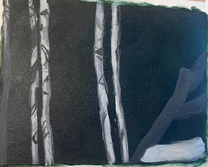
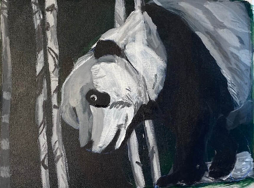
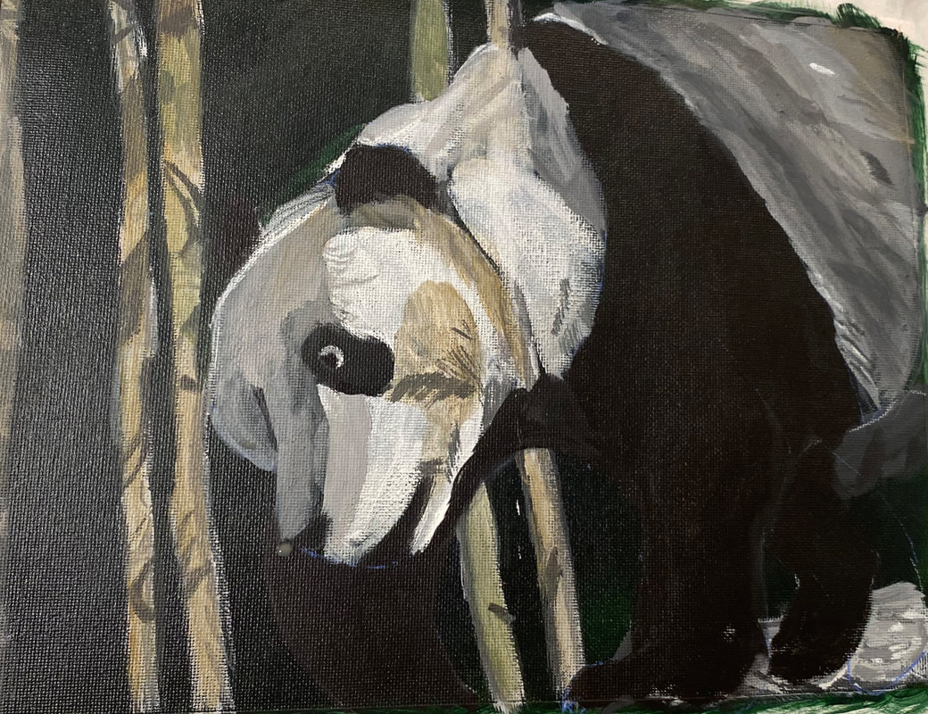
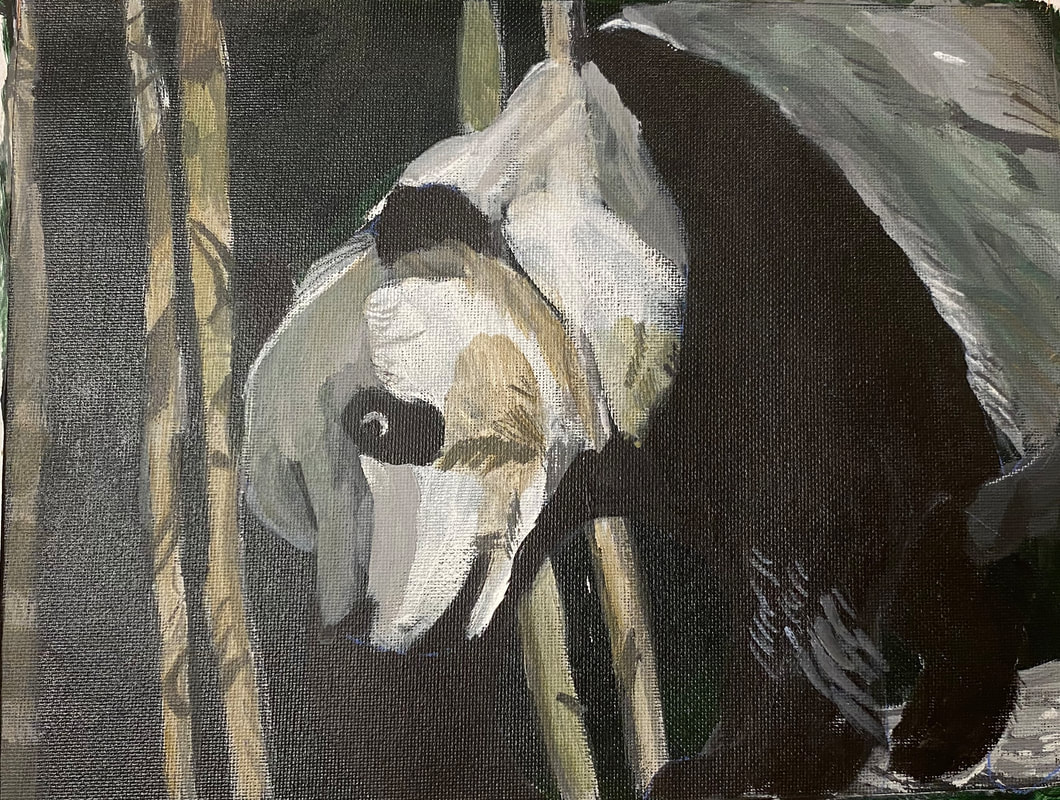
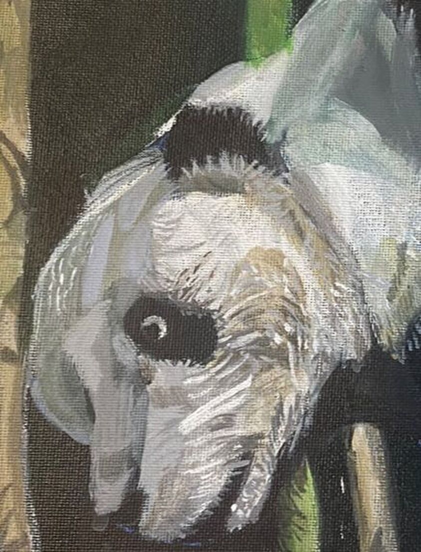
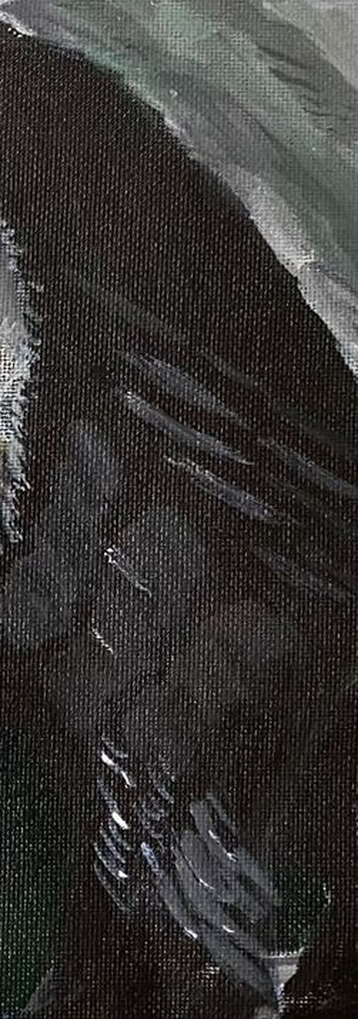
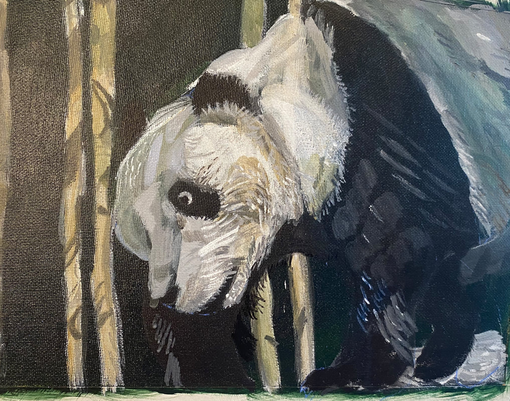
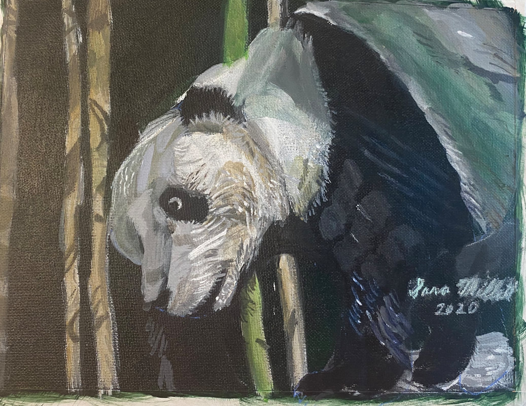
I’m starting by painting the bamboo and branches. This is so that when I add the panda over them, they’ll look like they’re behind him instead of growing out of him, if you know what I mean. I can see that most of the bamboo is very light, so I used a light gray as my base. I look at the shapes I see in my reference photo and mimic them. Painting all these shapes and keeping track of them requires a lot of concentration, but this allows me to almost turn painting into a mindfulness practice. Little by little, the shapes start to become the object I’m painting. Today I finished the underpainting of the bamboo and transfer the giant panda on. I positioned my transfer paper so that he would be walking into the scene from the right hand edge. Once the major form of the panda was on the canvas, I refined the shapes of his head, back, and right hind leg. After that, since I still had quite a lot of paint on my palette, I started to use block in areas of the panda’s body that were similar in value. 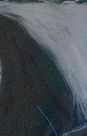 Today I painted more fur texture. I wasn’t worried about painting in every individual strand. I only painted those pieces that really stood out. What I did worry about, was making sure my strokes were going to in the general direction of the fur. Paying attention to the direction of your strokes can give you a fairly realistic, three dimensional look, even without spending a lot of time on individual strands of hair or fur. I started by glazing grayish brown all over the bamboo stalks. Later on, I brought this same color into the panda’s face and upper back. I was trying to glaze a grayish blue over the panda’s back, I can’t get the blue to show up now. I’ll have to try again on Monday. At this, I’ve started to reach the “I know this painting isn’t finished, but I don’t know what else it needs” phase. I pulled the reference photo up on my phone and took a close look at it. I saw that I needed some more pale grey fur strokes where the white meets the black on his back. I sat down to paint with the intention of just painting those strokes and while doing that, I also noticed some grayish brown marks and painted those. Sometimes you can sit down to paint one thing and see other things while you’re at it that can keep you going. What helps in this case, is, instead of looking at the photo as a whole, closely examine one part of it. In this case, I honed in one the panda’s back, ignoring everything else for the time being. The next time I work in this piece, I’m thinking I’ll do the same thing with his face. You might notice by now that even though pandas are technically black and white, there’s hardly any white in this guy and there’s less and, barring tiny highlights, the more I work on him. I covered up most of the white I had in his face yesterday. Nothing that’s three dimensional is ever going to be totally black or white, because, by it’s very nature, it’s going to have shadows and highlights. White fur is also going to reflect the colors around it. You can see that I’ve brought the grayish tan of the bamboo into his fur. If he’d been under a blue sky, I would’ve brought that into his fur, but since I used a green background, I brought that in instead. On the topic of white highlights, I’ve been using those to add more fur texture. 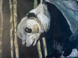 In my latest painting session, I directed my attention to this, and this. I noticed that there was lots of texture in both that I hadn’t painted yet. I mixed some light gray paint. The fur looked almost white here, but I didn’t want to jump to white just yet. I used my liner brush, and doing my best to load the paint on evenly and without clumps, touched just the tip of it to the canvas. Even with my best efforts, though, a lot of my lines came out thicker than I wanted, so I came back with my liner brush wet, but devoid of paint, and came back over those lines to thin them. I made similar strokes with both a darker, and a lighter shade of gray than that of my initial layers. It’s becoming more apparent to me that the texture of the black part of his fur is very coarse, but also shiny near his ankle. To achieve the shine, I started by putting little dots of titanium white with the tip of my liner brush on the ends of the fur texture lines I’d already painted in that area. To achieve the coarse look throughout the fur there is going to be more of a challenge. I don’t want to paint lots of very thing lines because that will just make him look wiry. Also, the shade I used for the strokes had to be very dark, as to almost blend in with the black. I couldn’t have high contrast here. So I mixed a gray using mostly mars black and a little bit of titanium white. Then, using my liner brush again, but pressing harder with it, using more of the body of it, so the lines would be thicker, I painted dark gray texture lines on his leg, all going in the same direction. I want to point out that when I’m painting all these fur lines, I find that, as much as I like to maintain control, when I make quick strokes, often with a little wrist flick, I’m happier with my results than when I go real slow and try to control everything. Maybe that’s because most things in nature are rough and uncontrolled. I hope that makes sense. I followed this principal of not trying to control things too much to paint extra fur texture around his left ear, his eye, and again, where the black on his fur meets the white. I’d known for a while that there needed to be a blue highlight on the lower part of his left foreleg. I couldn’t just paint it straight blue, though. It would have to be mixed with orange of course to tone it down. I had been frustrated with trying to tone down blue with orange because my blue would always turn purple. I was watching a video on YouTube from my friend Shana Rowe Jackson in which she was painting some blueberries and she was mixing all her colors from cyan, magenta, and yellow. I wrote to her in the comments about the same struggle I just described here and she encouraged me to try using magenta, instead of red, to mix my orange. I did just that with this painting and was thrilled with the results. I now realize that the red I was using was too warm. I was adding yellow to my blue without realizing it. The magenta has a blue undertone, so it doesn’t give me that issue. I took my liner brush and gave him some shaggy fur on his right foreleg. Here's the finished piece. To touch it up, I added some more intensity to the green shadow on his back. I made this decision after playing with the painting in my phone. When I turned up the color saturation, I realized I liked it. His neck had been way too transparent for a long time and I fixed that also.
0 Comments
|
Sara MillettPainter of portraits and wildlife Archives
November 2023
Categories
All
|
