|
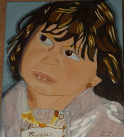
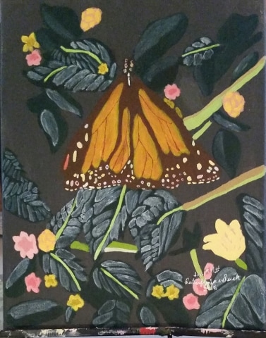
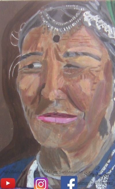
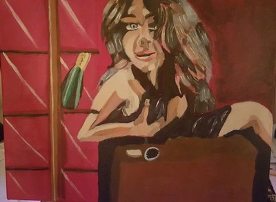
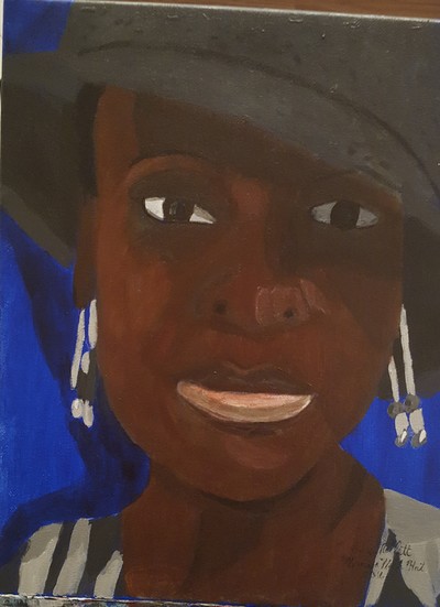
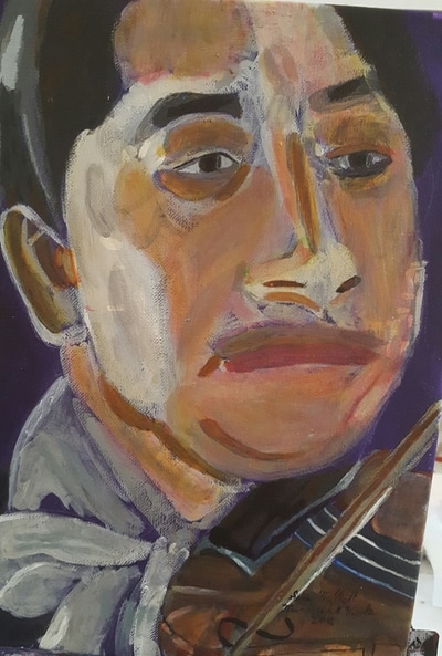
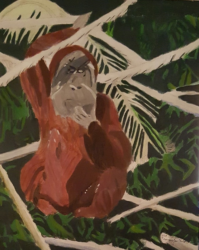
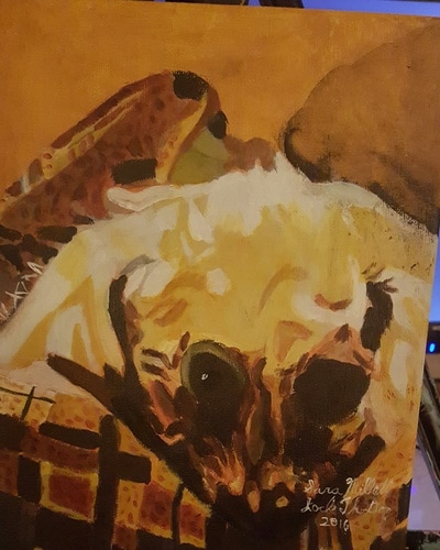
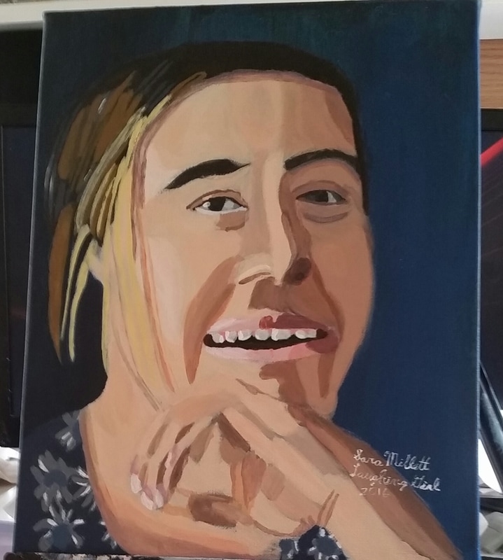
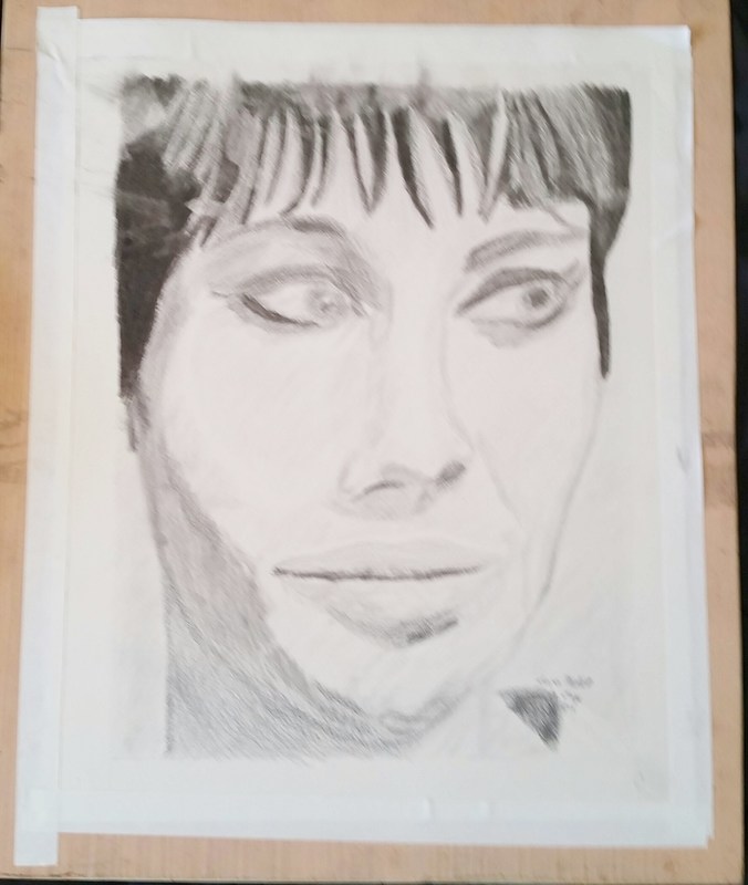
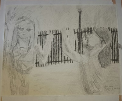
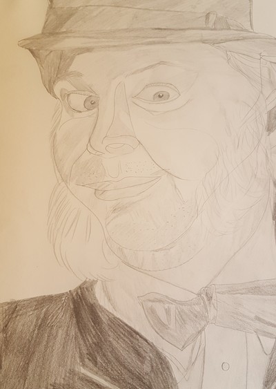
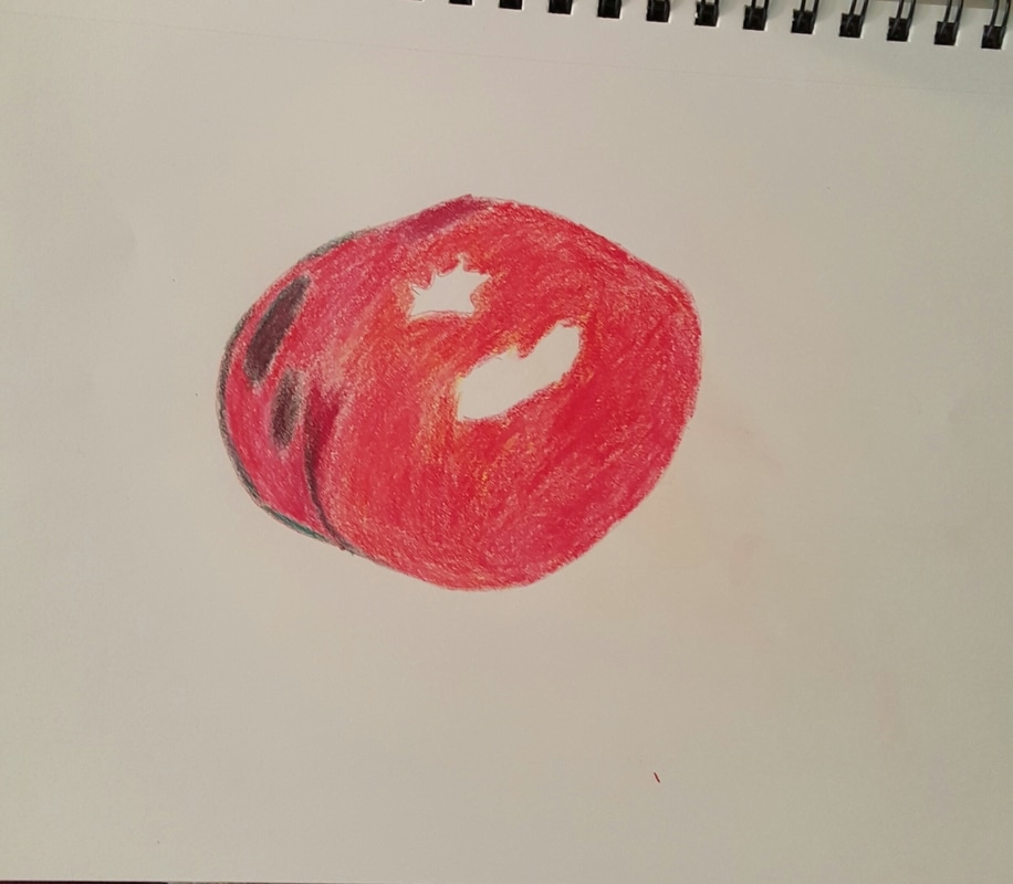
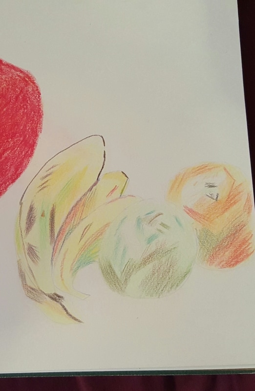
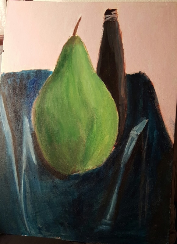
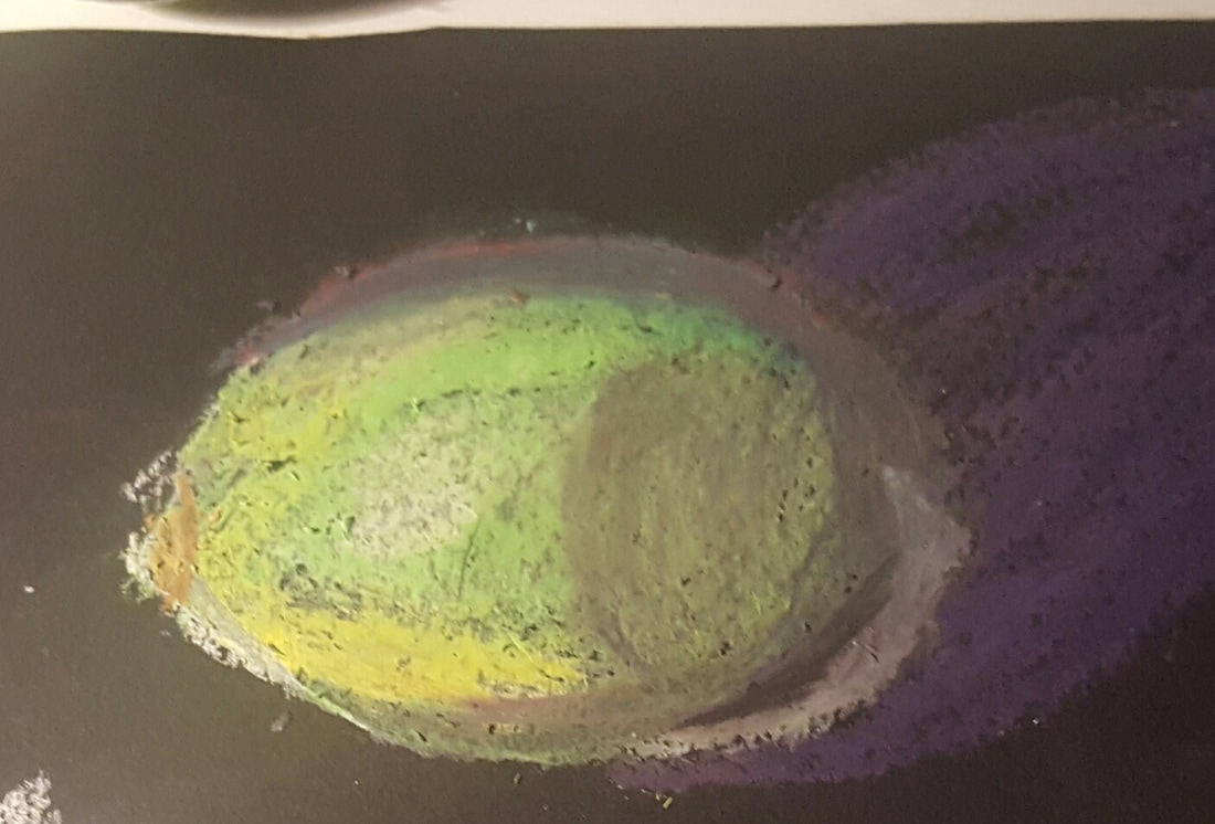
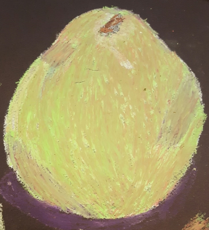
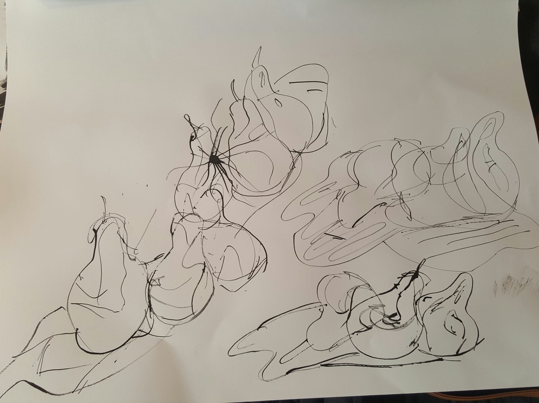
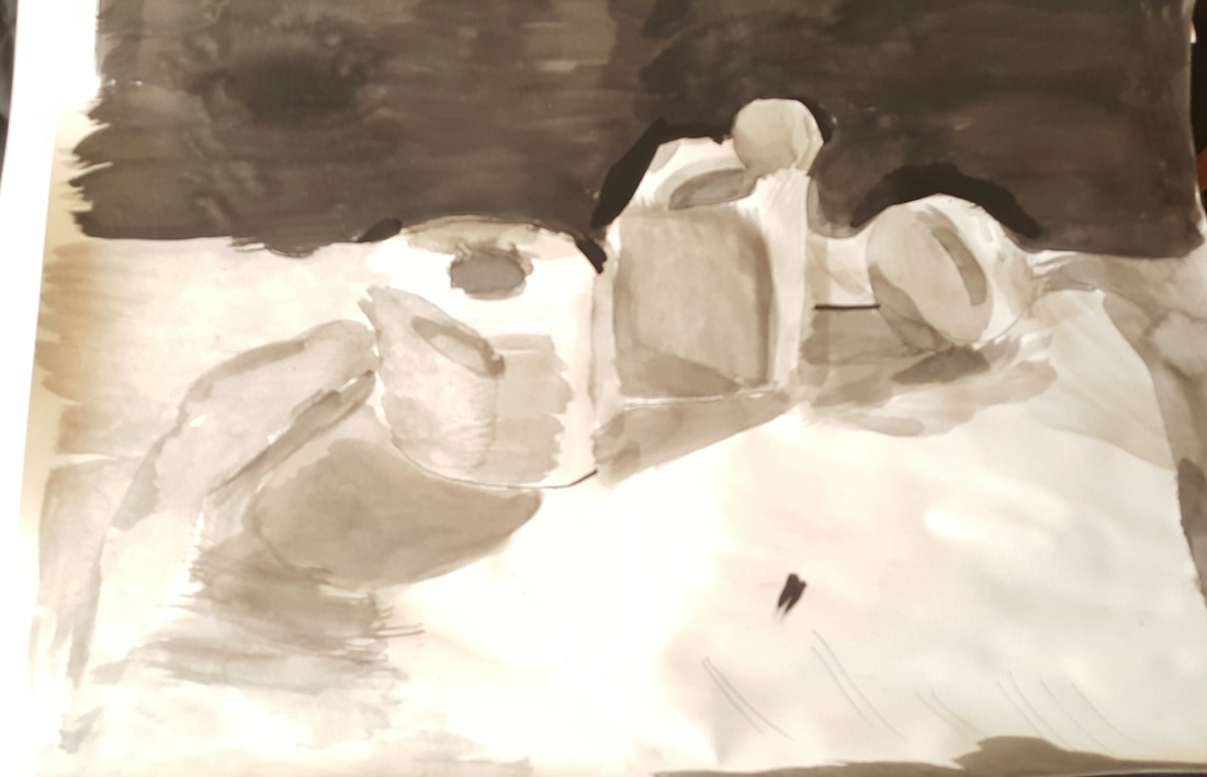
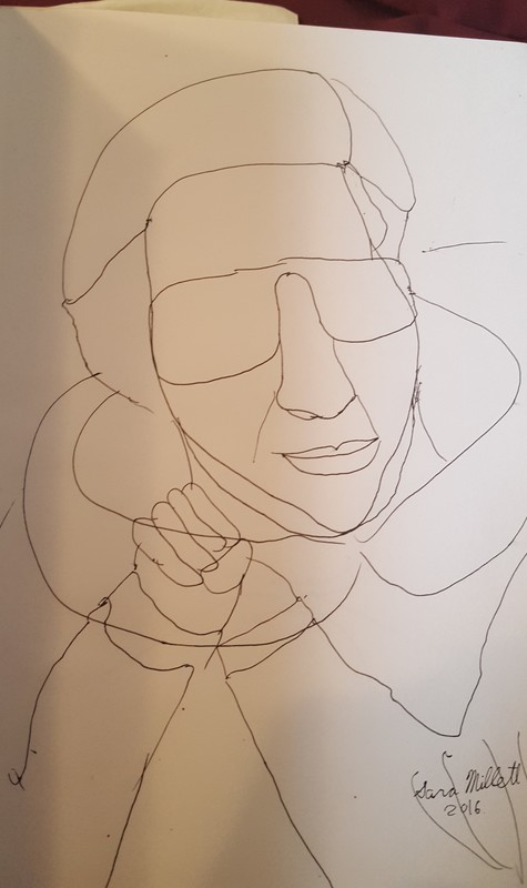
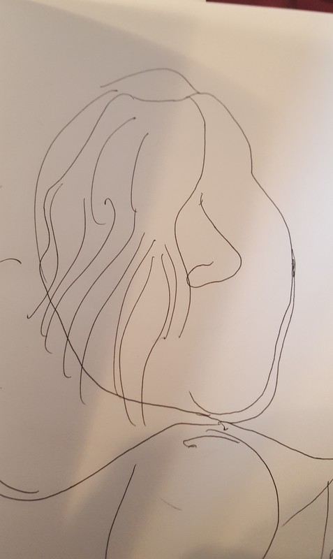
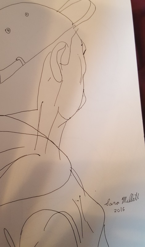
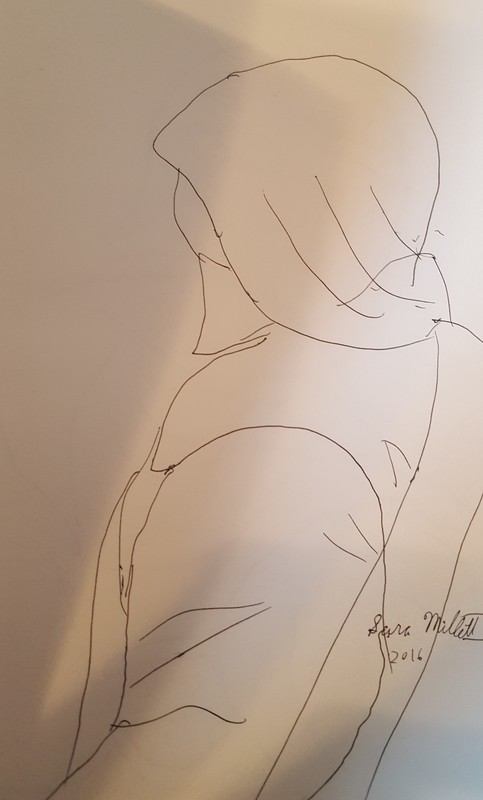
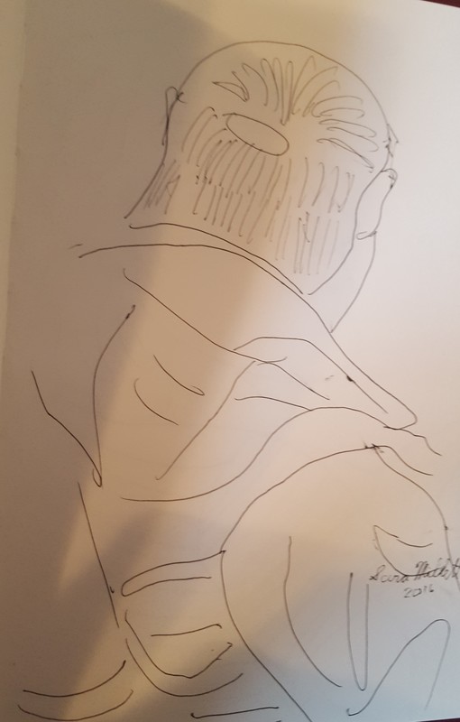
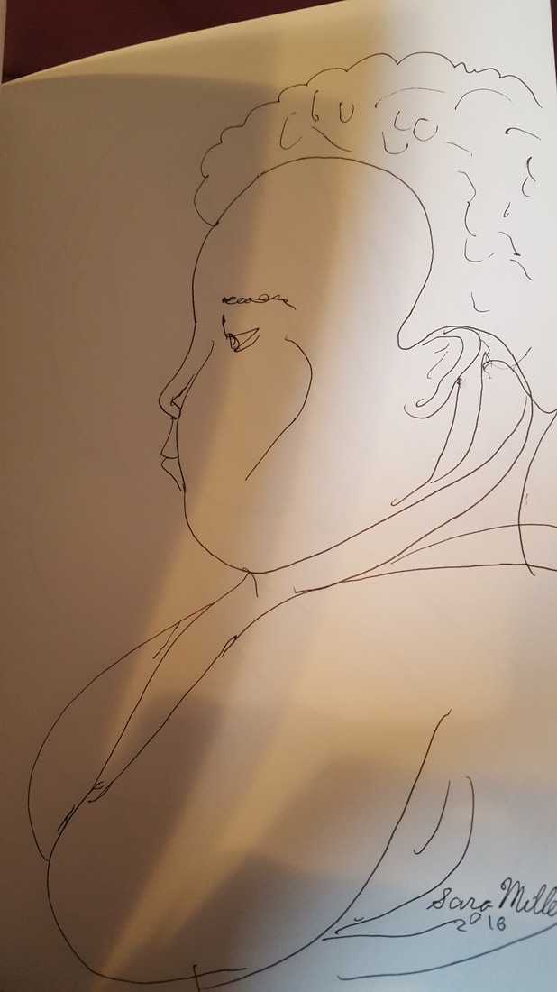
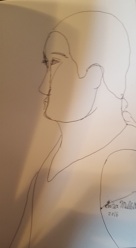
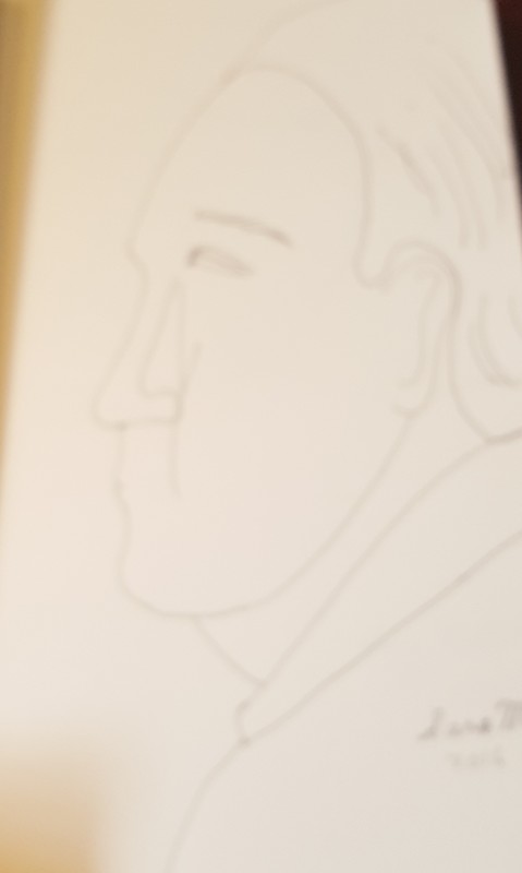
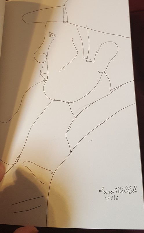
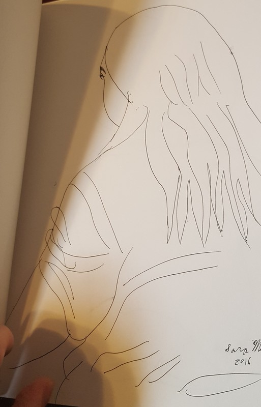
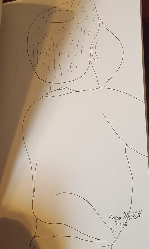
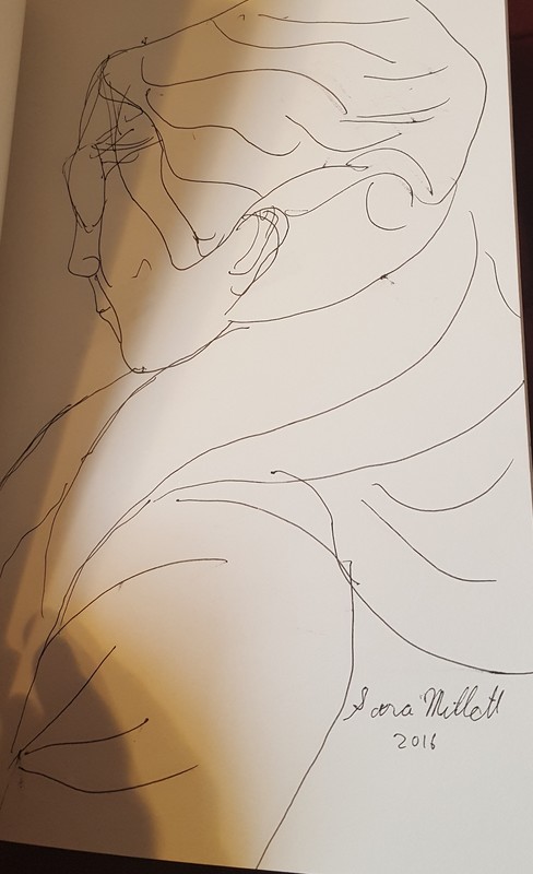
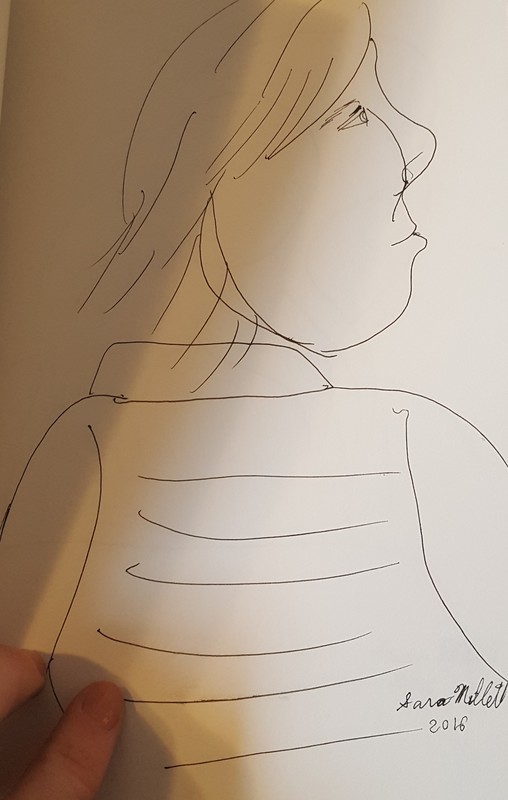
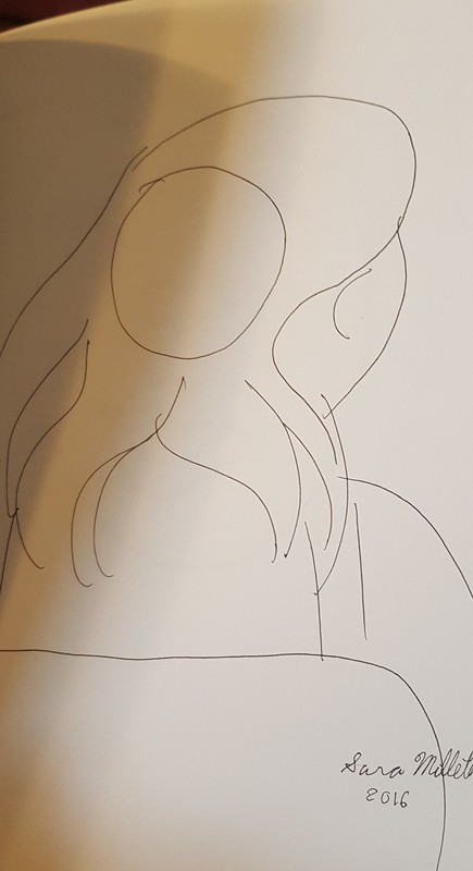
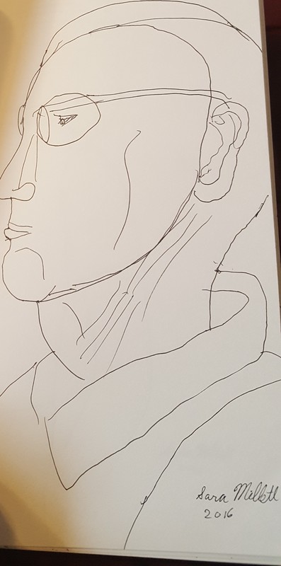
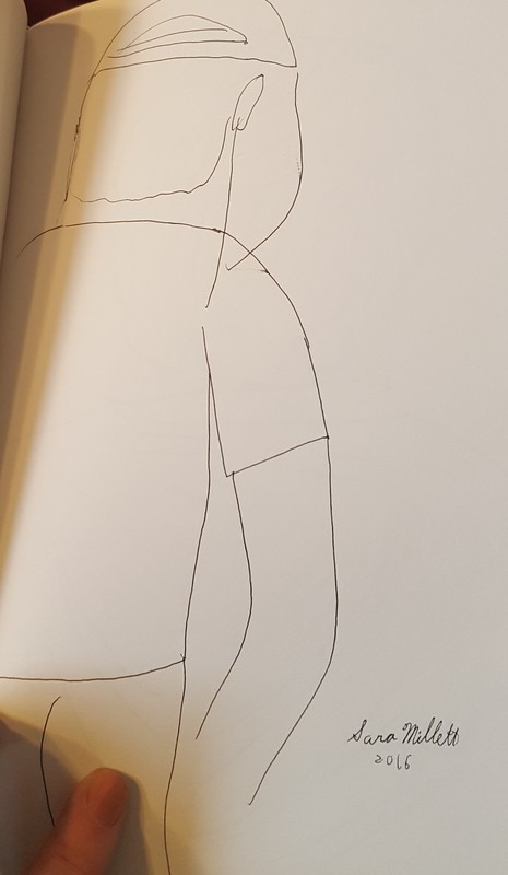
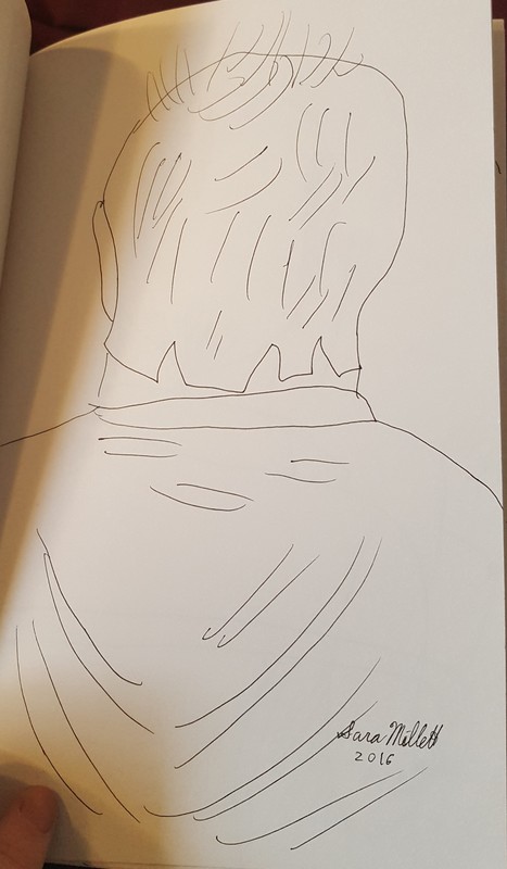
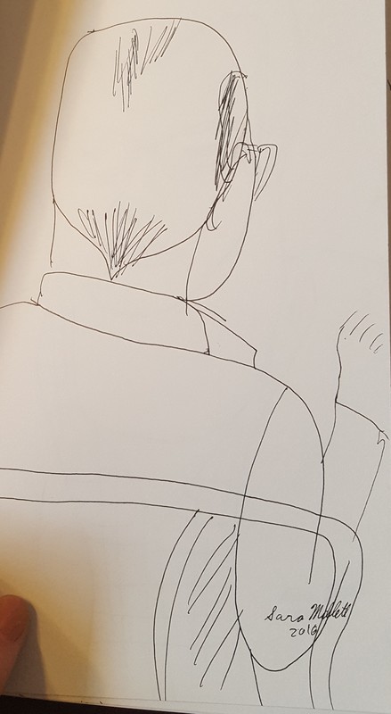
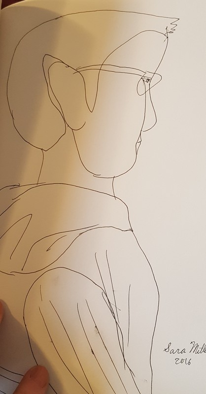
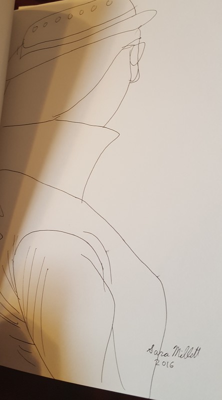
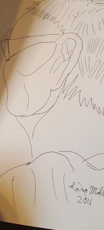
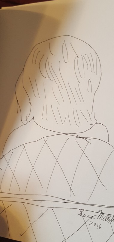
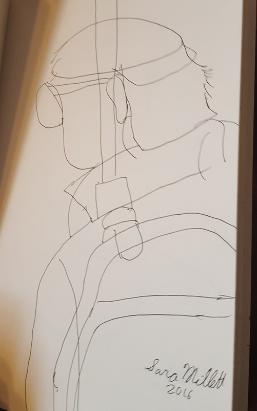
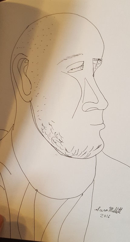
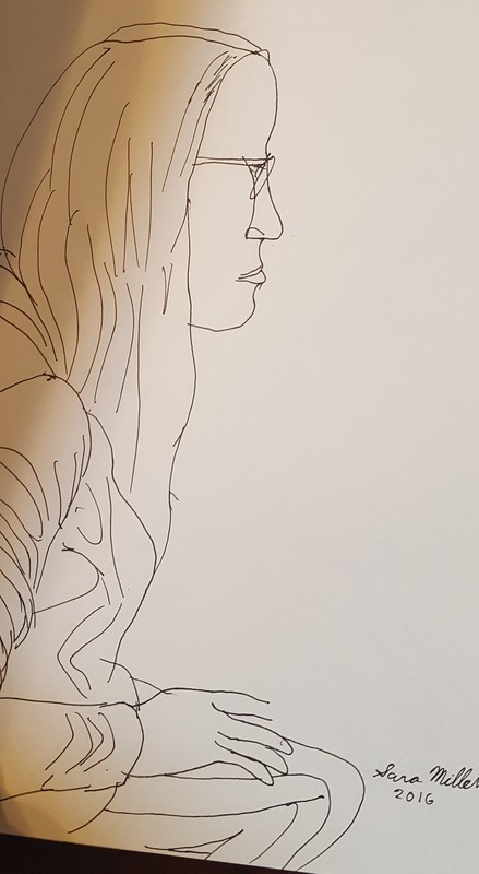
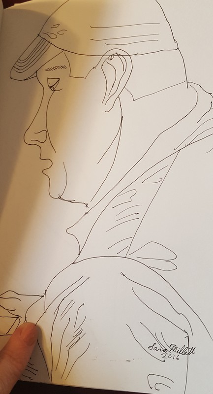
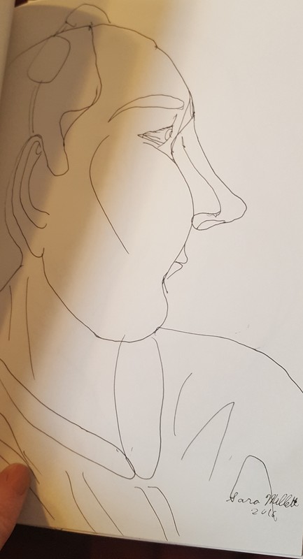
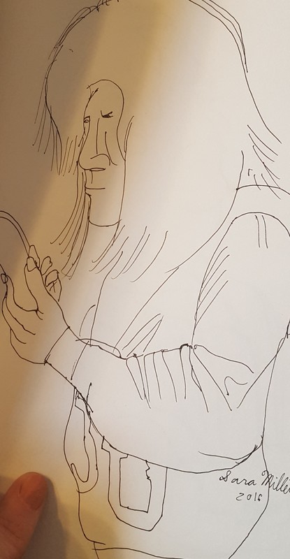
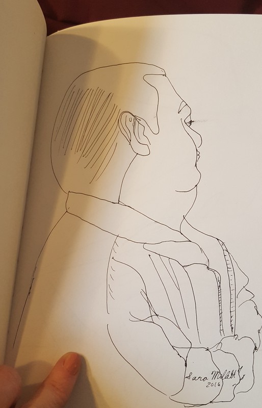
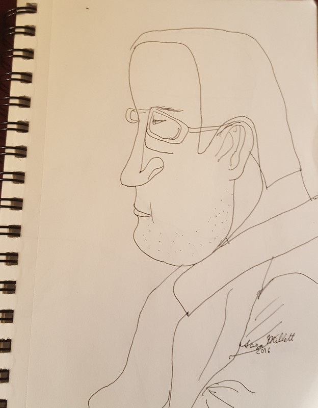
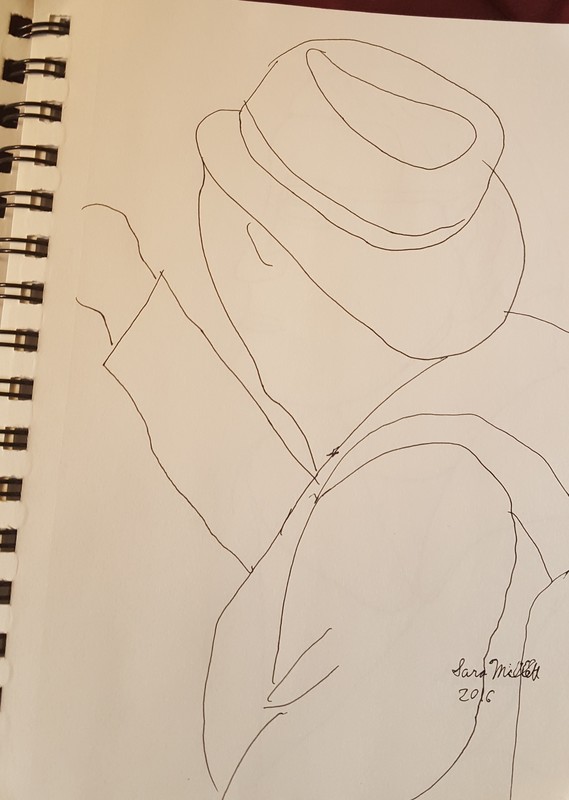
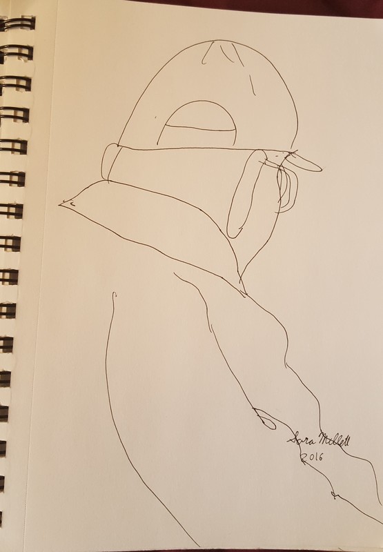
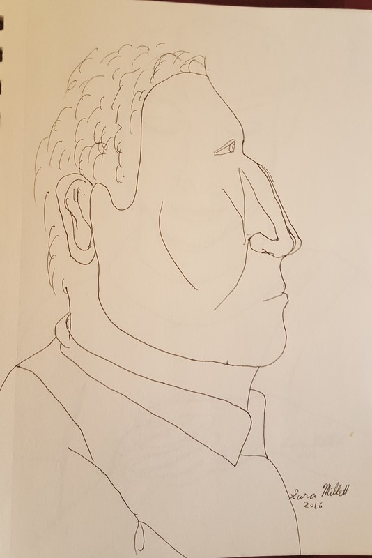
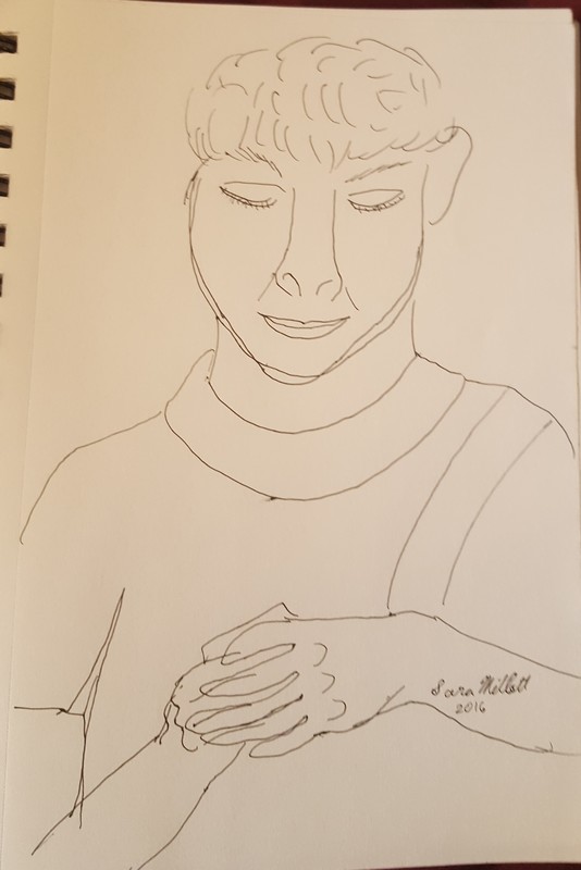
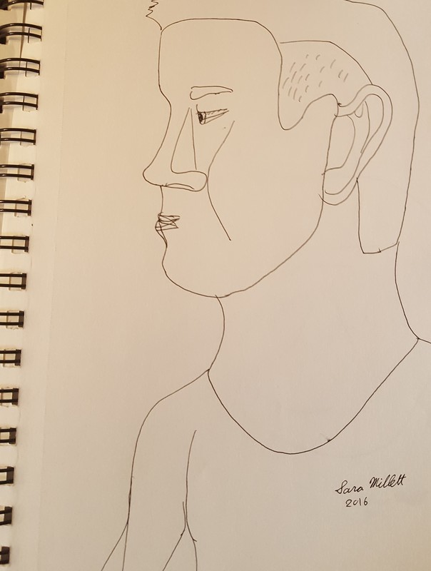
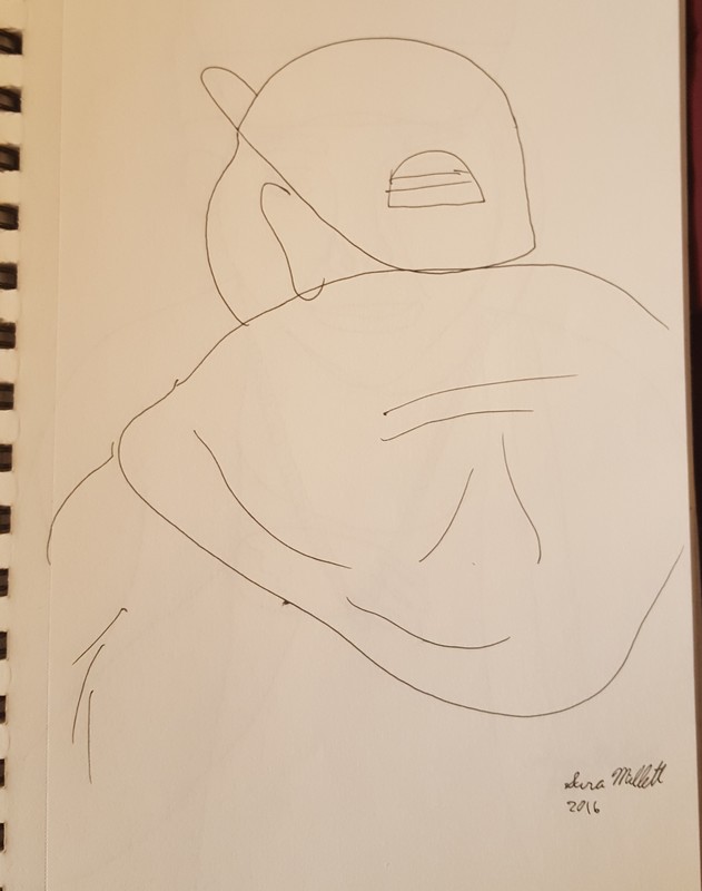
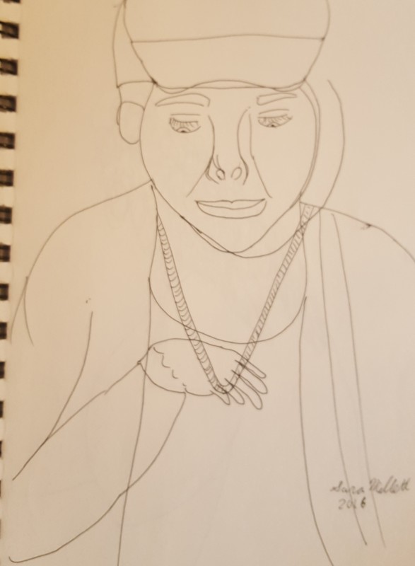
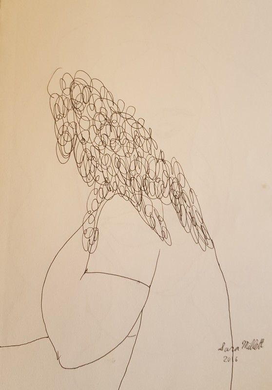
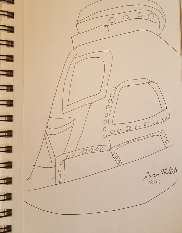
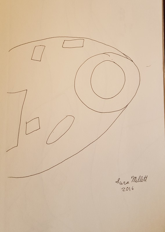
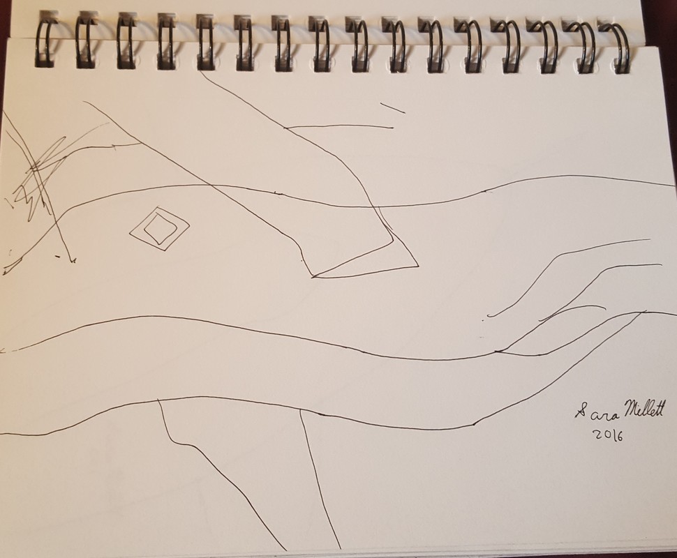
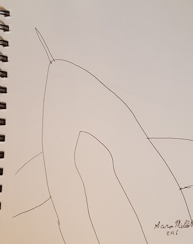
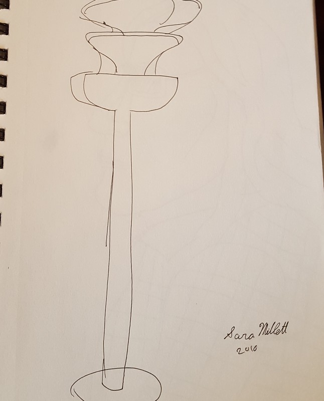
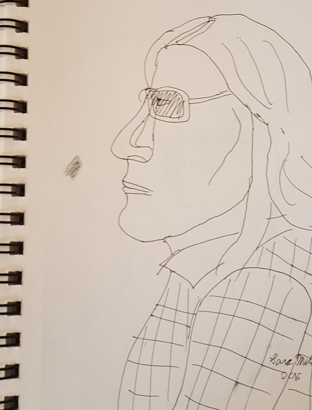
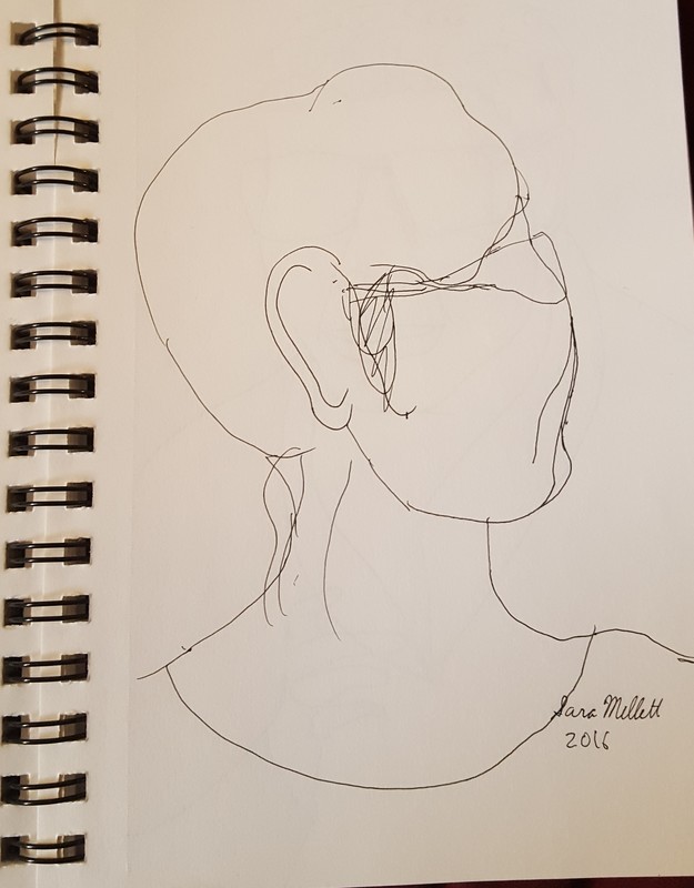
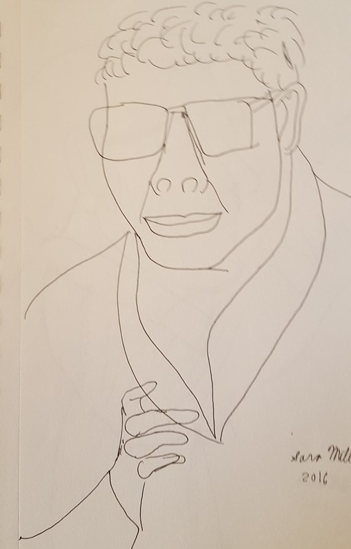
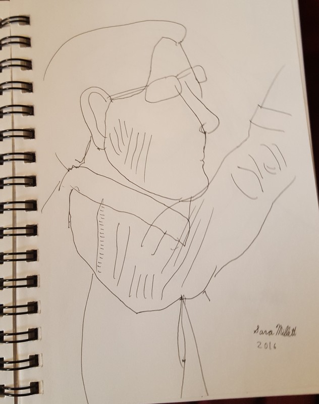
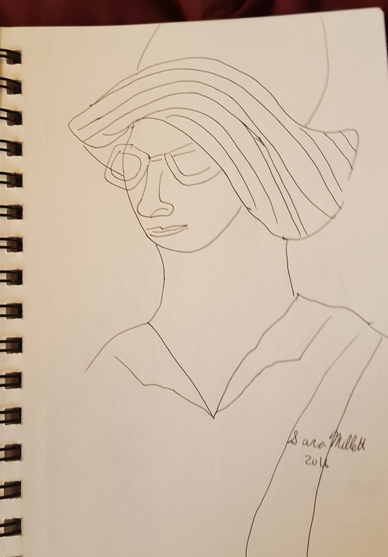
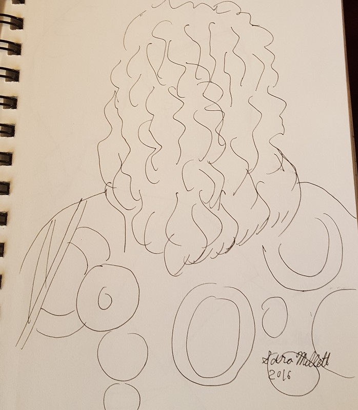
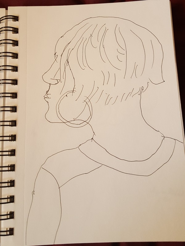
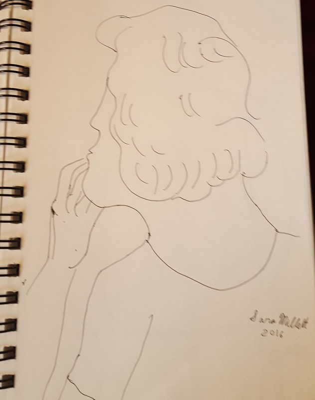
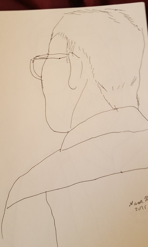
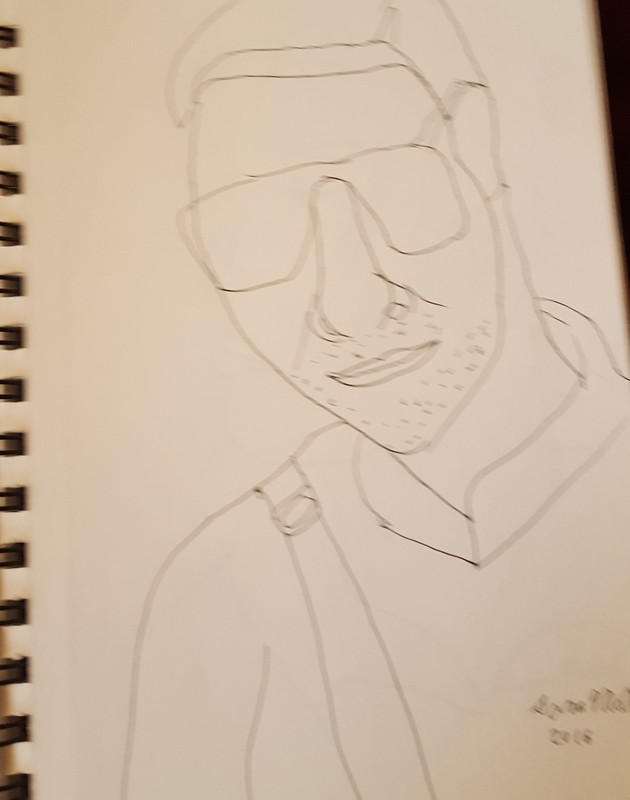
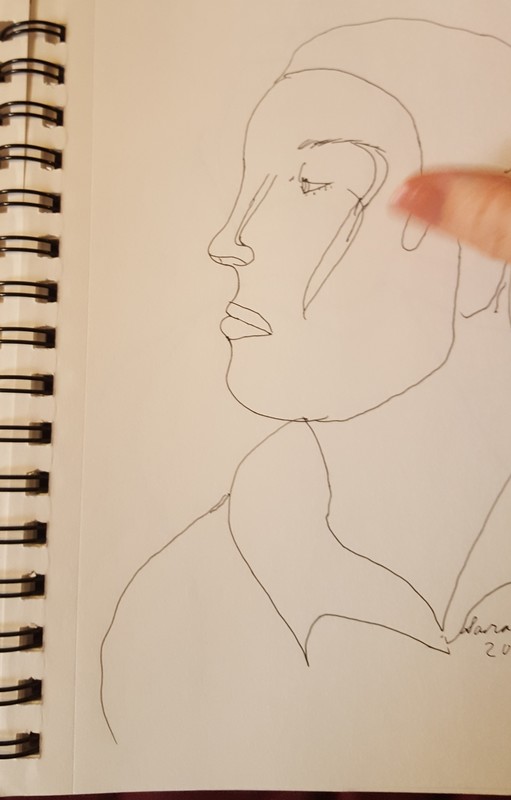
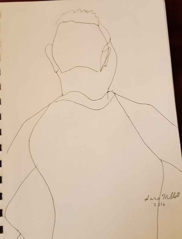
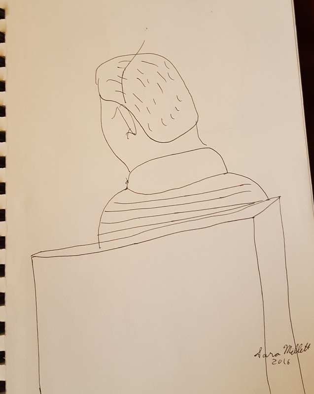
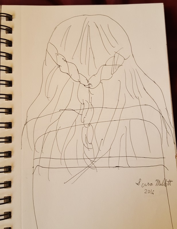
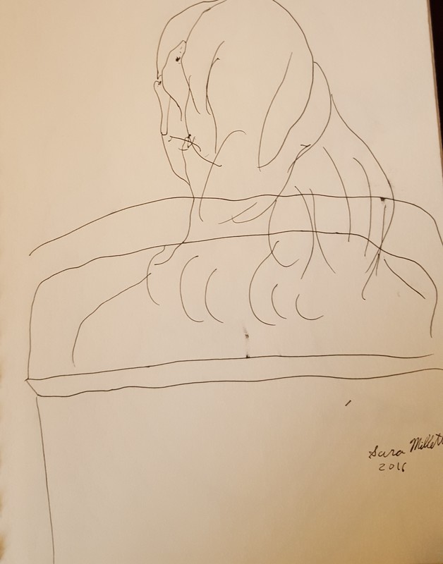
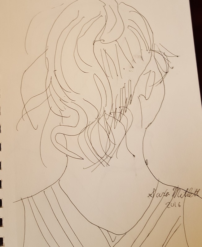
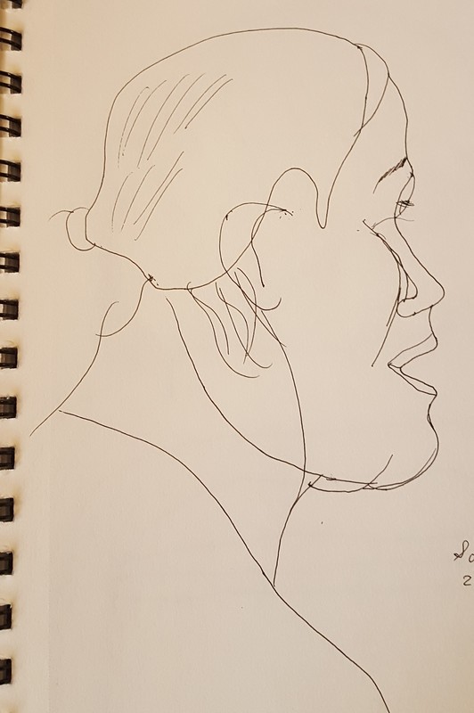
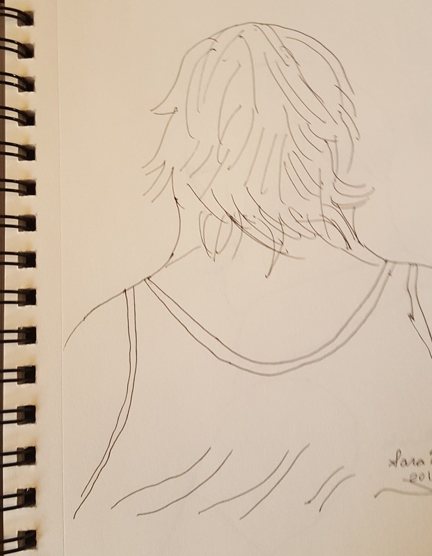
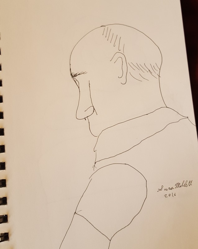
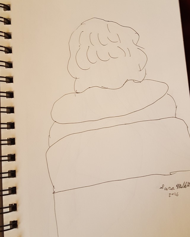
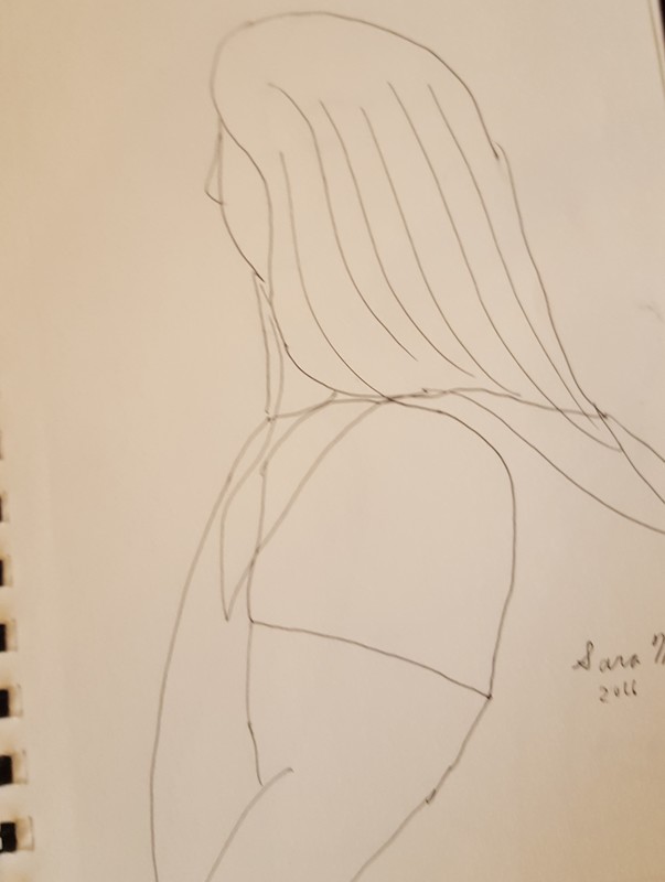
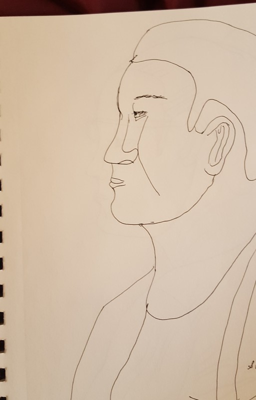
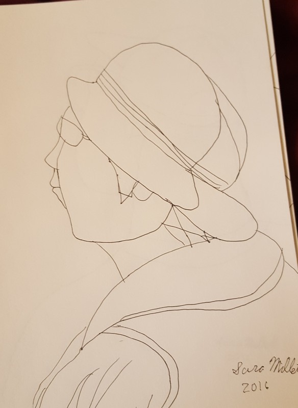
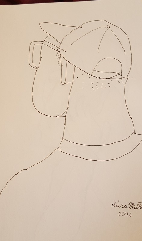
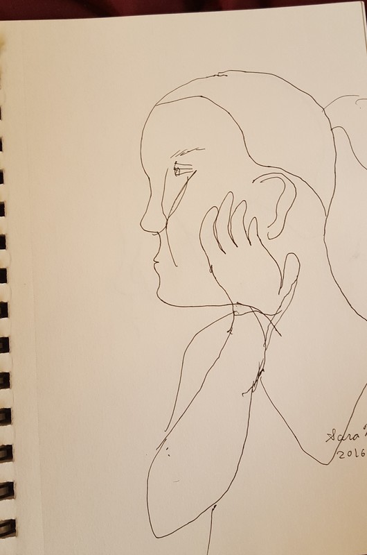
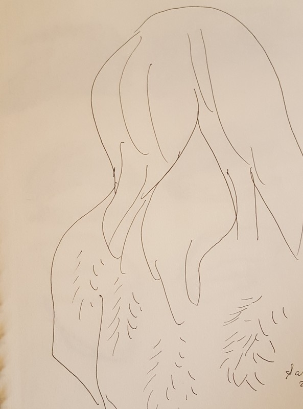
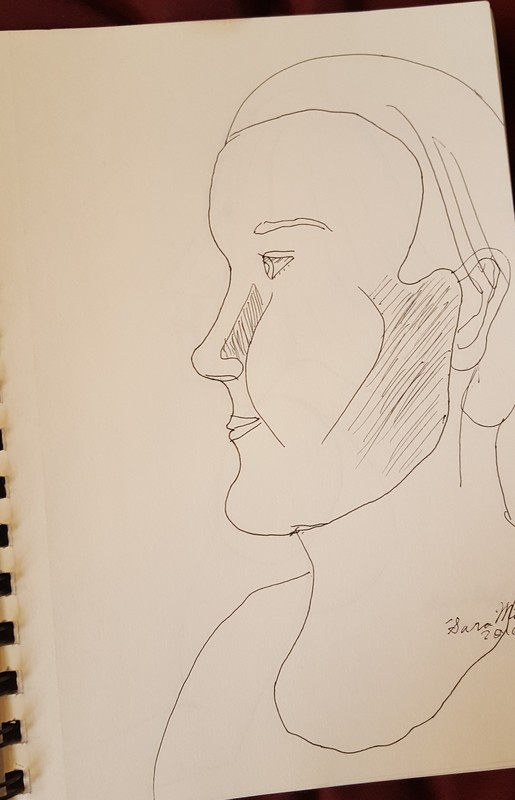
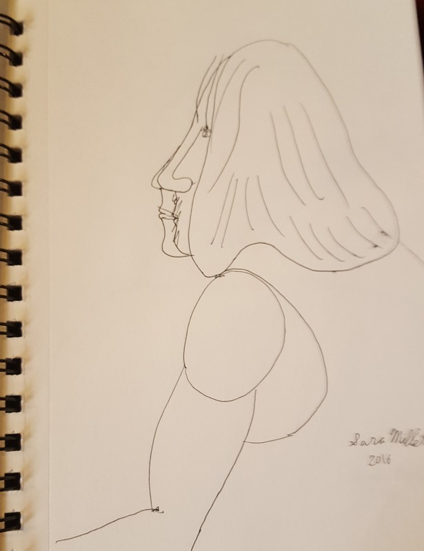
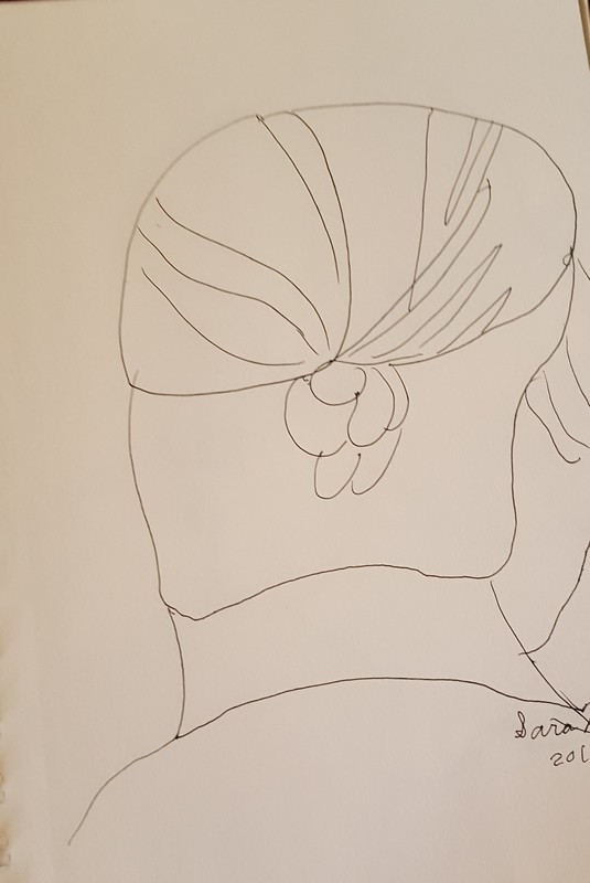
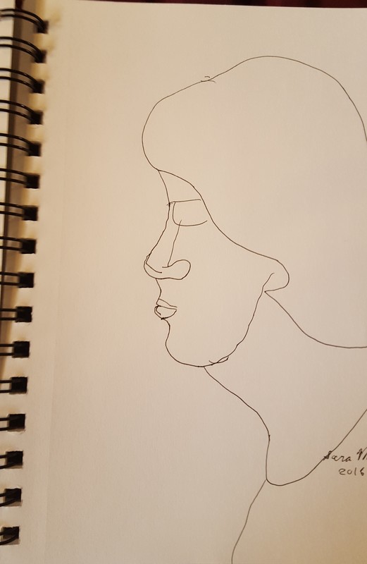
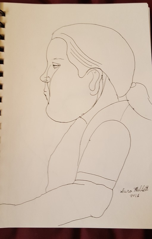
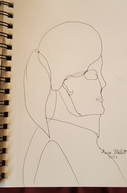
For this post, I’m going to take you back and show you all the pieces I completed in 2016. Well, at least the ones I was able to find photos of. I was inspired to do this by Lisa Clough from Lachri Fine Art, who made a video about all of her pieces from 2016. As I was compiling this video, I was really surprised at the amount of work I really did over the past year. I’m going to start with acrylic paintings. Here are my completed drawings. Here is my practice/classroom work. Here are my prep sketches. I have one original colored pencil piece. 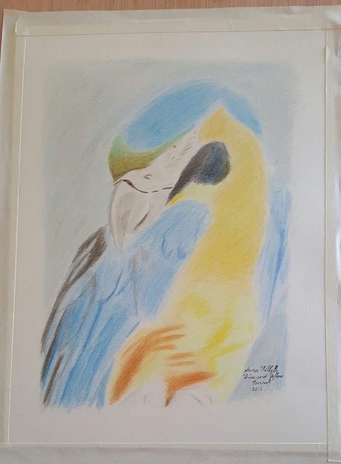 "Blue And Yellow Parrot" colored pencil on hot press watercolor paper "Blue And Yellow Parrot" colored pencil on hot press watercolor paper And finally, here are the contents of my traveling sketchbook. These were done during bus rides, while waiting for my food in restaurants, etc. And there you have it, my pieces for 2016.
0 Comments
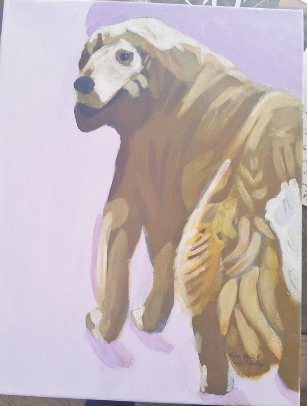
I finished a new painting! This one is called “Polar Bear Dozing” and it’s an 11×14 acrylic on a Belgian Linen canvas. This is another one of those paintings done from a pic I took at the San Diego Zoo. Here’s the finished painting. 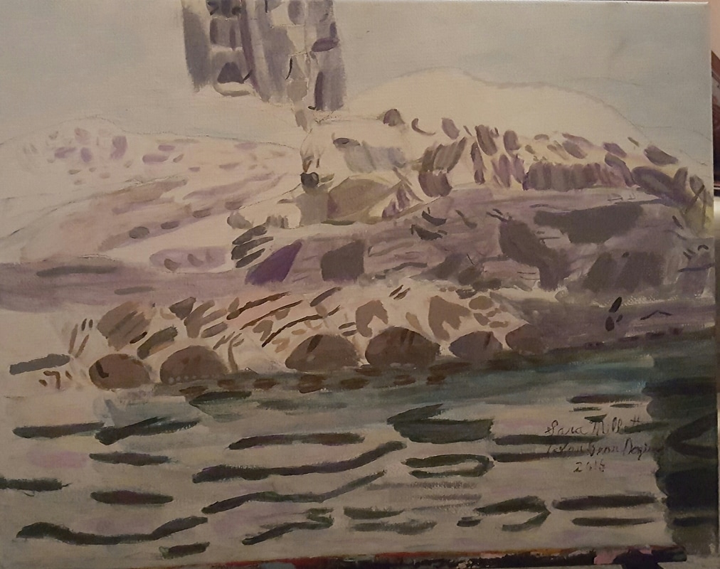 To paint the polar bear, I first filled him in with a single thin layer of hansa yellow light mixed with zinc white.The most challenging part was capturing the shadows on his side. To do that, I ended up using a combination of strokes of yellow, sheer grey(grey made by mixing zinc white and mars black0, and sheer purple along with opaque grey(gray made by mixing titanium white and ivory black), as well as opaque grey brown. 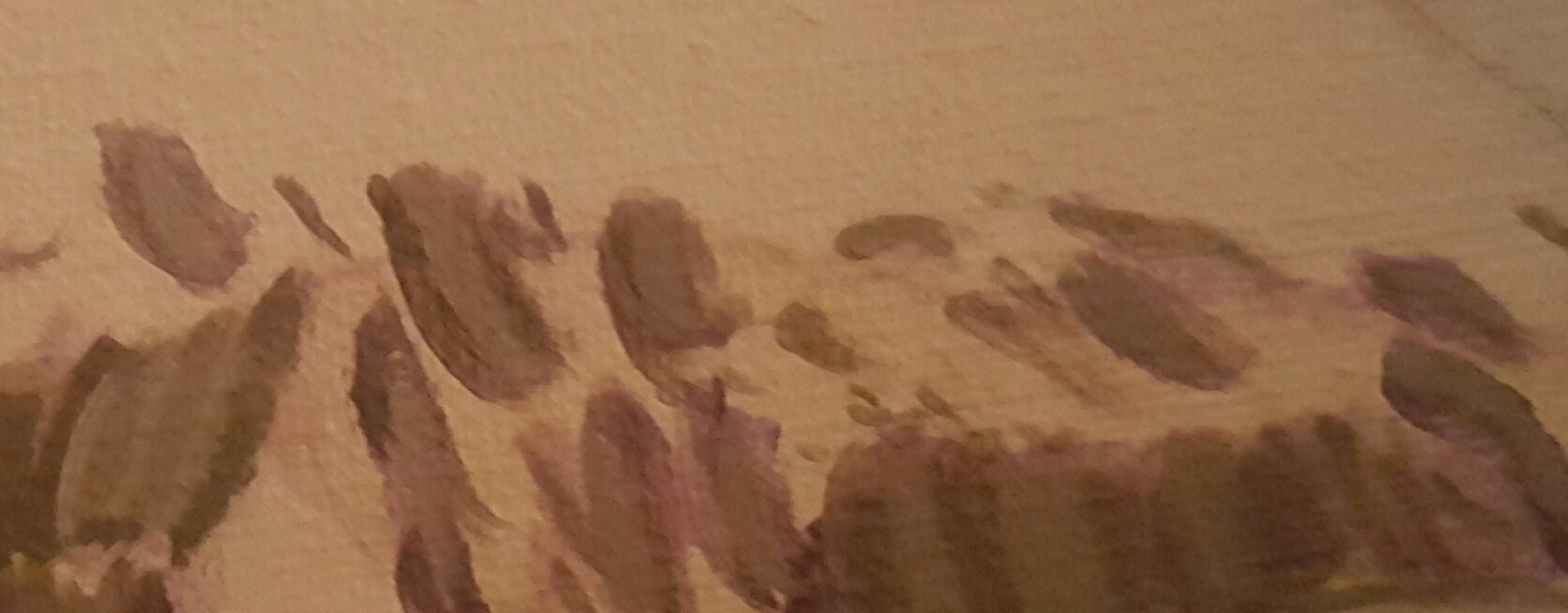 For the logs, I mixed titanium white with a tiny amount of burnt umber and applied it in a single layer all over. I tried to mix a peach color by mixing yellow and pink into this color, scrapped it and just mixed cadmium red medium into my original color and applied this in the appropriate places. I put some van dyke brown on my palette and mixed titanium white and ivory black into it. I painted this in very thin lines using a small round brush across some of the logs and around the fronts. I also mixed red and titanium white into this color and painted the appropriate parts of the fronts of the logs. I also mixed a grey brown from burnt umber, titanium white and ivory black and applied this where it was needed. 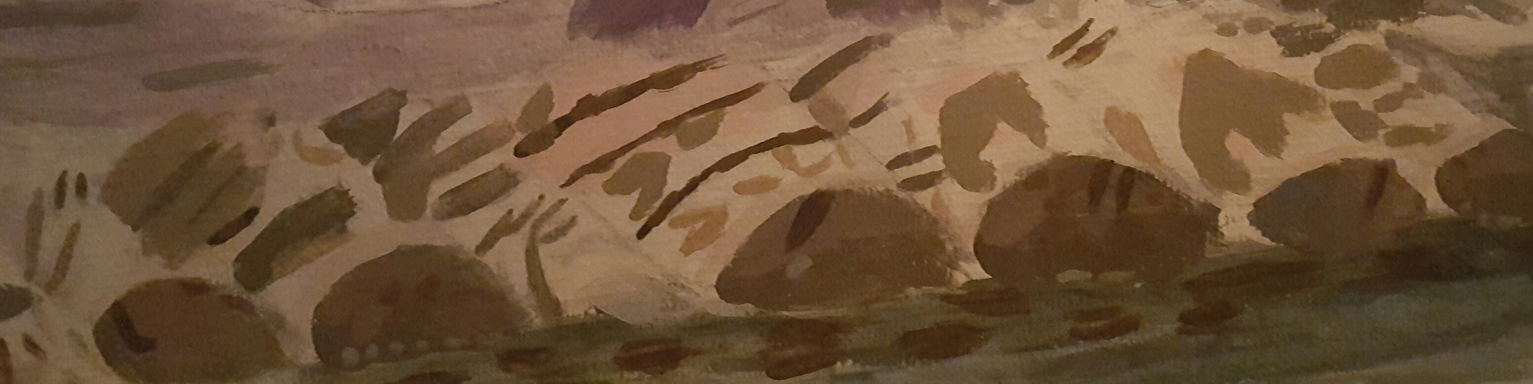 To paint the rock, I mixed zinc white and mars black with dioxazine purple, thinned it with matte medium and applied a singe thin layer of this color all over the rock. I darkened this color with more mars black and applied this darker color only on top of the dark grey spots. I mixed titanium white with ivory black and applied this opaque grey color following my reference photo. I painted thin lines of different lengths of this color using a small round brush. I mixed zinc white and Mars black and applied this thinned down sheer grey in a single layer all over the rock. 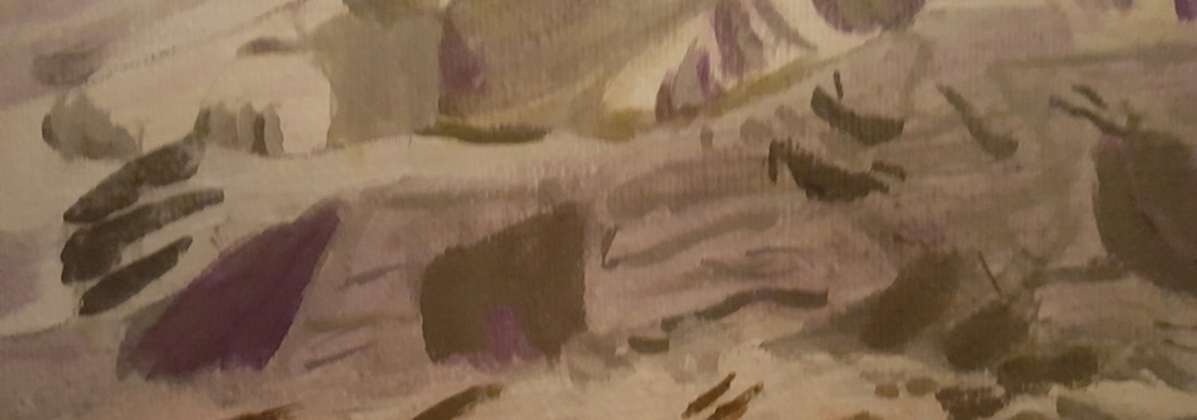 The water was the most intricate part of this composition because it had to have some color in it from everything else in the painting. I first mixed mars black zinc white and deep green permanent and painted a single strip of this color right under the rock. I mixed more zinc white into the original color then painted a strip of this color under the first one. I mixed more zinc white and phthalo blue into the first color and applied another strip of this color. Finally I mixed more zinc white and more medium into this color so it was very sheer and applied it all over the water. I mixed zinc white with a very small amount of burnt umber and applied this color in patches all over the water using a small filbert brush. I painted thinned down zinc white randomly all over the water. I mixed deep green permanent with phthalo blue and applied this color to the dark grey squiggly marks. I also mixed zinc white with burnt umber and cadmium red medium and applied patches of this color to the water. I mixed zinc white with mars black and applied a single thin strip of this right under the rock to show it’s reflection in the water. I mixed zinc white with dioxazine purple and put touches of this in the squiggly bits.  I mixed zinc white, Mars black, and ultramarine blue, thinned with matte medium and applied this color all over my building. I mixed zinc white, Mars black and dioxazine purple and used this color for the darker shadows of the building.  That’s all for now. I’ll talk to you again next week. There are so many ridiculous statements out there about who is not a real artist. You’re not a real artist, if you look at references: See this post for my thoughts on that topic. You’re not a real artist if you don’t have a BFA or MFA. You’re not a real artist if you’re not only an artist. You’re not a real artist if you don’t grind your own paint, stretch your own canvases, make your own paper, etc. None of the above things are required to be a real artist. You don’t even have to make to be making money from your art to be a real artist. I personally don’t have an MFA, I use references 99% of the time, and I buy prestretched, preprimed canvases. So what is required to be a real artist? Well, do you take your art seriously? Do you do it as often as you’re able, whether or not that’s every day? Do you strive to make every piece the best you possibly can regardless of what style you’re working in? If you answer yes to all of these questions, then I think you’re a real artist.
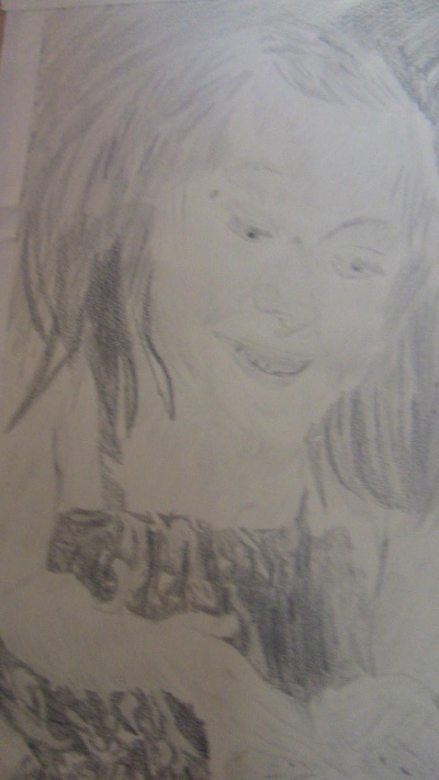
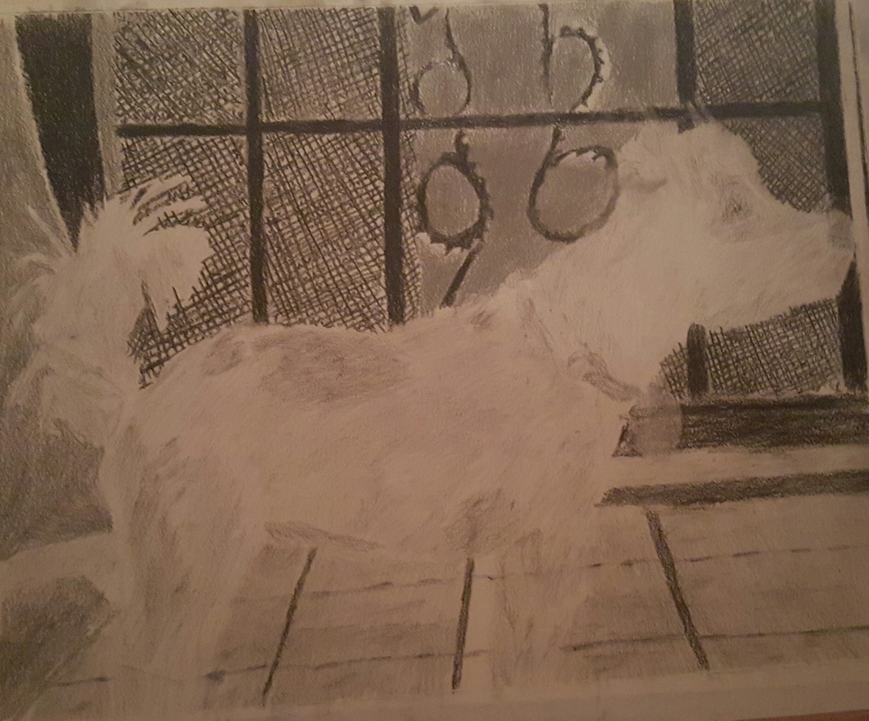
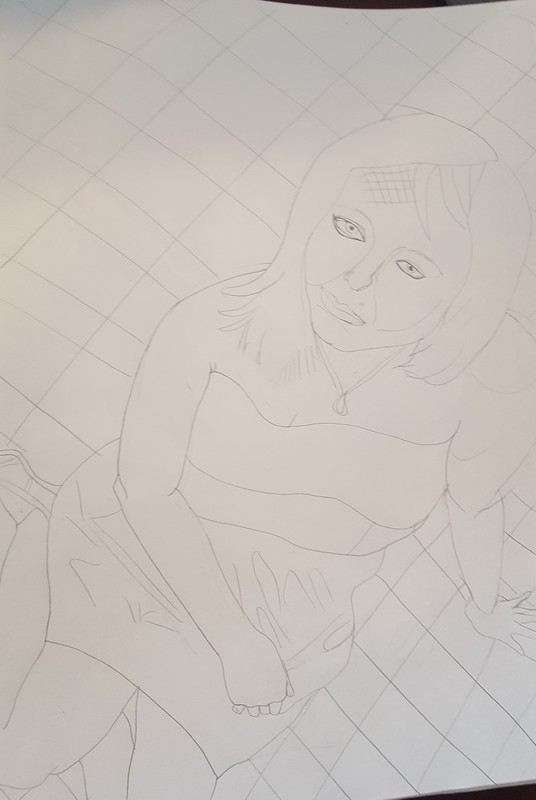
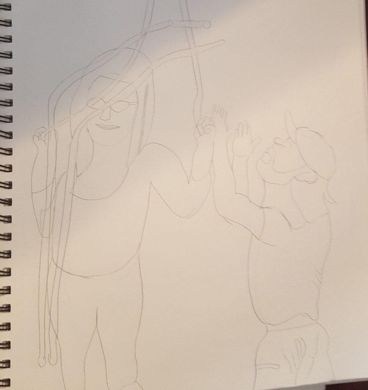
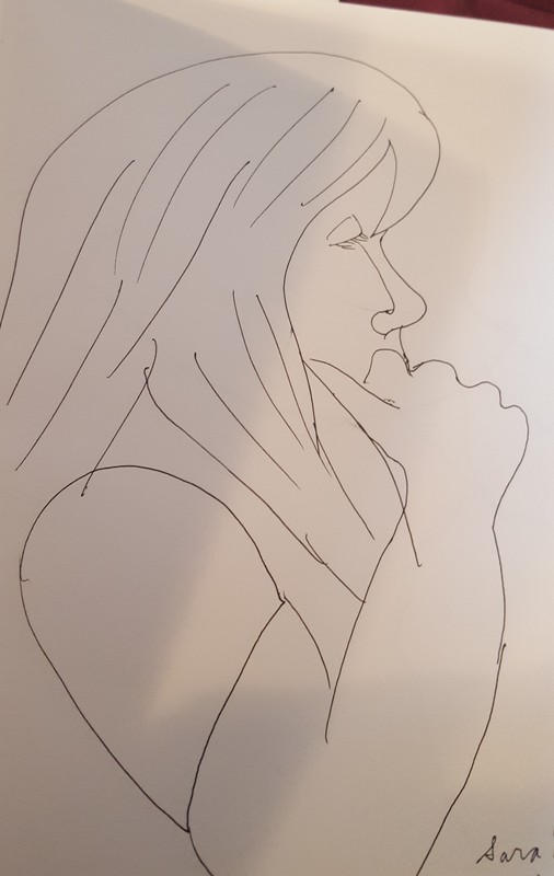
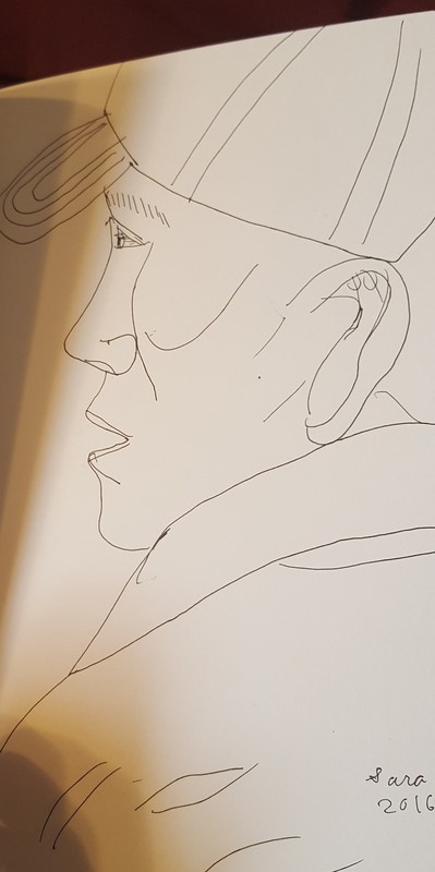
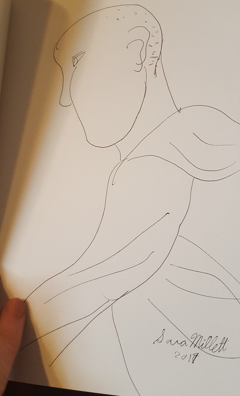
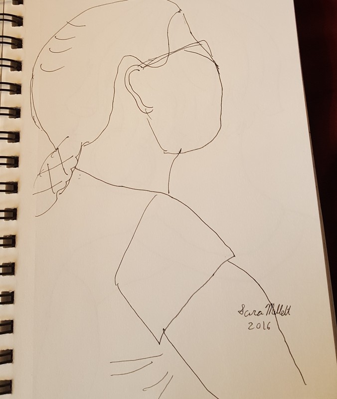
At some point, I decided I wanted to get a bit of practice capturing movement in art. I sketched this woman, who I saw dancing at Del Mar Fair. 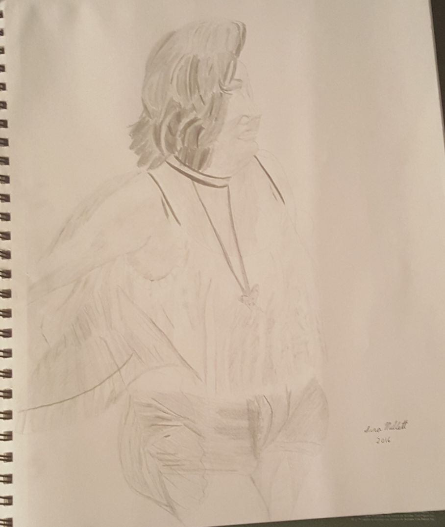 I also sketched a few animals walking and stalking, but I’m not including them here as they’re very light. I think depicting a moving as opposed to a still subject is an interesting challenge. Ironically, my project right after this was a drawing of my dog, the reference photo for which I snapped in a rare moment when she was standing still. That drawing is featured in this post. That’s all for now. I’ll talk to you again next week.
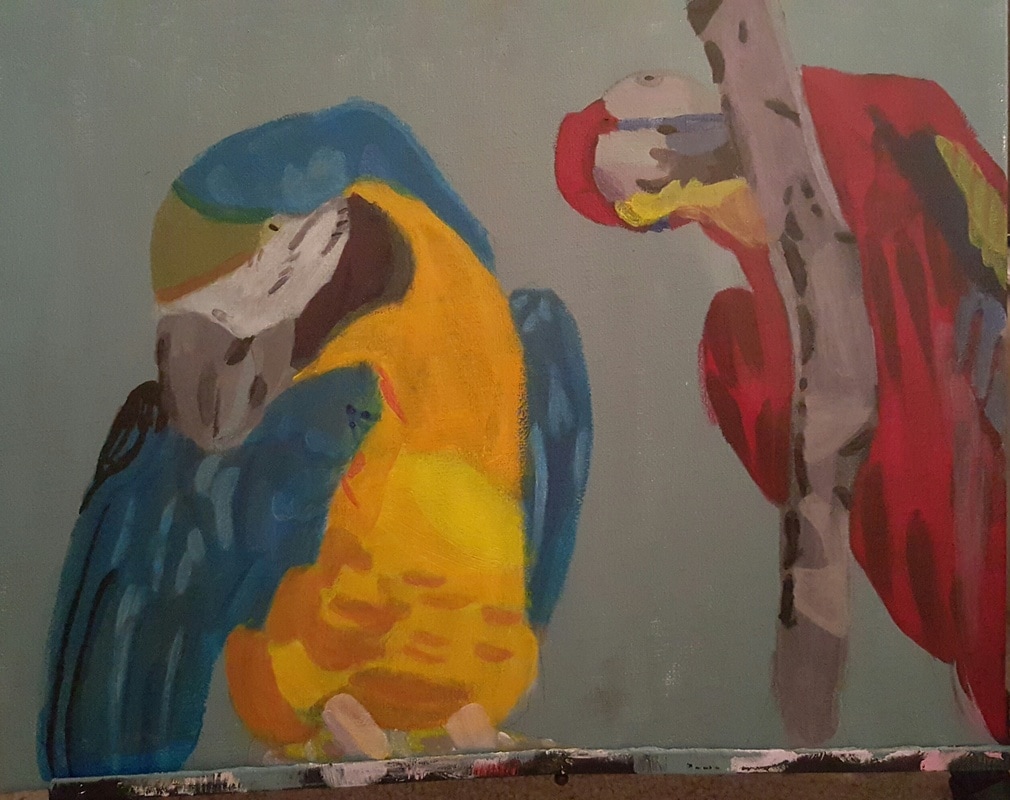
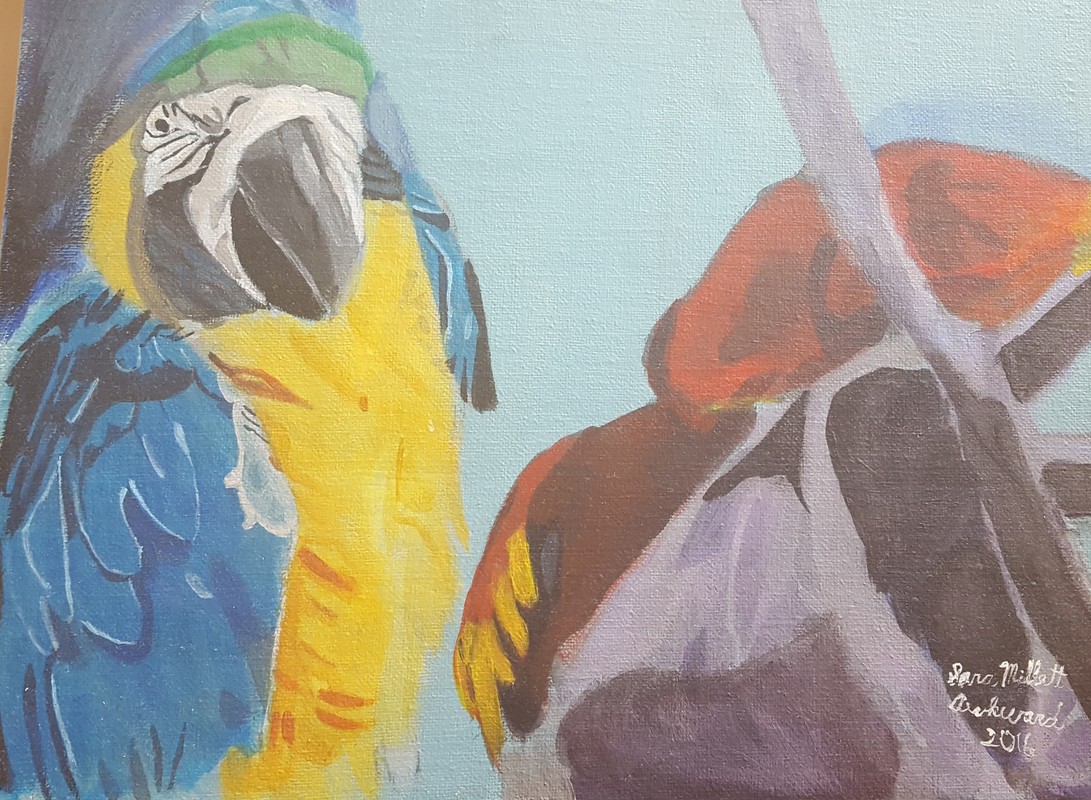
Hi Everyone, a little while back I made a video explaining that you don’t have to work from your imagination as an artist. Now I’m making a video about why you might want to anyway. There are three reasons I can think of and I’m going to go over them right now. Reason number one:To express your emotions. Now, I’m not just talking about abstract art, even though that’s probably what comes to most people’s minds when they hear about using art to express your emotions. The truth is when you paint without being able to see the colors and shapes of the actual thing you’re painting, it’s much easier, almost automatic, to let your emotions to come through in the piece. A prime example of a person who did this is Van Gogh. The Smart Art Box channel made a video on this. Anyway, when Van Gogh painted his famous “Starry, Starry Night”, he was locked in a mental hospital and so, since he wasn’t able to actually look at the night sky, he had to do the painting entirely from memory. As a result, his inner turmoil came through. If you have any emotions, particularly negative emotions , that need to come out and you don’t feel like you can express them in words, painting without reference can be a good vehicle. Reason number two:To stretch your creative muscle. I don’t think this reason really requires an explanation. Of course, if you’re working without reference, you’re forced to get more creative, since you don’t have anything to copy. And finally reason number three:To find out what you need to work on. I heard Happy D Artist talk about this in her video on drawing without reference. When you draw only from your mind, you really learn what you know and don’t know about how something looks. For example, if you draw faces from your imagination and all your mouths come out wonderful, but your noses come out kind of, meh, well you probably need to work more on noses, but you have a pretty good grasp of mouths. I personally don’t have much experience working from my imagination, but I’d like to start doing it every once in a while. That's it for now. I'll see you again next week. This post will focus mainly on these two parrots. 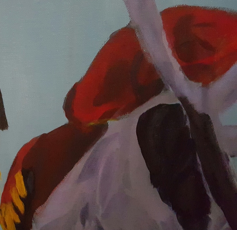 The process of painting these parrots was very similar to that of painting the second parrot in “Hey Over There” I used pretty much the same colors. I painted the whole thing with cadmium red, than went back over some parts with red, orange,and blue. 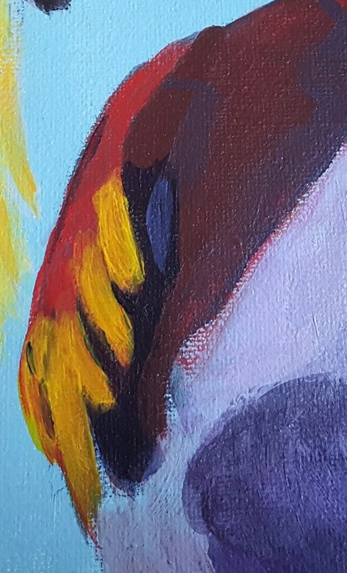 I think orange and yellow on the backside of one give it an almost glowy effect. 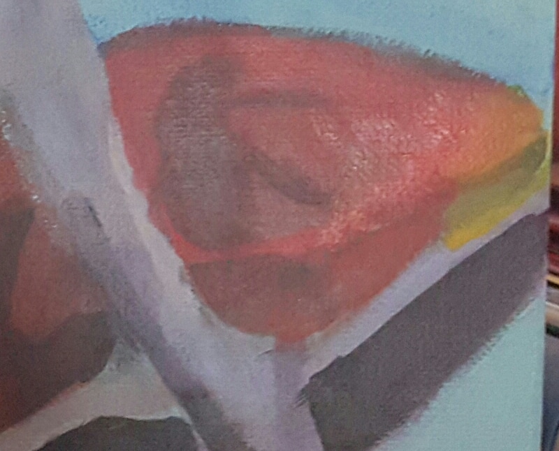 For the branch and rock, I used purples and blues. I thought it looked very bright and I wanted it to be more subtle, so I went over it with a grey made by mixing transparent mixing white with mars black, to tone it down. Transparent mixing white and mars black are both sheer colors, so they can be used as glazes, transparent washes of color, which let the colors beneath show through.  For very dark areas, I used straight mars black, thinned with just a bit of medium and some water. This would not work with colors like titanium white or ivory black, both of which would either cover up the purple completely or make it look cloudy.  Lastly, I went back to the first bird and painted a shadow around him to give the impression that more light was shining directly on him. I did this by first laying down ultramarine blue. Then I layered grey made with my mixture of transparent mixing white and mars black over that. By the way, another white that can be used in this way, depending on what brand you use, is zinc white. 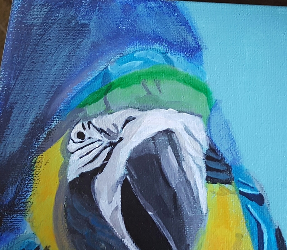 Hi there, Okay, for those of you who think I’m condoning copyright infringement, please see this video. All I’m saying is, as an artist, you don’t have to work from your imagination. Apparently so many artists, I don’t if they’re new or not, think if you used any reference, somehow it’s cheating and that just isn’t the case. Every piece of art you see here was done by looking at something and I’m not ashamed to admit that. There’s nothing wrong with working from a photo you took yourself, or one from a royalty free site, or working from a live model or nature. The great artists of the past did not work from their imaginations. They painted what was in front of them, whether it was a person or a landscape. Even impressionists set up their easels outside and painted the landscape that lay out before them. If you’re going for a realistic look, especially if you don’t know your subject very well, feeling free to use reference is especially important, of course. Now if you honestly like working from your imagination, there’s nothing wrong with that and I might even make a video about why I think working from your imagination can be good sometimes. I’m just saying, I don’t anyone to feel that they have to work only from their imagination or they’re not a real artist or something ridiculous like that. That's all for now. I'll talk to you again next time. This post will focus on this parrot. 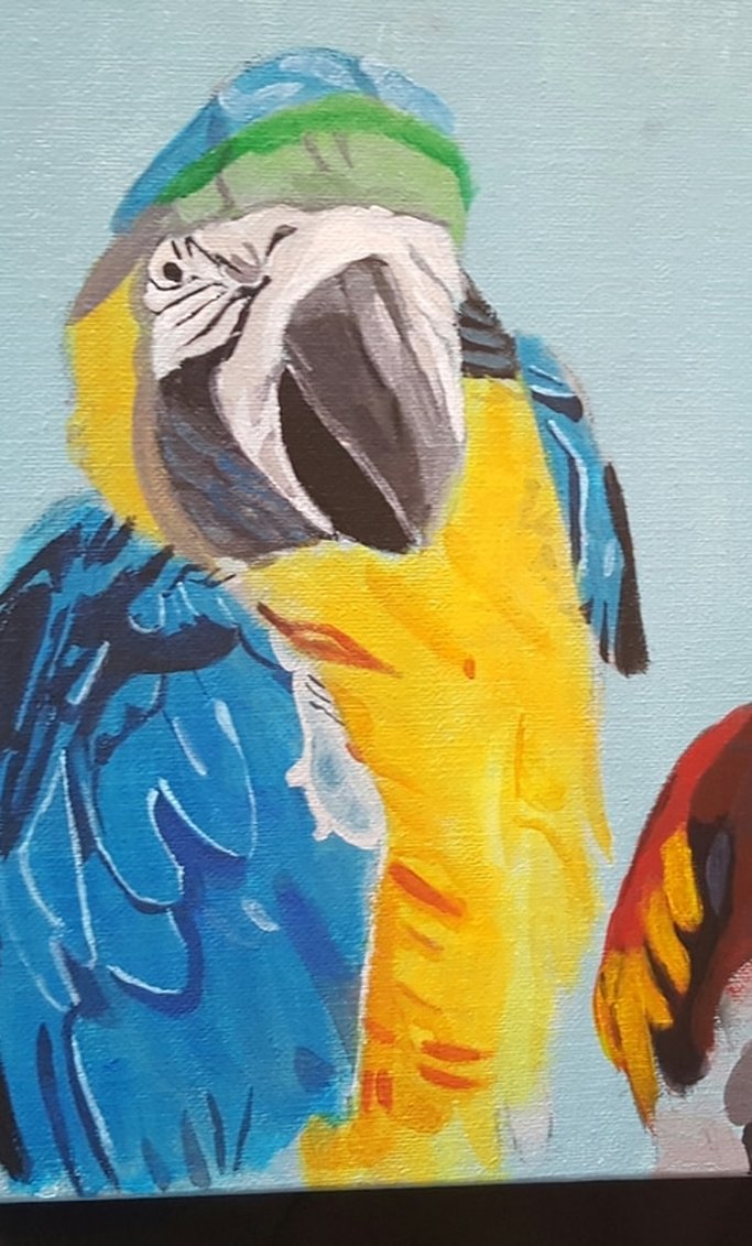 Much of the process of painting this parrot is similar to that of painting the same bird in "Hey Over There" so refer to the post about that bird, linked here. 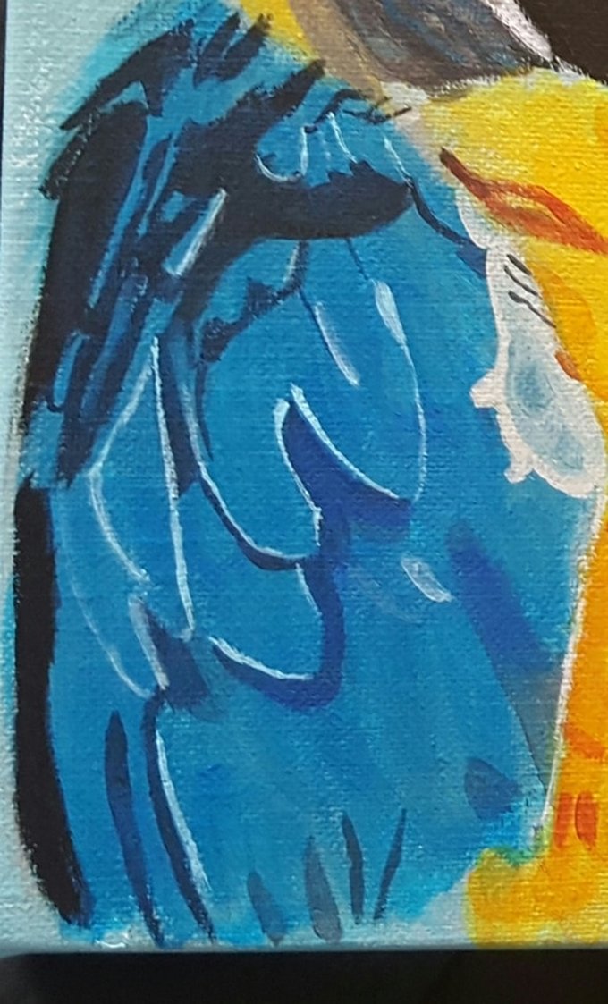 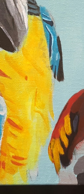 Some differences though, are in the colors I used. I used hansa yellow light, which is a transparent yellow, on the bird's chest, instead of cadmium yellow, which is an opaque yellow. I've been interested in the technique of glazing for a while, so it's nice to learn about transparent colors vs opaque colors. Other aspects of painting this parrot's chest are similar to the process I used to paint the same bird in my last painting. I had a bit of trouble figuring out how to paint the parrot's head. I decided on a wash of pale green with viridian green washed over the top as well as glazes of grey. In the interest of glazing, I got reacquainted with my Mars black, while making this painting. 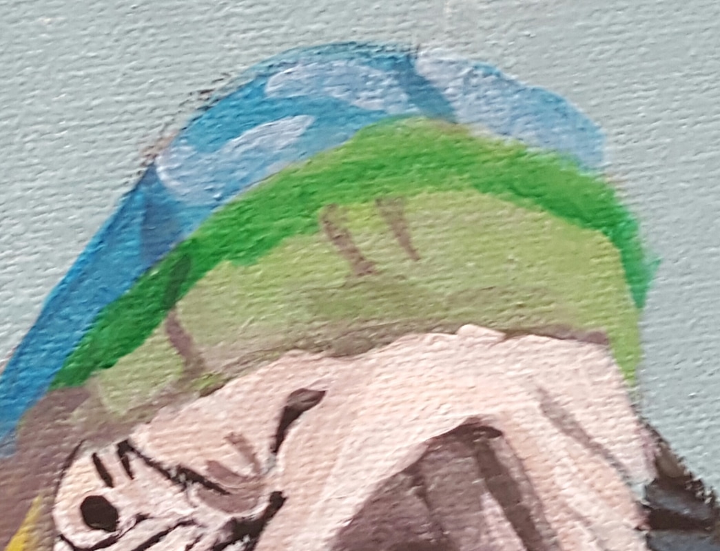 I noticed streaks of grayed blue in the black around the sides of the bird's beak 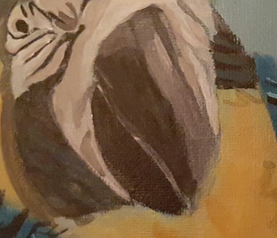 That's all for now. I'll have part two for you next week.
|