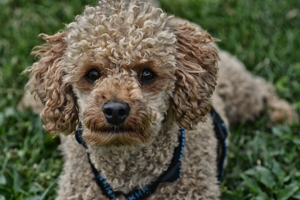
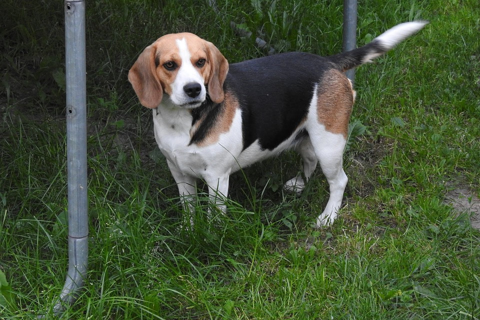
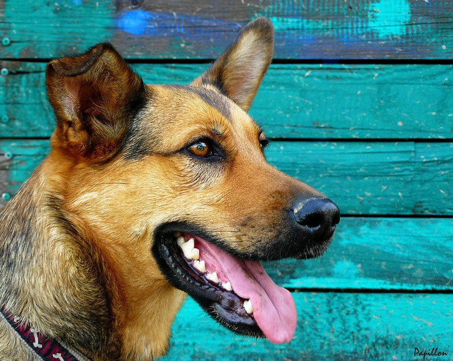
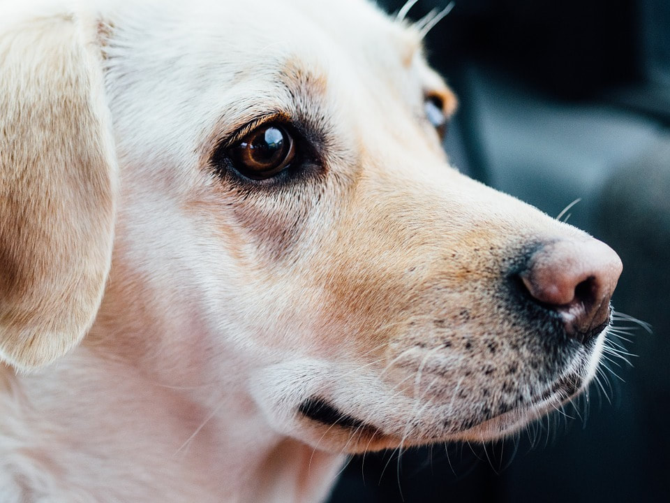
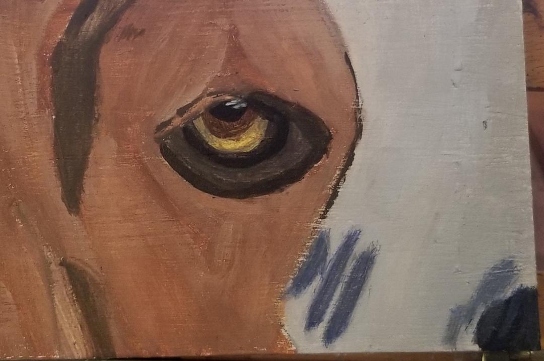
 I'm going to be doing a series of articles on how to paint the eyes of specific dog breeds. I'm going to be the German shepherd, the poodle, the beagle, and the labrador retriever. For this first post, I'm starting with the beagle. I'm starting with the beagle's eye. 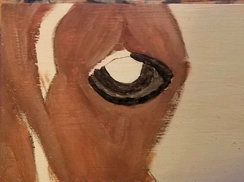 I started with a sketch in charcoal. So far, I've mixed burnt umber with transparent middle red and titanium white for the brown part of his fur. I painted the lines around his eyes in sections. My tendency is to stop and start when painting a line, but making one continuous motion will go miles in this case towards creating realism. The lines around his eyes are a dark grayish brown. I'll have to tint more brown when I go back to this. 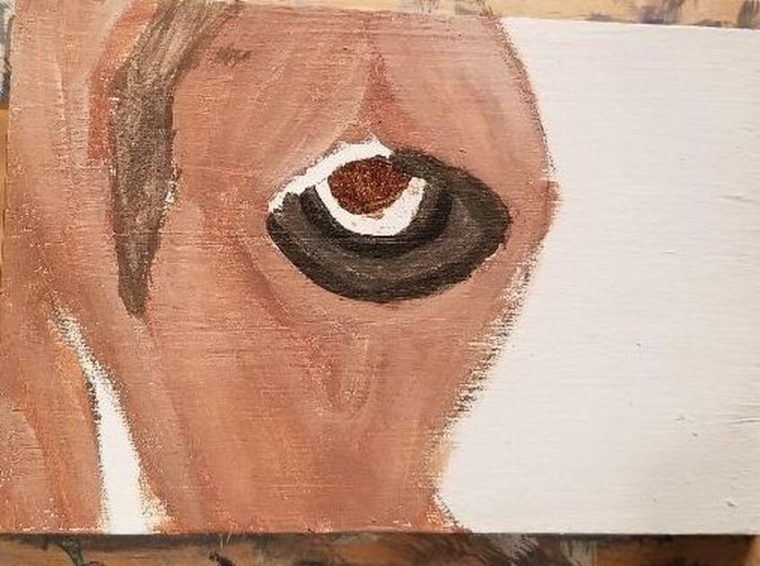 This is the next day and I've remixed my color for around the eyes so there's more brown, like I said. The rim right next to his eyeball still wasn't dark enough, though, so I took my liner brush and added a ring of black to it. For his iris, I just mixed burnt umber with a bit of oxide black. 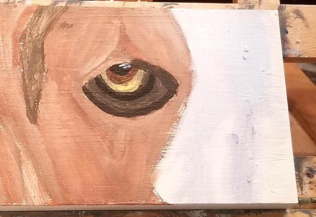 I conquered the challenge of figuring out what to paint his sclera. I chose to simply mix a bit of brown with yellow. LAter, I went over that with some gray made by mixing zinc white and ivory black, leaving a small window of the brownish yellow showing. I also gave him a pupil and started to fill in the missing colors in his fur. His pupil has some highlights, which so far I've done in light blue. 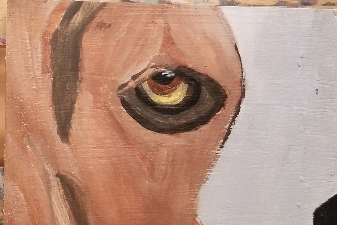 Here I've added that extra bit of black along the dog's eyeball that was needed. I've also filled in his snout a light blue, rather than leaving it white, and painted his nose. I'll probably continue to adjust the shadows on the nose, but right now, the eye is pretty much finished.
0 Comments
I'm going to confess, I'm currently in a creative dry spell, at least by my standards. In times past, I've been so overwhelmed with ideas that I feel like I can't possibly get to all of them and lately, I feel like I have my current project to work on and after that, I'm a blank. The thing is, it seems no matter what my mind is doing, whether it's in hyper creative mode or slow mode, I'm not happy. If it's coming up ideas left and right, I'm like, "Brain, I barely had time to start on that other idea. Can we slow down a bit." If it's slow coming with the creativity, I'm like, "Brain, can we step it up? Where are all the ideas you're supposed to be giving me? I need to know what I'm going to do after I finish this project". It just occurred to me today, in fact, to shift my mindset to that of, whatever my mind is doing as far as creativity, it's okay. Let's talk about the first scenario, where your creativity is chugging along like a choo choo train. You worry about not being able to bring all these ideas to life. So what? If you're a creative person, your mind will come up with more ideas than you make manifest in a lifetime. Literally. The greatest creatives went to their graves with some creativity still in them and that's a good thing. It means their creative well didn't dry out. Just work on the ideas that excite you the most now and don't worry about the rest. Now scenario two, where you have only one or two creative ideas at a time. Well, as long as you have something you're still winning the creativity game. Why not enjoy the peacefulness of a mind that's not racing? Even if you have zero ideas, a condition known as artist block, which is writer's block for artists, if being an artist is your identity, this is not an excuse not to create. I'll let Lisa Clough explain. "Not every single piece that we create needs to be our best, biggest, greatest piece ever. We just need to constantly create"~Lisa Clough to artists If there was nothing I was excited to paint or draw, I would do quick studies or sketches(which can be in any medium you like, not just pencil) that I could finish in a day or two, until I found something I was excited about. You could even get some canvas boards or "student" grade paper for this if you don't want to "waste" your good canvas or paper. Also, remember that inspiration has to find us working. That's a paraphrase of a quote from Picasso, which is the topic of this video I did. 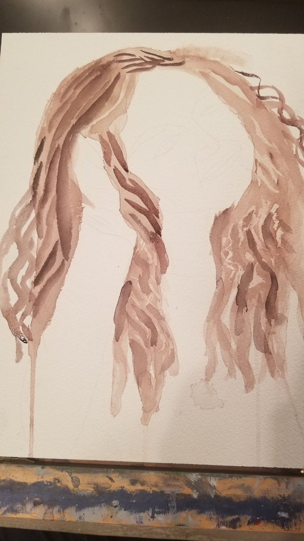 I've started with a wash of what's going to be the lightest shade all over the hair. With watercolor, you always want to work from light to dark because your lightest layers are your most watery layers and if you put a layer with a lot on top of a layer with very little water, the layer underneath can lift. 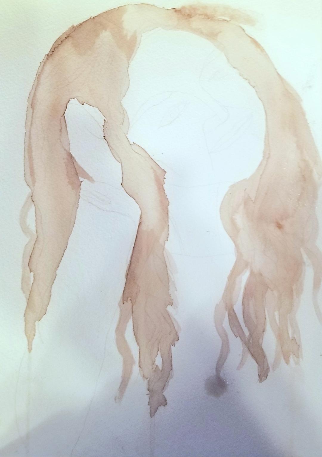 Before I painted the second and third layers, I took a needle and, using the thimble end of it, I put masking fluid where I wanted highlights to be. That's how I got that pattern that you see. I was almost painting with the masking fluid. I find a needle to be very convenient for when I want to keep my masking fluid areas very small. Even the smallest brushes can be too big a lot of the time. It's also important to have a lot of masking fluid on the needle. That was the only way I was going to be able to make the strokes that I did. 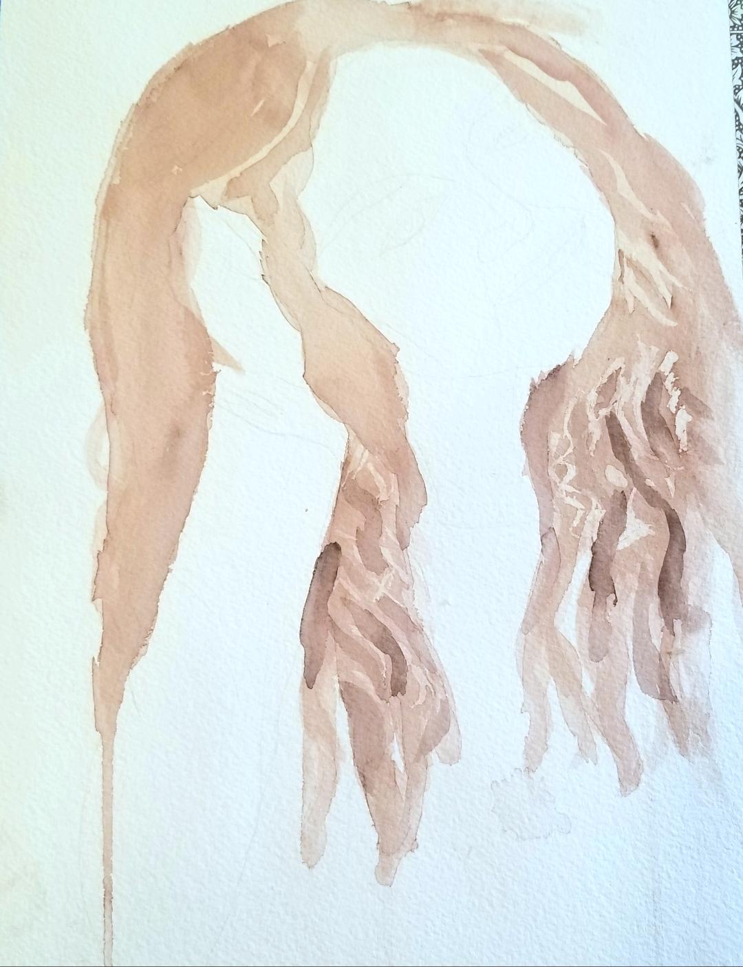 Here's what it looks like when I add more of the darkest colored strands. I was careful to follow the direction and copy the appropriate shapes I saw in my reference photo. Making curly hair is not about drawing lots or loops or spirals. In other words, it's not this. 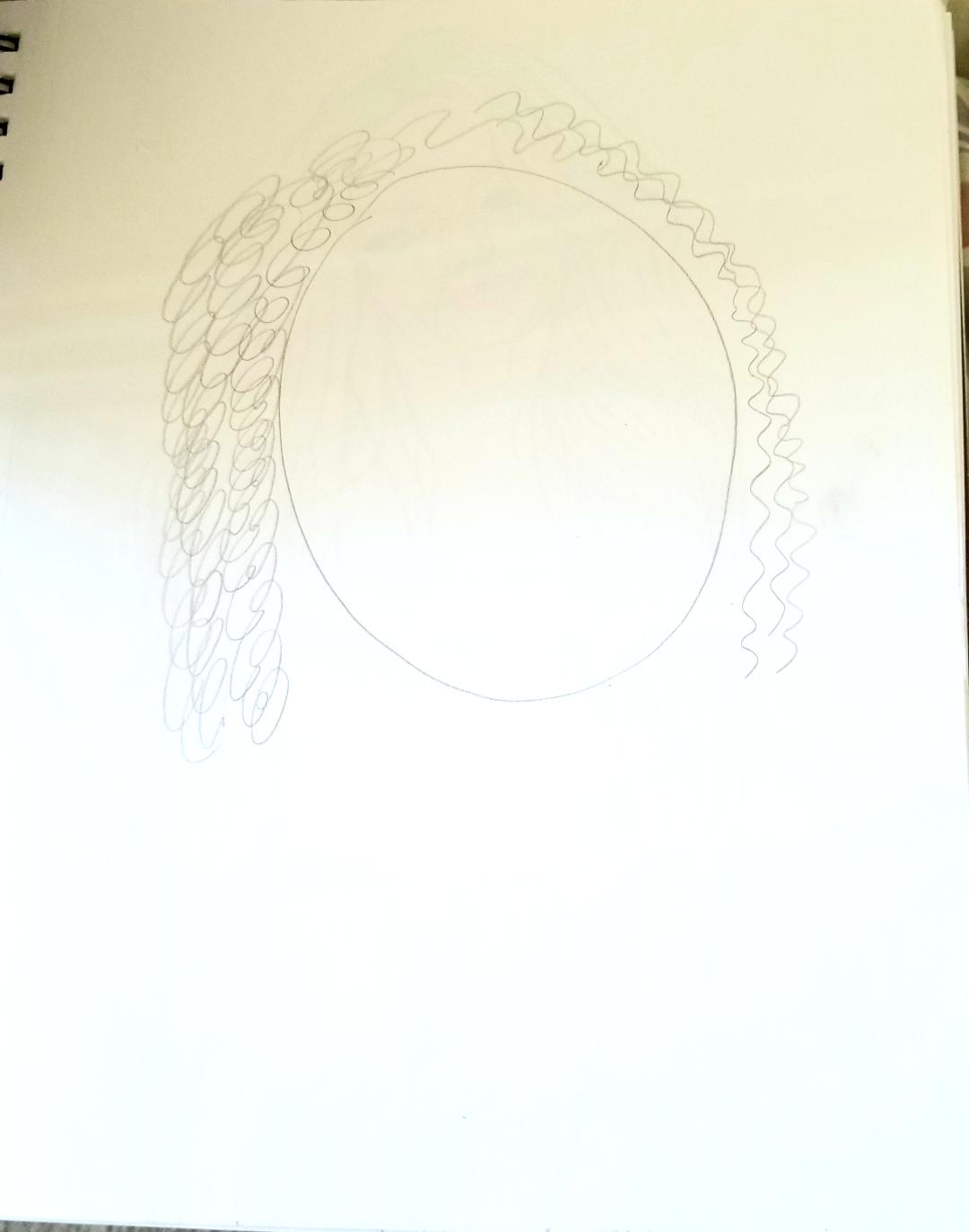 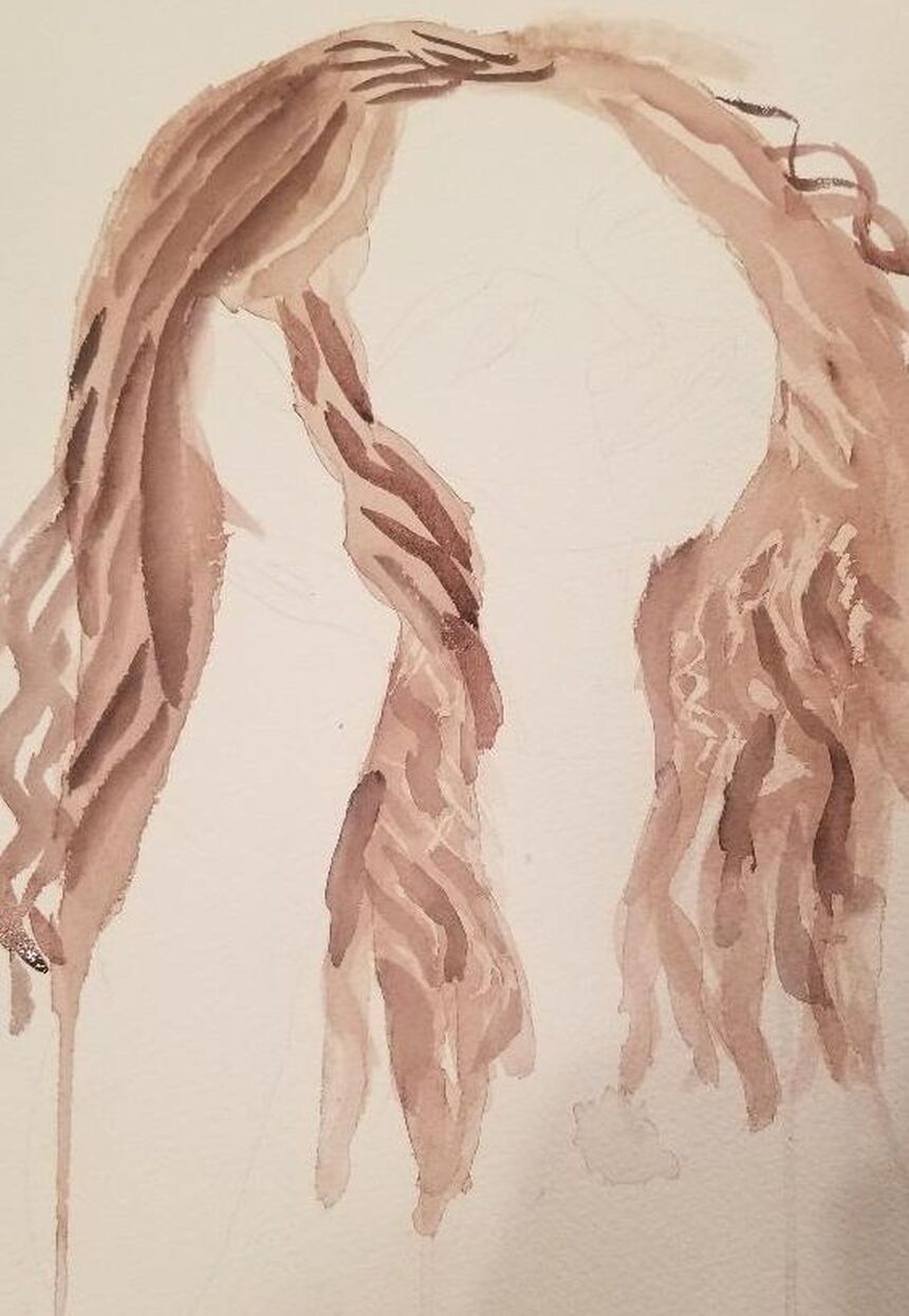 Also, because I wanted the hair to have some lift, I made sure my marks near the top of her head were slightly curved. I also needed to make sure the paint underneath was dry before I added more layers on top. This was so that I could get hard edges and therefore make each stroke look like an individual hair piece. If I'd painted wet on wet, the each stroke would've looked like different shade of the same mass. That would be fine if I was painting straight or maybe even wavy hair, but curly hair is usually more textured than that. You can hear even more details in this video I'm posting.
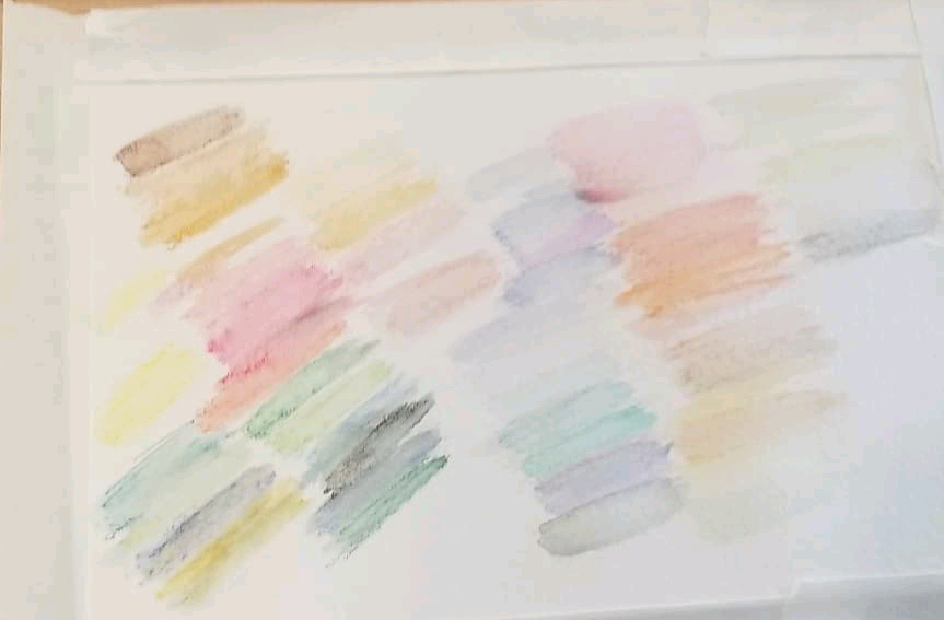
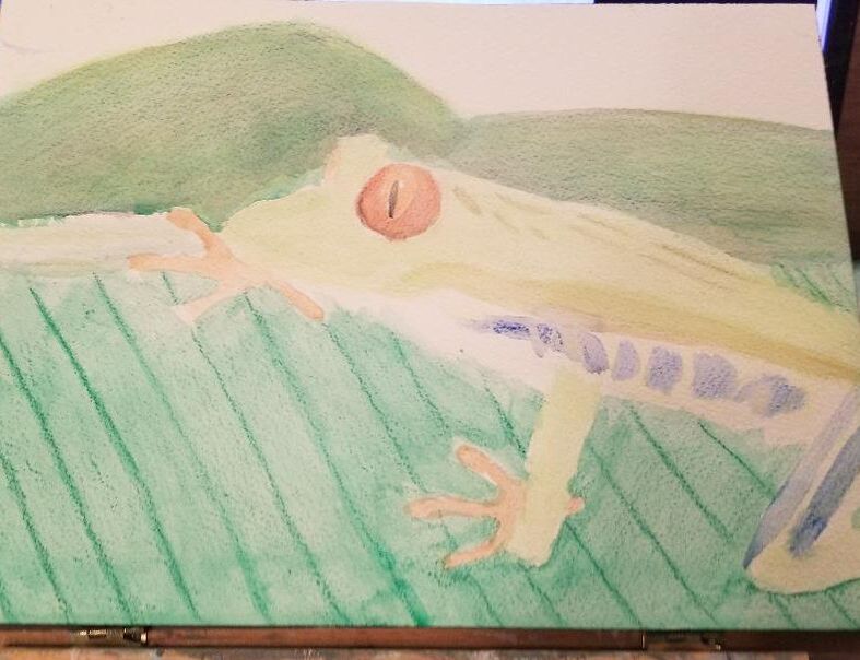
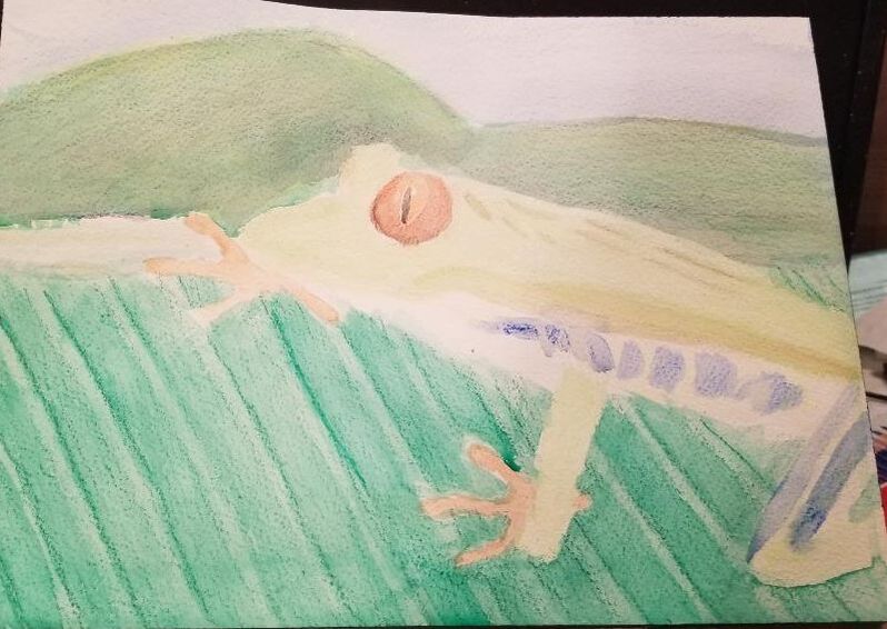
These are swatches I made of my General's Kimberly Watercolor Pencils and my watercolor pencils from Caran 'Dache . The first pic shows the swatches dry and the second one shows them with water added. I was expecting to like the Caran d'ache pencils way more than the Kimberly ones, but aside from the colors of Caran d'ache being more vibrant, there's not a lot of difference that I could see in quality. By that I mean, I think the Kimberly watercolor pencils are still great to work with. That's just what I learned from swatching, though. To get a real idea of how well both sets of pencils worked, I needed to do two full projects with them, so I decided to paint this frog from Pixabay in twice, using the General's Pencils for one and the Caran 'Dache pencils for the other. 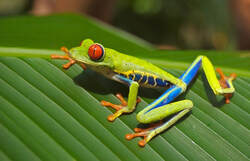 Below is day one of the General's version. 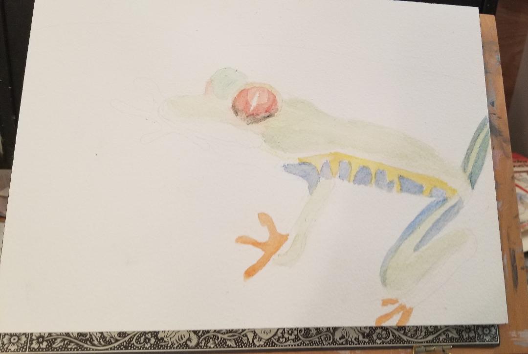 Maybe i just didn't use enough water or enough pencil, but I found it kind of difficult to build the green up to the intensity that I wanted it. What you see there is probably about three or four layers and I'm still not quite happy with it. As I'm writing this, I'm considering painting some red on the sides for shadows. In layering yellow with purple for the flesh around his eyeball and red with orange for his feet, I found that these pencils make it easy to blend and mix colors. 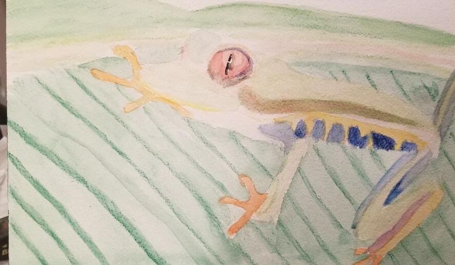 For the ridges in the leaf, I used the tip of my light green pencil and blended with my smallest watercolor filbert brush in a vertical motion. I moved my brush slowly in a continuous motion down the pencil line. I added a red shadow to the side of the frog's body. The idea behind this is that since red and green are compliments, the presence of the red should make the green of the frog's body look brighter. I'm not sure how well that worked out, though. Then again, maybe I just need more layers on the frog. I combined my light green and my regular green pencils for the mountains, since it looked like no single pencil was going to cut it. That's pretty much it for the General's version of this painting. Now for the Caran 'Dache pencils. 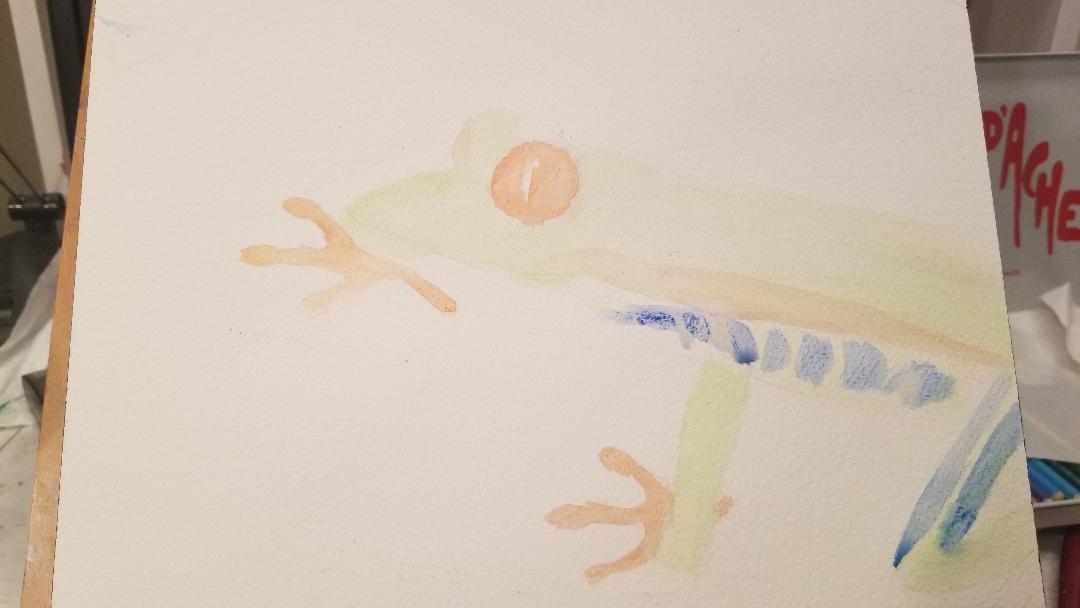 I quickly found that the Caran 'Dache pencils blended out way more easily than the General's. My blending frustration might also be due to the paper that I'm using, though. I'm working on rough paper, so the pencil has a lot of nooks and crannies to get caught in. Cold press or even hot press be a better choice for working in watercolor in pencil form. 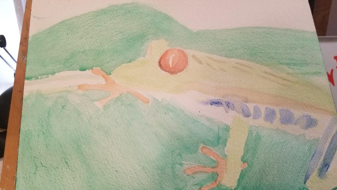 When it came to his left eye, I decided I would paint a ring of red around it, leaving some of the orange showing in the middle. Then I took a what looked to me like a bluish green pencil and draw a thin shadow, right along the outer edge. When I blended this all out with water, I was pleasantly surprised by how well the shadow blended into the rest of the eye. I took advantage of the extra colors in this set to paint some dark spots on the frog's back. I started filling in the mountains in the background with a dark green pencil. Then I decided it needed to be more yellow, so, I layered a yellow pencil with it.
I was thinking the mountains and the leaf looked too similar in color, so I set to work adding more yellow to the mountains. I also used purple, just so the yellow wouldn't be too bright. It took several layers of yellow and purple to get the mountains where they are now and I pressed pretty hard with the yellow. The harder you press with a watercolor pencil, the more of that pigment you'll get. So if you want, for example, a yellowish green, press really hard with your yellow and press lightly with your blue. That's how I painted the ridges flanking the strip on the edge of the leaf. In the second photo, I've started to color in the sky and I've also shaded the ridges in the leaf a darker shade, leaving a strip of the original shade showing on the edge for a highlight. |