|
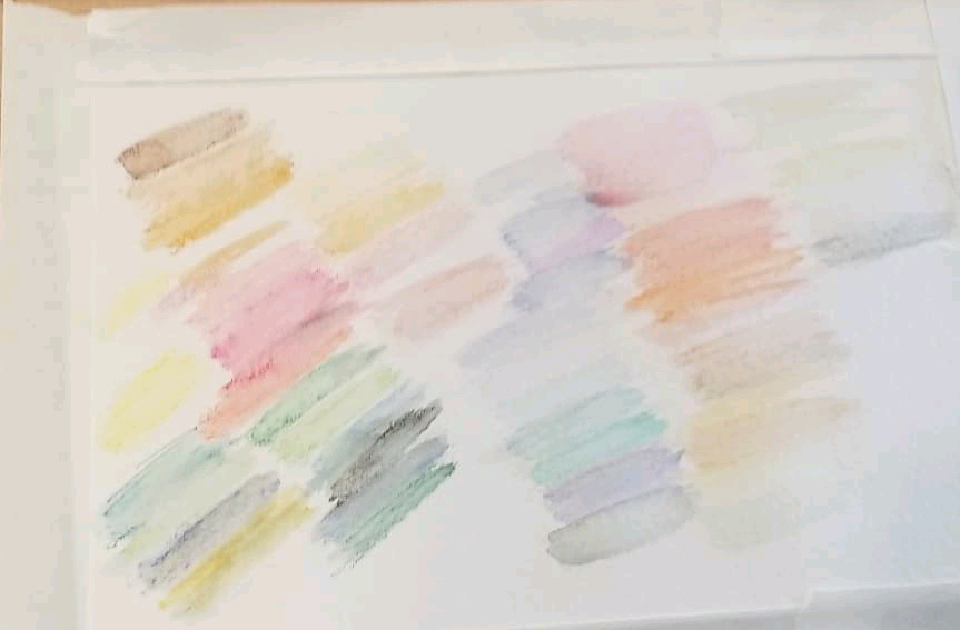
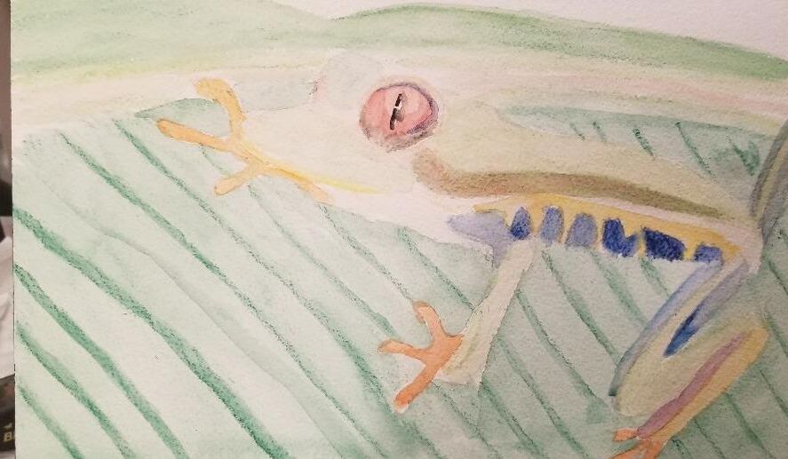
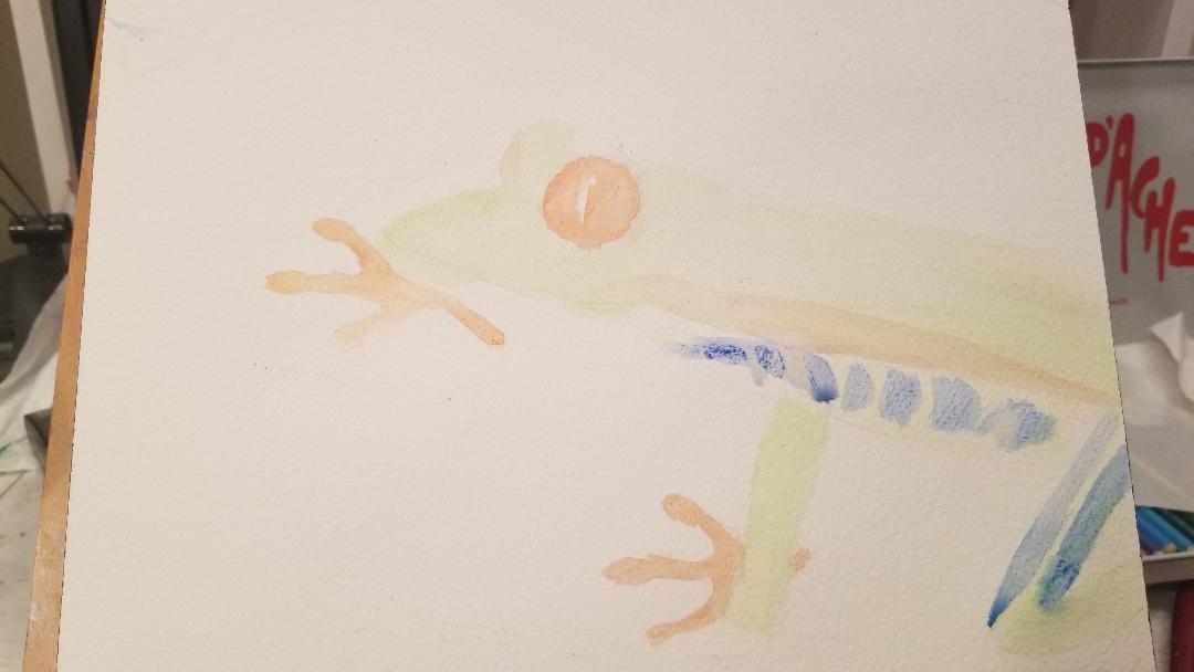
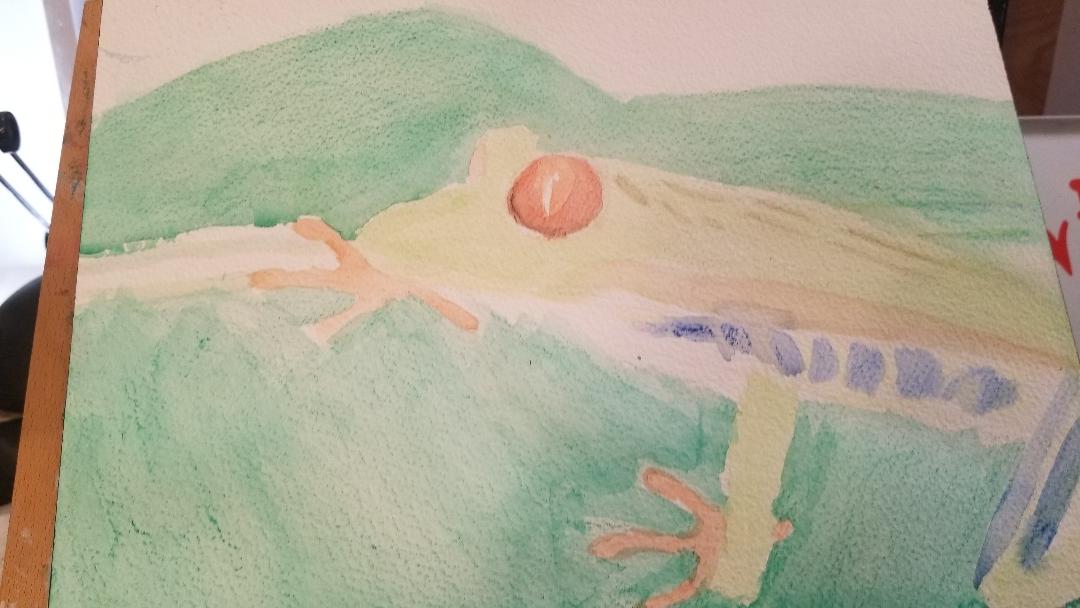
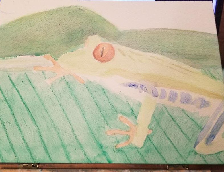
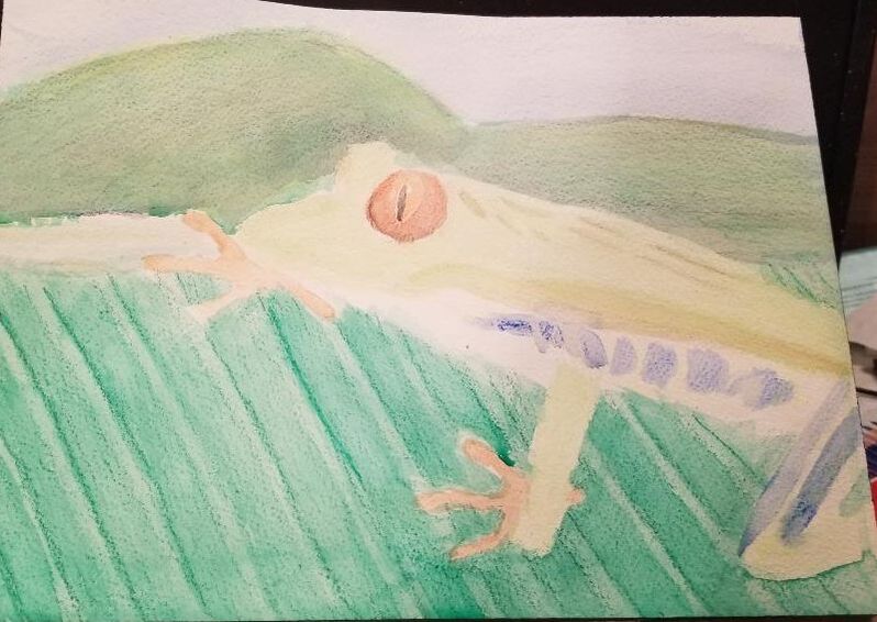
These are swatches I made of my General's Kimberly Watercolor Pencils and my watercolor pencils from Caran 'Dache . The first pic shows the swatches dry and the second one shows them with water added. I was expecting to like the Caran d'ache pencils way more than the Kimberly ones, but aside from the colors of Caran d'ache being more vibrant, there's not a lot of difference that I could see in quality. By that I mean, I think the Kimberly watercolor pencils are still great to work with. That's just what I learned from swatching, though. To get a real idea of how well both sets of pencils worked, I needed to do two full projects with them, so I decided to paint this frog from Pixabay in twice, using the General's Pencils for one and the Caran 'Dache pencils for the other. 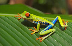 Below is day one of the General's version. 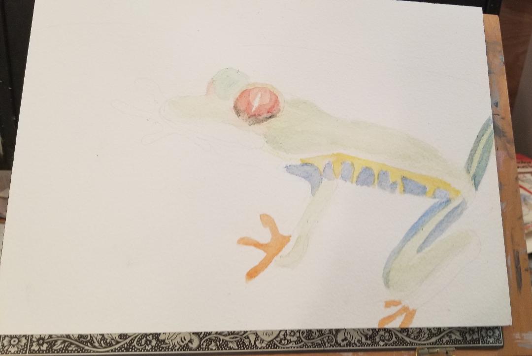 Maybe i just didn't use enough water or enough pencil, but I found it kind of difficult to build the green up to the intensity that I wanted it. What you see there is probably about three or four layers and I'm still not quite happy with it. As I'm writing this, I'm considering painting some red on the sides for shadows. In layering yellow with purple for the flesh around his eyeball and red with orange for his feet, I found that these pencils make it easy to blend and mix colors. For the ridges in the leaf, I used the tip of my light green pencil and blended with my smallest watercolor filbert brush in a vertical motion. I moved my brush slowly in a continuous motion down the pencil line. I added a red shadow to the side of the frog's body. The idea behind this is that since red and green are compliments, the presence of the red should make the green of the frog's body look brighter. I'm not sure how well that worked out, though. Then again, maybe I just need more layers on the frog. I combined my light green and my regular green pencils for the mountains, since it looked like no single pencil was going to cut it. That's pretty much it for the General's version of this painting. Now for the Caran 'Dache pencils. I quickly found that the Caran 'Dache pencils blended out way more easily than the General's. My blending frustration might also be due to the paper that I'm using, though. I'm working on rough paper, so the pencil has a lot of nooks and crannies to get caught in. Cold press or even hot press be a better choice for working in watercolor in pencil form. When it came to his left eye, I decided I would paint a ring of red around it, leaving some of the orange showing in the middle. Then I took a what looked to me like a bluish green pencil and draw a thin shadow, right along the outer edge. When I blended this all out with water, I was pleasantly surprised by how well the shadow blended into the rest of the eye. I took advantage of the extra colors in this set to paint some dark spots on the frog's back. I started filling in the mountains in the background with a dark green pencil. Then I decided it needed to be more yellow, so, I layered a yellow pencil with it. I was thinking the mountains and the leaf looked too similar in color, so I set to work adding more yellow to the mountains. I also used purple, just so the yellow wouldn't be too bright. It took several layers of yellow and purple to get the mountains where they are now and I pressed pretty hard with the yellow. The harder you press with a watercolor pencil, the more of that pigment you'll get. So if you want, for example, a yellowish green, press really hard with your yellow and press lightly with your blue. That's how I painted the ridges flanking the strip on the edge of the leaf. In the second photo, I've started to color in the sky and I've also shaded the ridges in the leaf a darker shade, leaving a strip of the original shade showing on the edge for a highlight.
0 Comments
Your comment will be posted after it is approved.
Leave a Reply. |
Sara MillettPainter of portraits and wildlife Archives
November 2023
Categories
All
|
