|
I made a youtube video about the fear of messing up and how it can keep artists, me including, from getting started painting and I'll embed it below. But the truth is, getting started is just the hardest part sometimes. I heard someone compare it to going to the gym. You know you really don't want to go to the gym and it can be really hard to get yourself off the couch and go to the gym, but once your there your okay. You do your workout and it's not a problem. For me, it's the same thing with doing art. It can be really hard to get myself to go from watching videos or looking at pictures to painting, but once I start I'm okay. I'm better than okay in fact. So how do I get myself to start painting? Honestly, sometimes I just do. I tell myself, Sara, whether you want to or not, it's time to paint now. The other thing is, sometimes I don't even give myself time to think about it. As soon as I get the idea to paint, I start setting my stuff up, because if I let myself think about it, I would find a reason or excuse not to paint. So that's all I have to say on that topic. I'll see you again next week.
0 Comments
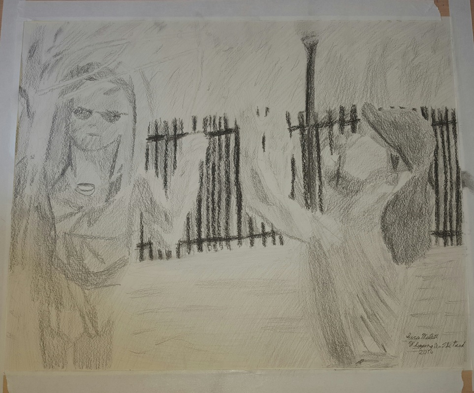
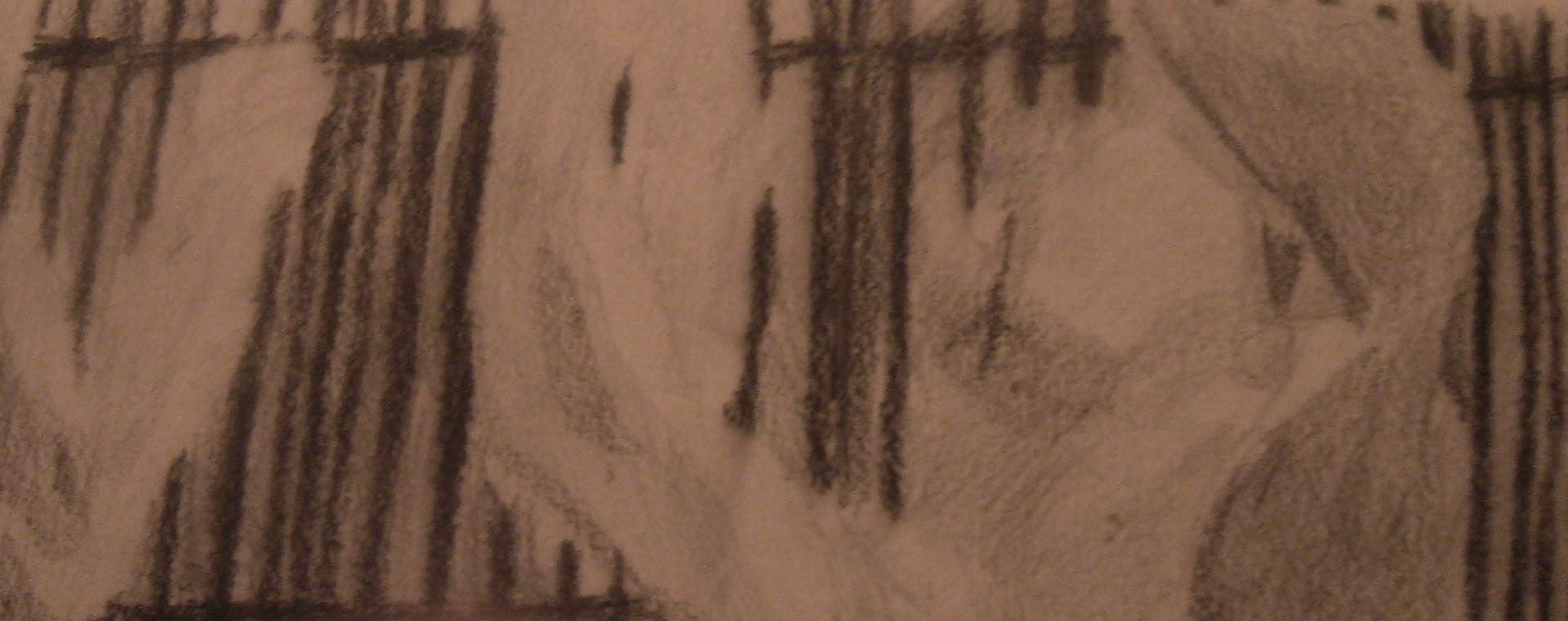
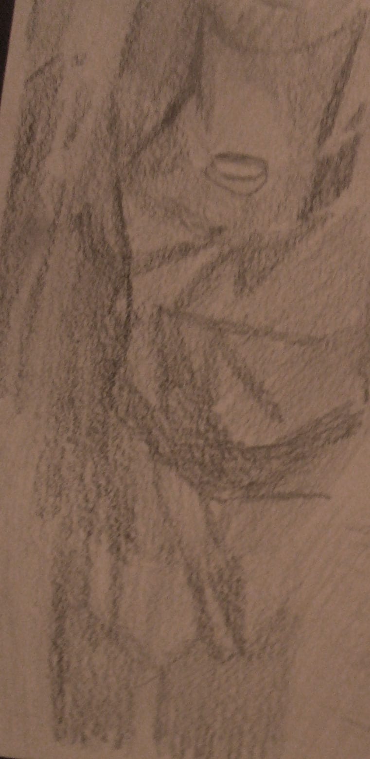
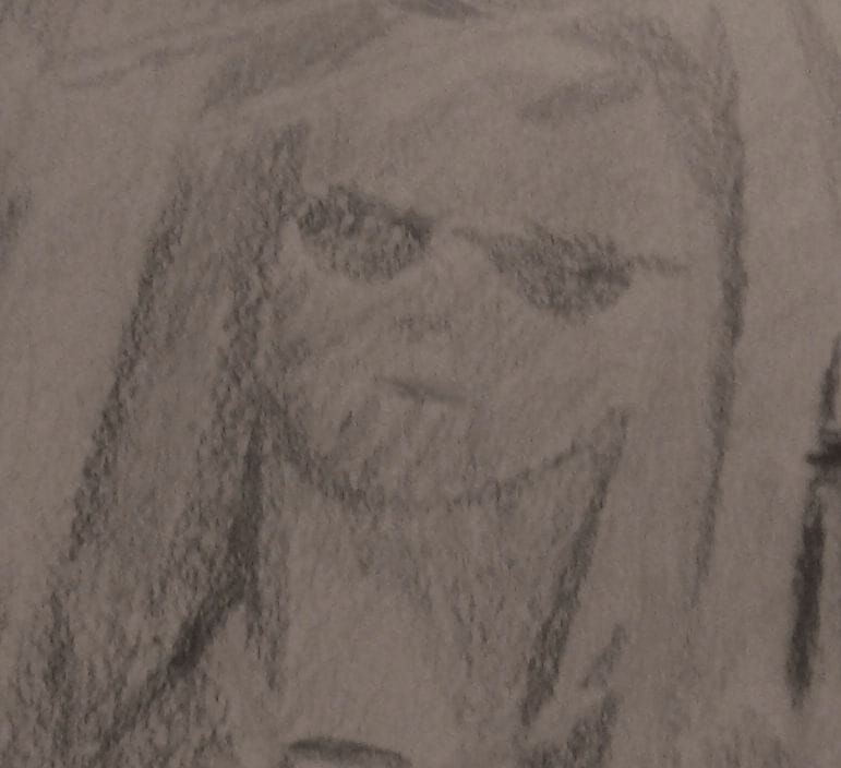
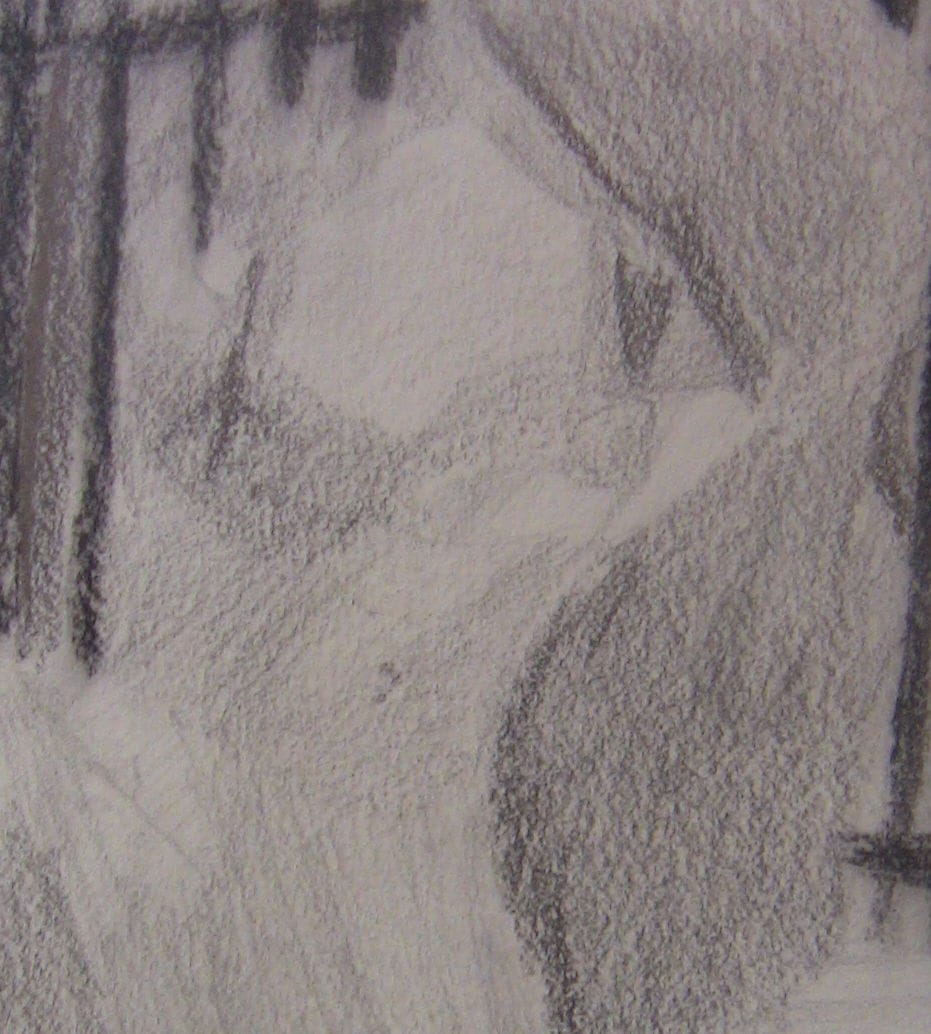
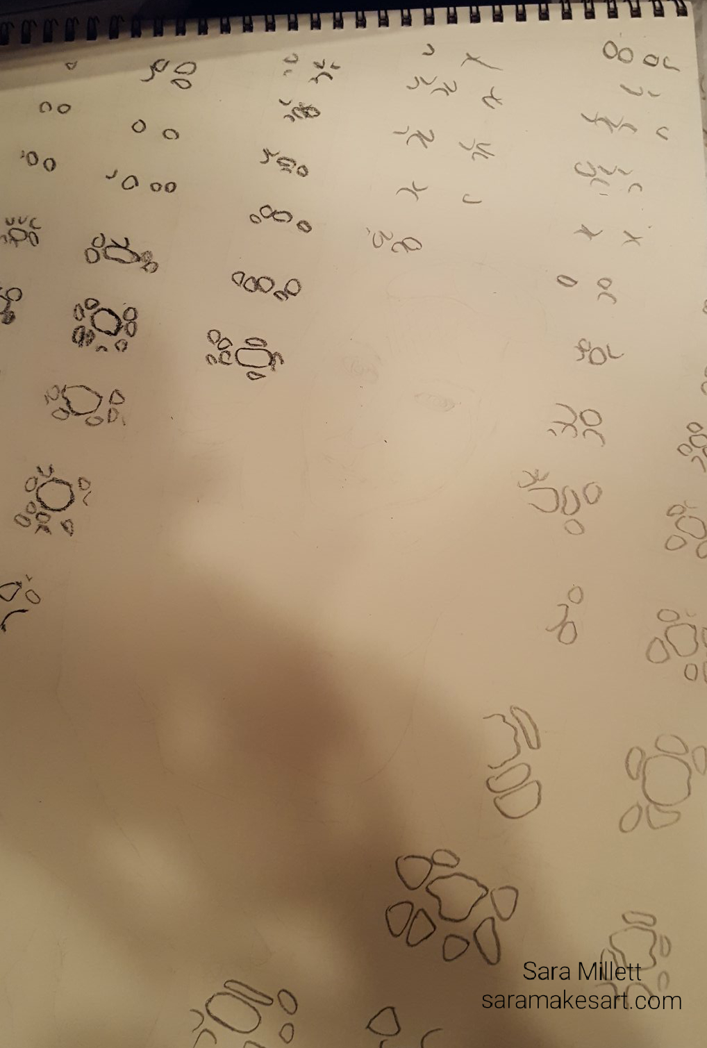
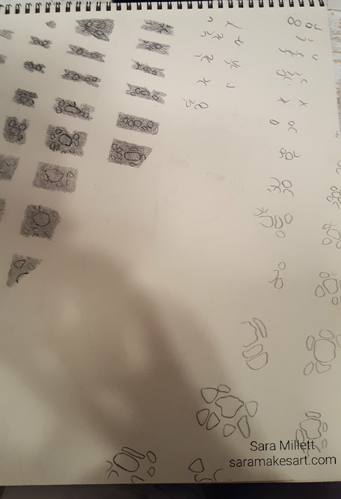
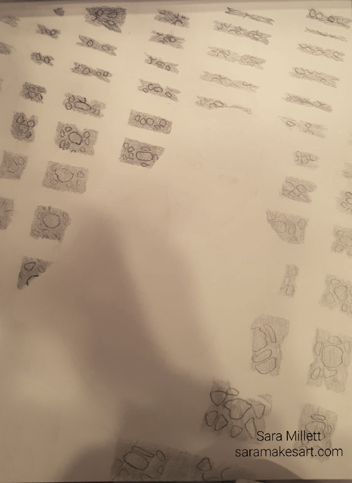
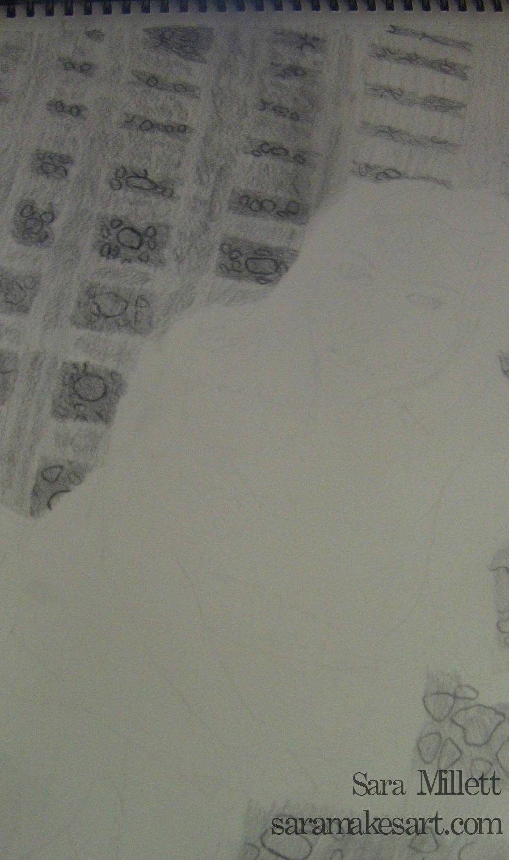
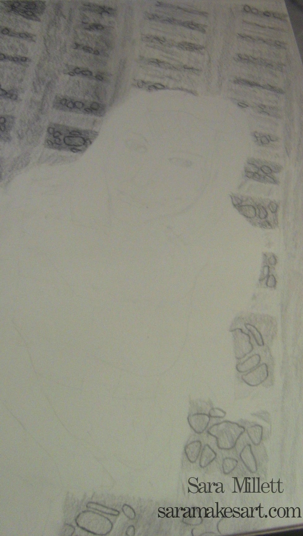
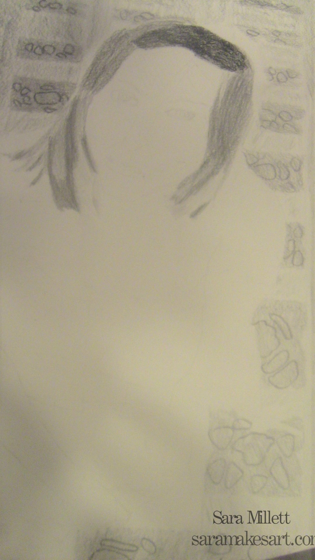
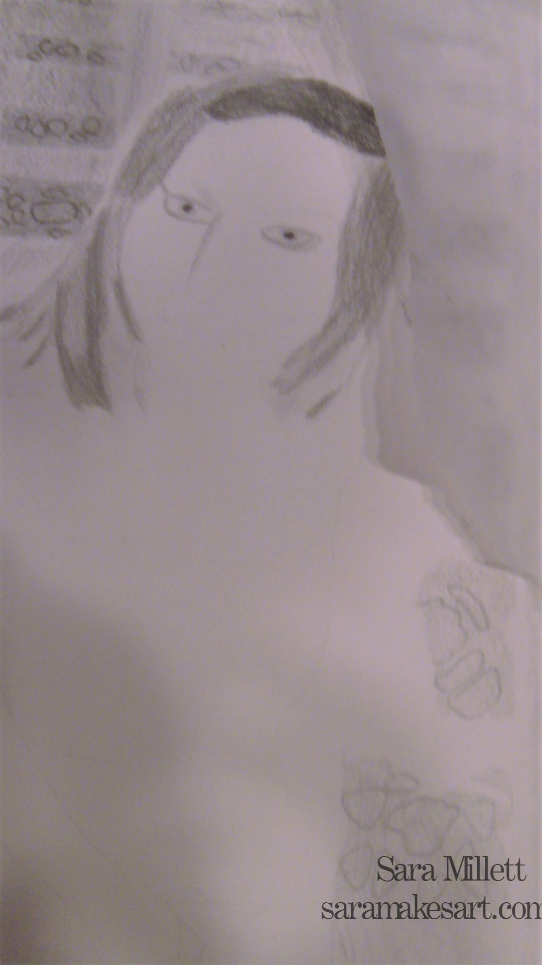
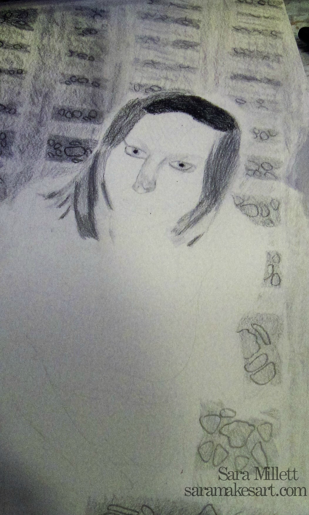
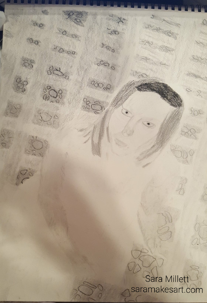
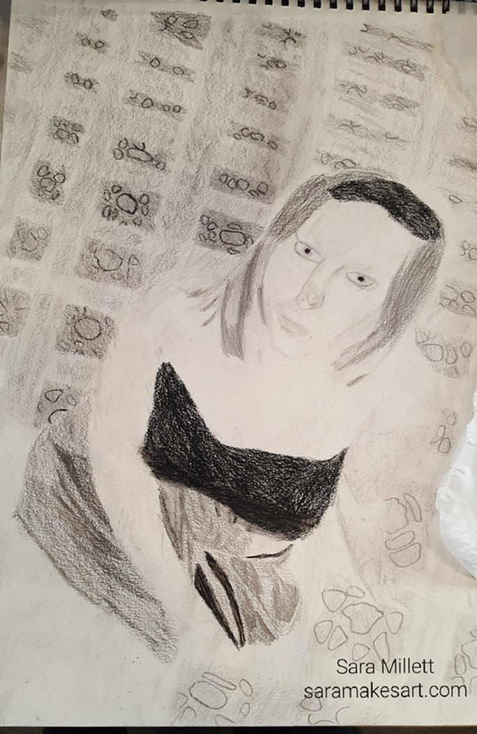
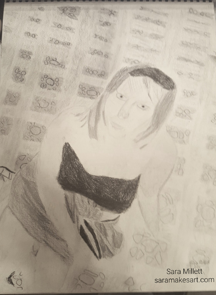
One day during my morning walk in the park, I saw two people doing exercises with whips and I took pictures of them with my phone. One of those became the drawing that’s going to be the subject of this post. I call it “Whipping In The Park”. It’s an 11×14 graphite on Strathmore 400 series paper. Like all my drawings, this one started as an outline made with a 6h pencil. All pencils I mention are graphite unless otherwise noted. I used a 6b carbon pencil to fill in the gate posts. I used a 4b carbon pencil, 9b graphite and 8b, for the lamp post. For the lamp itself, I used a combination of 2b and 4b. I used a combination of 4b and 6b for the woman’s sweatshirt. I was careful to follow the shapes of shadows I saw in my reference photo I used a 2b and 4b on the whips, carefully making thin lines of shadow down some while leaving the spaces in the middle white. I used a 5b to fill in the woman’s face and a 6b for a lips and the tip of her nose. I used a 5b and 3b in her hair. I used a 4b to fill in the man’s left arm and face. I used a 6b, 7b, and 8b for his beard, hat and hair. I used a 4b for most of the man’s arm, leaving a space white. I used a 5b for the muscle and a 2 b for the bicep. I filled in his shirt with a 2b and lightened it with a kneaded eraser. I went over the majority of that with a 3b pencil, making little folds by following my reference photo. I intensified the folds with a 5b pencil. I used a 4b to fill in the tree. I used 6b and 8b to make markings. I used a 5b to fill in the areas of the background between the gate posts I also used this color on the man’s pants and belt along with 8b.  For the ground I used a 3b pencil with a 5b to make little marks.  That’s all for now. I’ll talk to you again next week. It's time for a moment of truth. This is actually my second attempt at making this drawing.There were some aspects of the first drawing that I wasn't happy with and the only way I could improve it was to scrap the whole thing and start over. I'm doing this entire drawing with a set of Faber-Castell graphite pencils, only bringing in carbon pencils for the darkest parts. I sketched my initial outline using a 2h pencil. I spent a lot of time and had to do a lot of erasures just to get the background right. It finally worked when I made a set of slanted vertical lines that got farther apart going to the right-hand side and another set of horizontal slanted lines, unevenly spaced, with the spaces getting smaller going up. I then drew square shapes in every other area, making them get smaller as I went up the page. I drew the girl in over the background, erasing the it from the parts where she was. The first thing I did after the initial outline was all drawn, was use a 2b and a 4b to go over the pattern in the squares on the left hand side. Then I used a 7b and an 8b for the patterns on the right-hand side. The pattern always gets darker going up. I used a 7b and an 8b to fill in the backgrounds of the decorations on the left hand side of the floor. 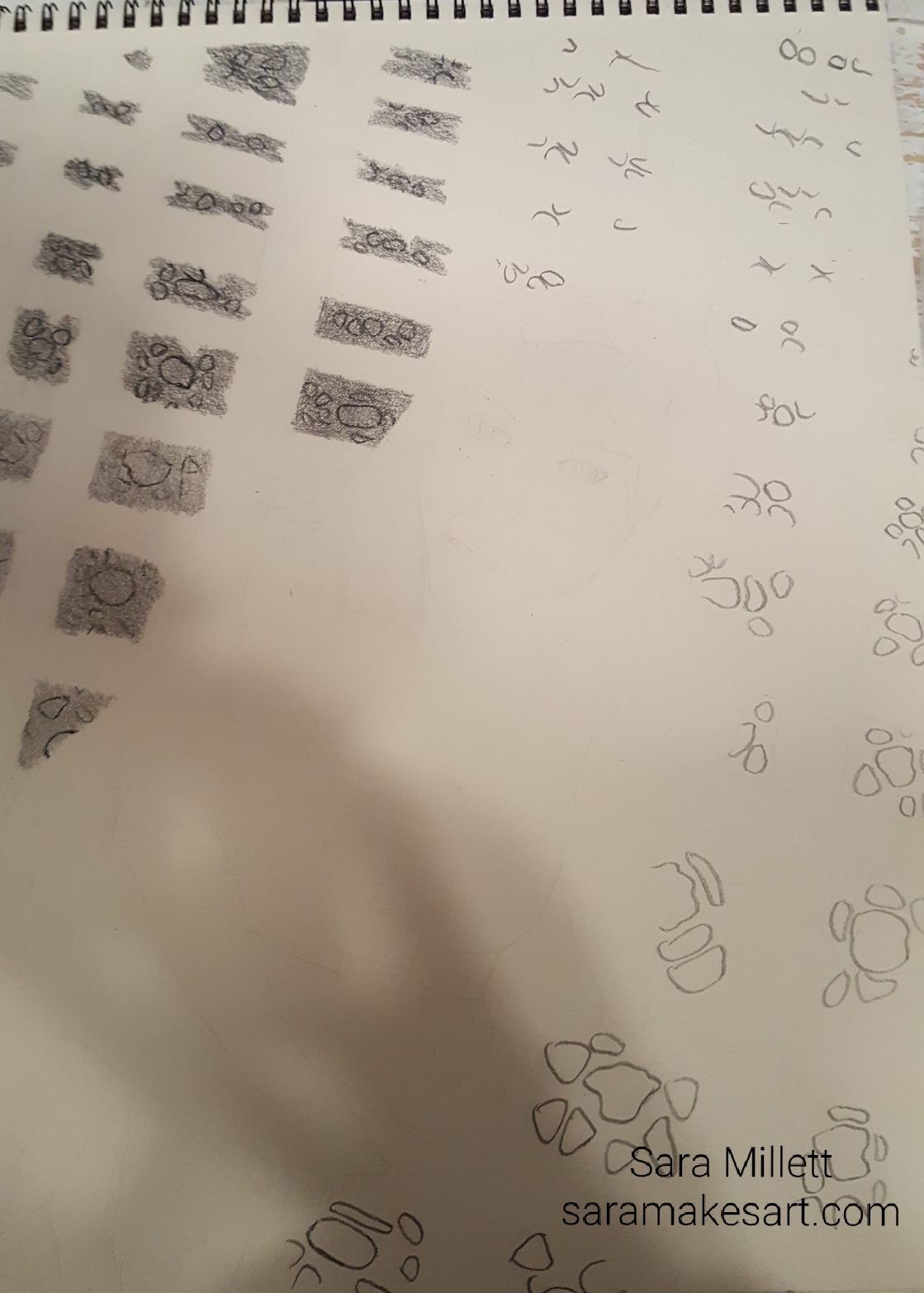 I used a 4b and a 5b for decorations on the right-hand side. I used a 4b and a 5b for the areas between the decorations on the left-hand side. 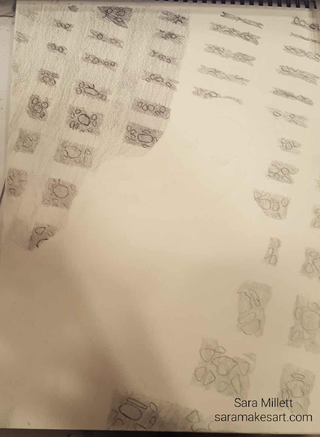 I used a 2b and a 4b for the areas between the decorations on the right-hand side. 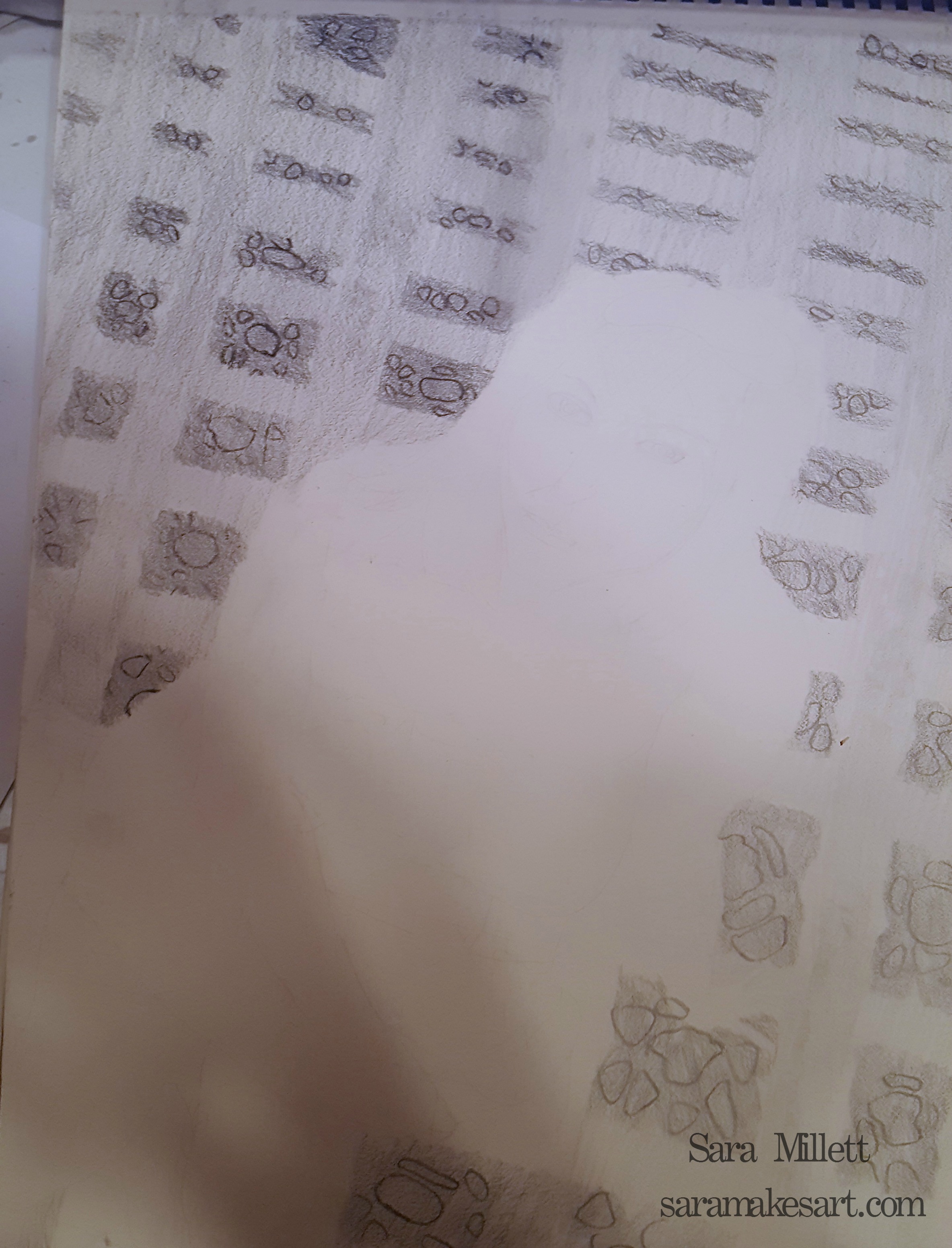 For the left-hand side of the carpet, I used a 5b and 6b to go over the areas between the decorations, being careful to let the color underneath show through. Again, the shades get darker going up. For the right-hand side I used the shades 3b and 4b for the same areas. I shading her hair using a combination of 2b, 4b, and 8b, being careful to follow the shapes I saw in my reference photo. I was not trying to draw in individual strands of hair, but rather to suggest the clumps that were there. After I was finished, I decided the 8b wasn't dark enough, so I went over it with a 2b carbon pencil and I went over the 4b with a 5b. I rimmed her eyes with 8b and used shades of 5b for around the lids and the iris, 2b, for the corneas and a 4b carbon pencil for her pupils. I used a 5b down the left-hand side of her nose and a 3b down the right-hand side, curving the shadow onto the bridge. I used a 2b to make light shadow lines going accross the bridge and used a 3b to fill in the majority of it leaving only a small white space where the light was hitting. I used a 4b for the outside edge. I also lightened my 3b marks with a kneaded eraser and did my best to make them follow the actual shape of the nose. I first filled in her mouth a 2h and went over most of it with a 3b, leaving only a small sliver of the 2h showing. I used 6b to rim around the bottom of both lips. I later changed my mind decided to use a 2b for the highlight and went over the 3b I'd drawn with 4b. 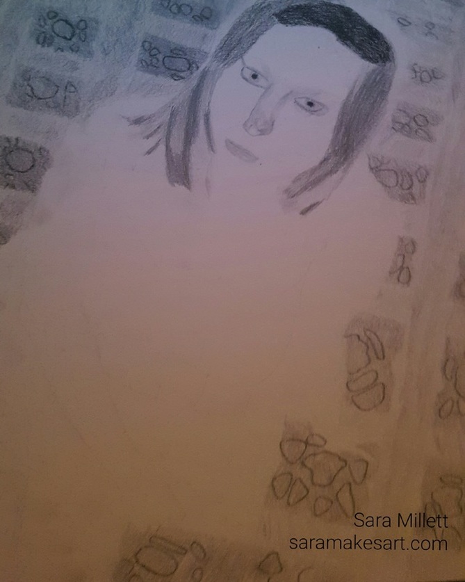 On her face I used a combination of 2b, 3b, 4b, and 5b. I used a 2b on her cheeks, making half moon shapes, being careful to leave some white showing. I used a 4b around her right jawline and to define her left cheekbone. I used a 5b around the edge of her bottom lip, which gave her mouth a more three dimensional look. 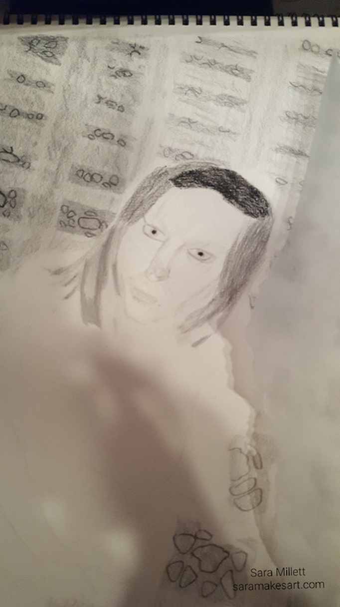 i used a combination of 3b and 5b for the shadows on the edges of her right arm. Then I filled in her entire arm using a 2b, but I decided it needed to be really light, so I used a 2h instead. I used this same 2h pencil later to fill in her chest and used a 3b to make small shadow marks there. I used my kneaded eraser to lighten up a lot of the shadow marks. I also used my tombow mono eraser to bring back some of the white of the paper where it should be. I filled in her left arm entirely with a 2h pencil and blended it with a blending stump to make it smooth. I used 2b, 3b 4b, 5b, and 6b where they were appropriate, going from light to dark. This time I filled in all areas with my pencil accept for the parts that were going to be lighter than the shade I was using at the time. For example, when using my 2b, I put all over the arm, except for the parts where I still wanted the 2h to show, then put the 3b all over except where I wanted either the 2h or the 2b to show, and so forth. This is a change from the way I normally do things as I'd always just put a shade where I wanted it to be an nowhere else. I liked the results I got with this approach, though. As always, I was careful to follow the shapes I saw in my reference photo. I filled in the top part of her dress using a 4b Wolff's carbon pencil, For the body of the dress I used my 8b. So far I'd been using only Faber-Castell 9000 pencils for this piece, with the exception of the occassional carbon pencil, but for the lighter shading on the dress, I decided to use my 9b woodless Progresso pencil from Koh-1-Noor. I used both a 2b and 4b carbon pencil for the darker shading within the 9b. I erased out some of the lighter areas with a kneaded eraser and filled them back in with a 6b. I also used a 2b to fill in the light area of her sash, being careful to leave small sideways "vs" of the paper showing. I filled in both of her legs with a 2h pencil. I shaded down the sides of both legs with a 2b, being careful to leave some of the 2h showing for a highlight. 3b was used in touches on the 2b on both thighs and on her right calf. I used 4b for the areas where her thighs met her calves. Finally I used a tombow mono eraser to bring back some of the white of the paper for the brightest highlights. I used a 4b carbon pencil for the straps of her sandal. 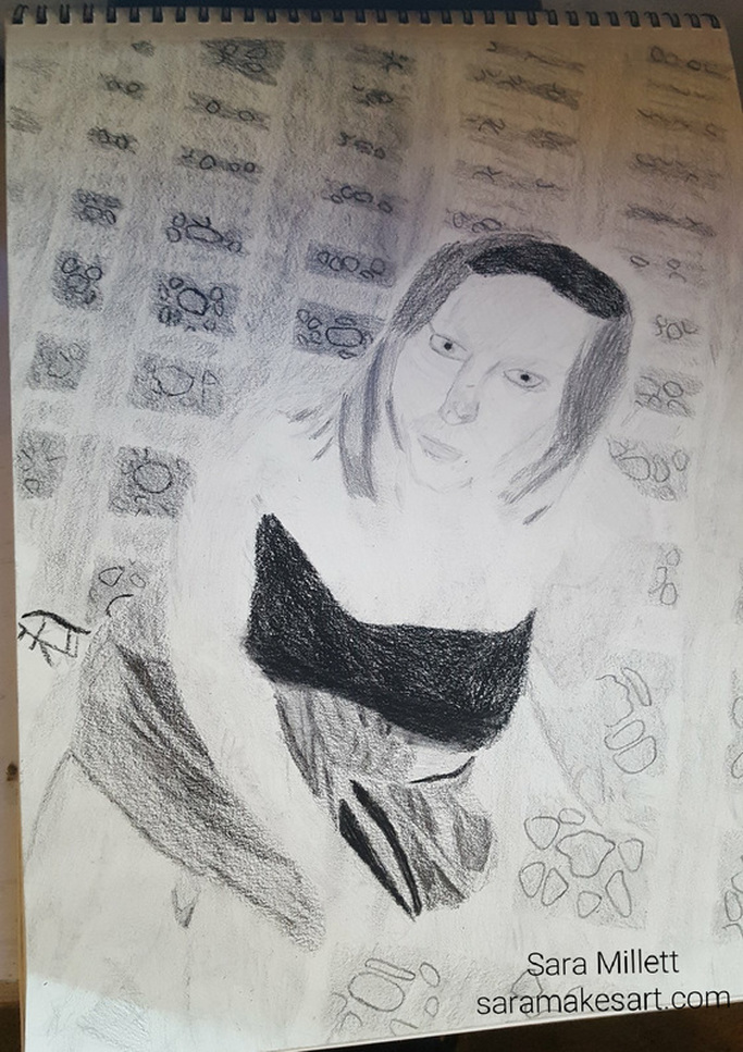 Aaaand, the finished piece! Now, I would like to talk about why I decided to draw this in the first place. The moment I saw the photo I used to make this drawing, I was drawn to the girl's slightly guilty expression. It looked to me like she had been caught doing something she shouldn't or maybe she was just being playful. In short, I thought the picture told an interesting story. I also thought the way she was looking up at the camera would give me a good challenge.
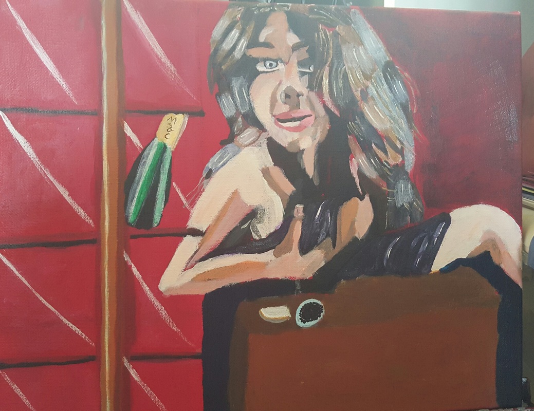
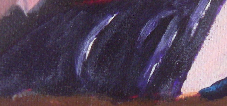
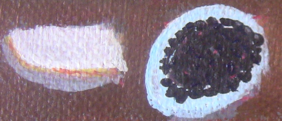
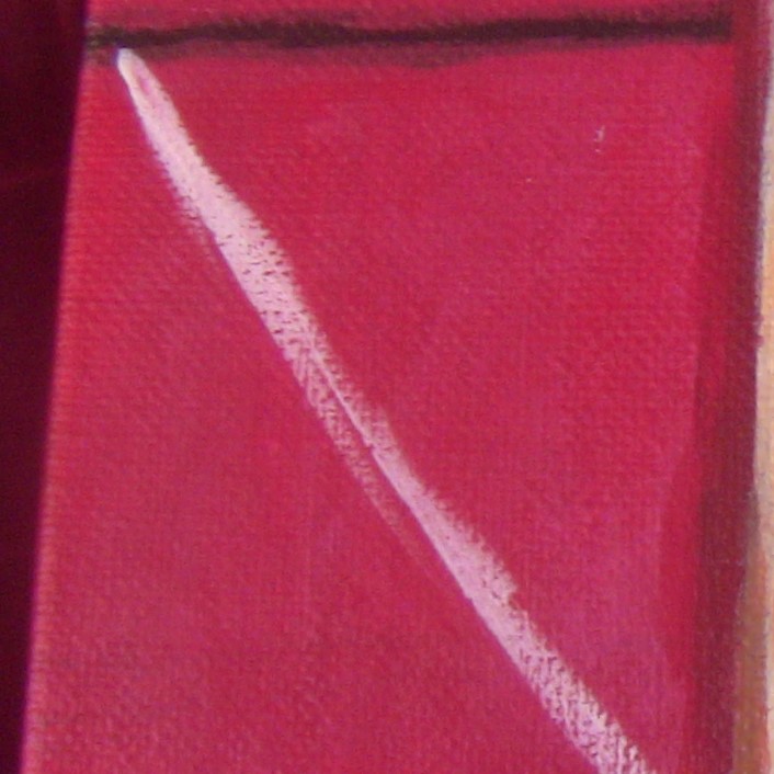
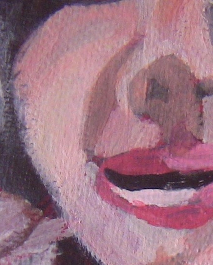
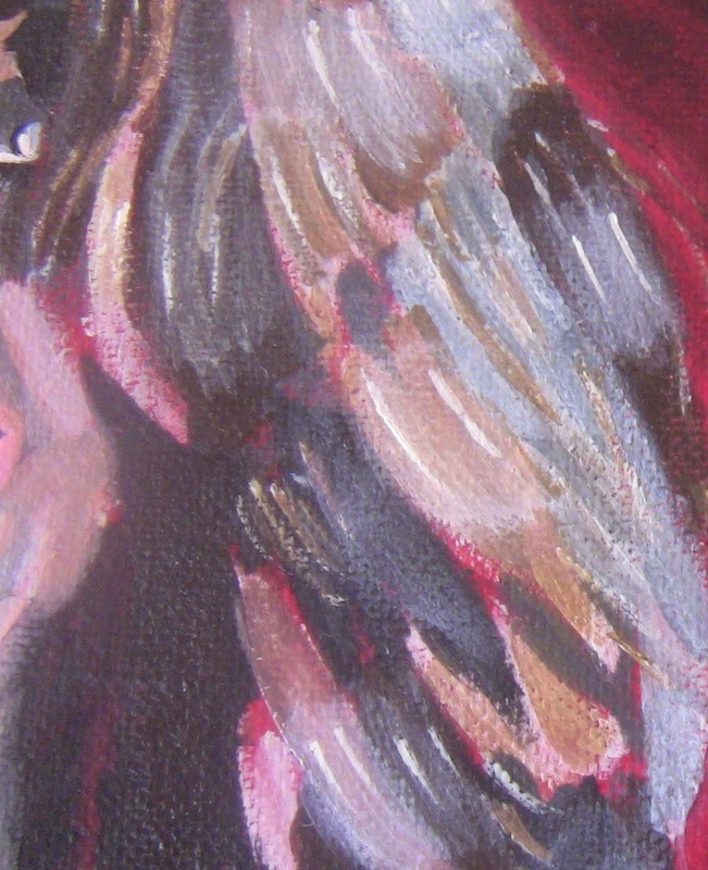
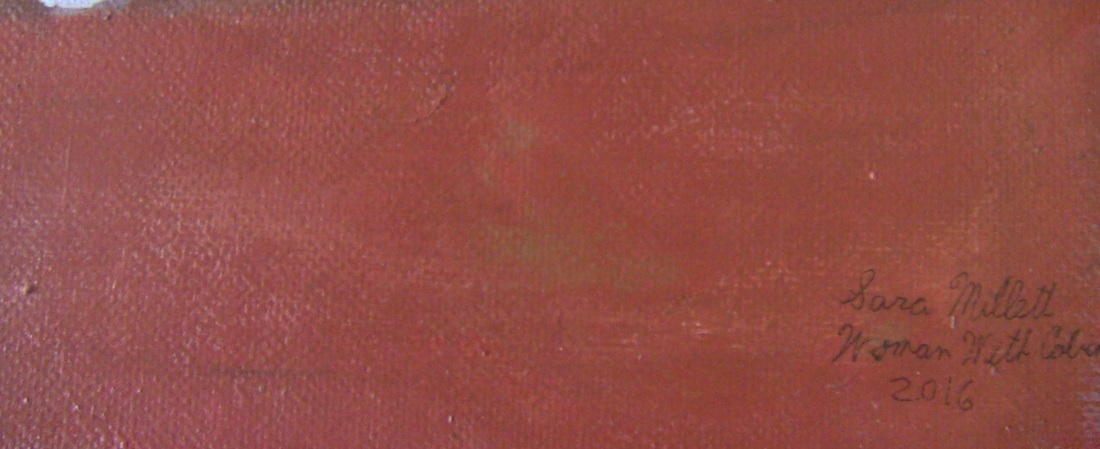
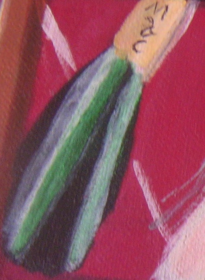
I finished a new painting! This one is an 11×14 acrylic on a Fredrix Green Label Belgian Linen Canvas titled “Woman With Cabinet”. This painting is twelve years in the making. It’s inspired by the lyrics to the Queen song “Killer Queen, written Freddie Mercury. The first line of that song is “she keeps Moet and Chandon in her pretty cabinet”, hence the cabinet next to the woman with the wine bottle inside of it. I purposely used several photos of different women so that the subject would not be recognizable as any one person. Nevertheless I would like to put a disclaimer that this is made for purely artistic purposes and does not represent my views on any person who might resemble the woman featured in this painting. The main photo used is from free stock photos originally from bodog.com and is issued under the Creative Commons 2.0 license. http://creativecommons.org/licenses/by/2.0/ I chose the red background to represent prostitution and the purple sheet and the blue bed to represent royalty. I painted streaks of transparent mixing white as well as a little bit of titanium white using a liner brush to create the look of satin or silk in the sheet. I wanted to give the impression that this woman is very wealthy and sleeps in only the most luxurious of bed sheets. In the first verse of the song there is a line about caviar and cigarettes. So I put a little caviar tin and an antique cigarette case or at least what’s supposed to be an antique cigarette case on this woman”s night stand next to her bed. I thought I was going to use pure beige to paint the cabinet but I ended up mixing a bit of red into the color and making it a bit pinkish To create the transparent look of glass I painted a very thin layer of transparent mixing white over each of where the black lines of the cabinet were. I went over that with streaks titanium white. I also used transparent mixing white in making the flesh. This is a first for me. I had always used titanium white in mixing flesh tone. I chose to use the transparent mixing white this time so that I could glaze to color over my underpainting in hopes of getting a softer more realistic feel. The other colors I used were my usual raw sienna and some quinacridone red. For the darkest shades I mixed a bit of purple into my original color. I later went over that with some of the other color very thinly in order to soften the shadow a bit. For the colors in between I put in varying degrees of raw sienna and quinacridone red into my original mixture. I did part of this painting in my creative painting class at the San Diego Art Academy which brings me to my next point. I was on my way to my class one day when I realized I was due to paint this woman’s hair and I didn’t have a reference photo. I knew I would be in class and I wouldn’t have access to a printer or computer to look up or print out reference photos. I started to panic a little. Then I decided I was going to look at photos on my phone of long ash brown hair which is what I intended to paint this woman’s hair. I didn’t plan to copy any of the photos exactly or even close. But I studied them to learn what shades and colors should be in the hair and had that in my mind as I was working on the painting in my classroom. I came to the conclusion did the hair should include shades of burnt umber mixed with ivory black, grey made from mars black and transparent mixing white with a touch of a phthalo blue, to keep her from looking old, and some hansa yellow mixed with the aforementioned blue gray and burnt umber and ivory black. To create the look of shine in the hair I put in streaks transparent mixing white very heavy and some places and long small streaks using a liner brush of titanium white. Finally I put a very thin coat of transparent mixing white over all of the hair 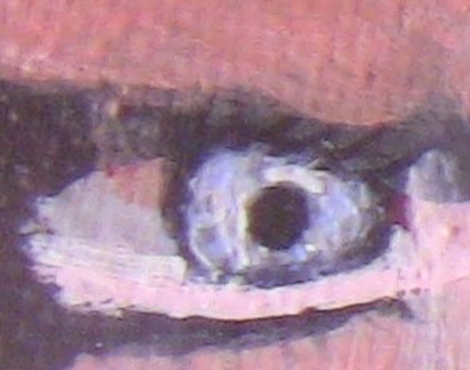 For her eye I mixed transparent mixing white with blue for a luminous look. I painted streaks of grey made by mixing transparent mixing white and mars black using a liner brush. I rimmed the entire iris with mars black. I painted the night stand using a combination of burnt sienna and a little bit of yellow ochre. I mixed ivory black into these colors to make the shadows. A technique my teacher taught me that I used on the background and on the nightstand to get solid color is to apply the paint in short, quick strokes going every which way, then blend it out with a mop brush. The size of the mop brush you use will depend on the size of the area you’re working on. Let’s not forget the bottle. To paint that I used dark green permanent with streaks of titanium white to create shine. I added mars black to the green for shadows. For the wrapping on the bottle, I mixed hansa yellow with a touch of raw sienna, then layerd transparent mixing white over the center for shine. I put a very line line of grey made by mixing transparent mixing white and mars black, with a liner brush, over the right hand edge.
I employed this same yellow and raw sienna with transparent mixing white on top technique to paint the metal clasp on the cigarette case. Then I put as thin of a line as I could of the same color that I used to paint the nightstand inside of that because I wanted to give the impression that the metal was reflecting the colors around it. That’s all for now. I’m currently working on a painting of a swan. I’ll see you next week. Okay, let me set the scene. It was June of 2011 and I was finally free to call the shots on my own youtube experience. The day my stepfather left, I unsubscribed from all the channels I had subscribed to because he had told me to. I finished the “My Art and My Asperger’s” series that he had started. I had no reason to fear not being able to come up with ideas. Within the first year after my stepfather left, I did the “My Favorite Youtubers” series, the “What Inspires Me” series, as well as numerous independent vlogs. I decided I wanted to participate in Philip Defranco’s Movie Club, so I created a response channel called Aspieresponds, later changed to Sararesponds. Then one day, I decided I no longer wanted to be Aspie232. I didn’t know how to change my name on the same channel, so on Oct 20, 2012, I created a new youtube account called SaraMakesArt. For all intense and purposes, I stopped using Aspie232, but I never closed that account. decided I wanted to keep my art videos and my Autism videos separate, so I made another channel called BeingAspie, which is dedicated to my videos about my experience dealing with Autism and the effects it has on my life. I uploaded videos onto SaraMakesArt for four years, hardly touching Aspie232 during that time. Then one day, I decided to take a look at Aspie232 again, just out of curiosity. I thought, I think I’m going to start using this channel again. So I took advantage of the youtube/google plus integration and changed Aspie232 to saramakesart and after four years, I’m finally comfortable using this channel again. I left comments or messages to all my subscribers whom I could contact and told them I was changing my channel name and starting to upload there again. So that’s my youtube story. I say thanks for watching at the end of every video, but right now I think it’s appropriate to say a big thank you to everyone who watches my videos, to everyone who subscribed, especially to all of you who stuck around while I was away for so long. Thank you, thank you, thank you. Anyway. I do timelapse drawing and painting demonstrations, as well as art related vlogs, normally, on my channel, so if that sounds goo to you, click here to subscribe, if you haven’t already, I’ll see you all again next week. Good bye.
This post is going to be a little bit different. I’m not going to write about art in this video. Instead I’m going to share my youtube story. Okay, my youtube story, where do I begin? Unlike most youtube stories, I imagine, my story does not have a happy beginning. If you’ve watched my videos “My Artistic Journey:Parts One and Two”, you know that I had a very controlling stepfather. He wouldn’t even allow internet in our house until 2008, when I was twenty. Even then, I could watch youtube videos, but I couldn’t create a youtube account, not without his permission that is. Then, when I was twenty-two, my former stepfather suddenly decided he wanted me to have a youtube account, which was to be called “Aspiechick”. On February 11, 2011, the day after my twenty-third birthday, my first youtube account was created. I couldn’t use the name Aspiechick, since it was taken, so my mom put my username in as Aspie232. My channel began as a way to talk about my art and my Autism, which we called Asperger’s Disorder at the time. From day one, my stepfather at the time, controlled everything about my youtube channel, just as he controlled everything about my art. He decided what videos I would make, he would dictate messages for me to write to people, and he even told me who to subscribe to. He had so much control, that I honestly didn’t know how I would do youtube without him. On top of all of this, I wasn’t allowed to edit, and my videos generally had to be a minimum of five minutes, preferably, ten to fifteen minutes. The thing is, I’d wanted a youtube account for a long time, and now I had one, but it wasn’t really mine. It was his. If you’ve been subscribed to my youtube channel since the beginning you might have seen some of the videos that that person orchestrated. I have those on private now, for good reason. Anyway, my former stepfather got out of my life, and I talk about how awesome that was in part two of My Artistic Journey. Now, I was not only free to do what I wanted with my art I was free to do what I wanted with my youtube channel too. Next week, I’ll tell you what I did on youtube after my stepfather left.
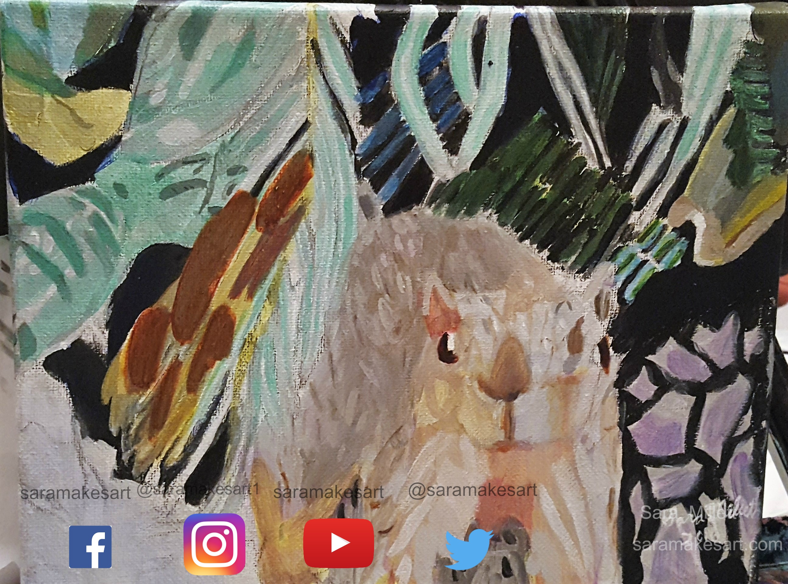
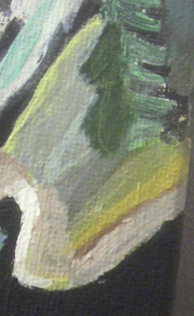
I finished a new painting! It's an 8x10 acrylic on Belgian Linen titled "Squirrel Among The Palm Branches". Adding color to this painting was started by glazing ultramarine blue mixed with black over the black parts of the background. I added this to some zinc white and used it to paint part of the leaves. I decided that they needed to brighter, so I touched them up with phthalo blue, then finally went over that with gray made by mixing zinc white and mars black to tone it down. I mixed a little bit of deep green permanent into zinc white, thinned it with matte medium, and applied it in three layers onto the uppermost leaves, including the branch that's hanging over the squirrel. I mixed a bit more of the deep green permanent into the zinc white, and using a small liner brush, started painting over the darkest parts. I mixed a touch of ultramarine blue with transparent yellow medium to make a yellow green and used this to paint the leaf on the far right hand side of the piece. I used sap green to paint the leaves that are in the shadows. I glazed transparent yellow medium over the bottom portion of these leaves. Other colors I used for the leaves were transparent yellow medium and phthalo blue mixed with zinc white. I painted the squirrel varying shades of gray and layered ultramarine blue over the lighter gray and burnt umber over the darker gray. You can barely see the blue and that's the way I want it.Alternating between a small round brush and a liner brush, I used varying shades of burnt umber to paint the fur texture, then went over these lines with gray to blend them in with the rest of the fur. I lightened the brown portion of the squirrel by going over it with a few layers of zinc white.  I went back to the squirrels head and painted more fur texture using a very light gray made by mixing zinc white and mars black, applying it with a small round brush. I used a liner brush to paint touches of zinc white and finally titanium white onto my gray patches. I mixed zinc white and mars black and applied several layers of this to the squirrels face and legs. I mixed titanium white, oxide black and ultramarine blue and started to apply it two the squirrel's chin. I realized it was still too dark, though, so I put some titanium white out onto my applied this color to the squirrels face and the inside edges of his legs. I could see there was some more white, but it wasn't as intense. First I tried adding more layers of my transparent gray color, but this wasn't working. I decided to mix an even lighter version of the opaque grey by mixing it with more titanium white. I painted this in long strokers, following my reference photo as closely as possible, using a small filbert brush. The fur looked so much fluffier after I'd done that. 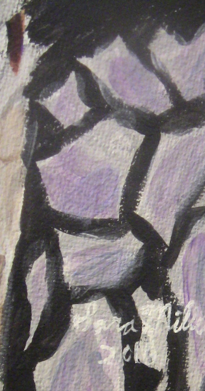 I went over the lighter shapes on the right-hand side of the ground with gray made by mixing a little bit of Mars black into zinc white. I applied this in three layers using a large filbert brush. I mixed Dioxazine purple into zinc white to make a pale lavender color and glazed it over the gray. Finally, I glazed more of my mixed gray over the lavender. To paint the gold portion of the fur, I started by mixing burnt umber into hansa yellow light. When I put this onto the canvas, though, I could see it was way too dark, so I layered Dioxazine purple over it to tone it down. I glazed transparent middle red over that to brighten it, then finally went over the whole thing with zinc white. 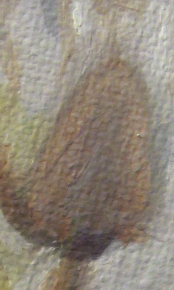 Now it was time to paint the nose and mouth. For this I used three different shades of purplish brown with I made by mixing van dyke brown, oxide black and dioxazine purple. I each shade with matte medium before applying it to the canvas. I went back and added more texture to the squirrel's fur. I used my liner brush and my small round brush, depending on how thick I needed my lines to be. I used a grayish brown made by mixing zinc white, mars black, and burnt umber, thinned with lots of matte medium to make it transparent. Then I used a dark brown made by mixing burnt sienna with a little bit of burnt umber. 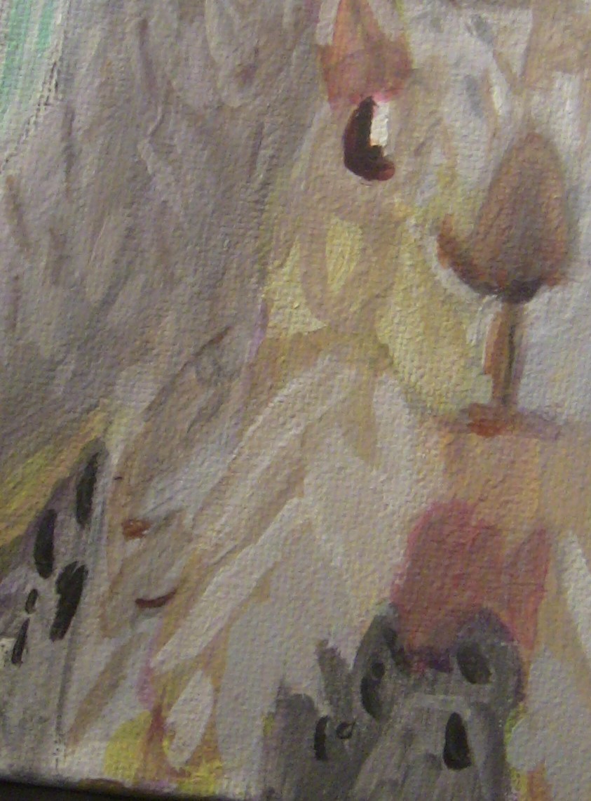 I mixed titanium white oxide black, and burnt umber to make a light grayish brown shade, and using a small round brush, I painted small strokes of this color where appropriate on the squirrel's body. I went over most of that with a glaze of transparent gray made by mixing zinc white and mars black to tone it down and blend it in with the rest of the squirrel's fur. I remixed the color I used on his legs and put a glaze of this over his cheek. I mixed more of the pale grayish brown color I'd used earlier and painted around the squirrel's eye. I glazed over this with gray made by mixing zinc white and mars black to tone it down a bit. I mixed zinc white with dioxazine purple to make a lavender color, thinned that with a lot of matte medium, so it would be barely noticeable, and, using a small round brush, applied it in different areas all over the squirrel's body. I took titanium white, with a small round brush, and applied on on the squirrel's cheeks. I glazed over that with the same gray I'd mixed earlier because I thought it stood out a bit too much. 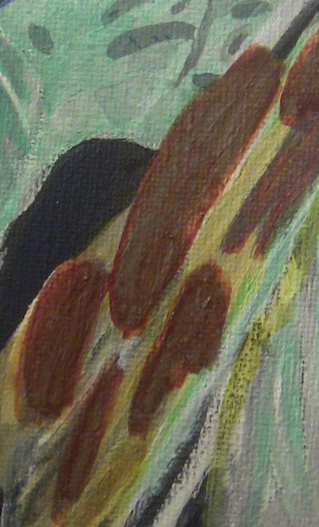 For the tail, I mixed the same color of golden brown that I'd used on the rest of the body. I mixed more brown and red into it to make a more brownish color. When, I got it onto the canvas, I thought it was too brown, so I started glazing yellow and white over them.  I went back to the branch that's hanging over the squirrel, and using a liner brush, applied titanium white very subtly to it. I applied thin strips of sap green over the pthalo blue I had painted on some leaves. For one of the leaves, I decided the glazing I was doing wasn't working, so I used a small round brush to paint a strip of cadmium yellow medium along the right-hand side. That was my a-ha moment. That little bit of opaque yellow gave the leaf an almost glowing effect. I went on to mix various shades of blue and yellow-green using the cadmium yellow medium, ultramarine blue, and titanium white and put them in the appropriate places. I mixed zinc white with a touch of phthalo blue and put this in a patch. I mixed sap green with oxide black and painted it in the upper portion. I used transparent yellow, both the middle shade and the azo yellow deep, over certain areas of the leaf. I went over most of the leaf, particularly the pthalo blue with zinc white, and then zinc white mixed with mars black to mute the colors slightly. I painted the tips with varying shades of greyish brown made by mixing titanium white, oxide black, and a little bit of burnt umber. I used the lightest of these shades for the very bottom of the leaf, the middle shade for the outer edges and the darkest shades for the edges of the middle shade. I used a small round brush to paint a small amount of titanium white over the lightest brown I had painted. The brown I painted along the left side ended up covering up the yellow I had painted, so I used a round brush to paint some cadmium yellow medium back in. I used a color called nikkel yellow titanium, which I was using for the first time now, and a small round brush, to paint a line along the left-hand edge. I painted over my red/yellow/brown spots gray, then went over those spots with thin layers of transparent burnt sienna. |
Sara MillettPainter of portraits and wildlife Archives
November 2023
Categories
All
|
