|
It’s confession time. I’m impatient. But I’m working on it. I’m doing an exercise where I drop a coin loose in my purse and give myself two minutes to find it. I can’t take anything out of my purse except for my sketchbook and notebook. You’re probably wondering, what does this have to do with art? And the answer is everything. Making good art is as much about slowing down and taking one’s time as it is about actual skill. Even to this day, I’m in a bit of a rush when I do a piece, especially towards the end when I know it’s almost finished and I just want to get it done. My art is good, but I know it could be so much better if I developed patience. For example, when I want to make very thin lines with a liner brush, I want to do the line very quickly, but the only way to get those lines to stay nice and thin all the way down, is to do them very slowly. Otherwise, I apply too much pressure and thicken the line. I'm really getting an opportunity to work on my patience with the drawing i'm doing now. I've scrapped the whole thing, after finishing the subject's face, no less, and am starting over from square one. Just today I erased the whole background and am going to redraw it after having it almost finished. I rushed through the background in my first attempt and I know I can do better. Now it’s your turn. How’s your patience? Do you need to work on it like I do?
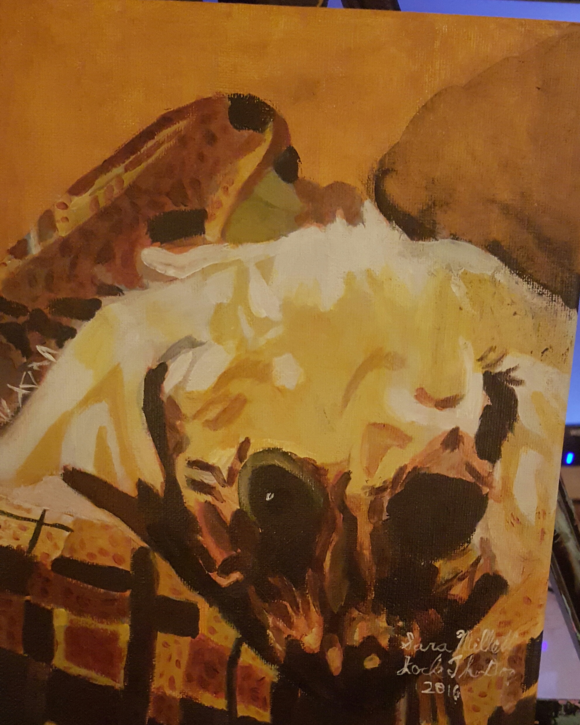
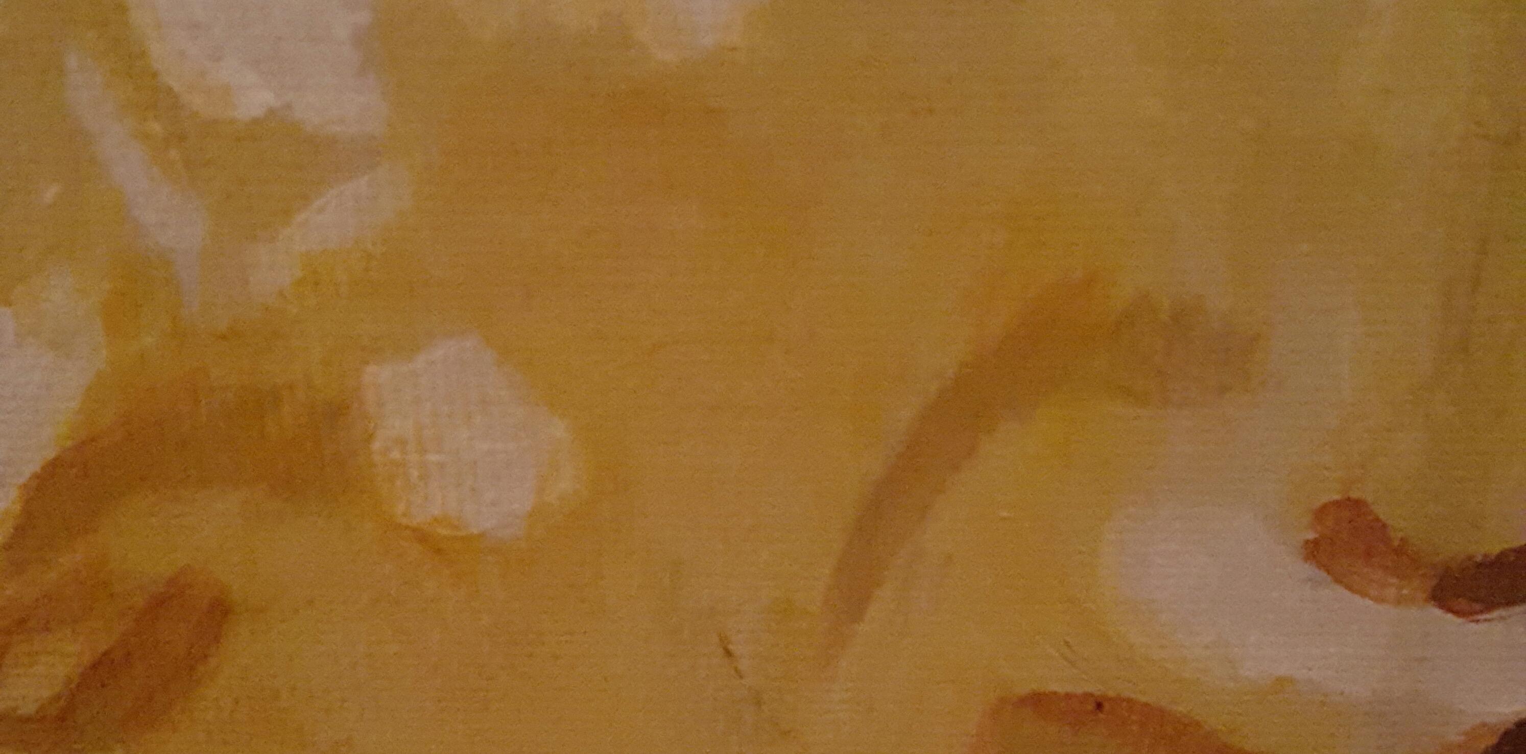
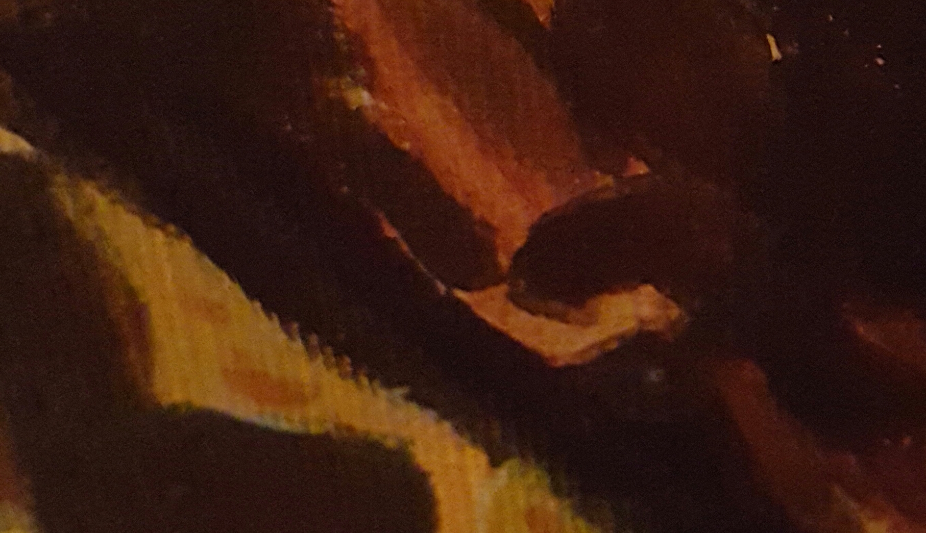
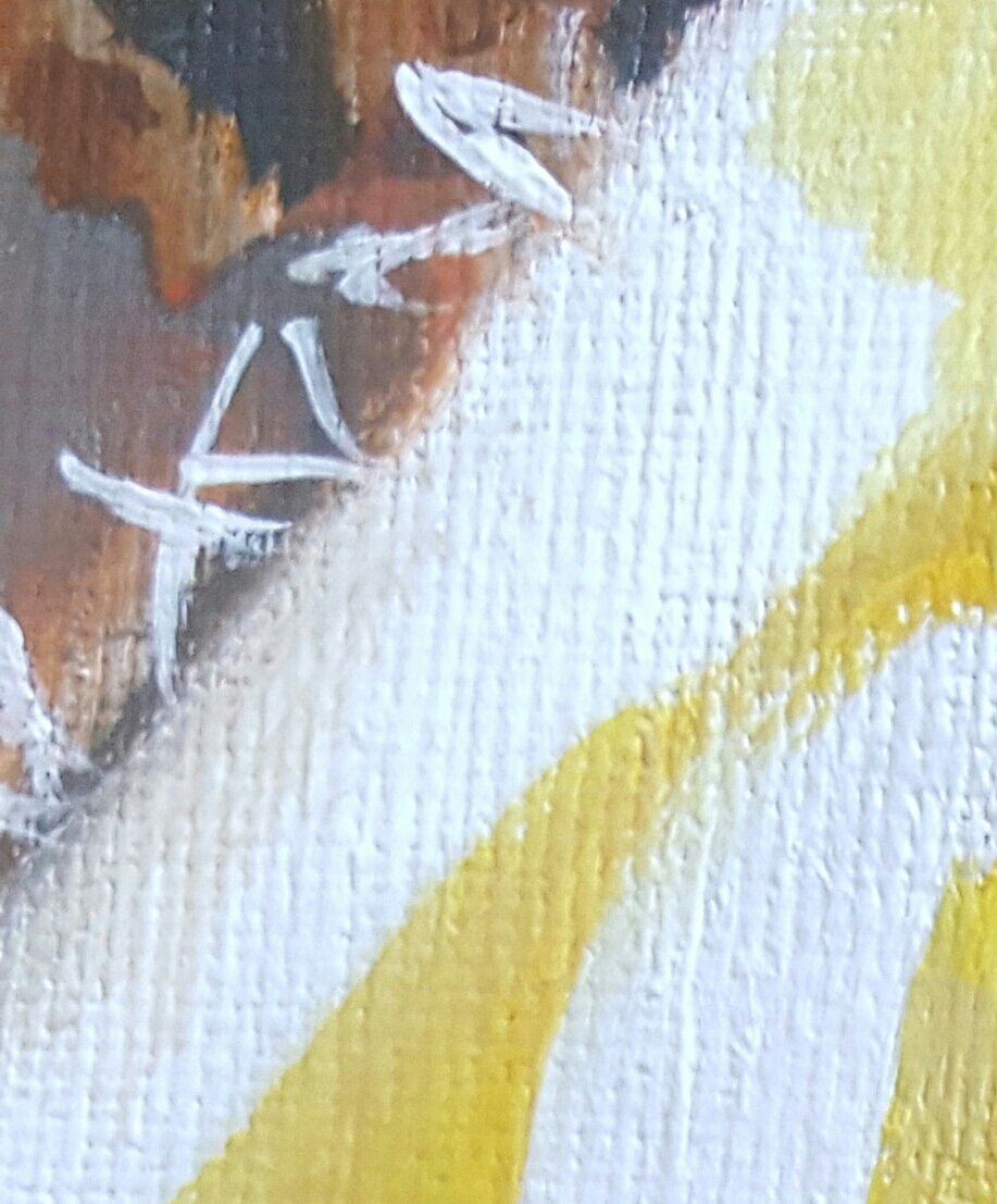
I want to tell you about this painting. It's an 8 x 10 acrylic on a Frederix Green Label Canvas called “Jock The Dog. It’s a commission. If you would like to commission me to paint your pet, check out this page Commission Me I used combinations of burnt sienna, raw umber, cadmium yellow, and raw sienna. I applied my base tan color, made by mixing raw sienna and cadmium yellow, very thinly in order to allow my other colors and shapes to show through. I left my underpainting alone on the parts where I wanted it to be white. I used a combination of burnt umber mixed with ivory black, along with straight ivory black, for the underside of his face and mouth.I also used a color called van dyke brown for part of Jock’s face. I made some lines of titanium white with a liner brush going every which way to create the look of fuzz. I used many of the same colors in the rug as I did in the dog himself. I layered random dots and lines of one color over another. I wanted the effects to be subtle but noticeable. I used just a bit of paint and a lot of medium to allow the color underneath to show through.
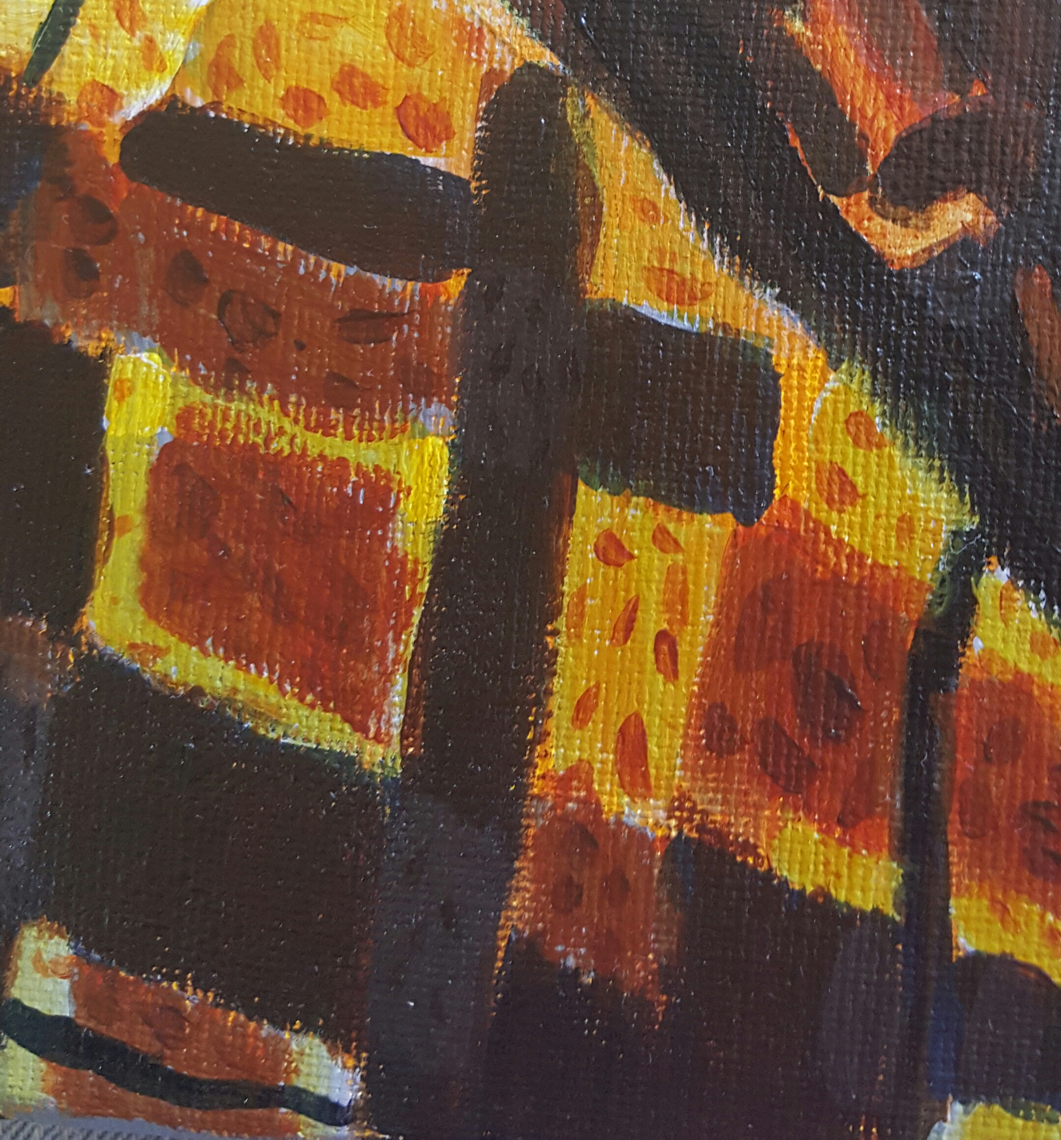
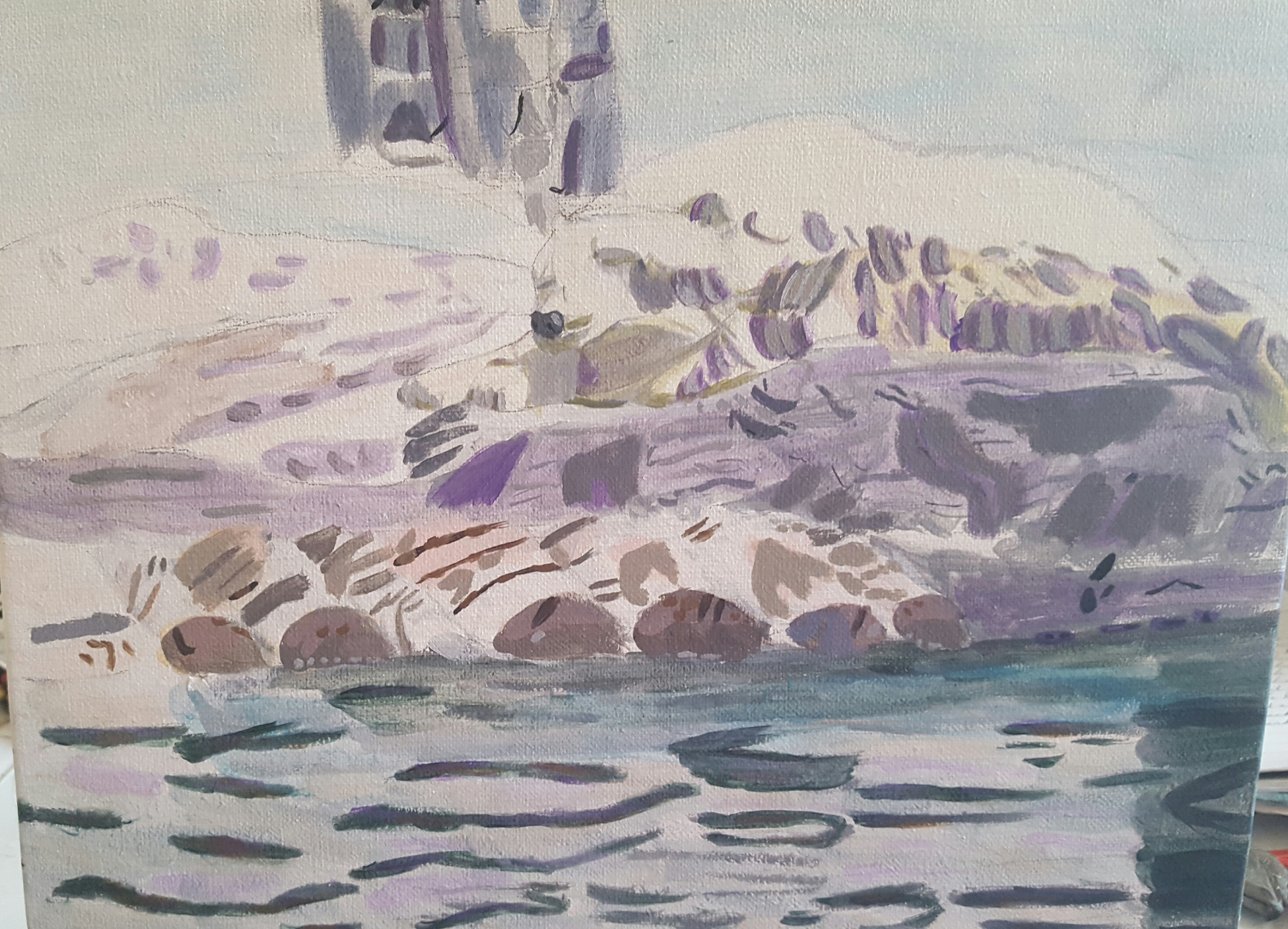
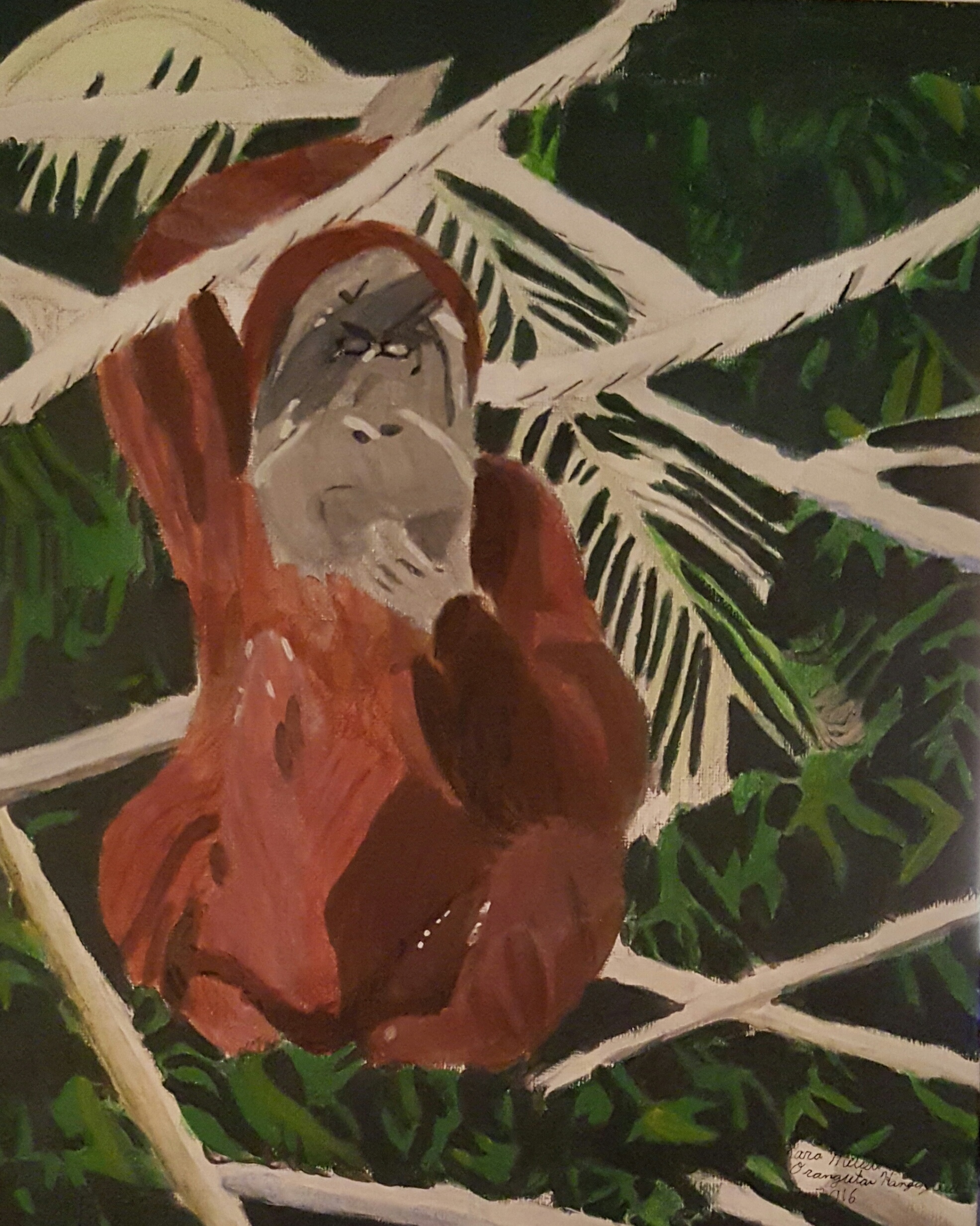
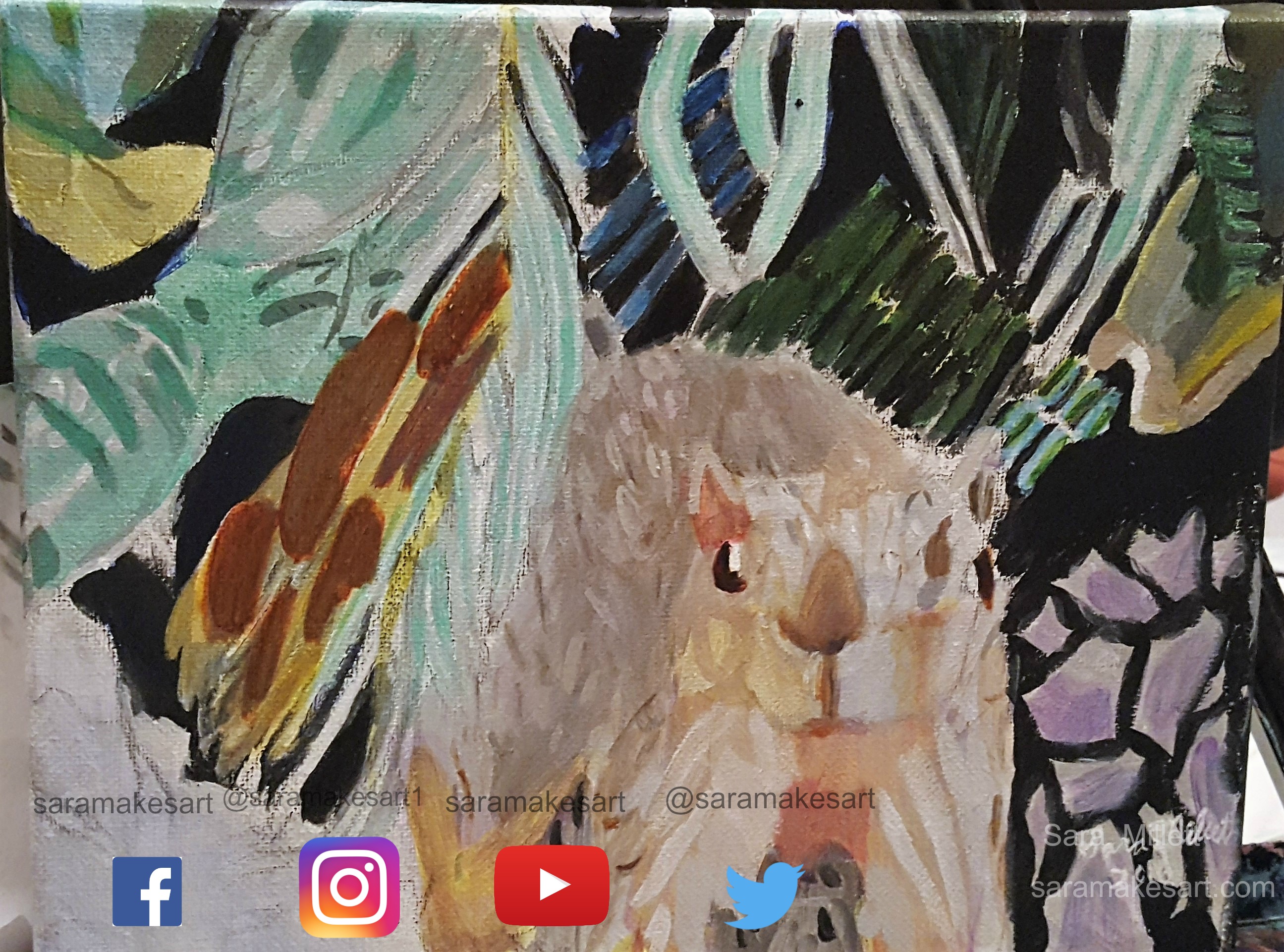
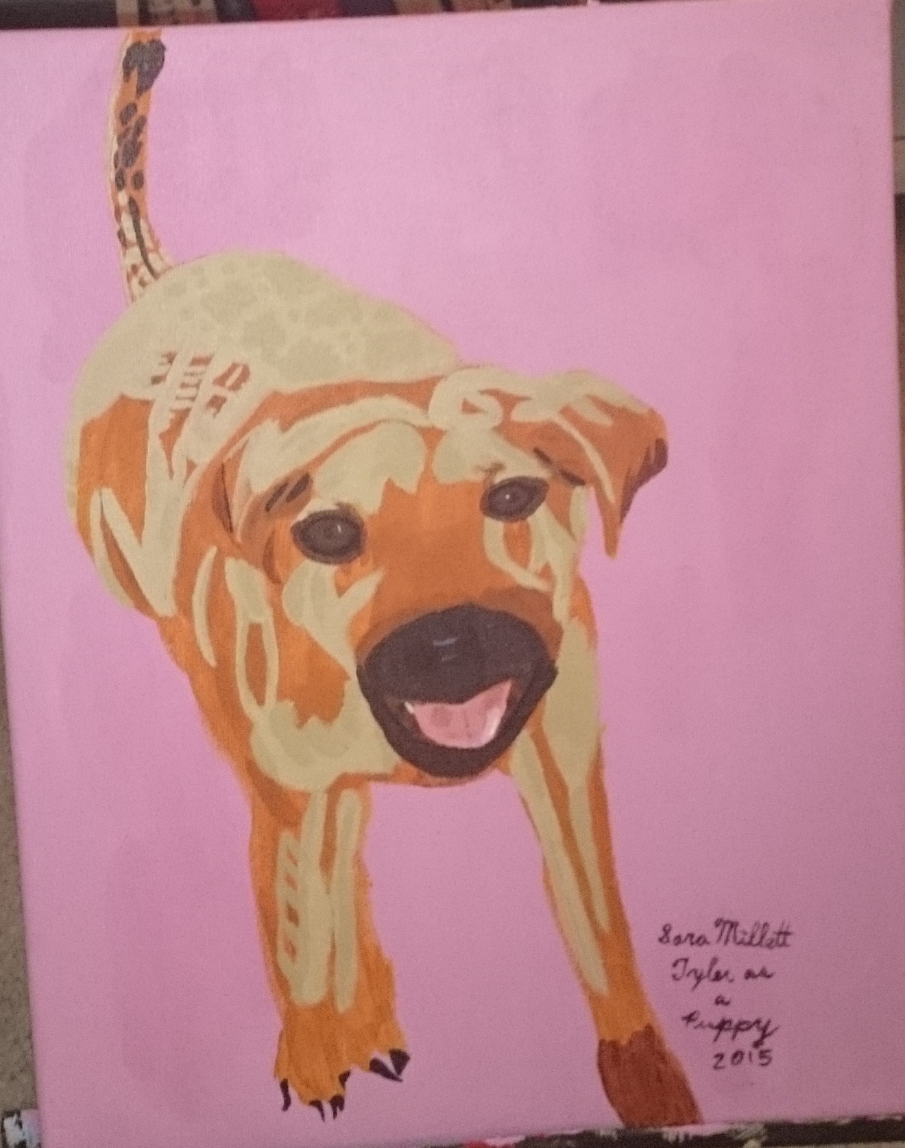
Today I’m going to tell you what I’ve found to be a big secret to getting more depth and dimension into a piece. That’s to use multiple colors or multiple shades of a color on one part of your painting. The thing is, nothing in nature is all one color. Everything has shadows at the very least and things that are shiny reflect other colors around them. Take this girl's dress, for example. 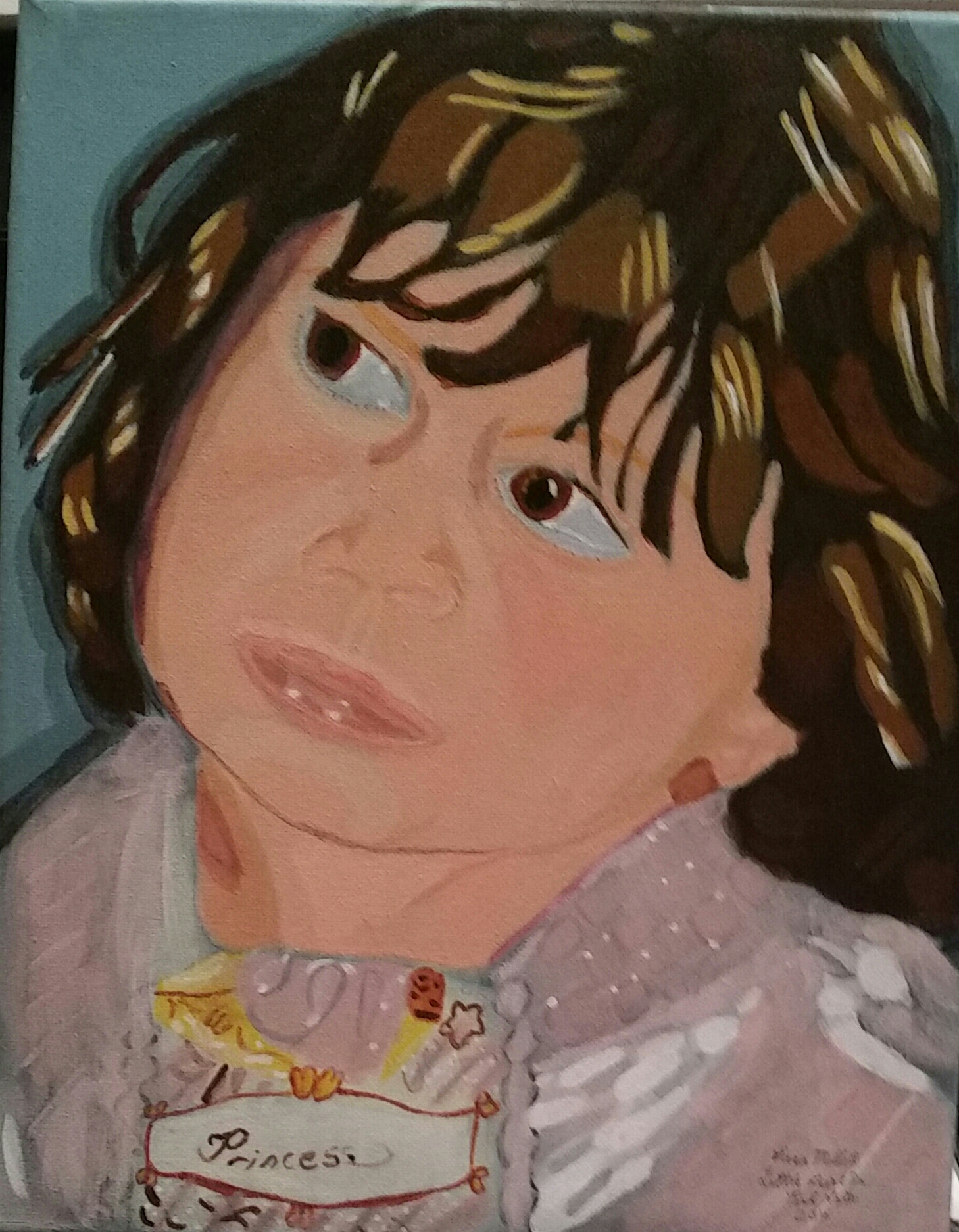 I had to put in streaks of blue and yellow besides the base pink. Without that, and the different whites that I used, I would not have been able to achieve the shimmery effect I was going for Water is another prime example of this. Unless it’s murky and disgusting, water is very reflective. What I’ve done here is take all the colors that appear in other parts of the painting and brought them into the water. 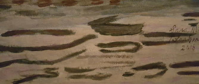 To give you full context, here's that complete painting. This is a perfect opportunity to point out that things that are white, are not really white. As you can see here, I used lots of yellow, purple and gray in the shadows on this polar bear. Not only that, but for his body, I used a pale yellow instead of straight white. Also, sometimes I use colors that don't seem right in my head and have great results. Sometimes glazing just a touch of blue, or green, or any other nonnutral color over something can give it a little extra added depth. I used this method in the ropes on my painting "Orangutan Hanging Out", and in the squirrel's fur in my latest painting, "Squirrel Among The Palm Branches". Last, but not least, when painting anything black and shiny, I almost always incorporate some blue. Here's that concept demonstrated on the dog Tyler's nose, and Shantih Beeman's tie.
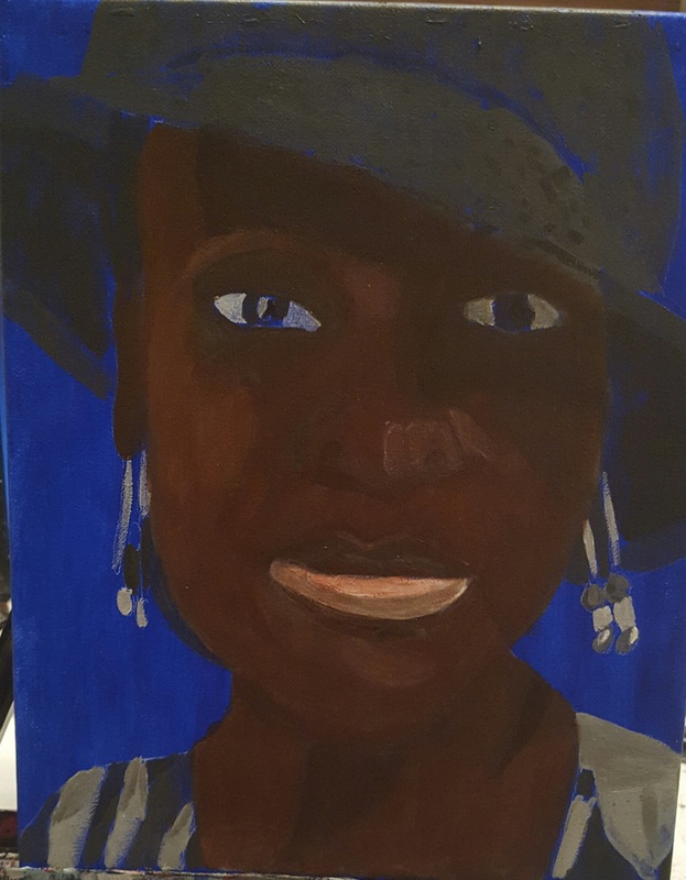
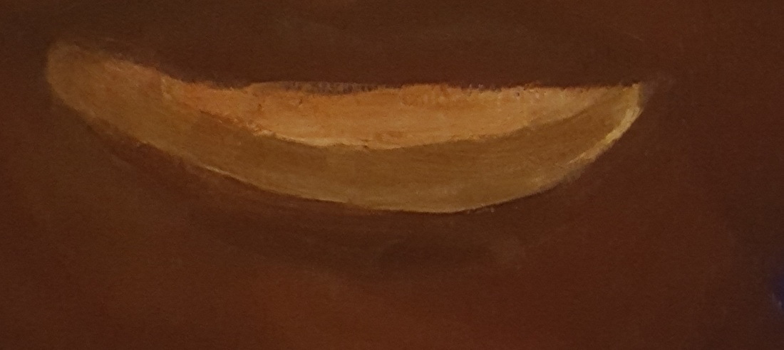
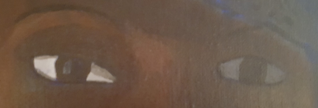
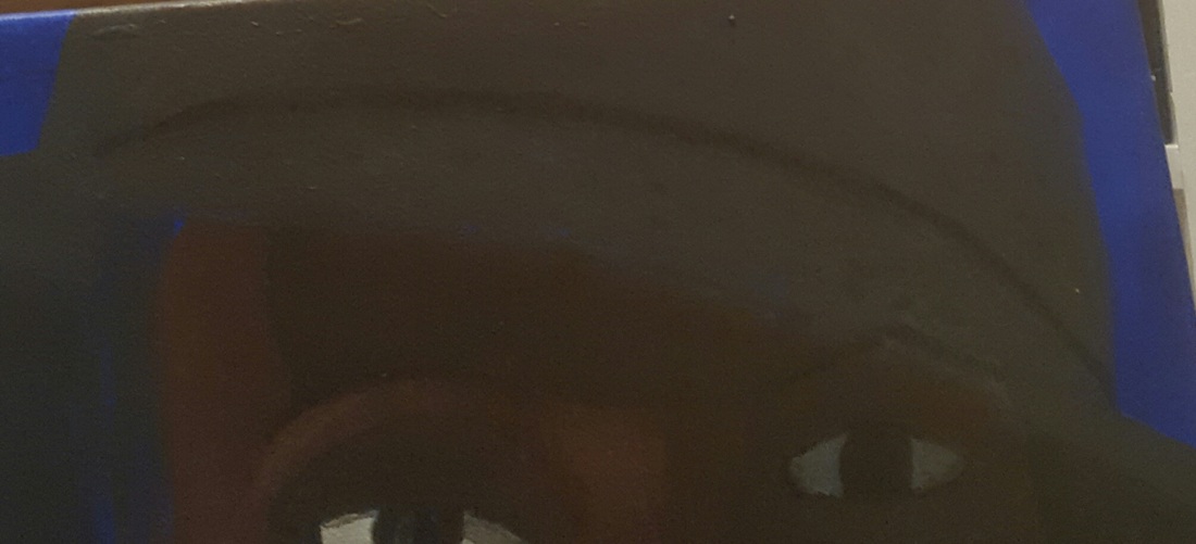
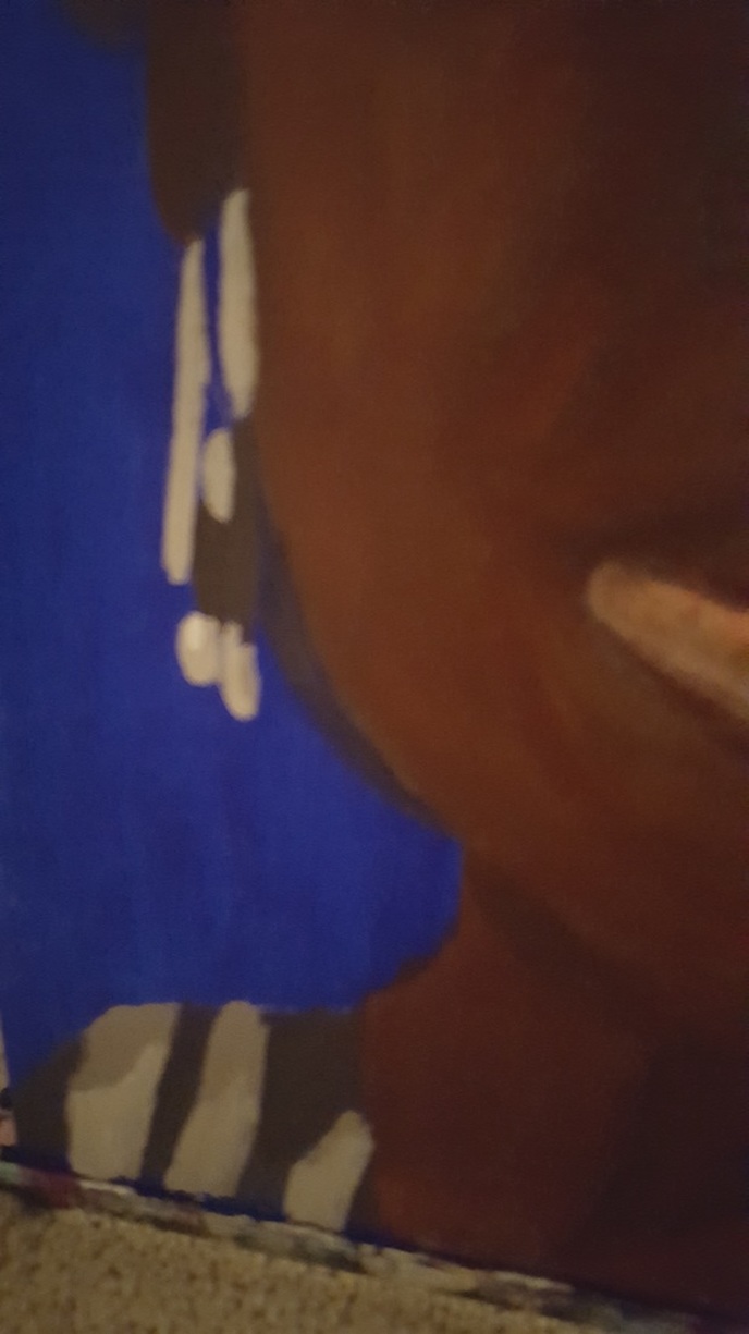
This is an 11×14 acrylic on a Belgian Linen canvas. I painted the background ultramarine blue in three layers and used a white charcoal pencil to sketch the woman. To paint her skin, I mixed burnt umber with cadmium red deep and a little bit of cadmium orange. I applied this color in light layers, thinned with matte medium, dampening my brush as I went to thin out the paint. To paint the highlights, I mixed zinc white into my initial color, but I decided it needed to be more grey, so I mixed Mars black into the zinc white that was already on my palette, thinned it with matte medium, and applied this in two layers onto these lighter areas. For the shadows on her face, I darkened my original color with mars black and applied where it was needed. I darkened this color with even more black and applied it where the darkest shadows were, such as along her forehead and around her left eye. I went over both of these with sheer grey, putting some in the center and blending it out with a mop brush. I put touches of grey on the upper lip, around the nose, and around the jawline, softening the edges with a small mop brush. For her upper lip, I mixed some of my medium darker skin tone color into some quinacridone red and applied a few layers of this just where the top lip met the bottom lip. I added this color to some zinc white and painted the first two thirds of her bottom lip. I mixed even more of the pinkish skin tone color into the zinc white and painted the middle of the lip, leaving the lightest pink on top, and the brown on the very bottom. After all this, I decided the color wasn’t bright enough, so I tinted straight quinacridone red, thinned with matte medium, all over the pink part of the lip. I painted her irises using burnt umber, but I decided the left eye should actually be darker than the right eye, because it’s in shadow, so I painted it van dyke brown. I decided this wasn’t going to work, though, so I eventually tinted that iris with mars black. I used mars black to paint the pupils as always. I painted a strip of sheer grey along the outer third of the pupil of the right eye. I painted her corneas using a grey made by mixing ivory black and titanium white in varying shades, making the cornea of the left eye much darker than that of the right. I added more shadows to the cornea of her right eye, using darker grey. I put a rim of very dark grey all the way around her right eye, and a rim of black around her left eye. I mixed van dyke brown into my black and painted her eyebrows, drawing slightly curved lines starting at the outer corner and working in, than thickening the line a little bit To paint her hat, I used various shades of grey made by mixing zinc white and ivory black. I used the darkest shades for the underside of the brim and the hat’s seam. I used a large filbert brush for most of the body of the hat and a small round brush to paint on slightly darker shadows. To paint her hair, I used mars black and glazed over it with two layers of very thinned out ultramarine blue, thinned with matte medium, and buffed out with a mop brush. For her blouse and earrings, I used different shades of grey made by mixing titanium white and ivory black. Lastly, I painted a dark blue shadow around the right side of her.
In this video I discuss ways that I get clear on how I'm going to do a project.
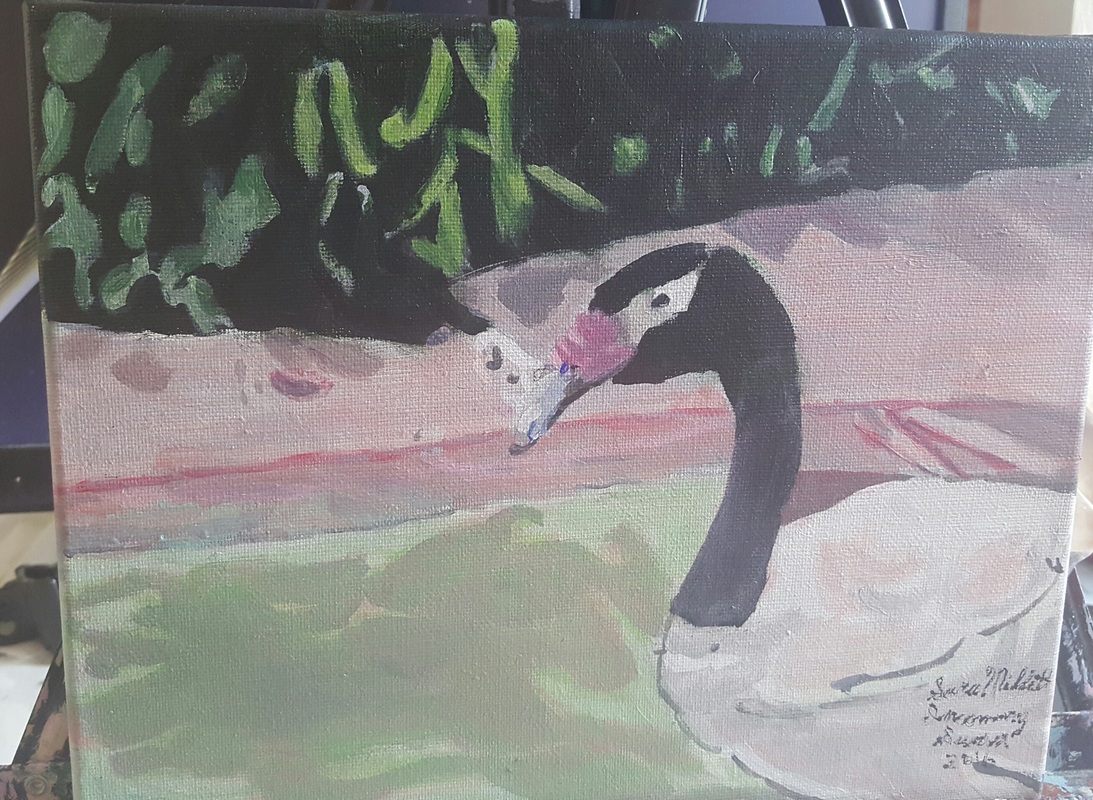
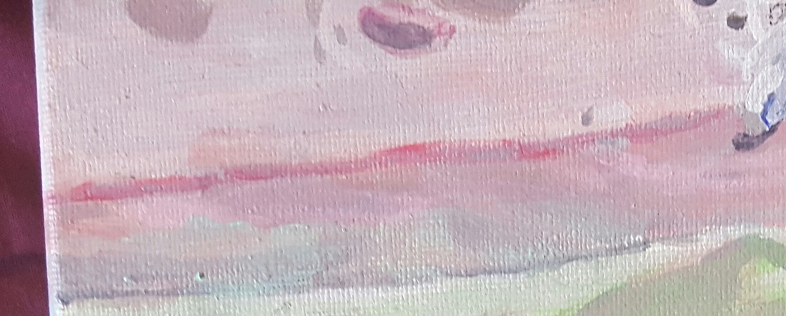
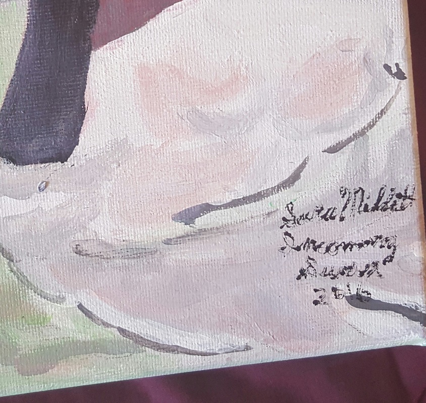
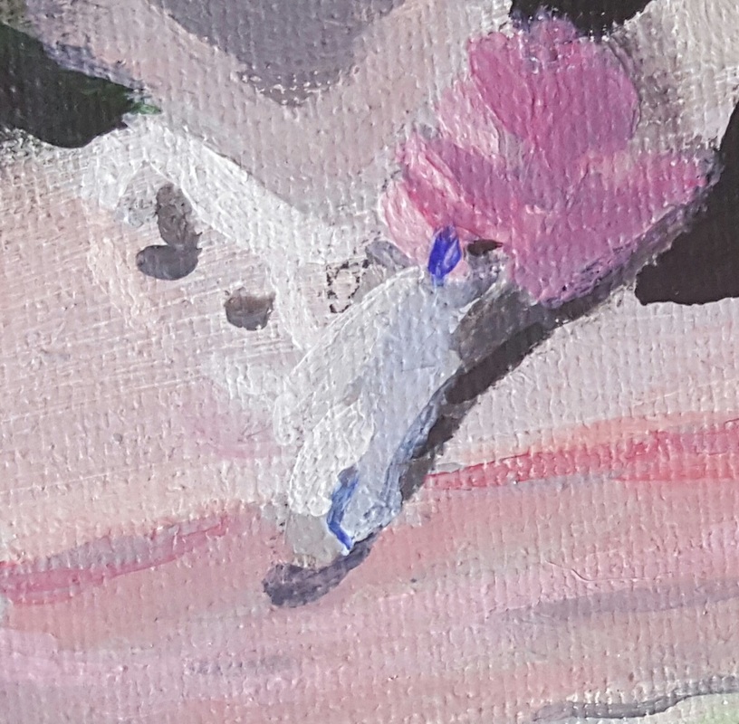
I want to tell you about this painting. It's an 8×10 acrylic on a Fredrix Green Label Canvas titled “Incoming Swan”. I came up with the title because the swan is literally coming onto the painting. This painting came about after a trip to the San Diego Zoo. While waiting in line for the sky ride, my family and I were watching a swan go around a moat. I took several pics with my phone. The photo included a metal bar, which I opted to leave out to create a more natural look. In the following paragraphs, I’ll explain the process I used to make this painting. Over a grisaille, I painted sap green mixed with black for the darkest part of the leaves. I went over that with a transparent mixed grey to give it a denser look. For the leaves, I used a combination of blue green and yellow green, made using phthalo blue and hansa yellow. To paint the water, I mixed a pale blue green using mostly transparent mixing white, some hansa yellow and just a touch of phthalo blue. I was going to paint the bank first. But I quickly realized I needed to paint the water before the bank, since the color from the bank was reflected in the water. I needed the color of the water to already be down before I put the color of the bank over it. To paint the bank, I mixed transparent mixing white with quinacridone red and just enough raw sienna to keep it from being bright pink. I used various shades of this color plus sheer mixed grey to paint the bank. Then I remixed the same color I’d used to paint the water and brought it up into the bank. I brought the color of the bank into the swan itself and it’s reflection. To paint the body of the swan, I went over it with transparent mixing white. Then I mixed varying amounts of Mars black into that to make different shades of sheer grey for the shading. 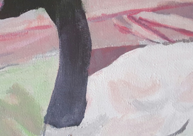 I also brought the green of the leaves and the pink of the bank into the black of the swan’s neck. For the swan’s beak, I used a combination of quinacridone red and transparent mixing white for the pink areas and ultramarine blue mixed with transparent mixing white for the blue parts. I promise your email will not be published.
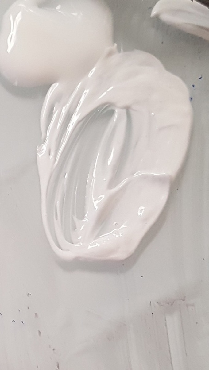
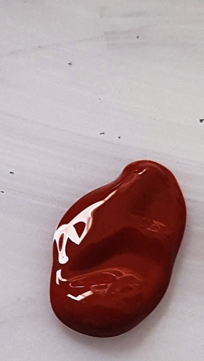
The word medium is used two ways in art. One way is to describe the material that an artist works in, such as oil, watercolor, graphite, or what have you. The second, and the definition that I'm going to be discussing is this post, is something added to paint to change it's texture. I use mediums both to thin paint and to thicken it. I thin paint when I want to do a glaze, or when the paint is just too thick to work with on it's own. For this purpose, I usually prefer a matte fluid medium. The one I'm currently using is from Liquitex. I can add the matte liquid medium to something like LIquitex Heavy Body, which is a thick creamy paint, to thin it so it behaves more like Liquitex Basics. Here is some zinc white with no medium mixed in it, and here's that same white paint, with some matte medium mixed into it. A type of medium I've just started using is called flexible modeling paste. The purpose of this medium is the exact opposite of that of my other medium. While the purpose of the matte liquid medium is too thin paint, the purpose of the modeling paste, which is a gel medium, is to thicken paint. You can add modeling paste to something like Liquitex Basics or Amsterdam Standard Series, which on their own are pretty soft textured paints, and create a more impasto effect. I bought it specifically to use with the Liquitex Soft Body line, though. Liquitex Soft body is very fluid and flows over the canvas easily. I've just started to experiment with it and I think it's going to be great for backgrounds and times when I don't want brush strokes to show. The thing about the soft body line, though, is that it's so fluid it really will not hold brush strokes and sometimes, I need brush strokes to show. This is especially true if I'm trying to create texture of any kind. That's where the modeling paste comes in. I can use it to thicken my Soft Body paint so that it's viscous enough to actually hold brush strokes. Below is an example of some Liquitex Soft Body paint as is, and here's that same paint with some modeling paste mixed in. 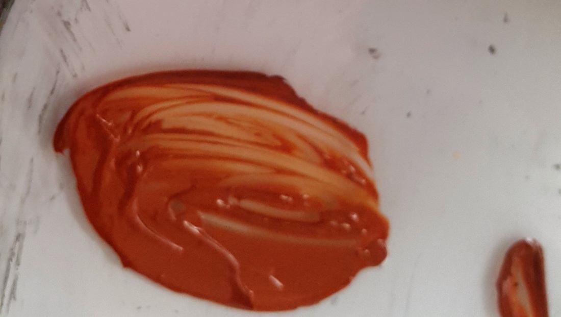 So that is how I use mediums as an acrylic painter. I hope you enjoyed. Do you use mediums? What kind do you use? Tell me in the comments. I promise your email will not be published. I titled this video “the beauty of glazing”, not only because glazing, which is applying sheer colors in light layers, can create a beautiful effect, which it can, but because knowing how to glaze is so helpful for artists. The thing about glazing, is that it can give you extremely realistic results. You’ll see that Lisa captures the texture of those grapes perfectly. Glazing will really have this effect of making things look more realistic if you do it over an underpainting. Another wonderful thing about glazing, is that it’s a quick way to correct color. If something needs to be more red, you don’t have to mix an entirely new color, just glaze red over it. You can also tone down a color by glazing it’s complement over it. Watch my video “Introduction To Color”(card in video) for more information on complementary colors. Just be sure to blend your edges so the color isn’t visible. I have a problem with this, myself. Like I said at the beginning of the video, glazing is applying sheer colors in light layers. You’ll also hear Lisa talk about this in her video. Therefore, not just any color can be used for glazing. You need to use transparent colors and you need to mix them with a lot of water or mixing medium. I think it’s about time to end this video. I promise your email will not be published.
|
Sara MillettPainter of portraits and wildlife Archives
November 2023
Categories
All
|
