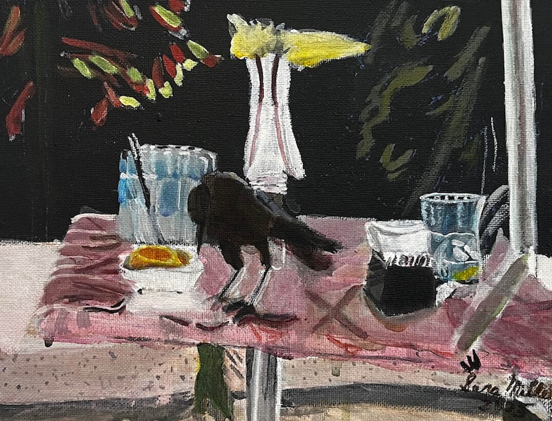
 A couple of months ago, I went out to lunch with some ladies from my art group at the Mimosa Cafe. There were a bunch of these little birds flitting around and I happened to capture one of them that had landed on a table across from me. It was important to me to the depict the textures of the marble table and the glasses themselves. When it came to the glasses, to achieve the goal of transparency, I layered transparent mixing white for “frost” over cyan blue. I contrasted titanium white and mars black for shine. As far as transparency, I let the background colors show. That, contrasted with the opacity of the titanium white, adds to the translucence. I focused on the shapes formed by the frost, the highlights, and how they were positioned next to each other, not on the whole glass at once. I don’t have much experience painting glass and other transparent objects, so this is helped me grow as an artist.
I used a pale pink for the table and a liner brush for the marbling texture, taking care to curve my lines at the edges to create three-dimensionality. To create the shiny texture of the table, I made sure that everything on it was reflected on its surface. Also, to prevent these reflections from being mistaken for decorations or things painted onto the table, I softened their edges and gave everything a slightly pink tint. I didn't want the table to look like a mirror, but I did want it to have some gloss to it. I painted this in acrylic on an 8x10 canvas.
1 Comment
I painted my community's clubhouse pool area in acrylics. Read on to find out how. 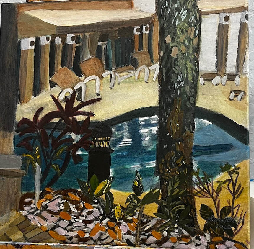 I’m starting by painting the sky, pool and deck as a base. I’m painting the grisaille and I’ll go on top with color. After I painted the shadows on the pool, I realized they were too dark and needed to be lightened. 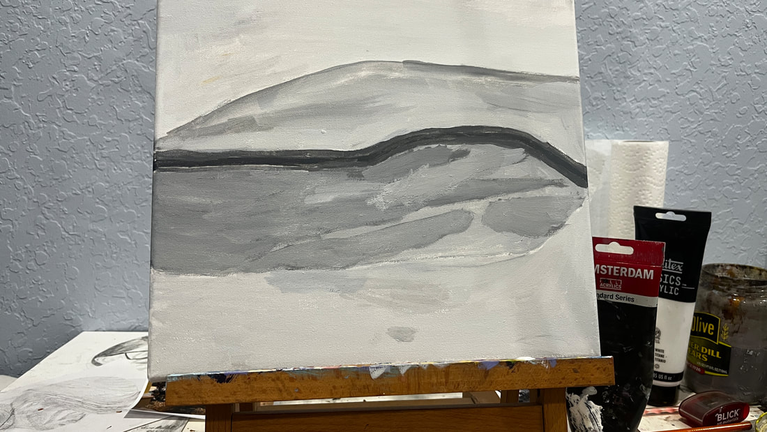 I mixed cerulean with ultramarine for the water and glazed green on top of that to brighten it.
After I’d finished glazing color over the water and the deck, I took a charcoal pencil and drew in the plants, gazebos, chairs, and tree. At this point, it was time to start over with the grisaille again. 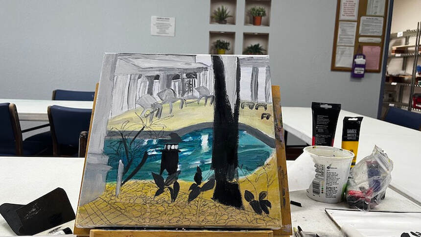 Using my liner brush and wiggling my wrist while holding the handle, I can get the roughness in the tree bark I’m going for. Making the highlight on the side of the top of the light post sufficiently light gives it dimension. I’m much happier with how the gazebo looks much better since I’ve added those dark shadows to the spaces between the posts. 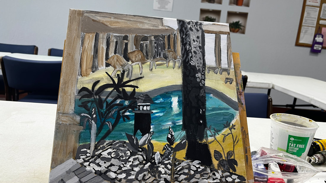 Approaching painting the pebbles, I’ve decided to mix a grayish purple from transparent mixing white and ivory black for the palest of them. The purple came out too bright, so I mixed some orange into it.
Most of the pebbles were different shades of brown, so I used yellow ochre or burnt umber mixed with cadmium red medium, which I chose for its orange tint. I had originally tried to use my yellow ochre and red mixture mixed with green and black for the darkest pebbles, but I quickly realized that mixture wasn’t dark enough.  yellow ochre mixed with cadmium red medium I planned to paint the spaces in between the bars on the light post yellow and glaze orange on top of that, but I was surprised by how happy I am with just the yellow. 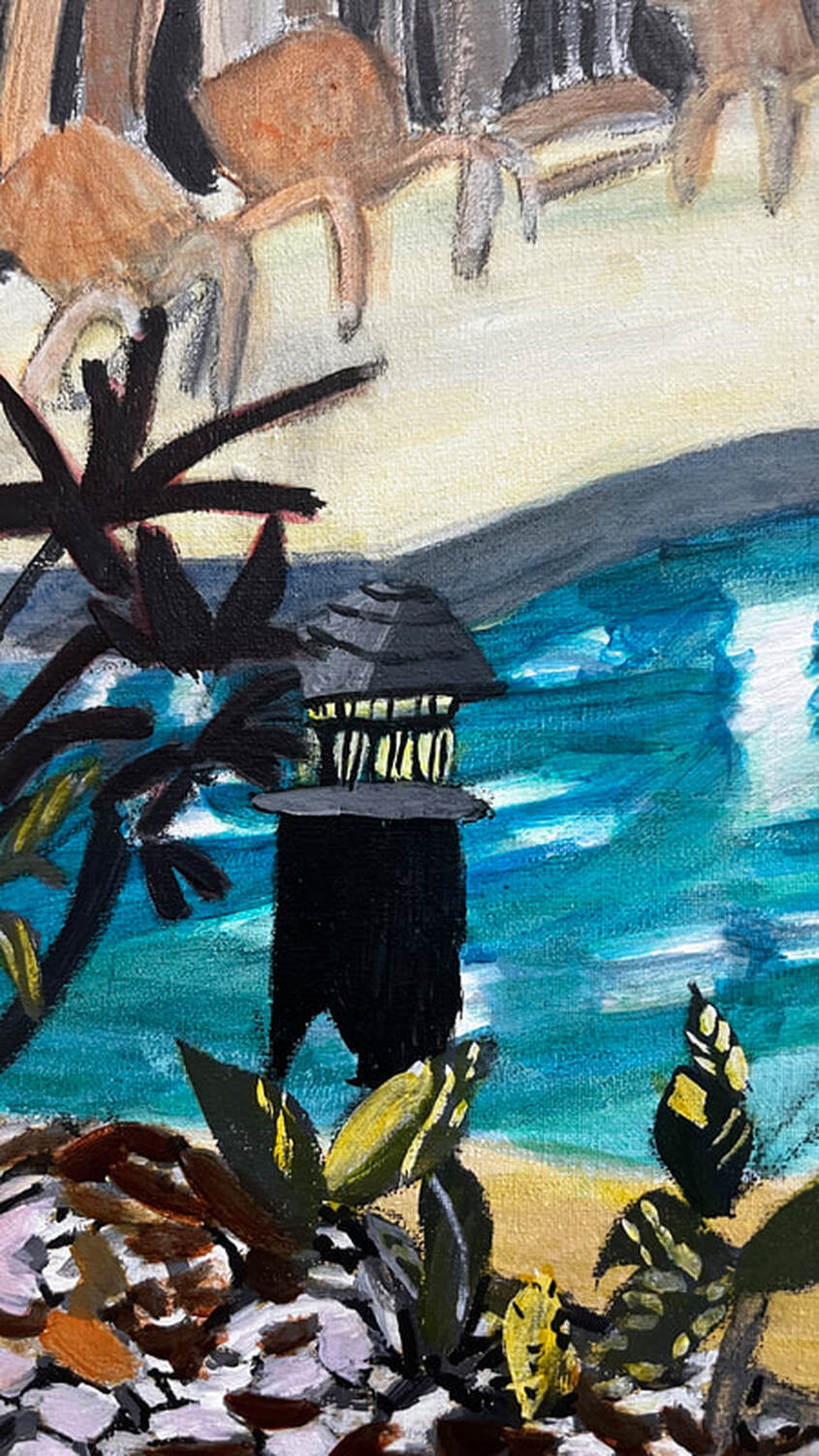 Here’s the lighthouse with orange glazed over the yellow. 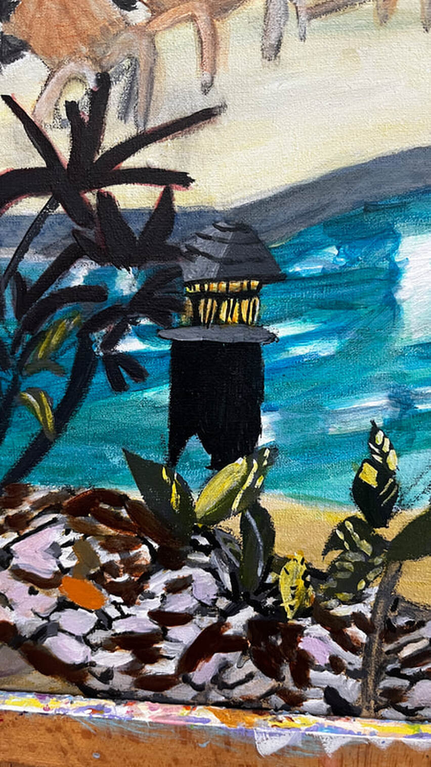 I mixed transparent white with yellow, purple, and cadmium red medium and glazed over the gazebo because it needed to be peachy. I used an opaque version of this color for the top of the gazebo roof to create the necessary contrast between it and the sides to make it look three-dimensional. 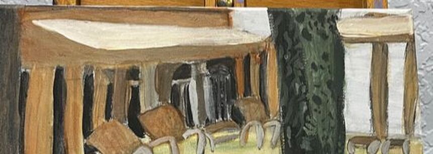 There needed to be more medium-brown pebbles. 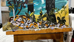 I knew the tree needed more detail, and I painted some brown markings on it, being careful to paint the same approximate shapes as were in my reference photo. 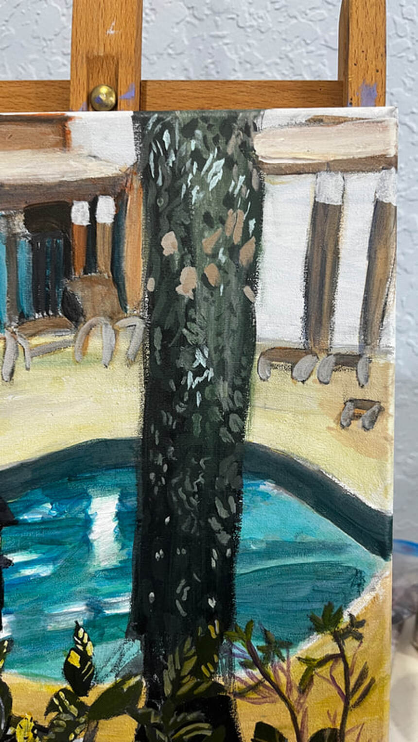 When I felt I’d done all I could on the tree, my attention was turned back to the gazebo, and I realized that there needed to be a shadow along the front of the overhang to give it dimension. I did this simply by glazing blue, which I’d toned down with orange so it would be muted and shadowy over that side. While I was doing that, I glazed that same blue over half of all of the posts. You don’t always have to do a big mixing job to get effective shading in your pieces. I saw that the windows in the gazebo looked to be bluish green. I used cyan instead of ultramarine this time when I mixed the shade for them. 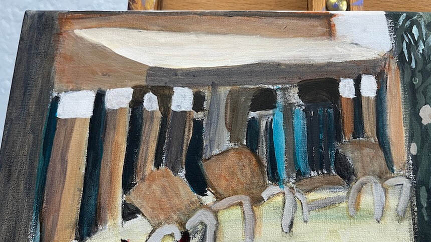 The first thing I did today was paint pale purple highlights on the reddish-purple leaves in the lower left-hand corner. The shade I mixed didn’t come out red enough, so I glazed some red over my purple when it had dried. 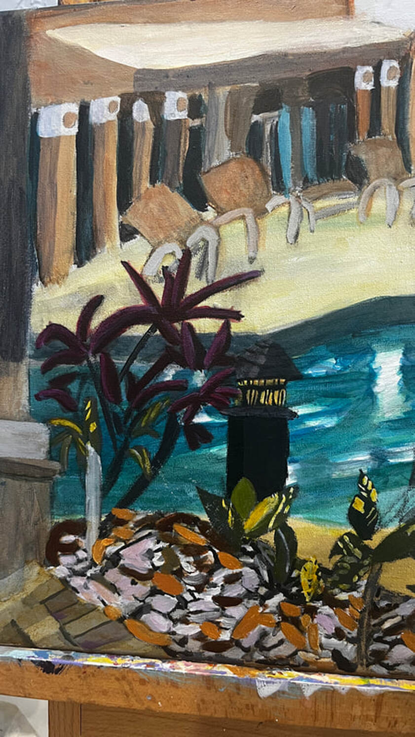 You can also see the light post in this pic, and you might notice that I painted two-thirds of it a lighter shade of gray, so now it looks like it has a front and a side. There was some obvious dry brushing in between the posts in the gazebo and on the edges of the tree, so I worked on taking care of that. Dry brushing is when there are little holes or bumps in the paint due to insufficient paint or water in the brush. So the fix for dry brushing is to go back over those parts with the same color, of course, but with just more paint and/or more water, in the brush. I painted reflections in the pool by wiggling my wrist from side to side, then spritzing the canvas with my cosmetic spray bottle, and then blending out the edges of the wet paint with a dry brush. 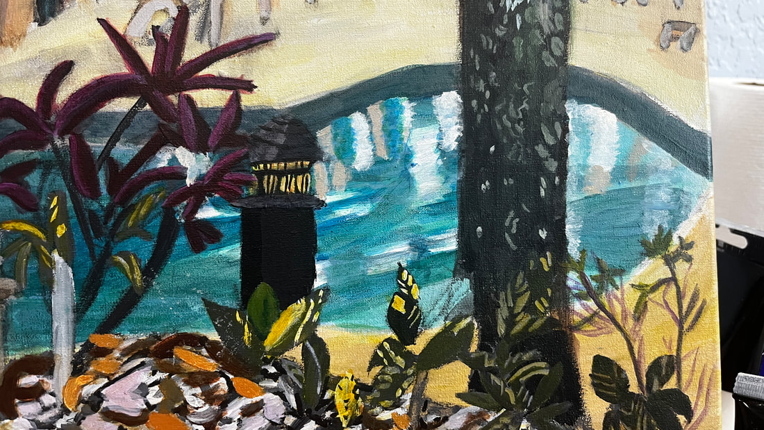 Then I glazed a layer of blue-gray over all of this. My first layer was too sheer. I wanted the reflections to look almost cloudy underneath. 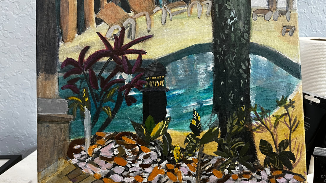 I painted more green detail in the tree using a liner brush. I blended out the edges so they wouldn’t be harsh lines. 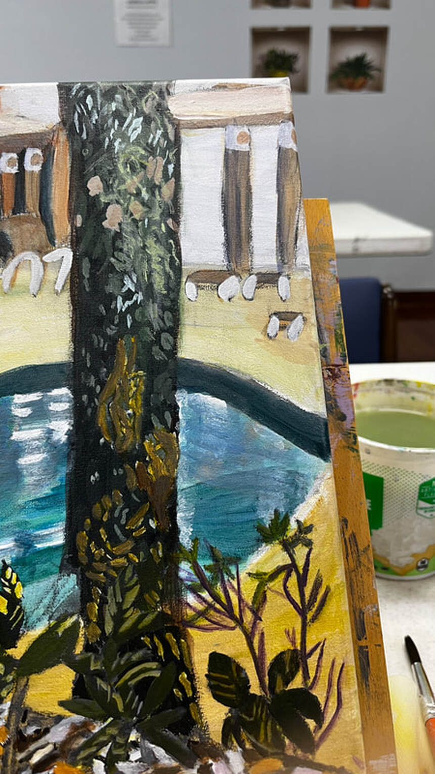 Those brown spots were too warm when I first put them down, so I added blue to my mixture for the second layer. I was finally satisfied when I mixed some gray into my brown. I glazed burnt umber over these leaves and I think they look much better. The color I’d painted them had been bothering me for a while. 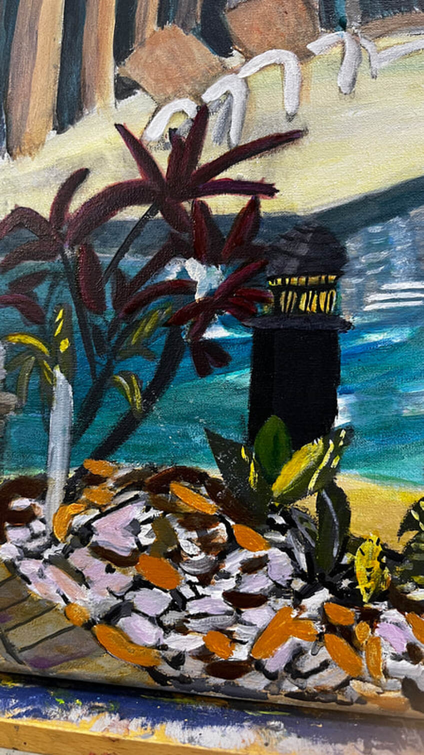 Being almost finished with this painting, my main concern today was adding contrast and saturating colors where appropriate. I darkened the edge of the pool, the windows of the clubhouse, and the tree with ivory black. I also lightened the deck with transparent mixing white. What I was really interested in, though, was brightening up the water in the pool. I did this using a combination of dark permanent green and, later, ultramarine blue. I was pretty satisfied with my work, 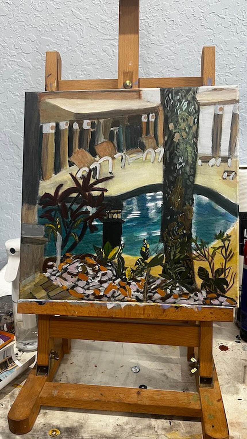 but then, while I was cleaning up, a bottle fell off a shelf, and when I looked at it, I saw that it was Prussian blue, a color I hardly ever use. I wondered if it was still good, as it didn’t seem to want to squeeze out of the container. I scooped some out with a brush and, while it was on my pallet, thought to myself that it really was a beautiful color and it was a shame I didn’t use it more often. It might just be perfect for what I’m going for with this swimming pool, I thought. 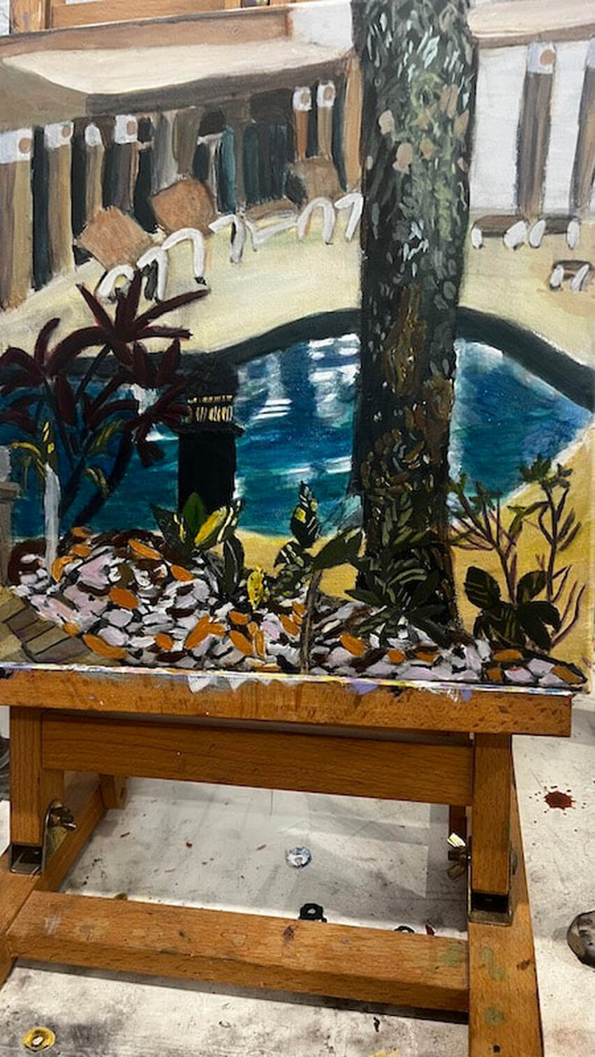 Before adding the Prussian blue, the water looked gray in comparison. I used a 12x12 watercolor canvas from Fredrix and paint from Liquitex and Royal Talens for this painting.
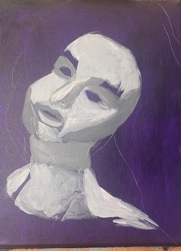
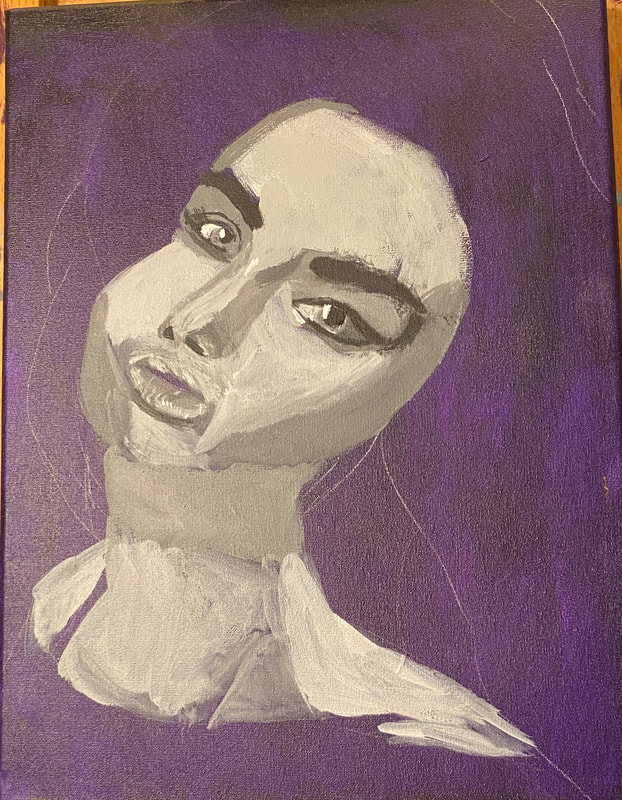
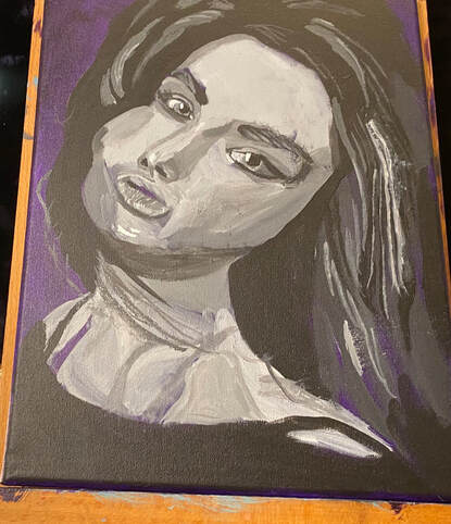
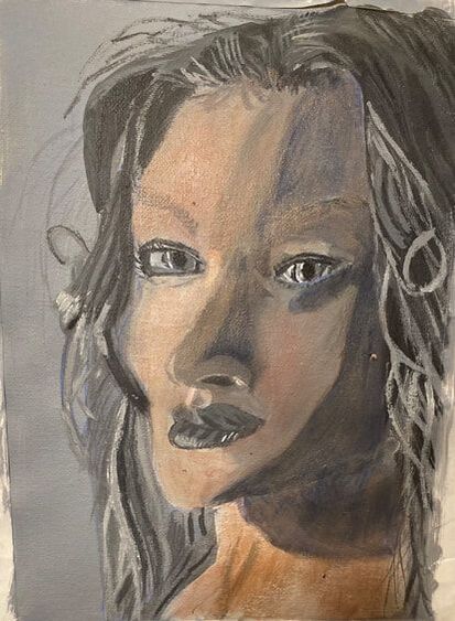
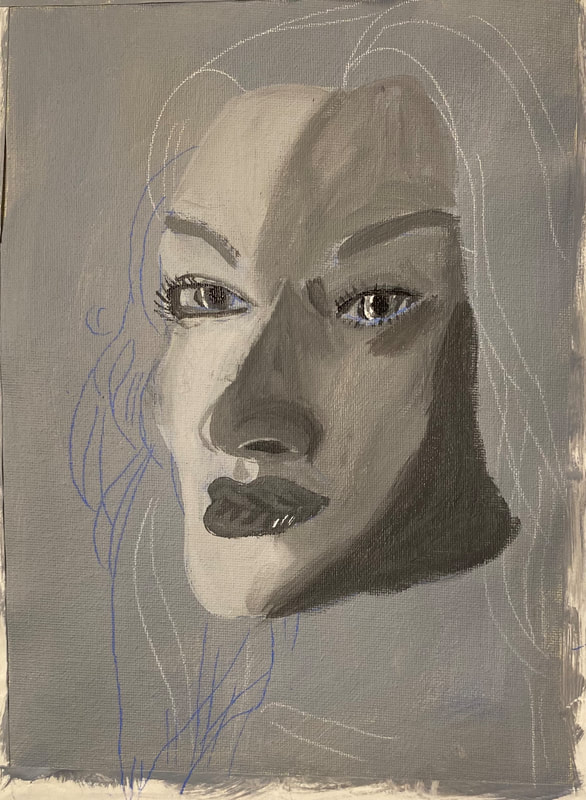
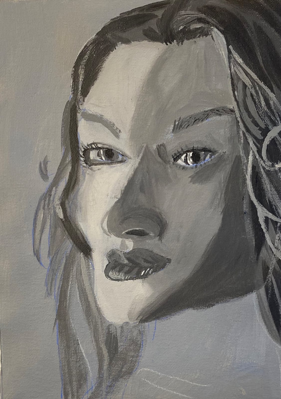
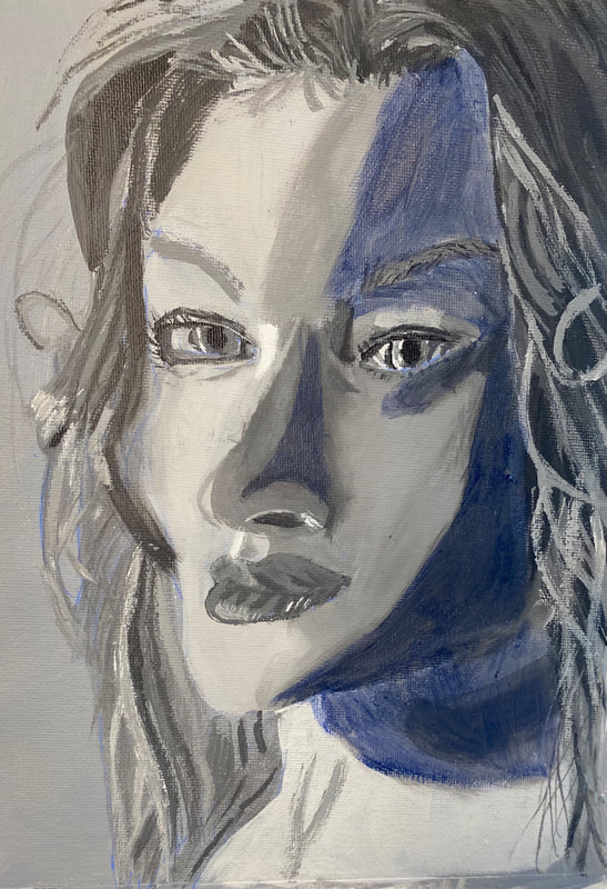
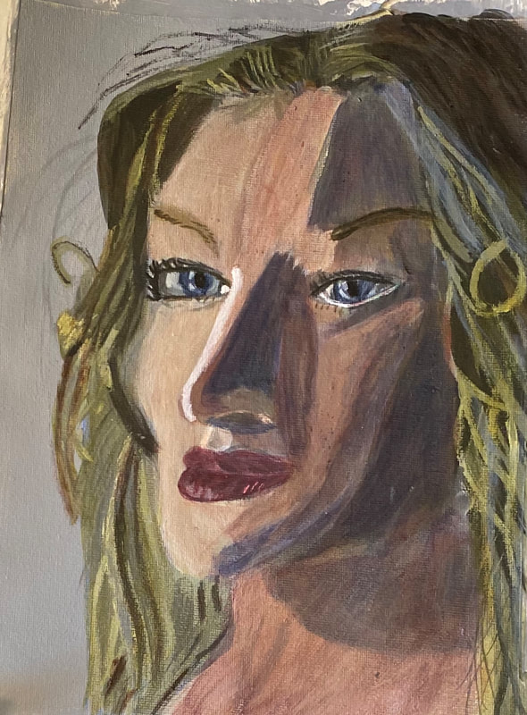
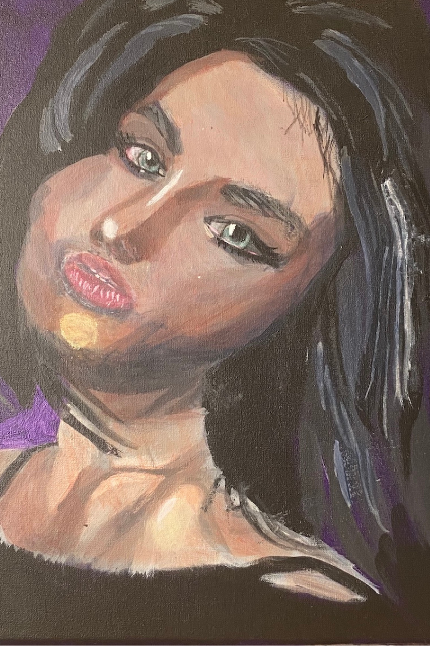 The more I used this canvas the more I liked it. More about that later. The edges are thinner than most I’ve worked with. I believed that was the only con of it, but after having worked on it for more than a week now, even that doesn't feel like much of a con. I decided on a bluish purple background for this portrait. I decided to mix ultramarine into my dioxazine purple and see how I liked that. I didn't mix any white into it, though, because I wanted it to be extra dark and, more importantly, I didn't want to dull the color. I painted my background in two layers using a large filbert brush and blending out my strokes with a mop brush. As I was putting the final layers on my background, I really started to notice how pleasant the texture of this canvas is. 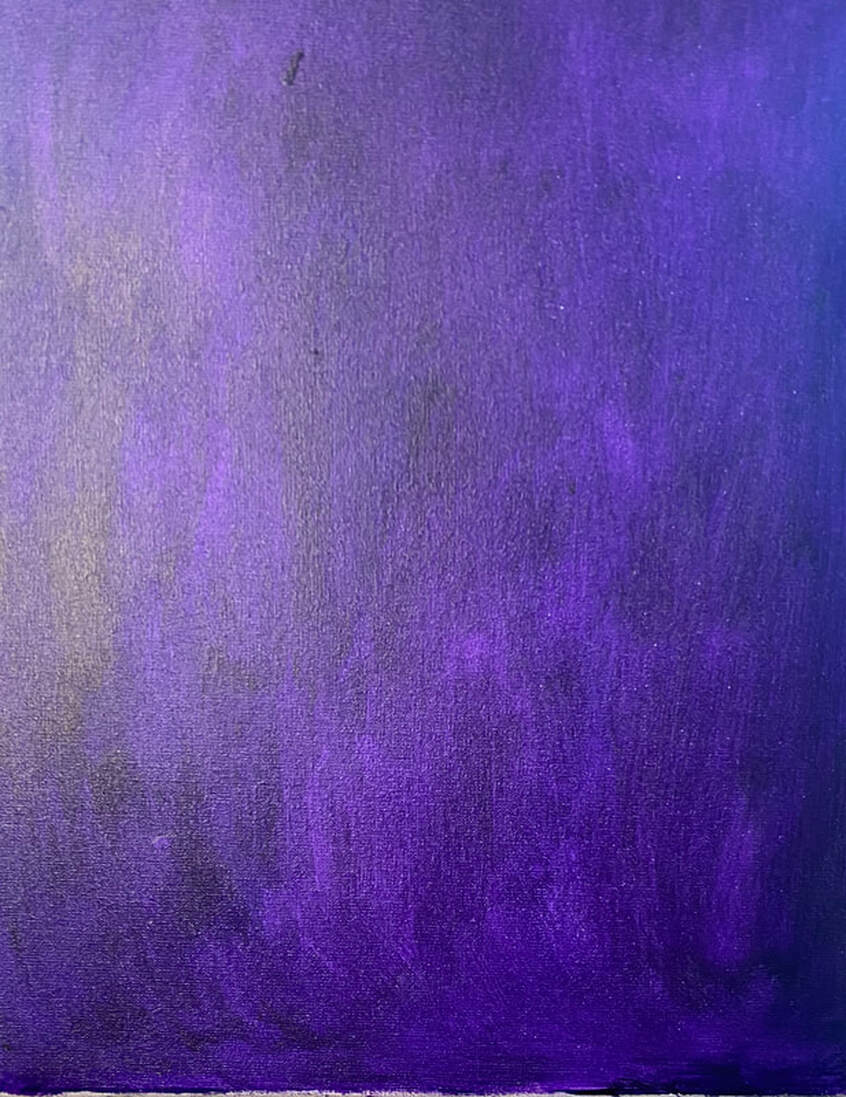 Fast forward, and now I’m building up depth in her eyes and mouth with shadows and highlights. Using a liner brush, I painted highlights on her eyelids, being careful to avoid the creases I’d painted. Where you place these shadows and highlights is just as important, if not more so, than how dark or light they are in terms of the structure of the face. Painting something a shade or two darker than it is in the reference photo won’t throw off the structure of your face as much as putting that same mark a centimeter or two of from where it should be. I’ve been making a point to keep my hand moving continuously while making most of my strokes, rather than stopping and starting. This creates a much smoother appearance. Making those smooth lines is also very easy on this canvas. I’m especially proud of the way her eyes have come out. I made her cheek rounder by painting another stroke on the outside. On the topic of her eyes, I ended up enlarging both of her pupils to open her eyes more. Pupil size can really effect the overall expression of the subject. Advertisers know this
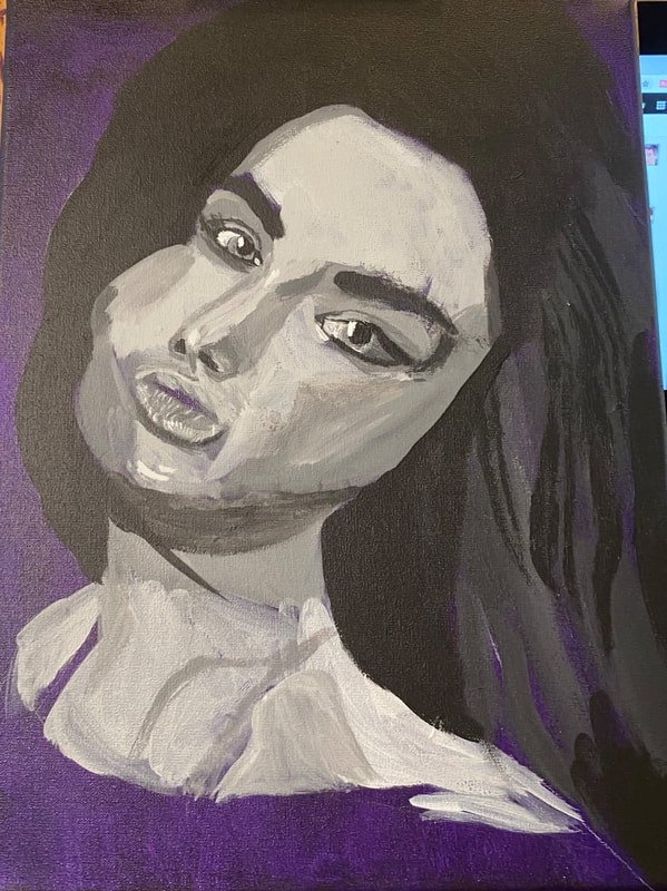
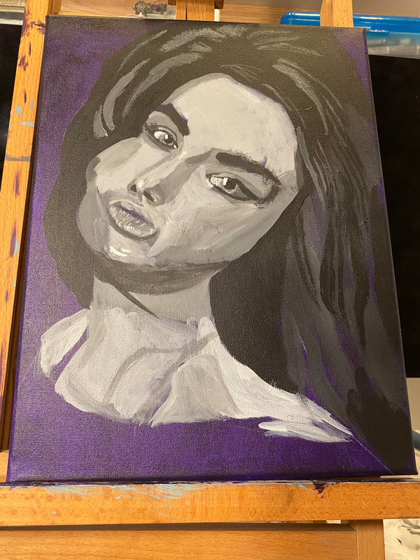
Last night it was time to add the lightest shades to her hair. I knew I wanted a lot of contrast between these and the darkest shades, but I went a little overboard with how light I made it to begin with, so I needed to add more black to my mixture. As with every other part of the hair, I was careful to place these strands in the right places in relation to each other. That went a long way in giving the hair the texture I wanted it to have, and the volume. I worked on painting her chest too, particular around her neck and shoulder, which I see both need to have brighter highlights than they have now.
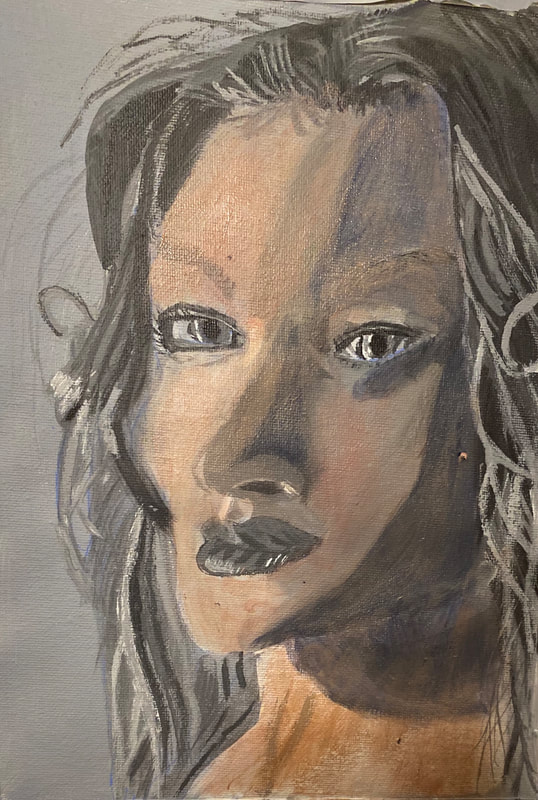
Her chest is the main thing now keeping me from moving on to the color. I haven’t gotten it to the point where I feel that the definition in her shoulder and collarbone is defined to my satisfaction. I’ve been working on making the highlights brighter that need to be and I think now I need some highlights that are just a touch brighter over very small areas, such as above and below her collarbone. I’m going to keep layering. I’ve filled in her teeth using my liner brush. 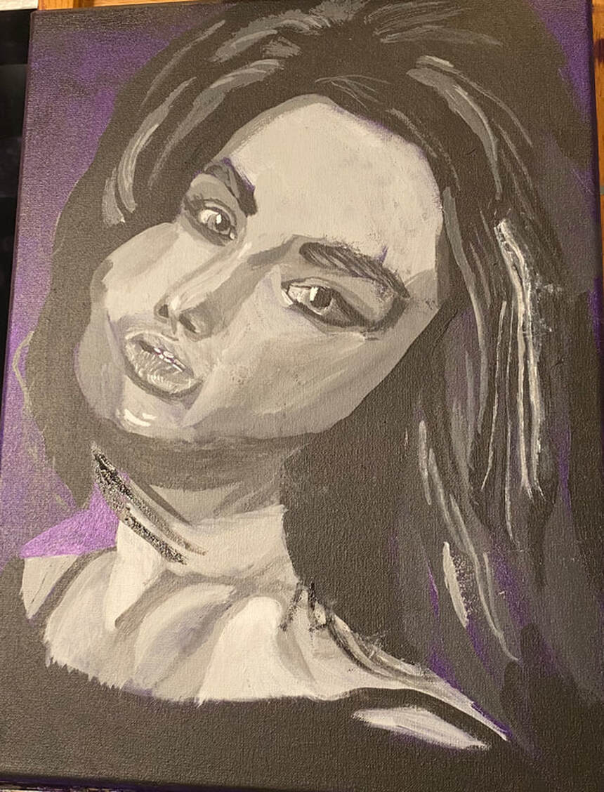 For the first layers of color on her face, I knew I wanted a pale muted pinky color. I tried mixing cadmium red deep, because it has more blue than cadmium red medium, which is more orange, with deep green permanent. This color came out too purple, though, so I mixed some yellow in to take care of that. I thinned this mixture down with water applied it in two thin layers all over the subject’s face and neck. I’ll add more layers to the skin later, but the next thing I did was paint the irises. I did this by mixing a touch of the deep green permanent into some gray that I made by mixing zinc white and ivory black. Even though the subject has green eyes, I didn’t want to use straight green. That would’ve looked cartoonish.
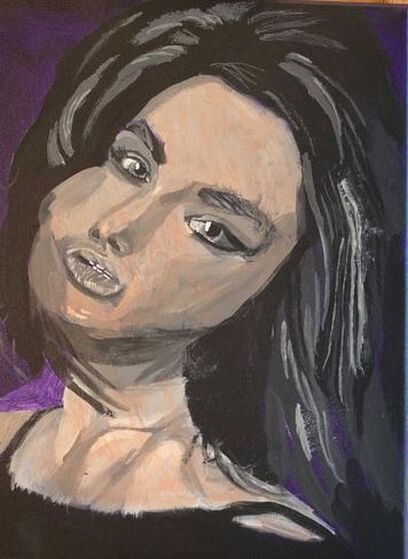
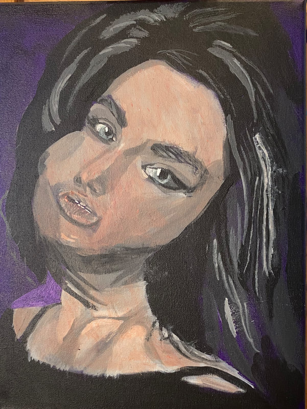
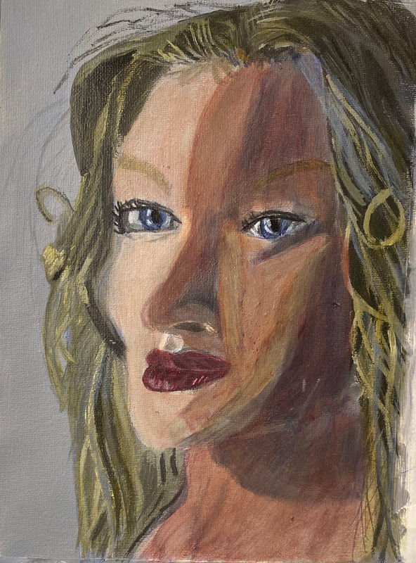
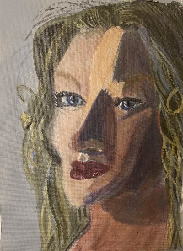
I mixed a darker version of the same color I used for the base color of her skin for the shadows under her cheekbones, the sides of her forehead and around her nose. Before I did that, though, I glazed some zinc white over the middle of her forehead, down the bridge of her nose, and on the apples of her cheeks. This small change gave her face a lot more definition. While I was painting what I thought would be the darkest shadows on her face, still using my brownish pink mixture, I realized I would need to include some blue shadows. I mixed those from ultramarine blue and an orange made with magenta and glazed them over the shadows I’d just painted. I feel I should point out that I was able to blend out the edges of these shadows very easily on this canvas. 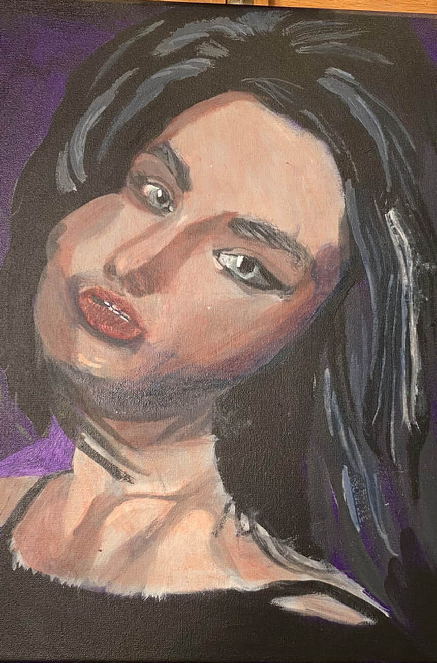 Painting pale gray on the outer corner of her right eye seemed to open it up more. I also painted a mars black line underneath and gave her some lashes. When I go to work on the piece again, I will glaze some bluish gray over the cornea of her right eye, too. I felt that her lips needed to be lighter, so I started by glazing some zinc white over them. I tried twice, thinking it was too light both times. The white was completely covering my color and all my details, which was not what I wanted. I decided to just start by glazing a streak of white in the center. I’ll probably go back and glaze some pink over that to help it blend in more with the rest of her mouth. 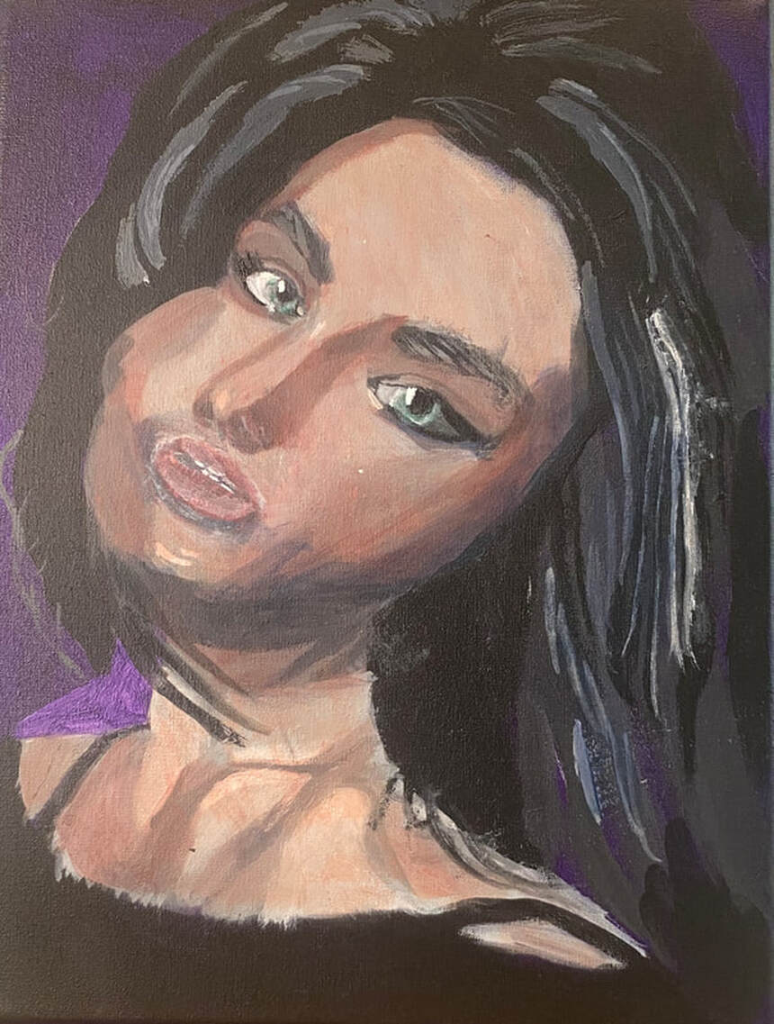 Today’s painting session started with that glazing of pale pink over the white of the mouth I predicted. I decided I was going to add some small areas of titanium white with my liner brush for extra glossiness, but that would have to wait. In the meantime, I directed my attention to her eyes and started by applying the streak of dark blue gray under her right eye that I’d known needed to be there since yesterday. I added some pale yellow to her left shoulder and her chin to show them catching the light more. 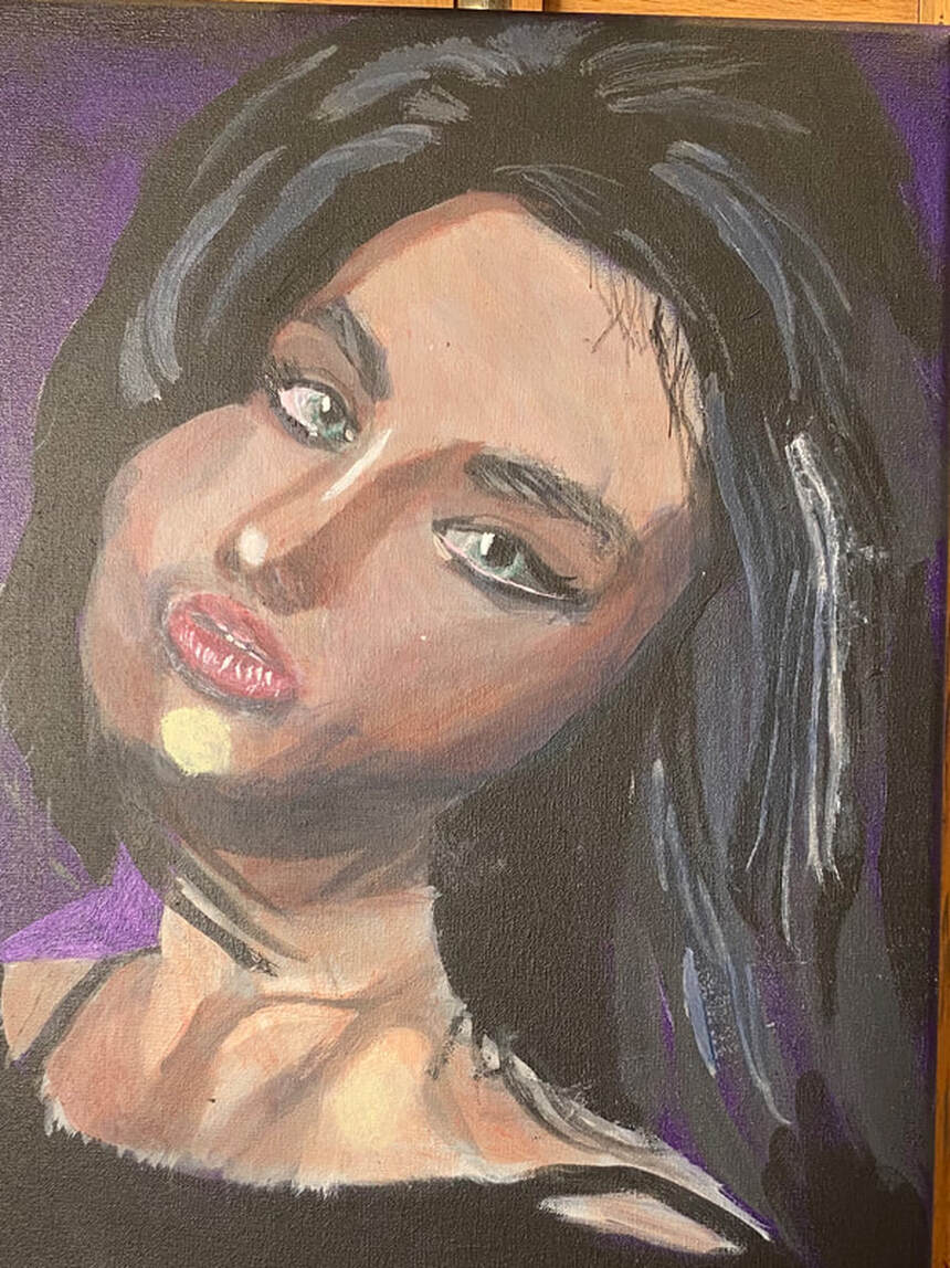 When I started my latest painting session, I sat down with the intention of painting the shadow the rim on the outer corner of her right eye, then moving on to her mouth. While I was putting my paint onto the palette, though, I thought it would make more sense to start with the mouth, since I would need a lighter color for that, so that’s what I did. I glazed a pale pink over the white marks on I’d painted on her mouth, blending them in much more with the rest of it. This greatly improved the look of her lower lip in my eyes. Then I mixed more red and more green into my color and did what needed to be done on her eye. I’d known for a while that I’d need to paint some titanium white on her left shoulder, just a small spot, to show where the light was reflecting. I took care of that with a liner brush. It was at this point that I started struggling to find things to do on the painting, but I saw that her eyes needed a dark gray rim, very thin, around the edge of each iris. I really struggled to get these lines thin enough. I mixed my gray from ivory black and zinc white, by the way, the transparent versions of black and white. Anyway, I put just a touch of paint on the tip of my liner brush and was careful to let just that touch my canvas. Even so, my lines were still too thick. I had to wash most of the outer edges of them with water. I noticed in my reference photo that there was a similar line going all the way across her lower lash line on her right eye. This also came out thicker than the reference photo, but this time I didn’t mind. 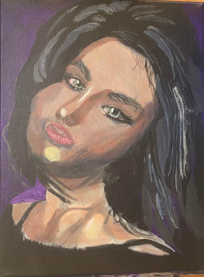 Today I glazed more of my flesh color over the spot on her chin, which I felt was standing out to much, drawing too much attention to that area. I directed my attention, now, to her chest and saw that there was some pinkish color reflected around her collar bone. I also added wisps around her hair with my liner brush. 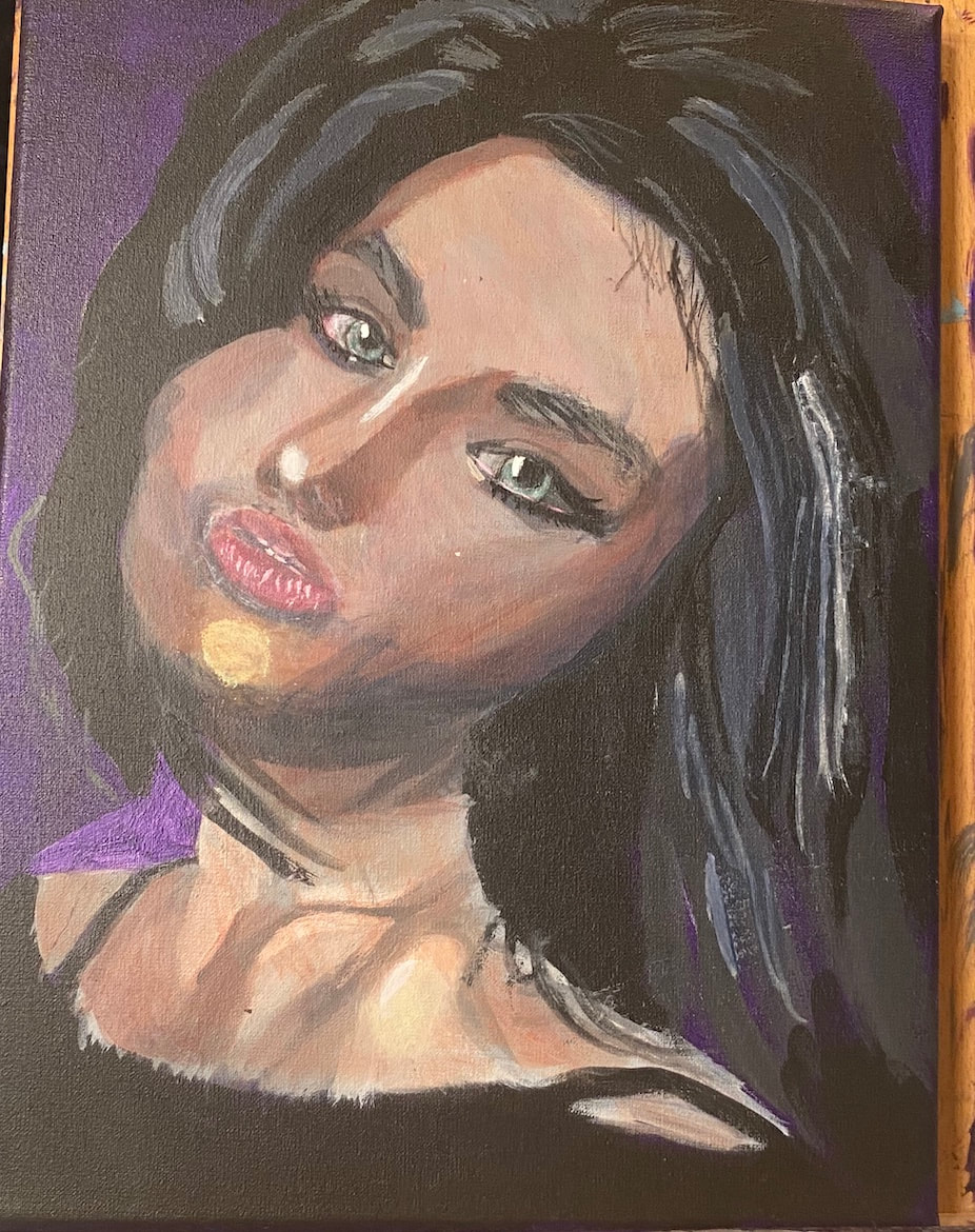 I had a very short painting session. I started by painting a bit of gray on her strap for a highlight. I’ll add more to that later, but I needed it to dry, so I moved on to another section of the piece. I noticed that the highlights on the right side of her hair needed to come down farther on her face, so, using my round brush and the gray that was still on my palette, I did just that. 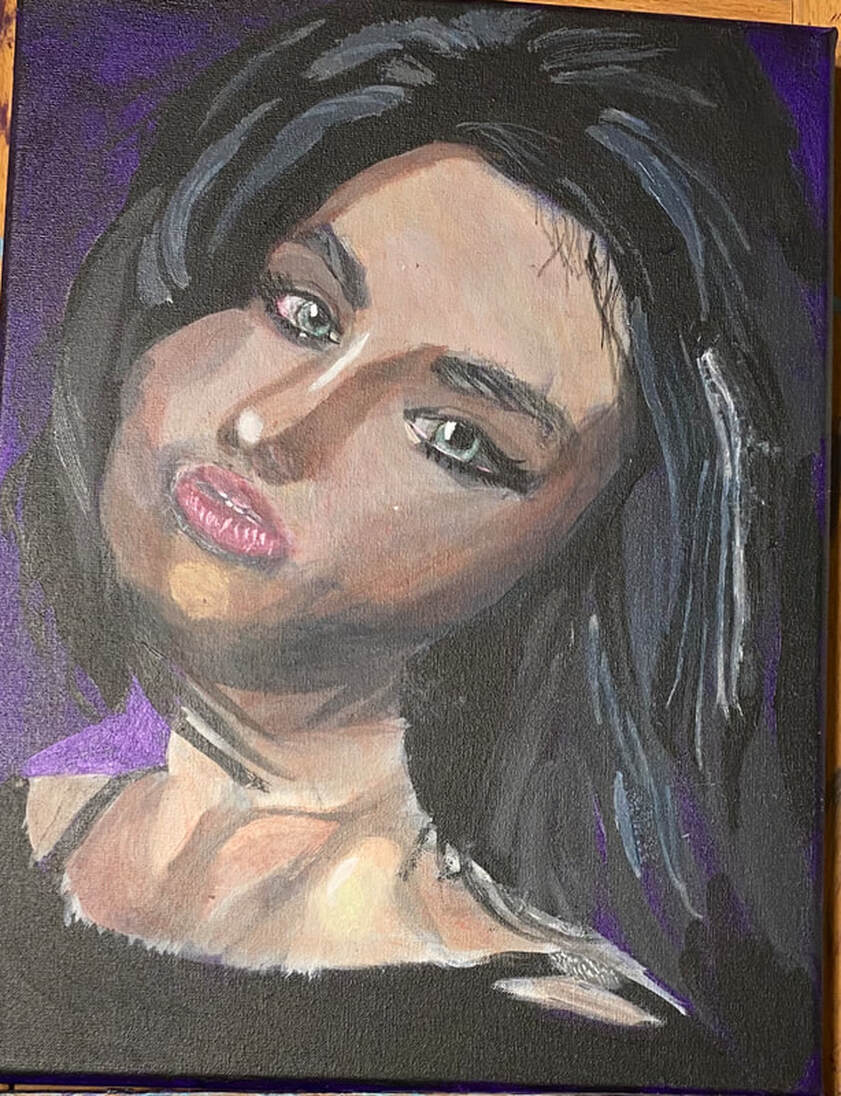 I’m starting by painting the bamboo and branches. This is so that when I add the panda over them, they’ll look like they’re behind him instead of growing out of him, if you know what I mean. I can see that most of the bamboo is very light, so I used a light gray as my base. I look at the shapes I see in my reference photo and mimic them. Painting all these shapes and keeping track of them requires a lot of concentration, but this allows me to almost turn painting into a mindfulness practice. Little by little, the shapes start to become the object I’m painting. 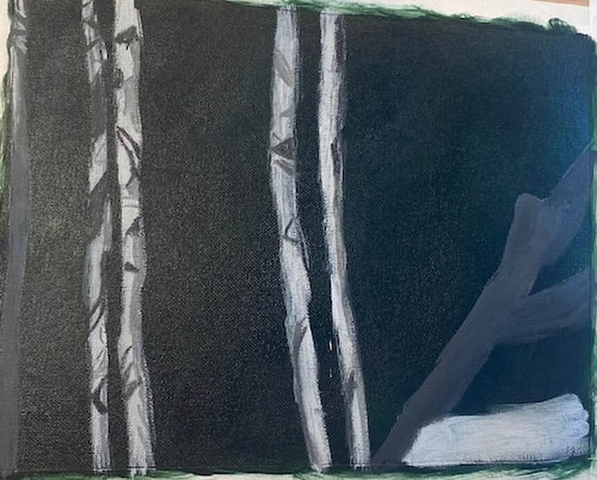 Today I finished the underpainting of the bamboo and transfer the giant panda on. I positioned my transfer paper so that he would be walking into the scene from the right hand edge. Once the major form of the panda was on the canvas, I refined the shapes of his head, back, and right hind leg. After that, since I still had quite a lot of paint on my palette, I started to use block in areas of the panda’s body that were similar in value.  Today I painted more fur texture. I wasn’t worried about painting in every individual strand. I only painted those pieces that really stood out. What I did worry about, was making sure my strokes were going to in the general direction of the fur. Paying attention to the direction of your strokes can give you a fairly realistic, three dimensional look, even without spending a lot of time on individual strands of hair or fur. 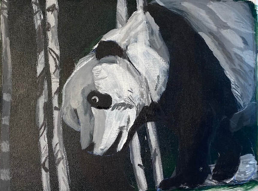 I started by glazing grayish brown all over the bamboo stalks. Later on, I brought this same color into the panda’s face and upper back. I was trying to glaze a grayish blue over the panda’s back, I can’t get the blue to show up now. I’ll have to try again on Monday. 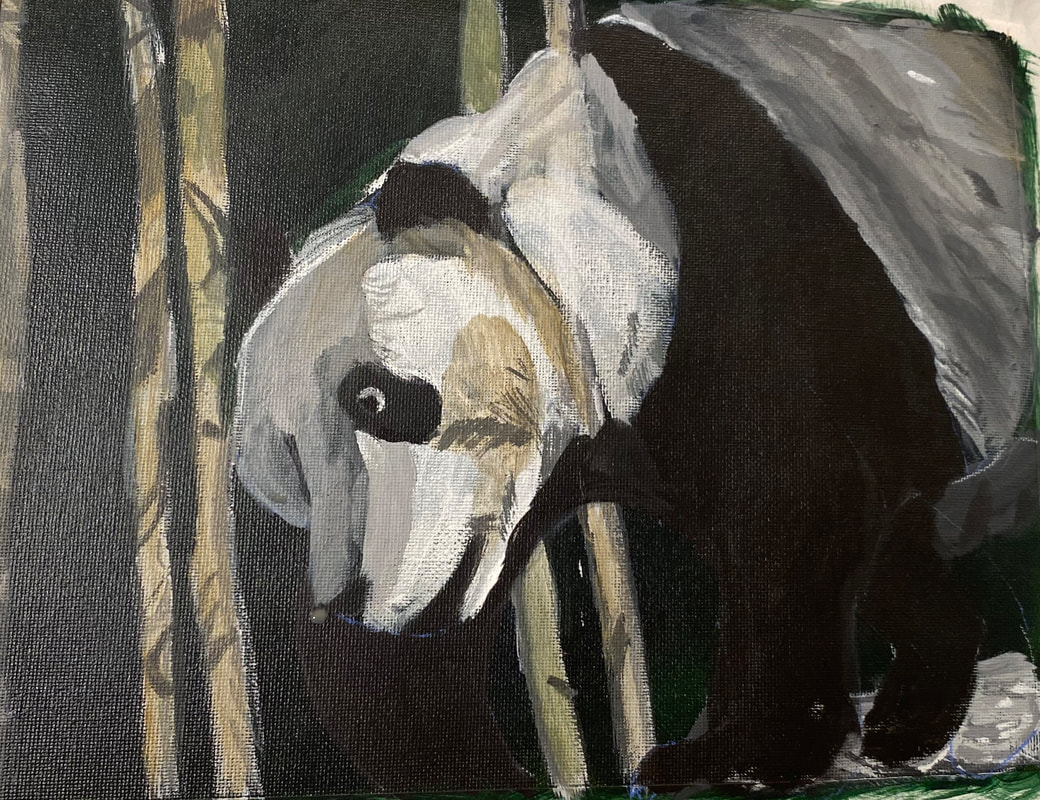 At this, I’ve started to reach the “I know this painting isn’t finished, but I don’t know what else it needs” phase. I pulled the reference photo up on my phone and took a close look at it. I saw that I needed some more pale grey fur strokes where the white meets the black on his back. I sat down to paint with the intention of just painting those strokes and while doing that, I also noticed some grayish brown marks and painted those. Sometimes you can sit down to paint one thing and see other things while you’re at it that can keep you going. What helps in this case, is, instead of looking at the photo as a whole, closely examine one part of it. In this case, I honed in one the panda’s back, ignoring everything else for the time being. The next time I work in this piece, I’m thinking I’ll do the same thing with his face. 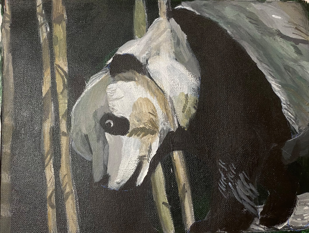 You might notice by now that even though pandas are technically black and white, there’s hardly any white in this guy and there’s less and, barring tiny highlights, the more I work on him. I covered up most of the white I had in his face yesterday. Nothing that’s three dimensional is ever going to be totally black or white, because, by it’s very nature, it’s going to have shadows and highlights. White fur is also going to reflect the colors around it. You can see that I’ve brought the grayish tan of the bamboo into his fur. If he’d been under a blue sky, I would’ve brought that into his fur, but since I used a green background, I brought that in instead. On the topic of white highlights, I’ve been using those to add more fur texture. 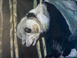 In my latest painting session, I directed my attention to this, 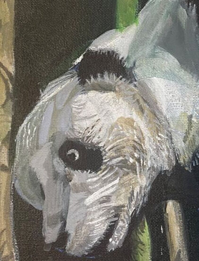 and this.  I noticed that there was lots of texture in both that I hadn’t painted yet. I mixed some light gray paint. The fur looked almost white here, but I didn’t want to jump to white just yet. I used my liner brush, and doing my best to load the paint on evenly and without clumps, touched just the tip of it to the canvas. Even with my best efforts, though, a lot of my lines came out thicker than I wanted, so I came back with my liner brush wet, but devoid of paint, and came back over those lines to thin them. I made similar strokes with both a darker, and a lighter shade of gray than that of my initial layers.  It’s becoming more apparent to me that the texture of the black part of his fur is very coarse, but also shiny near his ankle. To achieve the shine, I started by putting little dots of titanium white with the tip of my liner brush on the ends of the fur texture lines I’d already painted in that area. To achieve the coarse look throughout the fur there is going to be more of a challenge. I don’t want to paint lots of very thing lines because that will just make him look wiry. Also, the shade I used for the strokes had to be very dark, as to almost blend in with the black. I couldn’t have high contrast here. So I mixed a gray using mostly mars black and a little bit of titanium white. Then, using my liner brush again, but pressing harder with it, using more of the body of it, so the lines would be thicker, I painted dark gray texture lines on his leg, all going in the same direction.  I want to point out that when I’m painting all these fur lines, I find that, as much as I like to maintain control, when I make quick strokes, often with a little wrist flick, I’m happier with my results than when I go real slow and try to control everything. Maybe that’s because most things in nature are rough and uncontrolled. I hope that makes sense. I followed this principal of not trying to control things too much to paint extra fur texture around his left ear, his eye, and again, where the black on his fur meets the white. 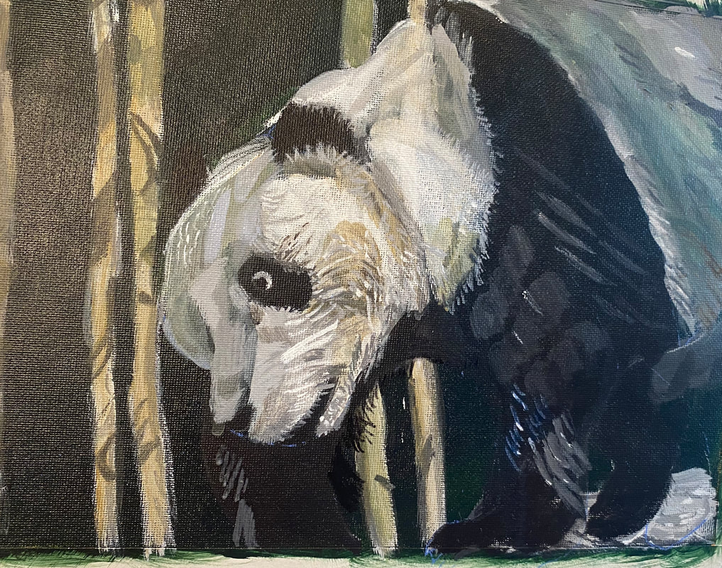 I’d known for a while that there needed to be a blue highlight on the lower part of his left foreleg. I couldn’t just paint it straight blue, though. It would have to be mixed with orange of course to tone it down. I had been frustrated with trying to tone down blue with orange because my blue would always turn purple. I was watching a video on YouTube from my friend Shana Rowe Jackson in which she was painting some blueberries and she was mixing all her colors from cyan, magenta, and yellow. I wrote to her in the comments about the same struggle I just described here and she encouraged me to try using magenta, instead of red, to mix my orange. I did just that with this painting and was thrilled with the results. I now realize that the red I was using was too warm. I was adding yellow to my blue without realizing it. The magenta has a blue undertone, so it doesn’t give me that issue. I took my liner brush and gave him some shaggy fur on his right foreleg. 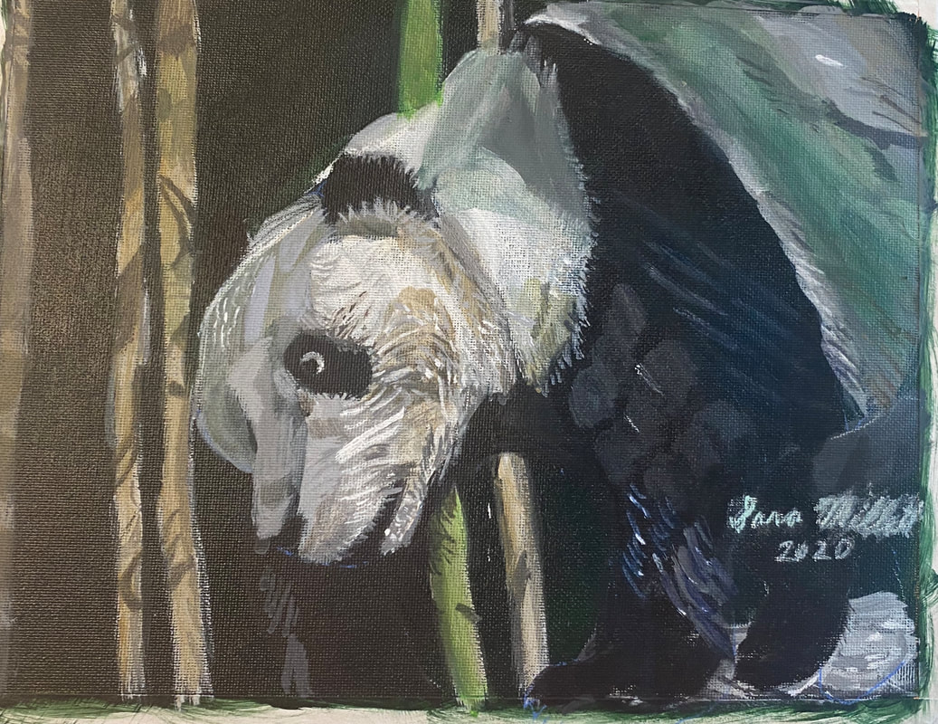 Here's the finished piece. To touch it up, I added some more intensity to the green shadow on his back. I made this decision after playing with the painting in my phone. When I turned up the color saturation, I realized I liked it. His neck had been way too transparent for a long time and I fixed that also.
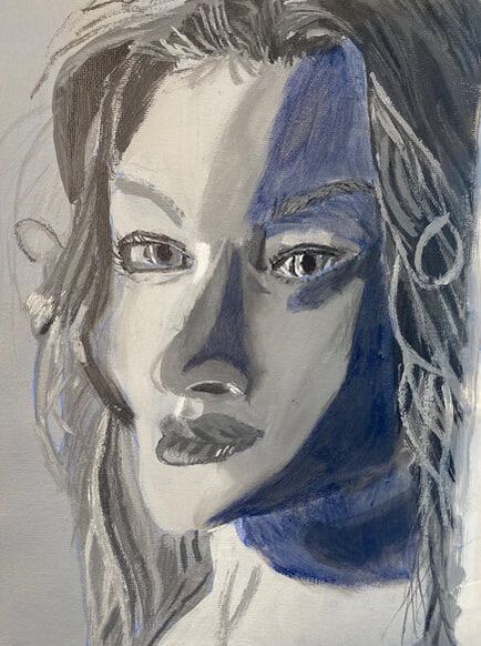
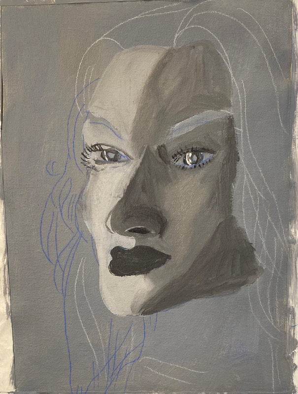
I couldn’t find any information online about how using a blue underpainting for a portrait was done, but I’m basing this off of what I saw Leo Stevens do while recreating Raphael’s “La Fornarina”. Leo used a green underpainting, and while I’m using blue, I copied his method of only putting it on the contours of the face. I did this over a grisaille.
In the later stages of painting this, I noticed that some of the darker parts of her skin had taken on a violet tone. I was puzzled as to what could have caused this, but I should have known that would be the result of glazing color with red mixed into it over something that was blue. Maybe next time, if I want to give someone a rosy glow, I'll add some yellow into the skin, or yellow ochre, if I'm glazing it over blue, to prevent the violetization of the skin. Yes, I just made up a word there. If I was going to try this method again, I would not mix red directly with the flesh color, at least not for the parts I intended to paint over the blue. That’s how I got the violet. In doing this, I accidentally mixed a color by glazing. Mixing color intentionally by glazing can look beautiful, but it's kind of annoying when it happens against your wishes. So, does using a blue underpainting give a more realistic result? I don’t think I can say conclusively yes or no. First off, it may depend on the subject’s skin tone. I have a feeling this technique works better on subject’s with lighter complexions. This was a renaissance technique apparently, and most subjects of paintings back then were Caucasian as was the subject I chose for my piece. In fact, the reason I specifically chose the subject I did is because she reminded me of someone who might have been in a renaissance portrait. The skin of Caucasian people is thinner than those of people of other ethnicity and so the veins tend to show more through the skin, which is where the blueness comes from. Extremely dark skin also tends to have a bluish cast to it, so this technique might also work if your subject has that type of skin tone. Regardless of your subject’s skin tone, I believe glazing, ie, applying color in light layers, in this of the flesh tone over the blue, is the key to making this work. Surprise, surprise, glazing was also a major technique of the Old Masters. So that is my experience doing a portrait with a blue underpainting. Here are some pics of the process. In this post, I'm comparing Liquitex Basics Cadmium Red Deep with Amsterdam Standard Series Carmine. 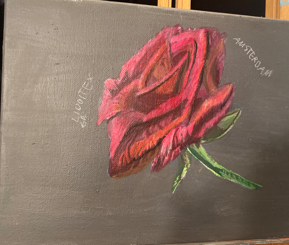 My goals were to
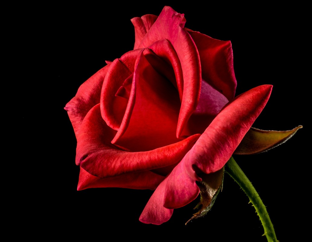 For my comparison, I chose to paint this rose. My conclusion is that both are excellent paints and I would recommend both. Both paints are very transparent, so they glaze beautifully. They also won't life when other layers are applied on top. Find out more in the video below. Id' like to give you a little back story on this painting. In the Spring and Summer of 2018, my parents and I went on a road trip across the United States. We saw twenty-five states in all, including Texas. While we were there, we saw the Alamo, and after that, we went on a river walk around the San Antonio River, which is where I took the photo that I'm making the painting you're seeing from. 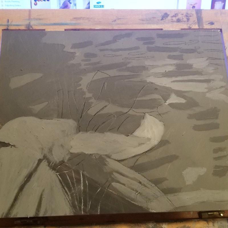 Day One I’m really going to enjoy working on Ampersand boards. I could tell that from the first stroke. I thought, why is the feel of my brush so pleasant on this? Is this really what Ampersand boards are like? 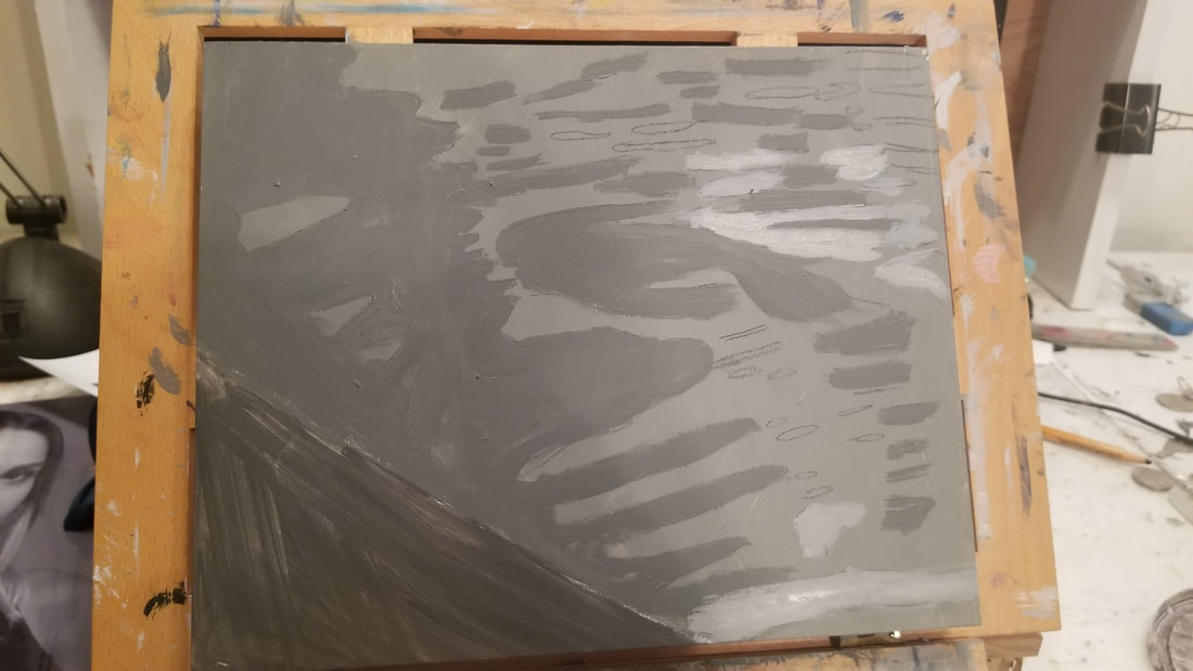 This is what the painting looked like before I added the duck and leaves. I started by blocking in most of the canvas with a medium dark gray, making a small sliver in the bottom left hand corner a much darker gray, closer to black. The large blocked out section will be the river. I took a charcoal pencil and drew the shapes of the ripples in the water and set about painting them different shades. Going back to what I was saying about some of these ripples being lighter and some being darker, trying to paint every ripple exactly like the reference photo is another one of those things that can stress you out. Unless that’s really what you want to do, I don’t recommend putting that kind of pressure on yourself. As for me, I’m not worried about making every ripple the exact right shade. I’m just trying to get some variety in here. Then I drew the duck and leaves on using tracing and transfer paper. Back to the topic of these boards, the cool thing about Ampersand boards is that they’re wooden boards that are pre-gessoed. That’s a big deal because a lot of wooden boards are not pre-gessoed. So if you wanna try working on wood, but don’t want to have to gesso your surface, Ampersand is the way to go. 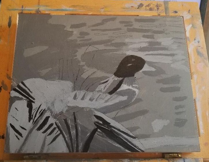 Day Two Today I decided to fill in the extra dark, almost black shadows of the leaves and duck. After painting a few of these, which included the duck’s head, I noticed there was a shadow on the duck’s stomach, which I’d painted a very light gray. The shadow was a good bit darker than the base of shade of the stomach but much lighter than what I’d been using. I went on and used the same shade on one of the leaves. At this point, the light values in his wings started to catch my eye and I decided they needed to be painted. I painted them using my liner brush. I thought the color was too light to start with, so I went over it with a slightly darker shade. 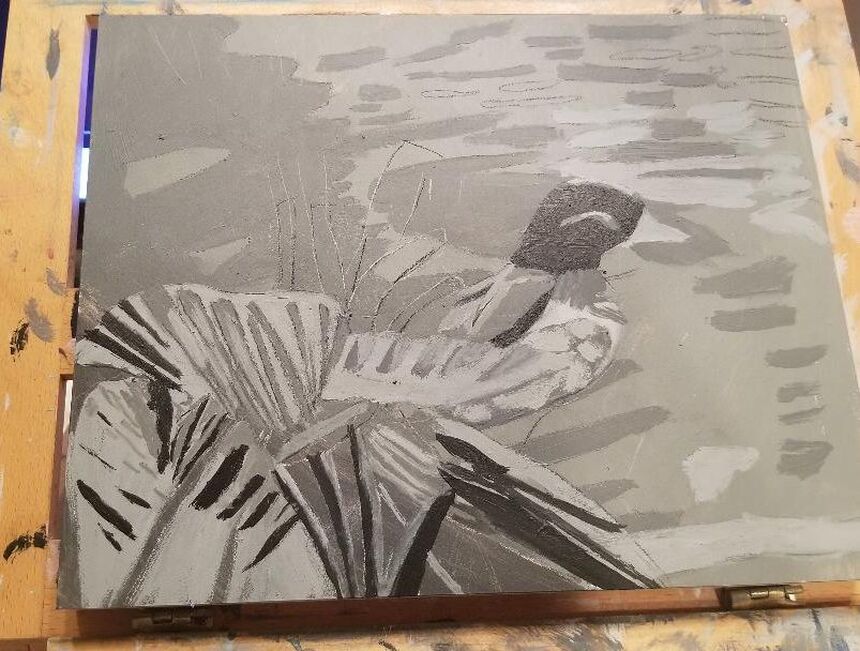 I painted some more of the ridges in this big leaf, using a much lighter, but still dark gray. ‘Painting more shadows on the leaves. Then I painted highlights on the duck. What I painted on his chest is meant to depict the fluffiness of his feathers. 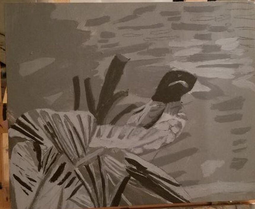 I reach a point twice, at least, in the process of every painting where I know I'm not done, but I don't know what else needs to be added. I was at this point with this painting until I realized I hadn't painted those big stalk things. How could I forget that?! All in all, the gessoboard from Ampersand, which is what I'm using for this painting was a great buy and one I would recommend. I'm including an affiliate link if you're interested. If you buy from this link, I get a small percentage of the purchase price. https://amzn.to/2ZWPQr5 This is the second half of my attempt at doing a painting mixing all the colors from just the three primaries, plus black and white. 'A couple of things I learned: 1.Sometimes mixing via glazing on the canvas yields better results than mixing on the palette. 2.This is something I already knew, but needed to be reminded of, and that's not all colors are equal in strength. Blue is much stronger than red or yellow and will over power these other colors when all three are used in equal amounts. To find out how I came to these conclusions and what it was like for me to do this painting this way, watch the video below.  In this video, I'm walking you through how I used a combination of bright and pale and transparent and opaque colors to achieve an iridescent look on the water in my latest painting, using acrylic paint.
I'm working on another 11x14 acrylic on Belgian Linen,which I'm titling "Monkey Eating Leaf" for now. I started with an underpainting for my background.  At this point, I've been glazing gray blue made by mixing transparent mixing white and ivory black with ultramarine blue over the rocks on the right hand side. I then added quinacridone red to this mixture to make it purple and used it on the rock on the far left. Tonight, I mixed gray blue and white and titanium white and mars black with violet and, using a small round brush, painted little bits of these colors over the sheer blue and purple. After putting down my gray violet color, I realized it was too strong, so I mixed transparent mixing white and ivory black and glazed that over it to tone it down. I tried to use my gray blue straight out of the tube, but saw that it was way too dark for some areas and decided to mix titanium white into it 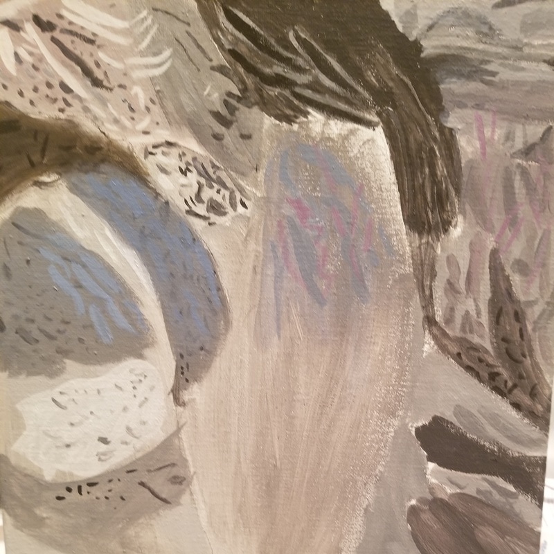 Tonight I mixed a transparent purple, similarly to how I described above and glazed it over the upside down triangle at the top. I mixed transparent grayish brown using transparent burnt umber and glazed that right under where the purple was. I glazed ivory black over that to make it even darker. I mixed transparent gray blue the same way I did last time and, using a small round brush, painted little bits of that over where I'd painted the purple. Using that same brush, I repainted the titanium white streaks that were lost when I glazed the purple. 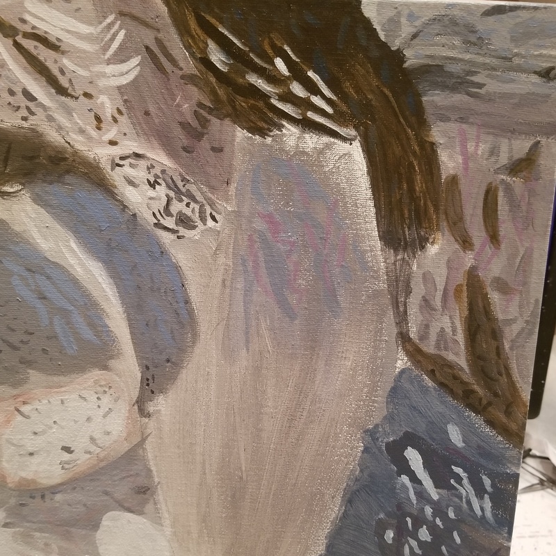 I added more sheer grayish white and purple to different areas of the painting. 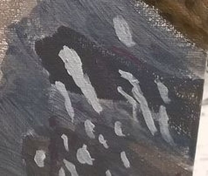 In the lower right hand corner, I used prussian blue to make a sheer grayish blue. 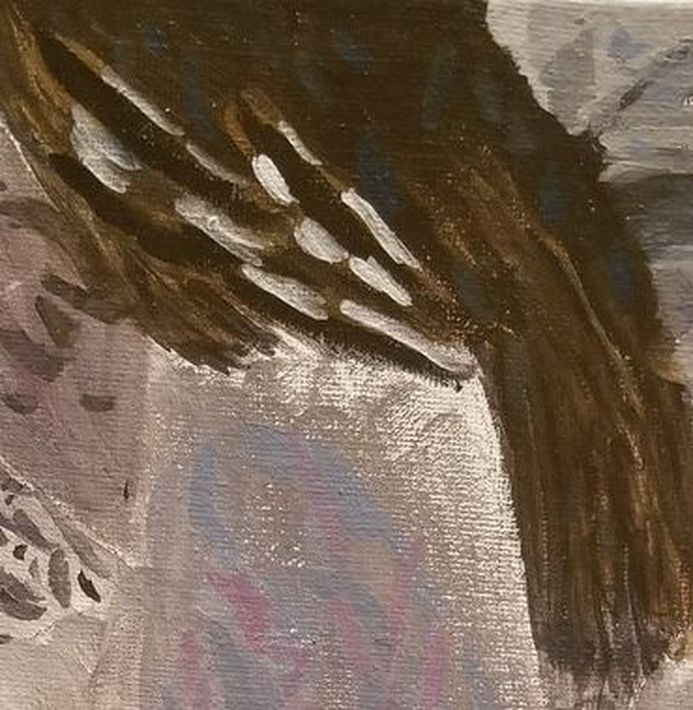 I'd previously used this color to make little blue marks in the dark brown at the top of the painting. 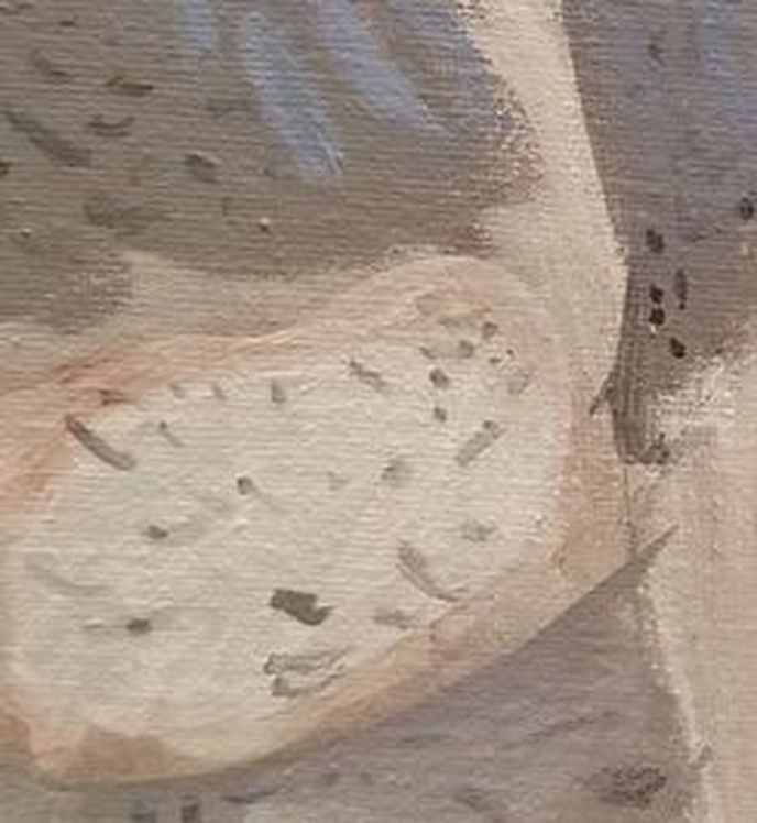 I mixed a transparent pink for the area around the white of the rock on the left hand side.  Finally, I put titanium white and transparent mixing white patches on the blue at the bottom.  I added more transparent blue and purple here and some transparent gray to the gray spot where the ground meets the rock.  Last night, in addition to adding yet more transparent blue and purple to the painting, I went over the lightest parts of the floor with titanium white. I rimmed the dark shadowy area on the far right with transparent pink, layered over with green made by mixing hansa yellow light and ultramarine blue, to tone it down. In the aforementioned dark patch, I've started to put bits of pale blue, made by mixing a touch of ultramarine blue into titanium white. 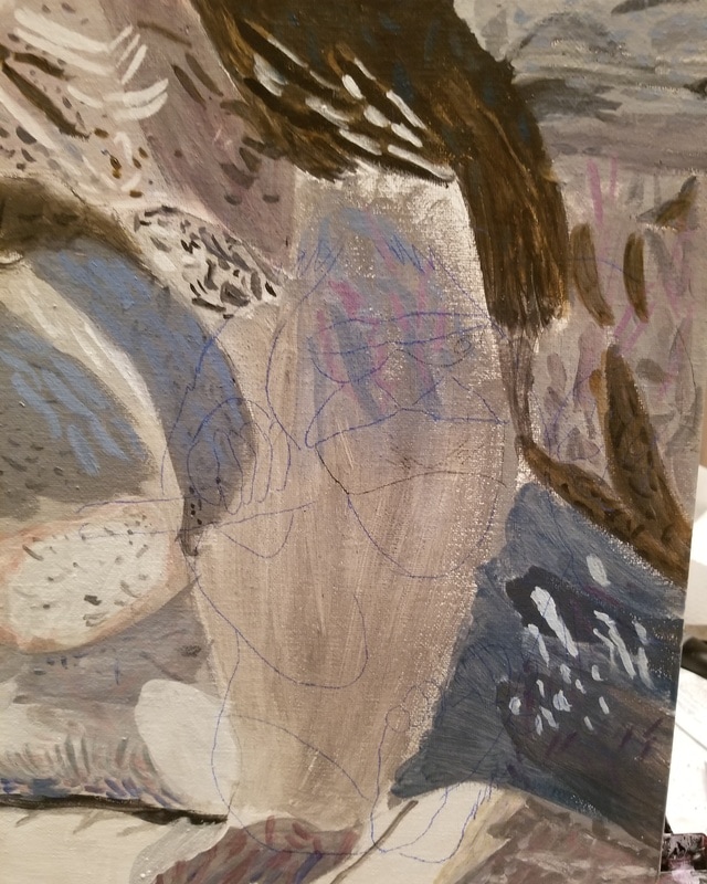 Here's my drawing of the monkey transferred onto my canvas. 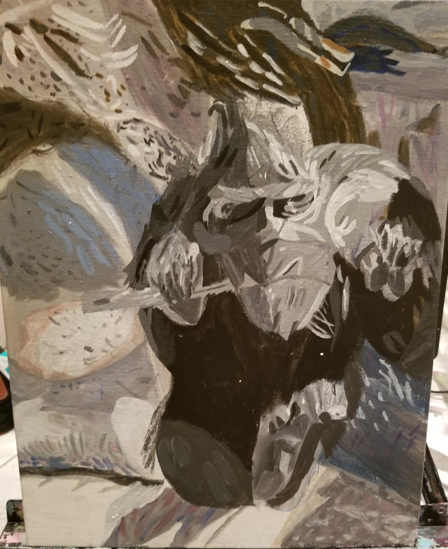 Here's my underpainting for the monkey done. 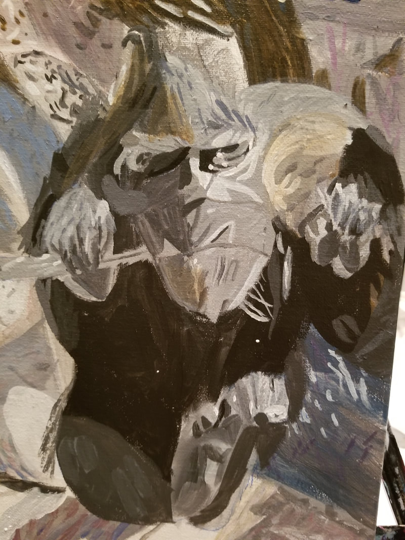 Tonight, I started to add color to the monkey. I used grayish shades of blue and brown using a large filbert brush. Using a small round brush, I painted small lines of grayish blue made by mixing titanium white, ivory black and ultramarine blue in where I'd put the the transparent gray-blue. 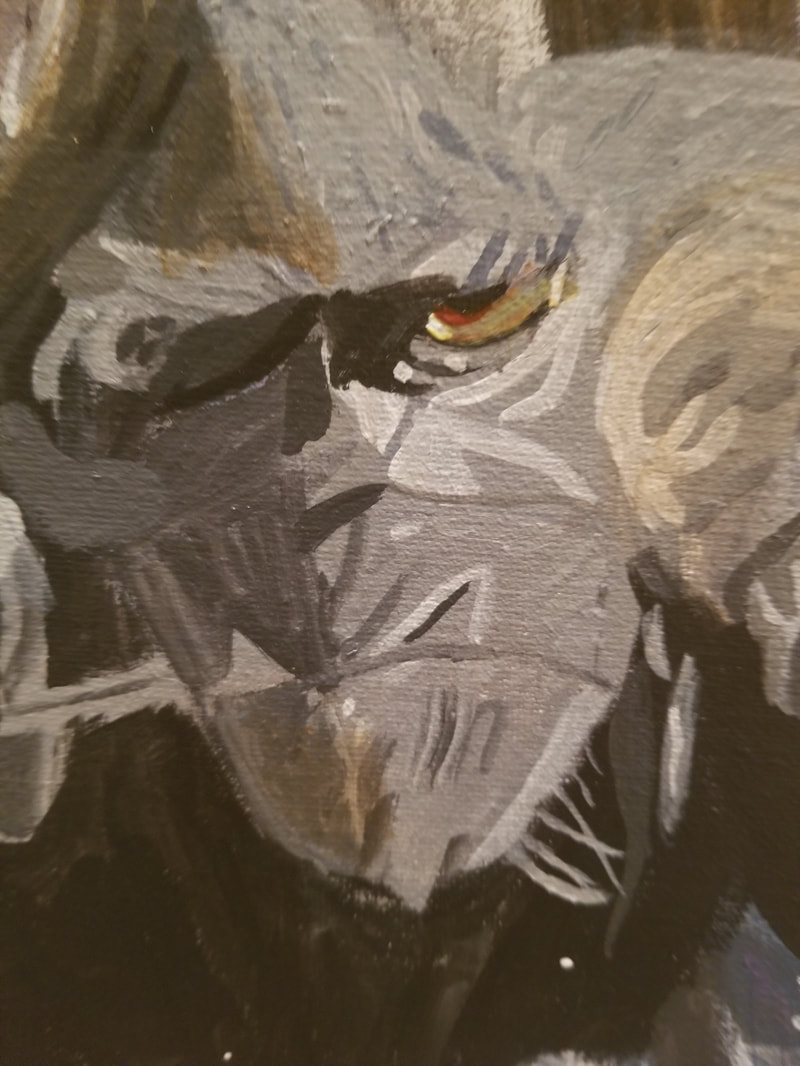 To paint his left eye, I first painted pale gray from the lid to the first crease. Then I glazed hansa yellow light over this part accept for a liner part at the outer corner. Using a liner brush, I painted thin lines of quinacridone red along his pupil and along the first rim. I painted a dot of titanium white on his inner corner and went over most of that with the hansa yellow light. Finally, I filled in the space between his pupil and that dot with transparent burnt sienna. I think I'm going to bring the dark gray at the inner corner in a little further. 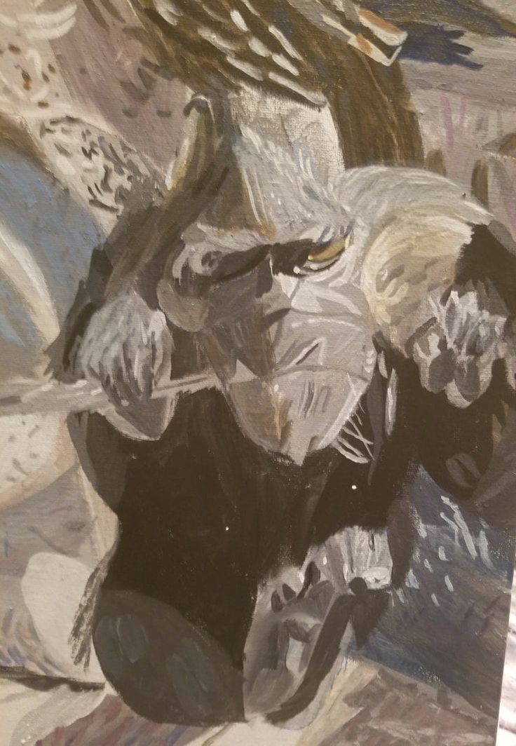 I've added a lot of titanium white and transparent mixing white strokes with a liner brush and I think it's made a big difference. 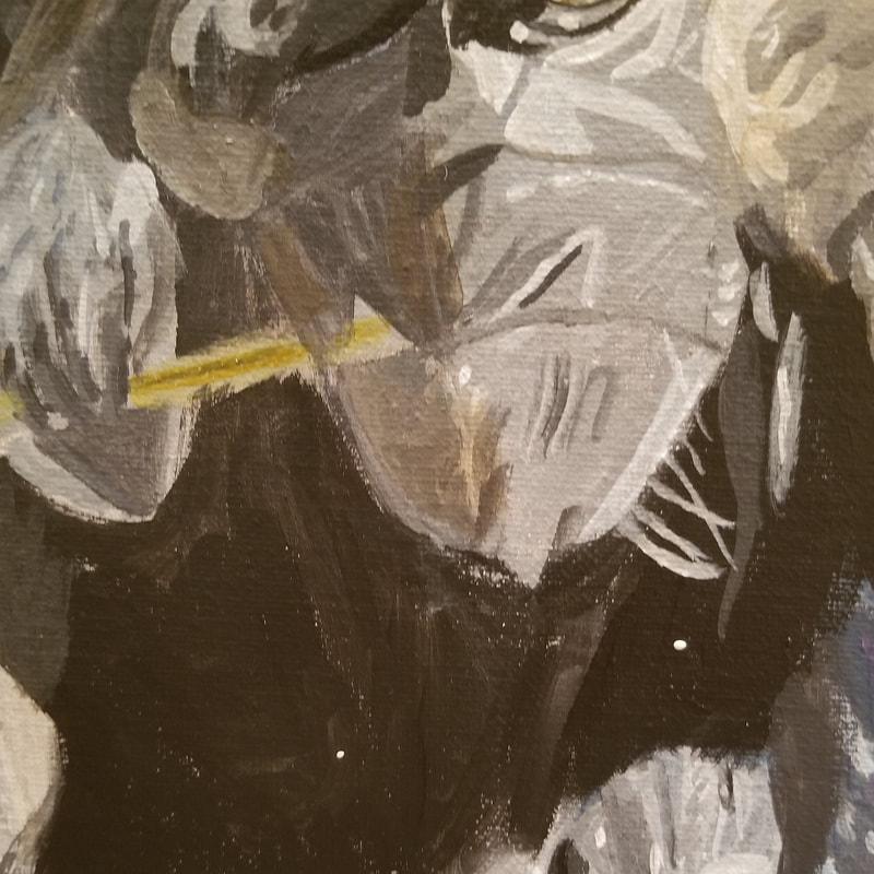 Tonight, I used the color I described in my last post to fill in the leaf, doing a glaze. I mixed some more of every color I'd used to mix it, except white, and painted the ridge in the middle. 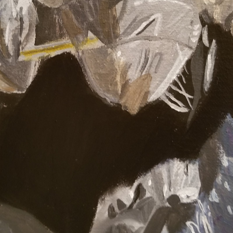 Tonight, I went over the monkey's torso with Mars black to make the color more uniform and then glazed ultramarine blue mixed with ivory black over it to give it some depth. 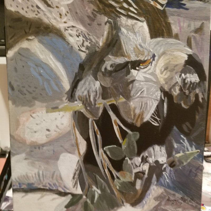 Finished! To paint the leaves, I mixed equal parts ultramarine blue and hansa yellow to make a transparent green and glazed that all over most of the leaves. I adjusted this with either ivory black or transparent mixing white as needed. I also used touches of cadmium yellow, gray made by mixing titanium white and mars black, and grayish brown made by mixing burnt umber into those colors in various parts of the leaves and branches. For most of the branches, I glazed a mixture of transparent mixing white and transparent burnt umber over them, adding more burnt umber to darken the color for shading.
|