|
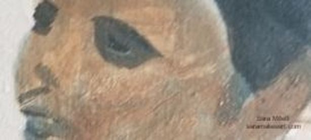
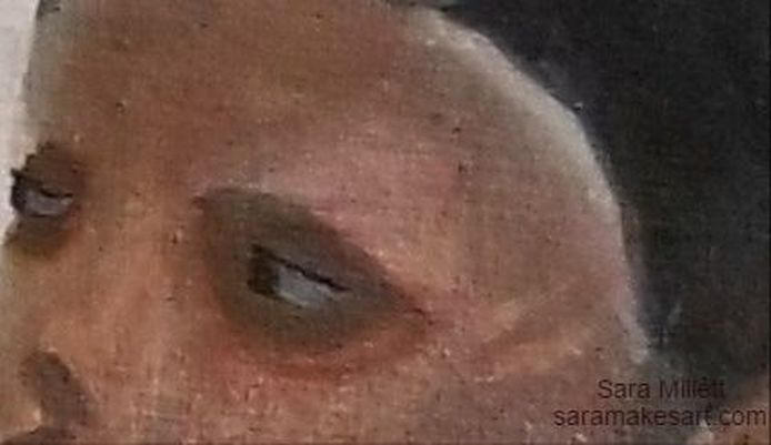
While working on my latest painting, it I learned that, while, as an artist, I use photos as reference, sometimes I have to judge a piece independently of the photo. In the photo I'm working, from the shadows around this woman's eyes are very dark, so of course I made them that way in the painting. But, as much as I tried to justify it, telling myself it looks that way in the photo, so it must be right, somehow I couldn't shake the feeling that something was off. Here is a a close up of her eyes as I'd first painted them. I decided to glaze over my shadows with transparent raw sienna and quinacridone red The result is this: The result, as you can see, is that, while the shading is still extremely dark, now it looks like it's part of the rest of her face instead having like she's wearing eye masks. So while a reference photo is pretty much an indispensible tool for me in order to create the pieces I do, I ultimately have to judge a piece on it's own merits. Just because something looks a certain way in the photo doesn't mean it's going to look right in my painting. That's all for now. I'll talk to you again next week.
0 Comments
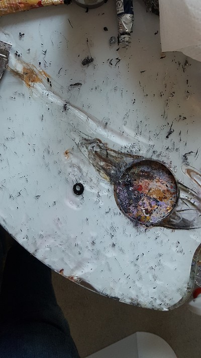
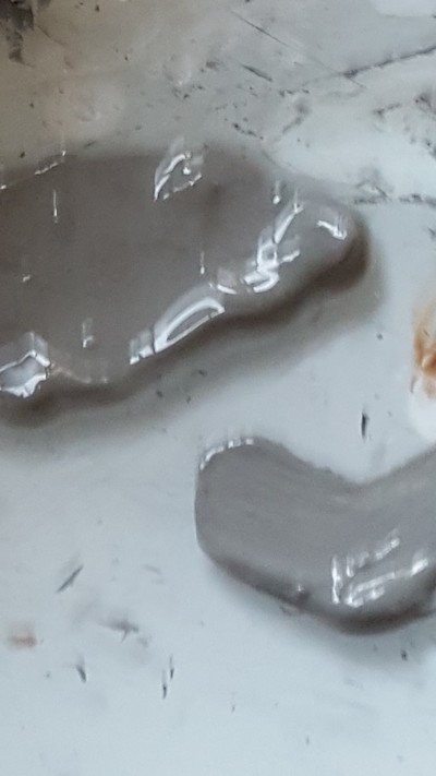
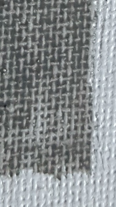
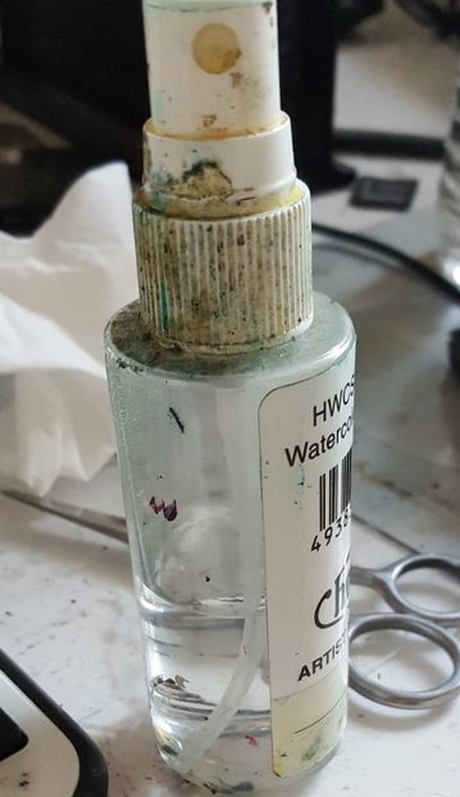
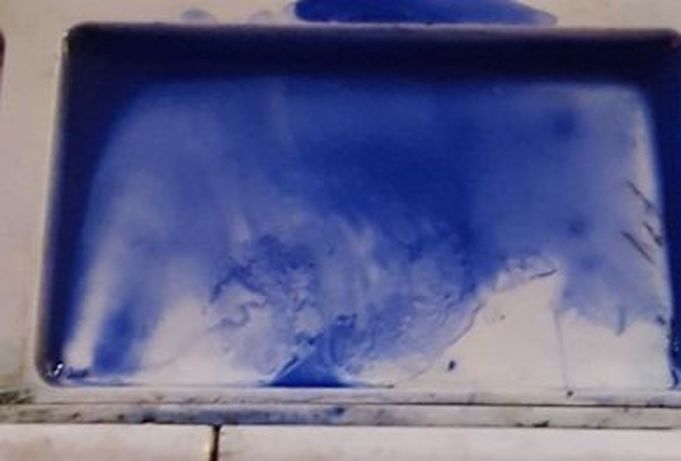
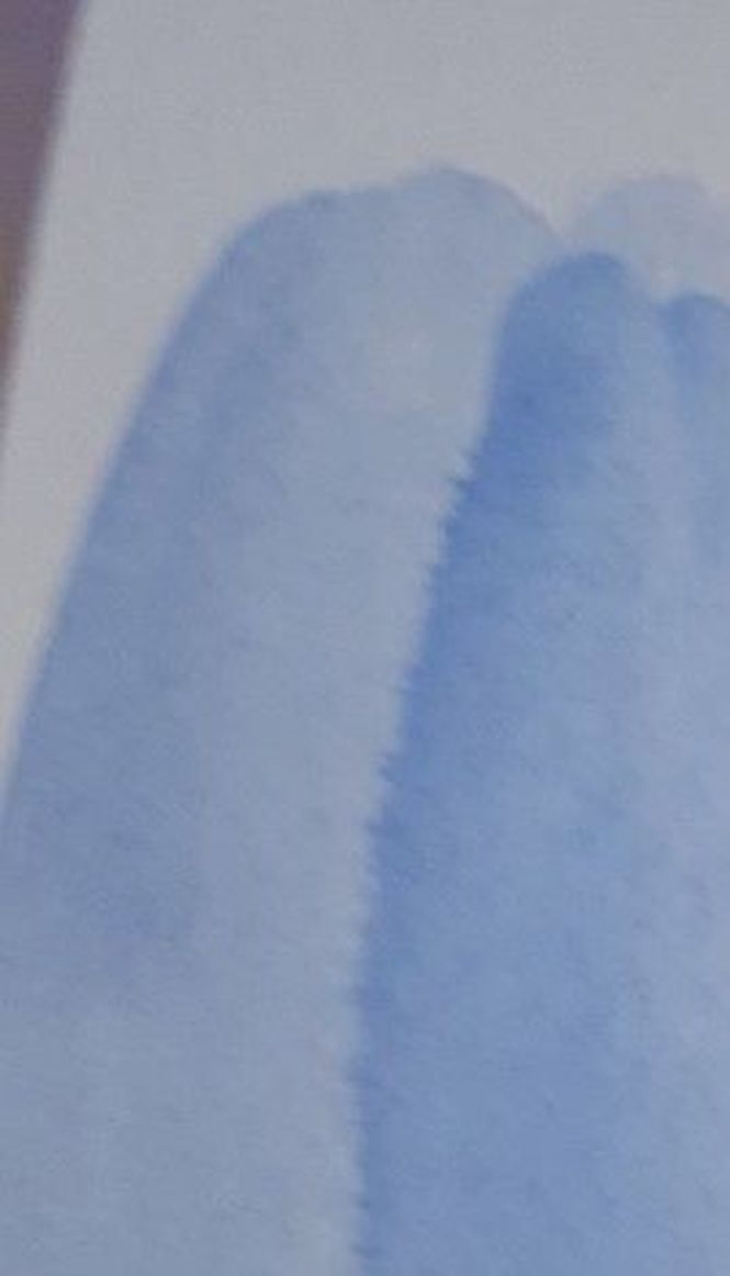
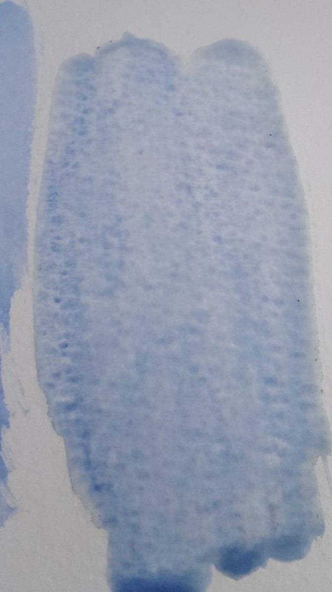
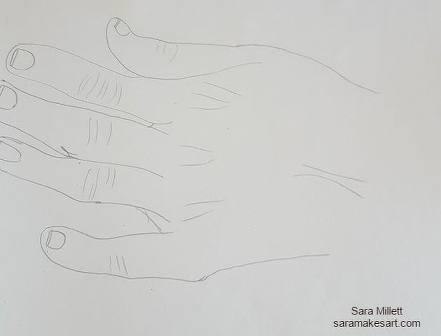
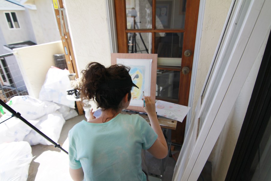
Please don't be misled by the title of this post. It's purpose is not to say which is better between the two, but just point out what I know to be the differences and similarities between the two mediums. Similarities The most major similarity between acrylics and watercolors is that they're both water soluble paints. That means they can be thinned with water and the brushes can be rinsed in water during painting sessions. Because of this, neither acrylics nor watercolors require the use of harsh chemicals so they're perfectly safe to let your kids play with, assuming they're old enough to know what not to put in their mouth of course;. Also, both watercolor and acrylics are relatively cheap mediums to work in. Now, no quality art materials are cheap cheap, but these mediums are a lot less expensive to work in then say oil paints. Differences So those are the similarities. Now for the differences. While all watercolor paint I've personally encountered pretty much has the same type of texture, acrylic paint comes in three varieties, "light viscosity", often labeled "fluid" or "soft body", medium viscosity, and heavy viscosity, often labeled "heavy body". According to manufacturers, the light viscosity acrylic paints are better for glazing for more realistic styles, while the heavy viscosity paints are better for impasto and impressionistic styles because they hold brushstrokes very clearly. If you like painting with a palette knife, a heavy body paint is definitely the way to go. A glazed effect is pretty easy to achieve with watercolor, because tend the put the paint on transparent. You can't really achieve an impasto look with watercolor, though, unless you layed the paint on so thick that it looked more like an acrylic or oil painting. But if you're going to do that, you might as well work with oils or acrylics. So in that sense, acrylics are more versatile than watercolors. That's not to say that you can't achieve a wide variety of styles in watercolor, though. But, if you like to paint in a style with bold brush strokes, you probably won't enjoy working in watercolor, since the nature of the paint interacting with the water tends to blend those out automatically. While writing this, I decided to do a google images search for "watercolor impasto" and I found pictures of watercolor paintings and impasto oil paintings separately. While there are watercolor canvases and acrylic papers, generally speaking most watercolor painting seems to be done on paper and most acrylic painting tends to be done on canvas. Acrylic paper doesn't seem to be good for much of anything other than practice anyway, so there. Another major difference is in the histories of both mediums. It wasn't as popular or as prestigious as oil paint, but watercolors have been around since ancient times. Albrecht Durer is known to have done them. Acrylics, on the other hand, as we know them, have only been around since about the 1950s. *Watercolor paints are comprised of just pigment and water, whereas acrylics also have a polymer called acrylic mixed into them, hence their name, which accounts for their more oil paint like texture. How I Work With Each Medium When I work in acrylics, I usually work on canvas. Sometimes I might work on board, but I never work on paper with this medium. I use a smooth glass palette without any wells, because I'm not going to be adding a lot of water to my paint. I'll usually thin the paint with some acrylic medium, or add just enough water to thin the paint without making it runny. In the gallery below, you can see both what that paint would like like on my palette and on the canvas. I achieve this by adding little bits of water at a time with a brush. When I'm working in watercolor on the other hand, I use a little spray bottle to load that paint down like crazy with water. When working in watecolor, you should expect to put so much water in the paint that the paints would run into each other if they weren't separated. That's why palettes made for watercolor have wells or compartments for individual colors. I'm including a pic of my watercolor paint in my palette after I've mixed water into it. You'll see that the paint runs along the edges of the compartment, because there's so much water. Note:If you already have a palette like this and want to try acrylics, you can definitely use it for that. I prefer the large glass palettes, though just because they're so much easier to mix on and clean. When working in acrylics I don't put anything on the surface under the paint, unless it needs to be gessoed. When I work in watercolor, though, I usually find it very helpful to wet the area I'm working on before putting the paint on top. It just seems to flow much better that way. Here's some paint put directly on the paper and here's some paint put down after wetting the paper. As far as how I actually paint, how I move the brush and stuff, that's pretty much the same with both mediums. The difference is in how I prepare the paint on my palette and how, or even if, I prepare my surface for the paint. So those are the similarities and differences between watercolor and acrylic paints and how I work with both. That's all for now. I'll talk to you again next week. *Since writing this post, I've learned that watercolor paints also include gum arabic and additives like glycerine, ox gall, honey, and preservatives. In a video I watched about drawing tips, the one thing I took away from it the most was to draw with the pen or pencil coming towards me and not going away from me. Yes, the video was focused on cartoons, but some tips can cross over styles. I find when I draw towards myself, I have much more control over my lines and I get much better results. It also feels more comfortable. To illustrate my point, I'm including two drawings of a hand. The first on was drawn with the pencil going towards me and the second one was drawn with the pencil going away from me. 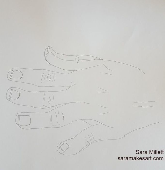 'See the difference? Under normal circumstances, my pencil lines are not going to be this dark, and if you're using a light pencil, as you should for realistic work, your outline will be practically invisible when you get your shading in. But just because your outline may not be visible, doesn't mean it's not important. On the contrary, your entire drawing will look wrong if your outline is. Drawing towards yourself is the easiest step to insure that your outline is the best it can be, even if that means stopping midline and going back to your starting point when drawing a feature. So how do you "draw towards yourself"? Simple. If you're drawing vertically, draw downwards, never up, since your body is going to be positioned in front of your paper. If you're drawing horizontally, you draw in the direction going toward your dominant hand. I hope this is helpful. I talk to you again next week. The following is a repost from my wordpress blog. Technically, this isn’t really my first time working in colored pencils. I’ve used colored pencils in cards and quick sketches, but this is my first time making a serious art piece with them. I saw artists like Lisa Clough and Leonardo Pereznieto do beautiful work with colored pencil and I started to wish I could do that myself. Well, recently, I needed colored pencils for an art class and I didn’t want to use my cheapies, so I went and bought a set of Faber-Castell polychromoses. I spent almost $60.00 on a set of twenty-four, so I'm determined to get my money’s worth. The first result of that determination, is the drawing you see below. It’s being made using a combination of the colored pencils and Mona Lisa odorless paint thinner to blend on 9×12 Fabriano Studio hot pressed 140 pound watercolor paper. 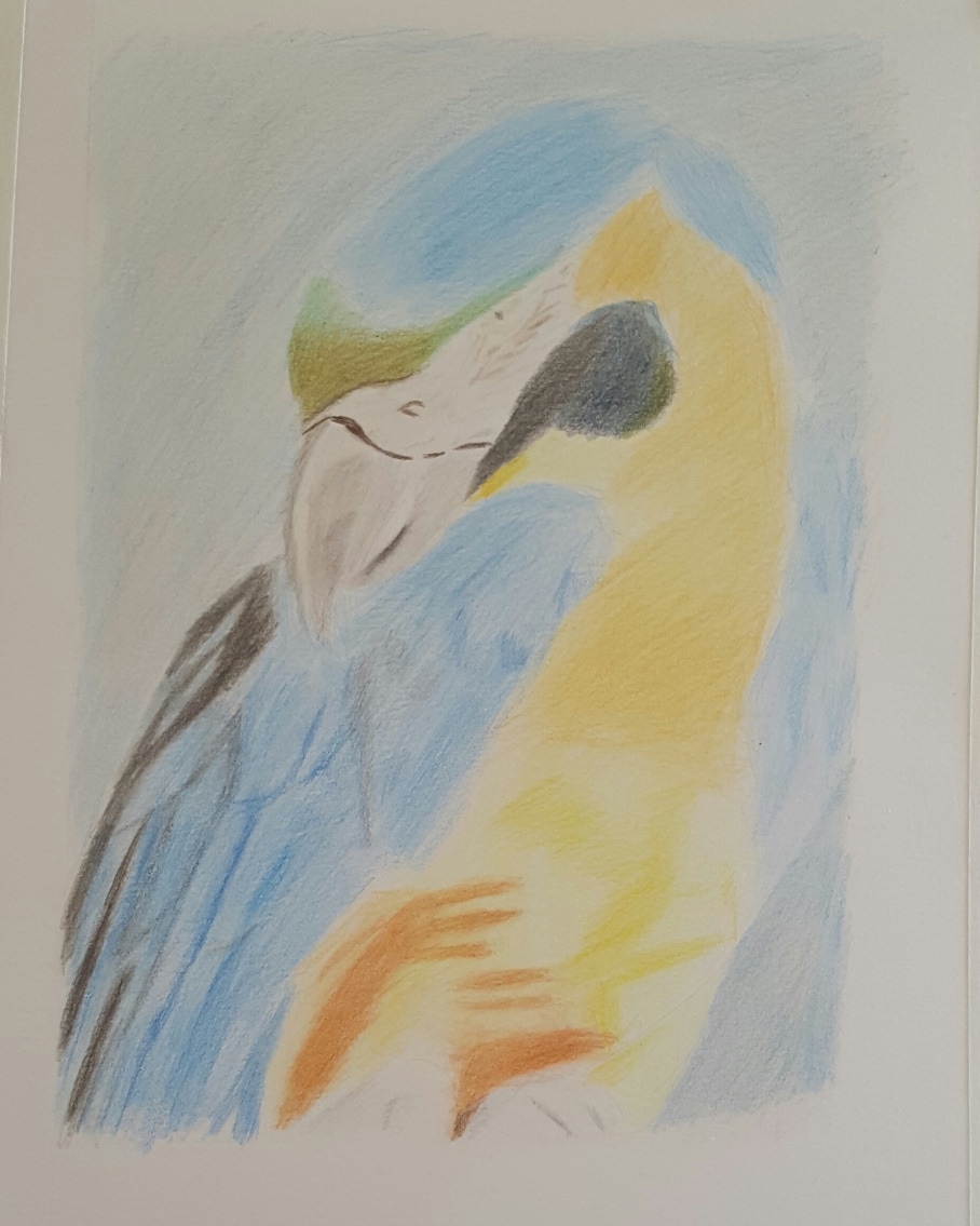 I surprised myself with how good colored pencil can come out. I found a new medium to enjoy working in. I used the technique of blending the pencil with paint thinner. Also, here are some pics my mom and stepdad took of me while I was working out on the balcony this afternoon. That’s all for now. I’ll talk to you again next week.
Yesterday, I published a whole post about my drawing supplies, and in this video, I explain why I always carry a sketchbook. I promise your email will not be published.
Making my drawings more accurate is something I’ve been striving for lately, so I’d like to pass on some of the knowledge I’ve acquired to you. One bad habit a lot of artists, myself included, is that we draw eyes too big. Eyes are an important feature, after all they determine the subject’s expression. But they should only be as big as the space between the eyes. To make it super simple, take your thumb and pointer finger, measure the space between the eyes, as I show in the video, and then measure your eyes, take a pencil and make marks where your fingers are and adjust your eyes as needed. You can use organizational line to make your drawings more accurate. In this video, I include a visual demonstration on using organizational line to insure correct placement while drawing faces. I want to point out that this is a guideline and won't apply to every face. Also, don't worry so much about making both sides exactly the same. No one's face is identical on both sides anyway. I personally don’t use all those lines I show you here. I just try to copy my reference photo as best I can, which brings me to my next point. Pay a lot of attention to your reference photo or model if you want your drawings to be accurate. So many artists just glance at their reference photo or model and then look at their drawing the whole time without ever looking back at the model or reference photo. As artists, we need to spend at least fifty percent of the time that we’re working on a drawing, looking at the model or reference photo. I spend a lot of time looking at a photo before I even start working from it. Even if you look at your model or ref photo constantly while working, you’ll probably still make mistakes in your initial outline, which brings me to the final piece of advice I’m going to give you in this video. When you do your initial out line, use a light pencil, unless it's a sketch for a painting, because you can wash it off and the paint will probably cover your pencil lines anyway. I personally use a 6h for my outlines. It’s dark enough that I can see it, but I can also erase it as many times as I need to and I won’t have smears. That’s what I’m getting at here. If you’re using a dark pencil to make your outlines, you can only erase so many times before your paper is filled with smears. If you want your drawing to have bold outlines, only use a dark pencil over your light pencil when you have everything where you want it. Thank you so much for watching and reading. I hope that was helpful. I do timelapse drawing and painting demonstrations, as well as art related vlogs on my channe Saramakesartl, so if that sounds good to you, click the link in the video to subscribe, for new videos every Wednesday. I’ll see you all next week with another video post. Bye. I promise your email will not be published.
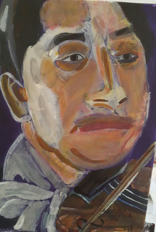
I finished a new piece! This is an 11×14 acrylic on belgian linen titled “Man With A Violin”. My reference photo came from paint-my-photo.net.
|
Sara MillettPainter of portraits and wildlife Archives
November 2023
Categories
All
|
