|
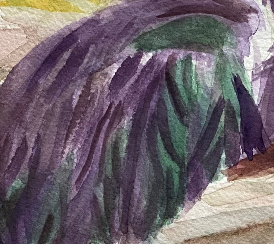
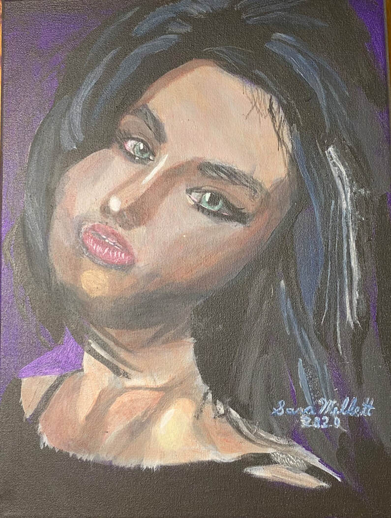
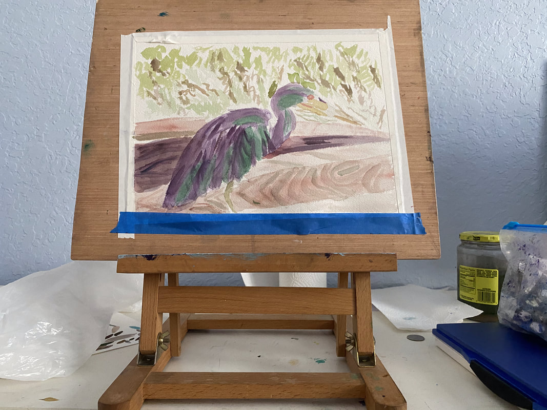
I feel like the most important thing for creating the right texture is to have my lines going in approximately the right direction and to have them either straight or curved, depending on what’s in my reference photo. I can be off the number of strokes in a given place and I can even be off with the length and width a little. If I have the direction and curve right, though, the animal I that ends up in my piece might not even look like the animal in my reference photo at all. While I’ve been working on my current painting of a multicolor heron, I haven’t even been thinking about what texture I want the feathers to be. I’ve literally just been thinking about the direction they go. If I do that, the texture takes care of itself. Sometimes, I happen to pause and take a look at a mass of hair or feathers and see that they’ve come out with almost the exact feel I wanted them to have, without me consciously trying for that feel. I love when that happens. An example I can think of the hair on this portrait. I just painted the shapes I saw in my reference photo and keeping my strokes going in the right direction. Before I knew it, I had the volume I was looking for. As you can see from the examples I've given, this principal applies across mediums.
0 Comments
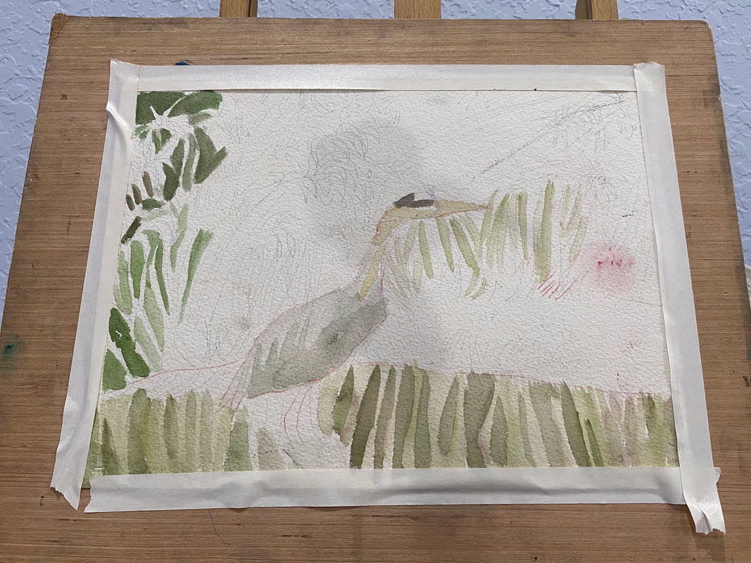
The bird I’m painting has a lot of colors in him. Trying to paint them all can be overwhelming. I’m starting simple by only focusing on green and purple for now. I’ll build up layers of these colors until I reach the darkness I desire. At this point, I'm not concerned with whether it's good or bad. This bird will have many layers and probably multiple colors on him by the time I’m done. By limiting my focus to two colors at these beginning stages, though, I keep myself from being too paralyzed by indecision to start. Don’t think about making a masterpiece when you start. Just think about starting.
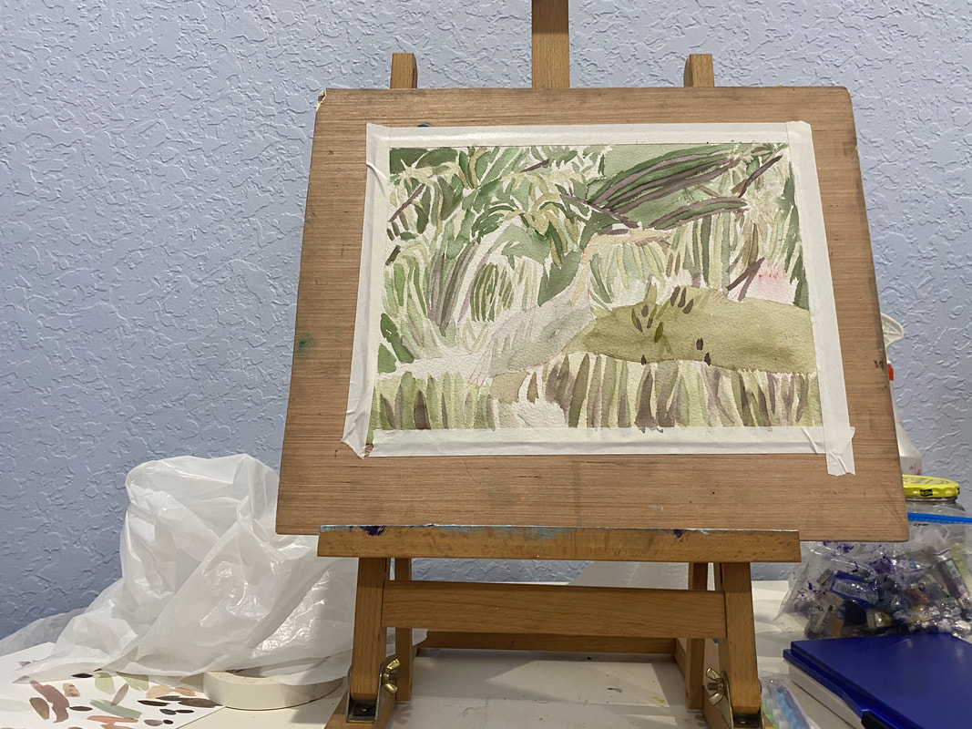
My goal is always for my subject to stand out from my background. I usually try to achieve this by making the background darker so the subject appears lighter and making the background cooler and the subject warmer, which I usually do by adding layers of blues over the background and yellows and oranges over the subject. I thought I’d try something different with my current painting, though. Since my subject is a bird with blue feathers, I knew painting yellow over him was out. That would just turn him green. Painting orange wasn’t much better because that would dull him and send him further into the background, exactly what I don't want. I remembered what I’d learned from Alicia Farris’s watercolor workshop and that's that layering analogous colors, or colors that are near each other on the color wheel, makes shades more vibrant. I could certainly use some more vibrancy in my subject. That would probably be a more effective way if getting him to stand out than trying to "warm" him. I chose cyan blue to layer over him. I could've chosen any blue, as well as purple or green. With just one layer of the cyan, he started to come forward more. On the other hand, his neck is more of a warm brown, so I've been painted red over it to get it to stand out more. I've added more layers of blue to my bird since I started writing this post. I'm looking at the painting now and he's standing out nicely from the background. What I think I need to do now, though, is create more separation between his feathers.
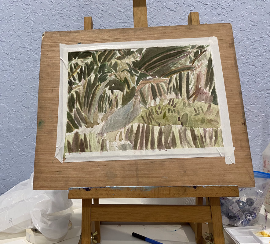
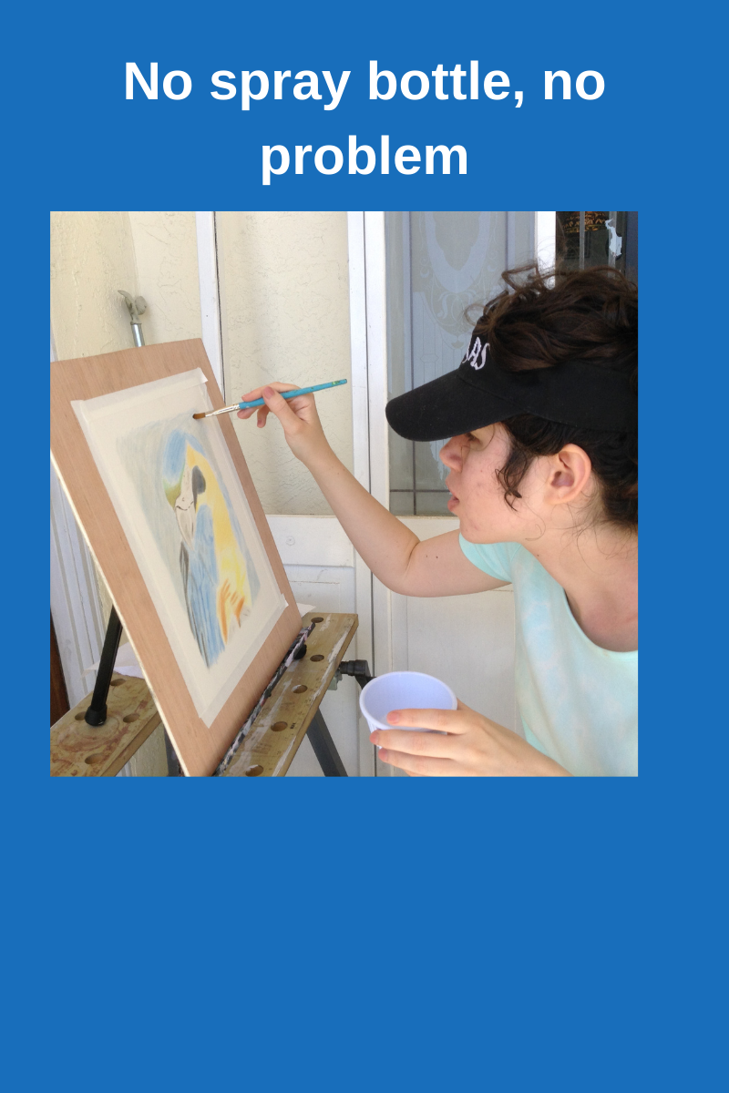
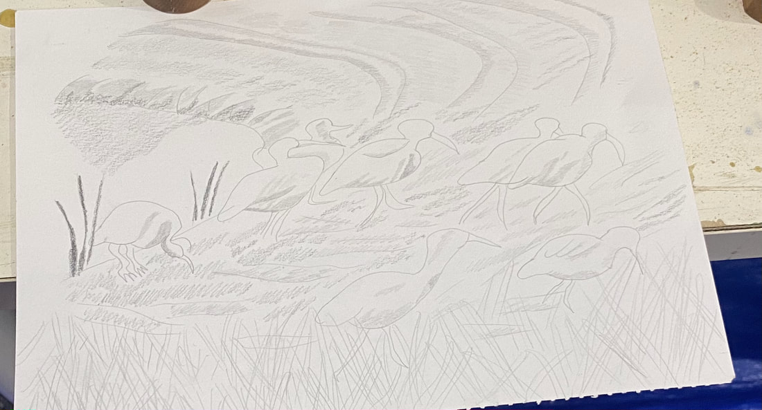
I went to the Art room on Thursday and when I got into my painting, I realized I didn’t have my spray bottle or pencil. I used my brush to load water from the cup on my table and borrowed a pencil from the supply closet to do a sketch of some white ibises from a photo that I'd taken on the way to the clubhouse. My tendency is to curse myself whenever I forget something, but I’m determined not to let missing a few supplies ruin my time in that room. I thought of the quote "Do what you can with what you have right now." I started a new painting that day. I painted his neck by mixing yellow ochre with cobalt blue, and then mixed more cobalt blue with that to make a gray shade. In Other News Last Tuesday I recorded intros and outros for my blue heron and my anhinga video, along with my video on making art a habit. I’ve been working on editing them throughout this week. I still need to record b-roll for my art habits video. I’ve gotten as far as taking out the long silent bits on that one. I hope to have the blue heron video on my youtube channel, Sara Makes Art, soon.
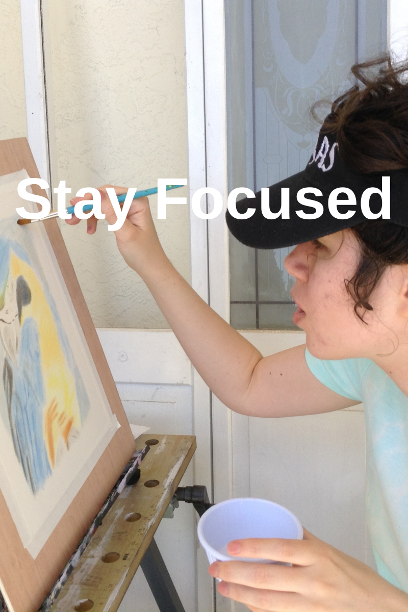
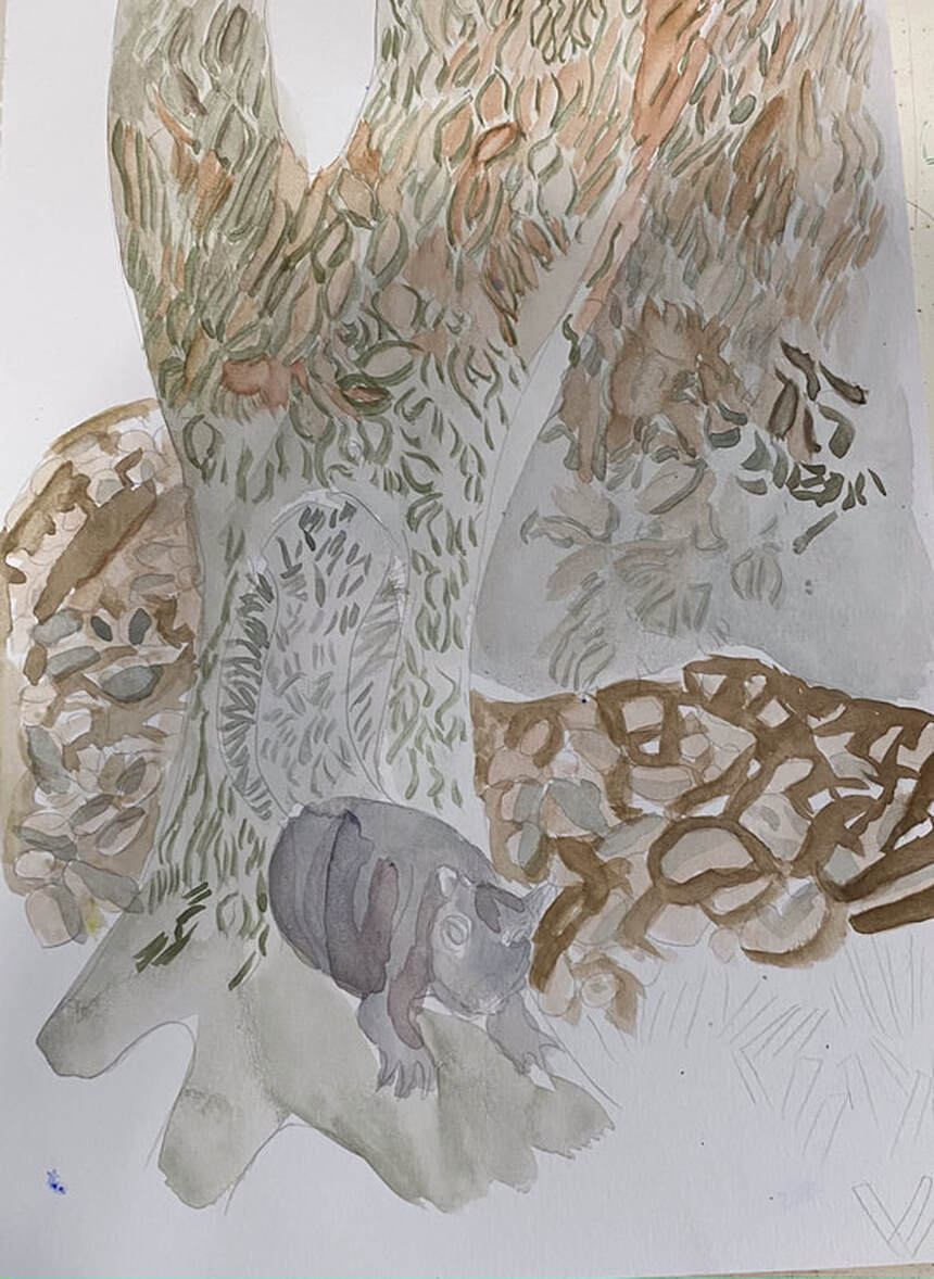
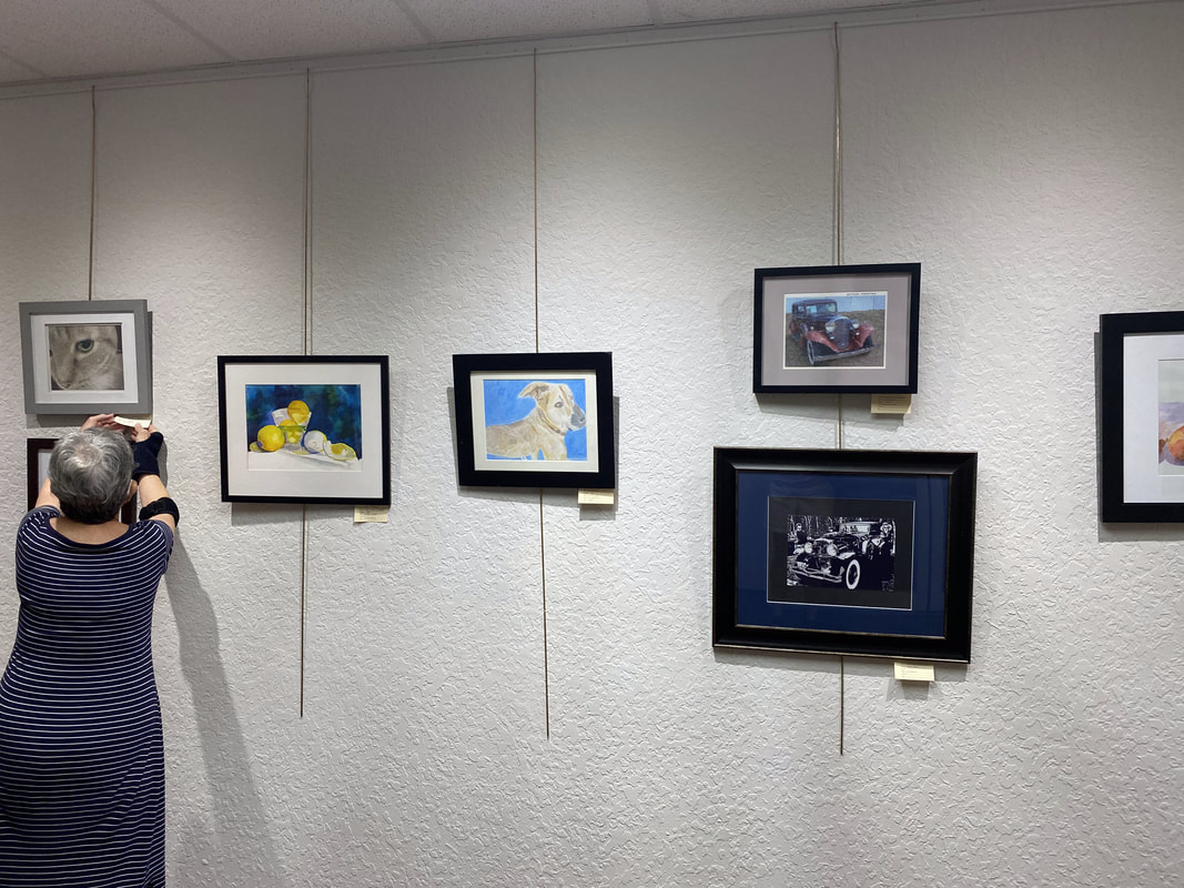
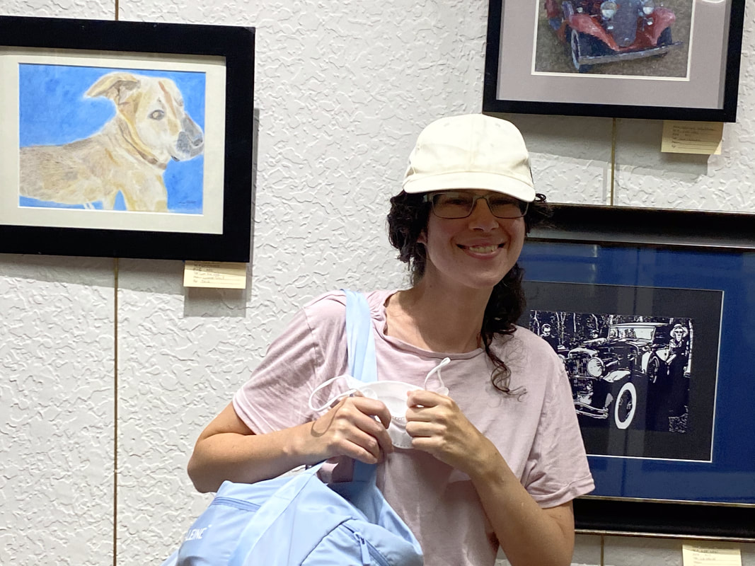
I’ve mentioned this in my last post, but I have an out of home studio to go to now. It’s in my community’s clubhouse and it’s open Mondays and Thursdays from 9 to 4. I’ve committed to going on those days, sitting down in there for around an hour, and being in painting mode. It’s actually not easy for me to be focused on one thing for a long time. I’m struggling with it now writing this draft. I don’t have to have my brush in my hand the whole time. Sometimes it’s necessary to pause and evaluate in order to figure out what to do next. These moments of uncertainty are uncomfortable and my goal is to learn to sit in the discomfort. I watched a guy do Picasso’s routine. The guy painted for a total of eleven hours a day! That included an eight hour stretch from 2-10. If he could do that, I certainly should be able to paint for one hour without needing to get up and do something else right? I’m never going to be able to paint for eleven hours a day, well most likely, I’m never going to be able to paint for eleven hours a day, even if I wanted to, but maybe I’ll try it for one day just to see if I have the stamina. But that’ll be for another day. Now, I don’t have to work on a major project all that time. I can do color mixing experiments, sketches, doodles, etc. For example, in these last Mondays and Thursdays, I’ve experimented with mixing alizarin crimson with other colors. I also have a watercolor sketch of a squirrel that I worked on this Monday when I’d reached a standstill on my crow, pumpkins, and storm clouds painting. It’s Thursday and therefore, I got a chance to put myself to the test. My parents generously gave me a ride and what do you know, soon after arriving at the art room, I realize I forgot my crow and pumpkins painting! My main reason for going! I was ready to kick myself, but I wasn’t going to let my time there goes to waste. I painted line details in the tree on my squirrel painting. This gave me practice making smooth brush strokes and mixing different shades of brown. By smooth brush strokes, what I mean is I have a tendency to stop and start when painting, but I forced myself not to lift the brush from the paper until each line was finished. In Other News My colored pencil drawing of Tyler, a dog who belongs to a friend back in San Diego, will be hanging in the Artists In Residence Gallery at my community's club house for the month of August. The hanging was today. I'm so excited.
|
Sara MillettPainter of portraits and wildlife Archives
November 2023
Categories
All
|
