|
As I'm working on my latest painting, I'm being reminded of an important principal of acrylic painting and that's always paint your background first. This doesn't just go for simple solid color backgrounds, but detailed backgrounds also. Take my latest painting for example. 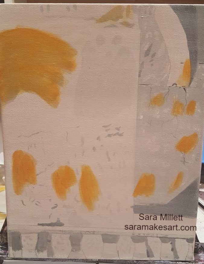 This foreground of this painting is going to include a woman walking and carrying a baby, but for now, all I'm worried about is the wall behind them. I'm acting like the people don't exist at this point. The reason for this, is because of the fast dry time of acrylic, I've learned it's very hard to blend out your brushstrokes quickly enough while trying to blend around a subject. After I'm finished filling in the color on the background, I'll draw in my subjects and repeat the same process of underpainting followed by color, on them. That's all for now. I'll talk to you again next week.
0 Comments
This post is directed at those who might be thinking about commissioning an artist but don’t want to interrupt what that artist might be working on. I have personally experienced this as an artist myself. I urge you to not worry about interrupting an artist’s project. Artists who are serious about our craft will almost always have some project going. If you wait until we have nothing we’re working on you could be waiting a long time. Granted there are times an artist will not be able to take on your commission at that time. These are mainly times when the artist is already committed to another person or organization. Obviously, if I’m already working on a commission for someone else, I’m not going to interrupt to start working on yours. You’ll have to wait. Likewise, if I’m working on pieces for a gallery show, I most likely won’t take on commissions during that time. Any commissions you send me will be postponed. However, if I’m working on a project, with no commitment to anyone else, there’s no problem with me interrupting it to take on a commission from you. After all, I can always go back to it later. Really, if you want to commission an artist, just go ahead. They will tell you that they're not taking commissions at that time, if that's the case. You may even able to find out whether or not an artist is currently taking commissions by visiting his or her website. That’s it for now. I’ll talk to you again next week.
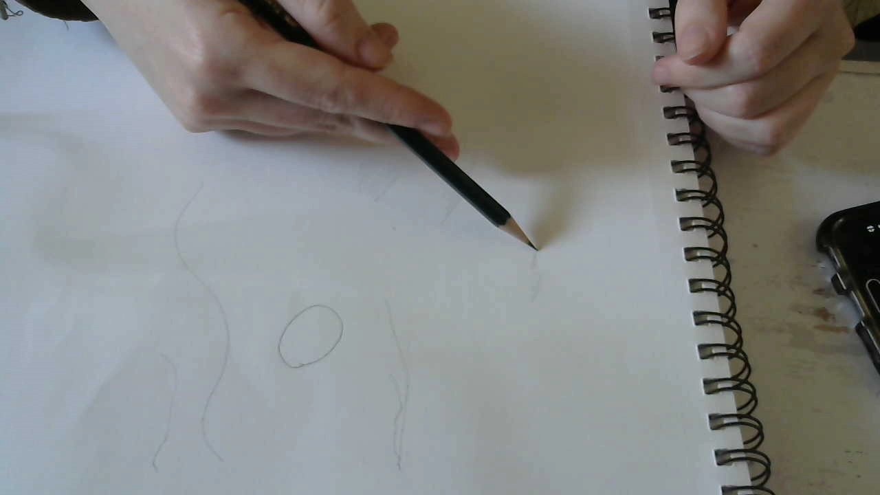
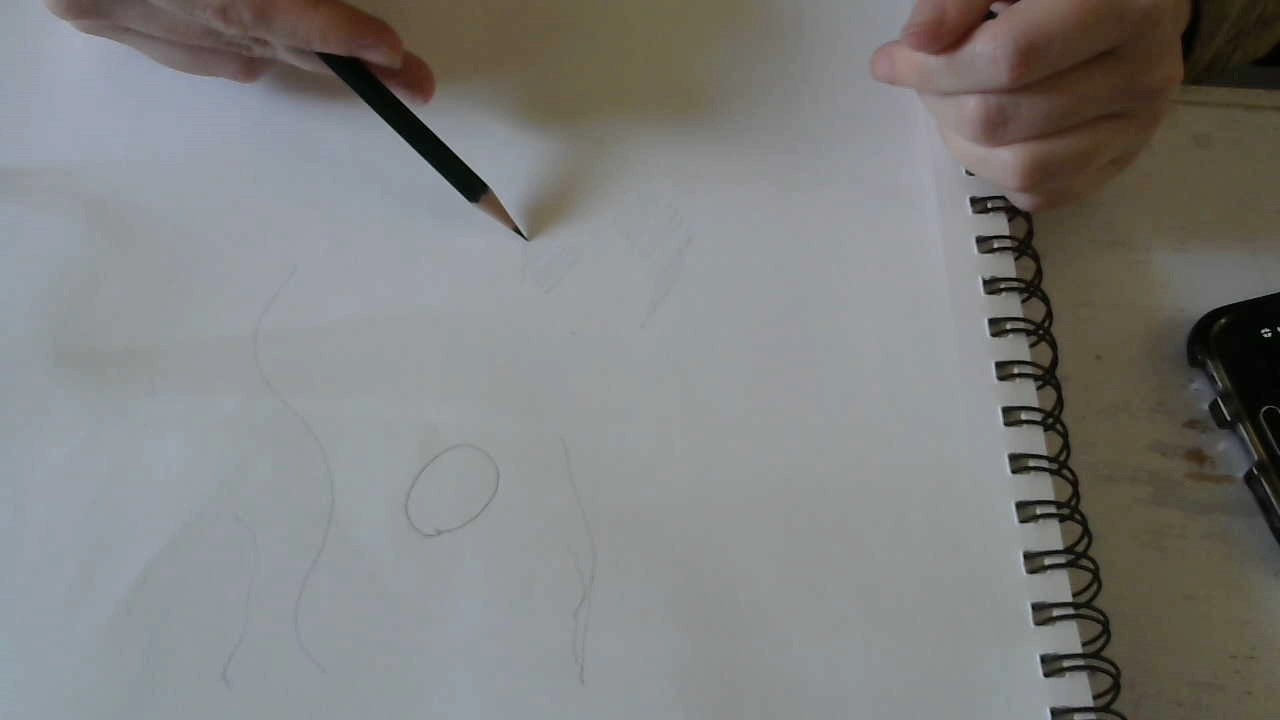
Roberto Blake recently posted a video called “How To Be More Creative and Find Inspiration”, which I’ll link in the description. I was already planning to make a video/blog post about creativity, but seeing Roberto’s video gave me a bigger push to go ahead and do it. My mind is always busy creating. I can’t stop it, except when I’m sleeping and sometimes, I don’t think even then. The thing is most of this is not anything I would share with anyone, because it’s just for me. Luckily, the little that is shareable comes around often enough that I can produce a constant stream of paintings and drawings, which then become the basis for videos and blog posts. Roberto said something in his video, which is something I also said in my first video on this topic, and that’s keep your mind open to inspiration around you. I said it before and I’ll say it again, and I’m paraphrasing, but keep your mind open and inspiration will find its way in. Most of what you see as far as paintings and drawings wasn’t something I came up with off the top of my head. I generally had to see something that I wanted to paint. For example, take this drawing of my aunt with her knitting instructor. I took the photo while I was sitting across the room from them watching them and thinking, “this could become artwork.” 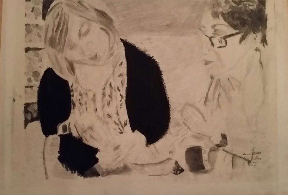 It was the same thing with these zoo paintings. Every one of them came as a result of realizing what I was looking at could become artwork and taking out my camera. 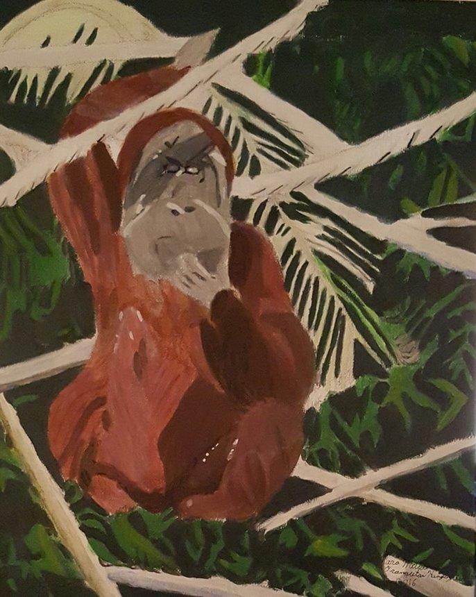   If you want to hear more explanations behind each of these pieces, you can read my post, 2016 Art Retrospective That's all for now. I'll talk to you again next week. I'm starting a new painting I'm calling "Peacock On A Limb" On day one, I'm painting a pale blue background to act as the sky,  and did a sketch in charcoal. 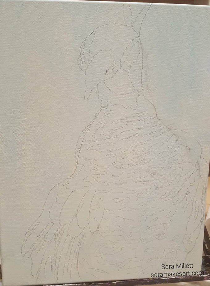 Last night, I livestreamed me working on the underpainting for this piece. I wish I had taken more pictures during it. At one point, it looked to me like he was wearing a scarf. I ended up covering up all the feather detail I had painted, by the way. I realized it would be easier to paint the body in solid using the dominant color of a particular area, than to try to paint around lots of tiny detail. I painted the lower third of his body pale gray, the upper third black, and the middle part a medium gray. Anyway, this is what he looks like now. 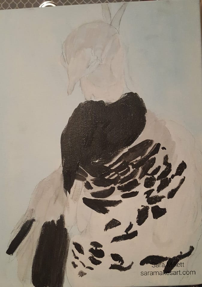 I added more feathers using titanium white and various size round brushes to the uppermost part of the peacock's chest and tail. I also worked on his head by layering various shades of gray and made by mixing titanium white and oxide black. 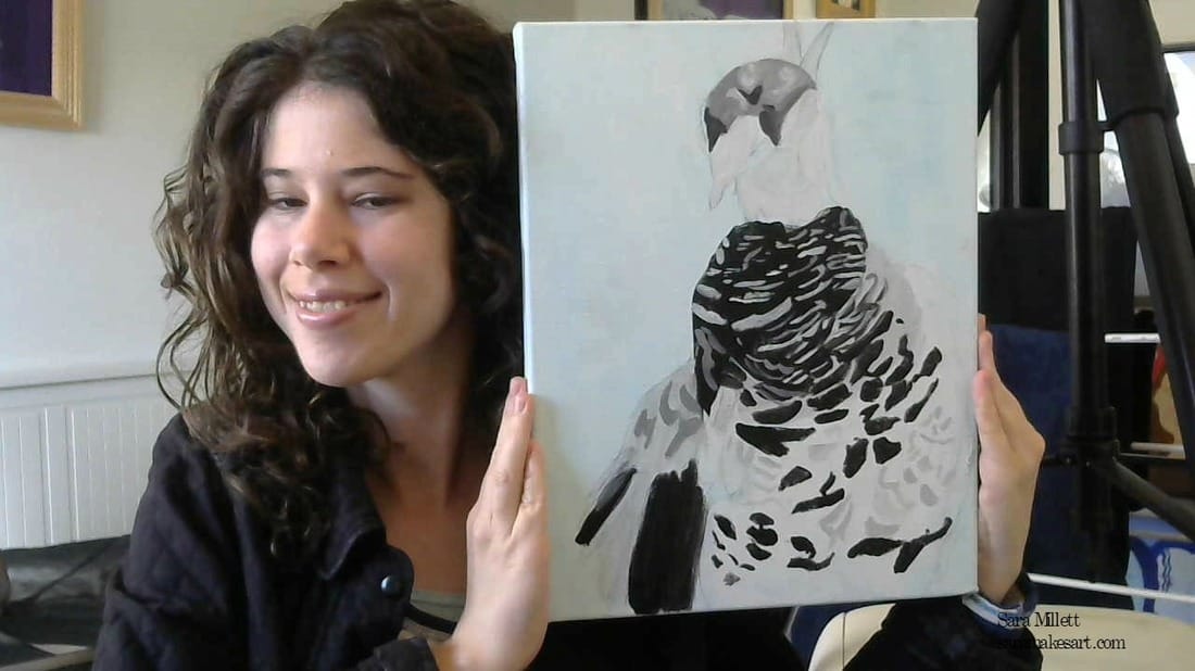 I added more shades of gray and white highlights to the peacock's chest and continued work on his head. 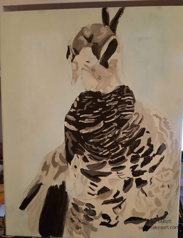 I went to his right wing and painted some more shades of gray made by mixing titanium white and mars black. I also put more dark gray and black in his head. 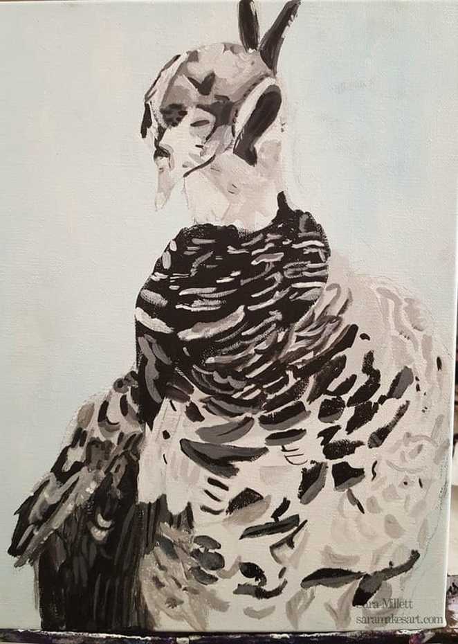 When it came time to start adding color, I started by mixing a small amount of dioxazine purple into a medium grey made by mixing zinc white and ivory black and applied this over most of the painting. I used more water for the area around the feathers so more of the underpainting would show through. I only had a small amount of paint on my brush for each stroke. I used a combination of a small round brush and a small filbert. 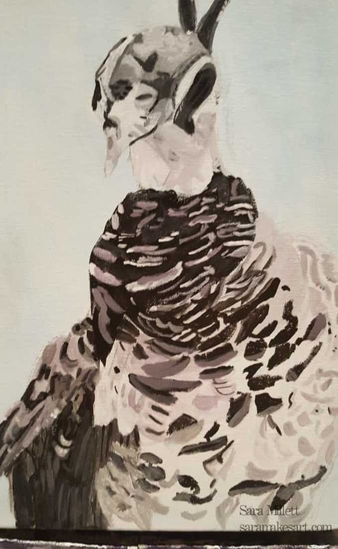 I mixed more purple into the gray purple I had mixed and brushed some of that onto the right wing. I used a liner brush and some zinc white and painted thin lines of white on some of the feathers. I went over these with a thin glaze of purple to blend the lines into the wing. 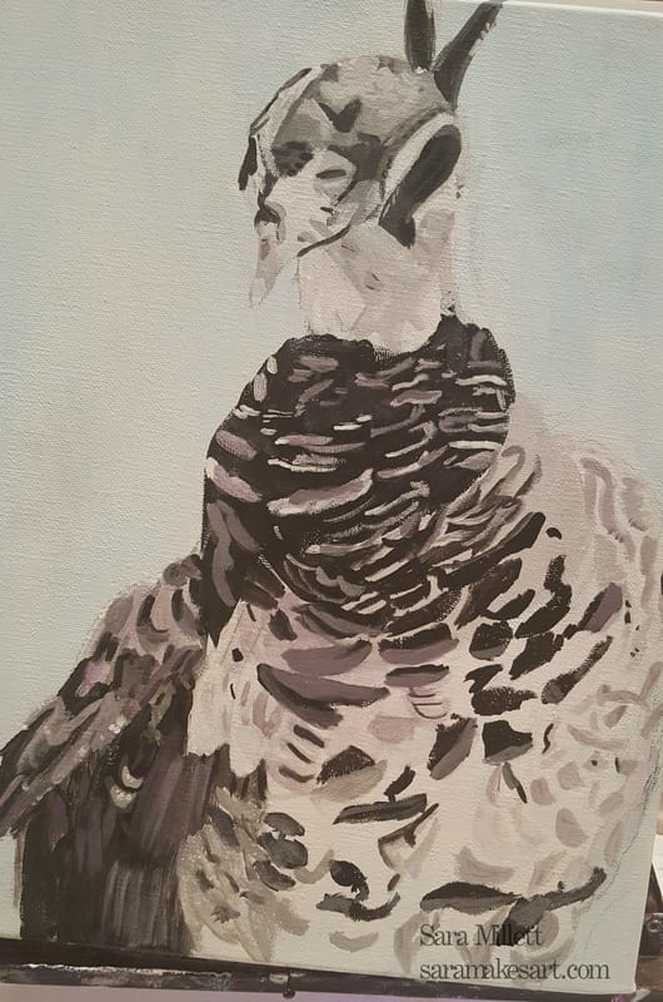 I have some gray/blue already mixed in a tube, so I used that to paint part of the peacock's feathers, with varying levels of opacity depending on the area I was painting. 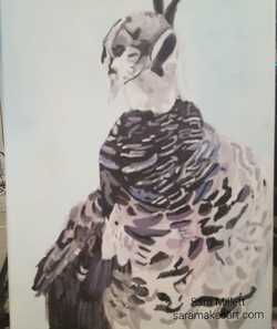 For the head, I used the same blue and purple colors that I had mixed for the body. I mixed varying amounts of water with my paint on my brush, which is why the colors are more opaque in some areas than others. 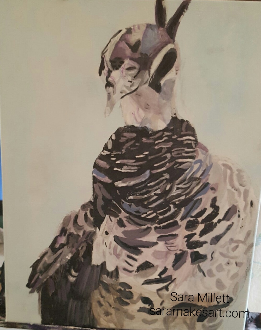 I also mixed a gray made from titanium white and mars black with a lot of matte medium to make it sheer and applied that in a sheer glaze along the bottom. I mixed some burnt umber into that color, along with more medium and applied a glaze of that on top. Lastly I mixed some titanium white and mars black, and, using a medium sized round brush, applied strucks of this color to break up the mass of brown and gray. 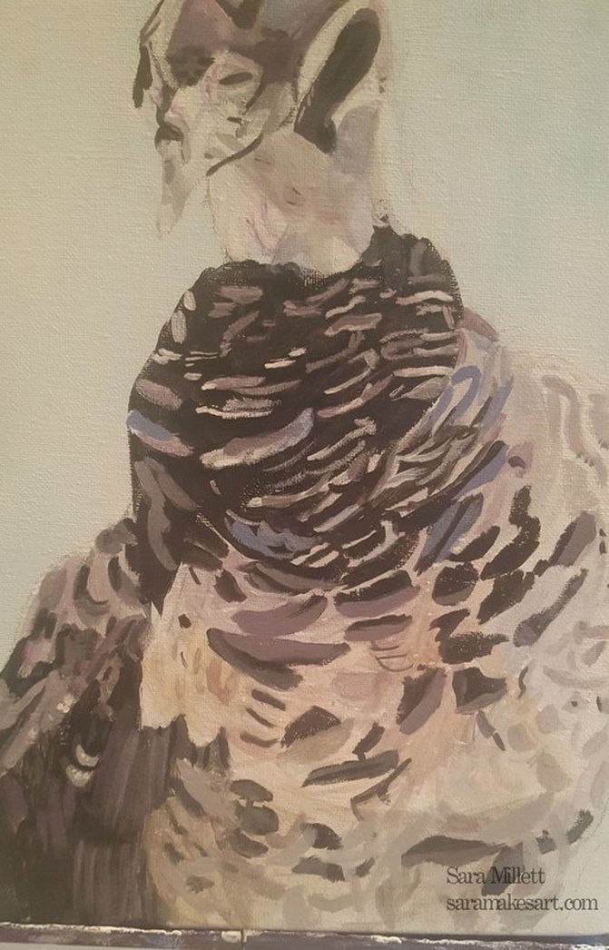 In today's painting session, I started by applying titanium white in small areas with a liner brush. I realized I would need to bring my brownish gray color up further, so I mixed more of it and interrupted by painting of white to put a wash of brownish gray up to where the blue ended. Then after trying to paint streaks of sheer gray and finding that it didn't work, I mixed opaque gray from zinc white and mars black and put this in various places all over the bottom third of the peacock's stomach using a liner brush. 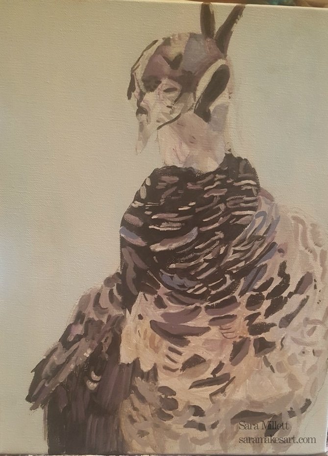 I then took that same liner brush, and this time used just plain titanium white to paint smore dots and lines on or around my gray streaks. 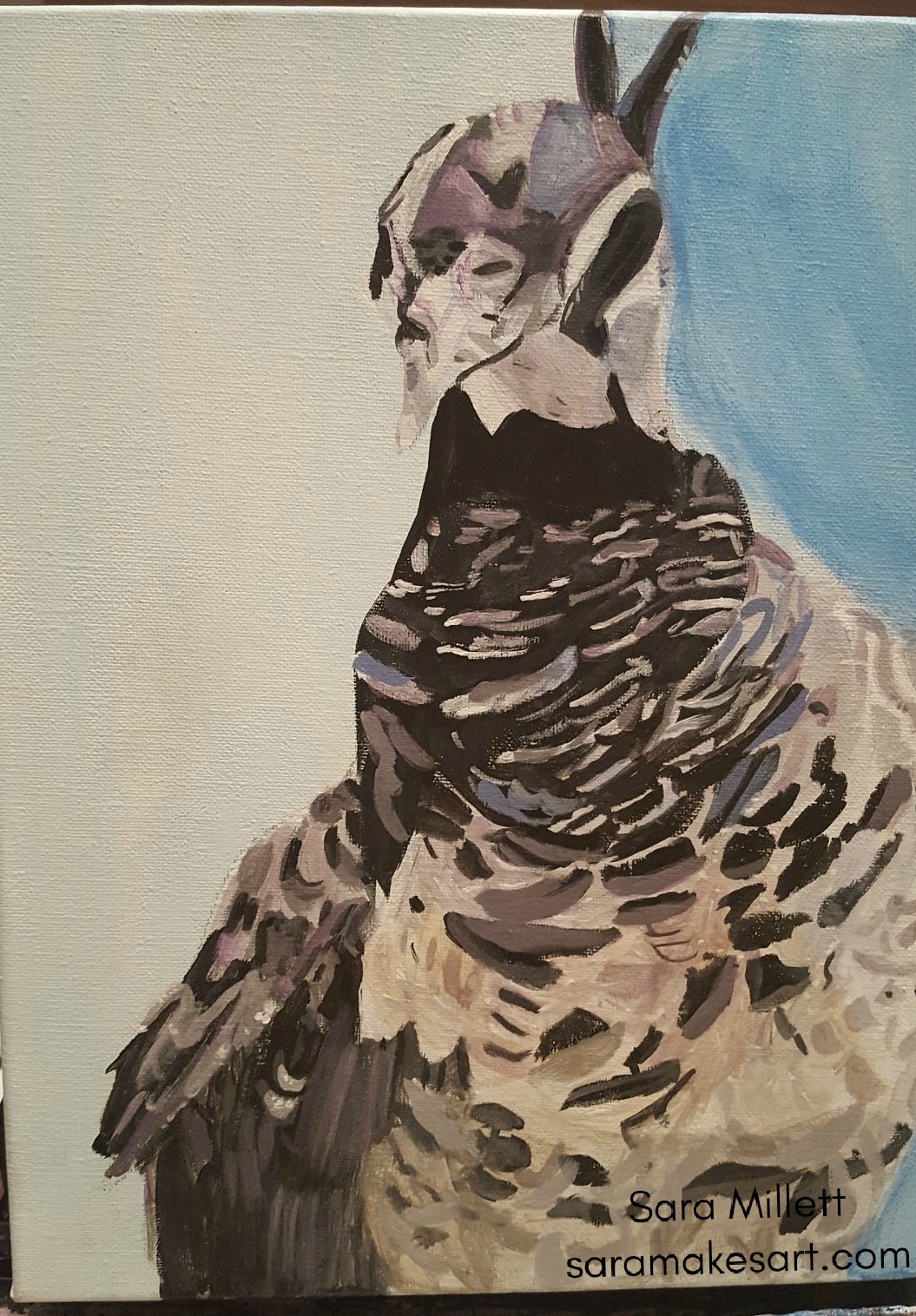 I took a small round brush and widened the gray areas where white was. I took the same brush with some titanium white and intensified the white areas on the upper right hand corner. Lastly, I mixed up a darker version of my background color and put this on the right hand side to emphasize the light coming toward that area. I stayed away from this painting for several weeks to work on other things, but when I finally went back to it, the last thing I did was glaze some magenta over it to brighten the colors a bit. And Voila! Here it is. 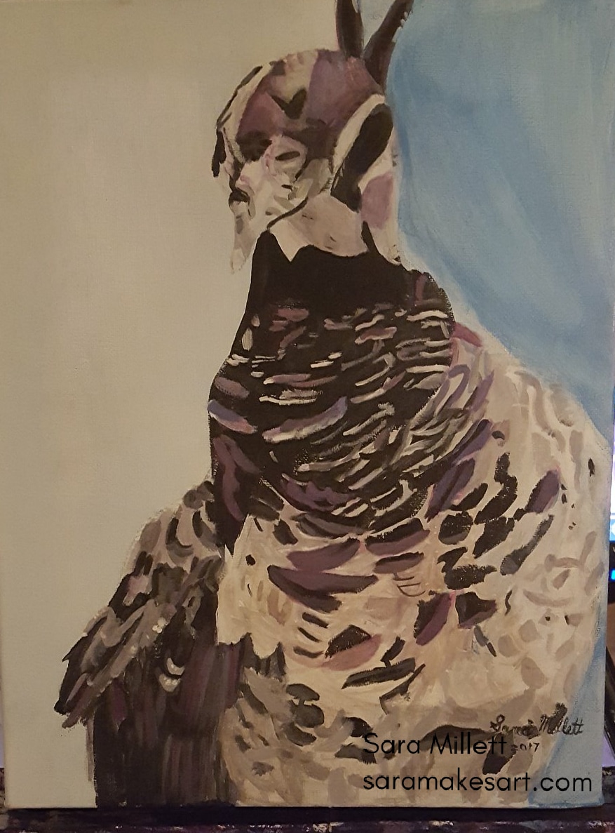 A long time ago someone commented on one of my youtube videos that I hold my pencil differently at different times and there’s a reason for that. Depending on what I’m doing, certain grips may be more comfortable. In the gallery below, I'm showing you how I hold the pencil when I use the tip. Those were ways I hold the pencil when I use the tip. In the second gallery, I'm showing you how I hold the pencil when I use the side. A recurring theme you’ve probably noticed by now is that I keep my wrist loose for everything except the tiniest details. This is something I still have to remind myself of sometimes but it’s very important. Drawing with a tight wrist will make your lines choppy and unnatural looking in almost all cases. That's all for now. I'll talk to you again, next week. 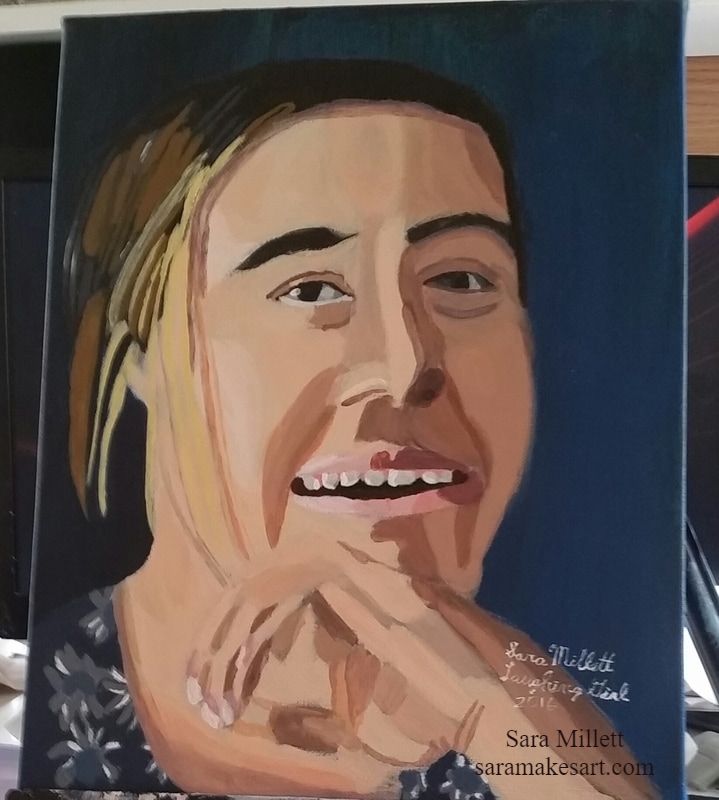 Recently, my mom told me that while I was working on the above piece she didn’t think it was going to work out, but now she loves it. I agree and her comment reminded me that this painting taught me an important lesson about perseverence. Here’s an instagram link of the painting at one it’s ugly stages. https://www.instagram.com/p/BB3fUYXK9kn/?taken-by=sararmillett As you can see, it doesn’t look encouraging here and I was tempted to give up at several points in this painting. Ironically, it’s now one of the pieces I’m most proud of and that’s because I kept painting over the bad layers until they looked good. My persistence paid off as I not only have a painting that I’m personally very proud of, but this particular piece was the first thing people saw when they walked into the Continuum Art Show in Kensington Gallery, in which I was the featured artist. Here’s a video I made showing the progress of this painting. Hi guys,You may remember posts like “Struggling To Get Started” and “Pushing Myself To Get Started”, and in those videos I share the difficulty I have sometimes in getting started painting, and I realized the struggle is just because I care so much about what I’m doing. I have high hopes for every piece and in my mind I never how my I’m going to create with my hands what my mind has dreamed of. I don’t believe this is a lack of confidence per se. I don’t doubt that my work is good and I don’t doubt that I’m talented. I also have no desire to hoard my talent from the world. Far from it. It’s just that such a strong emotional investment in every project plan that I make, whether a piece of art, or a video like this one, that the prospect of executing on that plan can almost fill me with dread because I just really care so much about the results and I don’t always trust that things will work out. That’s where I think my problem is. My problem is not caring about the results of my efforts. I’m certainly not gonna make any effort to stop caring. That would be just plain irresponsible. What I am gonna try to do is have more faith that things will turn out for the best. Even if something turns out horrible, chances are I learned from it, so it wasn’t a waste of time. I can’t explain why, but for some reason, I’m far less nervous about projects I do for other people, ie commissions or gifts, than I am about my own projects. Maybe it’s because I know no one else is gonna judge me my work as harshly as I am. So where does all my work come from if I’m so paralyzed with fear to even start. Well eventually my ambition overcomes my fear and I come to care so much much about the project that I can no longer stand to keep it inside of me. I’m curious, if you’re a person who also does your own projects, if you’re a painter, musician, photographer, author, whatever, can you relate to what I’m talking about here? Please tell me your thoughts in the comments. I finished a new painting! This one is called “Orangutan Hanging Out”. It’s an 11×14 acrylic on a Fredrix Green Label canvas. I was going to use another photo, but I thought the way the orangutan had her hand over her mouth in the one I chose would make a more interesting picture. 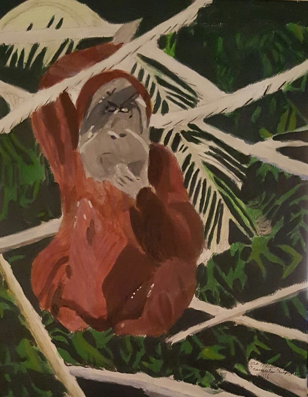 For the orangutan’s fur I mixed cadmium red medium with burnt umber and transparent mixing white. I was a bit worried about the color on the palette, but when I put it on the canvas, it was perfect. I glazed this color in light layers over my underpainting. 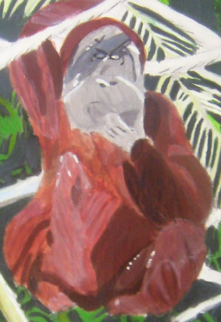 I thought I’d made a mistake by just using the lighter reddish brown color over the middle of the chest and arms and that I should have just used transparent mixing white. When I put the transparent mixing white straight over the base reddish brown color, I could see that a combination of that and the lighter mixed reddish brown color were what produced the best results. I put colors like blue and olive green in places you might not expect them, such as in the orangutan’s face and in the sticks around her. I don’t actually have a tube of olive green, so I mixed green with burnt umber to get the color. 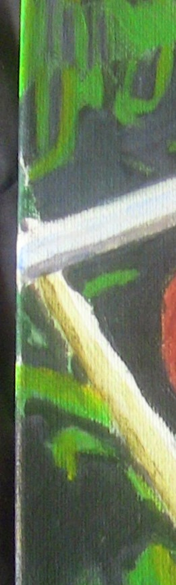 I mixed dark green and grey for my background color, but after four layers, I could see it wasn’t giving me the depth I was looking for. I mixed a grey color with the transparent mixing white and applied this in a very thin glaze all over the dark green. Finally, I had the dense forest look I wanted. 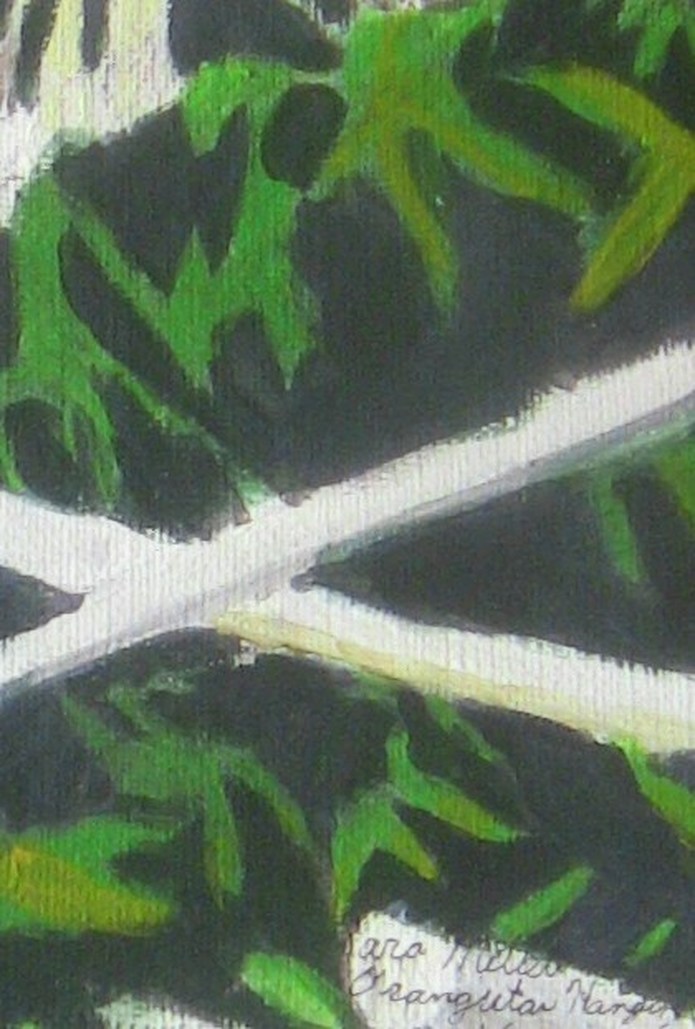 For the large palm branch to the left of the orangutan, I used a combination of transparent mixing white and a mixed yellow-green, glazing this color over my underpainting in light layers. I then put titanium white over some parts to create the look of bright light shining on it. 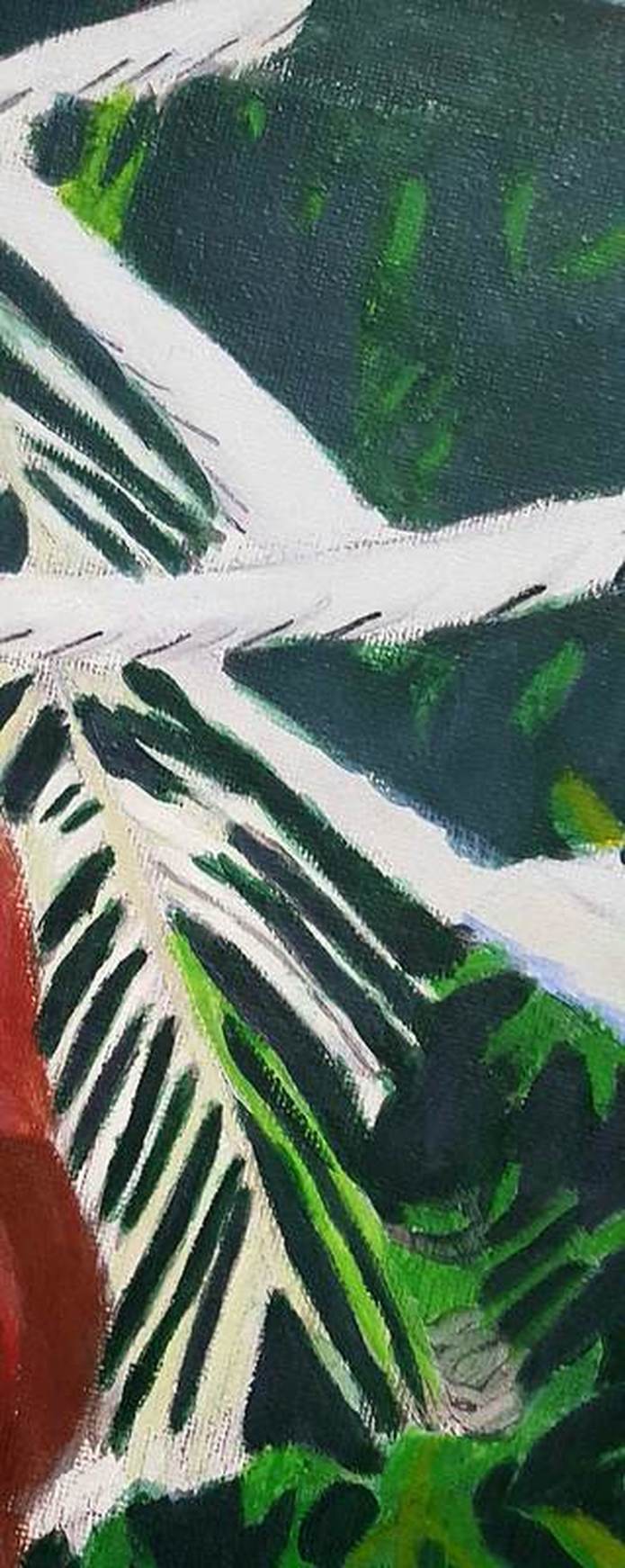 For the leaves, I didn’t copy my reference photo exactly. I just used it as a guide. I finished a new piece. That means it’s time to write a blog post about it. Without further ado, here’s the piece. 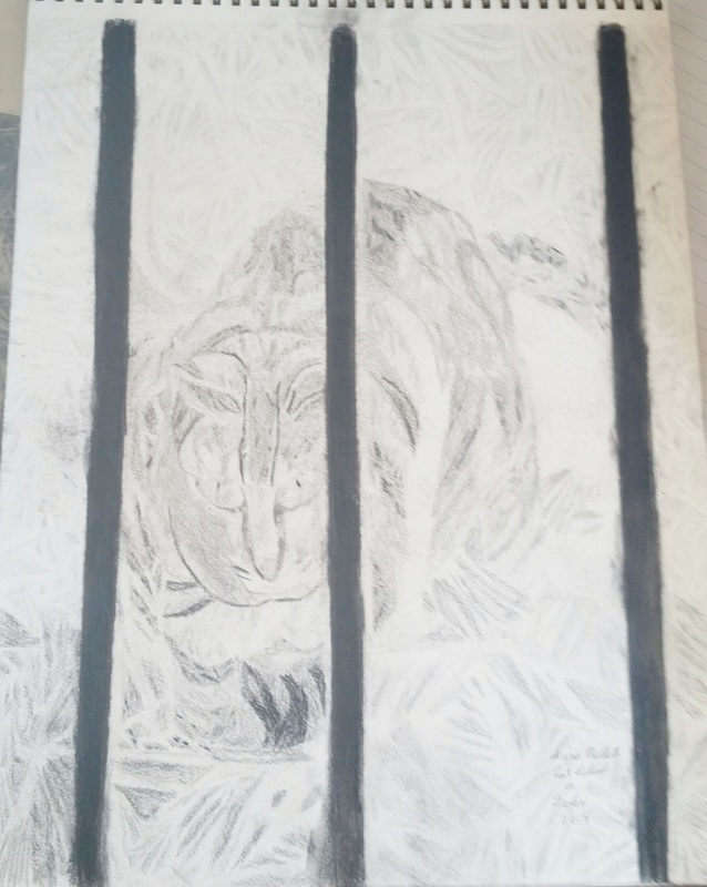 Origins There’s a certain park that’s near my house and every once in awhile, I go walking through it for excercise. At some point, I decided to keep my phone handy in case any good reference photo opportunity came up. This one time, there happened to be a cat staring at me from behind the iron gate into the valley and I snapped a pic, which became the drawing you see in this post. Tools To make this drawing, I used graphite pencils 8h, 2b,4b,6b, and 8b, a 2b charcoal pencil and a charcoal stick. Other tools included a kneaded eraser and my finger to blend. What I Did and Why I Did It The 8h pencil is extremely light, so that’s why you don’t see the initial outline. This gives it a slightly more realistic look. I’m not saying photorealistic, just more realistic than it would have looked if I’d had lines showing everywhere. I also tried my best to draw it as accurately as possible. You notice how the shading in the grass is very light and gets darker as it goes down? I did that to give the give the piece depth and make it look like there was grass far behind the cat. If I’d made all the shading the same tone, the piece would have looked flat. The other thing I want to point out is the iron posts. 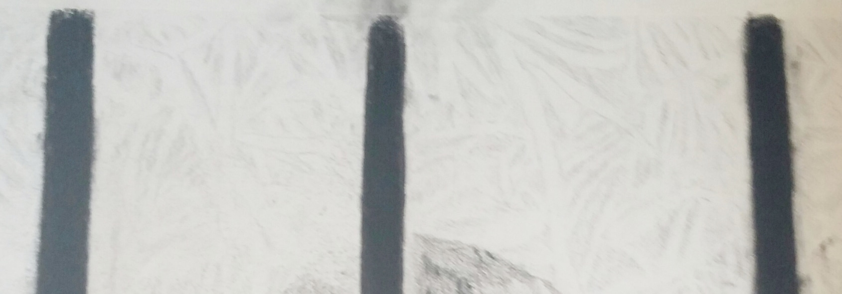 I'd already discovered how helpful the charcoal stick was in getting the perfectly black look. I tried using a charcoal pencil at first, before I thought better of it and decided to use the compressed charcoal stick. I then used a kneaded eraser to sharpen the lines up even more and my finger to blend out the strokes.
|