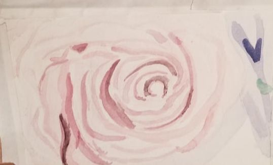
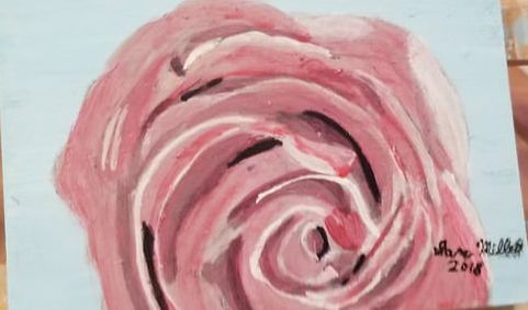
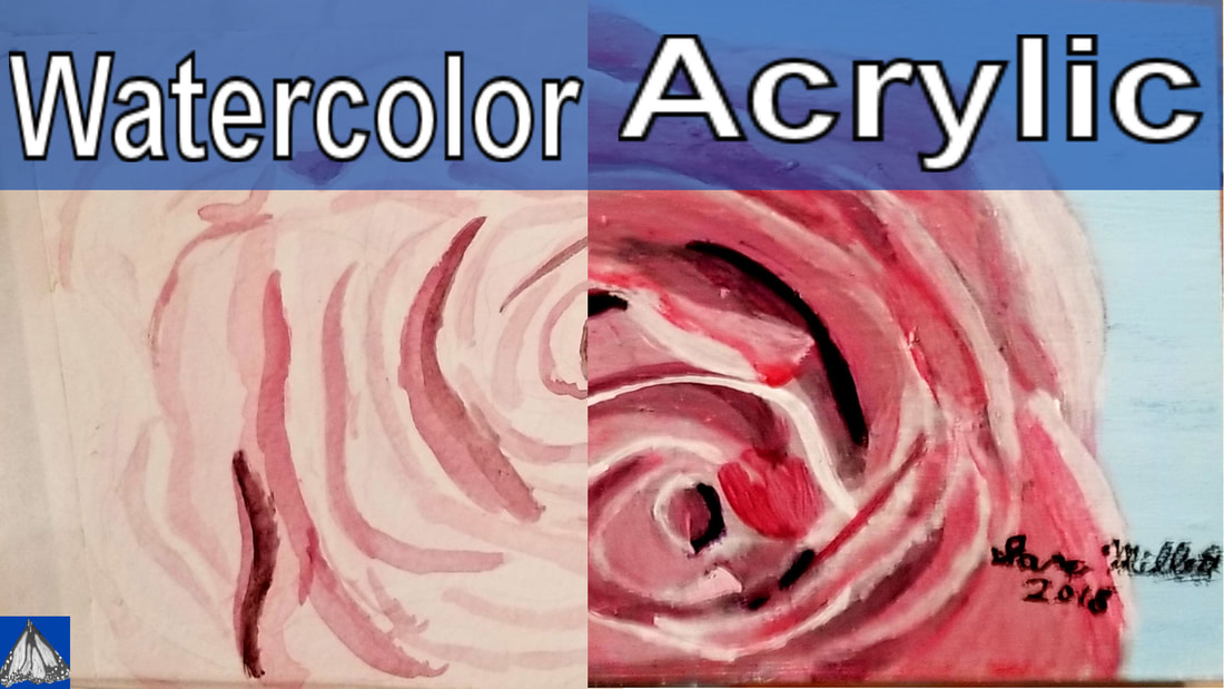
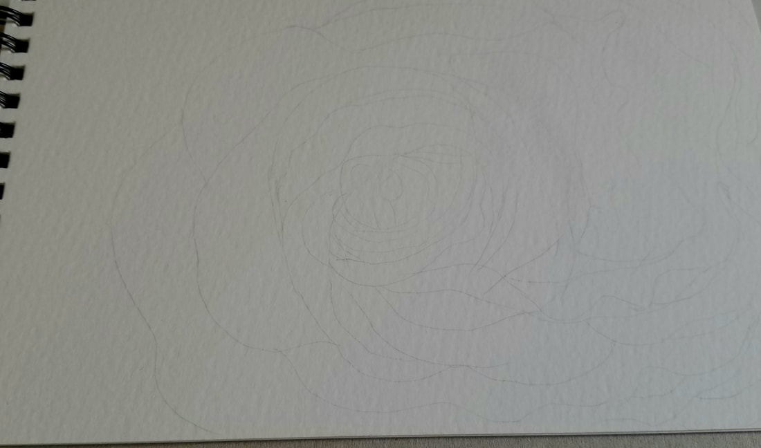
  The first difference between painting in watercolor and acrylic begins before I even start painting. When I work in watercolor, I draw in all my details with pencil before I start painting. This is because watercolor is transparent, so it's very hard to layer one color on top of another. It's impossible to layer a darker color over a lighter one in watercolor, period. Because of this, it's very important to have where I'm going to put all my shades mapped out, since if I put the wrong color down somewhere, I can't easily fix it, unlike acrylics. This brings me to... When working in acrylics on the other hand, I really just get the basic shape down before I start painting. Acrylic is opaque, unless you're glazing, which I'll get into in a bit, so you can easily layer colors over each other. I can even layer a lighter over a darker one in acrylic. So to have all my details drawn before I start painting is unnecessary and would really just create extra work for myself because I would need to worry about painting around all the details that I'd drawn. I'll give you an example of when trying to draw in all my details before I started painting in acrylics has created extra work for me. Take a look at this peacock I painted. 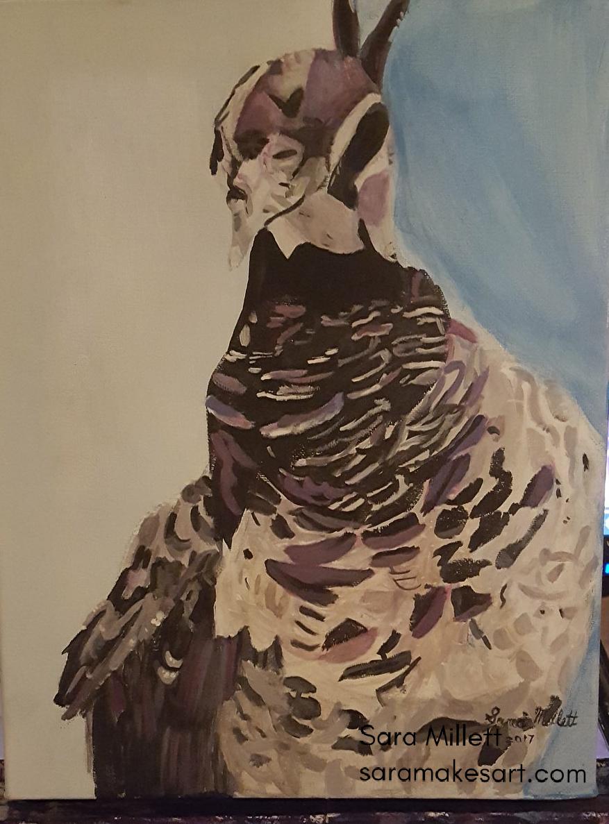 'See all the detail in his chest? Well, I meticulously drew in all of that before I started painting. Then I tried I tried to paint around it, realized it was slowing me down, so I ended painting over all the details and drawing them back in later. 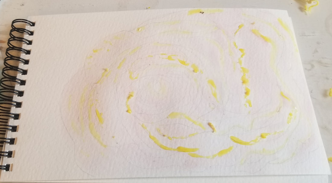 The next difference is in how we use white in both mediums. In watercolor, we normally don't use white. If a part of our piece is going to be white, we use the white of the paper. In the pic above, you can see a pale yellow liquid in various parts of my painting. This is called masking fluid. You don't have to use masking fluid when working in watercolor, but it offers extra insurance that you won't accidentally get paint on an area that you want to keep white, because it's impossible to get paint or water on an area that has masking fluid on it. 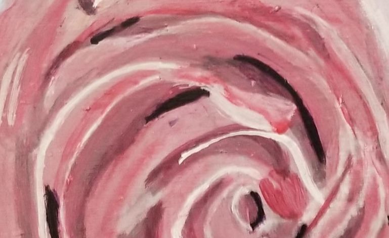 When it comes to acrylics on the other hand, we add our whites in with white paint. When I work in acrylics, I'm not that concerned with the cleanliness of my water. I can go days or weeks without replacing my water and won't effect the quality of my painting. Not so with watercolor. If the water is dirty when I work in watercolor, that will muddy up the paint I'm using. So I always make sure to keep my water as clean as possible. Something interesting happened in this painting session, though. I'd intended to apply a layer of clear water to my paper and put paint over it. This is called painting wet-on-wet. Now, earlier, I'd used my brush to mix some water into some red that was already on my palette and, while I did clean the brush, it turned out there was still some residual paint on it which got in my water and actually turned it into the perfect light pink color. There's one of those happy accidents for you.  I think this is a good time to mention that I chose to paint a pink rose, rather than a red one for this project, specifically so I could show you the difference in how we lighten colors between the two mediums. Like I said, when we work in watercolor, we really don't use white. If we want something to be white in our piece, we use the white of the paper and if we want our paint to be lighter, we lighten it with water. The "pink" you see in this rose, is actually red paint mixed with a lot of water. 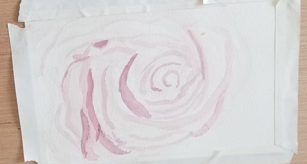 Now it's time to add shadows and for the watercolor painting, I just used the same red that I used for my base color, just with less water in it. When I put my first stroke of this paint down, I actually thought it was too dark, so I just mixed water into it and it lightened it right up. That's the cool thing about watercolor. Even after it's dry, you can reactivate it with water, both on your palette and on your paper. For the pink in this painting, I was using red that I still had left over from when I did my cat painting. 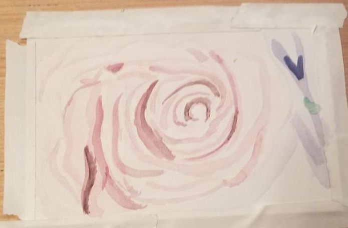 Here's my watercolor version of the rose finished. In the photo, there was obviously some very dark tones. They looked black to be completely honest, but I chose not to use black in my painting because I thought doing so would ruin the soft, airy effect I wanted the piece to have. Instead, I just mixed black into the purple that I'd already used to darken it a little. You can see that there's a shape in the background. An important thing to remember when working watercolor is that if you want to be able to put a brush stroke down and have the paint stay where you put it, the paint underneath needs to be dry. If there's moisture around, whether it's wet paint, or just water, watercolor paint will move all over the place. A lot of times I take advantage of this thing about the nature of watercolor, such as when I blocked in the base color for the background. I wetted my entire paper except for one corner that I didn't want paint on and let my paint run all over where my water was. I think it can actually be a lot of fun to paint like this and you can get some cool effects painting wet-on-wet. But, it's annoying when this running and bleeding happens unintentionally. 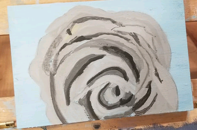 You'll notice that when I did the acrylic version of this rose, I started with a gray toned underpainting called a grisaille. I go over how and how do to a grisaille in this video. I chose not to use this method for the watercolor version, because I don't really know how the grisaille method would work with watercolor, but I would like to experiment with the grisaille method in watercolor in the future. 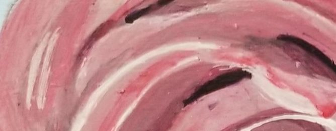 After I'd put in my shading, I thought I was done, until I realized I was forgetting the white highlights, which is a very important part of the piece. But then after those were in, it still didn't pop the way I wanted it to, so I thought I needed more red shadows. Actually, it had bothering me for awhile how dull this rose was looking, so I thought a glaze of red was just what it needed to brighten it up. After that I was so much happier with it.  But I still didn't feel like the petals had enough dimension. I decided that the purple shadows just weren't dark enough. I needed to go all the way to black. Which I did, and then glazed over with purple so it wouldn't look flat.
All in all, when I compare the two paintings side by side, I really prefer the acrylic one. I think the colors are more vibrant and I really like what adding that little touch of black did for the folds in the rose. I didn't spend as much time on the watercolor version of this painting and part of that was because I've only recently started to use watercolor after years of not using it, so I'm not as confident in working in it as I am in acrylics. So I didn't want to try techniques like grisaille, or glazing, which I did with the acrylic painting, just because I didn't know how well they would come out. I wanted to stick with what I understood, because I wanted this to be a straight up tutorial and not one of those I'm-just-trying-this-out posts I sometimes do. Not I don't love doing those, by the way. So I hope this post has helped you understand better how I work in watercolor vs how I work in acrylics.
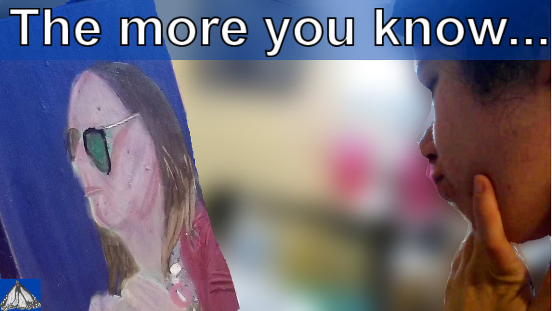
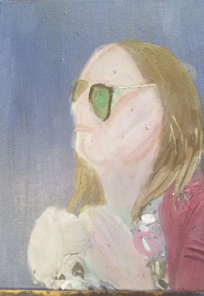
2 Comments
  The title of this post comes from a quote by Edgar Degas. The exact quote is "Painting is easy when you don't know how but very difficult when you do". I found it when I was googling quotes by artists to see if any of them would jump out and me and give me ideas for content and this one definitely did. On the surface, the very idea of it seems ridiculous. Why would something become more difficult the when you know how to do it then when you don't? Well, I'm sure with most things in life, they get easier the more you know about them, but art, as they say, is a different ball game. When I was painting as a kid, I didn't know anything really about how a painting should look. I didn't even have a particular style in mind. So I was just painting for pure pleasure. I didn't care really, how it came out and that made it very easy. Now that I know more, though, I find myself judging my work more critically. I have higher expectations of myself and that's what makes art more difficult as a consequence of knowing more about how to do it. The main expectation I put on myself is to produce my best work all the time. That makes doing the experimentation I know I need to do sometimes in order to grow very daunting. I broke through that anxiety in order to do my current piece, which, if you follow this blog, you know is an experiment to see what kind of results I can get by layering pink on top of green in the creation of skin. Now, I don't think my results came out great by any means. But you know what, I've realized the fact that I made a less than stellar painting doesn't really bother me. What I've learned from this is that I don't understand how to do the "underpainting" technique as well as I thought I did and I need to learn more about it before I attempt it again. Part of the problem is that knowing more about a topic makes you more aware of what you don't know about that topic. A way that I like to deal with this uncertainty is to latch onto what I do know, what I am sure of, work on that, and for the time being, pretend the rest doesn't exist. I did that in my current piece with the woman's hair. I knew ir had a dark ash brown base, so I just mixed some transparent burnt umber into gray made by mixing zinc white with ivory black and glazed this all over the hair, not worrying about other shades at the time. Because I'd thinned the paint out enough, though, the lighter values on the ends of her hair still showed through. Also, if something about your piece is making you miserable, take a break from it. Don't quit it altogether, but put it aside. For example, I couldn't stand the thought of working on this woman's skin any more. That's why you I decided to work on things like her hair, features, and clothes. To me, this quote seems very related to another quote by Salvadore Dali, which is something artists need to remember also and that's, "Have no fear of perfection. You'll never reach it." When we start thinking about reaching perfection, we can start to get that voice in our heads that tells us we can't paint and that's where this quote from Vincent Van Gogh comes in and that's "If you hear a voice within you say 'You cannot paint', then by all means paint and that voice will be silenced." I explain more and talk a bit about what I'm doing on my painting in the video embedded below. 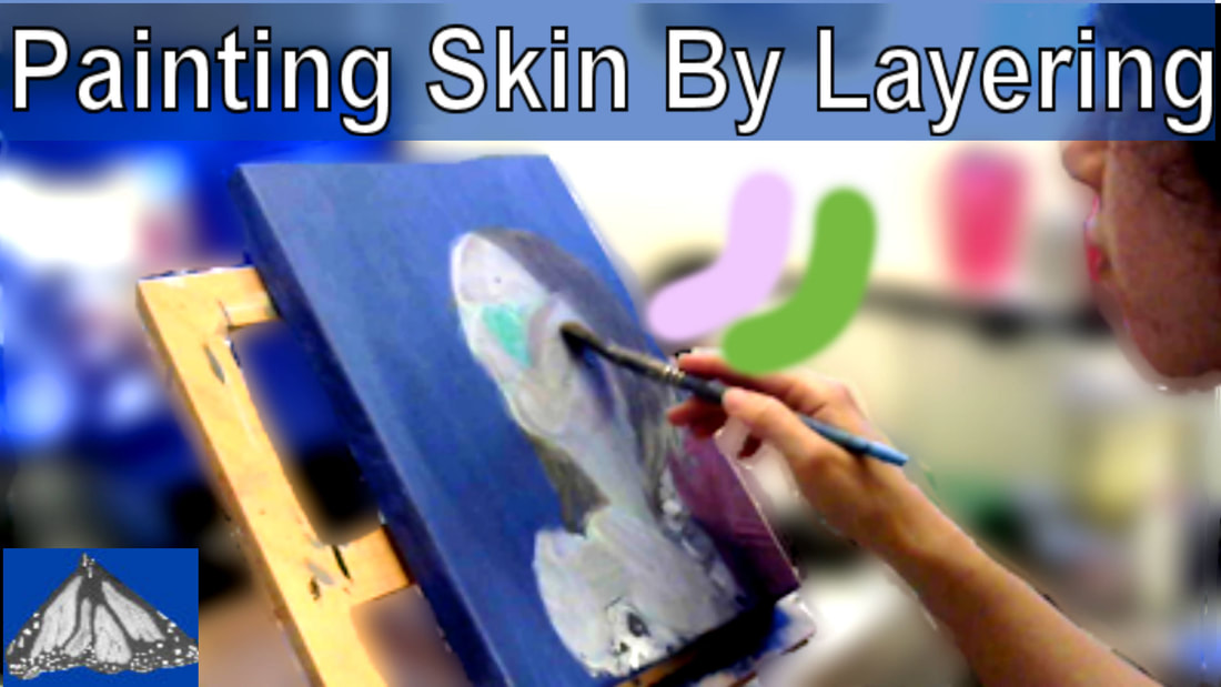 Last week, I explained how I took my painting and turned it around when it was going badly. This week, I'll be talking about how my original plan for that painting went. As you know, if you read last week's post, I started with a green underpainting, in which I layed down her values and added in her features. 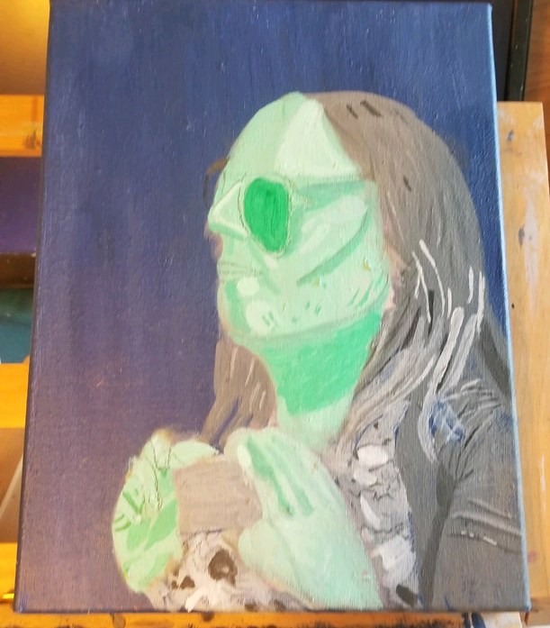 I then started to add the first, very thin layers of pink. 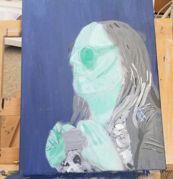 I know you can't see any pink yet, but that's kind of what I wanted at this point. It wasn't until the fourth layer that I saw something resembling a skintone coming through. 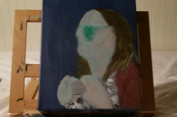 What I learned from this is that painting skin by layering colors on top of each other is far more difficult and time consuming than I'd anticipated. At one point, I actually thought her skin was looking too pink, so I glazed green over it to neutralize it. I even tried glazing blue over it to see what that would do. Anyway, this is how the painting is looking at the time of this post. 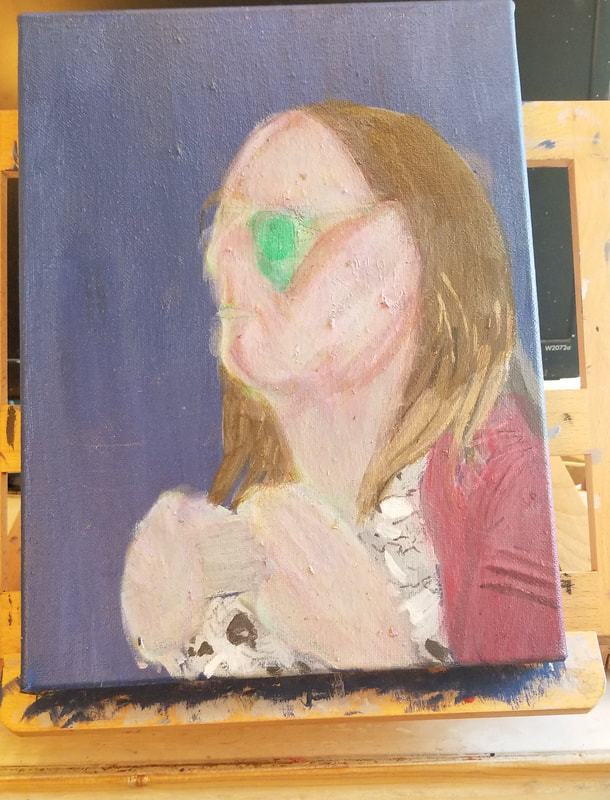 You can hear all about my debacle in the video embedded in this post. The last thing I did was glaze some red over it because she was looking kind of gray and red can brighten things. This isn't one of my favorite pieces, but it has to be okay to make less than stellar art. Otherwise you can't do experiments like this. If I insisted on every piece being amazing, I would have to just stick with doing what I know. I might revisit this concept in the future. I'm working on a painting that's an experiment to see how what kind of results I can get by layering colors on top of each other. I started with a black and white underpainting, like I do with all my pieces, which looked like this. 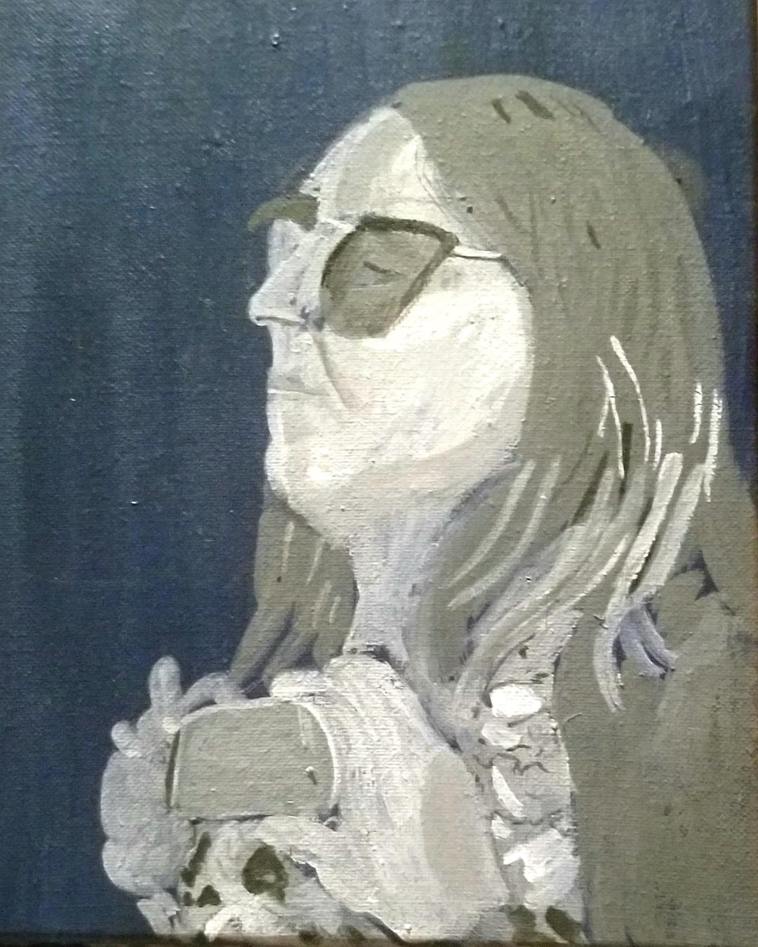 My plan was to glaze green on top of it and then I would glaze pink on that and the two colors together would create a neutral skin color. For info on what I'm basing this on, see this post about complementary colors. Anyway, so I glazed a couple layers of green on top and so far everything was looking good. 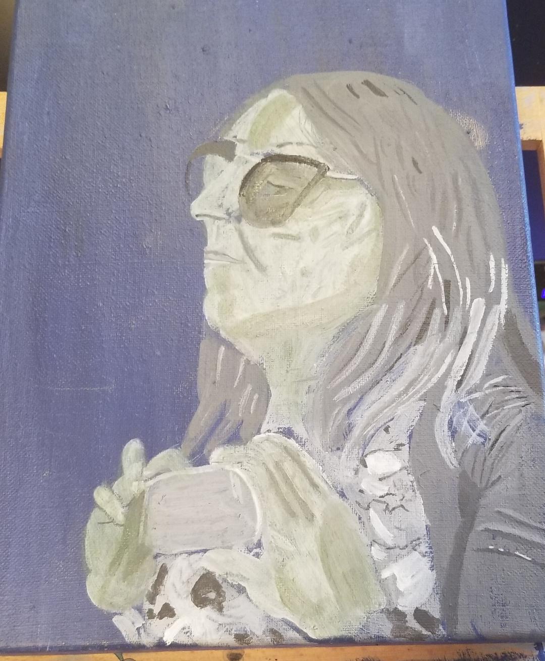 But when I added the pink, I made the mistake of not thinning it down enough so it not only completely covered up my green underneath, it covered up all the work I had done on my underpainting as far as her features and stuff. Needless to say, I wasn't very happy at this point. 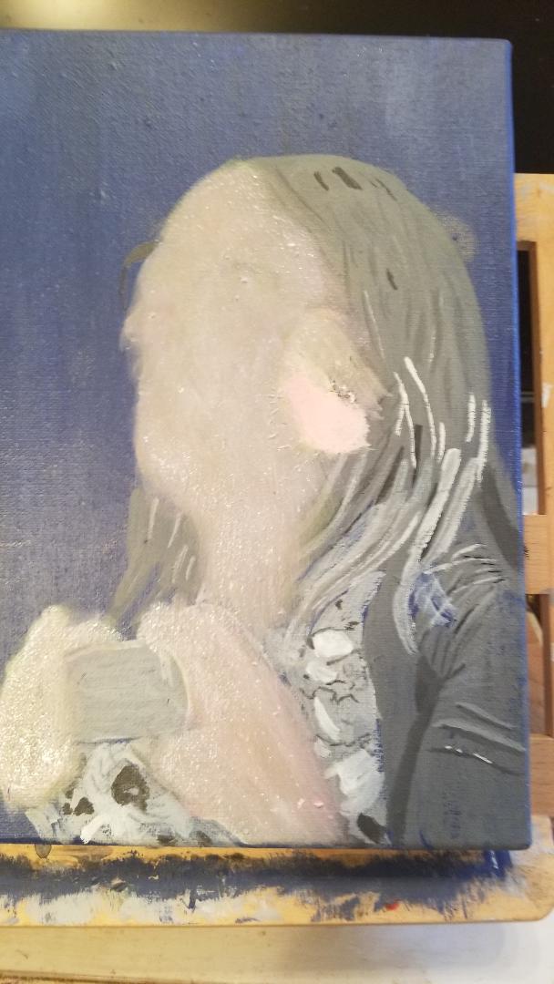 From there it turned into a cycle of turning her pink,  then turning her green again, 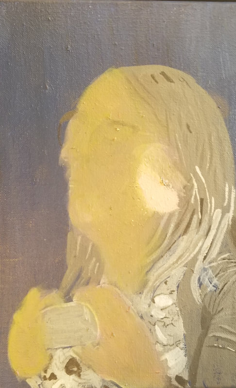 then turning her pink again. 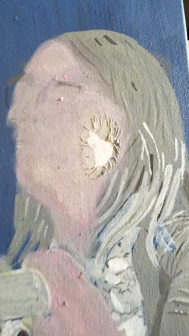 Finally, I was like, I can't continue like this, I gotta go to plan B. So I decided to paint over her whole face with an opaque green. This would serve the same purpose as my original black and white layer, which was to put down her values and features 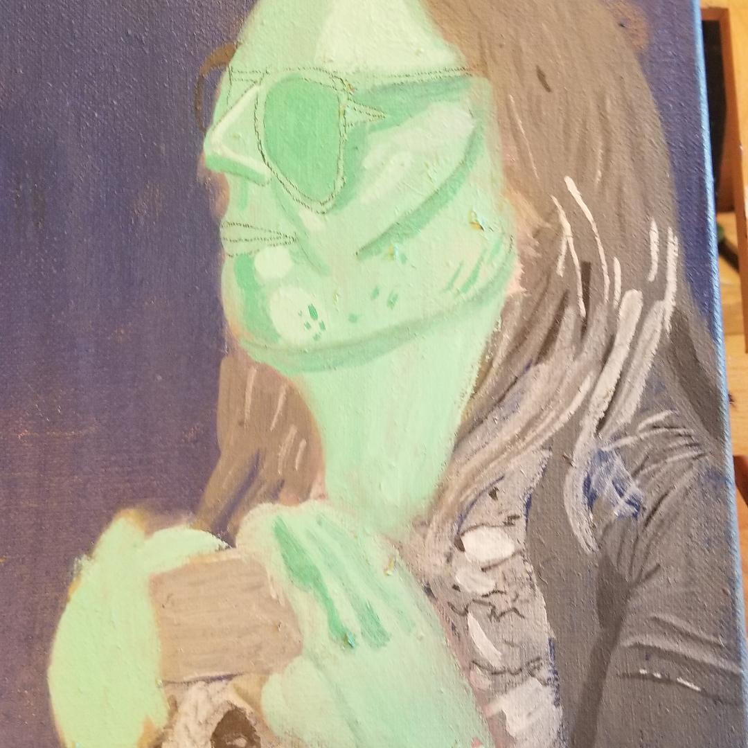 So that's where I am in the process of this painting now. My plan next is to glaze pink over it, as was intended. I've figured out now that I need to thin the paint down a lot for this to work. Putting just a few spritzes of water in the paint won't be enough. I need to water it down to the point where it's practically just water with color in it before I paint over the green. I'll let you know how adding the pink went in the next post. The reason I'm telling you this is because I want to show you the importance of finishing a piece and sometimes that requires you to find a way to turn a bad piece around and try a different plan than the one you were using. There was a time during the process that I was tempted to scrap the whole thing and say forget about it. But if I'd done that, not only would I be wasting the canvas and the paint, I would be wasting the time I'd spent working on it up until now and that's just not acceptable. |