 It seems obvious to just mix brown into yellow to make yellowish brown or golden brown, but if you do it this way, the color can easily end up looking muddy. I found this out for the first time when I did this painting. 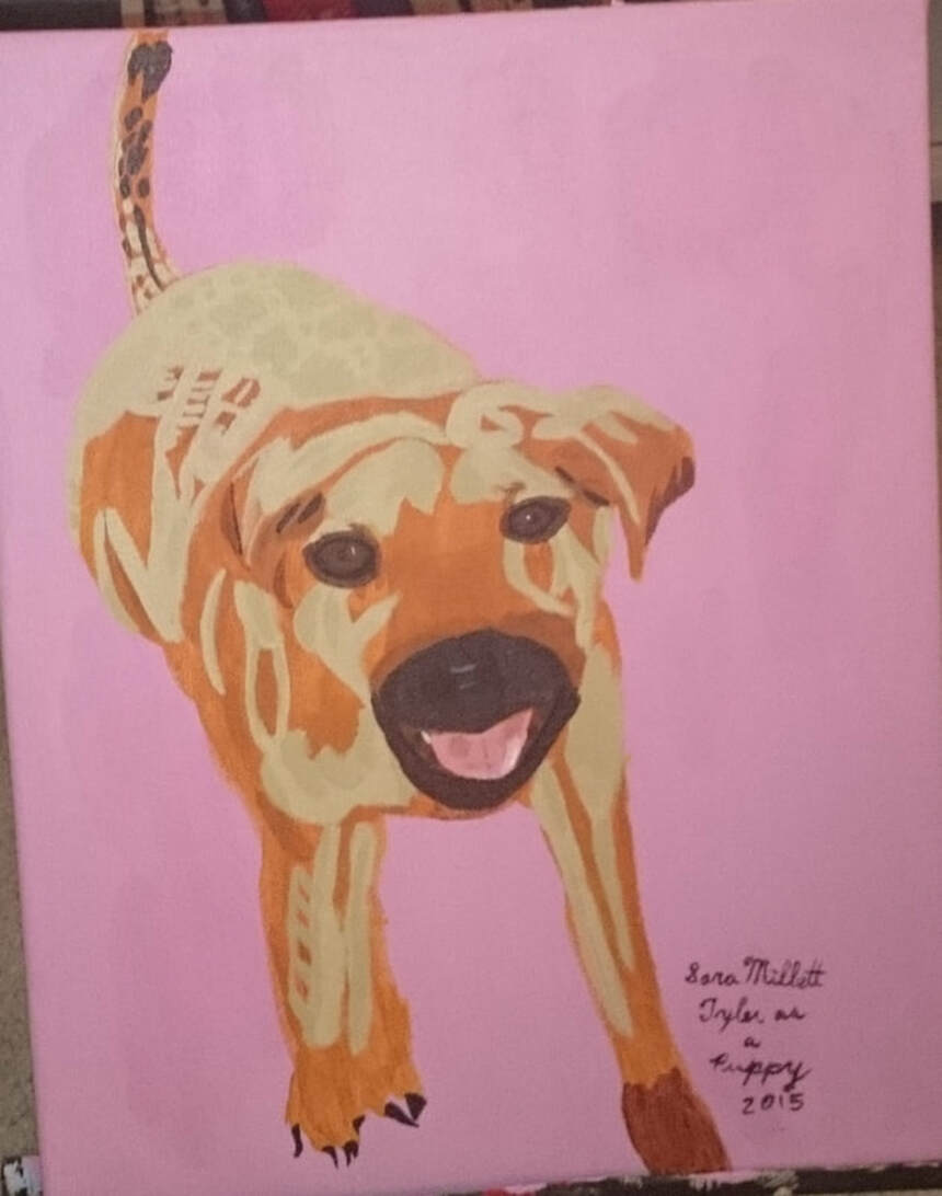 To fix this issue, I mixed a tiny bit of red, an almost imperceptible amount in fact, into my yellowish brown mixture. This brightened the color, without making it look ruddy. I actually got the idea to try this from the makeup artist, Bobbi Brown, who describes using red lipstick to brighten other colors in her book "Teenage Beauty". In addition to using this little color mixing trick in the painting above, I also used it for this golden retriever. 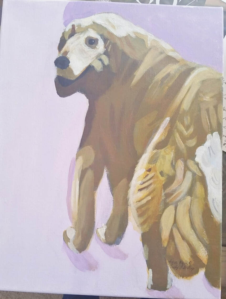 This will not work to brighten green, though as red and green are complements. If you want a bright green, the only way I can tell you to get it is to buy one in a tube.
1 Comment
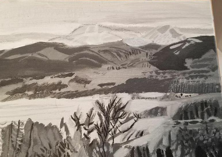
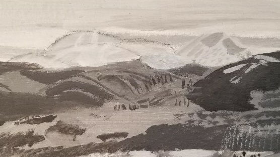
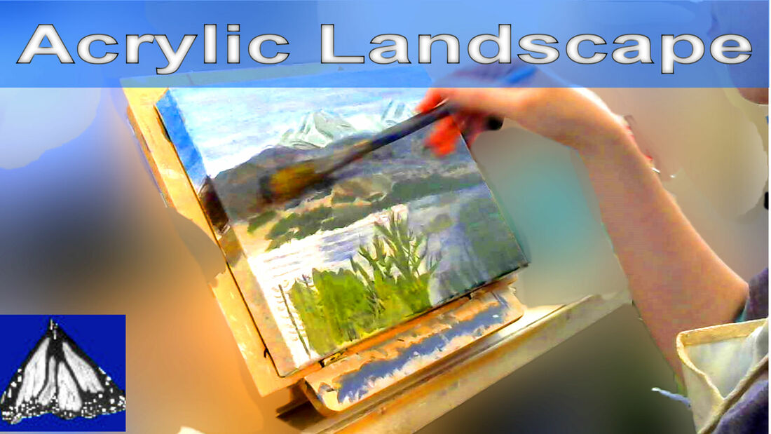 In this video, I'm demonstrating the use of warm and cool colors to create depth in a landscape. I'm painting mountains over a lake near Silverton, Co. I used Liquitex and Amsterdam acrylics on a Belgian Linen canvas from Fredrix. 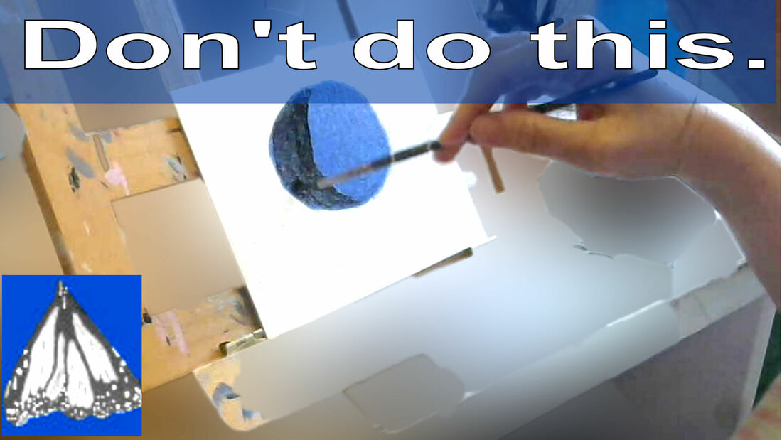 One of the worst things you can do, if you want your piece to look realistic, is to immediately reach for black when getting ready to paint your shadows. Here's my painting, "Couple In Costume At Balboa Park. 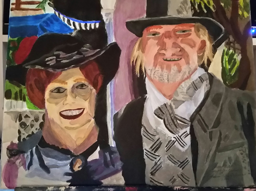 I want to direct your attention to the blue overhang in the upper left hand corner. 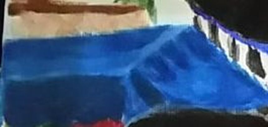 For this particular piece, I used cerulean blue as the base color and ultramarine, mixed with black for the shadows. You can see it has obvious dimension. In the pic below, though, I've digitally colored the shadow on the side black. 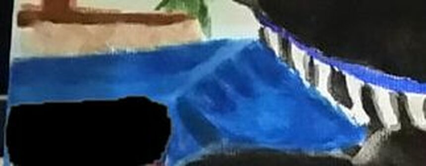 Next, take a look at how I painted this table in my painting "Woman With Cabinet". 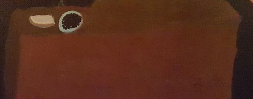 Here, I've painted the base of the table burnt sienna and for the shadow on the side, I used a burnt umber shade. Both shades were mixed with other colors, of course. Now here's that same table, with the shadow on the side digitally colored black. 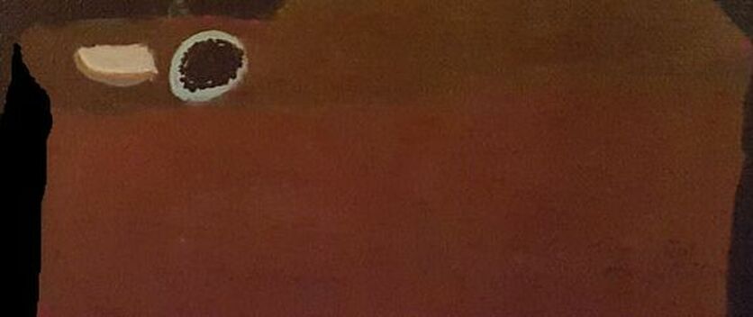 Here's a graph of the mockups side by side. 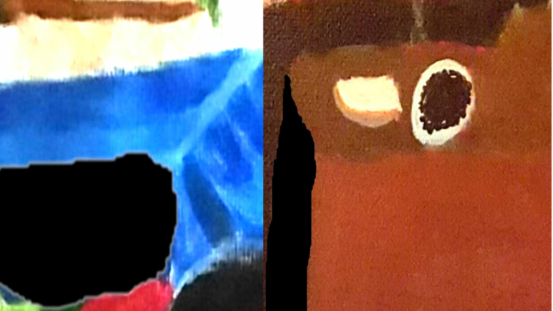 Truthfully, when I paint a shadow, I usually just make it a darker version of the base color. Now, I ususlly mix black with the base color to darken it for this purpose, but that's not the same as actually painting the shadow black. Thinking about shading for this post gave me the idea to try seeing how using complementary colors to shade would work. I painted six circles in different colors. Then, mixing each color with it's complement, I used that complementary color to paint a shadow on each circle. So, to put it more simply, I mixed orange with blue and painted a shadow on the orange circle, red with green and painted a shadow on the red circle, and so forth. 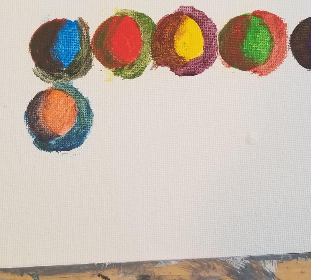 I wasn't crazy about the results, so I decided to try glazing some of the dominant color, so red over the green shadow on the red circle, and orange over the blue shadow on the orange circle, etc, to see if I could get any better results. 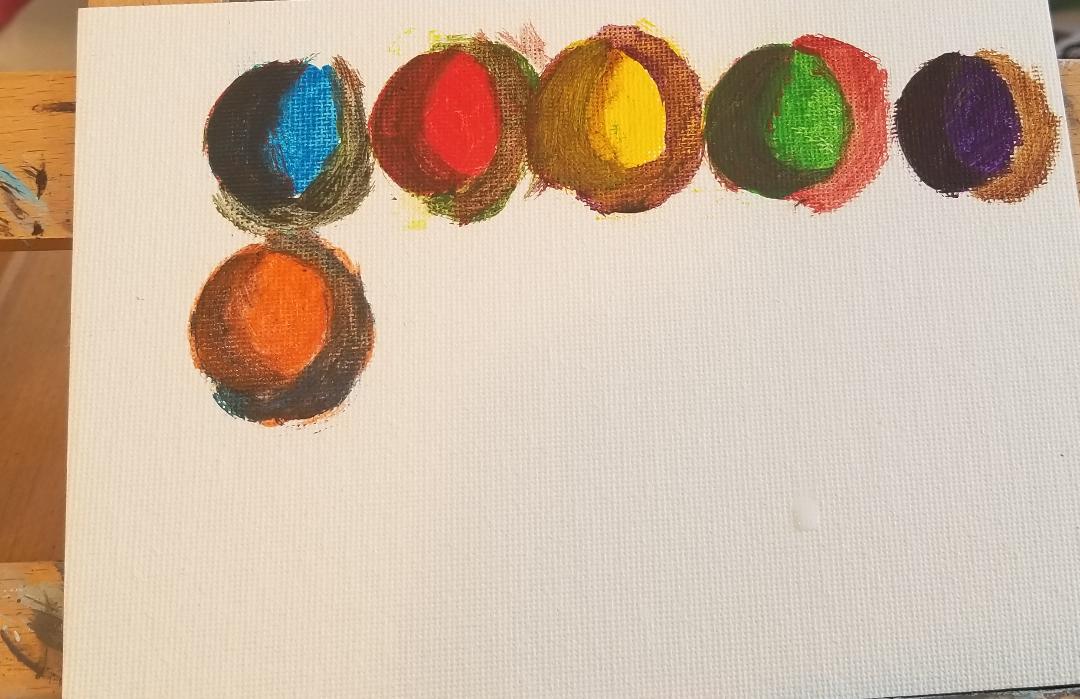 I think using a complementary color to shade works well when the complement is a cool color. Meaning that using blue to shade orange, green to shade red, and purple to shade yellow can work, but the reverse, orange to shade blue, red to shade green, and yellow to shade purple, does not. This is because shadows must always be cooler than the base color. That's because not as much light is hitting those areas and when less light is hitting an area, colors just appear cooler and grayer. I'm sure you've noticed if you've ever looked around a dark room, there's not as much light. But I must emphasize that even using complementary colors that are cooler than the base to shade can only work if those colors are muted. No color will work as shadow if that color is bright. But maybe you're thinking, okay, so I won't use black for shadows cast by objects, but what about using black for shadows cast by an object? Black is a perfect color for those right? Well, lets try this out with my painting "Cody The Dog. In the image below, I have the painting as is, with the shadows cast by Cody's paws colored a darker purple and in one pic where I've colored the shadows cast by his front paws black. 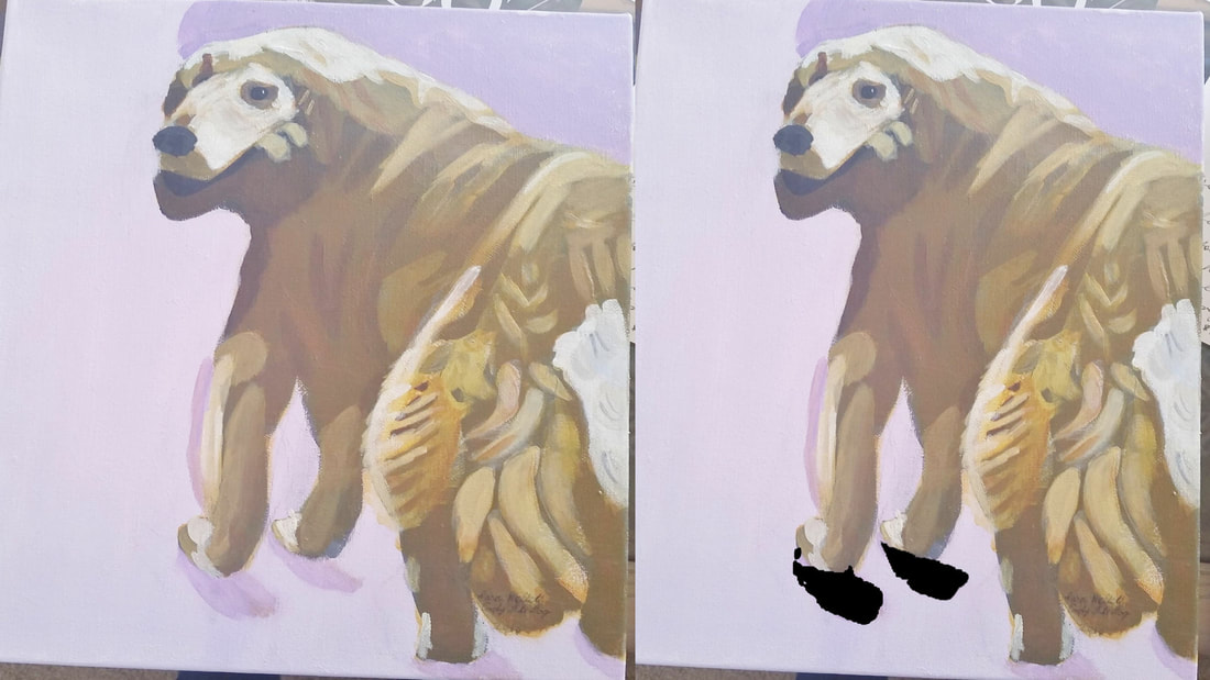 I think you can see, even for shadows cast by objects, black is probably still not the best choice. It just doesn't look natural. 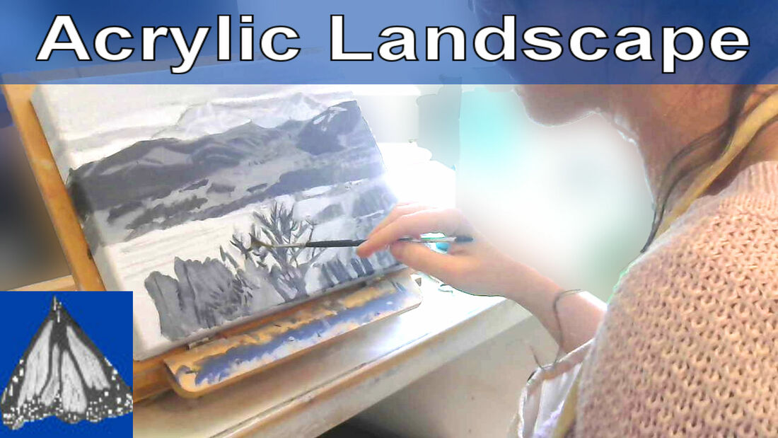 In the video embedded below, I'm demonstrating using size and placement to create depth in my landscape. Things that are closer to the viewer I made larger and sharper and things that are farther away I made smaller and more fuzzy. I also painted the mountains, not in neat rows, but with some placed here and there.
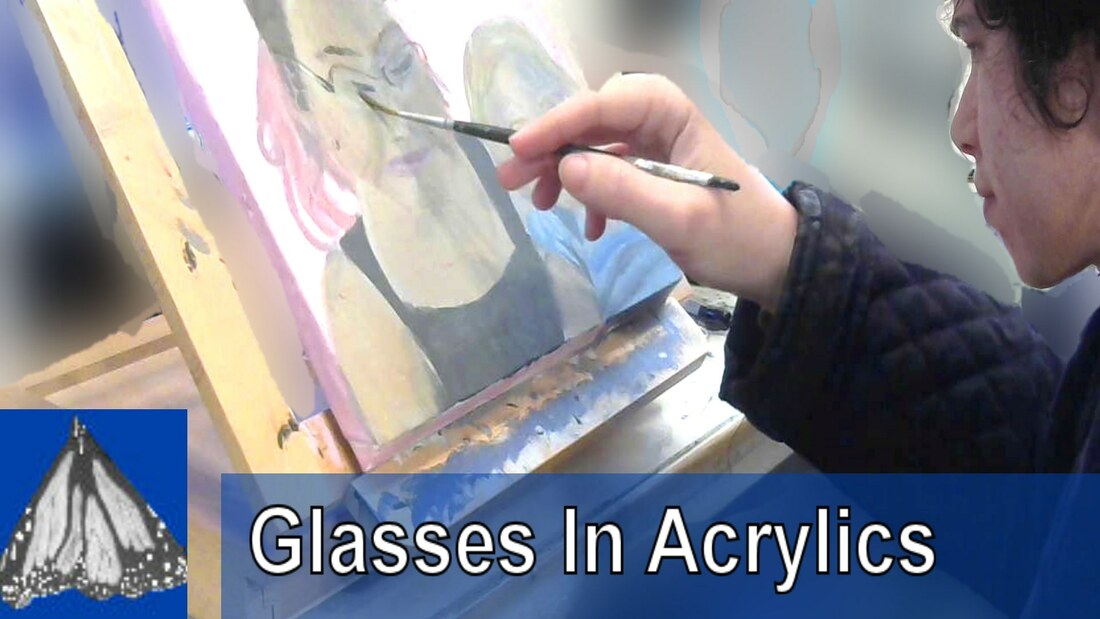 I was almost finished with my painting of Katie and Adelaya, but I knew I had to paint Katie's glasses. I remember looking at them and thinking, how am I going to paint those, but it was a lot easier than I thought. It came down to using a liner brush and a transparent white. In this case, I used zinc white from Royal Talens's Amsterdam Standard Series line. Watch the video below to find out why I chose to use the method I did and see how I got this look. 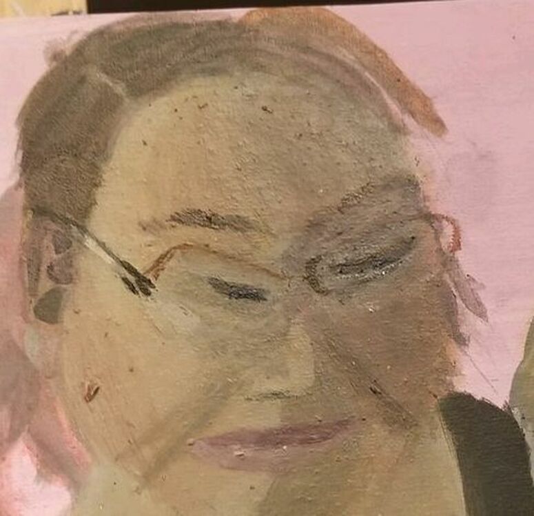 I just used a the Plein Air Naturecore Board from Fredrix Canvas for the first time. On it, I painted a portrait of my cousin Katie with her daughter Adelaya. As with all my acrylic pieces, I started with a black and white underpainting. 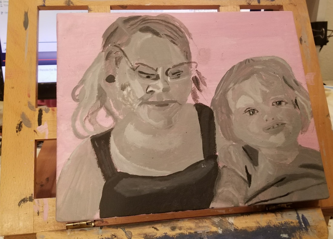 After I got Katie's skin to look the way I wanted, I decided to paint her eyes. As you can see, though, from this pic, I have too much contrast between her irises and corneas. This is giving her eyes an unnatural, almost glow in the dark effect. 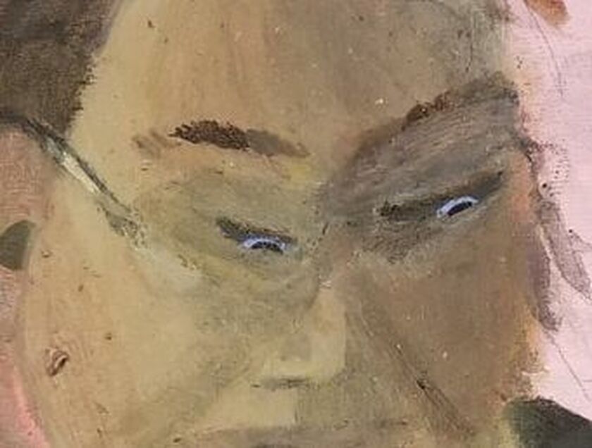 To counteract this effect, I glazed ultramarine blue mixed with ivory black over Katie's irises. Bye bye, creepy glow. 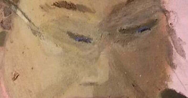 Learning my lesson last week, I mixed green into the pink I used for Katie's lips. 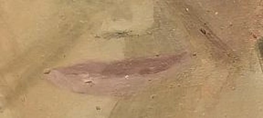 When it came time to paint Adelaya's face, I decided to start with the darkest shadows and build on top of those. Here I've glazed grayish blue, mixed with orange, over the dark shadows that I'd already painted on Adelaya's face. 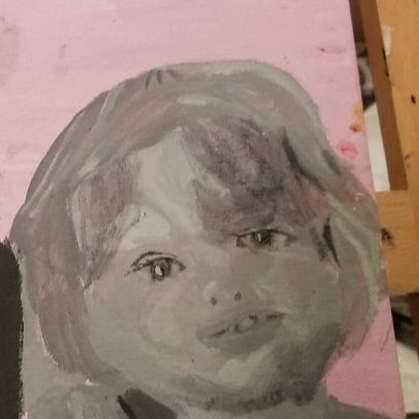 Then I went over her whole face with a layer of pink mixed with green. 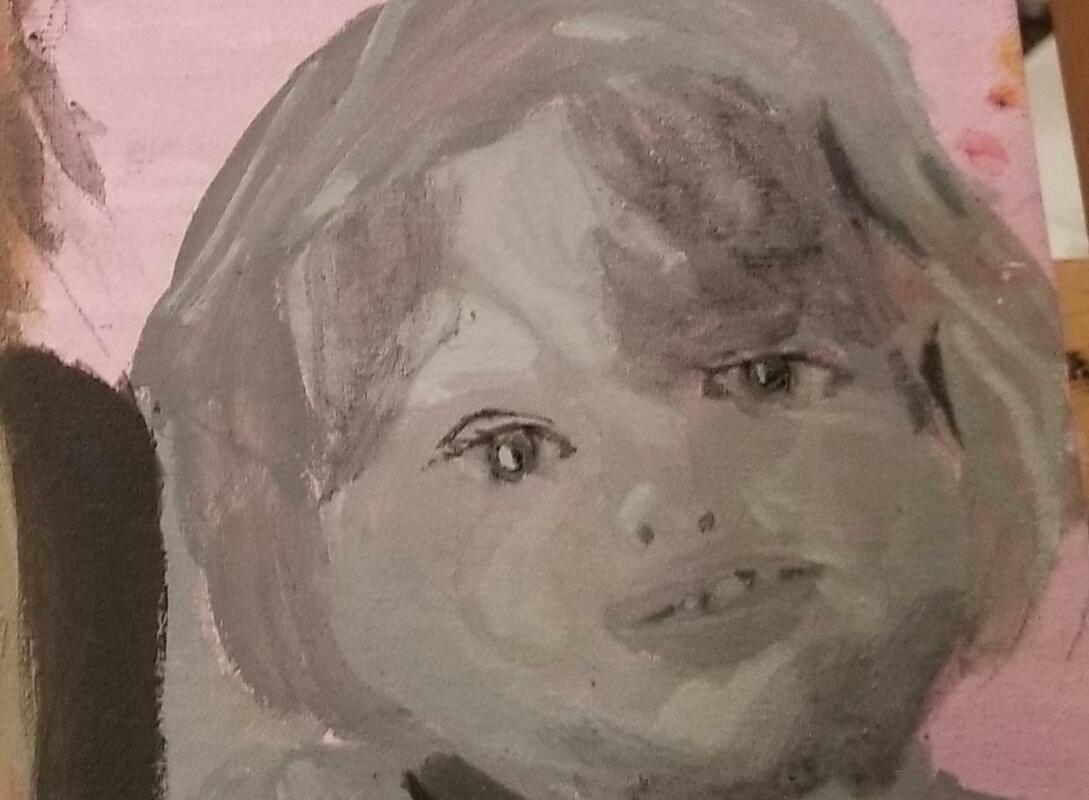 For the uppermost layer, I mixed zinc white, transparent raw sienna, yellow, and just a bit of purple so the yellow wouldn't be overpowering. 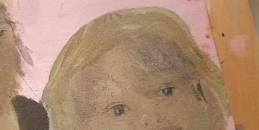 Now, I never use straight yellow for blonde hair. I always mix some purple into it to make it more neutral and therefore more natural looking. But this time, I used even less yellow than usual. In fact, I mixed just a little bit of my purple and yellow mixture into some gray, made by mixing zinc white and ivory black, because I wanted her hair to have a grayish tone. 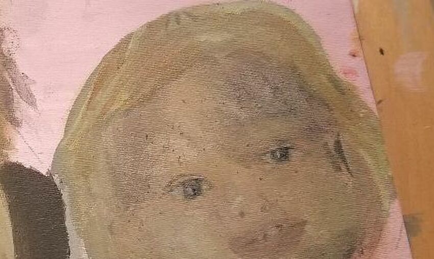 For the darker, more shaded parts of Adelaya's hair, I mixed some transparent burnt sienna into the aforementioned grayish yellow color. 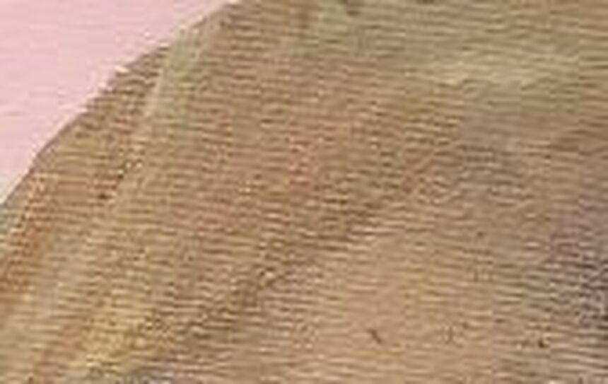 I used a mixture of cyan and ultramarine blue with zinc white to paint Adelaya's top. I mixed, not only more of my blues, but also black in to make the shadows. Black dulls colors a bit and shadows don't work if they're too bright. 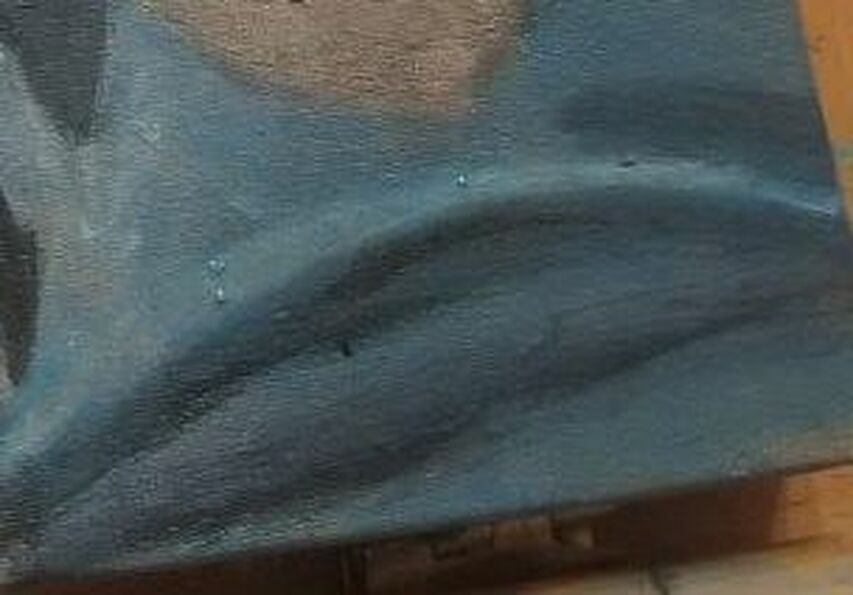 I knew I would need to add lighter color as well as darker color to make this look three dimensional, so I mixed some of my cyan and ultramarine mixture into some titanium white now. I wanted to color to sit on top of my base and not disappear into it, which is what would happen if I'd used zinc white. At first, I actually made the highlights a bit too light, so I went over them with a glaze of a darker version of my blue mixture. 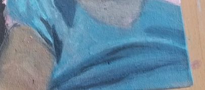 I decided to add a streak of darker shading above the white line on the middle of Adelaya's top to give more of tthat depth I was talking about.
|