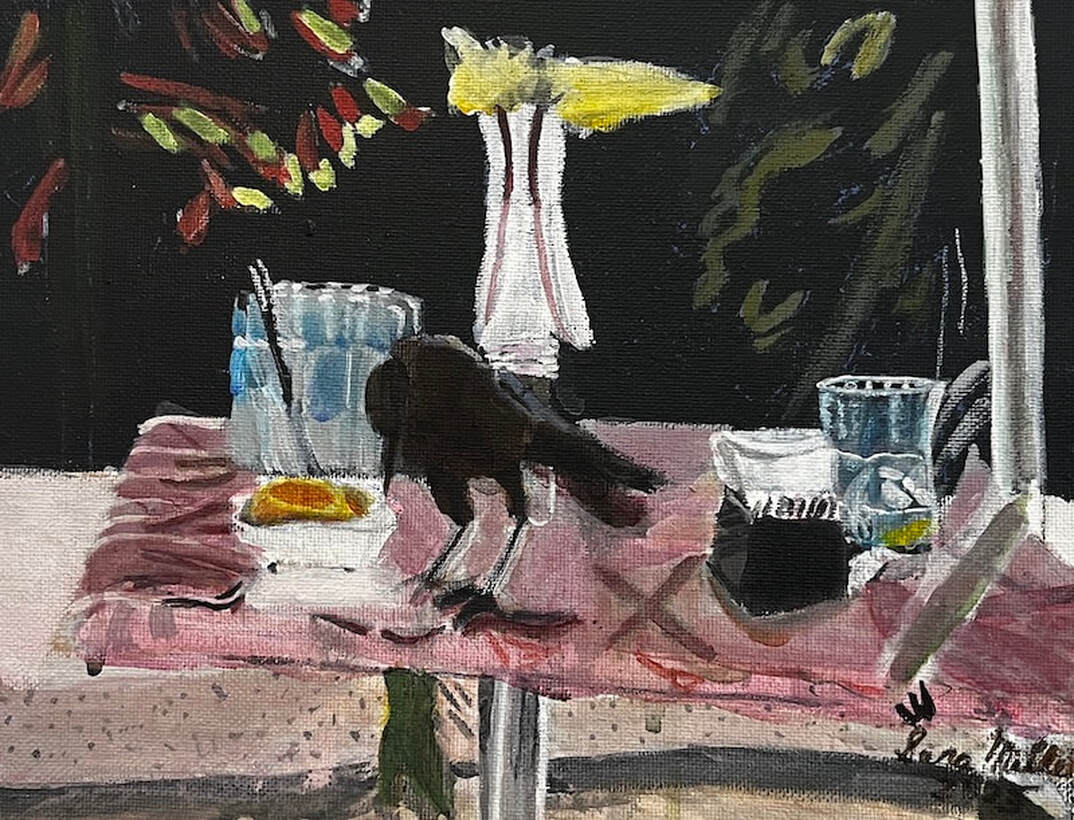
 A couple of months ago, I went out to lunch with some ladies from my art group at the Mimosa Cafe. There were a bunch of these little birds flitting around and I happened to capture one of them that had landed on a table across from me. It was important to me to the depict the textures of the marble table and the glasses themselves. When it came to the glasses, to achieve the goal of transparency, I layered transparent mixing white for “frost” over cyan blue. I contrasted titanium white and mars black for shine. As far as transparency, I let the background colors show. That, contrasted with the opacity of the titanium white, adds to the translucence. I focused on the shapes formed by the frost, the highlights, and how they were positioned next to each other, not on the whole glass at once. I don’t have much experience painting glass and other transparent objects, so this is helped me grow as an artist.
I used a pale pink for the table and a liner brush for the marbling texture, taking care to curve my lines at the edges to create three-dimensionality. To create the shiny texture of the table, I made sure that everything on it was reflected on its surface. Also, to prevent these reflections from being mistaken for decorations or things painted onto the table, I softened their edges and gave everything a slightly pink tint. I didn't want the table to look like a mirror, but I did want it to have some gloss to it. I painted this in acrylic on an 8x10 canvas.
1 Comment
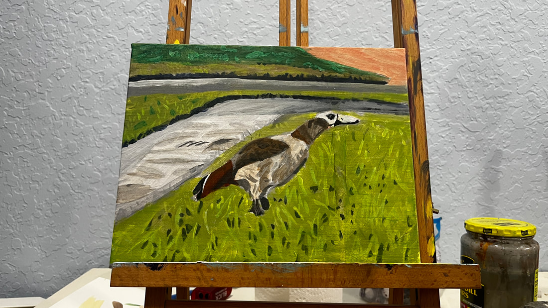 I had been looking at the grass for a while and feeling overwhelmed by all the detail. I told myself I would just find one aspect of each section to focus on. These were the slightly lighter green marks on the grass across the street and the tiny yellowish blades in the grass on the opposite side of the sidewalk from the goose. While I was working on those sections, I only allowed myself to focus on these things. This made the process far less daunting. My brain doesn't get as tired because it's not trying to figure out half a dozen things at once. Later I can look for another type of detail to add, or add more of this one. I made my strokes somewhat follow the reference photo, although, since there is a lot of detail close together, I didn't put pressure on myself to copy it exactly. To paint the yellowish blades of grass, I used my smallest filbert brush and just put paint on the tip. This process didn’t take long and after doing it, the grass was coming to life. The goose’s body has dark gray patterns on his wing. I was careful to follow the pattern in my reference photo as closely as possible while painting these.
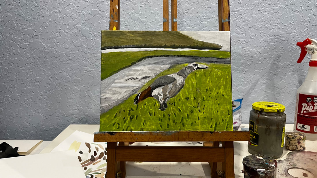 I started by my first layers of color on this painting by glazing over the grass with a green made my mixing permanent green with yellow. I mixed a bit of magenta into this so it wouldn’t be too bright. I was careful to keep my paint transparent so that the detail I'd painted in my underpainting would show through. I mixed more magenta into the green for the grass across the street, because it’s darker in my reference photo. I’ll probably go over this area with more green when I go back to the painting because it needs to be brighter. Telling myself I'll go back to the grass later, I started painting the first layers on the bird. I mixed zinc white ivory black and burnt umber to make a grayish brown. I mixed my gray first and then slowly brought my brown into it. There are varying shades of this color on the goose’s neck and wings, so I’m starting with a very light shade and I’ll layer darker shades over it. While doing my underpainting, I added black where the edge of the grass met the sidewalk. This gives the effect of the former being up slightly higher than the latter.
|