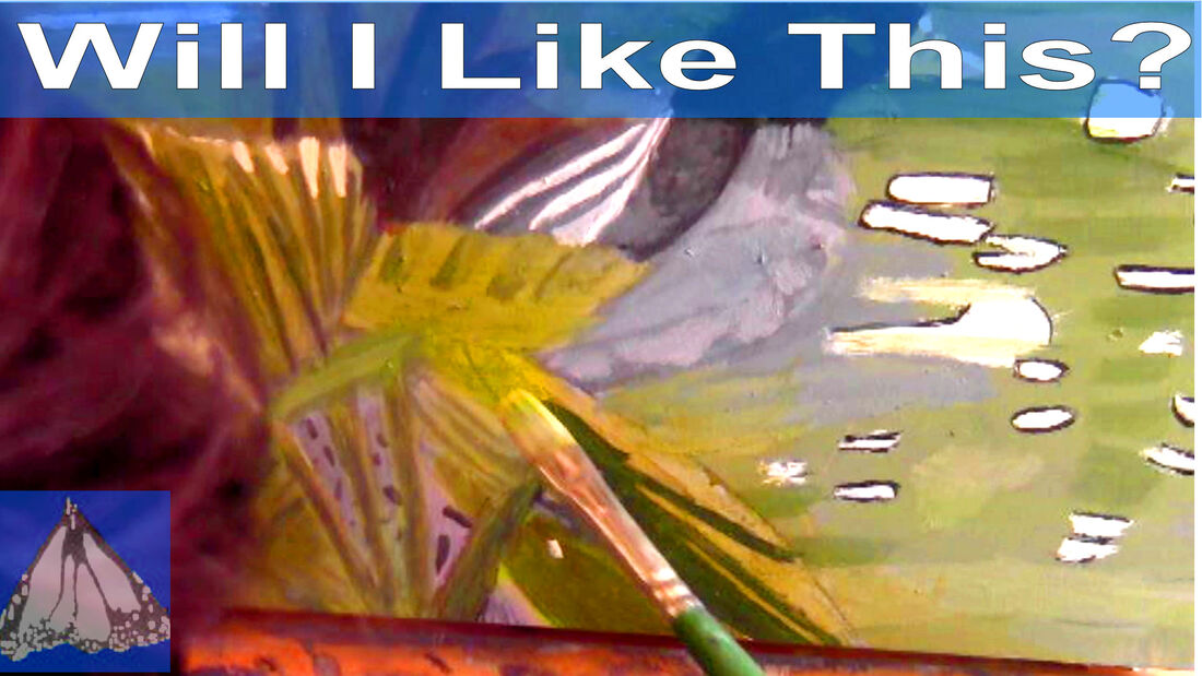
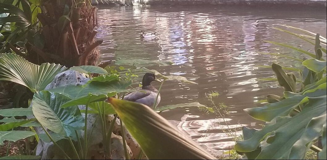
 I want to start off by saying that I think looking at your reference photo for a good while before starting to paint or draw is smart. I talked about this in my post about how to improve as an artist. But if you get into the mindset that you have to know exactly what to do before hitting the canvas, this can hinder your productivity and cause unnecessary anxiety. Eventually, you need to be okay with going forward with a piece without being one hundred percent sure. I struggle with this myself. That's why I'm writing about it. I can't help thinking I've wasted time because I was afraid to paint the wrong thing, when I could have moved forward with the piece by putting something, anything, on the canvas. Why do you think we try on clothes and look in the mirror instead of mentally figuring out what looks good on us? We're not afraid to try something on for fear that it won't flatter us. I know I'm not, at least. If the item doesn't suit us, we just don't buy it. I don't always know what colors to mix to get a shade that I see in my reference photo. It can be a debate between mixing yellow and brown or brown and white? The only way to settle this conflict with myself is to get out the paints that I think will make the color I want and start mixing. The more colors you mix, the more this sense of indecision will subside. You won't be a hundred percent sure if you like something or not until you see it on your canvas or paper. I'm thinking of what Lisa Clough has said in her live streams, which is to adopt the attitude of "Let's see what happens when I do this. 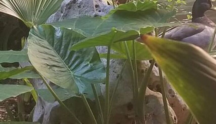 let's look at how this is manifesting in my current piece. I really want to paint a sheer green over these reeds. Because this area is so small, though, I need to be super careful to thin my paint down enough so that it doesn't go on too thick. I don't have a lot of area to spread the paint out after all, so even a tiny bit is going to look very thick if I'm not careful. That makes me hesitate. 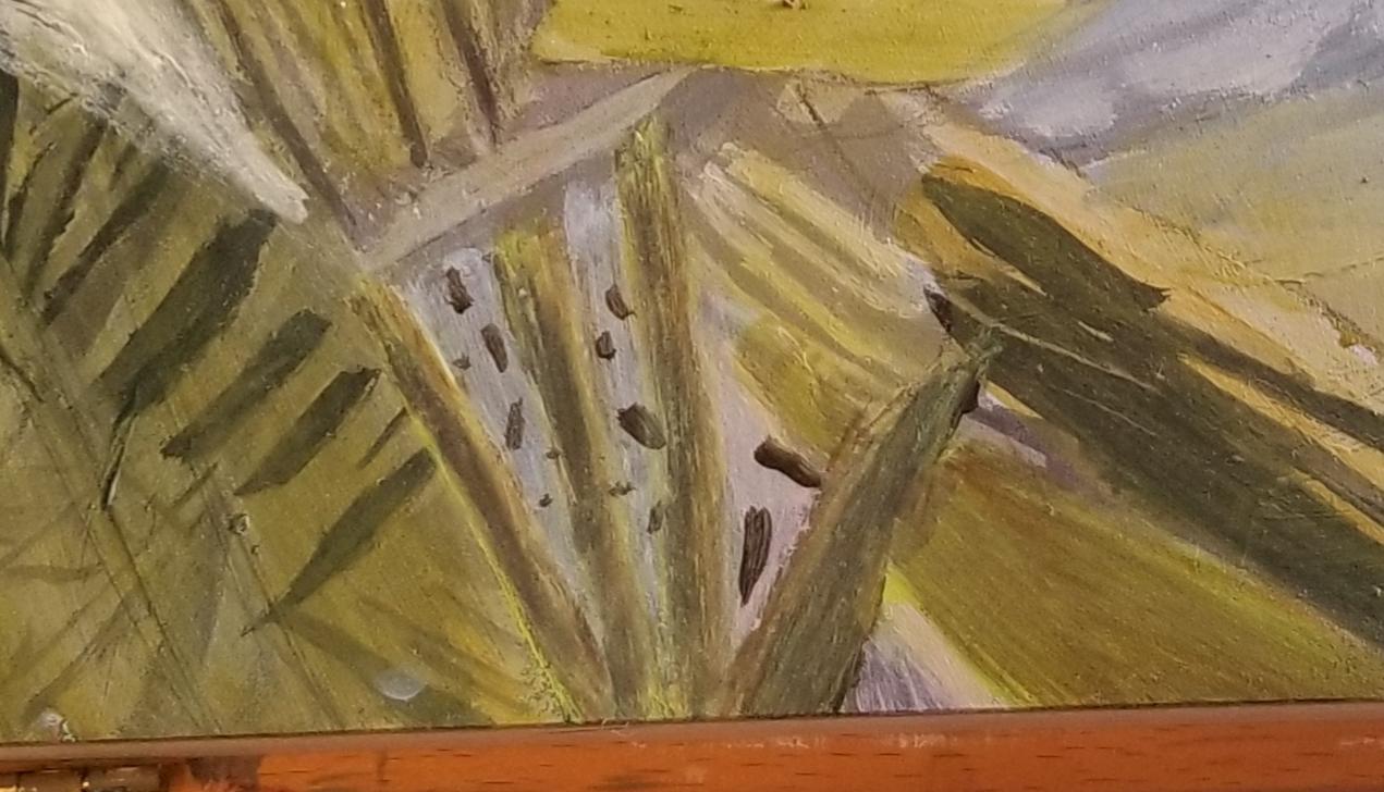 Here's how the reeds came out. Not exactly what I was envisioning, but I'm pretty happy with it. 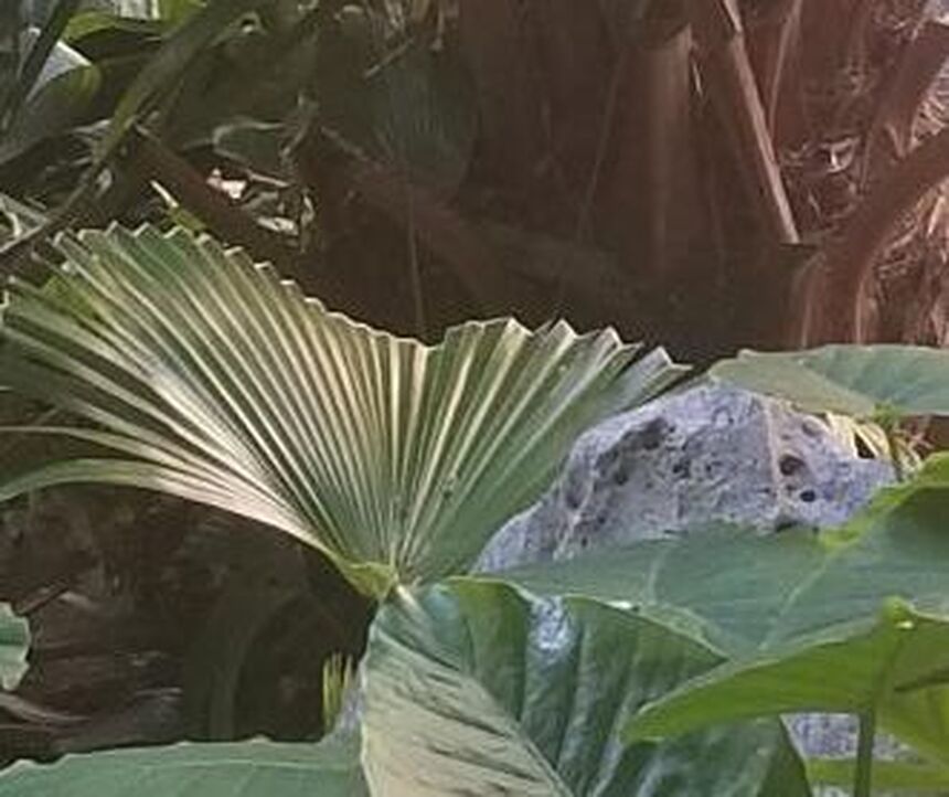 There's an obvious highlight on the side of this palm leaf I'd like to paint. It doesn't look green to me. If anything, it looks like a light tan color. I'm nervous about painting it because I've tried and failed to paint this highlight before. 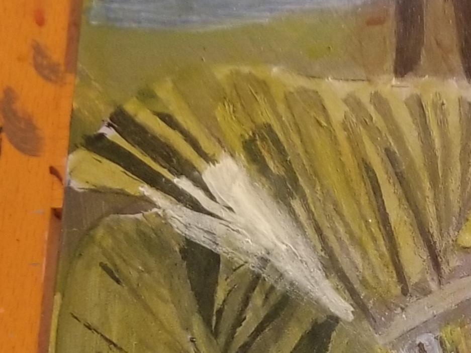 I tried using my unbleached titanium white. I was happy with my shade choice from my first brush stroke. Your eye will always know better whether something is right or wrong visually than your mind will. All I had to do now was make sure I followed the shape I saw in my reference photo. I brought the unbleached titanium white down to the bottom of the leaf in a pointed shape. Then I cleaned and dried my brush and blended out my edges. 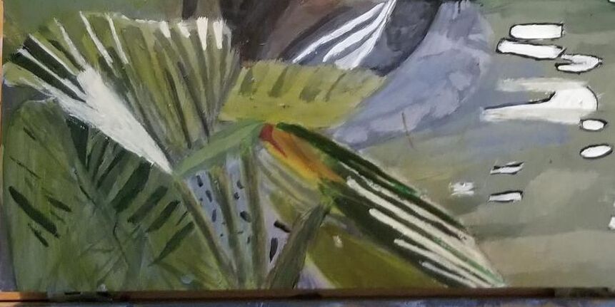 For my second attempt at painting the little tan highlights on the palm leaf, I used a my liner brush. I was much happier this time. I noticed there were also some thin stripy highlights too, so I painted those. I saw some colors, like yellow, brown, and purple, in the leaf closest to the river that I'd missed before. I didn't want to use straight yellow for it, so I mixed it with violet, because I thought it looked a bit reddish. I noticed there were some highlights on the side the same shade as the ones I'd painted on the palm leaf, so I painted those. If you're working in a medium that's not easy to cover up, like watercolor or colored pencil, you might want to keep a piece of scratch paper(that's the same type of paper your project is on)to test colors before using them on your project. Assuming it's not a commissioned piece, though, even if you do put the wrong shade down, at the end of the day, it's not the end of the world. You'll probably be the only one who notices the "mistake" anyway. Do you really think if you have a great foundation drawing, a fantastic balance of lights and darks, and phenomenal perspective,(okay, I'm getting a little ambitious here, but just go with me), if you're piece has all that, do you think the people you show it to are really going to notice if you used the "wrong" shade of blue somewhere. No, they're not.
0 Comments
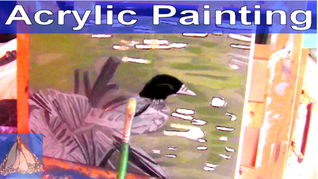  At the time of beginning this post, I haven't put a single stroke of color on my painting that I'm doing from this photo. But I knew very early on that I didn't want to make the river gray as depicted in the photo. I felt like I wanted to make it a blue green. I thought I should do some experimenting in Corel Paintshop, though, to see if my idea would work. I think it will. 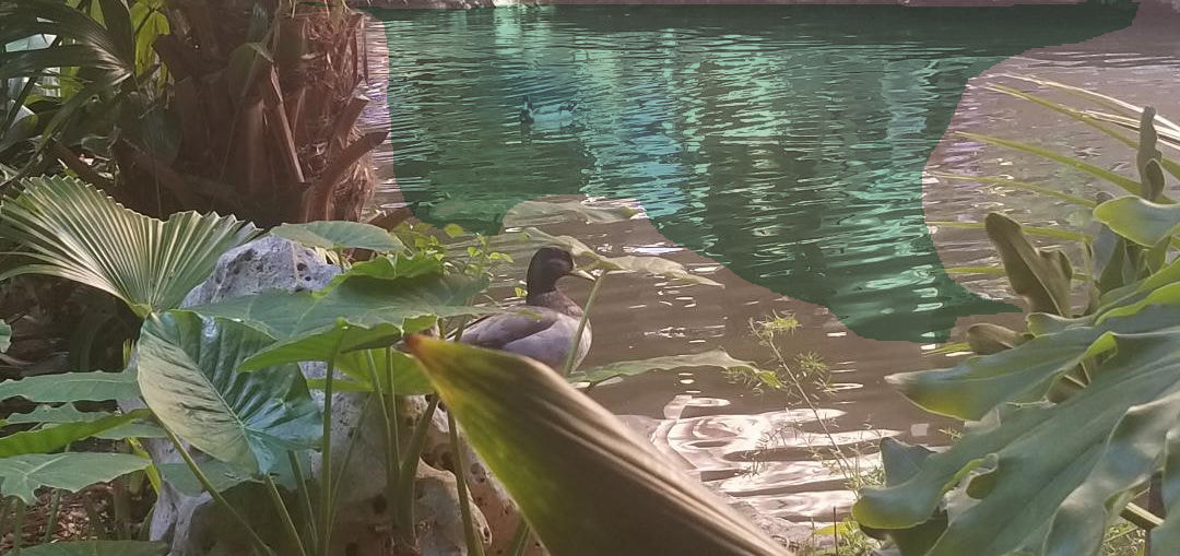 Day One 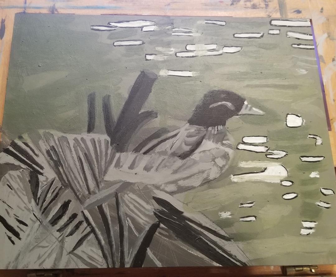 I started by blocking the river in a grayish blue green liked I planned on, darkening it for the shadows. Now, while I was doing the underpainting, I noticed some white spots, but I didn't paint them at the time. Now was the time to paint those so that they wouldn't get covered by the blue-green I was using for the water. The most important part was keeping my brush moving in one continuous line in order to make the spots as smooth as possible. Smoothness here was more important than getting the exact right shape or width. These things had to be close, but they didn't have to be exact is what I had to tell myself. I need the smoothness because I'm depicting still, shiny water. Ragged edges would give the feel of roughness, which would be helpful if I was painting an ocean with waves crashing, but not for this. Even after I'd painted the white spots, made sure they were nice and opaque, and my edges were smooth, the water still didn't have that glossiness I wanted it to have. I decided to do something I'd thought about earlier, not knowing how it would come out, and that was to paint thin outlines of black around the white areas. Using the tip of my liner brush and some mars black, I did exactly that. My objective was to keep the lines as thin as possible. After I did that, I felt like the water was starting to take on more of the gloss I wanted it to have. Day Two 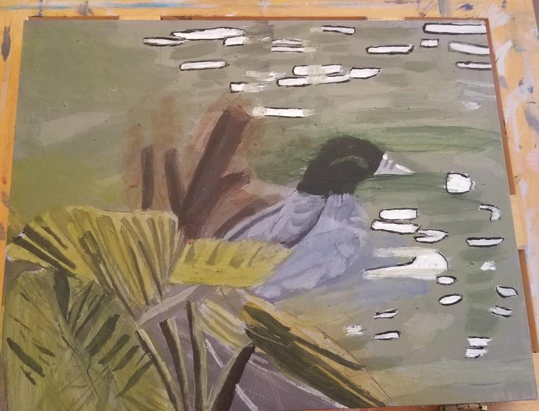 Today was time to paint the duck and leaves. When I looked at the duck, I have to admit, I wasn't entirely sure what to paint it. Now, I've had a habit of, when I'm not completely sure about something, feeling almost paralyzed with indecision. But now, I've decided to start a habit of plunging into something rather than pondering over it forever. I thought I saw a brownish green in his neck. Again, I wasn't a hundred percent sure, but I went for it. If I hated it, I could paint over it or wipe it off. But the only way, really, to know if you're going to like how something is going to look in your painting is to see it and the only way to see it, is to take the plunge and paint it. Well, it didn't look horrible.;) I saw a blue gray in the duck's body and can you guess what I did? That's right, mixed some up and glazed it over that part. I try to remember what Lisa Clough says, which is that you can paint something pretty much whatever color you want.(Assuming it's your own painting. You can't take as many liberties with commissions.) It's your values that matter. I mixed a little bit of brown into some yellow and then a tiny bit of red into that forth the big leaf on the right hand side. I mixed some blue and yellow, so I made a green, into this color for the rest of the leaves. I felt like the leaf under the palm leaf was a bit more bluish. No big deal. I just glazed some blue right over it. Everytime I finished anything that was touching the water, I brought that color into the water, often going over it a paint free wet brush to make sure it was translucent enough. This helped add even more to the shine and iridescence of the water. Day Three 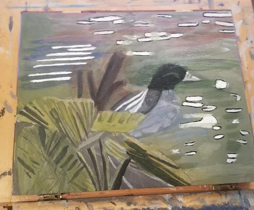 I sat down to today's painting session with two objectives, to add some pink into the water, and darken the duck's wing. I originally didn't think I would add any other colors into the water, other than those of the duck and the leaves, but I'm glad I did. Anyway, as you can see, I ended up doing quite a bit more than what I'd originally intended. Adding the pink,(and the orange, and the blue), was important part of making it look as shiny as I wanted it to. Anything that's shiny is going to reflect whatever is around it. So, besides putting some pink in the water, I said another thing I wanted to do was darken the duck's wing. I'm still sticking with the blue-grey color scheme, but I thought there should be more of a contrast between the duck's wing and his belly. After doing this, though, I felt like the highlights I'd painting weren't standing out enough, so I went over them with a liner brush and some titanium white. I still didn't like the pattern I'd made, so, while not being one hundred percent sure if I had the right idea, I widened the end of the third swipe that was closer to the leaf, closing the gap between it and the one next to it. After I did that, I was much happier with the shape of the wing. I'm not sure about the patch of blue with white streaks in the water on the left-hand side. After painting a few layers of the blue, it didn't look quite right and I thought adding the white would improve matters. Now, though, I think I'm going to find myself glazing over those white spots with more blue. Day Four 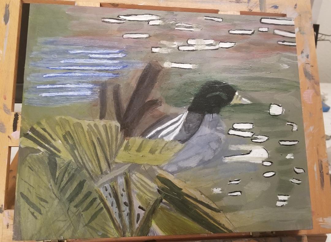 I started by painting light blue right over the dark blue streaks I had painted on the river in the far left. After the first couple of strokes of that, I was already thinking that section was looking much better. I went directly over the white spots with a liner brush and some watered down ultramarine blue. The little bit of white that still shows will act as my highlights. I directed my attention to the leaves and rock. I painted the rock a grayish blue and brownish pink. Since it appears to have a pumice like texture, I painted some holes in it using burnt umber mixed with ivory black and a liner brush. I realized there was a whole side to one leaf I hadn't painted it. I painted it with a mixture of transparent mixing white, burnt umber, and permanent green light. I later glazed yellow and brown over that side of the lead to make it blendi n better with the others. I felt that the reeds needed painting. I tried painting them a yellow green, but I quickly saw that that wasn't working. I wipe most of the yellow-green paint off and painted them just plain brown instead. I think it looks much better, although I may glaze over them with green and see how that goes. Id' like to give you a little back story on this painting. In the Spring and Summer of 2018, my parents and I went on a road trip across the United States. We saw twenty-five states in all, including Texas. While we were there, we saw the Alamo, and after that, we went on a river walk around the San Antonio River, which is where I took the photo that I'm making the painting you're seeing from. 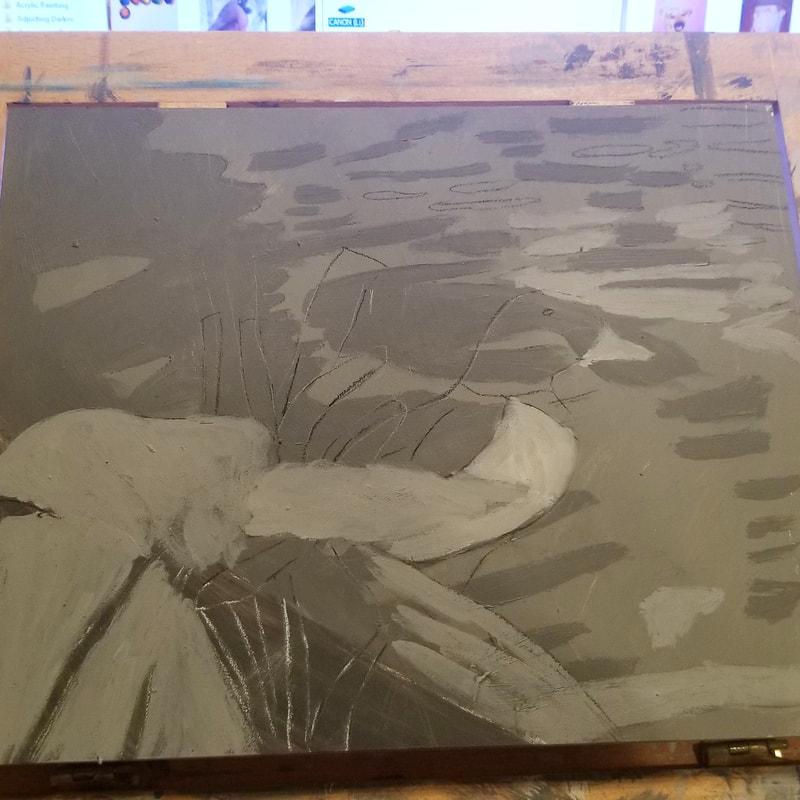 Day One I’m really going to enjoy working on Ampersand boards. I could tell that from the first stroke. I thought, why is the feel of my brush so pleasant on this? Is this really what Ampersand boards are like? 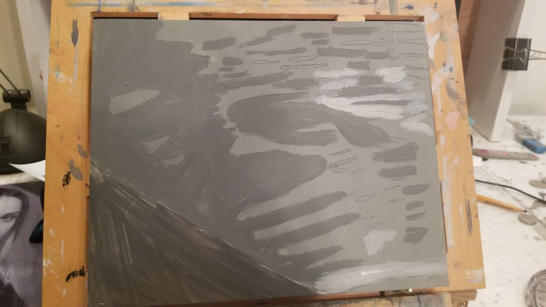 This is what the painting looked like before I added the duck and leaves. I started by blocking in most of the canvas with a medium dark gray, making a small sliver in the bottom left hand corner a much darker gray, closer to black. The large blocked out section will be the river. I took a charcoal pencil and drew the shapes of the ripples in the water and set about painting them different shades. Going back to what I was saying about some of these ripples being lighter and some being darker, trying to paint every ripple exactly like the reference photo is another one of those things that can stress you out. Unless that’s really what you want to do, I don’t recommend putting that kind of pressure on yourself. As for me, I’m not worried about making every ripple the exact right shade. I’m just trying to get some variety in here. Then I drew the duck and leaves on using tracing and transfer paper. Back to the topic of these boards, the cool thing about Ampersand boards is that they’re wooden boards that are pre-gessoed. That’s a big deal because a lot of wooden boards are not pre-gessoed. So if you wanna try working on wood, but don’t want to have to gesso your surface, Ampersand is the way to go. 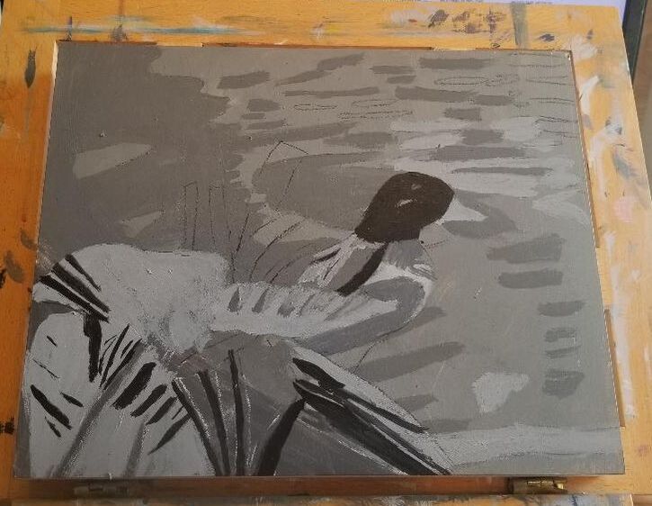 Day Two Today I decided to fill in the extra dark, almost black shadows of the leaves and duck. After painting a few of these, which included the duck’s head, I noticed there was a shadow on the duck’s stomach, which I’d painted a very light gray. The shadow was a good bit darker than the base of shade of the stomach but much lighter than what I’d been using. I went on and used the same shade on one of the leaves. At this point, the light values in his wings started to catch my eye and I decided they needed to be painted. I painted them using my liner brush. I thought the color was too light to start with, so I went over it with a slightly darker shade. 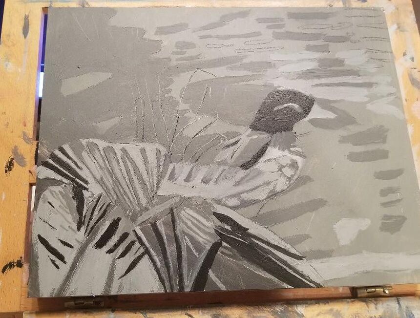 I painted some more of the ridges in this big leaf, using a much lighter, but still dark gray. ‘Painting more shadows on the leaves. Then I painted highlights on the duck. What I painted on his chest is meant to depict the fluffiness of his feathers. 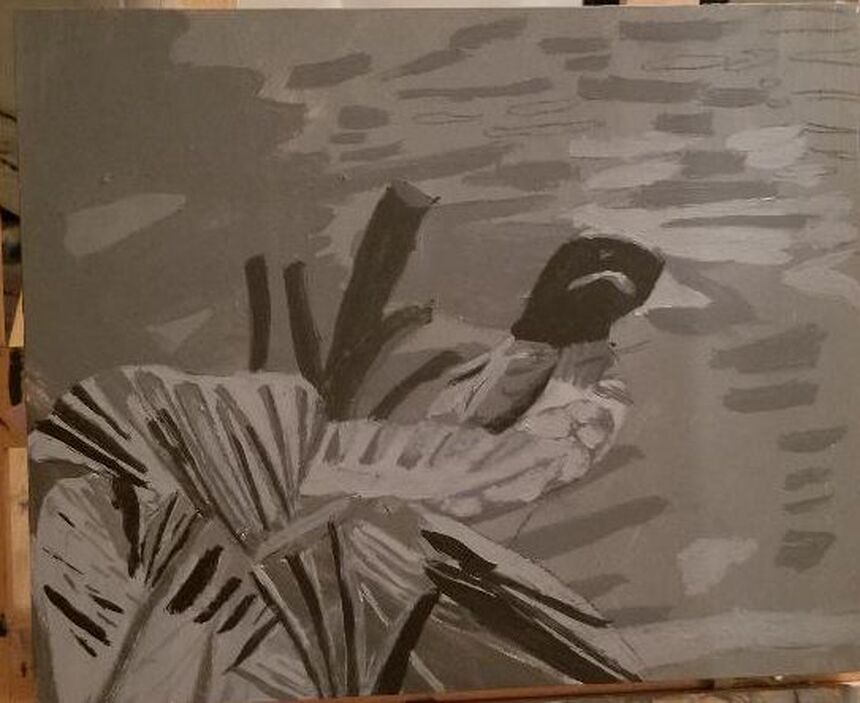 I reach a point twice, at least, in the process of every painting where I know I'm not done, but I don't know what else needs to be added. I was at this point with this painting until I realized I hadn't painted those big stalk things. How could I forget that?! All in all, the gessoboard from Ampersand, which is what I'm using for this painting was a great buy and one I would recommend. I'm including an affiliate link if you're interested. If you buy from this link, I get a small percentage of the purchase price. https://amzn.to/2ZWPQr5 |