|
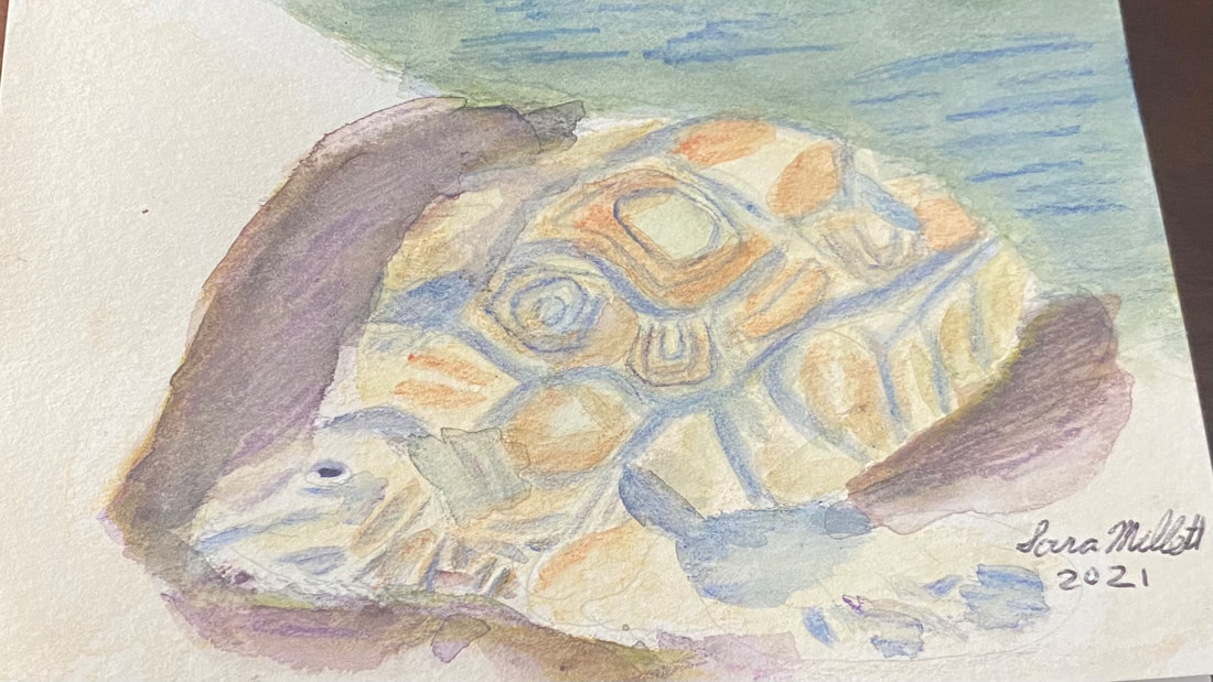
When I started on this painting, which is for my mom’s birthday card, and I looked at the rocks the turtle was coming out of in the reference photo, I thought, what if that was the ocean. My mom loves the ocean, so I chose to paint the rocks to look like the waves were washing up on the shore and the turtle was crawling out of them. I’m using my set of Kimberly watercolor pencils. I don’t have a lot of colors, so I have to rely on layering to get the colors I need. Putting green on top of blue was how I colored made my sea. I saw a couple of times that I needed to add more layers of blue after my paper had dried. I used a tan shade all over for the turtle and blue for the edging around his scales. I painted my tan layer, waited for it to try, then shaded in my blue, then blended that with water, and waited for it to try. If I’d shaded in the tan, then the blue, and blended them all at once, the colors would’ve all run together and the the blue needed to be in a distinct pattern. I wanted the turtle to look as three dimensional as possible, so I drew a purple shadow around him. Layering yellow and black over this shadow helped to get it just right. This time, I started layering colors while my paper was still wet. This was to intensify the shades and make them blend more thoroughly. I added more layers to the blue on the turtle’s shell sections to give them more oomph. The shell sections had a darker brown pattern on them, so I used my terra cotta pencil. Adding extra layers to reinforce certain shades adds a lot to my painting, even if it doesn’t necessarily look like that in the reference photo. If you’re looking at your piece and thinking, should I add more color here, should I make this darker, go for it. I could see that there were some pencil marks on my ocean that didn't seem to want to blend out. Rather than fight these, I chose to make them work for me by turning them into ripples, ie, I emphasized them. I shaded some small “triangles” around the turtle’s neck. The negative space between them created a pattern of wrinkles.
0 Comments
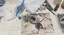
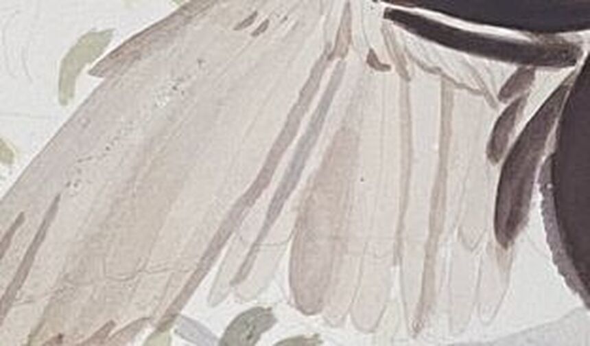
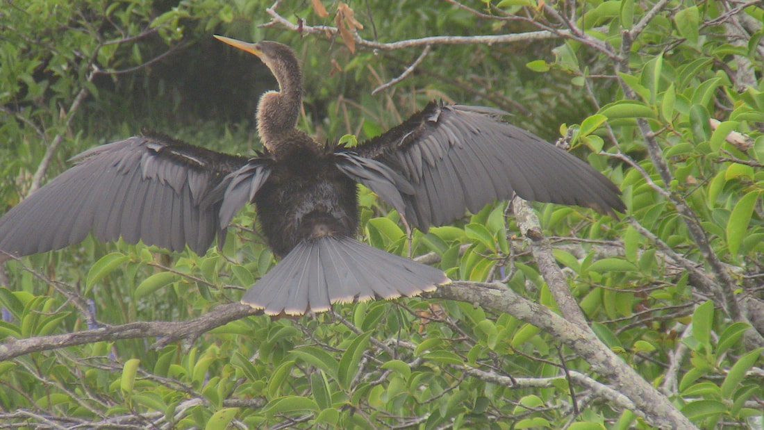
I'm painting a bird called an anhinga, which I must say, has a very interesting wingshape. In this post, I want to write a little bit part of my process of painting separating the feathers of those wings. As I was getting near the end of painting the anhinga, the wings were still bothering me. I knew I needed more separation between the feathers. I could not get by with just the pencil lines. My first thought was to add shadows, but that wasn’t right. The wings weren’t separate by shadows, but by highlights. I couldn’t make the edges of my feathers any lighter, though, so I made the other sides of them darker. That way the edges would look lighter by default. Here's what the anhinga's wings looked like before I added the darker shade to them. You can see what they looked like after in the pic at the top of this post. I used a small brush and one fluid motion for each wing. If I’d stopped and started, my edges would’ve been ragged. I couldn’t have that, since these the shapes of these highlights determine the shapes of the feathers, which needed to be straight. As soon as I put my first stroke down, I could see the wings coming to life. It was like depth was being infused into them. To think I almost skipped this because I was lazy. A way I could’ve made it better would be to have a more consistent amount of water in my brush throughout the project. There were times when I had more water in my brush than at others and this caused the paint to pool in those areas, so it wasn’t as even as I would’ve liked. The hardest part was getting super close to the edge, while still leaving that little sliver. By the way, here's the full painting, so far,  and the reference photo. If you've found this post through google, I'd love it if you'd consider signing up for my email list. That way, you can get all my future posts sent straight to your inbox.
|
Sara MillettPainter of portraits and wildlife Archives
November 2023
Categories
All
|


