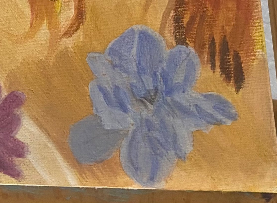
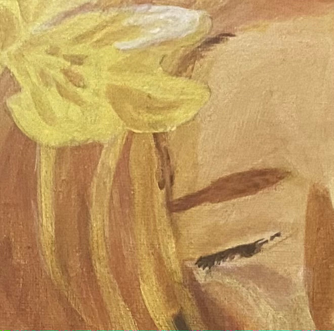
I knew I wanted the blue on the one flower to be very light. I obviously over did it, though, because when I put that first layer on, I could hardly see any color at all. It needs to be darker than this, I thought. I couldn’t fix it right away, though, because that first layer had to dry. My other flower is somewhere between pink and purple. My plan was to mix red into the blue that was already on my palette. I knew the cadmium red medium I’d been using wouldn’t work. I needed a bluer red, so I chose carmine, from the Amsterdam line. The color I came up with didn’t exactly match the reference photo, but that didn’t matter to me. Getting back to that blue flower, it took two more layers, both times adding more ultramarine blue into my mixture, before the I started to be satisfied with the color that I was seeing. Maybe this is a lesson that even if I think something should be extremely light, it might be better to go a little darker than what I think something should be. 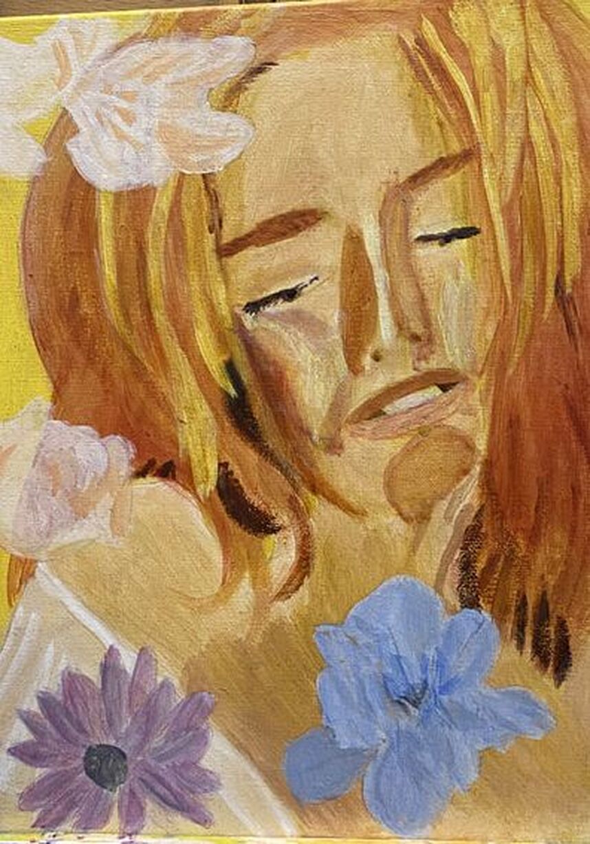 I mixed purple with my yellow for the shadows on the flower in the top left-hand corner.I needed to be careful when painting the pink on the rose, so as not to cover up all of the yellow. I needed some of it untouched and I’m always nervous when doing stuff like this. I look back at my reference photo every time I finish painting one patch to see where my next one should go. I used a couple different shades of pink, as you can probably see. 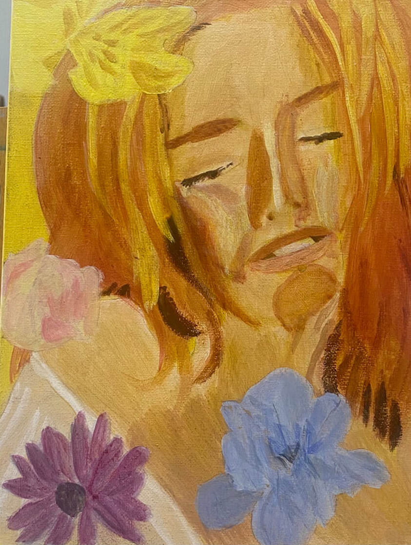 I painted shadows on the blue flower by mixing blue with orange. What stood out to me when looking at the yellow flower was the white highlight on it.
0 Comments
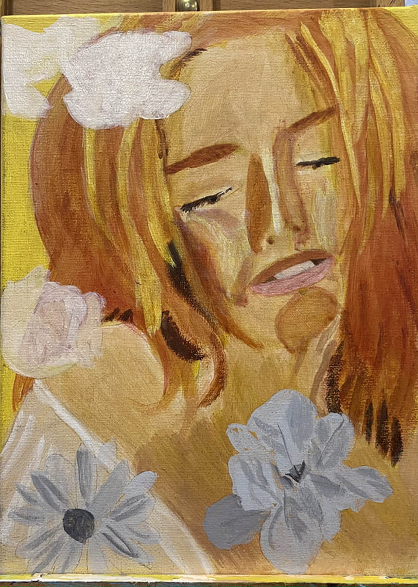 For the flowers, I drew them onto a separate piece of paper and transferee them onto the canvas using tracing and transfer paper. When I was getting ready to transfer the flowers, at first I thought, oh no, I’ve made them too big! I made it work, though, by spreading the flowers around the subject. I’m leaving one out, though, because I think to include it would ruin the balance of the composition. One of the flowers is yellow, one is yellow and pink, one is blue, and the last one is purple. For the blue flower and the purple flower, I’m using a gray toned underpainting and for the yellow and pink and pure yellow flower, I’m using a sepia toned underpainting. 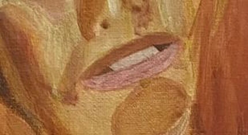 I want to talk a little bit about her mouth. I did not use white for her teeth, nor did I use black for the space around them. For both of these, I actually used a combination of burnt Sienna and raw umber. I just mixed it with white for the teeth and black for the inside of the mouth. Using straight black or white for these things would’ve looked totally unnatural. Now that I think about it, I might bring some of the colors from the flowers I'll be painting into the teeth also. I'll discuss that in next week's post.
For the past few years, I've been starting the vast majority of my acrylic paintings with a grisaille underpainting, which is an underpainting done in gray tones. This time, though, I'm testing different types of underpaintings, of which there are many. For this experiment, in addition to my go-to gray toned underpainting, I'm also doing a portrait with a brown-toned underpainting and a green-toned underpainting. I've drawn the same woman's face three times. I'll be using the same surface colors on all three. The only thing that willc change are the underpaintings. This will show me if the same surface colors look the same or different, depending on the underpainting. If you're wondering why I use an underpainting in the first place, watch this video from my youtube channel. 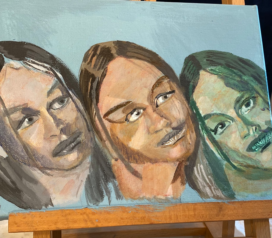 Today I finished the last of the underpinnings and so it was time to start the color. I started with a basic mixture of zinc white, because it’s transparent, that’s important, my trusty raw Sienna, and a touch of red. I applied a wash of this color over all three faces, then mixed some more raw Sienna and red for the shadows. I noticed that the face I'd done with the brown underpainting looked significantly warmer than the other two. I'd been struggling to find a way to paint people with warm skin without making them look sickly or jaundiced, so this was a very pleasant discovery. The green was significantly harder to cover than either the blue or the gray. I don't think I'll be using a green underpainting in this way for portraits in the future. It's just not worth it. The darkest shadows were bluish, though, so I mixed some ultramarine into my shadow color, but this color just looked muddy on my canvas. I mixed up some ultramarine and orange so it was muted and painted this on the left-hand sides of each face, down the right-hand sides of each of the noses and around the left cheeks, leaving a whole for the highlight. Back tracking a bit, before I did this, I glazed a muted red over the whole of all three faces. I kept mixing more water into my paint even after I had it on the canvas to keep it nice and subtle. 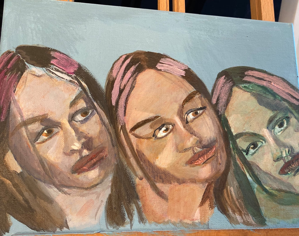 Yesterday I added more layers to the green and brown under-painted faces. I adjusted the blue shadows by glazing orange over them because I thought they were too intense. I've started to add pale purple highlights to the hair. I’ll need to glaze yellow over those highlights. They're too intense. Now that I’ve looked at the piece, I think the gray under-painted face needs another layer.
The following is a repost from my wordpress blog. 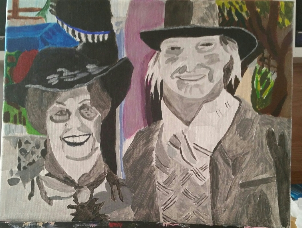 Above is a photo showing the finished background of my latest painting. In this post, I'm going to tell you all about how I painted it. I didn't make things like the fence in the upper left hand corner or the leaves on the other side very detailed. You'll see that I painted the foliage as random shapes. That's because I wanted to create depth and if every part of the painting has the same amount of detail, it looks very flat. I used dots of white in the leaves, also, to create the look of the sun reflecting on them. There's also use of the glazing technique, which is applying sheer washes of color over another, in this painting. I glazed burnt umber over the grey to the right of the tree branch and purple over the building behind the couple. I was very happy with how the overhang came out. I used a combination of cureulean blue plus ultramarine for the shadows and I could see that my underpainting was causing the different tones to show through even before I added the shadows. That's it for now. I'll see you guys next time.
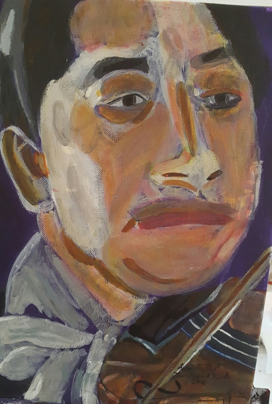 I finished a new piece! This is an 11×14 acrylic on belgian linen titled “Man With A Violin”. My reference photo came from paint-my-photo.net.
|