|
I’m planning to start an Impressionistic painting soon. It’s not a style I usually work in, but my local art group has chosen it as our theme for October—and honestly, it never hurts to stretch your boundaries. One of the first things I had to consider was the paint itself. Impressionism is all about visible brushwork and texture, so I knew I’d need something thicker than the paint I typically use. To figure out the best approach, I experimented with two options: thickening my Liquitex Basics paint with medium, or investing in some Heavy Body acrylics. While Liquithick did give my Basics paint a heavier consistency, the Heavy Body paint offered a much smoother, creamier experience overall—and a noticeable jump in pigment quality. No amount of thickening medium will give you more pigment. For a style that depends so heavily on vibrant, confident marks, that matters. So I went with the Heavy Body paints. I also made a deliberate choice to work with more opaque pigments than I typically do—like phthalo blue. Normally, I lean toward layering transparent colors, but Impressionism calls for bold, direct application, and opacities help support that. For my surface, I ordered a Blick Studio heavyweight canvas—20 oz, sturdy enough to handle thick, expressive strokes. As for the subject of the painting? I’m keeping it close to home—literally. I’ll be painting my backyard, in a quiet nod to the original Impressionists, who often painted scenes near their homes or studios. I won’t be painting it plein air, but it’s close enough. To help shift my mindset, I processed the reference photo in Canva. I boosted the brightness, contrast, and saturation, and then deliberately reduced the sharpness—blurring it just enough so I can’t see fine details like individual blades of grass. That way, I’ll be forced to focus on light and shadow rather than outlines or textures. The result will be a painting built on the interplay of shape, color, and movement rather than detail.
0 Comments
The community I live in has an art group, which I'm apart of. Every month, there's an opportunity to have our work displayed in an informal hanging. The theme for next month’s is Impressionism and abstraction. I’m not much for abstract, but I thought I’d try my hand at planning an impressionistic painting. I’ve chosen to do a painting of a parrot in a tree that I snapped in Trolley Barn Park. I turned up the contrast on the photo so the lighting would look more interesting. 
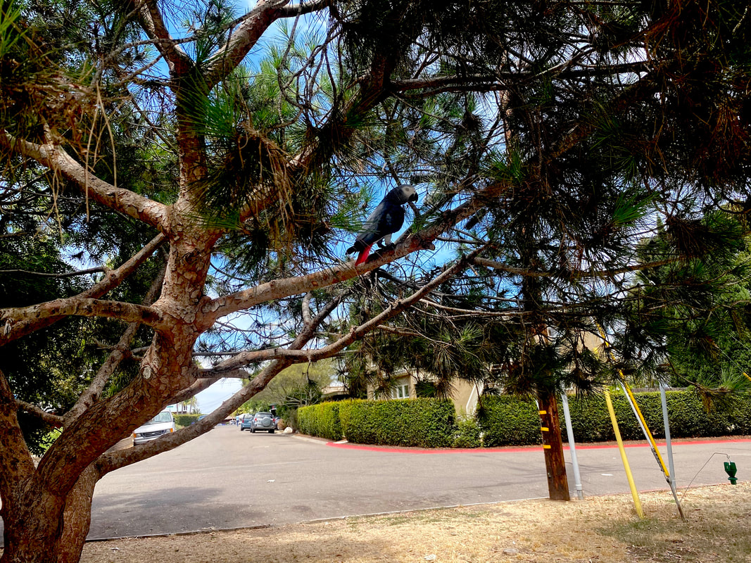
I’ve been going back and forth with myself whether to do the painting in watercolor or acrylics. If I’m going to do it in acrylics, I need to order a different type of canvas than the one I have. The impressionistic style involves putting a lot of paint on the canvas, which requires a heavy weight surface. I still have some sheets of 300 lb watercolor paper that I had to buy for that workshop I took though, so I’m leaning toward doing the project in watercolor. Some principals I’m going to follow are: 1: Use large brushes, no liners, and use the whole body of the brush, not just the tip. 2. Hold my brushes far back on the handle. Both of these principles will prevent me from being able to add a lot of detail, which we don’t want in impressionism. Rather, we want to rely on our shadows and highlights to give our subject shape. 3. (In acrylics) Use lots of paint and let my brush strokes show. But then... After all this, though, I realized I was being a little over ambitious. I wasn’t going to have time to complete this painting before the next art hanging. Luckily, I happened to have a painting already done in an impressionistic style, which is this one. 
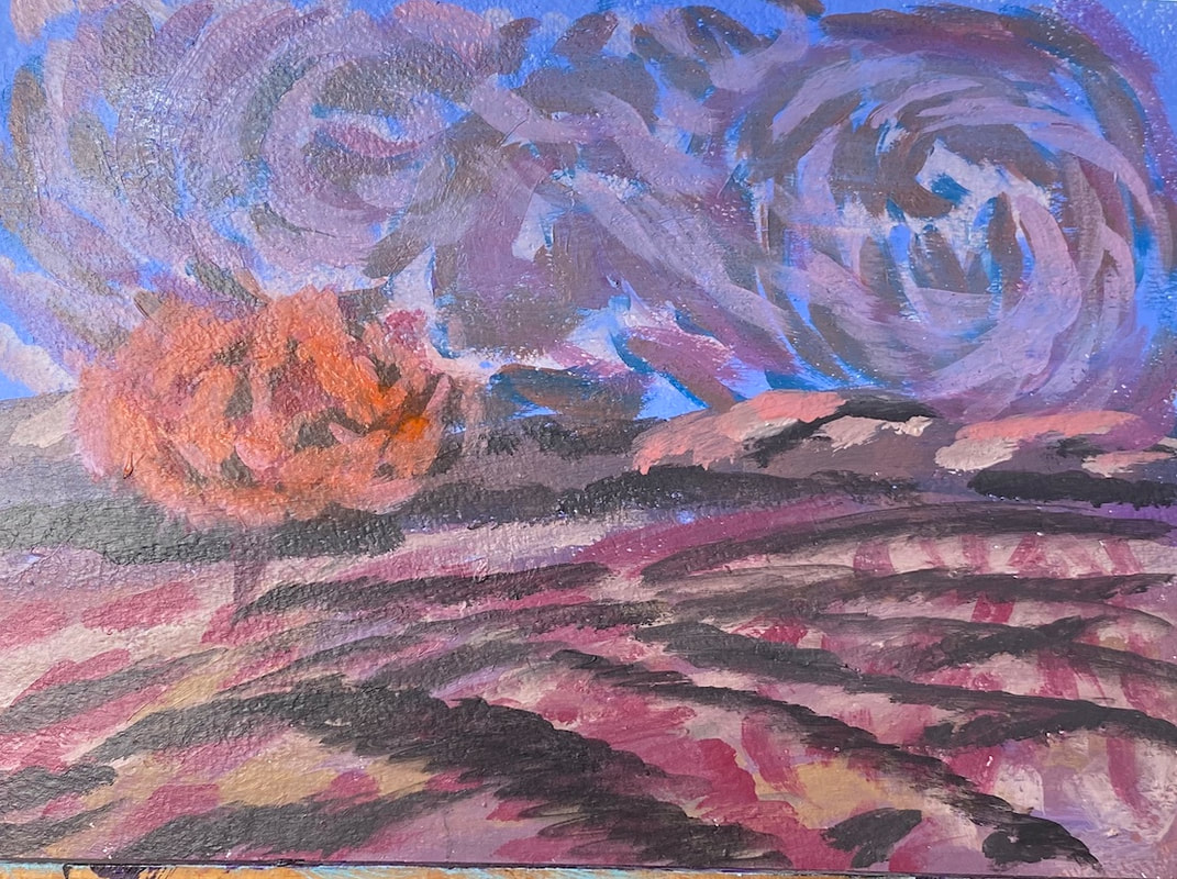
I painted this during one of Lisa Clough of Lachri Fine Art’s paint alongs. You might notice it’s very reminiscent of Van Gogh. That was done on purpose. I would like to paint the picture I was planning above. It just won’t be for this show. This teaches me a lesson about keeping up with what’s going on in my community and planning ahead.
|
Sara MillettPainter of portraits and wildlife Archives
July 2025
Categories
All
|