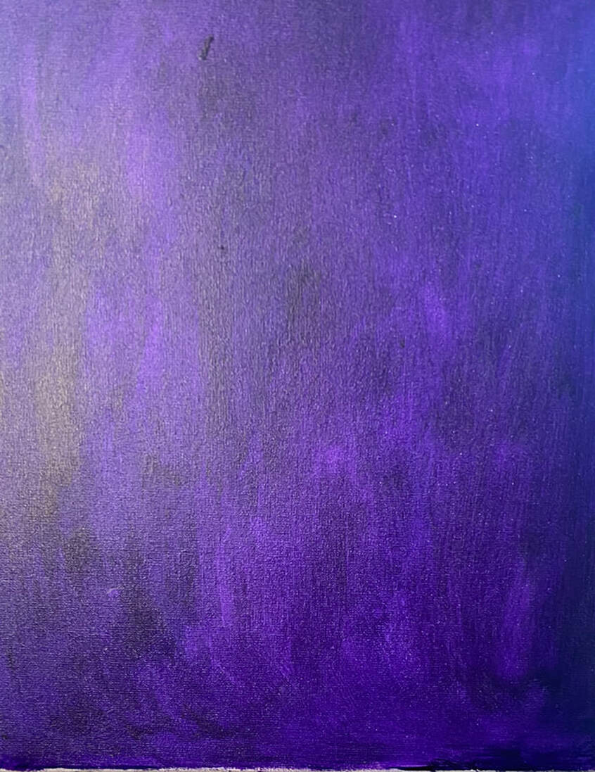
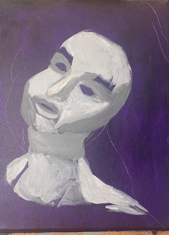
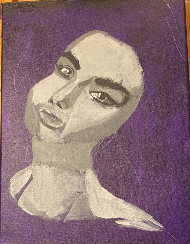
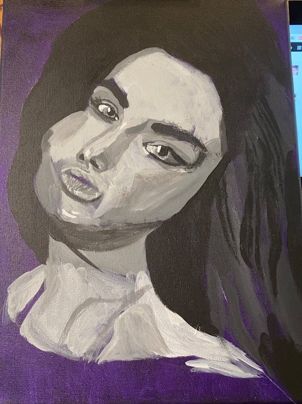
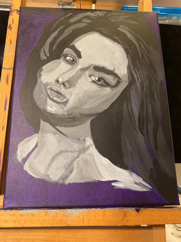
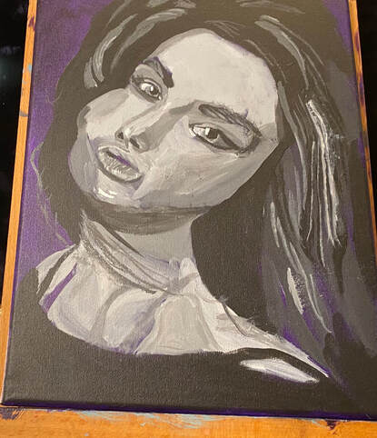
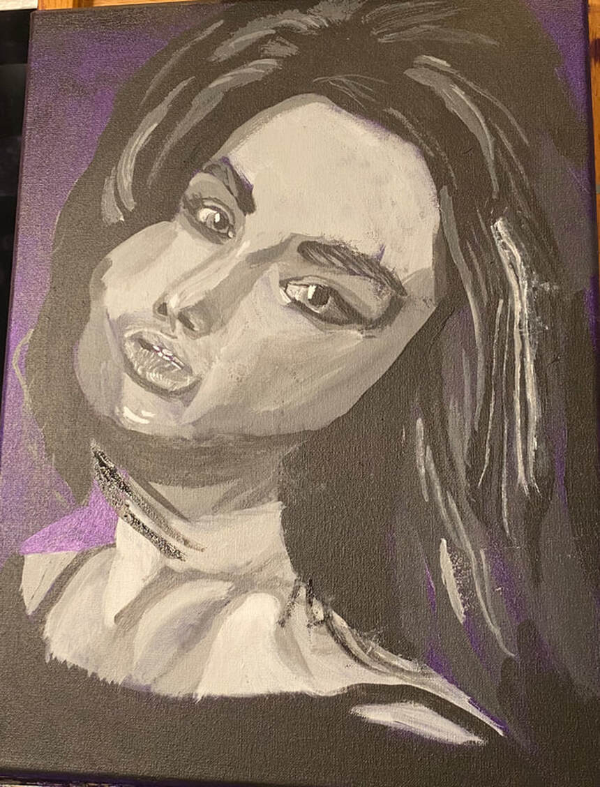
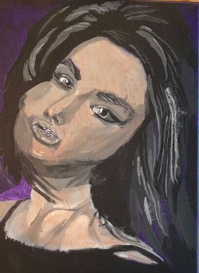
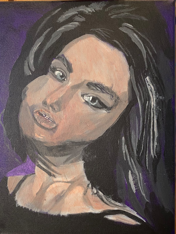
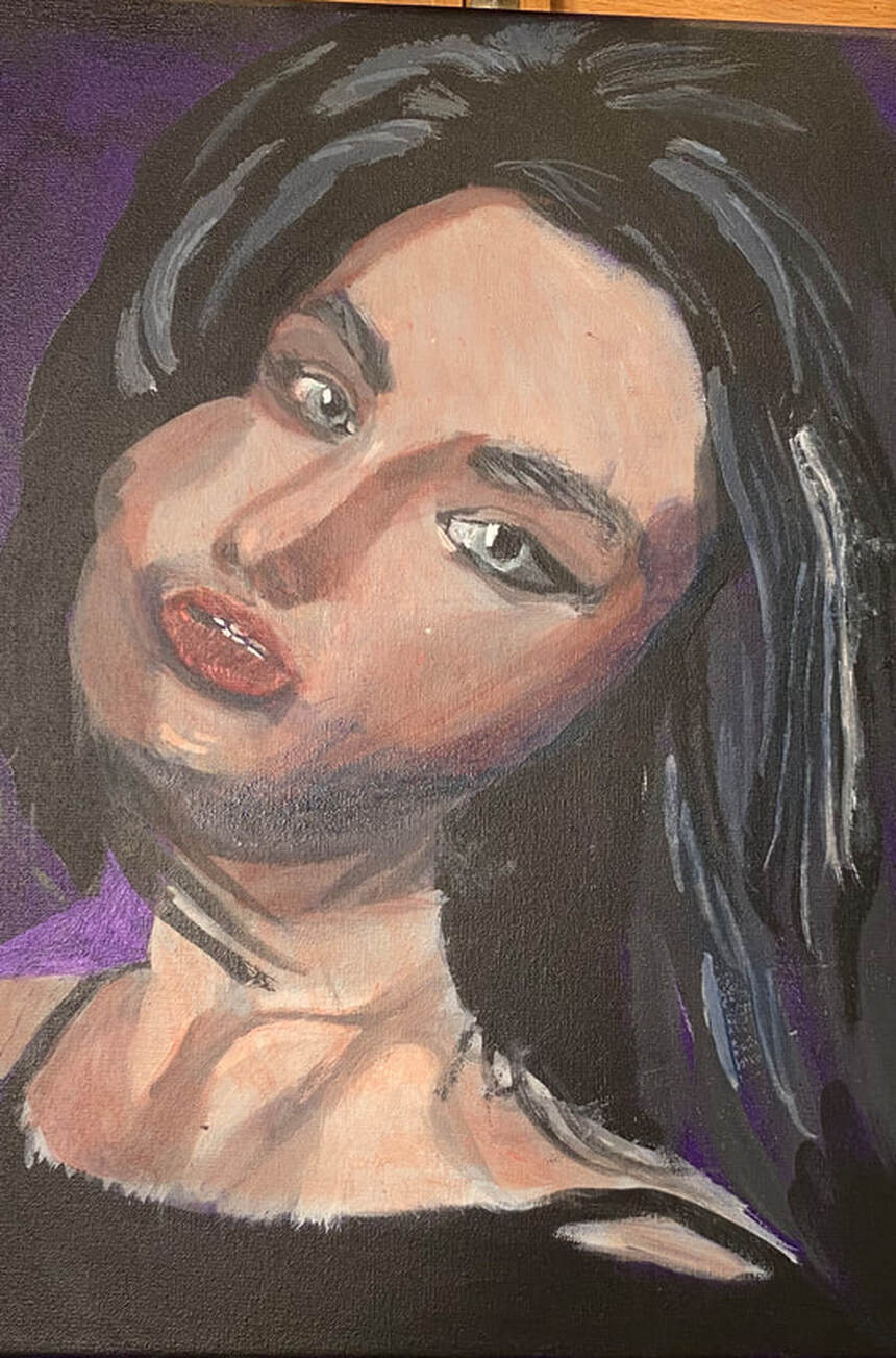
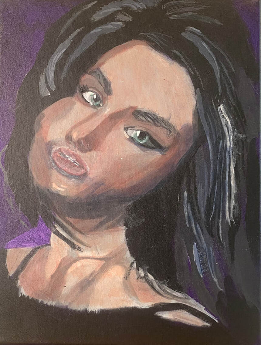
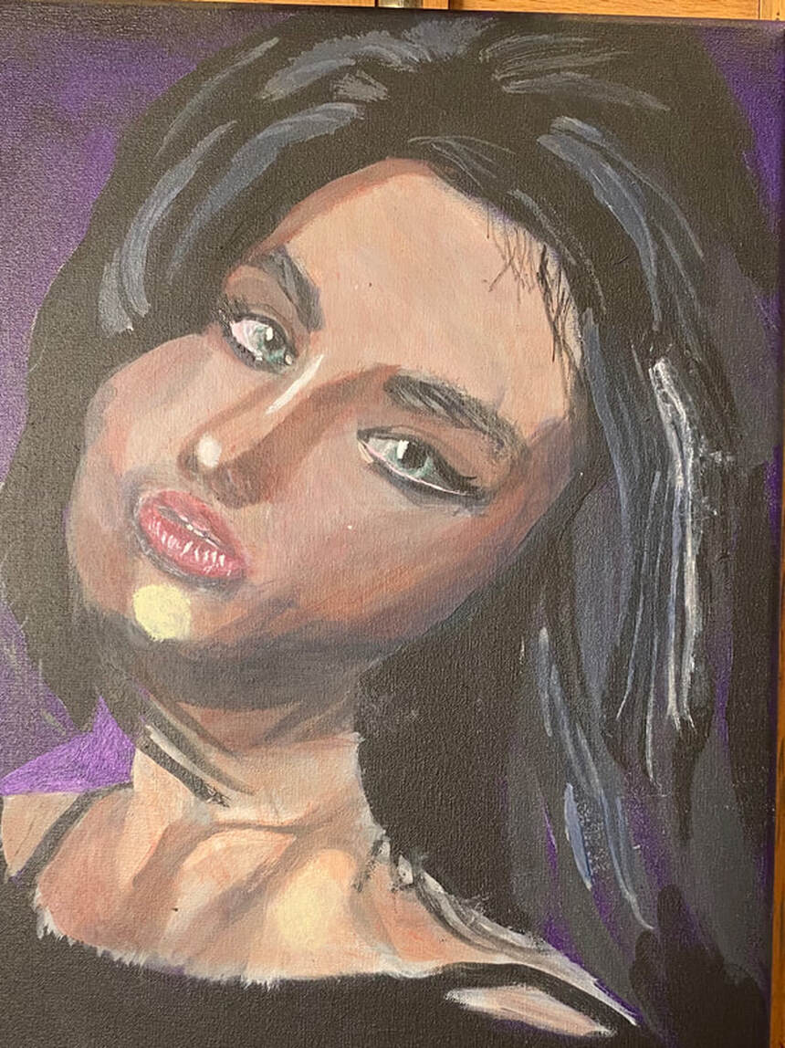
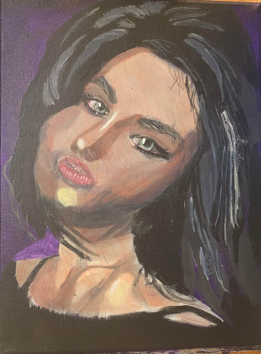
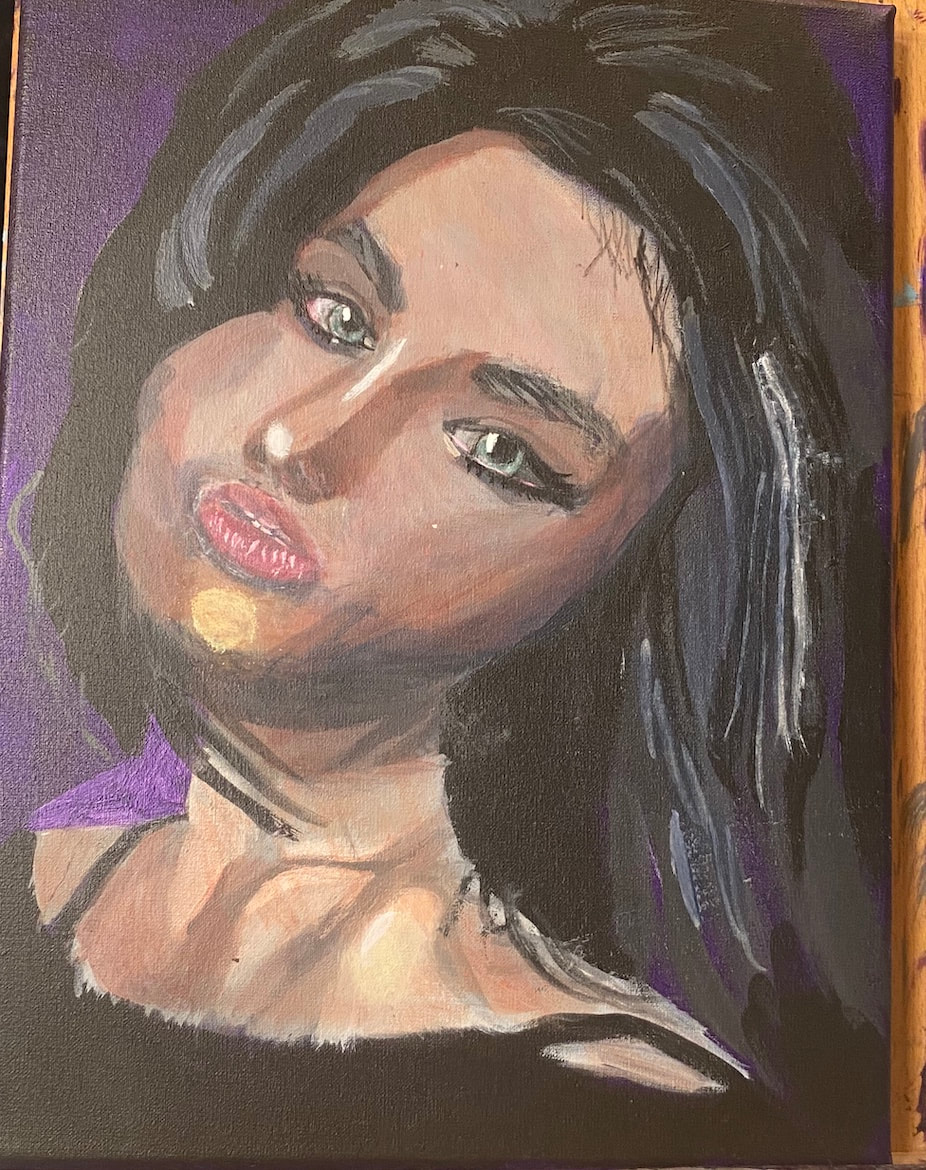
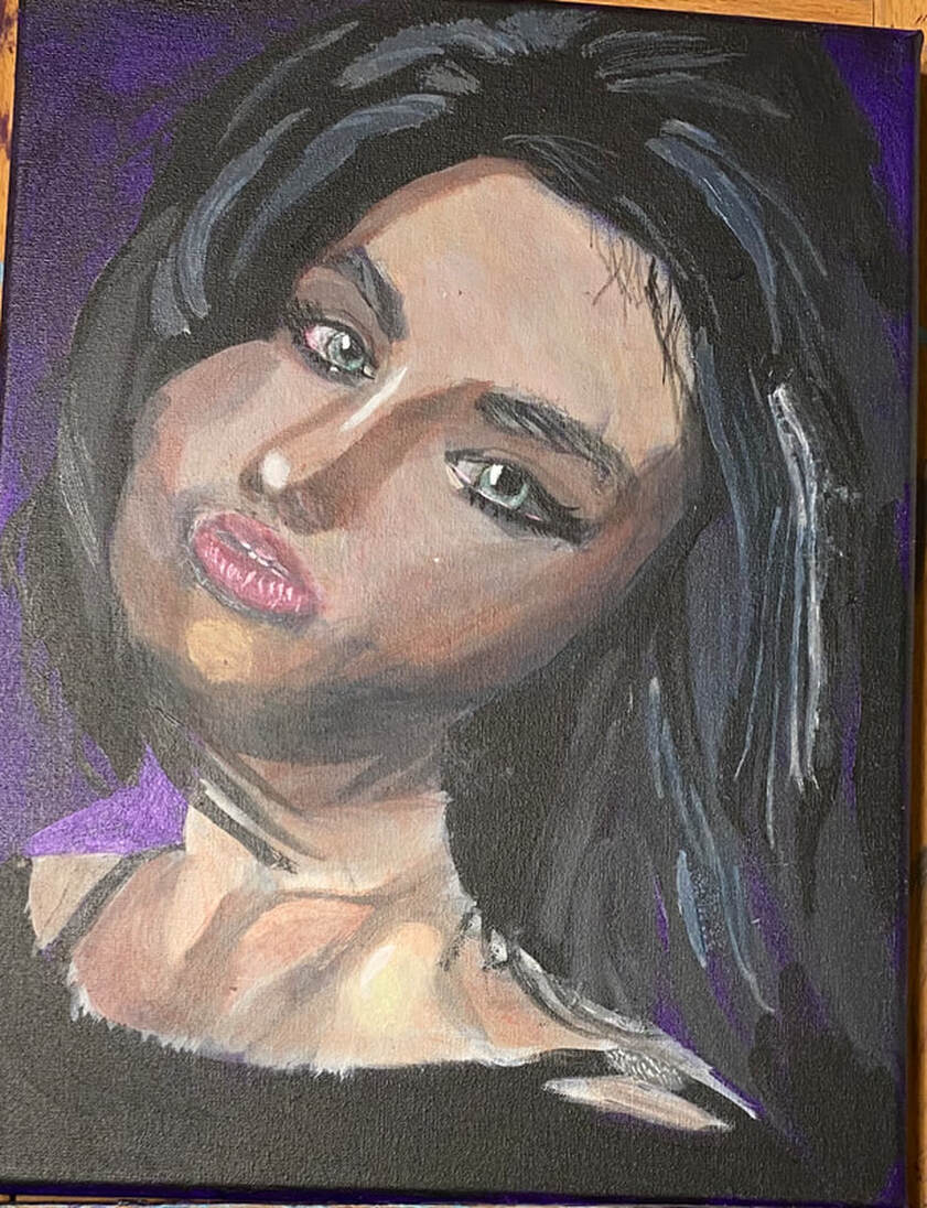
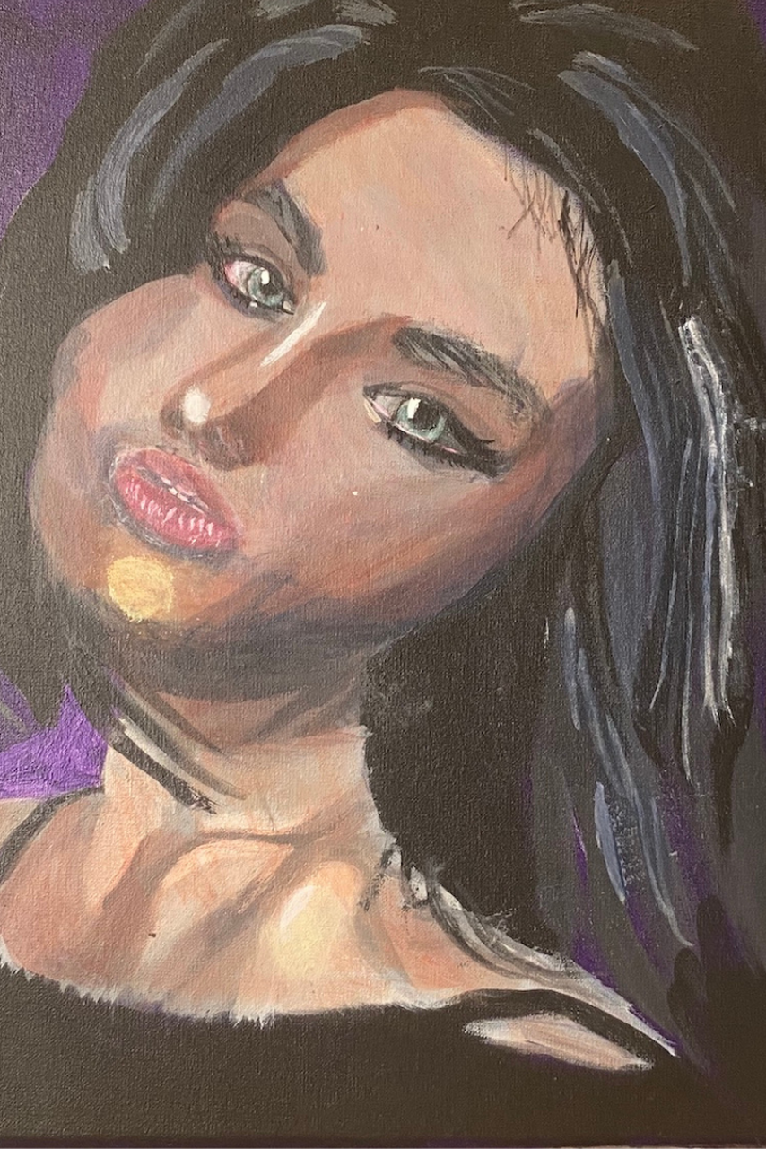
 The more I used this canvas the more I liked it. More about that later. The edges are thinner than most I’ve worked with. I believed that was the only con of it, but after having worked on it for more than a week now, even that doesn't feel like much of a con. I decided on a bluish purple background for this portrait. I decided to mix ultramarine into my dioxazine purple and see how I liked that. I didn't mix any white into it, though, because I wanted it to be extra dark and, more importantly, I didn't want to dull the color. I painted my background in two layers using a large filbert brush and blending out my strokes with a mop brush. As I was putting the final layers on my background, I really started to notice how pleasant the texture of this canvas is. Fast forward, and now I’m building up depth in her eyes and mouth with shadows and highlights. Using a liner brush, I painted highlights on her eyelids, being careful to avoid the creases I’d painted. Where you place these shadows and highlights is just as important, if not more so, than how dark or light they are in terms of the structure of the face. Painting something a shade or two darker than it is in the reference photo won’t throw off the structure of your face as much as putting that same mark a centimeter or two of from where it should be. I’ve been making a point to keep my hand moving continuously while making most of my strokes, rather than stopping and starting. This creates a much smoother appearance. Making those smooth lines is also very easy on this canvas. I’m especially proud of the way her eyes have come out. I made her cheek rounder by painting another stroke on the outside. On the topic of her eyes, I ended up enlarging both of her pupils to open her eyes more. Pupil size can really effect the overall expression of the subject. Advertisers know this Last night it was time to add the lightest shades to her hair. I knew I wanted a lot of contrast between these and the darkest shades, but I went a little overboard with how light I made it to begin with, so I needed to add more black to my mixture. As with every other part of the hair, I was careful to place these strands in the right places in relation to each other. That went a long way in giving the hair the texture I wanted it to have, and the volume. I worked on painting her chest too, particular around her neck and shoulder, which I see both need to have brighter highlights than they have now. Her chest is the main thing now keeping me from moving on to the color. I haven’t gotten it to the point where I feel that the definition in her shoulder and collarbone is defined to my satisfaction. I’ve been working on making the highlights brighter that need to be and I think now I need some highlights that are just a touch brighter over very small areas, such as above and below her collarbone. I’m going to keep layering. I’ve filled in her teeth using my liner brush. For the first layers of color on her face, I knew I wanted a pale muted pinky color. I tried mixing cadmium red deep, because it has more blue than cadmium red medium, which is more orange, with deep green permanent. This color came out too purple, though, so I mixed some yellow in to take care of that. I thinned this mixture down with water applied it in two thin layers all over the subject’s face and neck. I’ll add more layers to the skin later, but the next thing I did was paint the irises. I did this by mixing a touch of the deep green permanent into some gray that I made by mixing zinc white and ivory black. Even though the subject has green eyes, I didn’t want to use straight green. That would’ve looked cartoonish. I mixed a darker version of the same color I used for the base color of her skin for the shadows under her cheekbones, the sides of her forehead and around her nose. Before I did that, though, I glazed some zinc white over the middle of her forehead, down the bridge of her nose, and on the apples of her cheeks. This small change gave her face a lot more definition. While I was painting what I thought would be the darkest shadows on her face, still using my brownish pink mixture, I realized I would need to include some blue shadows. I mixed those from ultramarine blue and an orange made with magenta and glazed them over the shadows I’d just painted. I feel I should point out that I was able to blend out the edges of these shadows very easily on this canvas. Painting pale gray on the outer corner of her right eye seemed to open it up more. I also painted a mars black line underneath and gave her some lashes. When I go to work on the piece again, I will glaze some bluish gray over the cornea of her right eye, too. I felt that her lips needed to be lighter, so I started by glazing some zinc white over them. I tried twice, thinking it was too light both times. The white was completely covering my color and all my details, which was not what I wanted. I decided to just start by glazing a streak of white in the center. I’ll probably go back and glaze some pink over that to help it blend in more with the rest of her mouth. Today’s painting session started with that glazing of pale pink over the white of the mouth I predicted. I decided I was going to add some small areas of titanium white with my liner brush for extra glossiness, but that would have to wait. In the meantime, I directed my attention to her eyes and started by applying the streak of dark blue gray under her right eye that I’d known needed to be there since yesterday. I added some pale yellow to her left shoulder and her chin to show them catching the light more. When I started my latest painting session, I sat down with the intention of painting the shadow the rim on the outer corner of her right eye, then moving on to her mouth. While I was putting my paint onto the palette, though, I thought it would make more sense to start with the mouth, since I would need a lighter color for that, so that’s what I did. I glazed a pale pink over the white marks on I’d painted on her mouth, blending them in much more with the rest of it. This greatly improved the look of her lower lip in my eyes. Then I mixed more red and more green into my color and did what needed to be done on her eye. I’d known for a while that I’d need to paint some titanium white on her left shoulder, just a small spot, to show where the light was reflecting. I took care of that with a liner brush. It was at this point that I started struggling to find things to do on the painting, but I saw that her eyes needed a dark gray rim, very thin, around the edge of each iris. I really struggled to get these lines thin enough. I mixed my gray from ivory black and zinc white, by the way, the transparent versions of black and white. Anyway, I put just a touch of paint on the tip of my liner brush and was careful to let just that touch my canvas. Even so, my lines were still too thick. I had to wash most of the outer edges of them with water. I noticed in my reference photo that there was a similar line going all the way across her lower lash line on her right eye. This also came out thicker than the reference photo, but this time I didn’t mind. Today I glazed more of my flesh color over the spot on her chin, which I felt was standing out to much, drawing too much attention to that area. I directed my attention, now, to her chest and saw that there was some pinkish color reflected around her collar bone. I also added wisps around her hair with my liner brush. I had a very short painting session. I started by painting a bit of gray on her strap for a highlight. I’ll add more to that later, but I needed it to dry, so I moved on to another section of the piece. I noticed that the highlights on the right side of her hair needed to come down farther on her face, so, using my round brush and the gray that was still on my palette, I did just that.
0 Comments
Your comment will be posted after it is approved.
Leave a Reply. |
Sara MillettPainter of portraits and wildlife Archives
November 2023
Categories
All
|
