|
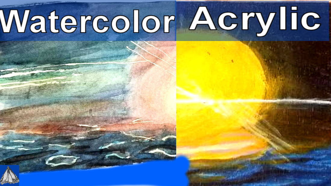
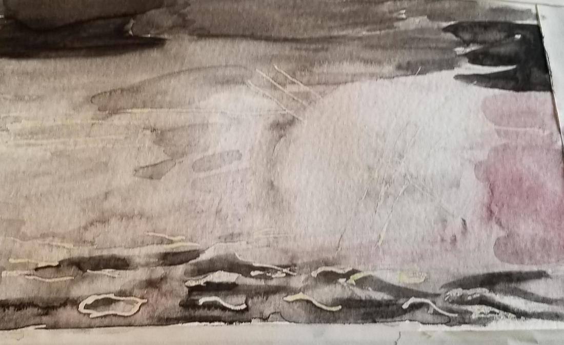
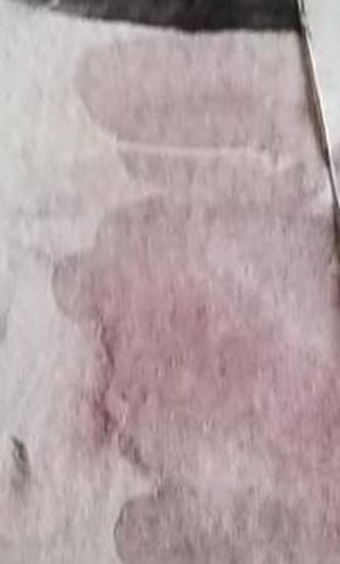
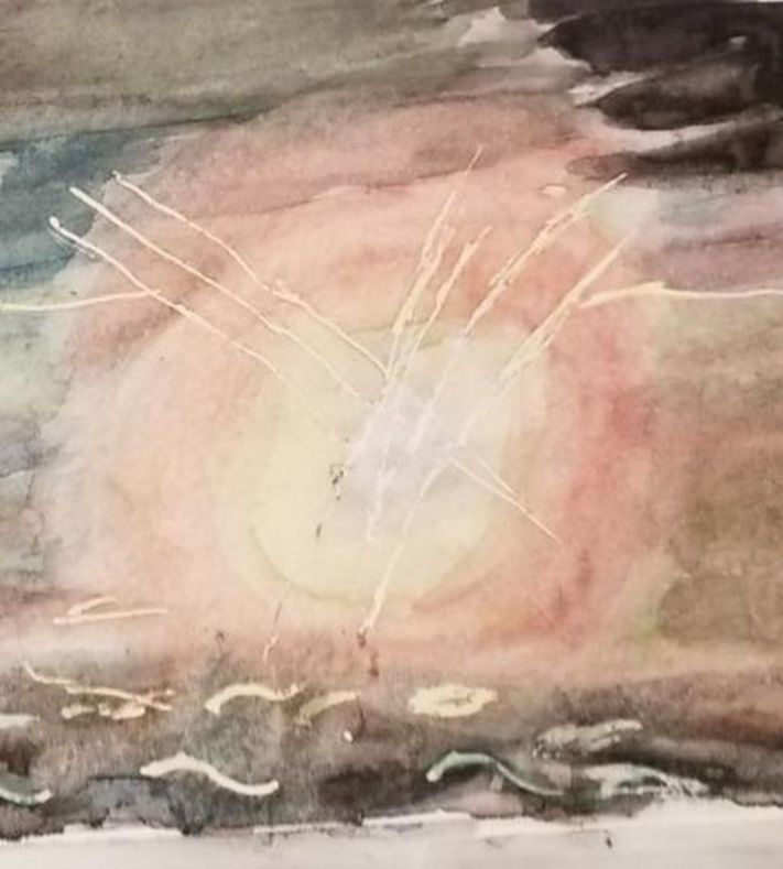
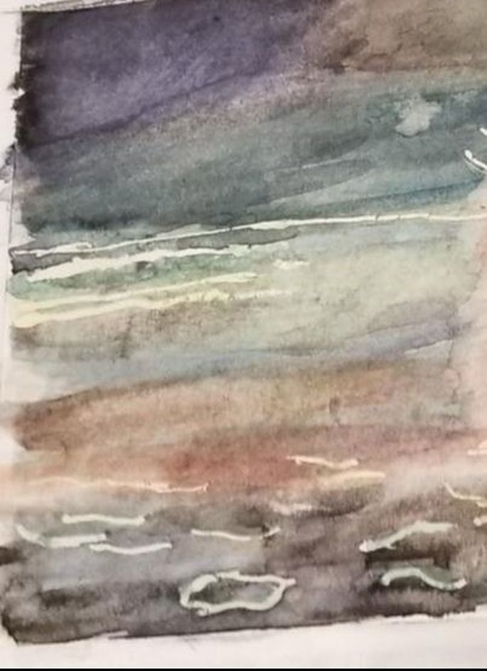
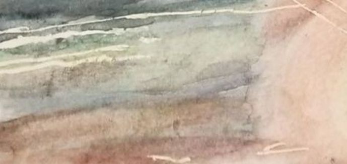
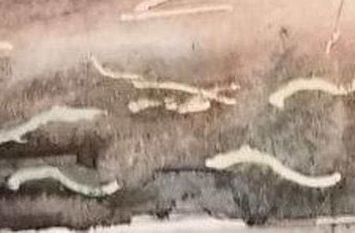
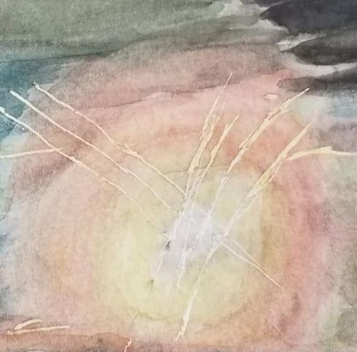
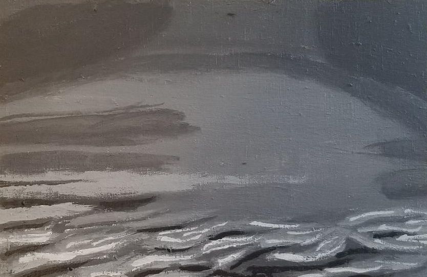
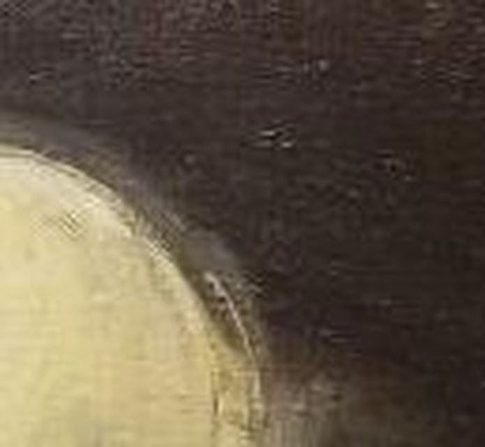
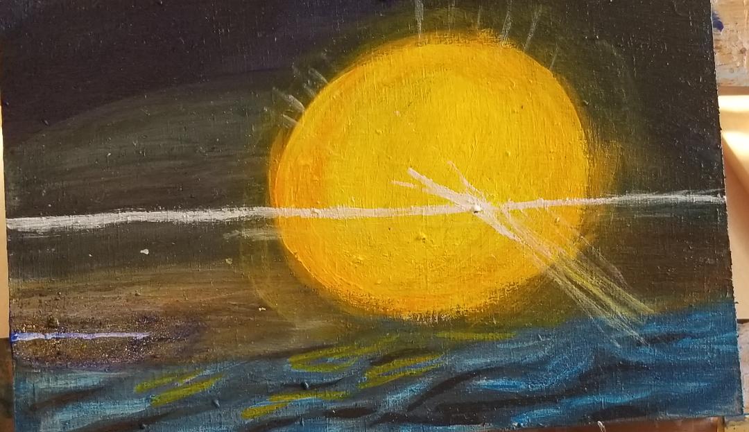
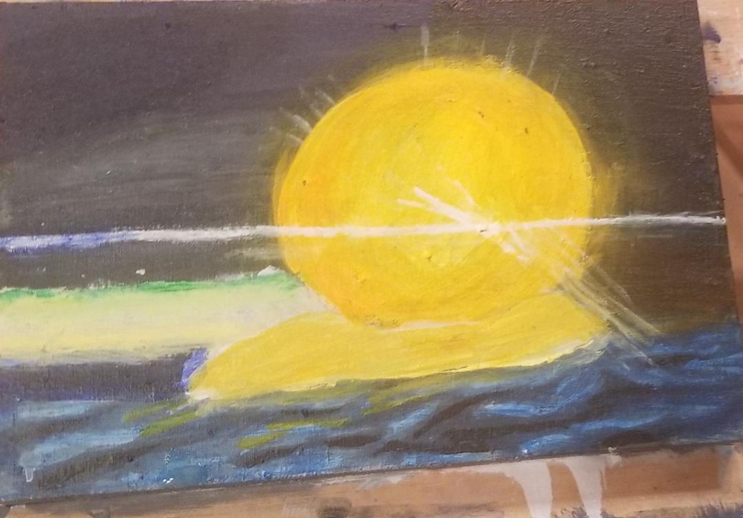
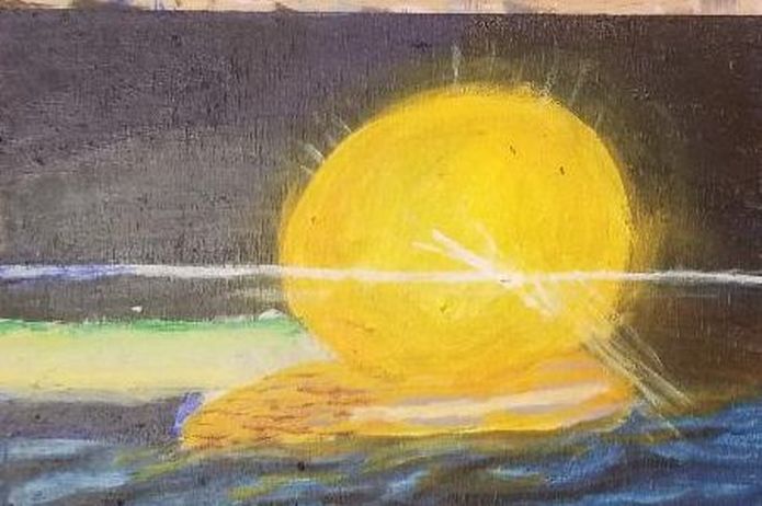
As with my painting of the rose, I'm determining where my whites will go first on the watercolor version of this painting. I decided to try the grisaille method this time with my watercolor painting. I thought I'd cleaned out the section of my palette that I put my black on pretty well, but it turned out there was still some residual red paint, which showed up in the painting. Now, this is a sunset, so the red works. That brings me to an important point. Part of being a good artist is learning how to fix mistakes, or if you can't fix them, how to make them work for you in the painting. When I was painting the sky, I was careful to leave a space open for the sun. When it came to painting the sun, I thought the rim around it was a bit too reddish and I wanted it to be more toward the yellow orange side. I don't have much practice glazing in watercolor and I don't know how effective I can make it, but I decided to try it with this painting. I glazed yellow, lightened with water of course, over the rim of around the sun. When it came time to add color, I filled the sky with blues and greens. I would periodically take a brush with nothing but water on it and soften my edges, blending my colors into each other. Now, in the middle of painting, I realized there should have been some yellow in the sky. I set to work lightening my blue in the sky with a wet brush. I wasn't able to lift it completely, but I was able to lighten it enough that I could get yellow in that part and have it show up somewhat. I used this same technique to get blue on the part up top, which I'd painted black in my underpainting I feel I should mention, I used Prussian blue to paint the water because it's brighter than my usual ultramarine blue. On the second day of painting, I went over my waves with some black paint and a liner brush, because I decided they needed to be redefined. I used a liner brush, even though the waves are a bit thick, because it gives me the most control, so I'm able to make the specific shapes that I wanted to. I also thought the blue of the water wasn't intense enough, so I put another layer of it on. In some parts I thought the paint had gone on too thick, so I took a brush with, again, nothing but water on it, no paint, and spread and thinned the paint out. When watercolor paint has the right amount of water mixed into it, it's a pleasure to work with. The last thing I did was go over the sun again with more yellow to intensify it and glaze some of the yellow over the orange part to give it more of a glow. Now that the watercolor version of this painting is done, I’m starting on the acrylic version. I’ve started with a layer of a midtone gray and I’ll layer darker and lighter shades on top. Here's the result of adding extra values to my initial midtone painting. When it came to painting the water, I actually drew my the shapes of the waves in with a charcoal pencil. I layered phthalo blue on top of ultramarine for the top part of the sky. I painted the main part of the sky a transparent blue green. I didn't bother to leave space for the ultramarine streaks I would be painting on, because I actually wanted the blue green to show through them. I glazed burnt umber over the right hand side of my blue streak and brought it into the green. This has nothing to do with the lesson, but I just want to say that I'd been using my transparent burnt umber from the Liquitex Soft body line, but this time I decided to try the burnt umber from Amsterdam. It worked for the technique I was using, but I think I might like the results I get from the Liquitex paint better. The water in my reference photo is a really beautiful blue and I was debating with myself over how I was going to capture that. For the watercolor portion, I used prussian blue, but for the acrylic version of this painting, I decided to mix ultramarine blue with cyan and I glazed that over the entire water portion, right over my waves. Then I took some yellow orange that I mixed from Cadmium yellow and Cadmium orange, and using a liner brush, painted that over some of the light blue waves. I tried to paint my sun straight on top of my sky, but the paint I was using was too translucent for that. So I painted the sun with titanium white and then painted my yellow and orange over it. That titanium white works like a charm. I also painted rays of light coming off the sun using a liner brush and both zinc white, because I wanted the yellow to show through some of the rays, and titanium white. You can see, I also painted a streak of titanium white going straight through the sky and sun. I decided to paint the area of the ocean that was around the sun titanium white and then go over it with pale orange and green, to brighten up the area. When I showed the painting to my mom and this stage, she asked if the green line going across wias the green flash and I was like, I hadn't thought of it, but I guess it is. ...and here's the acrylic version of this painting finished.
0 Comments
Your comment will be posted after it is approved.
Leave a Reply. |
Sara MillettPainter of portraits and wildlife Archives
November 2023
Categories
All
|
