|
This post is going to be about not agonizing over color choice. I’ve made posts about color before and in my post “How I Choose Colors”, I said that the first way I choose color s is by what I see. But sometimes it’s not quite clear what I’m seeing. Now don’t get me wrong. Of course I know whether I’m seeing blue, red, green, pink, etc. But it’s not always clear exactly what shade I’ll need to make that color. .The message I want to give today is, that’s okay. I’ll usually have a pretty good guess and I’ll go with whatever my gut is telling me. Since I work acrylics, if the color looks horrible, I can paint over it almost right away. If you’re working in a medium that’s not so easy to paint over, like watercolor for example, you might want to test your color on a scratch piece of paper. Just make sure it’s the same color and texture as the paper you’re painting on, so you’ll get a correct reading 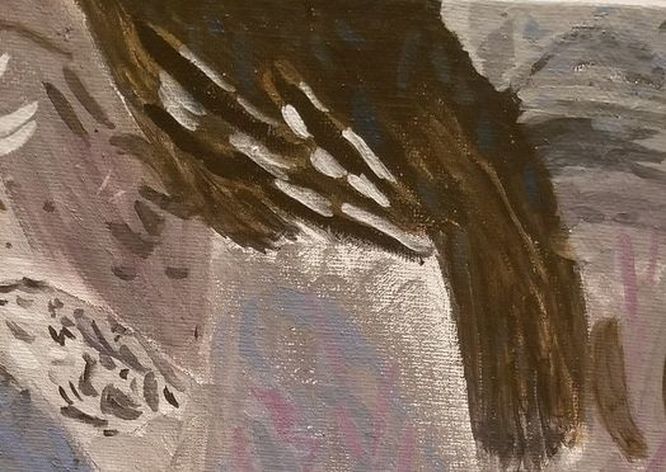 To give a personal example, last night I was painting and I saw that there were blue spots in my reference photo. I’d already used a lot of blue in the painting and I could tell these spots were a different shade. As you might have guessed, I couldn’t tell exactly what shade they were, but I decided to go with prussian blue as the shade that I would mix into transparent mixing white and ivory black to make a greyish blue and it turned out fine If it’s really important to you that the colors are exactly right, you’re welcome to keep repainting until you get them that way. But if worrying about getting your colors exactly right is causing you to enjoy making art less, than I encourage you to lighten up on it a bit. I haven’t personally had this happen, but I have heard if you’re doing pet portraits, some clients will get very particular about the colors and in fact will expect you to get the color exactly right. So if you’re doing a commissioned pet portrait, you might do well to ignore the advice in this video. For the record, you’ll probably need to use at least three or four different colors in any given area before it looks right anyway. Check out my post, “I Use Lots Of Colors” for more on this topic. So how do you deal with color choice? Are you determined to get every color exactly right or do just try to get it as close as you can? Tell me in the comments, please.
0 Comments
Your comment will be posted after it is approved.
Leave a Reply. |