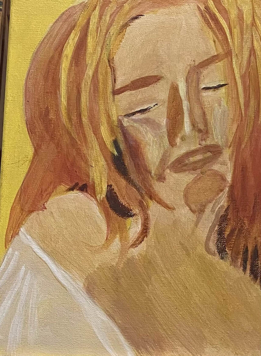
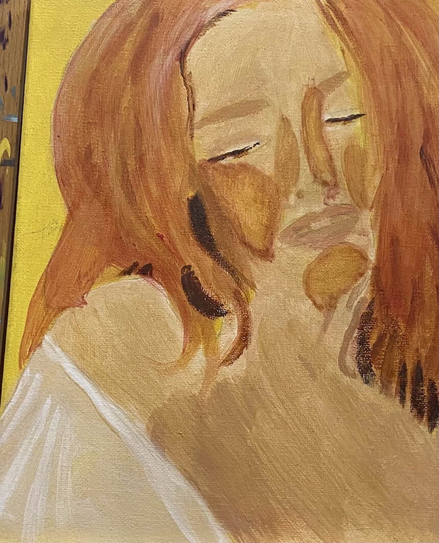
 It's time to start adding dimension to my subject's face. The first thing I did when I started working on this painting again, was glaze yellow over the edges of her right cheek and nose where a ring of red had formed. I’m very happy with her cheek now, but I think her nose still needs some work. Her hair needed some highlights. Because these needed to be opaque, I painted strokes of titanium white where I wanted them to be. Otherwise, they wouldn't have shown up. For the highlights themselves, I used a combination of yellow with a touch of burnt Sienna. I was considering going over the apples of her cheeks with titanium white mixed with yellow because the highlights are just not as bright as I think they need to be. I know I’ll have to careful to blend the edges out properly of course. It’s the day after after I wrote that last block and I’ve followed through with my plan of painting titanium white mixed with yellow over the areas I said I would. I really didn’t mix enough yellow into the white at first at it was really glaring. After I glazed some yellow over it, though, I was much happier. Now they’re starting to look like cheekbones. Next I'm going to add flowers around her to enhance the cheerful mood of the painting.
0 Comments
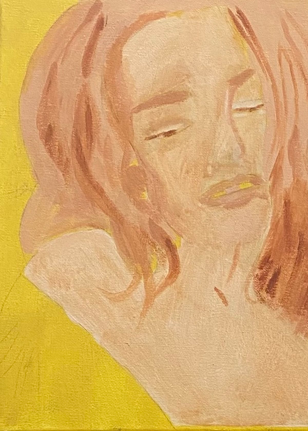
 I started the process of adding color by glazing raw sienna mixed with zinc white over this woman’s face. I decided to add my warm yellow over the parts of her face where light would hit, so cheekbones, bridge of nose and chin protrusion. I thought this would look more natural than painting it all over. I wanted to paint a golden red over this yellow. Now, I wanted this to be golden red, not orange. I experimented to figure out how I’m going to come up with that color. I decided I was probably going to mix green into red and mix that into yellow. After this is on the canvas and dry, I’m probably going to glaze some of my red and green mixture over it. I'm less happy with my piece after having added this last layer. That just means I need to figure out how to improve it. I need to make my shadows around the nose and cheekbones darker and my highlights brighter. If you're interested in how I bring a piece back from being "ruined", which happens more often than you might like this video.
 A few years ago, I showed you how I made a painting with a dark and spooky mood. I decided then that one of these days I would do a something about creating a calm and happy mood in a painting and now I’m finally doing it. I chose this particular photo because of the woman’s serene expression. I’ll be using mostly warm tones, yellows and oranges. The concept of using warm colors starts with background, for which I used yellow mixed with a bit of burnt umber. 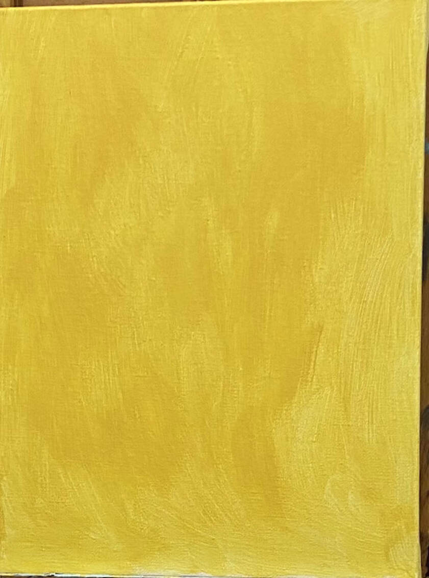 I’m using a sepia toned underpainting instead of my usual gray one for this piece. This will not inferior with the warmth of the colors I’ll be putting on top. I know this from this experiment. 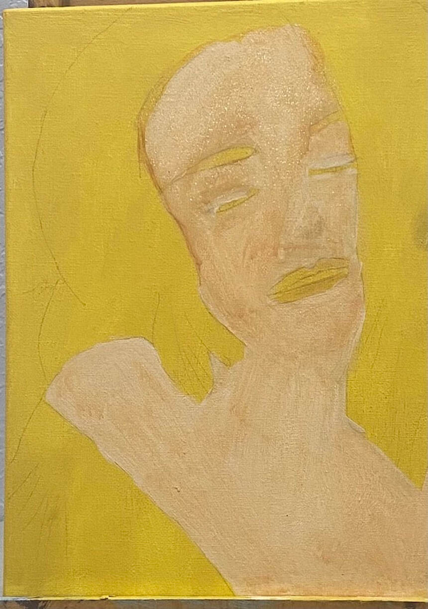 I part two of this post, I'll be discussing the surface colors.
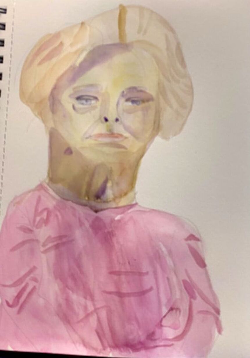 I’ve had the opportunity to draw live models before in art classes, but today I made my first attempt at painting one. This session took place in the Craft Studio 2 of my community’s club house. I chose to work in watercolor. I started by sketching in the outline of the subject’s face and body as quickly as I could while still making it accurate. To make sure the features of the face were in the right places, I used the techniques outlined here. When it came time to start painting, I started with the model’s flesh, which I painted by mixing yellow and purple. Now, the color I had was going to be way too dark, so I wet my paper first to dilute the color. Watercolor is probably not the best medium or the most practical medium for a short modeling session, since when you wet the paper, like I did, you have to wait for that layer to dry. When someone’s only going to be in front of you for a half an hour, you want to be able to go back and add more layers as quickly as possible. After I painted the model’s hair, I realized I needed another layer on her face. This layer, though, was way too yellow. Nothing I could do about that, though, until it dried. In the meantime, I blocked in color on her shirt. Once it was safe to go back over the face on my portrait, I did so with purple, making sure to thin it out of course. This toned the yellow right down. I decided to use purple for the shadows and planes on her face too. I tried to look and see where the edges of the shadows were and draw them in my piece. My goal was more about having fun and learning than creating a masterpiece. If I was painting a model professionally, it would be done in sessions and both the model and I would take breaks. I think next time, I'll work in black and white. That will probably be easier.
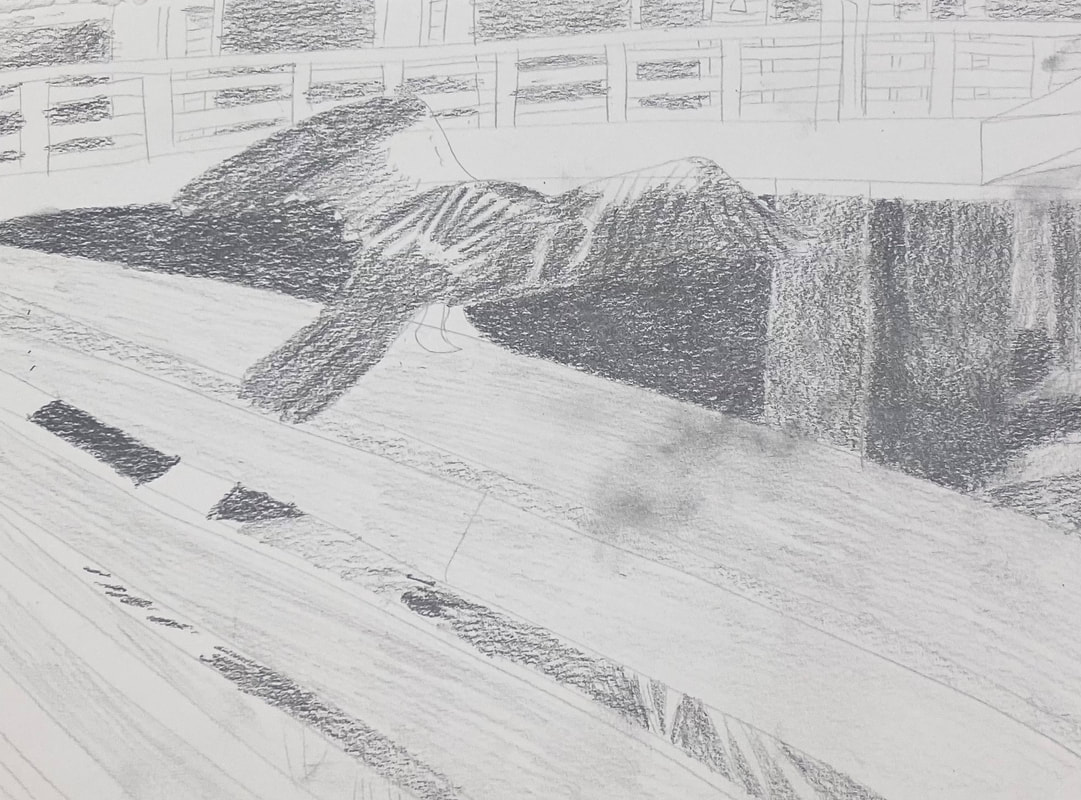
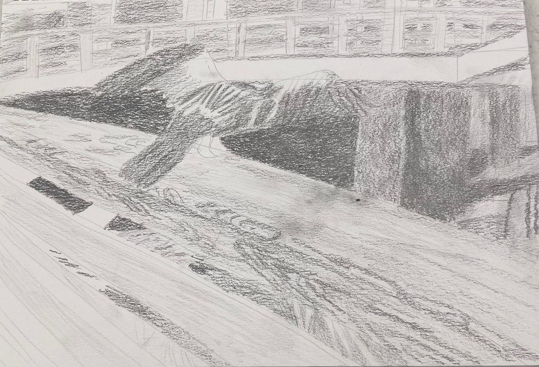
Paying attention to seemingly unimportant background details can make a big difference in your piece, because of the dimension these details add. This impacts your entire piece.
Take a look at the rails on the fence this bird is perched on. In the pic on the left, I have no pattern in the wood and in the pic on the right, I do. You can probably see that the first picture looks relatively flat in comparison. When I put the first curves of the wood pattern in, I could see the clear separation between the top and sides of the rail start to form. I was almost going to skip this part because it seemed boring and unnecessary. The bird is my focal point. As long as I have enough detail on him, I’m good, I thought. But giving the rails more dimension, by adding the details on the wood, also gave the bird more impact. Pay attention to your background and you can make your subject look even better.
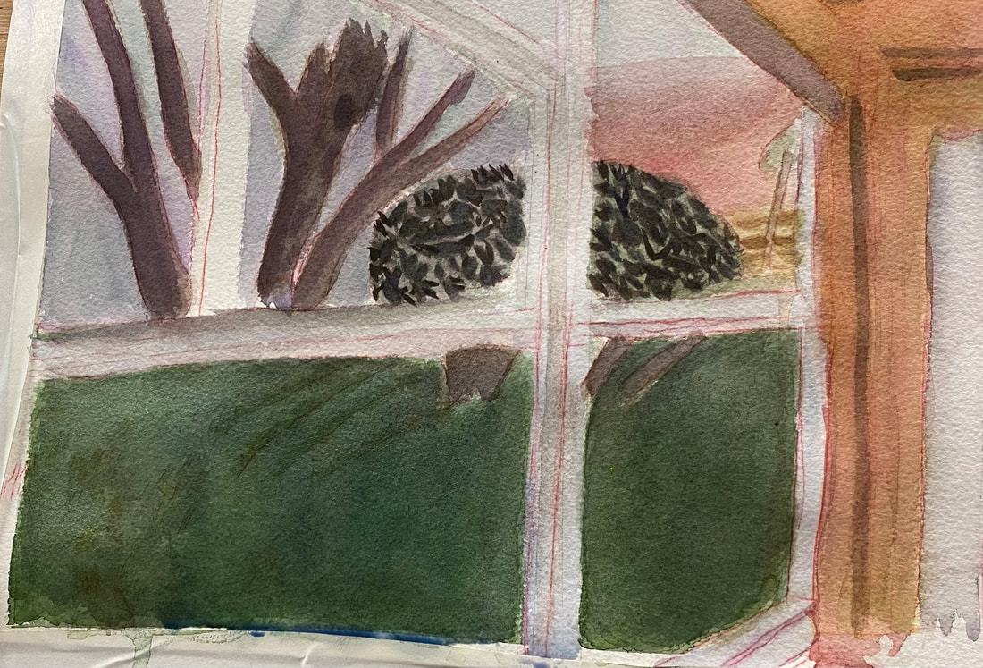
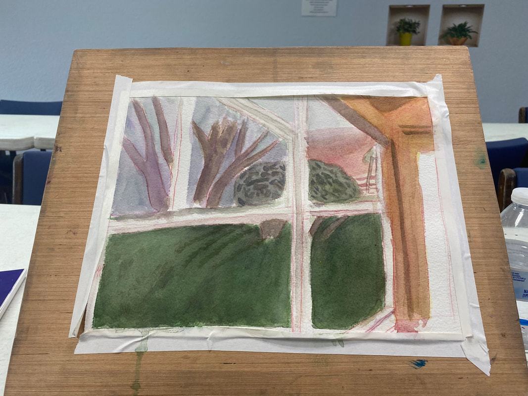
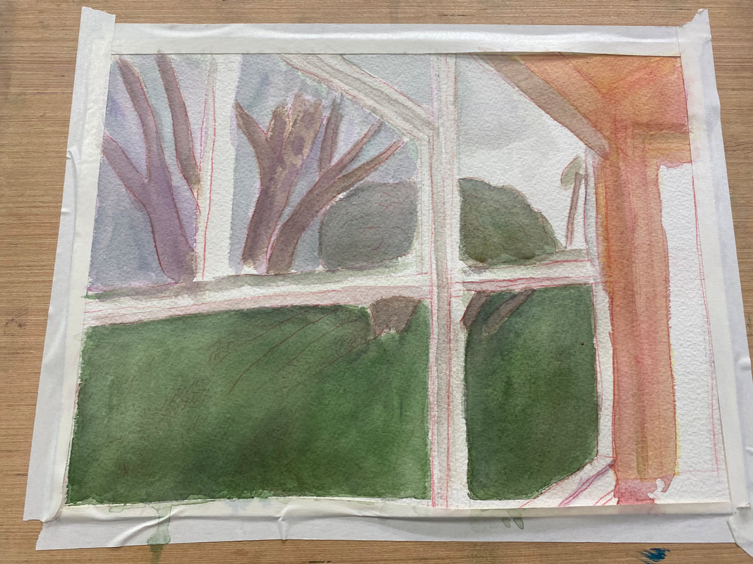
Your reference photo is your guide for your piece. It's your gps, so to speak. But just as you may need to take a different route from what your gps suggests when traveling, sometimes you need to do something in your art other than what your reference photo shows, because it just doesn't look right in your piece. I talked about that in this video. The window frames in my photo appear pure white.  But that looked too stark in my painting. It bothered me. I mixed cerulean blue and purple, the same color I'd used for the sky, and painted very thin washes of this over the frame. My goal was to leave just a hint of the color, so that the frames would look like they were reflecting the color of the sky, but not that they were the color of the sky. I could never have felt that the painting was finished, no matter how many layers I put on it, if I'd left those frames white.
So do what feels right for your piece, not necessarily what your reference photo shows.
 When it was time to start painting my sunrise, I started by blocking the whole area in with yellow. While that was still wet, I painted red on top. The goal was for the red and yellow to mix and make a peachy color. Using wet on wet also prevented sharp edges. It was very important to me, also, to leave some of the yellow showing. I painted a band of purple between the blue and the pink of the sunset to help the colors blend a little better. When the top layer was dry, I painted a couple bands of red along the bottom with my smallest brush. I used wet on dry this time because I wanted the edges of these bands to be a little sharper. I plan to go over these bands with some layers of yellow to soften them. If you like this post, you might enjoy the one before this, where I explain why I use the particular shades that I do in this piece.
 I’m working on a scene of my backyard during a sunrise. It’s teaching me something about how the eye’s perception of color will change with the time of day. If I was painting this same scene at midday, I would use more yellows and oranges and make everything warmer. Because it’s the beginning of the day, I’m making everything blue, purple, and generally cool. The grass on the bottom needs to be much darker. I’m going over it with layers and layers of “black”, made by mixing ultramarine blue and burnt Sienna. I realized that the blue I’d painted the sky was also too warm. Now, I was just blocking in the color when I was doing it, so I wasn’t all that concerned with accuracy. But now, it was time to fine tune things a little. I thought I’d try layering purple over it and see how that looked. Other than the purple going on a little thicker than I would’ve liked, I was very happy with the results. By contrast, the third of the sky where the sun is rising is going to mostly shades of pink and yellow, but that will be for another post.
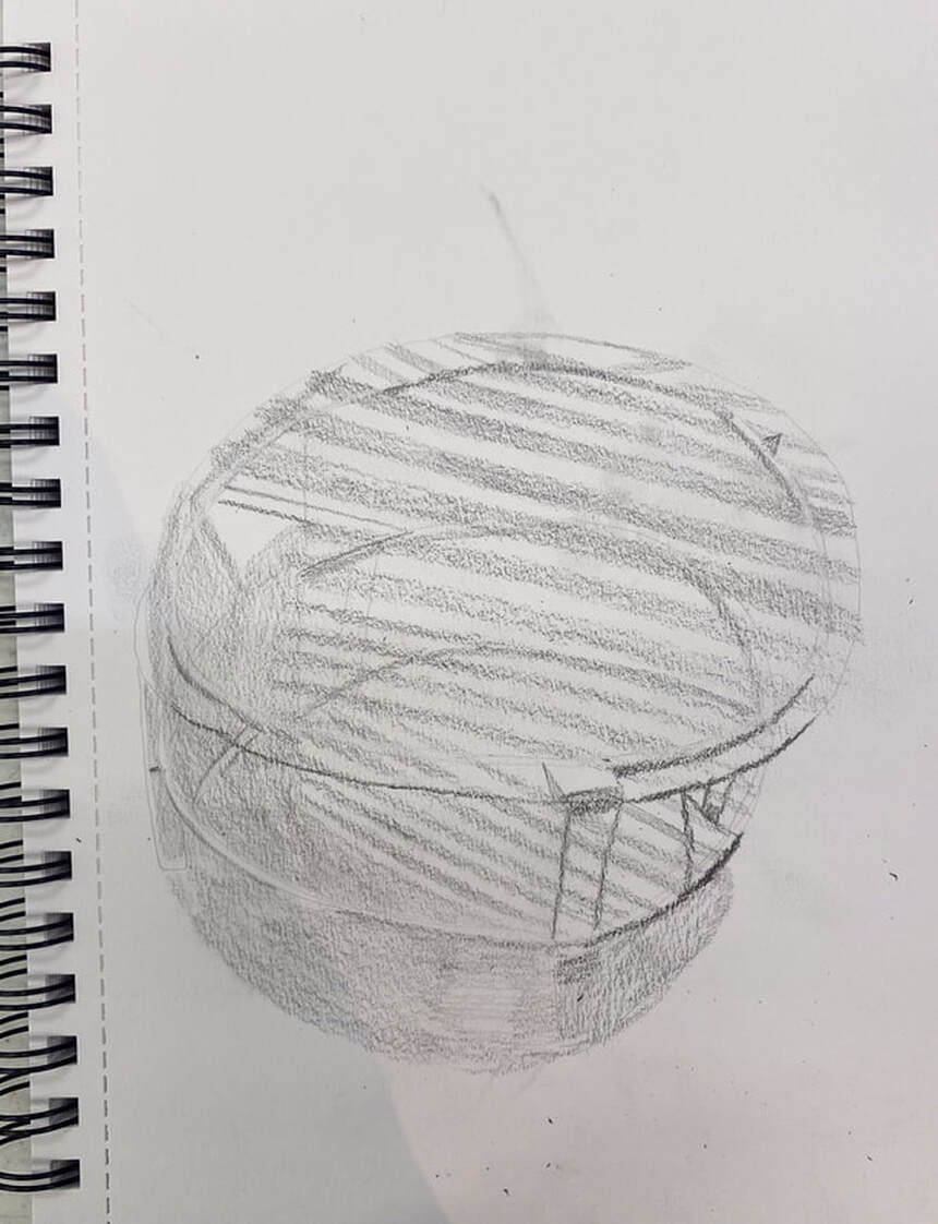 Today I decided to draw my family's new living room table to give myself practice drawing glass, using graphite. Glass, as you probably know, is very smooth. As such, I must keep my shading smooth while drawing it. This is not as easy you might think, as the edges of my shading tend to get ragged if I’m not careful. I had to give my full attention to what I was doing with my pencil while I worked on this. My pencils also needed to be as sharp as I could get them if I was going to achieve the level of smoothness I was after. I looked carefully at the rims of the circles and saw that there was some very thin, very dark shading around them. This provided necessary contrast, which brought out the reflective nature of the glass and made it look more three dimensional, as did drawing the reflection of the shutters. While I worked, I didn’t think about the fact that I was drawing a glass table. I only thought about where I was putting each bit of shading, how dark the shading needed to be, and about keeping the edges of that shading as smooth as possible. When I stepped back from it, I saw it come together, though.
The community I live in has an art group, which I'm apart of. Every month, there's an opportunity to have our work displayed in an informal hanging. The theme for next month’s is Impressionism and abstraction. I’m not much for abstract, but I thought I’d try my hand at planning an impressionistic painting. I’ve chosen to do a painting of a parrot in a tree that I snapped in Trolley Barn Park. I turned up the contrast on the photo so the lighting would look more interesting. 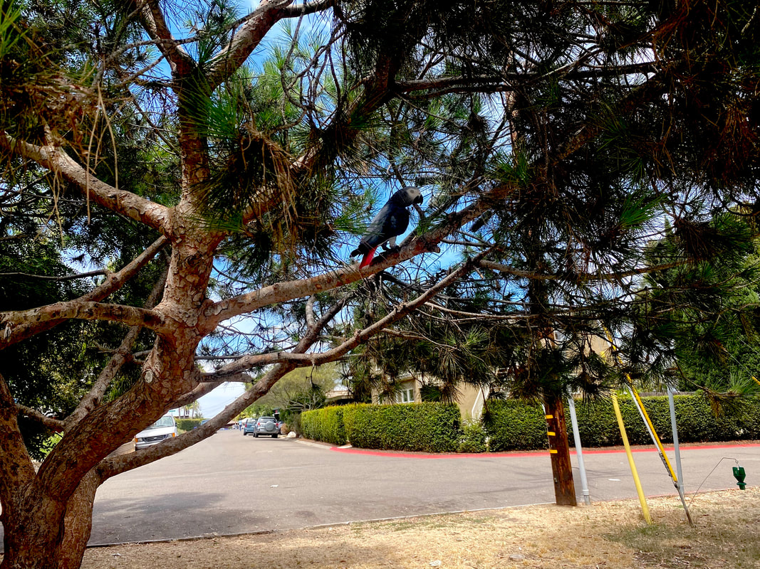 I’ve been going back and forth with myself whether to do the painting in watercolor or acrylics. If I’m going to do it in acrylics, I need to order a different type of canvas than the one I have. The impressionistic style involves putting a lot of paint on the canvas, which requires a heavy weight surface. I still have some sheets of 300 lb watercolor paper that I had to buy for that workshop I took though, so I’m leaning toward doing the project in watercolor. Some principals I’m going to follow are: 1: Use large brushes, no liners, and use the whole body of the brush, not just the tip. 2. Hold my brushes far back on the handle. Both of these principles will prevent me from being able to add a lot of detail, which we don’t want in impressionism. Rather, we want to rely on our shadows and highlights to give our subject shape. 3. (In acrylics) Use lots of paint and let my brush strokes show. But then... After all this, though, I realized I was being a little over ambitious. I wasn’t going to have time to complete this painting before the next art hanging. Luckily, I happened to have a painting already done in an impressionistic style, which is this one. 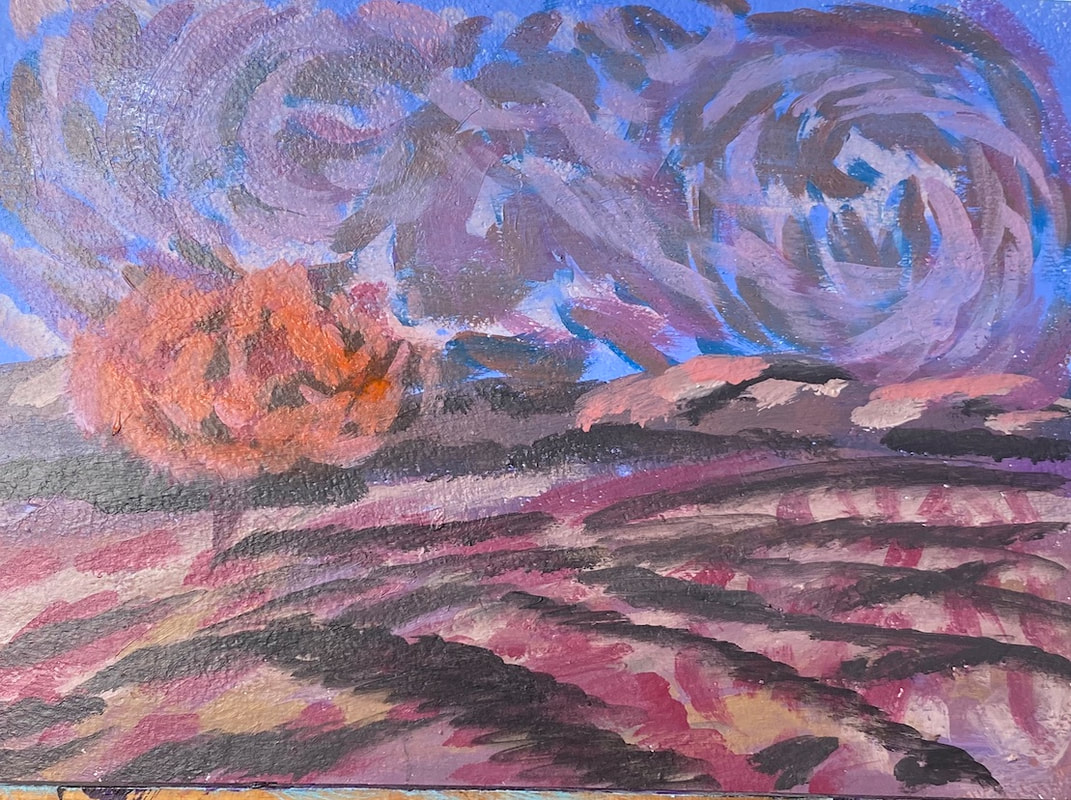 I painted this during one of Lisa Clough of Lachri Fine Art’s paint alongs. You might notice it’s very reminiscent of Van Gogh. That was done on purpose. I would like to paint the picture I was planning above. It just won’t be for this show. This teaches me a lesson about keeping up with what’s going on in my community and planning ahead.
|