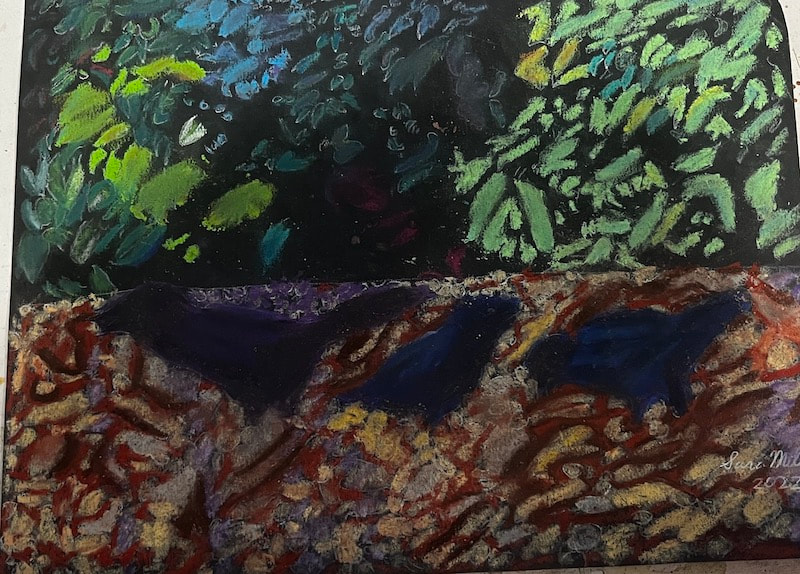
 When I saw how thick these sticks were, I thought there was no way I could fill in the shapes of those leaves properly with them. They were simply too thick, and rounded, I thought. So what did I do?
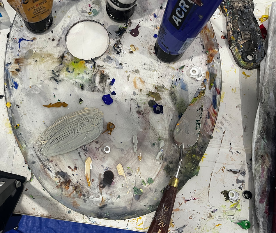
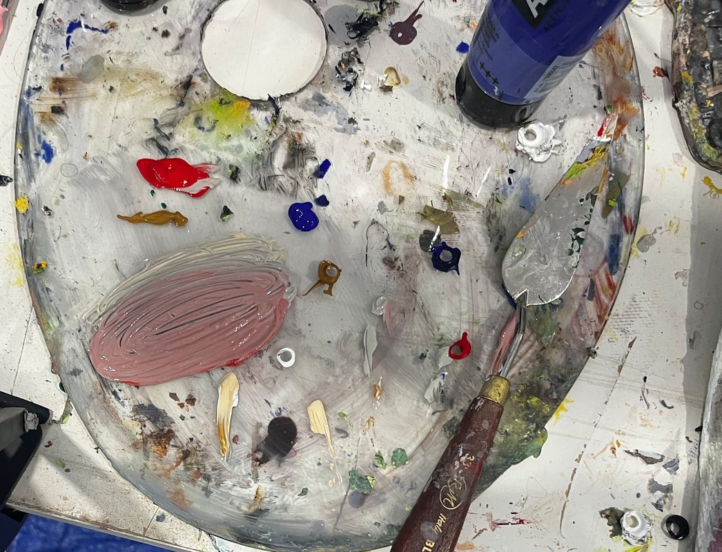
I tried taking a paintbrush and stroking it onto the end of the pastel stick and using it to paint in the shapes of the leaves. That didn’t work out so well with a wet or dry brush. I asked myself what would happen if I turned the pastel on its side. To my surprise, I had a lot of control this way, and it was very easy to get the shapes I wanted. I was really surprised the paintbrush technique didn’t work. That may be because I’m using black paper. I bought it because I thought it offset my colors in a cool way. Some of the leaves were blue, so I made sure to fill those in before I forgot. Nothing I was putting down at this point was what the final piece would look like. 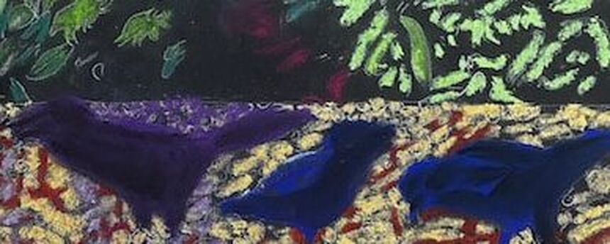 I tried mixing the colors by layering them next to each other and on top, but neither seemed to work. When I put the colors on top of each other, the color on top just overtook the color underneath. I decided to try sandpaper since it worked so well with my charcoal. I have to get up periodically to put the pastel dust on my paper in the trash. I’m starting to realize that to mix colors, I must first rub my underlay color in solidly. Get a good foundation for it. Then I go over it with another color, pressing more lightly. This allows the color I put down first to not be overtaken by the color on top of it. I did this with the purple bands on in the pebbles, laying a solid foundation of purple down first, then white. The result is a light purple. 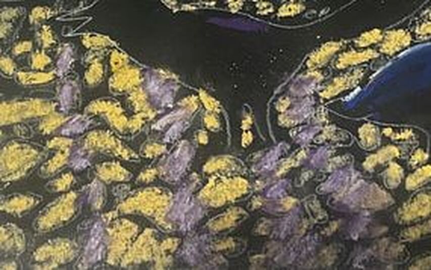 Pastels come off easily onto your fingers. Try leaving margins on paper so your paper can pick it up without smudging the edges of your project. It's imperative to have a piece of glassine under your hand when you're working in pastels. Inevitably, you will end up resting your hand on a part of the paper that already has pastel on it, and we already know what can happen. I didn't want my crows to be solid black, so I colored them in by blending black with purple and blue. Remember, almost nothing in nature is solid black, or white for that matter.  I filled in the spaces between the pebbles with a terra cotta shade. 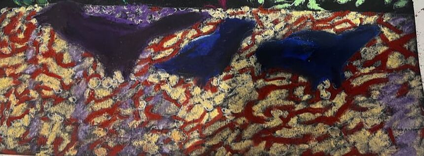
2 Comments
I’m planning to paint this photo, which I took in the canal behind my family’s house, in an impressionistic style. 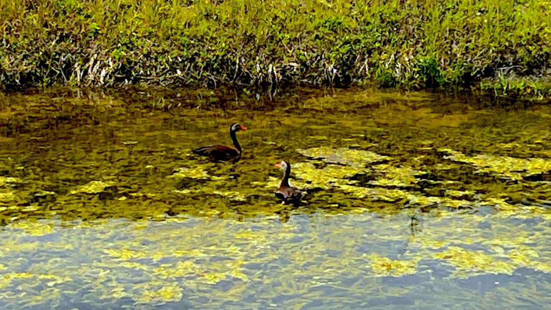 I already started practicing the looseness of this style with the preparatory sketch by holding my pencil far back from the tip. Holding my brush like this helped me move my wrist more freely, emphasizing basic shape and not detail. 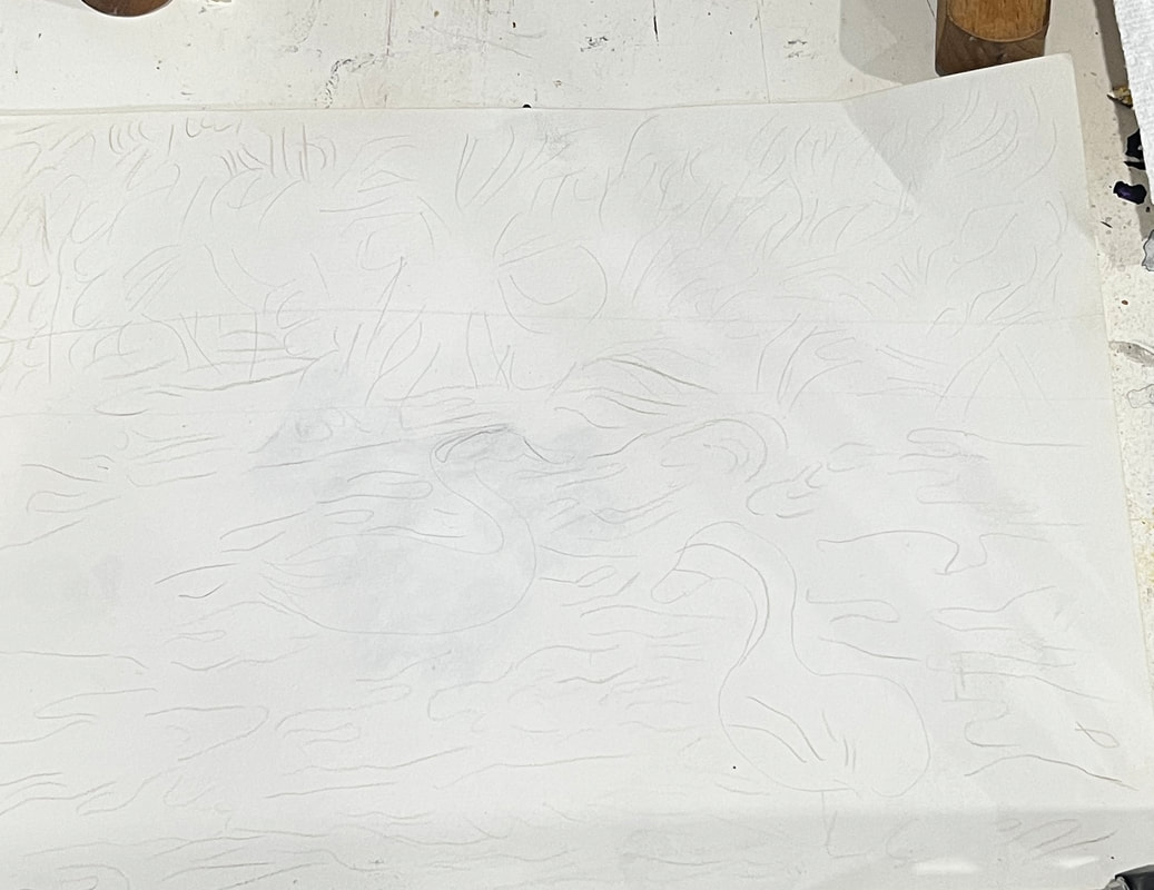 For this style, I want my brushstrokes to show more clearly, so to enable this effect; I’m planning to order a thickening medium for my more fluid paint. I plan to use more flat brushes than the filberts I usually use.  I’ve decided to employ the fat over lean technique for this piece. I’m working in acrylics, not oils, so I technically don’t need to do it this way, but I wanted to get in the habit. 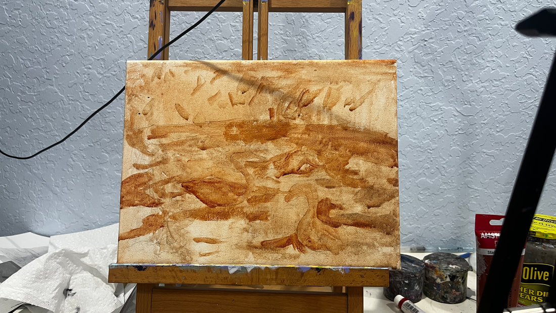 I’m sitting in my community’s Art Room while writing this, and I’ve just put the first layers of color on the painting. You can probably see that it will need a lot more layers. I haven't even completely covered the underpainting in some parts. 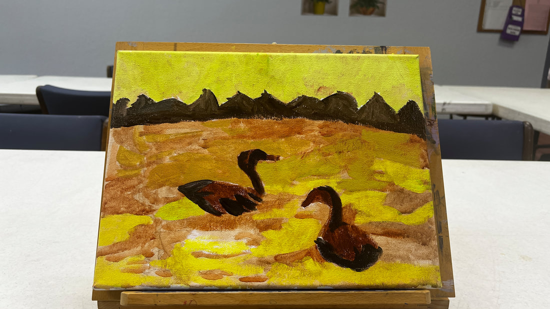 I have a lot of transparent colors, so to get them to cover the background, I painted titanium white over those parts first. Today I worked on creating the contrast between the part of the canal closer to the viewer and the region farther away from it. The part that’s closer to the viewer is significantly lighter. For today's entire session, I used different combinations of burnt umber, unbleached titanium white, and mars black. 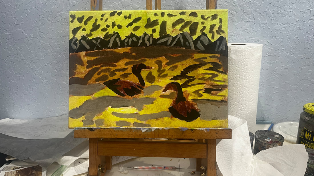 I purchased a jar of Liquithick acrylic medium from @liquitexofficial, which I used for the first time today. It gave the paint an almost custard-like texture on my palette. When I used it with brown shades, it even reminded me of a bit of pudding. The information on the container said this product wouldn’t make a difference in the opacity of the paint, so I was a bit worried it wouldn’t help me achieve my goal. With this in mind, I was pleasantly surprised. I think adding this medium did give me more opacity. I did already have paint on the canvas, however. I don’t know how well paint mixed with this product would cover a black canvas. I wanted even more contrast in the water, so I painted over the part of it that's closer to the bushes with a shade that had more red mixed in it. The idea is that the closer something gets to the viewer, the brighter it should be and the farther from the viewer it is, the duller it should be. 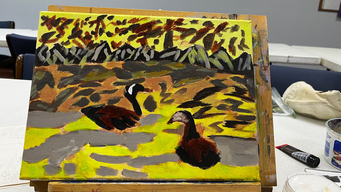 Glazing would never be a significant technique with this piece, but I glazed over some parts to intensify the colors. For example, I glazed red in this area.
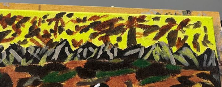
Since red is already present, adding more red, and letting the original shade show through, doesn’t change the color, it just makes it more saturated. I added highlights to shape the ducks’ bodies. To make the shade for it, I mixed burnt umber and red to make burnt Sienna. I thought about what I would use to make a complement for burnt Sienna, and the conclusion I came to was green since it’s the complement to red, and Burnt Sienna is a red-based brown. So I mixed green into my red and burnt umber mixture, then mixed titanium white into that. Because these highlights were meant to add shade, I placed them along the curves of the ducks’ bodies. 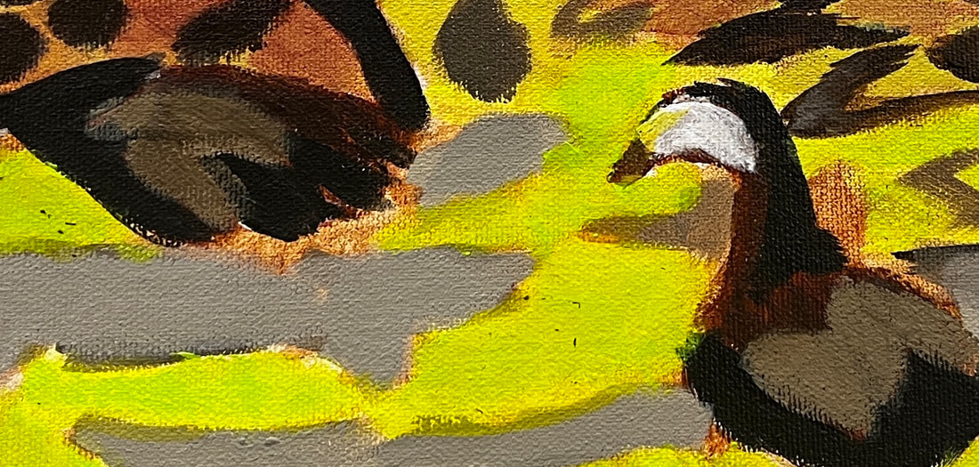 I added more brown to the bushes because they were looking a bit too plain. The color of the leaves in the upper half of the water needed to be changed to make them flow with those on the bottom. 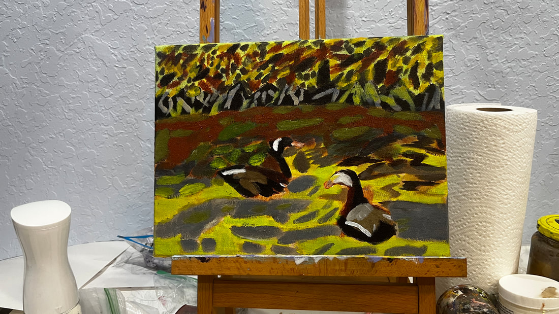 To recap, use thicker paint or a thickening medium, larger brushes, don't blend out your brush strokes, and use a heavy-weight canvas when doing impressionism.
I’ll admit that I’ve had some painting sessions that ended with me being unhappy in the last couple of days. I was tempted not to share anything from those days on social media until I remembered a book I’d been reading called Show Your Work, which Ali Abdaal recommended on his Youtube channel. Of course, I had been showing my work long before I read this book, but what stuck out to me was “think progress, not product.” It hit me that even the stages in my pieces I consider ugly, that even embarrass me a little, are part of my progress and teaching opportunities. If I only share my work when it’s in a favorable stage, I’m doing my audience a disservice. The key phrase here is teaching opportunity. I don't put myself or my art down in these posts. Instead, I objectively explain what I think is wrong with the piece, what I think I did to make it that way, and what I might try to fix it. Even if you don't share your work on social media, I encourage you to look at your own pieces in the same way. What I hope you take away from this, whether you share your work or not, every part of your process is equally valid. Don’t get discouraged because maybe your piece suddenly looks worse to you. Keep working on it, and eventually, it will look better again. Below are a couple of examples of pieces I was unhappy with and how I improved them.
I recently ordered a Fredrix Red Label canvas. This canvas is rougher than what I usually work on. I bought it because I'm planning to do an impressionistic piece. I learned from Lisa Clough of Lachri Fine Art that this particular canvas is more suited to that style than the Green Label I'd been buying. This is because I'm probably going to want to use heavier globs of paint when working in this style, which the Green Label, which is linen, wouldn't be able to take. You want to select a lightweight, smooth canvas for realistic pieces that rely on fine detail. Some cotton canvases work for this, and linen is excellent. Go with a rougher canvas for more impressionistic styles, impasto techniques, or painting with a palette knife. Anything that says heavyweight is your best bet. It’s difficult to do fine detail on a rough canvas. Your lines won’t be smooth. On the other hand, a smooth canvas may be too lightweight to take all the globs of paint required for certain impressionistic styles. I’ve also heard it’s hard to blend smoothly on a rough canvas but easy on a smooth one. Blending isn’t such a concern when doing impressionistic work, but it’s a big concern when doing realistic work. Below is Lisa's video on which Fredrix canvas is best for your painting style, which is where I got most of these tips. I watched Youtube vlogger Nathaniel Drew attempt to follow Pablo Picasso’s routine from when he lived in Paris for two weeks. He gives a summary of the routine starting at 1:06 in the video. Drew comments in his video that starting his day at 11:00 am, as Picasso did, made him feel sluggish. I can see myself having a similar experience if I try this routine. I’m rarely still in bed after 8, even if I’ve been up late. Some people left on the video that Picasso’s schedule wasn’t necessarily out of the ordinary Spanish culture. While I do really like the idea of painting when it’s quiet and no one’s around, staying up until 3 is out of the question for me. I also would find it difficult to go to bed right after working. I’d be too amped. Picasso and I have in common that we both like to ease into our day instead of getting to work immediately. We know Picasso wanted to ease into his day because he gave himself three hours of leisure time before getting down to business. I hope he included some exercise in these hours because I don’t see it anywhere else on his schedule! Unlike contemporary artists, Picasso wasn’t obliged to do social media or keep a blog or YouTube channel to promote his work. Most contemporary artists couldn’t devote as much time as Picasso did, even if they wanted to paint. Picasso probably also didn't have to do laundry or cooking.
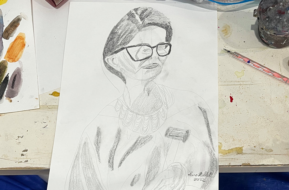 When I'm drawing, I can find myself making the wrong line over and over sometimes. This usually happens when I spend more time looking at my paper, then at my reference photo or model. Looking at your paper while you’re drawing is logical. After all, we need to make sure everything is where it should be, right? But your paper doesn’t show you what you should be doing. Your reference photo or model does. This was brought into sharp focus for me when I drew from a live model in a free class last week. I struggled with her left cheek. I would look at the model for a second and then try to recreate what I saw. I’d be unhappy with it, erase it and try again. I must have done this three or four times at least. Then I decided I was going to look at the model as I was drawing. What do you know, it turned out right this time. There have been times I’ve had my eyes fixed on a model while my pencil is on the paper and I just quickly glance at my paper to make sure I’m in the right place, which is the complete opposite of what I described before, which is just glancing at the model and then keeping my eyes on the paper. This is especially beneficial when you're working on small details. I only recommend doing it for a few minutes at a time, though, as staring at fine detail can hurt your eyes. At least, it hurts mine.
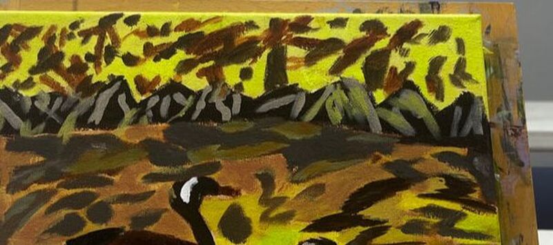
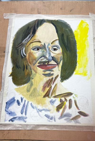
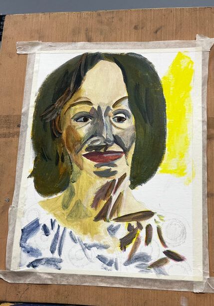
Sometime ago I made a video for my youtube channel about changing the color in a painting from what it is in a photo. Now, I’m faced with changing how things are laid out. I have this photo that I took of some crows. 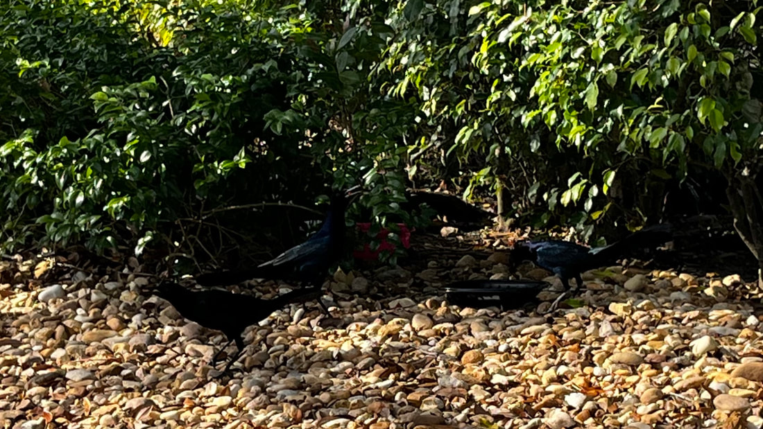 There are three crows in the frame, which fits with the “rule of odds”, but one of the crows is off away from the others. I’m thinking, bringing him in between his friends and slightly down, will make for a better painting. Just because you have a subpar photo doesn’t mean you can’t have a pretty good painting. Take this painting, for example. 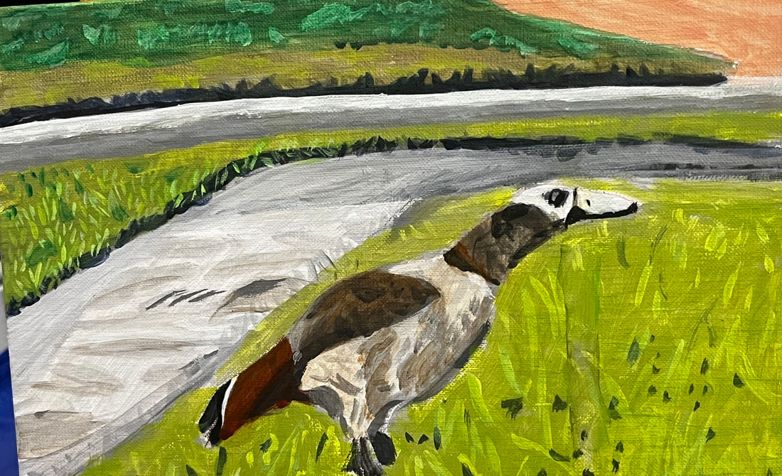 The photo includes another goose, but I chose to leave it out of the painting. When I started to make the drawing, I thought it looked better with just the one goose. Your painting doesn’t have to be an exact copy of your reference photo. Do what you think will make your painting look the best. 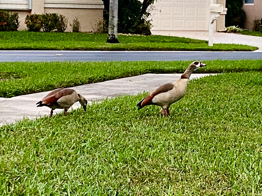 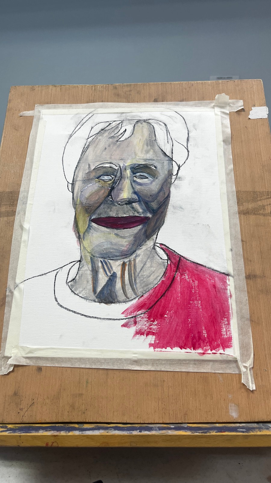 I softened the blue that I used for the shadows with orange because. The blue is always going to be too bright on it's own. If you’re like me, you put a lot of pressure on yourself to get your color right when mixing skin tone for a portrait and, if you’re like me, you fail a lot at first. I should note that things like the type of light the person is under will affect how the color of their skin looks, so, technically, there’s no such thing as a perfect or “correct” skin color. Nevertheless, you’ll probably find that something’s look off to you. What now? Do you just throw the whole painting out and start over? Of course not. There’s always something you can do. Most art teachers, and I agree, would probably tell you to add color in slowly a little at a time because, well, you can always add more, but you can’t take the color out once it’s in there, they say. They’re right, you can’t take a color out once it’s mixed in. But you can neutralize it by mixing it with its complement. Red is an easy color to mix too much of, because it’s so strong and when that happens, I mix green in with it. I do agree with trying not to add too much in the first place, but mistakes do happen despite out best efforts. If you mix too much blue into your skin tone, the effect it can have on it is making it look gray. To counteract this, I mix a bit, just a bit, of red, to liven it back up.
What if you don’t notice anything wrong until your paint is on the canvas? Don’t worry. You can still use complementary colors via glazing. If you’re looking at your reference photo or model and just can’t figure out what colors to use, I encourage you to just come up with the best approximation you can. Once you see what you’re working with, it’ll be much easier to know which of the tricks above you need to employ to improve it. You can edit a rough draft, after all, but you can’t edit something that doesn’t exist.
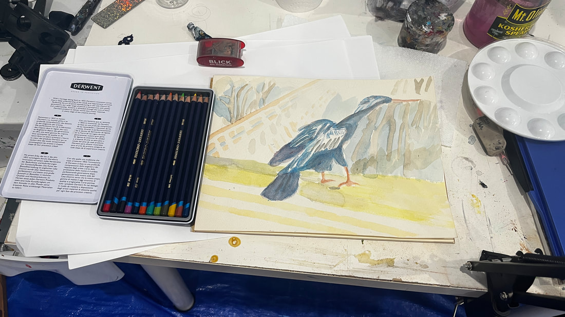 I ordered a set of Derwent Inktense pencils from Blick Art Materials and I’m doing my first project in them. Inktense are water soluble ink in pencil and block form. This makes it easier to work with than traditional ink in liquid form. I’d worked with India Ink a while back and really enjoyed it. Since Inktense is a water soluble medium, I'm working on watercolor paper. Inktense pencils should not be confused with watercolor pencils, however. Inktense will not lift like watercolor. Once it's dry, it's permanent. Don't worry, though. If you don't like a color you put down, you can always go over it later. For best results, I’ve learned that it’s best not to apply the pencils directly to your project. If you do this, the pencil will appear gritty even after you blend it out with water. Instead, rub your pencil on a separate piece of paper or board, add water, and apply that mixture to your project with a brush. To mix two or more colors together, layer them on top of each other and do the same thing you would do to blend out one color. 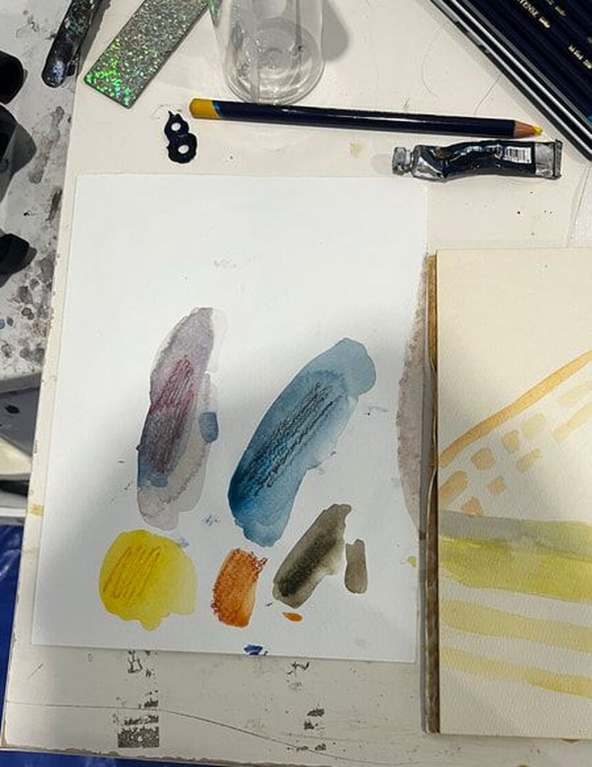 The puddles of color you see, when wet, can be dipped into with a brush and applied to the paper, as if you were painting. The puddles of color you see, when wet, can be dipped into with a brush and applied to the paper, as if you were painting. I hope to have more inktense tips for you in the future. In the meantime, I recommend the tutorials of Lisa Clough of Lachri Fine Art and Shana Rowe Jackson of Caution Artist at Play, both of which you can find on youtube. Lisa's artwork is also on the box for the pencils and the Inktense blocks.
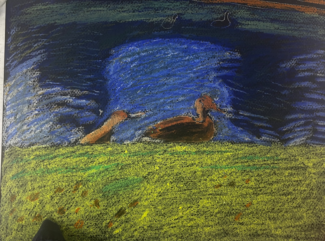 I’ve recently dove back into oil pastels. I’m reminding myself that most of the same principals I’ve been practicing when it comes to color use with acrylics and watercolor will apply with these. One of these principles is to layer multiple colors in one place. The grass will have a yellowish green base, darker green strips and brown spots. Besides being blue, the lake will have the green reflections from the bushes that are above it. Another one is to use less of "strong" colors, like red and purple, and more of "weak" colors", like yellow and orange. For some of the green in the grass, I put red down first and then green on top, because I knew the green could not overpower the red as easily as the other way around and so I would get a nice, muted green color. 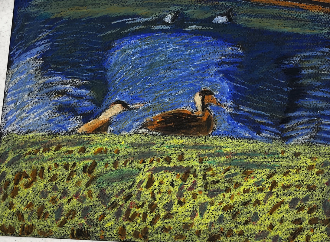 When you start with another medium, you don’t have to start from zero. I made a video about what I was learning when I first started using oil pastels. You can watch it here.
|