|
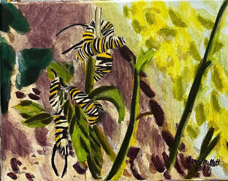
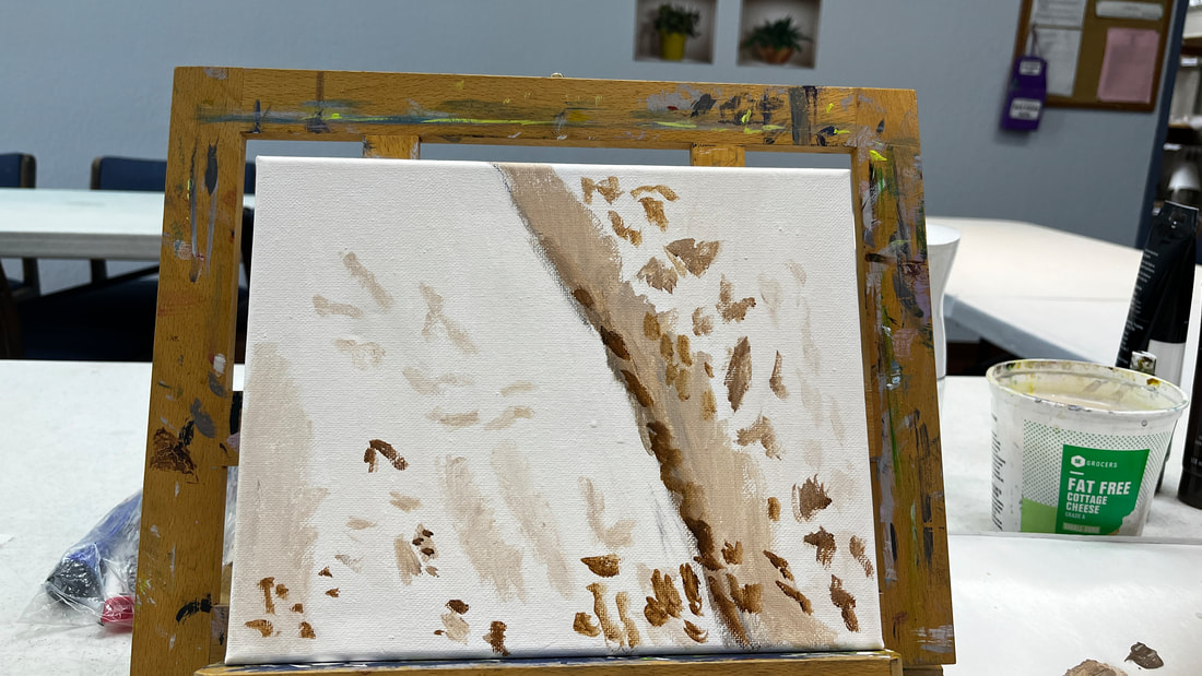
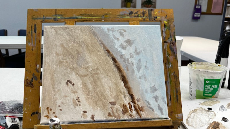
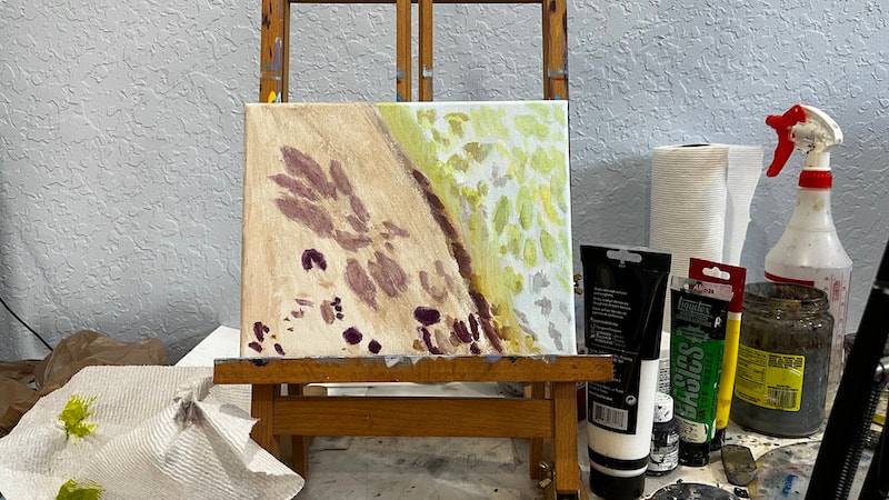
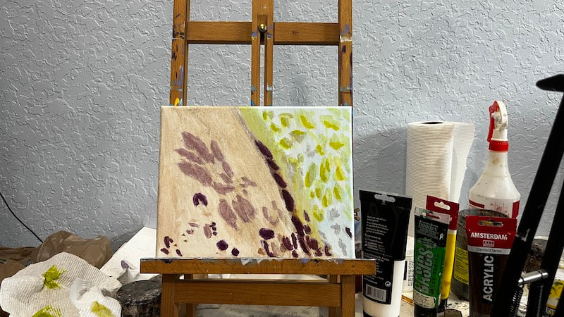
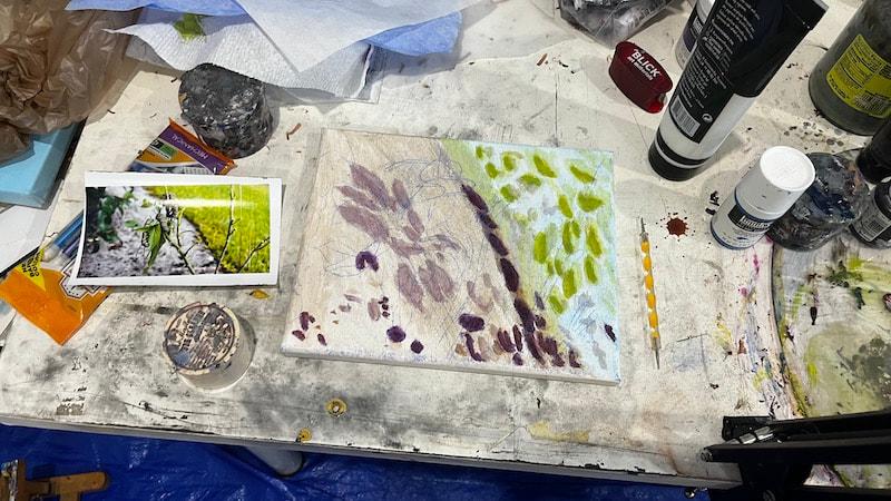
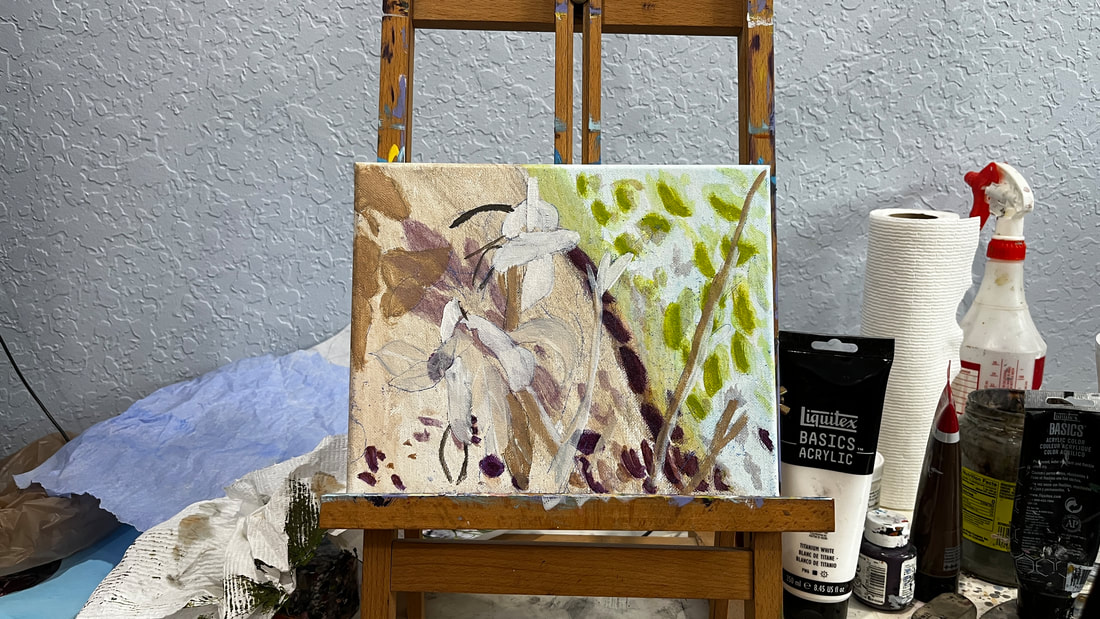
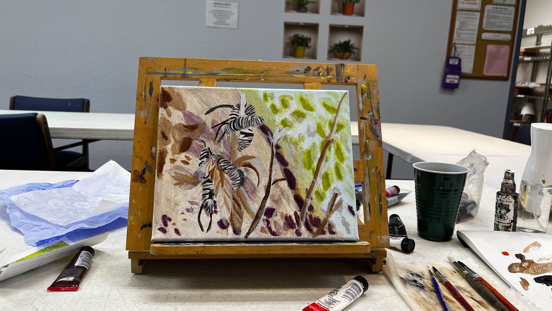
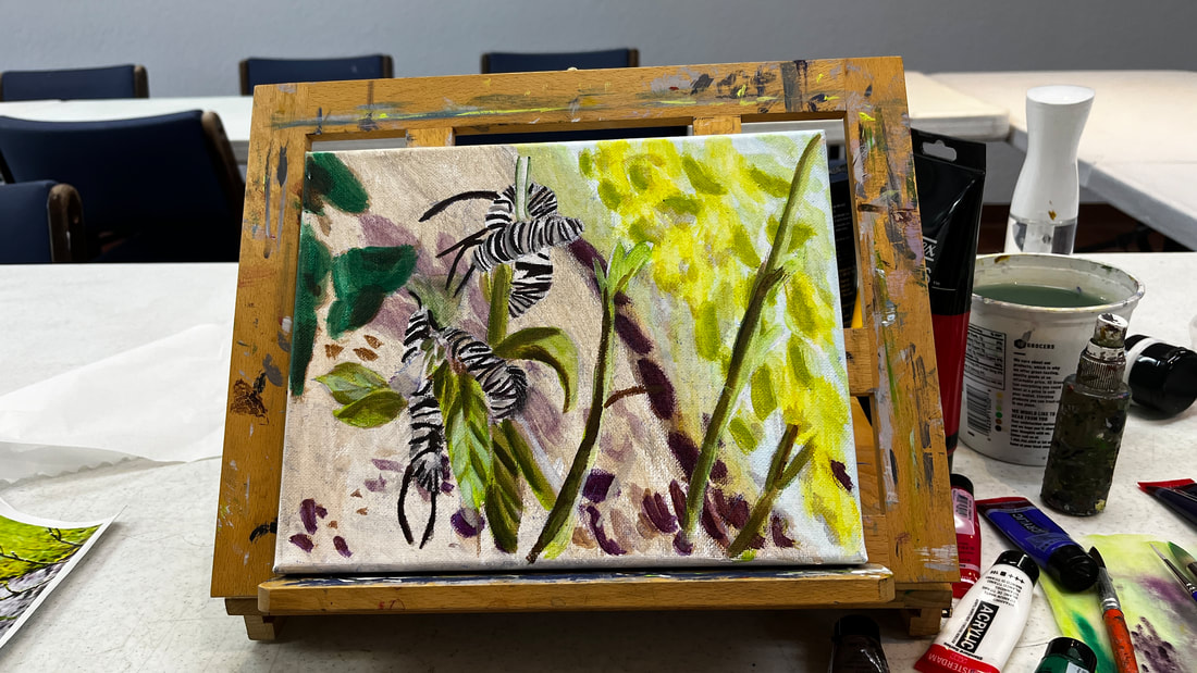
In this article, I'm going to walk you through me painting caterpillars eating milkweed in acrylics. Due to the overall warm tones in my reference photo, I decided to go with a brown toned underpainting, instead of my usual gray-toned one. For more insight into how I came to this conclusion, watch this video. When I was ready to start adding color to the grass, I saw that it had an underlayer of blue. My first thought was that I should use blue-green. As you can see, though, I scratched that and boldly went with straight-up blue for my first layer. I used cyan rather than ultramarine because of its brighter tone. Don't get me wrong, though. The grass was going to have plenty of green, as you can see in the pic below. As I said, the tones in this painting are going to be warm overall, so the grass leans more toward the yellow side of the spectrum. I just added a bit of yellow to some permanent green to make my color. Now we get to the dirt. It would be natural to want to paint everything in this area plain brown, but when I looked at it in my reference photo, there was clearly some purple. I would've said a deep plum shade. I used straight blue violet with very little water mixed in for the small patches and mixed some zinc white and added more water into that for the larger patches. Here the painting is again with just another layer over these patches. I've done this by painting on shapes, then spritzing the canvas, blending my edges with circular motions, and repeating. The next step was transferring the sketch onto the canvas, which I did by tracing and transfer paper. You can see that there are no stripes in caterpillars. That's because I plan to add them in after I block in the underpainting. I'm painting the caterpillars the same way I did the background, i.e., starting with a brown-toned underpainting and then putting on color. The direction of the stripes determines the shapes of the caterpillars. By curving their lines downwards as I move away from the leaves and letting their ends meet, I’m giving the animals a more rounded shape. In addition to this, I worked on the veins in the leaves. I want to preserve the definition in the leaves that I created in the underpainting, so I've been applying my color layers in thin washes, being careful to confine my darkest shades only to where they're needed. I’m using a brownish purple for the antennae and dark stripes on the caterpillars. I think it looks more natural than stark black. The veins in the leaves needed re-emphasizing and more shadows around them. Here's the completed painting again. Again, I took time to increase contrast by darkening the purple patches behind the milkweed and up saturation by layering more green on the leaves. This is especially important when working on small canvases to help them stand out among larger ones in public displays. I'm ending this post by discussing why I didn't use black for the caterpillar's stripes and antennae. I chose not to use black for the stripes on the caterpillars because this piece has an overall warm color scheme, and black would clash. Artists are divided about whether or not to use black. Some say never to use it or to mix your own. Others say if you like black, go for it. I came to the idea while working on this piece that artists against using black may feel that it’s unharmonious with the color palette of their paintings. This explains why impressionists and other artists who mainly paint nature traditionally avoid black. It's because they’re often working with this warm color palette.
0 Comments
Your comment will be posted after it is approved.
Leave a Reply. |
Sara MillettPainter of portraits and wildlife Archives
November 2023
Categories
All
|
