|
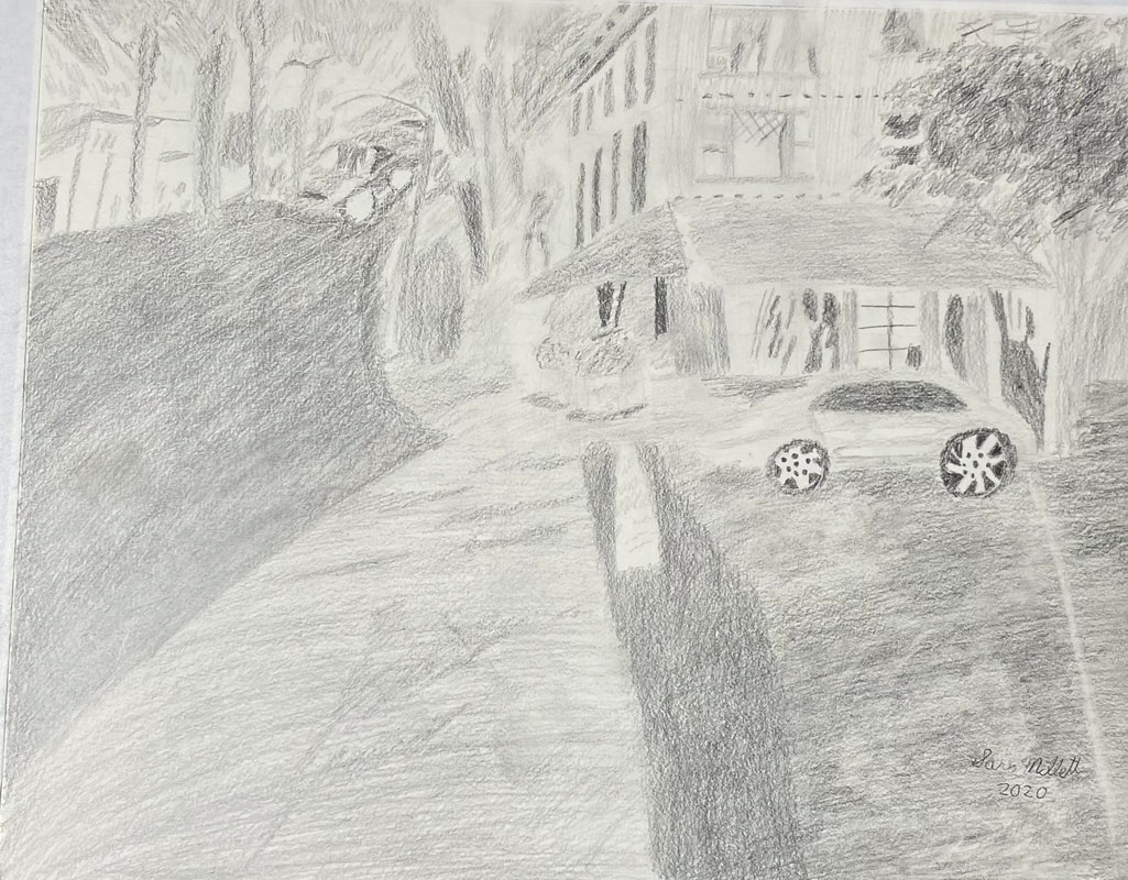
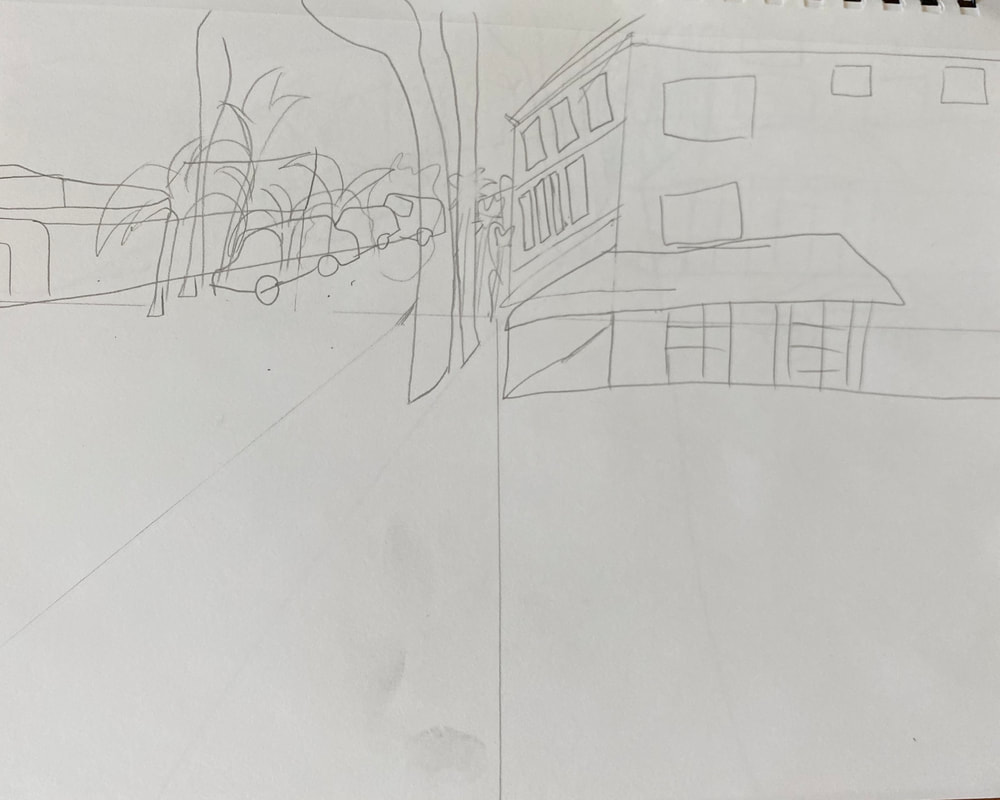
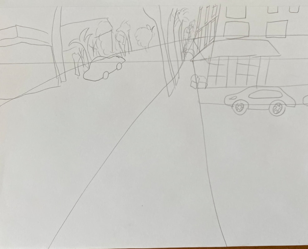
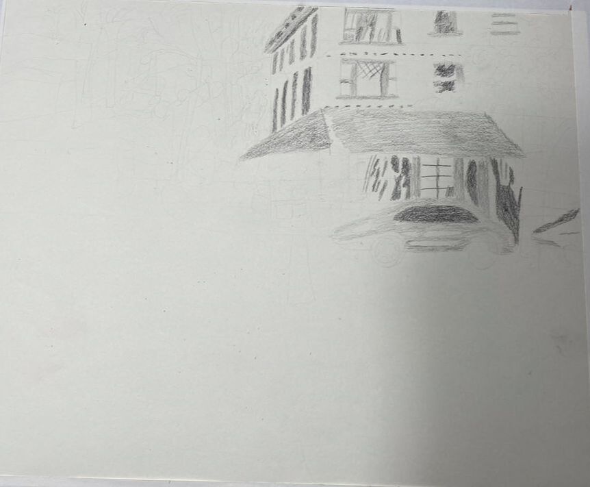
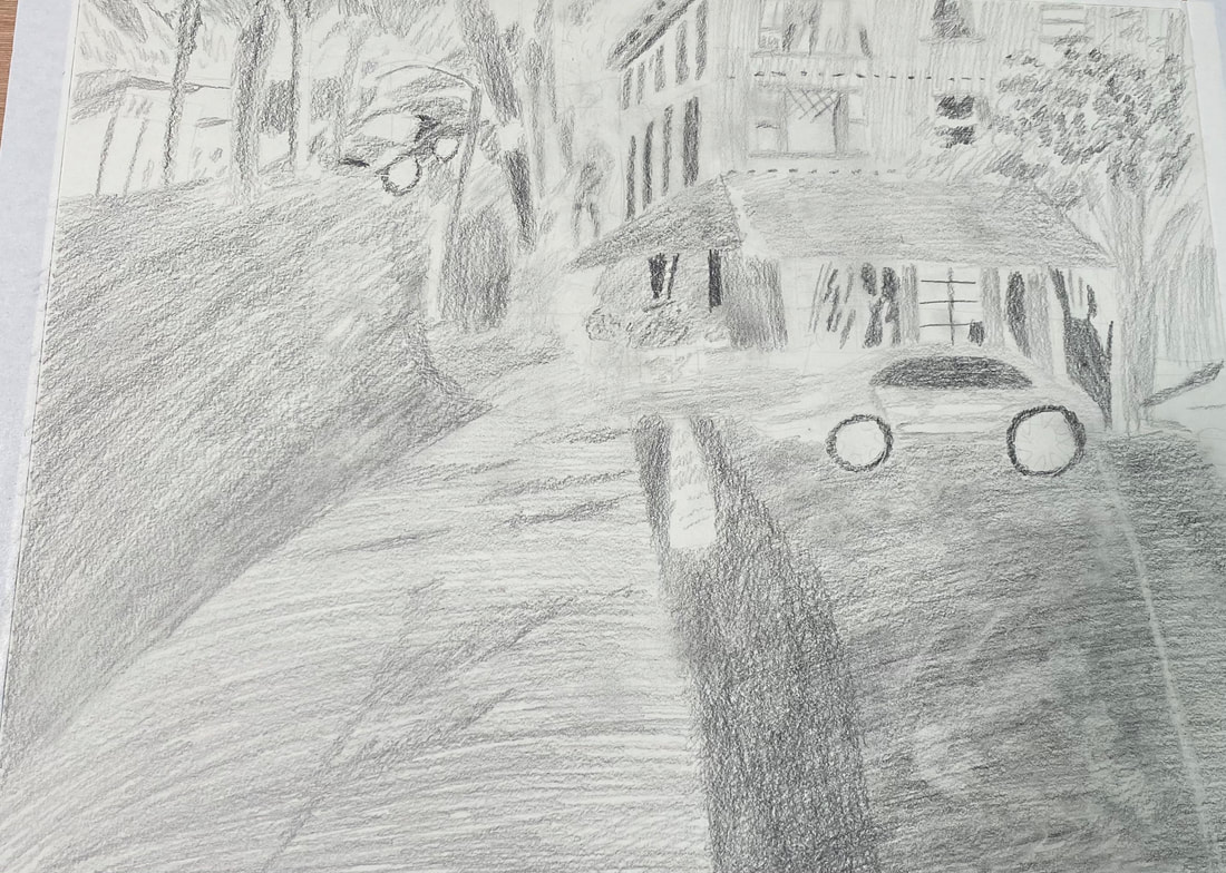
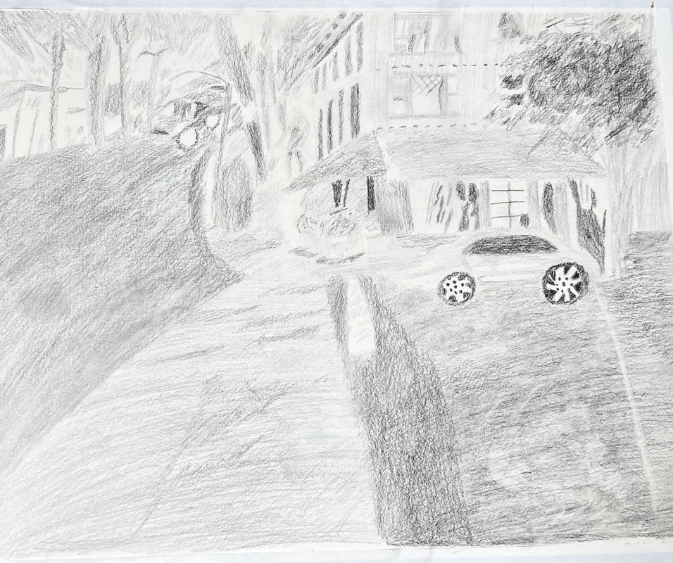
I was inspired by Shana Rowe Jackson’s drawing to do my own road scene. I wanted to depict a street that’s pretty significant to me in my neighborhood. On Thursday, November 19, on my afternoon walk, I took pics of Park Boulevard with Twiggs Coffeehouse visible. Twiggs is one of my favorite haunts. I know the owners and they’re great people. So far I’ve made two sketches to get the feel for the layout. For both, I started with a horizon line, but for the second, I made the adjoining diagonal lines come to a much more narrow point. I drew tiny fuzzy trees and cars close along the horizon line to signify that that was far away from the viewer. For the coffeehouse itself, the front and left-hand side was visible. The distance of the left-hand side was signified by the slanting and sizes of the windows, narrower on the outer edge, and getting wider toward the front of the building. In my second sketch, I also drew the road slanting slightly upward on the horizontal. On Monday, November 23, I decided it was time to start on the actual drawing. My plan was to go slow and focus on getting the perspective of the sidewalk right, then move on to the coffeehouse, which I want to be the main point of focus, and so on, but things are moving a little faster than I anticipated. I’m not hesitating to erase and redraw something if I think it’s too big or my perspective’s off. Speaking of too big, the farther things are away from the viewer, the smaller, and less detailed I want to make them. Groups of things in the distance will also be closer together than ones close up. There’s a liquor store across the street from the coffeehouse and they’re quite a bit closer in my drawing than they are in real life. I don’t know yet if I want to change that or keep it the way it is. So far, I’m happy with the perspective of the sidewalk near the coffeehouse. I have some trees, a lamppost and someone walking there. On Tuesday November 24, I began shading the drawing. I redrew the person walking. I wanted to change the positioning of his legs in particular. It was important to me to keep the shading in the windows smooth because those are reflections that will show the transparency of the windows. I shaded the curtains in the windows of the apartment above the coffee house. On Dec 6, I got back to this drawing after a short hiatus. I decided I should probably shade in the street before anything else so it doesn’t look like the buildings and cars are floating in the air. I started out shading the street by making big sweeping horizontal motions with my pencil across the paper. The most important thing to me, was that the paper was complete covered with pencil. I didn’t want to leave any white showing. Accomplishing this required several layers. The road was not all one shade either. There was a shadow close to the edge of where the paved part of the road met the concrete part and I wanted an obvious contrast between that shadow and the part of the road around it. I shaded all the trees, the lamp post, the trash can, and the man walking so they would stand out. I started by putting a base layer down. I’ll go back and look at each one and see how I can build on it. I shaded the leaves of the big tree in front of the coffeehouse by making squiggles with my wrist. I did not cover up all of the white of the paper. This time, I was concerned with leaving some of it showing. The leaves need to have separation. After I put down my initial layers, I went over them with more squiggles with a pencil one shade darker. When I thought I was done, I looked at it and it didn’t look right. I realized that was because I wasn’t really done. The tree needed more of that darker color on it. Even now, think it needs more shading. I’ll fill it in more and may use either my tombow mono eraser or my needed eraser to open up the little white spots that I need. For the things like tree leaves, I kept my edges very soft. I almost didn’t pay too much attention to the lines I was making and even moved my pencil in squiggles or circles. This was to give them a softer look. For things like the over hangs of buildings and the rims of pots, I kept my shading as straight as possible to show the solid nature of these items. I didn’t think I would, but I shaded the clouds in the sky. For the first layers, I just followed what I saw in my reference photo, which was mostly varieties of “V” shapes. For the layers below those, I used a slightly lighter pencil and made quick zig zag motions with my hand. I thought my top layers were darker than I wanted so I lightened them with my kneaded eraser. After looking at the piece again, I saw that there wasn’t enough of a separation between the street the coffeehouse was on and the road, so I put a shadow between those two things. Like I promised myself earlier, I revisited the tree in front of the coffeehouse and added more squiggles. I think I have still more work to do on it, but I feel it looks better already. I added shadows under the cars that were parked on the street. After I did that and filled in my shading more solidly, I decided the piece was done.
0 Comments
Your comment will be posted after it is approved.
Leave a Reply. |
Sara MillettPainter of portraits and wildlife Archives
November 2023
Categories
All
|
