|
The following is a repost from my wordpress blog. 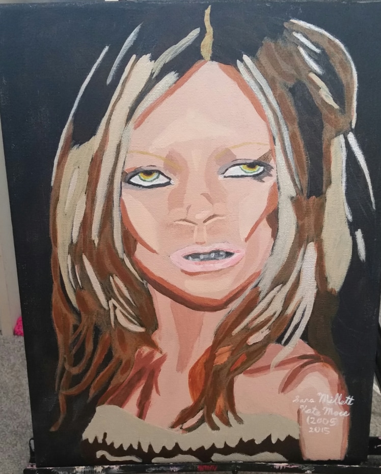 My latest portrait is of Kate Moss at the 2005 CFDA Awards, in which she was being honored as a style icon. The painting is an 11×14 acrylic on Art Alternatives Studio Canvas.The photo was taken by Evan Agostini and was used with his permission. Without further ado, I’m going to go over various aspects of the painting and share my thoughts on them. I’ve painted the flesh using a combination of white, blue, red, and yellow. I used a little more red and yellow than the other colors because I was going for a peachy effect. 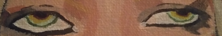 When I looked at my photo, I noticed her eyes had a lot of different colors in them so I mixed white and green with grey, yellow with raw sienna and yellow with burnt umber to make the colors for the iris. Then I mixed a darker version of the grey green for the rim around her eyes. I was very concerned about getting the eye shape right and that included getting the makeup correct, which meant making it darker and thicker on the outer corners. 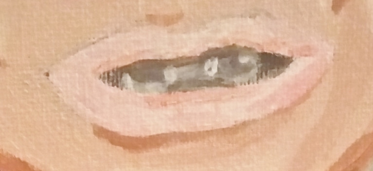 I did the mouth by layering different shades of pink on top of each other, starting very light and gradually getting darker, and letting my bottom layer so through. As always, corneas and teeth are mostly grey with just a little bit of white. 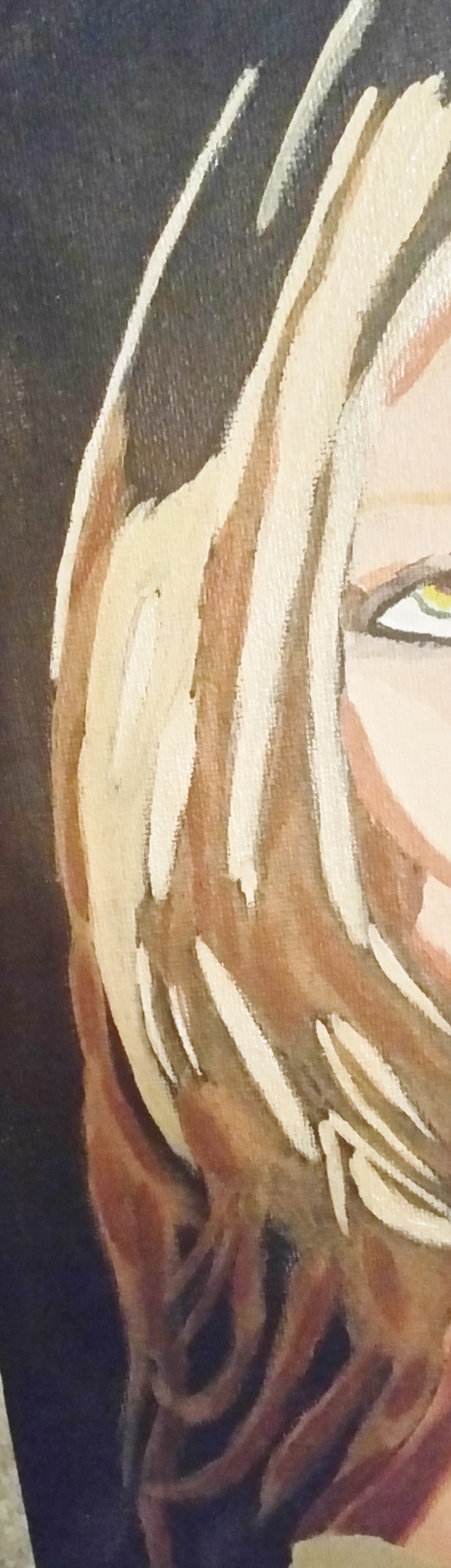 For the hair I mixed white, yellow and purple. This combination made the lightest shade you see. I mixed in a little more yellow and purple to make the slightly darker color that you see here. I went back mixed up that same color again and used it for her eyebrows. Then I mixed burnt sienna into that color, because I saw that some parts of her hair were a bit reddish. I tried going over the palest parts of her hair with transparent mixing white, mixed very thinly to make it shinier. Before I did all this though, I filled in some parts of her hair with a combination of burnt umber and black and an even darker version of this color over top of that. I decided to go over the lightest parts of her hair with a mixture of iridescent medium and matte medium to create extra shine. I’d been wanting to experiment with iridescent medium for a long time and this seemed like the perfect opportunity. 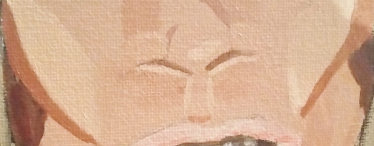 The biggest thing I wanted to get right were her cheekbones, which are iconic. I tried my best to follow my reference photo as closely as possible, and used very dark shading underneath to make them really pop.  I decided the trim on her dress needed to be more taupey, so I remixed the color to give it more of a grayish tone and repainted that area. I then used a combination of burnt umber and burnt sienna mixed together to paint the rest of her clothes. video
0 Comments
Your comment will be posted after it is approved.
Leave a Reply. |