|
On Wednesday, I published a blog post about the rule of thirds. In this post, I'm going to be covering the golden ratio, particularly how it applies to drawing faces. The golden ratio is often called the golden ratio of Da Vinci, because it's present in many of his portraits, including the Mona Lisa. 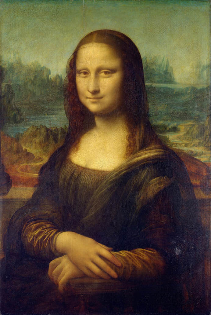 Simply put, the golden ratio describes what is considered to be s perfect face. If you see someone who looks really pretty or handsome, the chances are pretty good that their features fit the golden ratio. 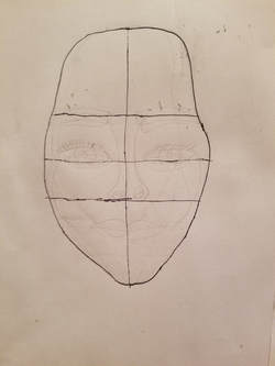 Above, I've drawn a face and divided it into thirds horizontally and then in half horizontally and vertically. I measured my character's face to be six inches long and four inches wide. 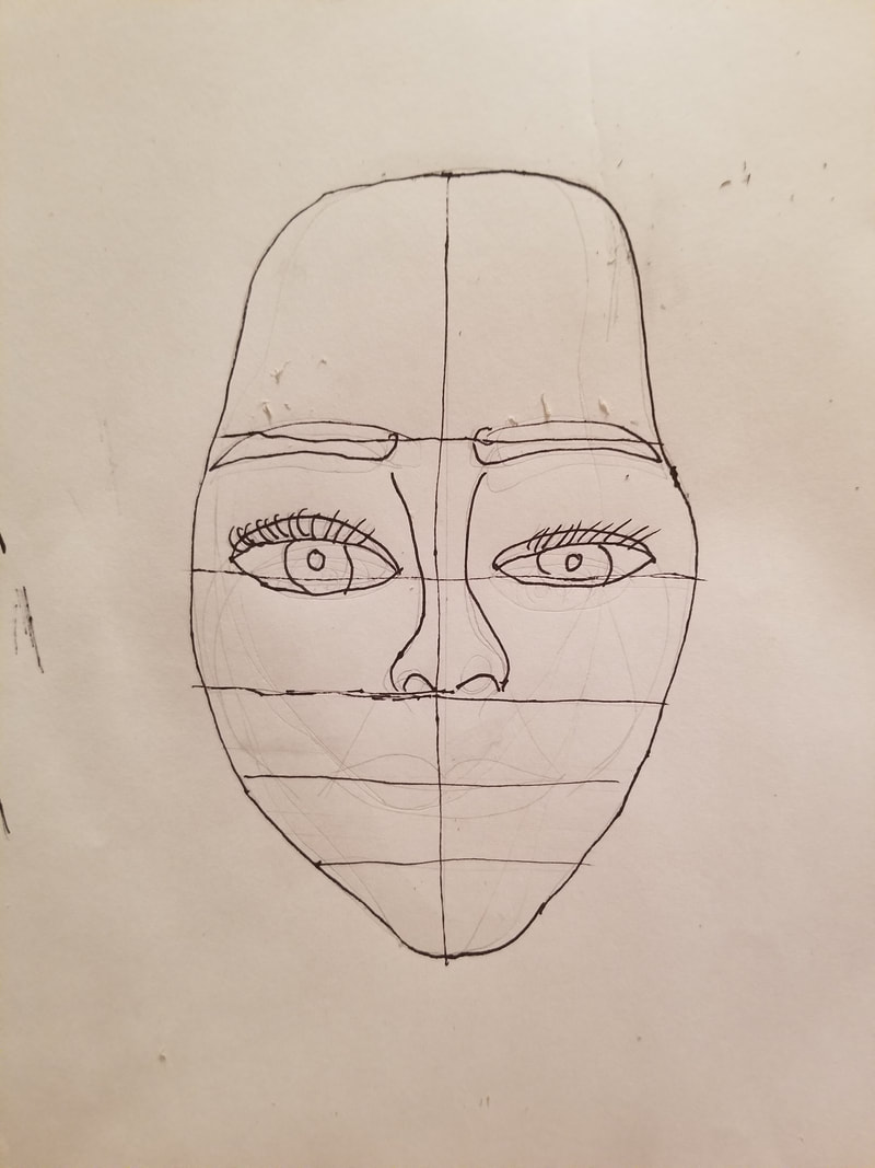 According to the principal of the golden ratio, the spaces from the forehead to the eyebrows, from the eyebrows to the bottom of the nose and from the bottom of the nose, will be a third of the face each, thus, the lines I drew. Each cheek will be approximately the same width. The mouth has to be at one third the distance between the nose and chin. I had a hard time measuring one third of two inches with my ruler, so I eyeballed it as best I could and drew three lines from the bottom of the nose to the chin. 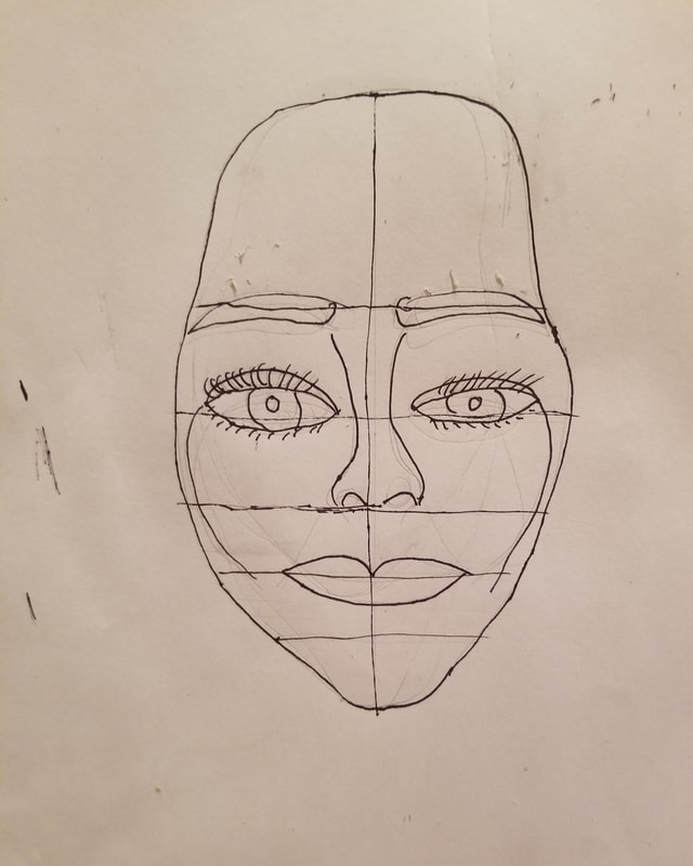 This is the completed face. I'd like to caution against always relying on the golden ratio when you draw faces, though. This is pretty much what would be considered an idealized face, not so much a realistic one. Yes, some people's faces really will have these proportions, but not very many. A much better strategy is to just look at your model or reference photo than rely on any set formula. While I don't encourage relying on the golden ration, necessarily, I do think you should know about it because it's important to art history and you might use it sometimes. Like I said, it helps to create an idealized face, which sometimes might be just what you want, like when your subject actually has these proportions or if you're personifying something nonhuman in your artwork, meaning you're trying to send a message with your piece rather represent something in the real world. The golden ratio can be used to determine where all things are placed in your piece, not just how you draw faces. I chose to focus on how it applies to drawing faces for this post because that's the aspect I personally find most interesting about it. I'm going to embed a video, though, that explains the golden ratio vs the rule of thirds better than I'm able to. So why have so many artists throughout history used the golden ratio to draw portraits, even though most people don't actually look like this? Well, I have a couple of guesses. Number one, the golden ratio equals perfect proportion and perfect proportion is something our eyes are instinctively drawn to, which is advantageous for the artist. Using the golden ratio could've also been a way of flattering a subject who was likely much more powerful than the artist. There's a bit of debate in the art world as to which is better for making pleasing compositions, the rule of thirds or the golden ratio. My stance is, it doesn't matter which one you choose or if even use either at all. I don't plan my pieces according to any of these techniques. I just put things where they look good to my eye.
0 Comments
Today, we're going to look at five of my pieces and see how well they live up to the rule of thirds. Some background info:The rule of thirds is a composition technique in which an artist divides a surface into nine equal squares and the idea is that points of interest should be placed where the squares meet. The thing is that a well composed piece often follows the rule of thirds unintentionally. That just means that what naturally looks good to your eye, will likely fall within the rule of thirds. To that end, I've decided to see how well my pieces fit within this rule. To determine this, I've imported photos of five of my pieces into Corel Paintshop and overlayed grafts on top of them. 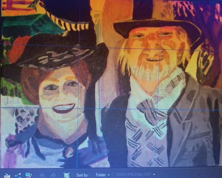 This is "Couple In Costume At Balboa Park" and both of the people's faces just about fall within those areas. 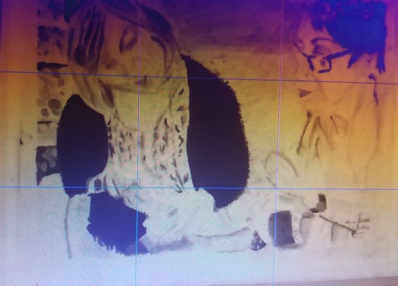 'Same thing with Danique's head and both pairs of hands in "The Knitting Lesson". 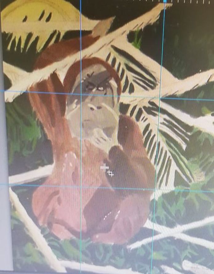 In "Orangutan Hanging Out" the orangutan's body hits on those marks. 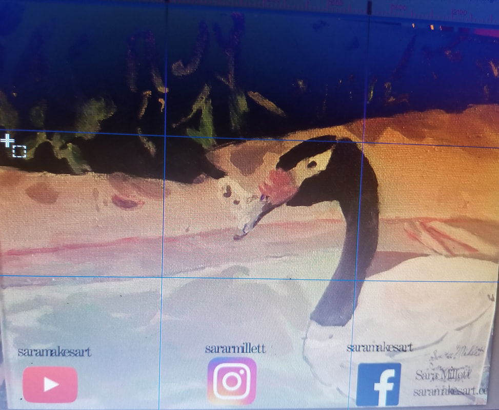 The swan's head in "In Coming Swan" almost falls within this rule and his neck does. 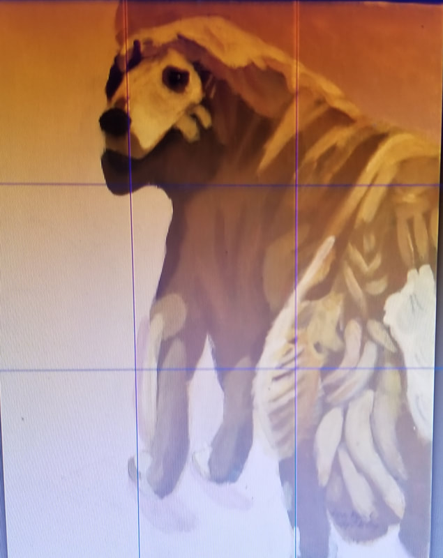 I just want to say, if a piece does not follow the rule of thirds, that doesn't necessarily mean it's a bad piece, but, if you're not happy with your compositions, try utilizing the rule of thirds and see how things turn out. I got the idea to do this with my paintings from this video by Lisa Clough. In this post, I'm going to tell you why you should consider mixing charcoal with graphite. A while ago, I made a video about things I had learned about charcoal. Something I've never shared, though, is that sometimes I like to mix charcoal with graphite, as I did in these two drawings. 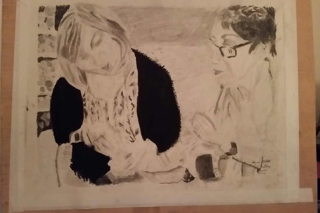 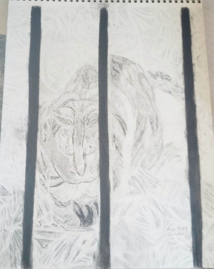 The reason I sometimes mix charcoal with my graphite is because sometimes I want something to be truly black, such as the sweater on the woman in the one drawing, and the bars of the gate in the other, and even the darkest graphite pencils and shading sticks don't get truly black. The darkest you can get with them is a very dark gray. I think charcoal pencils are great for small areas, like the pupils of people's eyes, but for both of the above drawings, I used compressed charcoal, which looks like this. 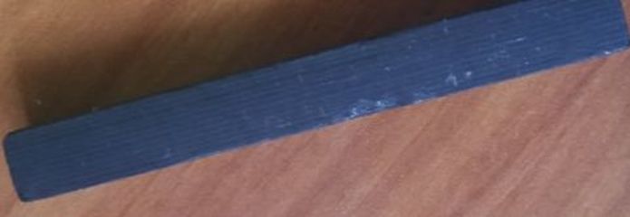 The thickness of compressed charcoal allows me to cover an area much more quickly and smoothly than I could with a pencil. I demonstrate this from 1:18 to 3:09 of the video below. The only downside to this is, because charcoal is so soft, it smears easily. To that end, try as hard as you can not to touch it. You also might want to try using a workable fixative. This is something you can spray on the charcoal portion of your drawing, which will lock it in place, but while still allowing you to continue working. You don't have to mix charcoal with your graphite, but I wanted to let you know it's an option. There’s a popular artist on youtube named Leonardo Pereznieto, who’s channel is called Fine Art-Tips. I’m on his email list and it was an email I got about just this topic, mixing charcoal with graphite to make your blacks really black, that inspired this video.
|